Convo Email Provider
OVERVIEW
Challenge
Messaging and email are staples of working in the 21st century. Email is one such product that is used frequently, especially in a professional setting, but it is not a method of communication that everyone likes to use. Younger professionals, especially, prefer direct messaging apps to get important information delivered. The challenge for this project is to create an email product that more closely resembles a direct messaging app.
Goal
The goals of this project are:
To reduce the time spent emailing.
Allow users to get to inbox zero.
Having an email provider that is more casual.
Make email feel more conversational.
Role
This is a solo design project where I was responsible for the visual design of the project.
DESIGN PROCESS
The Steps

01 Research & Empathise
Market Research
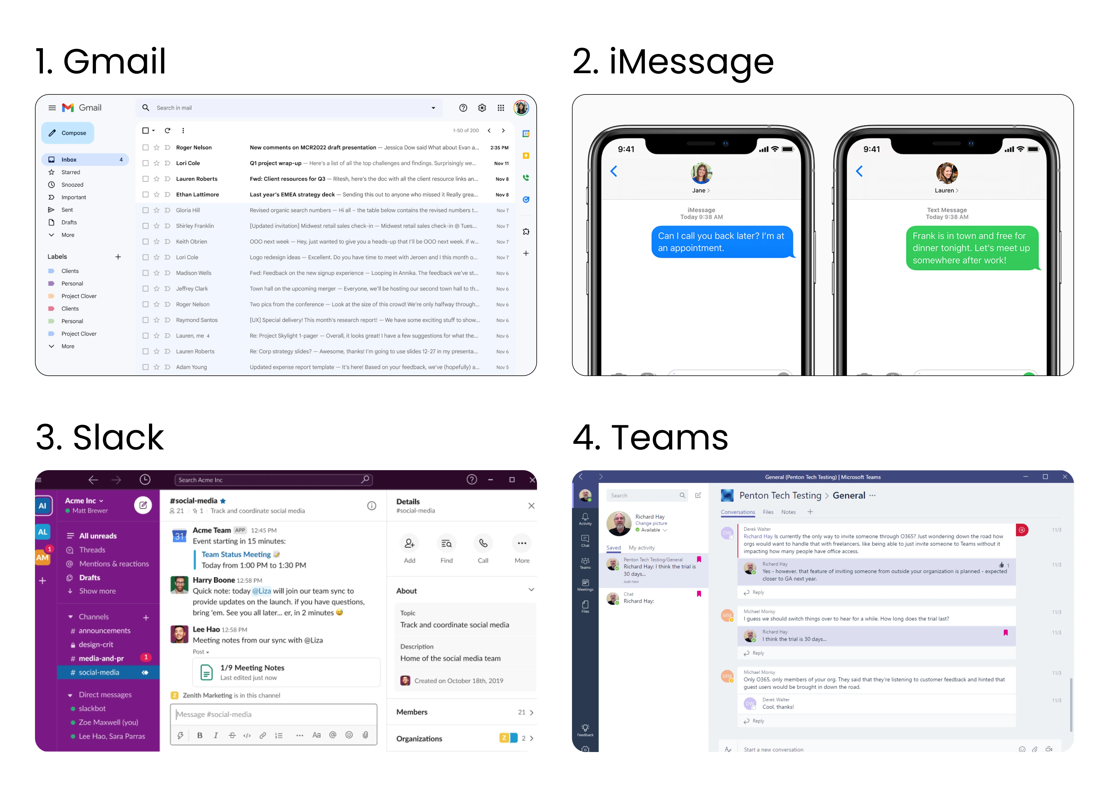
For this project, I looked at various email and direct messaging services: Gmail, iMessage, Slack and Teams. Going forward I used Slack as my main source of inspiration due to the fact that it is a professionally used app that uses direct messaging.
Slack Pros:
Can be separated into workspaces.
Has a section for mentions, channels, drafts and threads.
Can show the people you directly message.
The messaging area looks professional but has some text message features (like the ability to add emojis).
Slack Cons:
Can be challenging to navigate.
User Research
To start the user research process I sent out a form to three potential users to see what email or direct messaging tools they used professionally (or preferred). I looked at what features they liked and what features they didn’t like so I could get an understanding of why and how they used that service.
“It’s connected with other things like Google drive, calendar, and Meet. It’s nice to have an ecosystem where it’s all connected. I also like how it separates my inbox messages automatically.” -Potential User
Furthermore, I looked into how much time people spent using email to determine if it was efficient or not. In the end, none of the people who took my survey spent less than 30 minutes on their email daily.
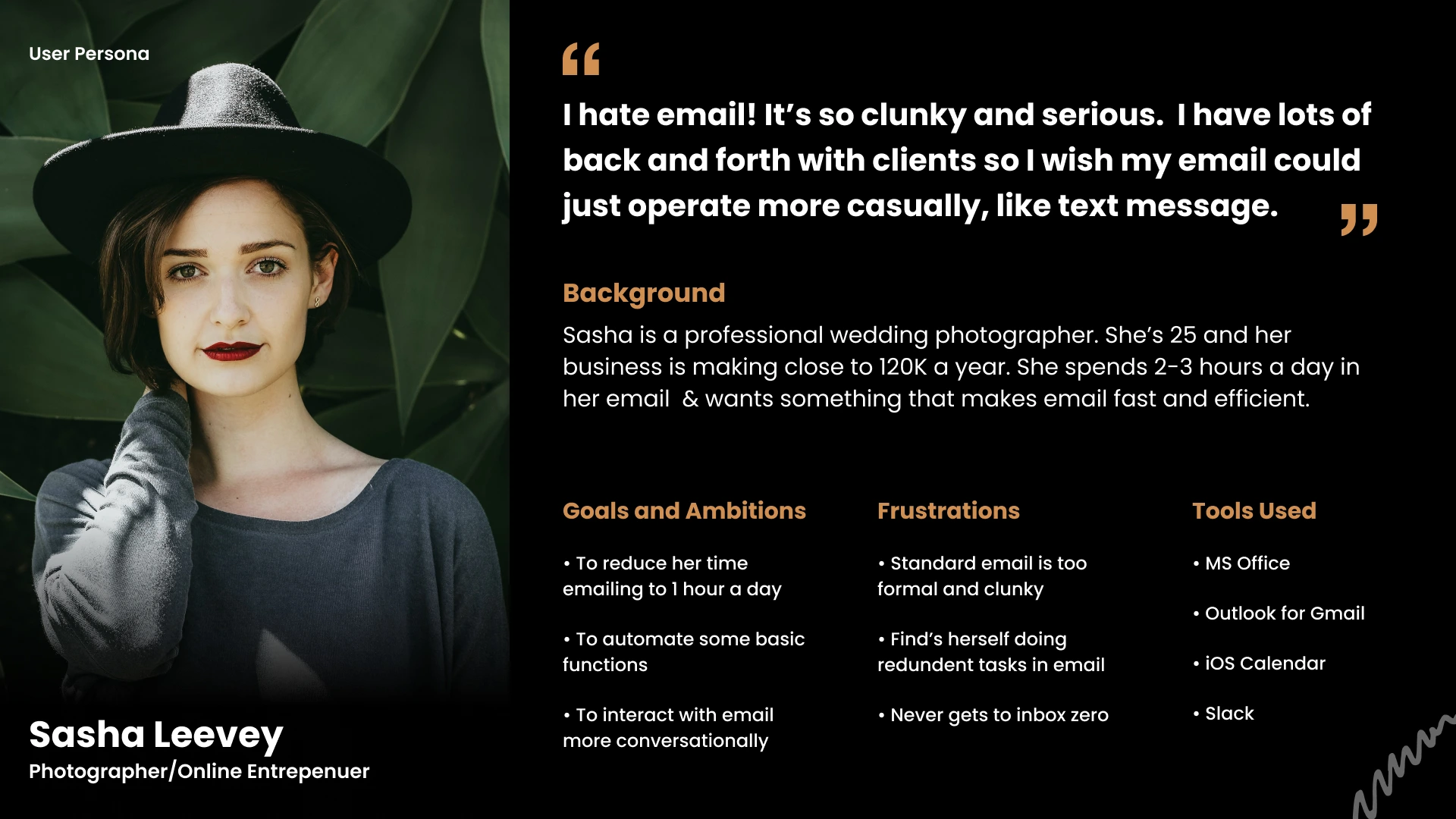
Young Professional User Persona
02 Define the Problem
Pain Points
These are the main pain point that I saw when working on this project:
Email can be cluttered and it is hard to get to inbox zero.
Standard email is too formal and clunky.
Can show the people you directly message.
Would like emails to be more conversational.
User Flow
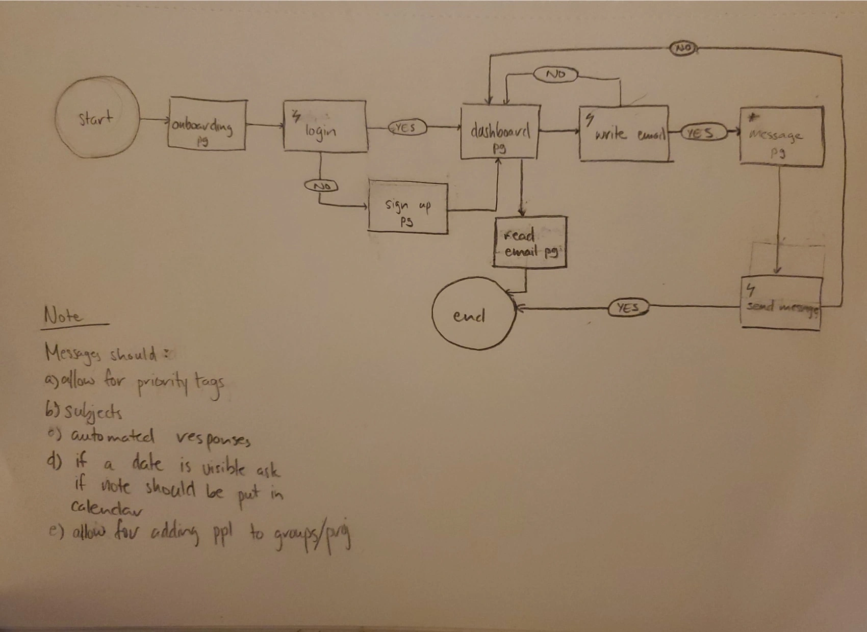
Email Provider User Flow Sketch
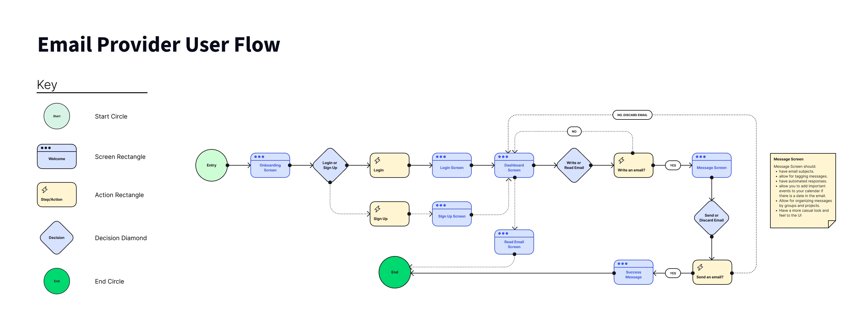
Email Provider User Flow
Wireframes

Email Provider Wireframes
03 Ideation
Visual Research: Colour
The colours I chose were meant to create the feeling of being inviting while still creating a sense of trust that this app is a professional option for individuals and companies.
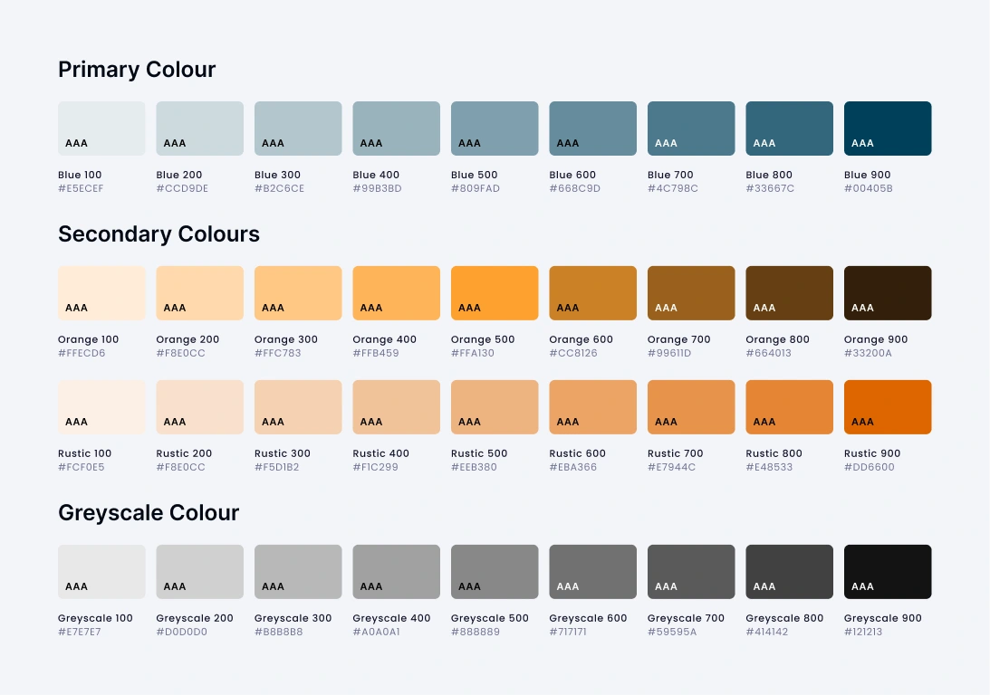
Colour Style Guide
Visual Research: Typography
The typeface Poppins is used throughout the entire design. Its simple design and rounded look make the messages in the app easier to read.
Typography Style Guide
Visual Research: Iconography
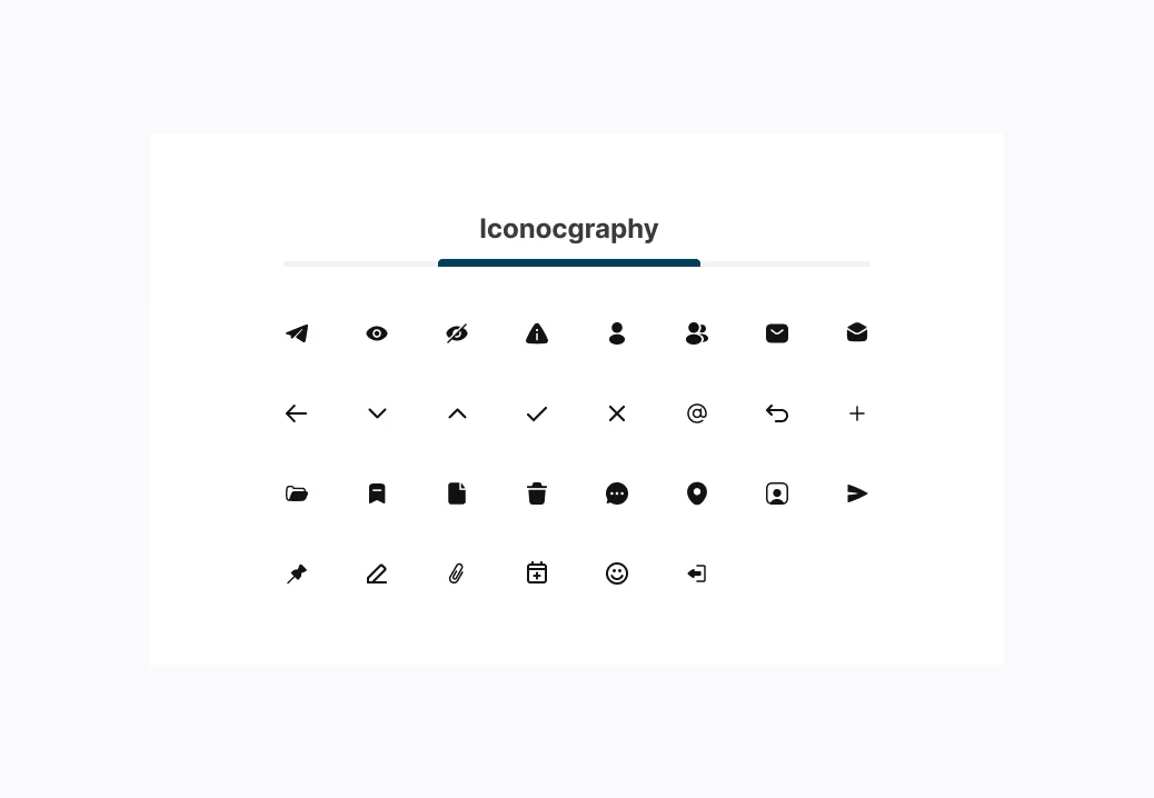
Iconography Style Guide
Visual Design
Convo High Fidelity Screens
04 Prototype & Test
05 Annotations
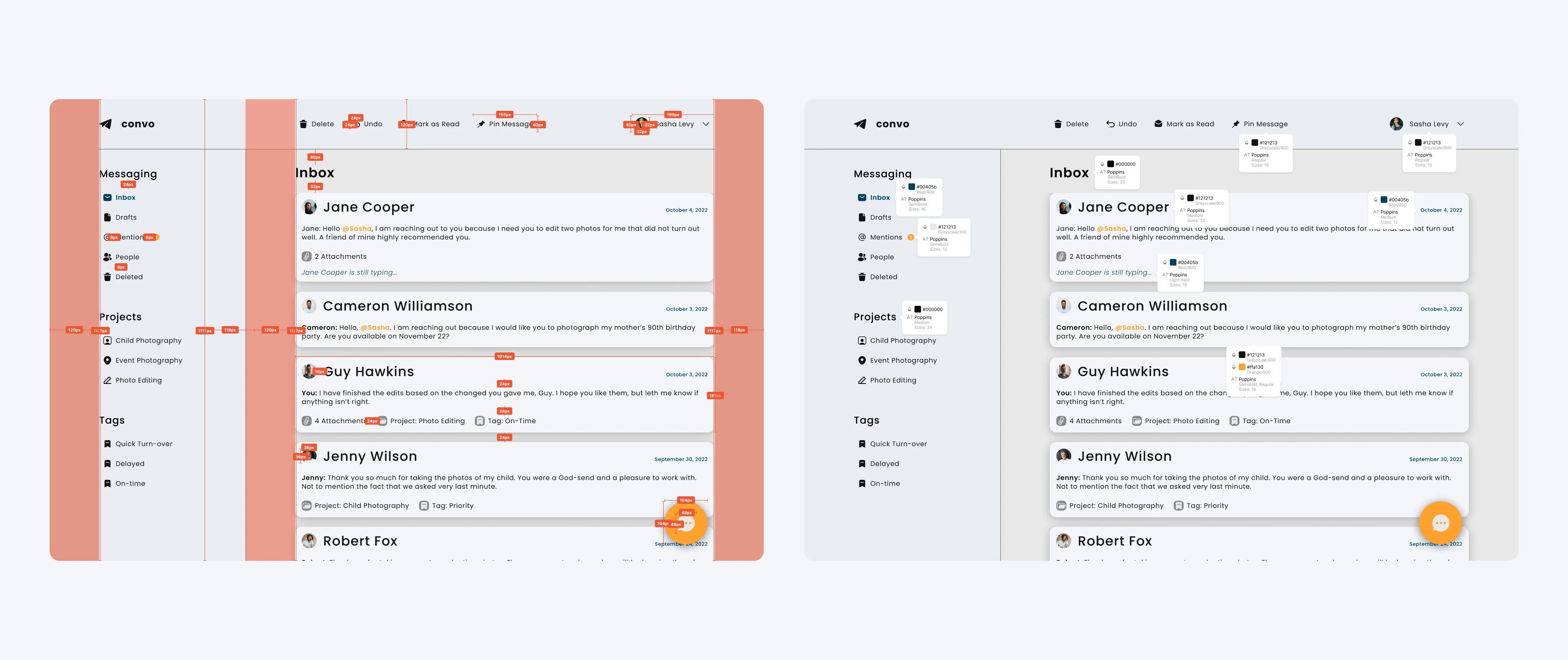
Convo Documentation
CONCLUSION
Summary
Outcome & Lessons Learned
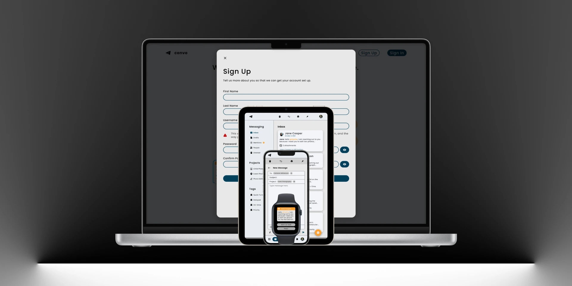
The final product is the design of a clean email app that is easy to use and can be viewed on the web and on smartwatches. When it came to this app’s design I wanted it to have a smartwatch component. That meant that I spent a lot of time researching the design of the smartwatch UI (the Apple watch in particular) to understand what design principles are effective to use in that scenario because the screen is smaller.
Final Thoughts
I enjoyed the challenge that designing a smartwatch posed. It gave me the opportunity to delve into emerging technology which is something that I have enjoyed for the past few years.
Like this project
Posted Aug 1, 2023
This project redesigns the email experience so that users can limit the frustration that comes with standard email and help users focus on what they need.
Likes
0
Views
4


