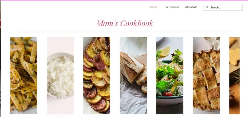
Mom's Cookbook Website

Mariah Foerster


To view the Mom's Bookbook website visit: https://myafoerster.wixsite.com/moms-cook-book.
To view the whole case study visit: https://myafoerster.wixsite.com/portfolio/momscookbook
Mom's Cookbook website is a recipe site that was created as a wedding gift. I was asked to create an easy-to-use, editable, website for their family recipes. I wanted to create a site that passed on the feeling of cooking with family, was responsive in design so that users could use it on any device while cooking, and was editable so the family could go in at any time and add more recipes.
Getting Started and Wireframes
When I was first asked to design a cookbook website, I started by looking at other recipe sites. There are a lot of different recipe sites to look at. A lot of them were blog-based and were harder to use. They worked fine if you went with a specific recipe in mind but were confusing to navigate within the site.
When I finished my research, I started my wireframes. This step was different than normal because I knew we were going to use WIX so I looked at some of their templates before starting. During this wireframing session, the client was involved because I wanted to be sure that I got all the features they wanted and needed. It was interesting because they wanted some features that I hadn't added to their design but made sense for their site. One of my favorite parts about wireframes is that you can never try too many new designs, especially when you're using paper and pencil. I can say I have no idea how many times I drew out different versions of the site before I landed on an idea that the client wanted to move forward with.
Working with WIX
Taking my wireframes to WIX always is an adventure because they have so many templates to choose from. While looking at templates, I looked at my sketches so I could find the one that would be the easiest to change to the design that the client wanted. I decided to do it this way instead of building it from scratch on WIX because it allowed me to focus on the useability and a lot of the animations were already programmed into the site. It also made it easier for the client to get an idea of what the end site will look like.
Deciding how to add recipes
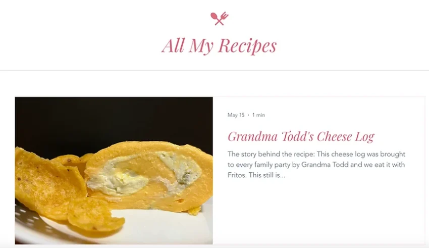
At this point, I started plugging in the information that the client gave me and figuring out the best way for the site to be editable for the client to add recipes while having the design consistent across the whole site. I debated two different ideas on how to add recipes. The first idea was to have each recipe a sub-page. The second idea was to create a blog feature within the site. This was a debate because each idea had pros and cons. Adding recipes by sub-page would be easier to add recipes but it would be harder to create a filter feature for all the recipes and would be easier to accidentally change the design of the site. Adding recipes as a blog feature would be a sharp learning curve on how to add recipes but once learned it would be easy. It also allows an easy filter system within the site because you can add tags you want to filter by and the search could be more refined. I decided on the second idea because while the learning curve was there the filter system and search were important to my client.
Finishing touches
After figuring out the best way for my client to add recipes, I moved on to adding images and focusing on the UI. This is one of my favorite parts of the design process because everything is coming together and you can really spot what changes need to be made in the UX.
Before this point, I had talked to the client about what colors, fonts, and icon styles they wanted so completing the UI design aspects went quickly. It was interesting to see that while I was adding the UI aspects, I noticed that the home navigation needed slight editing so that it worked better on mobile. Some of the features that were added made it look cooler yet made the navigation more confusing. In the end, we decided to keep the UI design simple but make sure the UX made to website easy to use.
At this point, I had finished what I was asked to do, and I taught the client how to add recipes to their website and completed the handoff.
Conclusion
When I started this project, I wanted to design an easy-to-use, responsive, editable website that could be used by anyone in their family. Every time I finish a project, I take a moment to think about what I learned from doing it. While making Mom's Cookbook, I learned more about how to think about what is most important in the design, not only for you but for the client. How to work through ideas better and pick the idea that is best in the long term not just easiest now, and how to make the navigation both look professional and easy-to-use.