Card Board Games App

Mariah Foerster


To view the full project visit: https://myafoerster.wixsite.com/portfolio/card-board-games-app
Figuring out the Style
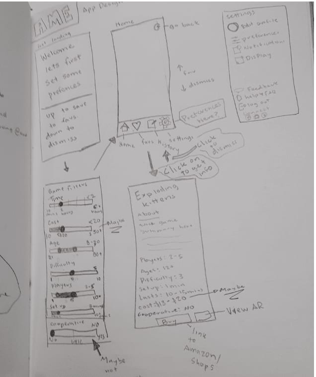
Getting started with this project, I really struggled with how to get the theme of Card and Board games into an app that hadn't been done before. Since I was struggling, I decided to make a list of requirements for the app and ideas of what it could be. Creating a list helped me think about what it could be, especially having an Augmentative Reality (AR) element so users could see what the game looked like before trying it. After making a list, I was still stuck so I decided to ask for help from a mentor and potential users to see what they would want in an app like this. With their help, I decided I was going to create an app that was similar to a dating app but for card and board games. Where you would see a card or board game be able to learn more about it and swipe up or down if you like it or not.
Strategic Approach
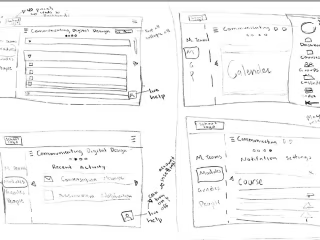
Once I figured out my direction, I started thinking about the users, specifically when they would use this app and what they would want. I decided that this would be for when users are looking for a new game or looking at the games they saved to play later. This is because they are looking for a new game or if they want to play a game they saw earlier and wanted to try. After figuring out why users would use the app, allowed me to think about where users would use it. As I thought about where would I use this and even though I am not the end-user, this allowed me to get started on sketches and talk to potential users. While showing my sketches and talking to potential users, I discovered that they would use it when they were bored looking for something to do, or looking for a new game for game night. After that, I decided to simplify the design and have easy navigation.
Designing
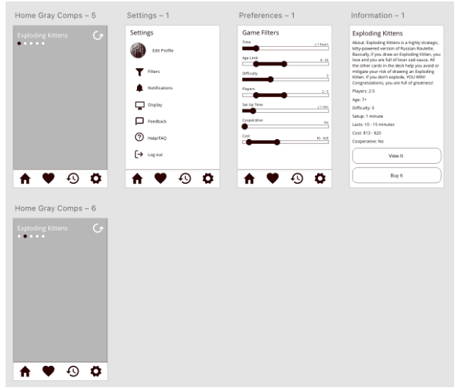
When I started making gray comps, I debated on several parts of the design - especially where to put the navigation, how to access the AR view, and colors - so I went and looked at dating apps to see what worked and didn't. I took what I learned and went through several iterations on paper before starting on gray comps. I decided to go with a bottom navigation bar because the user could use it while they were on the go and so they could click it with one hand. I decided to have the AR view accessible so users could see how big the game was. I decided that the colors, dark red, a light version of that dark red, light yellow, and light orange because they drew the user's attention, seemed to fit with the fun game idea, would match most game designs, and look professional.
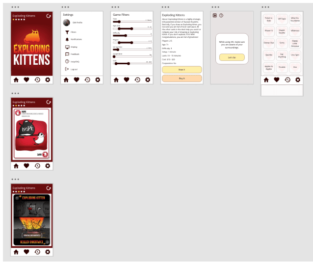
Prototyping
Prototyping this design was simple because I had examples from dating apps to get ideas on how to have the design function. I love prototyping because it helps me figure out more fully how the app would work, and the experience of the app, and I have something to test with potential users. I always learn a lot while prototyping because I can see my design flaws. Here is the link to that prototype: https://xd.adobe.com/view/ba6896c0-0460-4d4a-a1ba-b0f01e42e3ea-ef3b/
Conclusion
Looking back at this project, I realized that the solutions I came up with were inspired by something that most people don't connect with card or board games. I was able to think about design techniques and principles as I looked at the dating apps to be inspired as I designed with a different user in mind. I was able to see what works and doesn't from other designers and get inspired. I was able to design something I can be proud of by getting feedback, working with those who would be the users, doing research, and carrying the idea of sharing new games with users along the way.