To view the full project visit: https://myafoerster.wixsite.com/portfolio/canvas-instructure-redesign
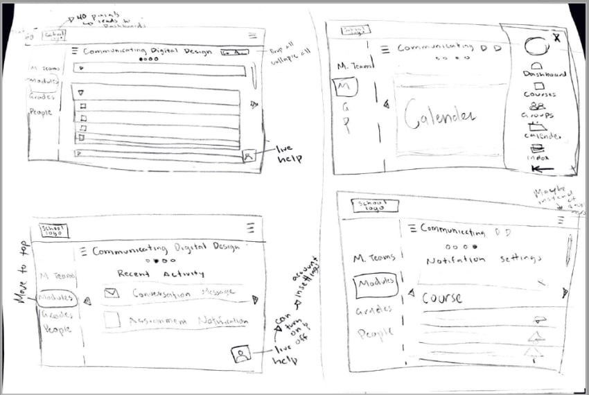
Getting Started and Wireframes
When I was first asked to redesign Canvas, I had no idea where to start because I had only looked at Canvas with the mindset of using it to get homework done. It didn't take long to change my mindset from using it to designing for it. Changing mindsets was easy. It changed when I started initial user research to discover what users at Utah Valley University did and didn't like about Canvas.
After discovering what changes students wanted, I started my wireframes. One of my favorite parts about wireframes is that you can never try too many new designs with your wireframes, especially when you're using paper and pencil. I can say I have no idea how many times I drew out different versions of desktop and mobile ideas before I landed on an idea I wanted to move to the computer and gray comp.
Gray Comps
The gray comps to the left are not the first version of the gray comps that I did or the last. In my final version of my gray comps, I decided to move the to-do list under the tiles that popped up and down when clicked from the position on the right. I decided to do this because it allowed students to focus on what needed to be done by class and it changed the information architecture so what was most important was seen first. I also decided to move all the canvas information to a top navigation bar from a side navigation bar. I decided to do that because it is most consistent with other websites and so lessens the learning curve for new students.
At this point, I decided it was time to get some feedback from some of my peers. It was later into the design process than I normally would like but that was due to factors outside of my control. The feedback I received on this design was focused on making sure the design was consistent between devices and that everything was legible with font sizes. There weren't major changes needed for this design but after receiving that feedback, I now make sure that getting feedback is done earlier in the design so that I can make the needed adjustments easier.
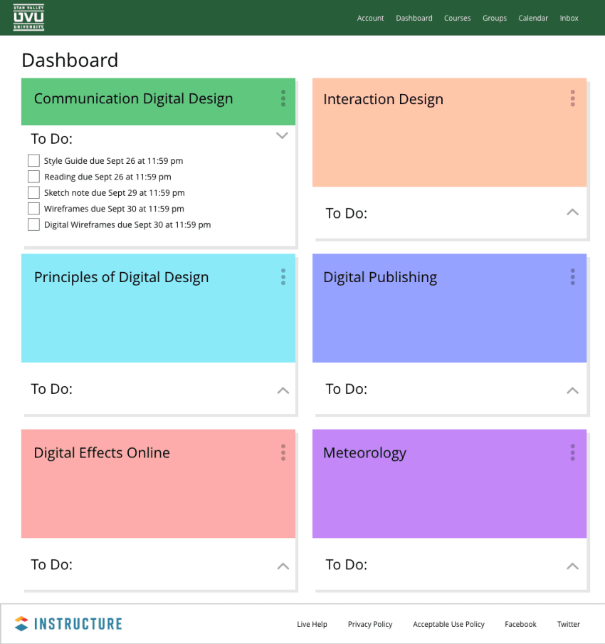
Color Comps
One of my favorite parts of the design process is changing gray comps to color comps. It is my favorite part because it adds an extra layer of depth to a project, you can see the progress you have made, and you can do user testing with the users getting a full idea of what the design will be.
I enjoy user testing because you can see how people will react and make adjustments based on their needs. I was unable to do a lot of user testing for this design but the testing I was able to do made a difference in the end design. The feedback I received was about font size, spacing, and contrast for accessibility. I always try to take user feedback with grace and whenever possible, make the suggested changes and then do further user testing. I was able to make these changes quickly and after I did, I saw a difference.
At this point, I completed this design for the needs of the project and moved on but after a few years, I came back to it to try another idea for a redesign while learning Figma in the process.
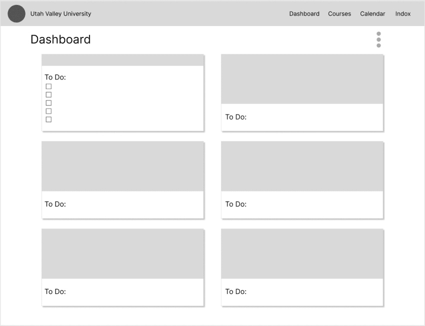
Gray Comping in Figma
I decided to revisit this project because as I was applying for new jobs I learned that most companies now used Figma instead of Adobe XD and wanted a stress-free project to work on as I was adapting to the new program. I had used FigJam before starting the update, had talked to a mentor about how Figma worked, and had attended online seminars from Figma about cool tips for using their software but never had used it before. The learning curve from moving from Adobe XD to Figma wasn't as bad as I thought it would be. As soon as I really started designing, their layout and icons made sense so it wasn't hard to use.
The design for this Gray Comp was based on the idea of the to-do list in the course tiles but keeping the navigation on the left. I decided to try this to see how the information architecture changed and if the page would feel out of balance without having the to-do list on the right. Where the users' eyes were drawn to definitely changed from the course tiles to the side menu and it seemed to me that the page felt slightly lopsided but couldn't decide how I felt about it. I didn't go further with this design because the goal of the update was to adapt to using Figma and I did.
Conclusion
Working on this project, both times, it reminded me of the importance of the design process and receiving feedback. The design process is not a linear process but you can go, rethink ideas, get feedback, do more sketches, try new ideas, and do what you can to create the best design that suits your users' needs. Since I received feedback later in the design process the first time, it made me change when and how often I get feedback. It taught me that it is never too early to receive feedback on a design and that if you make the needed changes earlier in the process it is easier than doing it later and trying to change the prototype. Receiving feedback allows you to grow as a designer and see what you couldn't see as you are working on a project.