To view the full case study visit https://myafoerster.wixsite.com/portfolio/arches-app.
Where is the app for Arches?
As I started, I decided to see what was out there for Arches National Park. I was surprised to learn that there weren't many websites or apps out there. There is the official site for Arches, a Utah Big 5 national park site, a few blogs, some personal sites, and no apps.
After visiting all the sites I could find, I started making my design by making a list of what I wanted to add to my app based on what was in other hiking apps and from the sites I looked at. As I made my list I saw that the official site has a lot of useful things like trial maps, current updates, and events. I decided to incorporate most of what was on the official site because I wanted it to be used at the national park. I also decided to add a share your photos section because I have found that creating a community around similar-minded people can help increase park attendance and app usage.
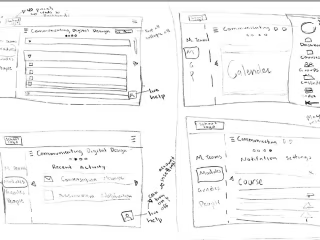
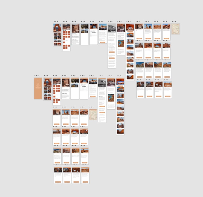
Sketches and Gray Comps
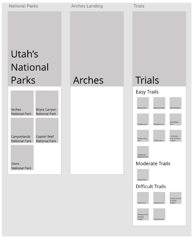
After making my lists I started making sketches. Each of my sketches focused on a simple design where users could find what they needed and wanted to return. I enjoy making gray comps because you can see your idea take form and can see if it will work. To me, gray comps are the steps that can make or break your design. Gray comps allows your sketches to take form and you can find issues that you didn't expect. One of the issues I ran into moving my sketches to gray comps was that the touch size of all the buttons was bigger than I expected which caused the need to scroll to find what you need. I decided to keep the buttons slightly bigger and have the scrolling but set everything in sections so they were easy to find. Another issue I discovered was that my headers were too big on the sketches and I had made them even bigger on the gray comps. That was an easier issue to solve by just shrinking the headers and testing them on a phone prototype.
Adding Color and Testing
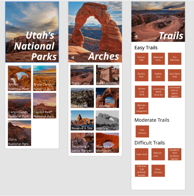
Adding color and images is my favorite part of making apps and designs because you can create the feeling you want in the app. I will admit for this app I made a mistake at the beginning because I forgot to make a style guide. I did have an idea in mind of color but I had to figure out what colors I wanted to use to carry the feeling of Arches. In the end, decided to go with the colors you could actually see at Arches National Park.
After I picked my colors I decided to reach out to some people and ask for their feedback on how it was going so far. It was interesting to receive that feedback because they helped me change the colors slightly so that they fit the arches theme and they also helped me change the layout slightly so that it was easier to use.
Prototyping
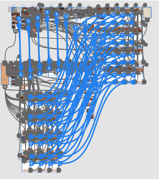
After I got my color comps done, I started prototyping. Prototyping this app was a lot harder than I thought it would be because I had to figure out where each screen should link so the user could have the best experience possible.
During my prototyping, I decided to do some tests with peers and potential users so I could see what direction the app needed to go. Each test allowed me to get more feedback and make the app better than before. To view the prototype visit https://xd.adobe.com/view/c21d5101-40cd-4f58-8496-0680887a0524-974e/.
Conclusion
When I started this project, I wanted to design an app that kept the feeling of Arches National Park, was simple enough to use out on trials, and was able to introduce people to everything Arches had to offer. When I finish a project, I always take a moment to think about what I learned from doing it. While making this app, I learned a lot more about how to be consistent in your design, how to add cool tricks to your prototype to make it feel like a real app, start with a style guide in mind so you have your colors and fonts from the start, and how by changing the font in headers and sub-headers just slightly creates a better more professional-feeling design.