Built with Relume
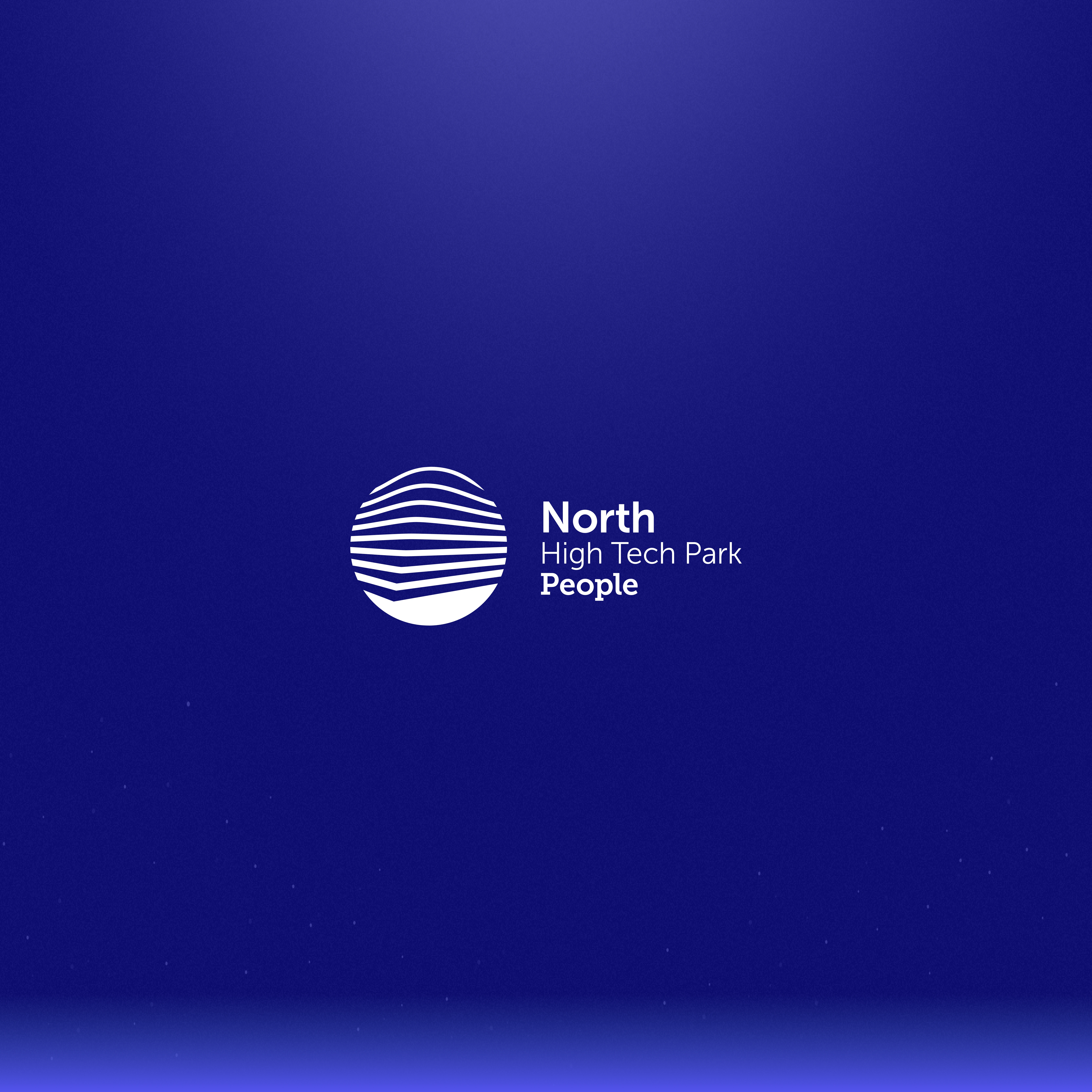
North High Tech Park • A Digital Hub for Innovation
Daniel G Bright
Thumbnail
Overview
When NHP came to me, they had one request: “Make us a website that looks professional but still feels approachable—and make it awesome.” No pressure, right? The goal was simple: create a site that reflects their expertise, connects with clients, and doesn’t look like every other cookie-cutter corporate website out there. Challenge accepted.
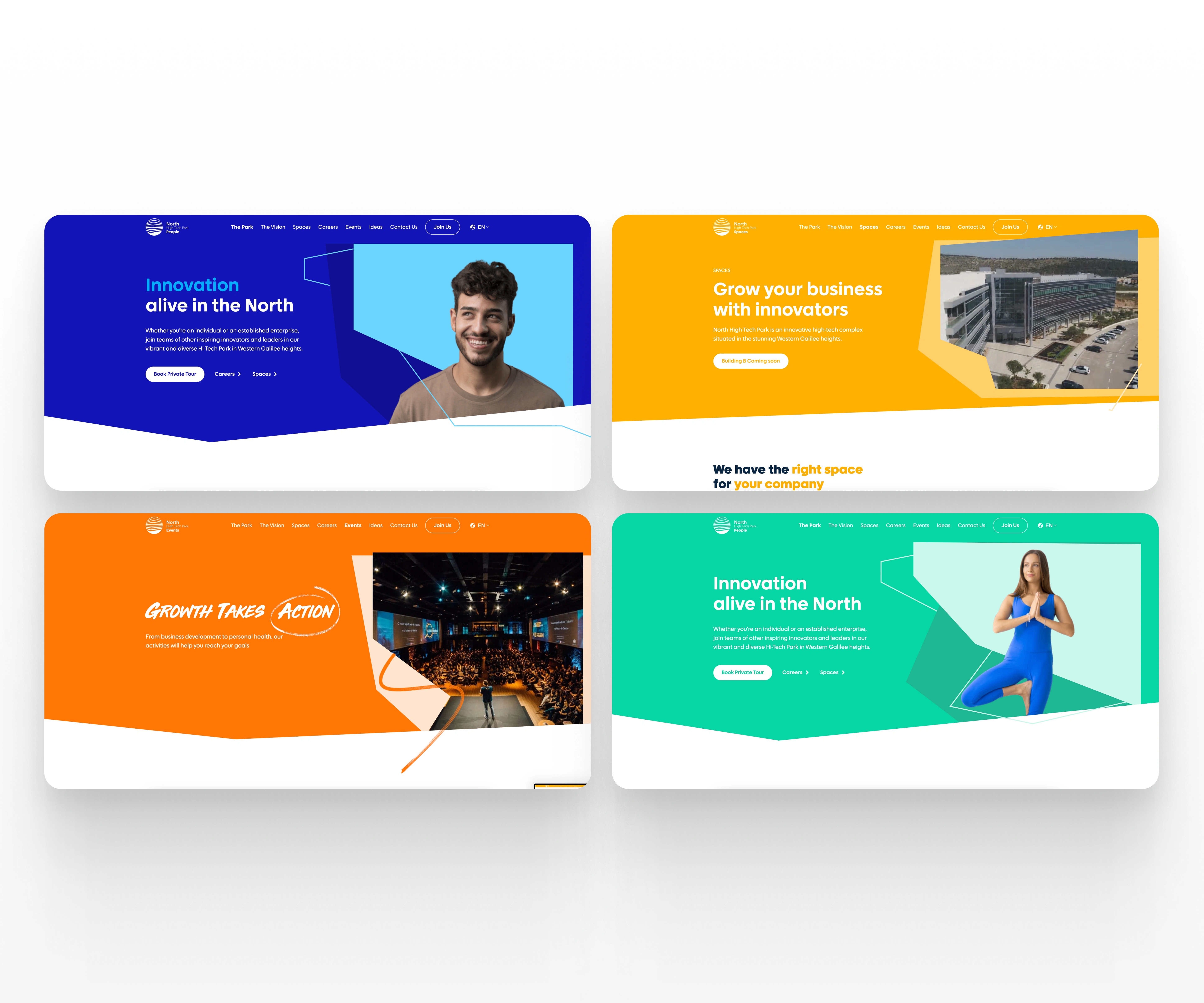
Hero Sections
The Challenge
Most websites these days? They’re bland, overly complicated, or worse, stuck in 2010. NHP needed something different—a site that:
• Shows off their industry expertise without boring visitors to tears.
• Makes it ridiculously easy to navigate.
• Looks stunning on phones, tablets, desktops… basically everything.
Oh, and it needed to feel like them: smart, professional, but with personality.
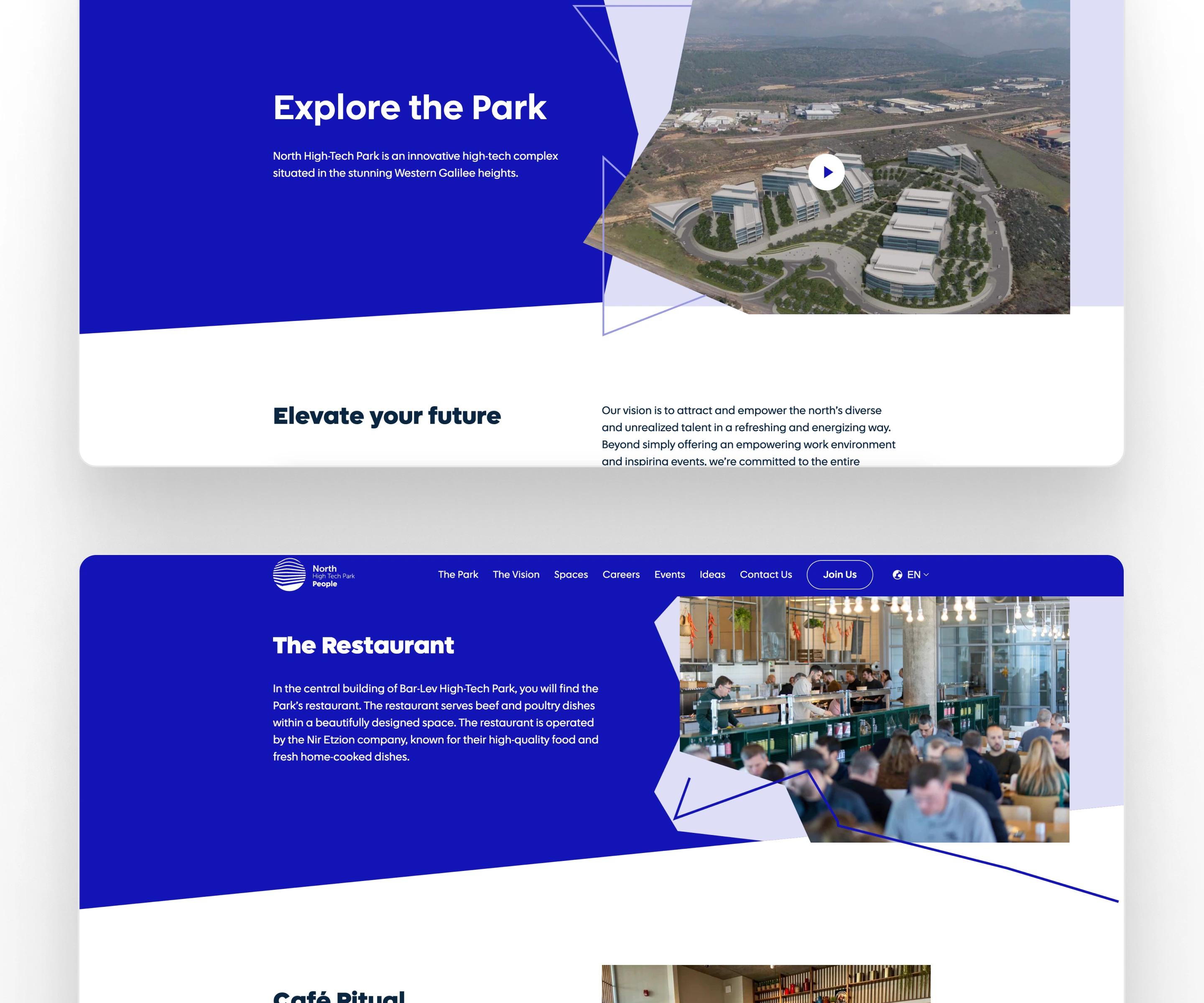
Content Sections
The Strategy
Here’s how I tackled it:
1. Step into Their Shoes: I started by getting to know NHP inside and out—who they are, what they do, and why their clients love them.
2. Simplify, Simplify, Simplify: I focused on creating a super clean and intuitive experience because nobody has time for confusing websites.
3. Design with Soul: I wanted the site to feel as polished as their work but still have a human touch—something visitors could relate to.
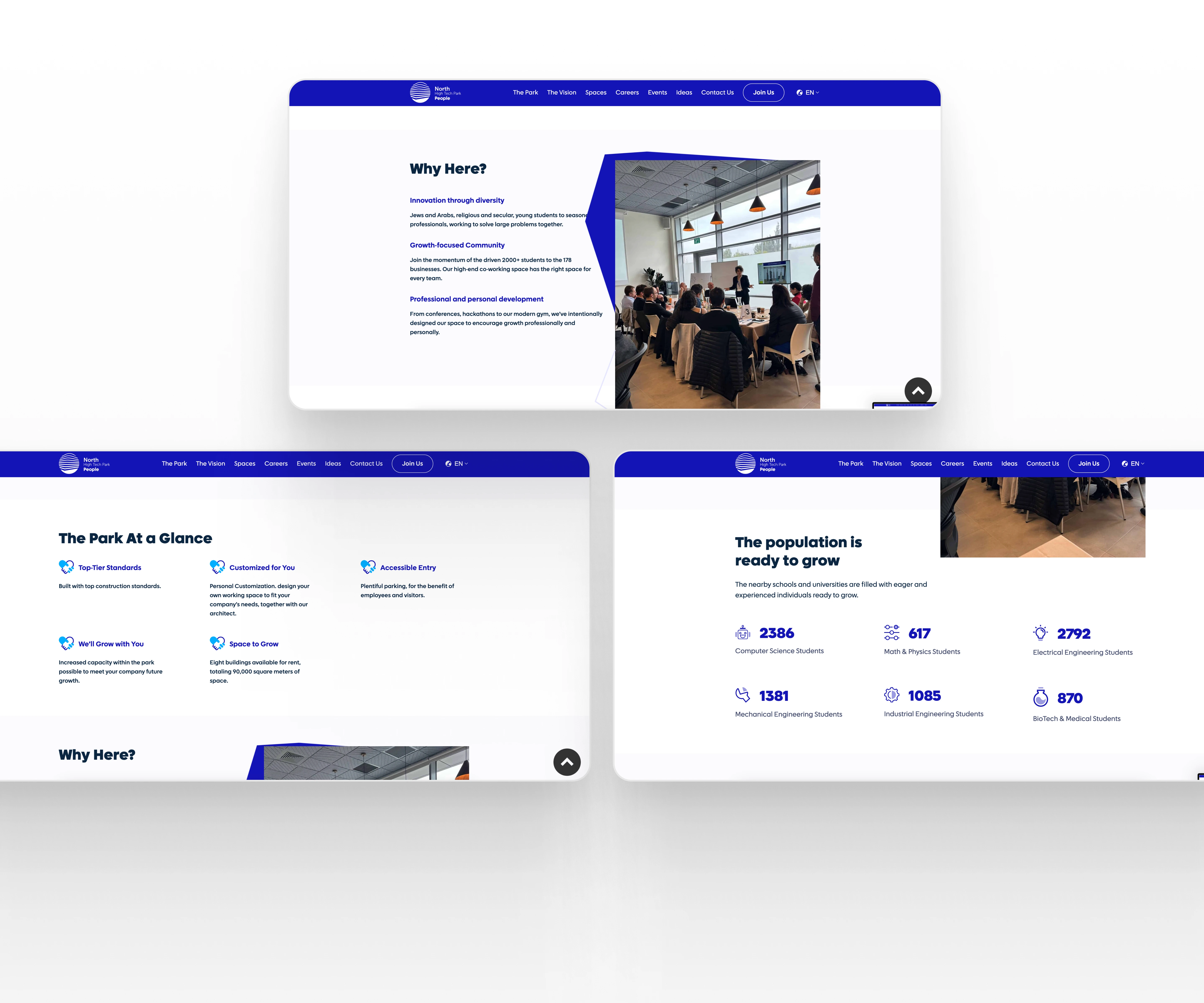
More Content Sections
The Design
Let’s get into the fun part: the design. Here’s what I cooked up:
• Professional Meets Modern: A clean layout with sleek typography, a strong color palette, and plenty of breathing room (because clutter is the enemy).
• User-Friendly Navigation: Whether you’re tech-savvy or not, the site flows so smoothly, you’ll never get lost.
• Visuals That Pop: Every detail was designed to catch attention without overpowering the message.
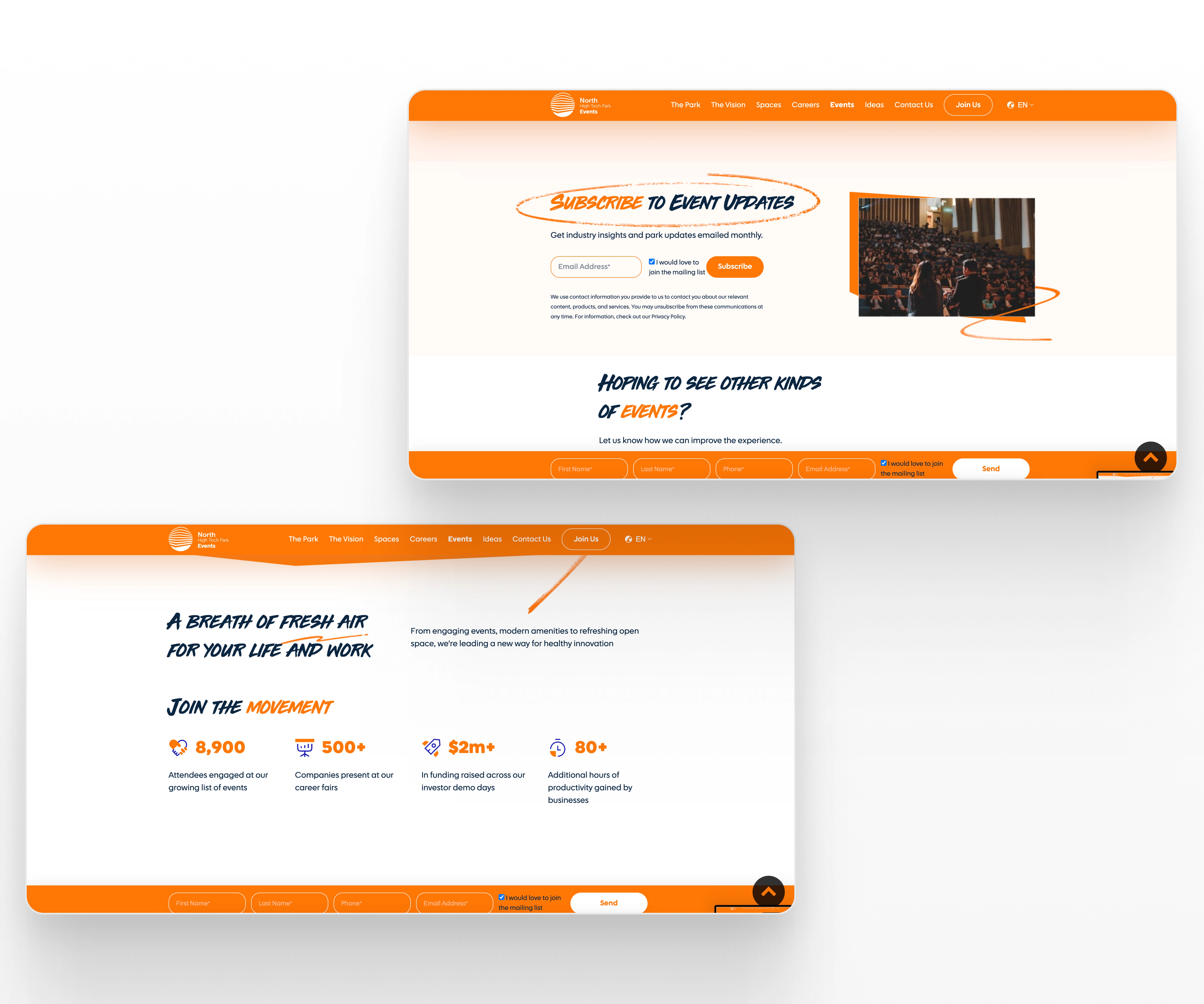
Events Page
Results That Matter
After launch, the website didn’t just look good—it delivered results:
• People Stayed Longer: The average session duration jumped by 35%—a good sign that visitors liked what they saw.
• Mobile Traffic Soared: A fully responsive design led to a 50% increase in mobile visits.
• More Client Inquiries: Within three months, NHP saw a 40% boost in new business leads.
• Smiles All Around: NHP was thrilled with how the site captured their brand and made life easier for their clients.
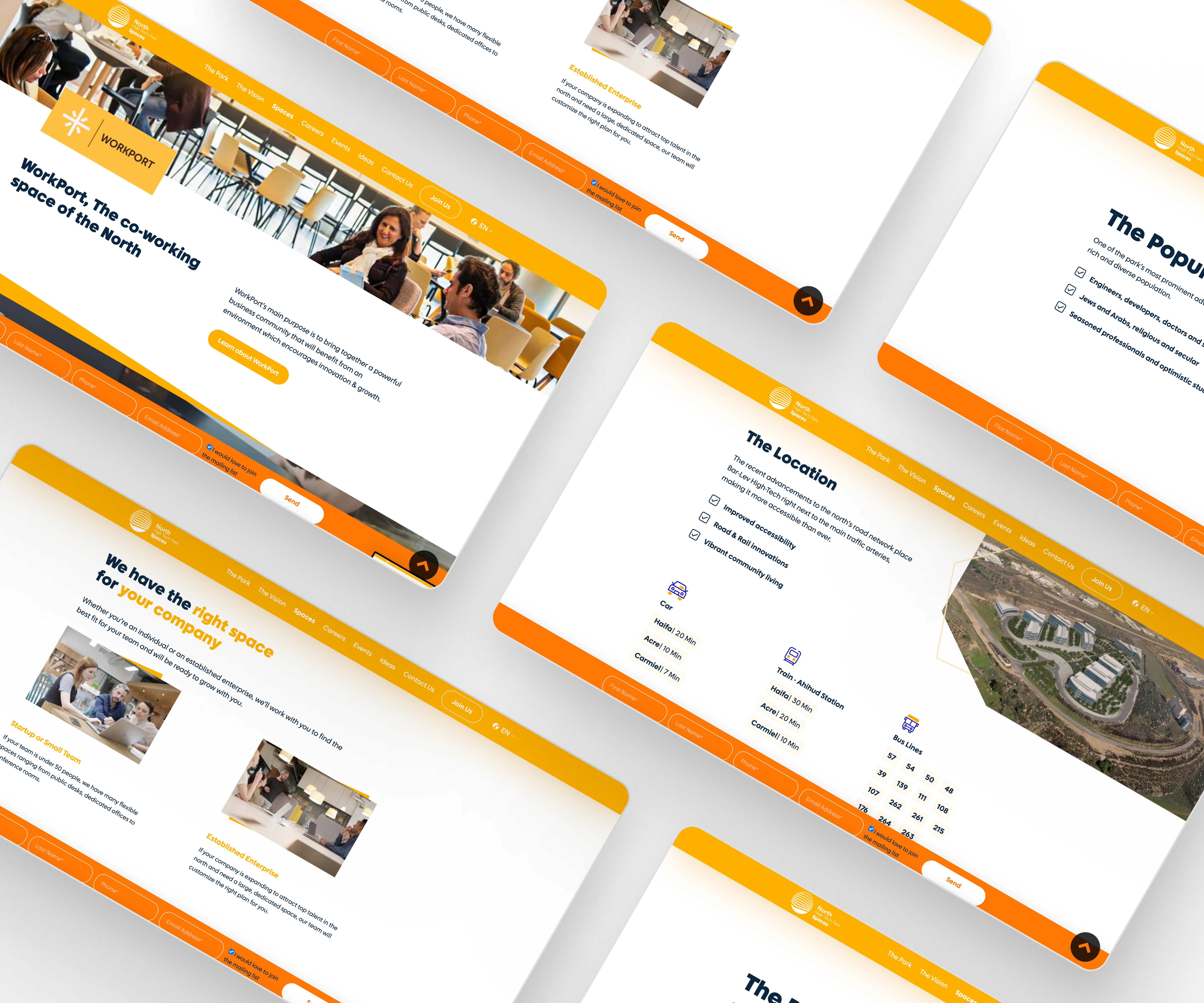
Workspaces
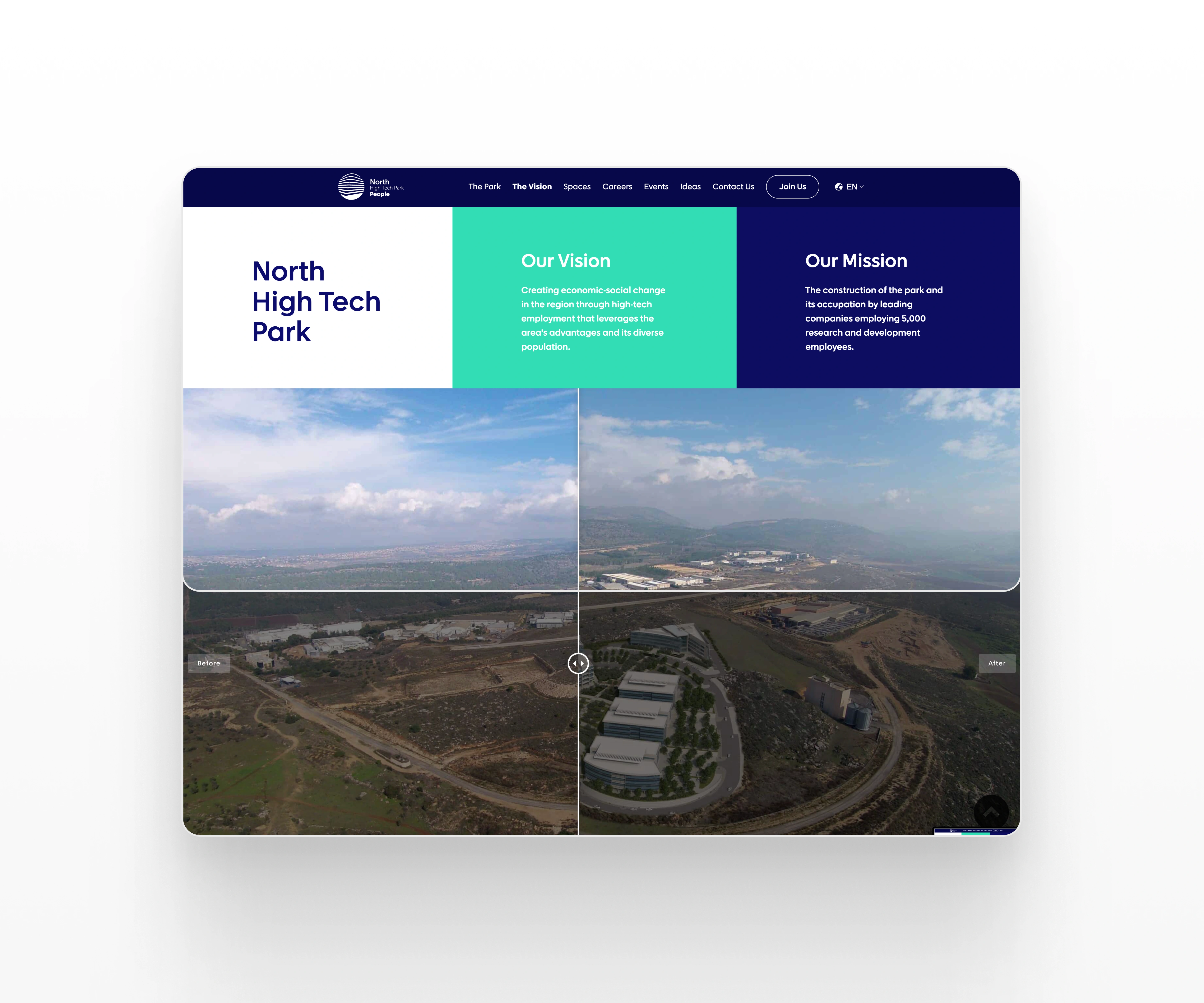
Befor/After
Takeaways
Here’s what this project reminded me:
• Simplicity is powerful. No one enjoys a complicated site.
• Design isn’t just about looking pretty—it’s about solving problems.
• A single designer (hi, that’s me!) can create something incredible when you mix creativity, strategy, and caffeine.
In the end, NHP.co.il isn’t just a website; it’s a digital handshake that leaves a lasting impression. And honestly? I’m pretty proud of it.
Like this project
Posted Jun 20, 2025
Designed a sleek, user-friendly website for NHP.co.il, ensuring seamless navigation, modern aesthetics, and effortless client engagement across all devices.
Likes
2
Views
72
Timeline
Oct 3, 2023 - Dec 27, 2023
Clients
North High-Tech Park