Barke - Brand Identity and Packaging Design

Rayalain Sohail | Brand Therapist


| BARKE BRAND IDENTITY |
Barke is a bold, gaming-inspired dog food brand redefining mealtime with real ingredients, fun flavors, and playful packaging. Say goodbye to bland Barke delivers premium, healthy dog food that fuels your pup with flavor, nutrients, and next-level tail wags.
Barke Presentation
| THE VISUAL IDENTITY |
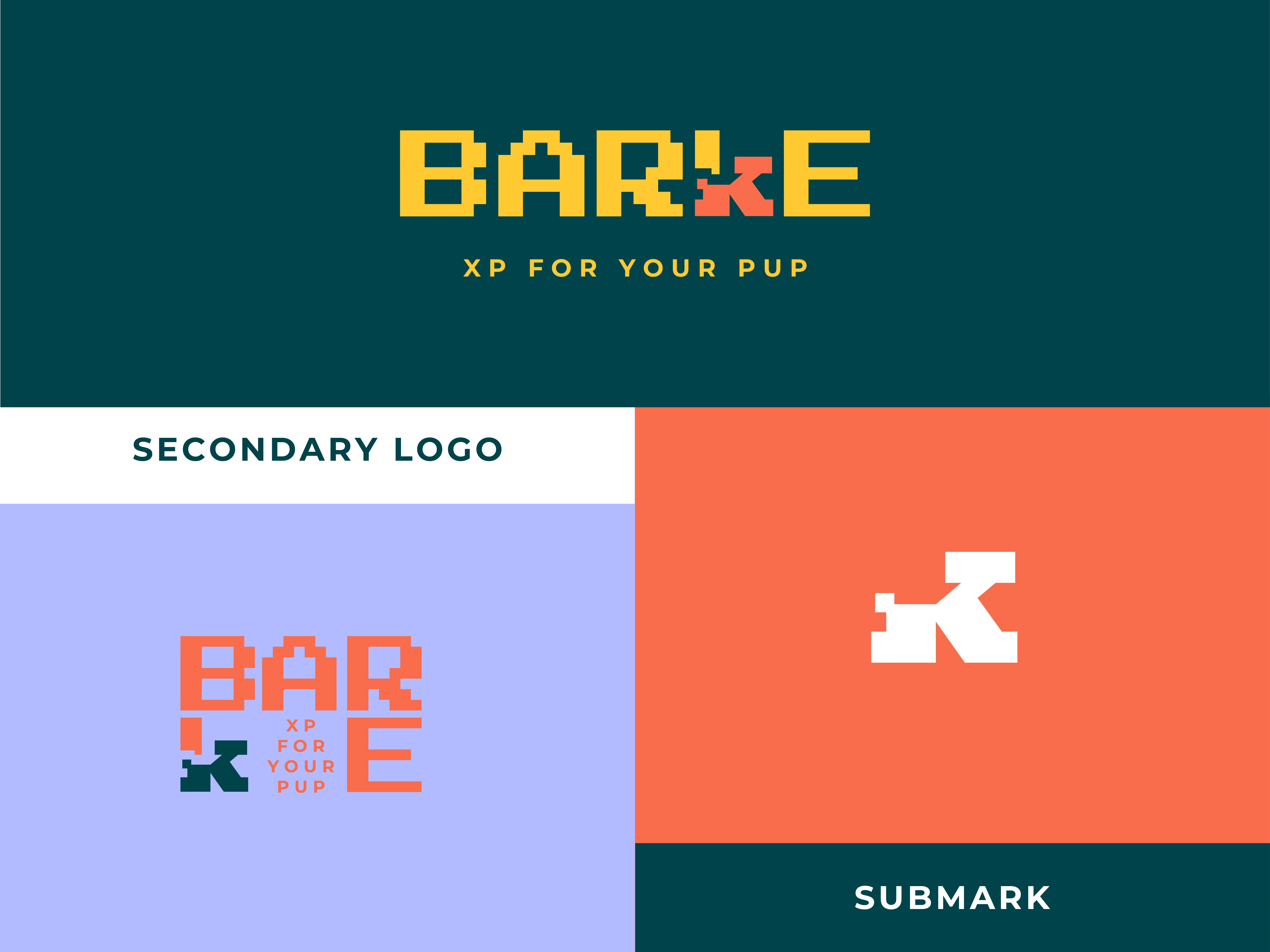
Logo Suite
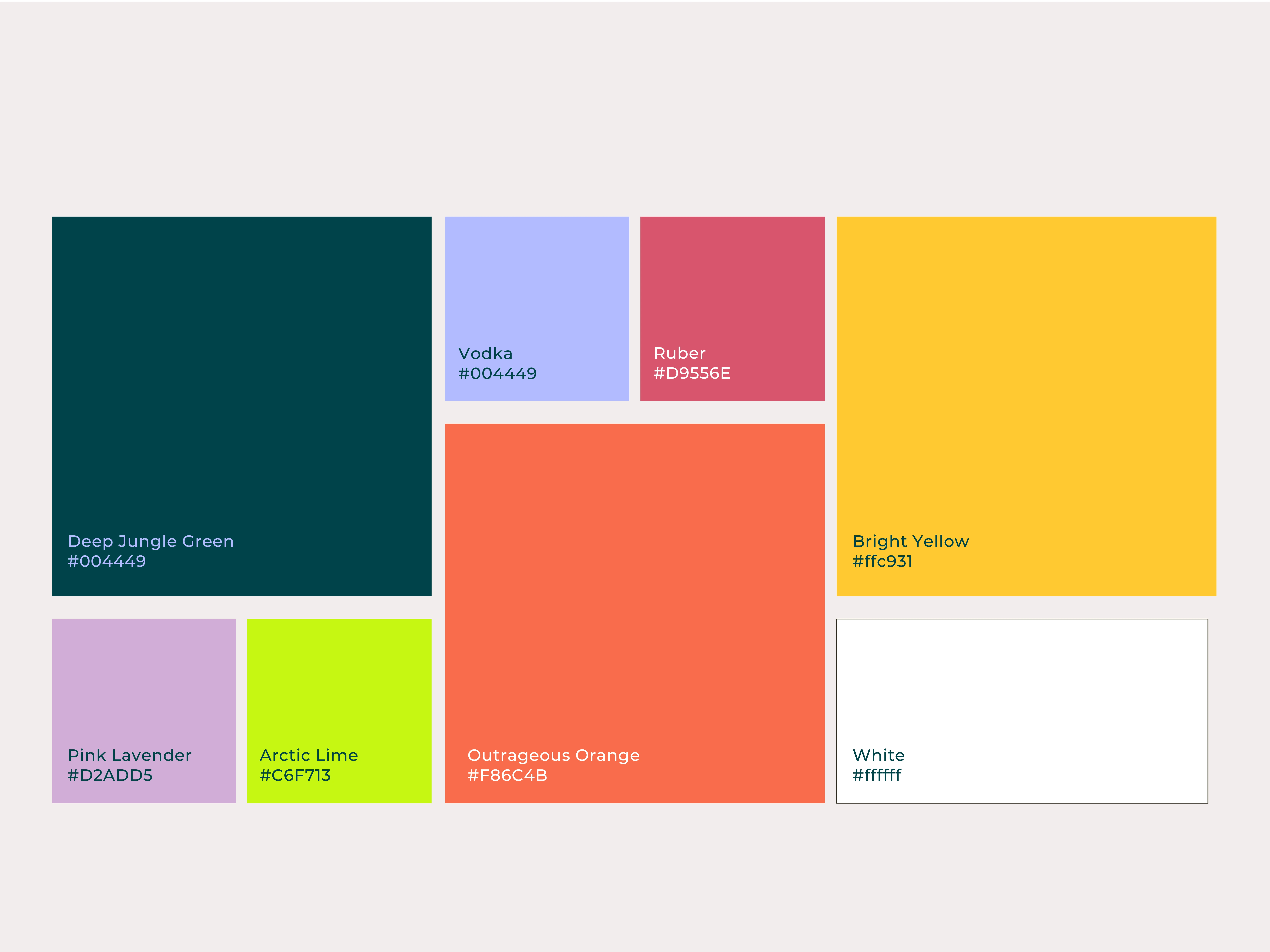
Color Palette
| BARKE BRAND GUIDELINES |
Welcome to the Glimpse of official brand guide for Barke where bold flavor meets playful identity. This comprehensive document spans over 30 pages and serves as the backbone of our visual and verbal communication. Inside, you'll find everything from our logo usage, color palette, and typography system to packaging styles, tone of voice, and social media direction.
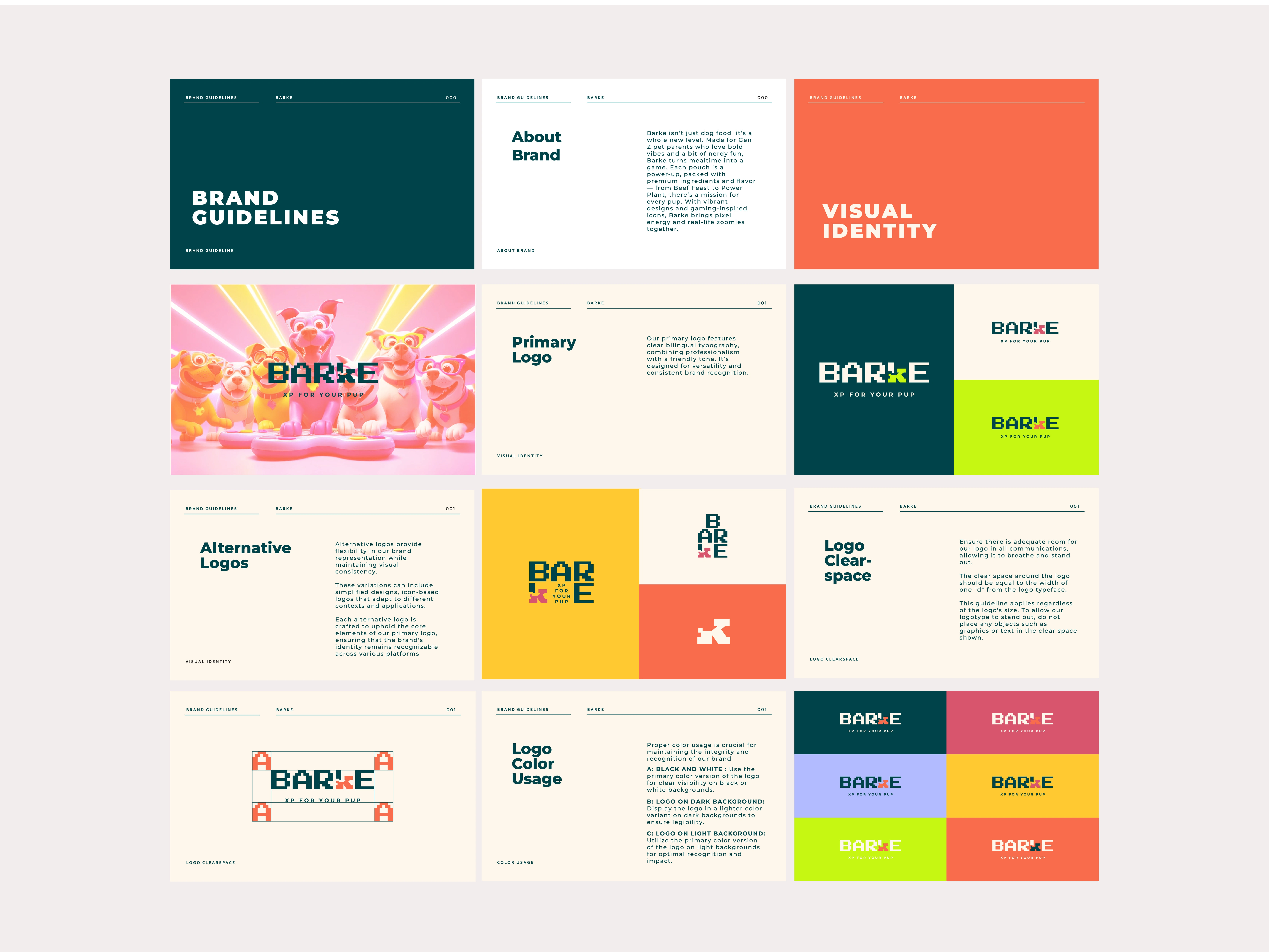
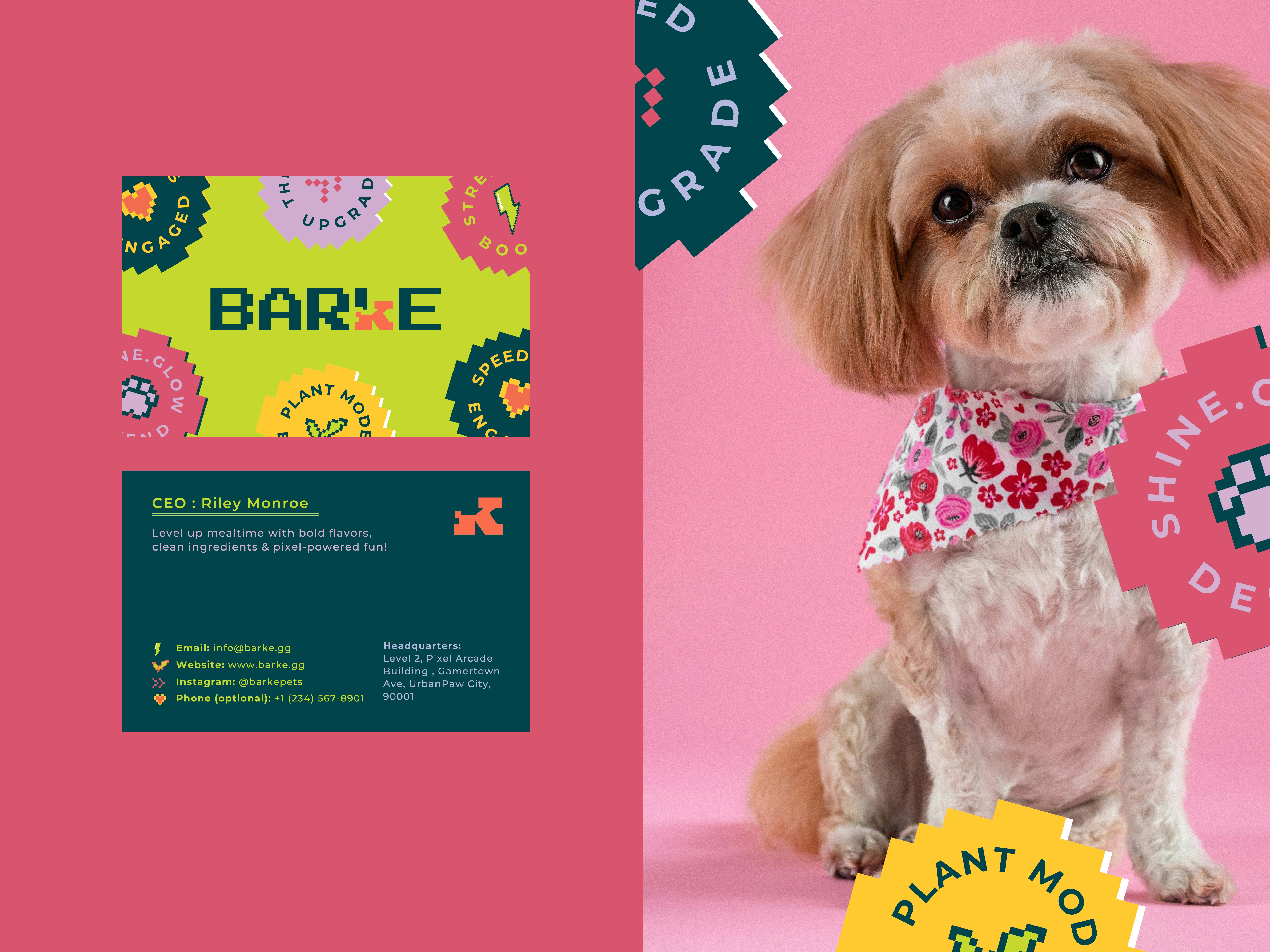
Brand Guidelines
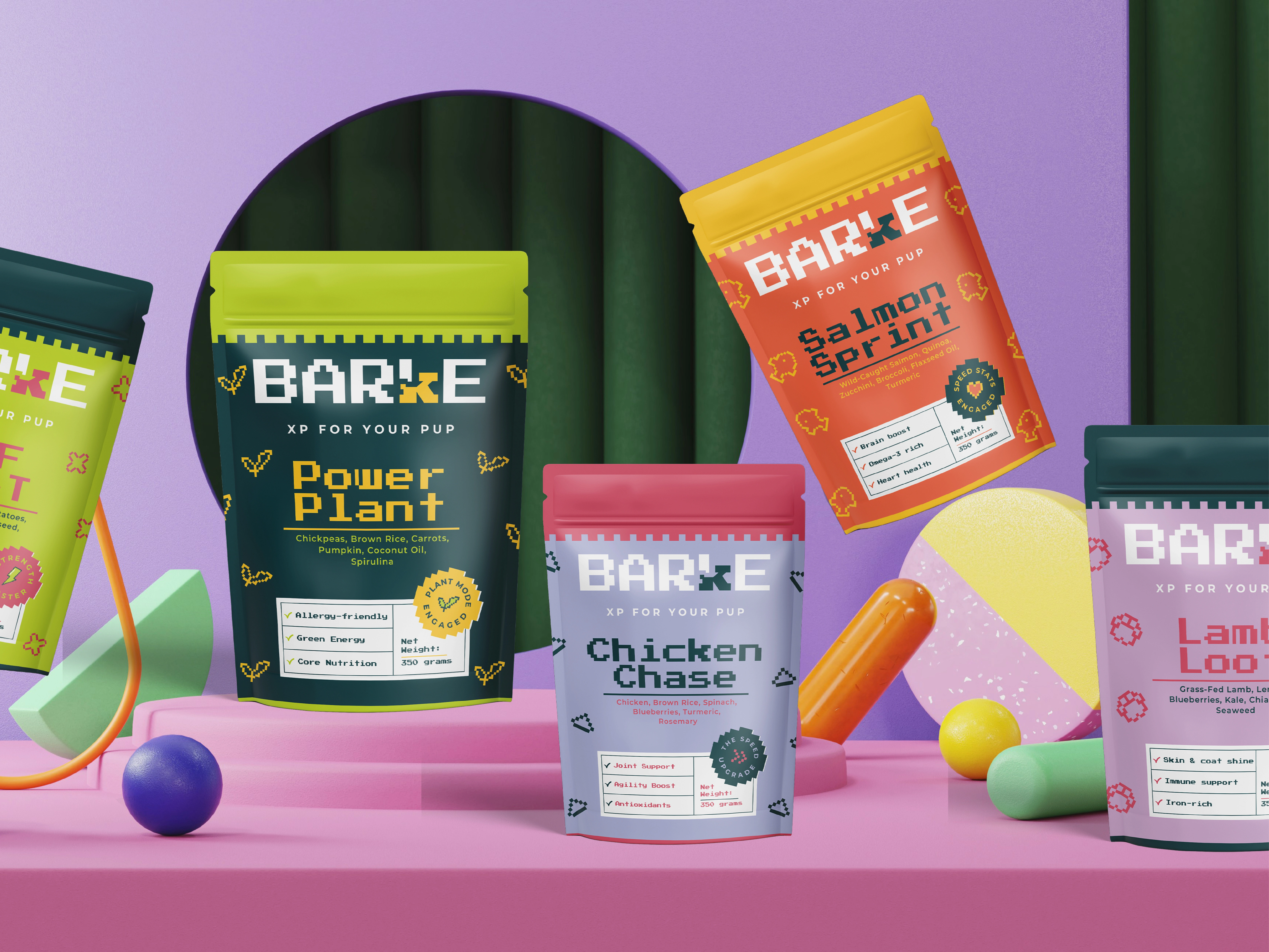
| BARKE PACKAGING SYSTEM |
Barke’s packaging is more than just a container it’s a statement. Every element, from layout to color to quirky copy, is designed to reflect the brand’s playful, gaming-inspired spirit while communicating trust, nutrition, and fun. Our packaging system balances vibrant visuals with clarity, making it shelf-ready and scroll-stopping. This section includes guidelines for flavor-based color codes, hierarchy of information, iconography, material specs, and print considerations to ensure every Barke product looks and feels like part of the same energetic universe.
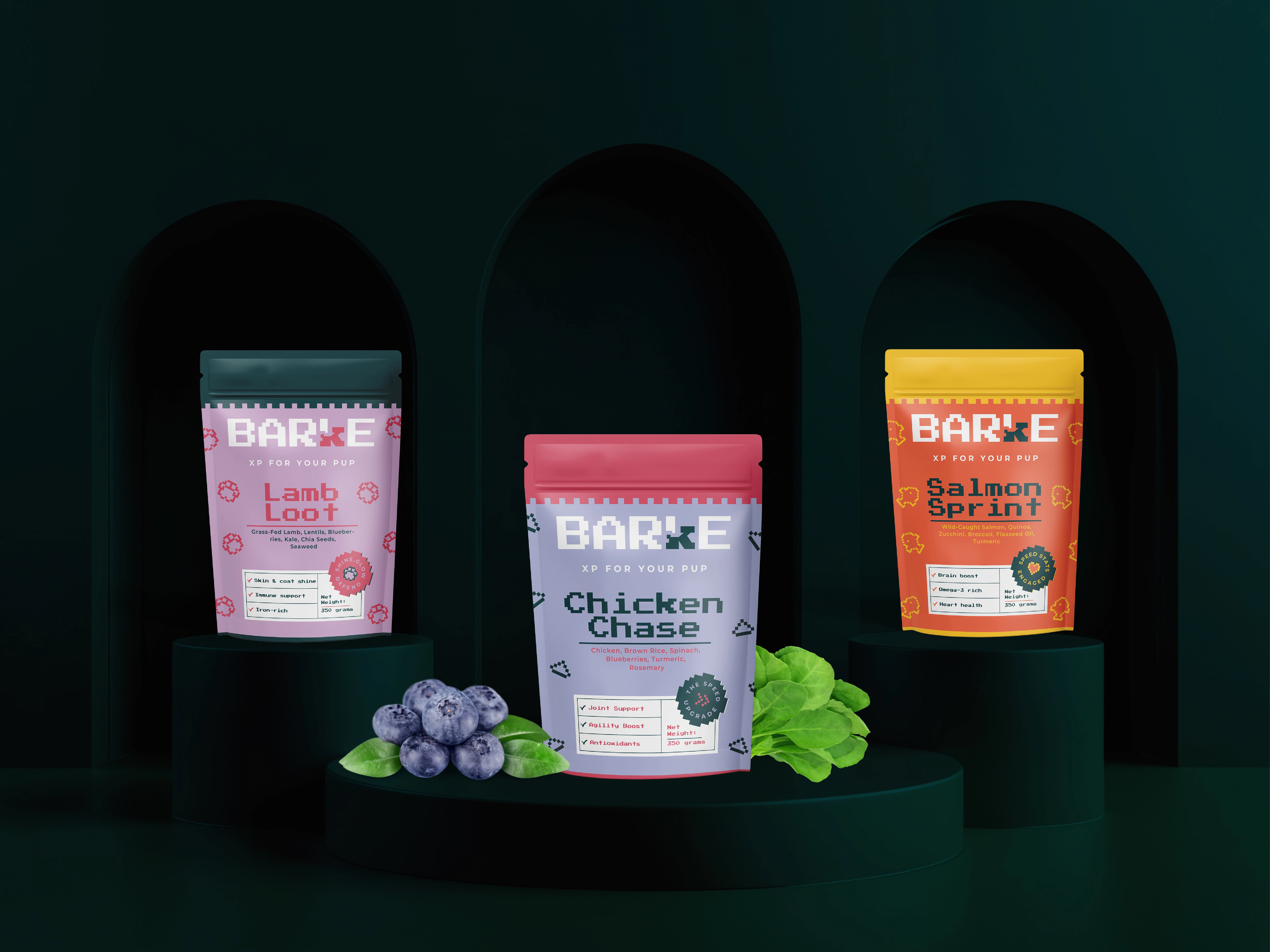
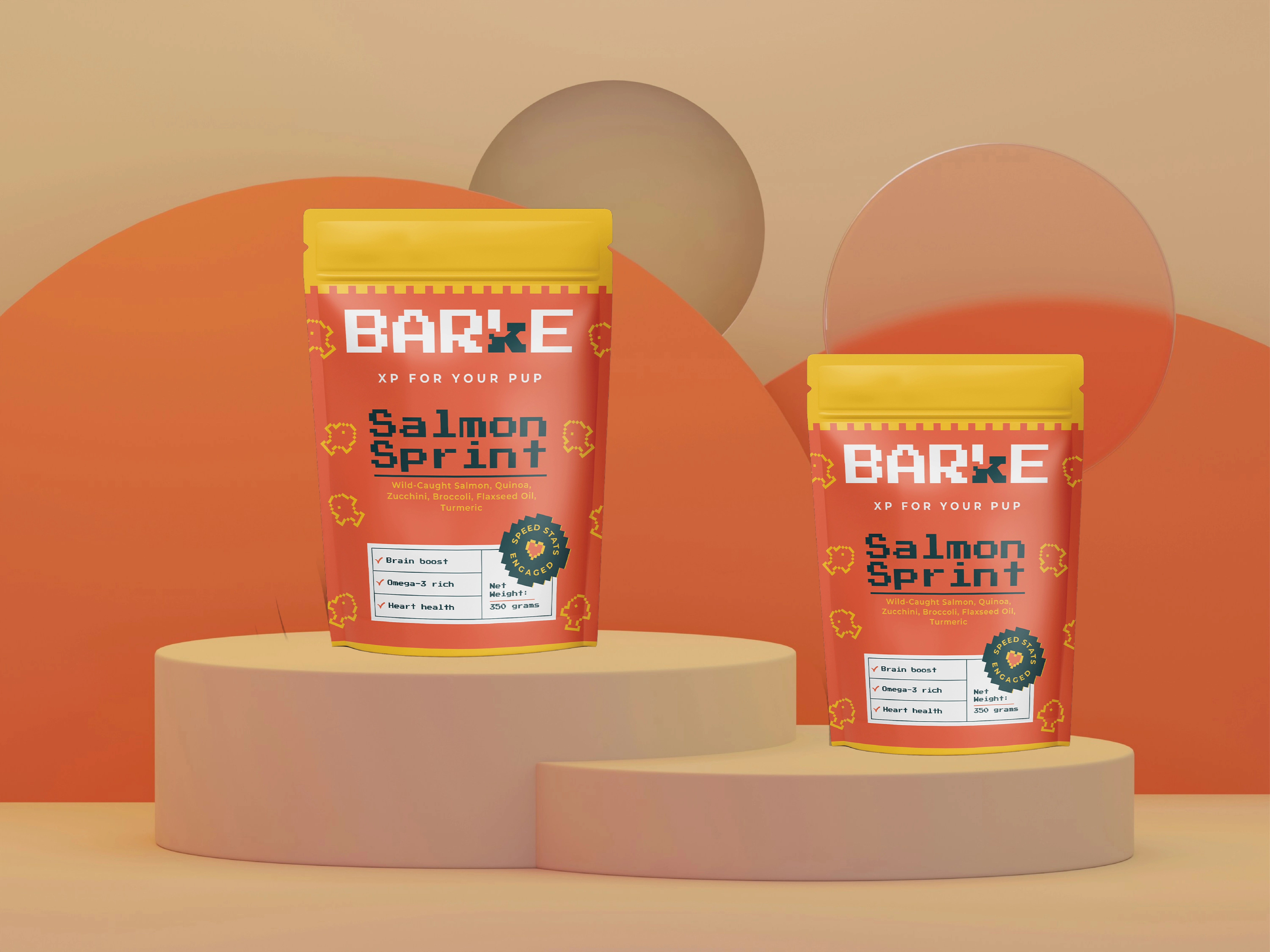
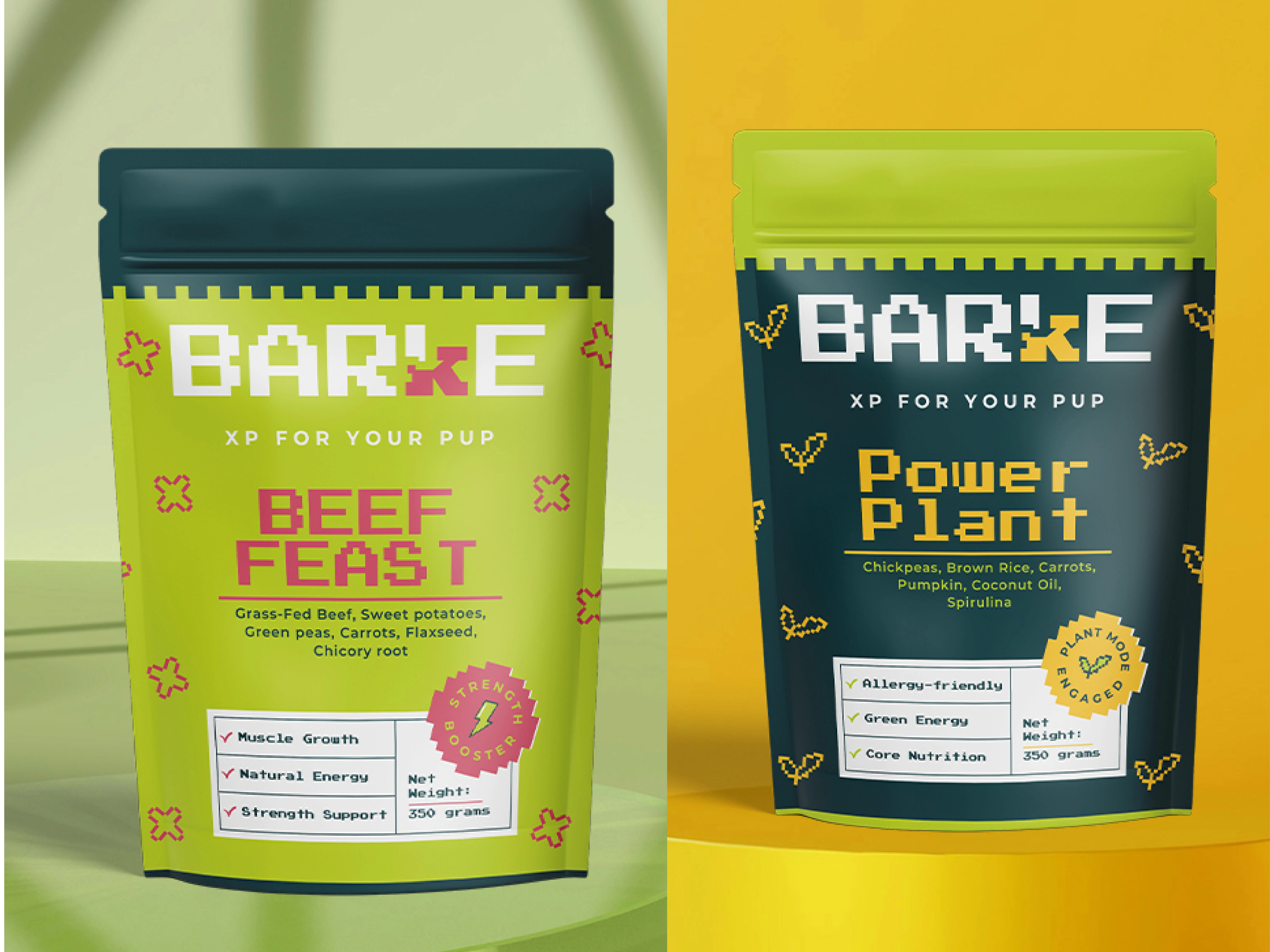
Pouch Packaging
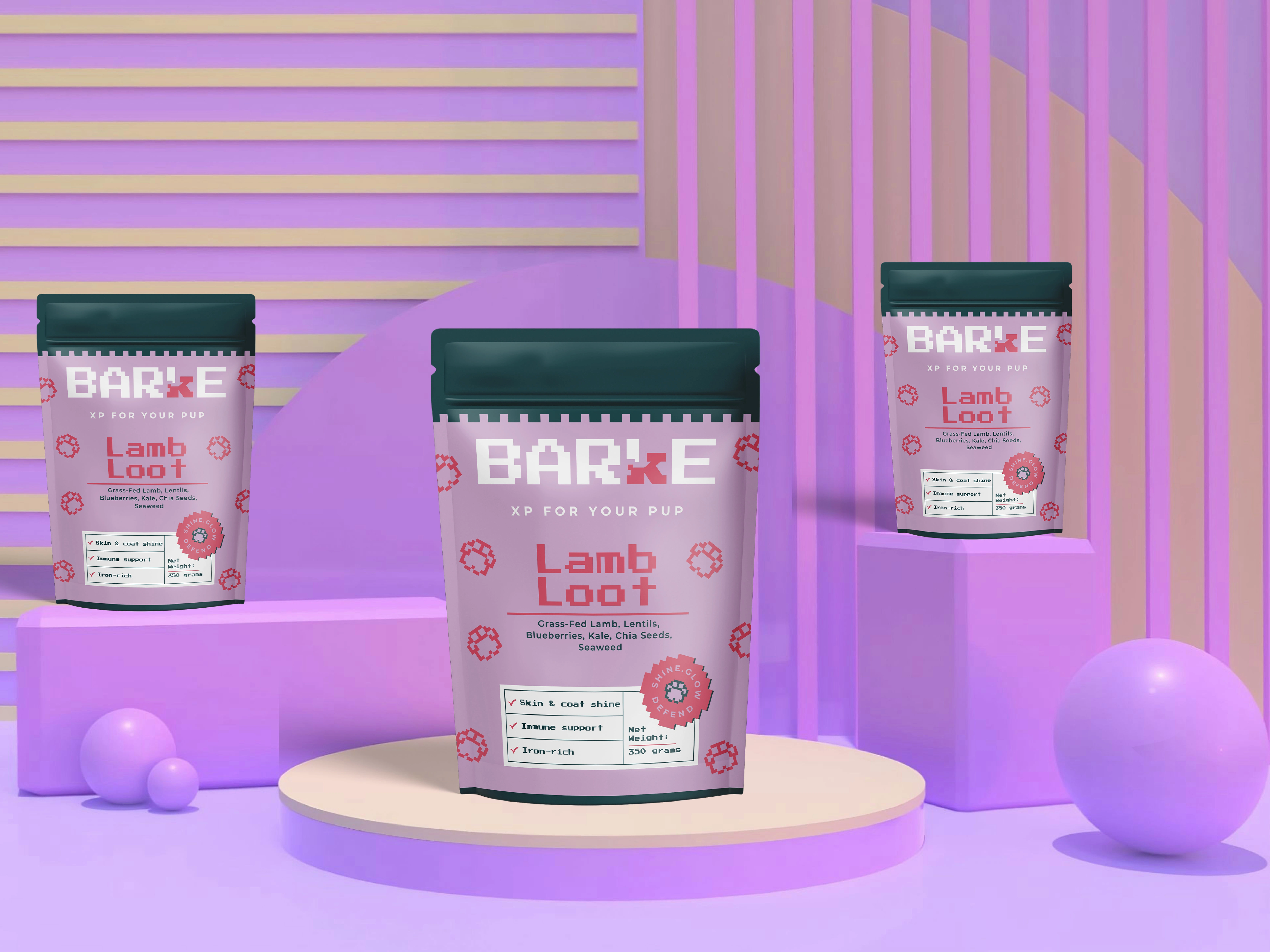
Pouch Packaging
Packaging
Package design
|MOCK-UP PRESENTATION |
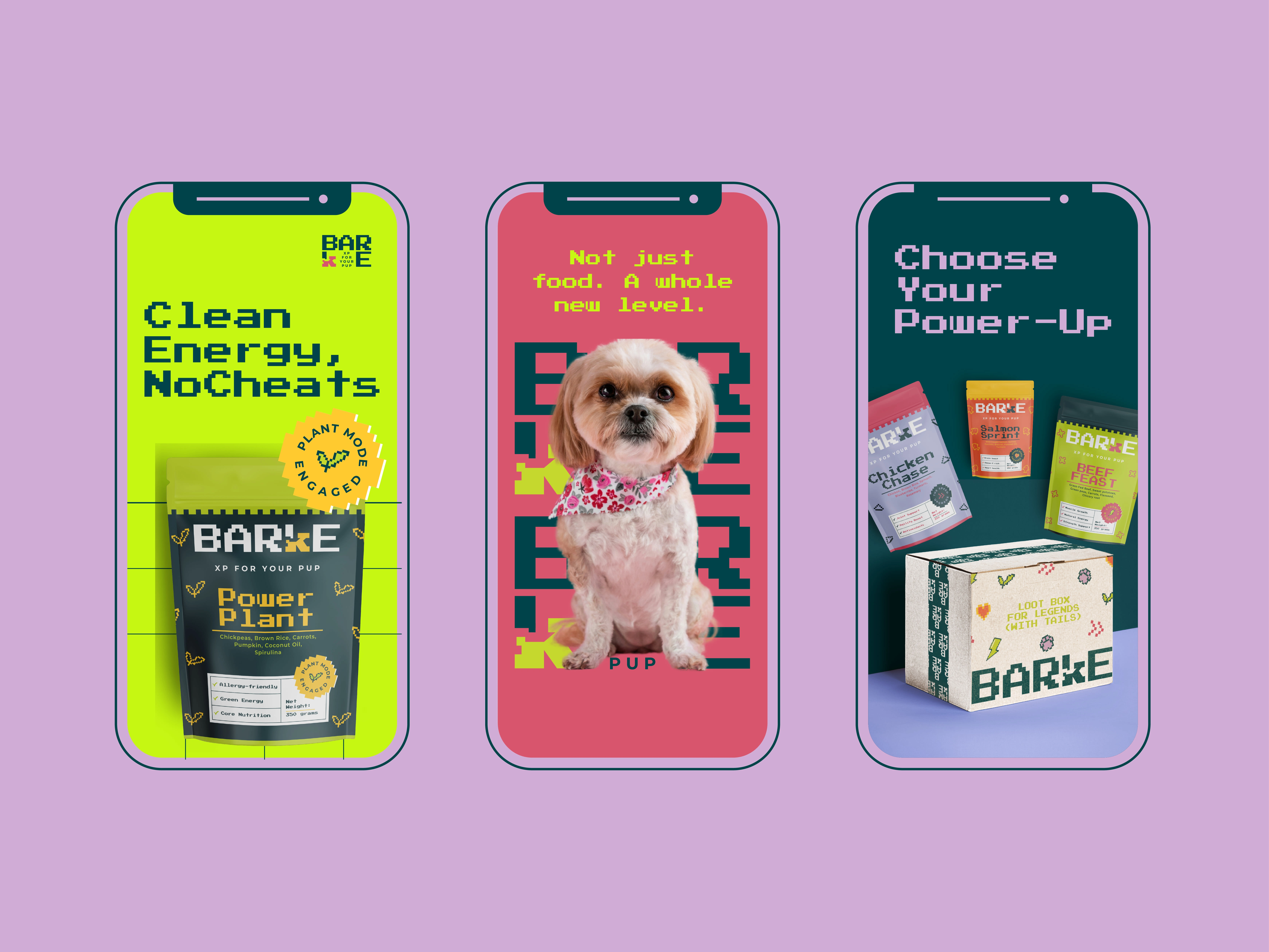
Social Media presentation / Instagram Posts
Thanks for scrolling!
Barke was more than a branding project it was a chance to redefine what dog food could look and feel like. From bold packaging to a playful tone of voice, every detail was crafted to delight both pets and their humans. If you enjoyed this project or would love to collaborate on something just as fun (and a little rebellious), I’d love to connect!
Like this project
Posted Aug 4, 2025
Developed branding and packaging for Barke, a bold dog food brand inspired by gaming. Fun visuals, smart design, and flavor-forward identity for pups.