A Revenue-Ready Landing Page We kicked
Zahima Begum
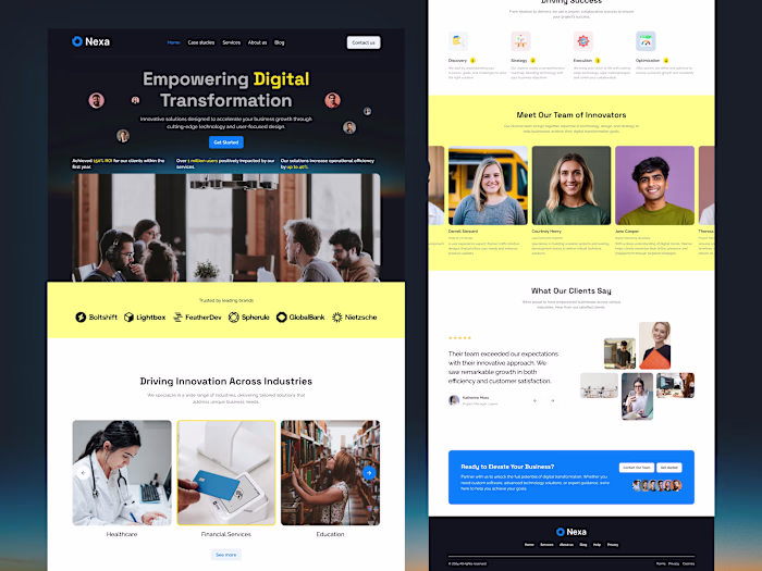
A Revenue-Ready Landing Page
We kicked off by reviewing analytics goals + competitor pages.
The issue was trust and clarity: visitors couldn’t quickly see why this platform matters.
I redesigned the layout with stronger trust signals (logos + reviews), clearer sections, and a CTA that stays consistent across the page (better UX consistency = less friction).
If you’re launching or scaling, let’s build a page that sells, message me.
Like this project
Posted Mar 7, 2026
A Revenue-Ready Landing Page We kicked off by reviewing analytics goals + competitor pages. The issue was trust and clarity: visitors couldn’t quickly see...
Likes
0
Views
1