
Zahima Begum
UI/UX Designer designing intuitive products for startups
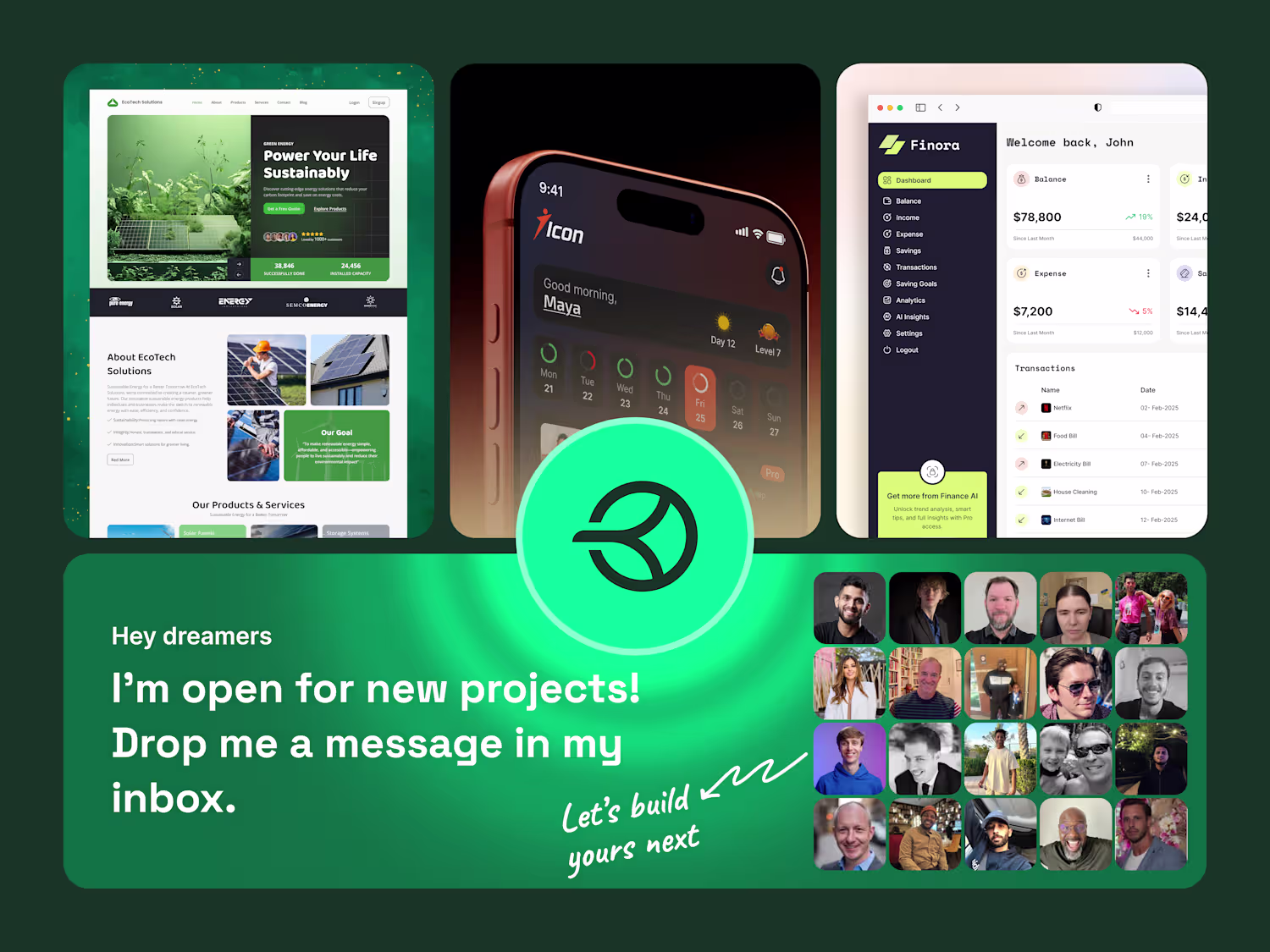
Ready for work
Zahima is ready for their next project!
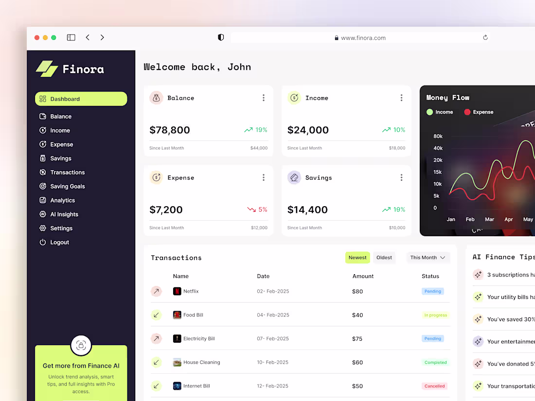
Finora – Smarter Finance Management Dashboard for Modern Profess
Finora is a modern finance management dashboard designed for professionals who need clarity and control.
With a clean UI, smart analytics, and seamless tracking, it simplifies personal and business finances in one place.
4
98
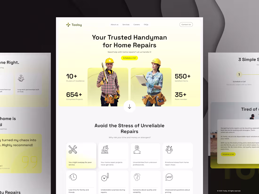
Toolsy Website UX – Designing Solutions Beyond Style
A user-centered website design for Toolsy that prioritizes solving real user problems with intuitive UX, balancing functionality with clean and effective style.
2
3
98
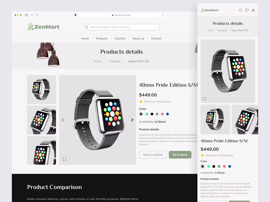
ZenMart – Minimalist eCommerce Website for Better Conversions
ZenMart is a clean, minimalist eCommerce website design focused on delivering a calm user experience and high conversion rates. With intuitive navigation and modern UI elements, it creates a seamless and satisfying shopping journey.
2
3
93
HR Management Dashboard – Clean & Efficient SaaS Admin UI
A modern and intuitive HR management dashboard designed for SaaS platforms, featuring streamlined admin panel UI/UX that simplifies employee management, reporting, and workflow efficiency.
4
4
139
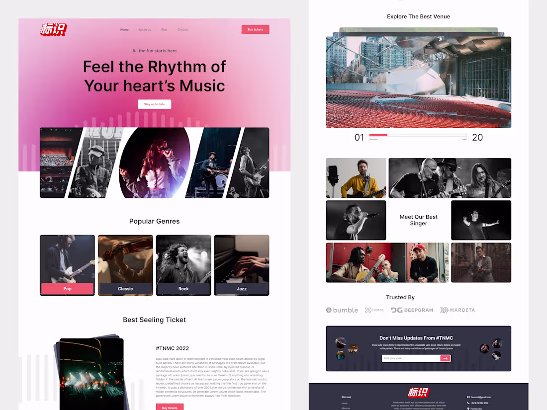
Vibrant Music Landing Page – Concert & Events Website UI
A vibrant and modern landing page design for a music event platform, blending bold typography with immersive imagery to bring the rhythm to life.Perfect for concert ticket booking, artist showcases, and genre discovery.
1
63
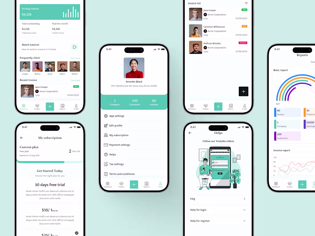
Smart Invoice Generator – Mobile App Concept
Invoice Generator App A clean and intuitive mobile app designed to make creating, managing, and sending invoices effortless. Minimal design, smooth workflow, and user-friendly interface ensure fast and seamless invoice management for freelancers and small businesses.
2
2
80
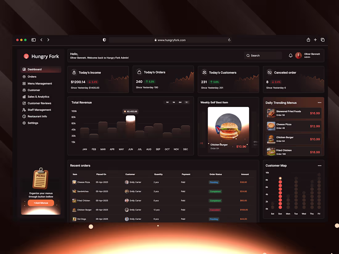
Hungry Fork – Modern Restaurant Management Dashboard UI Kit
Introducing Hungry Fork – A modern restaurant management dashboard UI that blends clarity, control, and style in one smart system.
Designed for busy restaurant owners to:
✅ Track income, orders & cancellations
✅ Monitor top-selling items and trending menus
✅ Analyze customer behaviors and revenue patterns
✅ Manage everything from one clean dashboard
Built for real-world SaaS food businesses.
Hope you like it!
💬 Feedback is always welcome
❤️ Drop a like if this inspired you
📩 Open for freelance or collaboration – message me here!
0
58
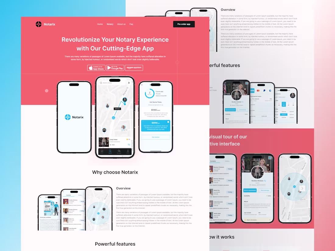
Notarix – Landing Page UI Design
Hello everyone!
We designed this landing page for Notarix, a next-gen notary app built for speed, security, and simplicity.
Seamless cross-device experience
Location-based notary access
Clear CTA flow for conversion
Clean layout with modern UI touches
The goal? Build trust, reduce friction, and guide users toward fast notarization — all in a few taps.
1
64
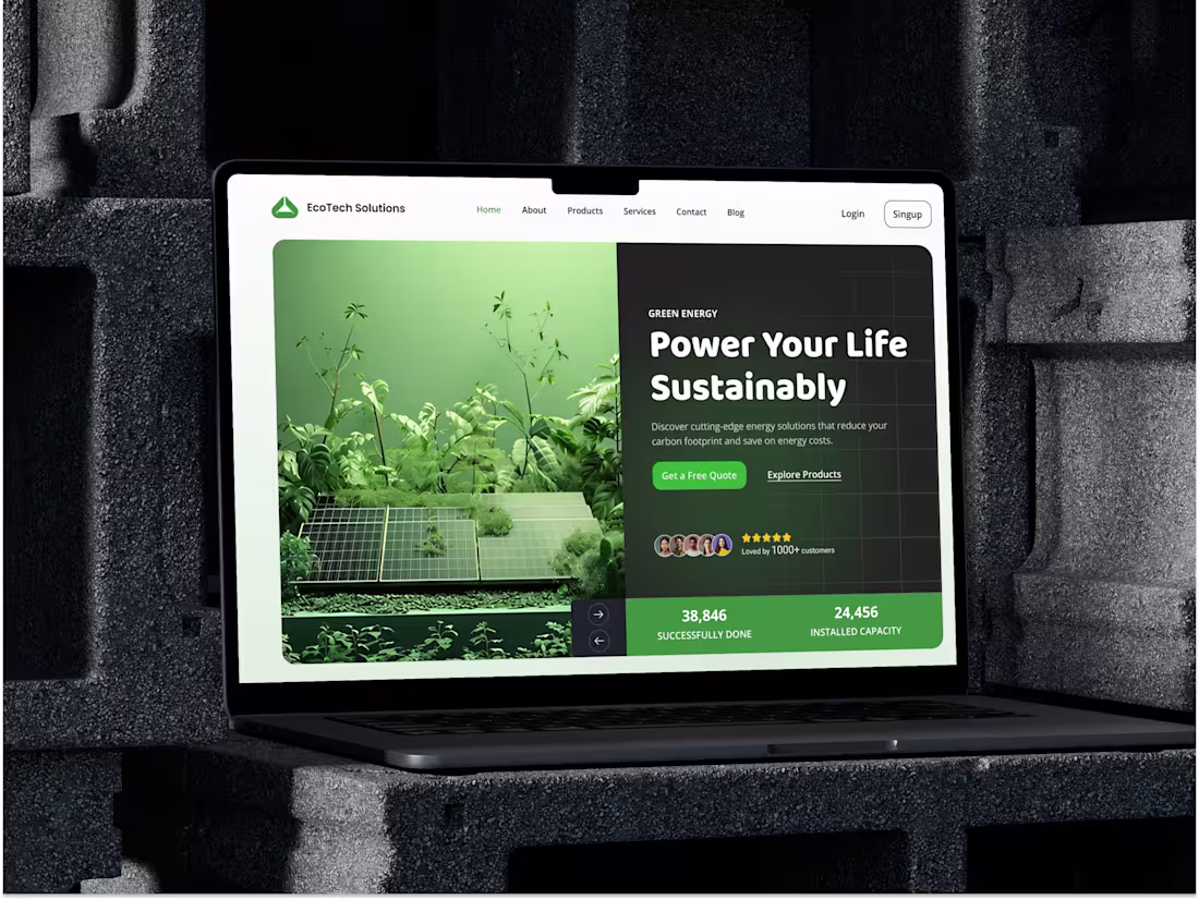
EcoTech Website Design – UX for a Greener Future
Hello Creative Folks!
Presenting our sleek and intuitive EcoTech Solutions website UI designed to make switching to sustainable energy easier than ever. From solar panels to EV charging, every section is built to inform, engage, and convert.
Let's discuss your project. We will provide a quick analysis and a free proposal for it. Don't worry, it is secure and confidential
1
45
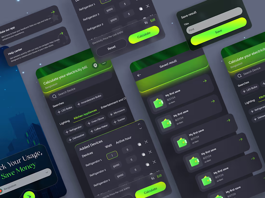
Electricity Estimator Mobile App Design
Hey, design lovers!
Here’s a sleek, modern Estimator Mobile App Design crafted for Electricity Estimator, a next-gen Estimator platform.
1
43
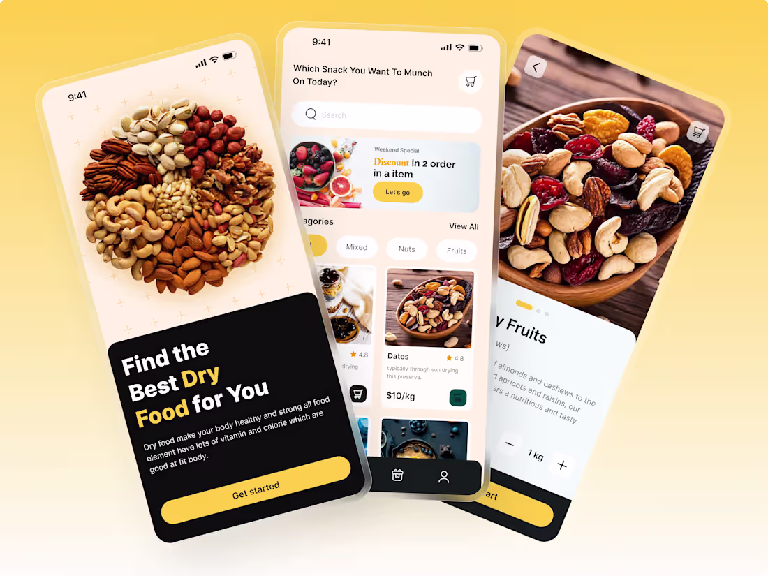
Healthy Bites Dry Food E-commerce App UI/UX
Healthy Bites is a modern grocery app concept designed for conscious snack lovers. The goal was to create a smooth, intuitive shopping experience that feels fresh, trustworthy, and effortless.
From welcoming onboarding screens to a frictionless checkout flow, every interaction is built around clarity and speed. High-quality product visuals, smart filtering, and a minimal layout make browsing simple and enjoyable.
A clean interface. Clear choices. Seamless purchasing.
1
49

More Leads, Less Money Stress
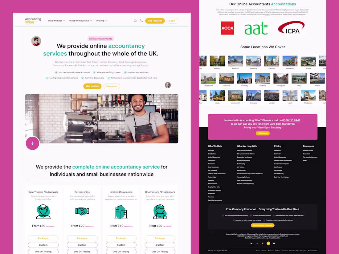
Accounting Wise asked me to redesign their main landing page to bring in more qualified leads from across the UK.
Their challenge: many services, many audiences, but one crowded page. I simplified the story around three things who they help, what it costs, and why they’re trusted.
One UX choice I loved: colour‑coded service blocks so each audience can find their section fast.
Curious how a clearer story can make your site sell more?
Message me and let’s explore your project.
0
46
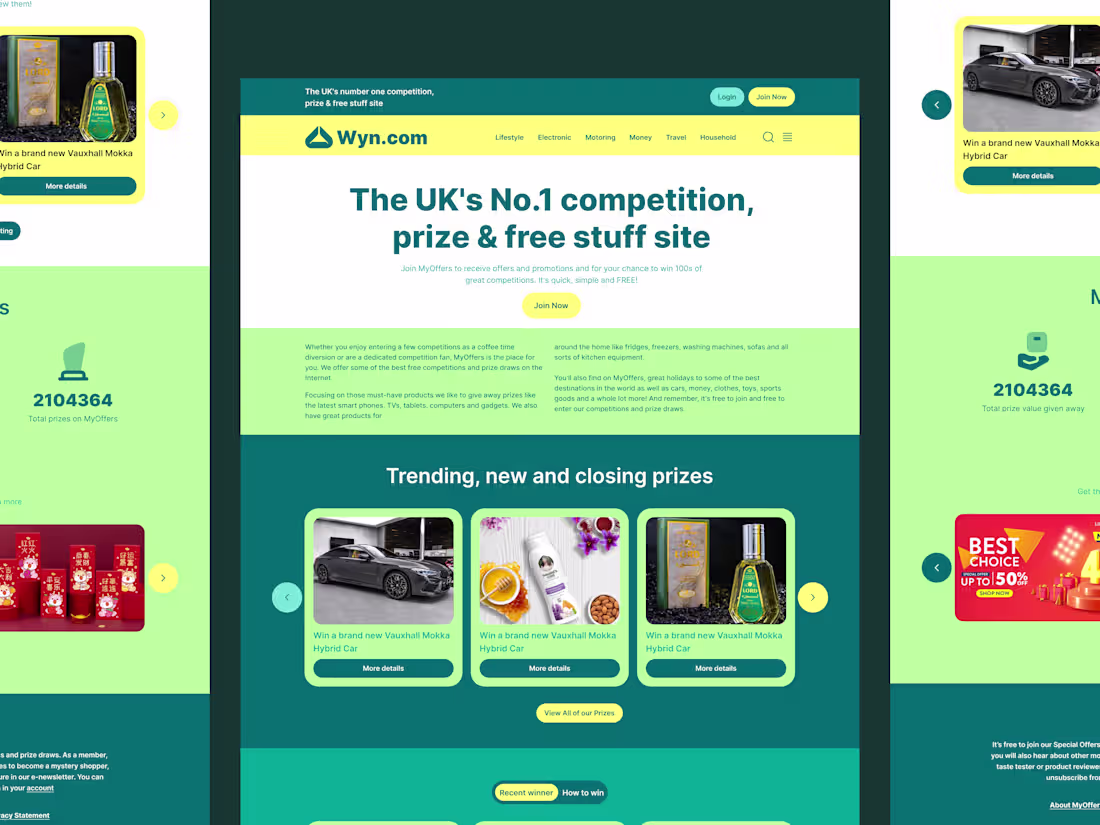
More Prize Signups, More Revenue
At the start, we mapped the full journey from homepage to first competition entry.
The problem was clear: users could not see how real the prizes and winners were, so they left.
I rebuilt the page with social proof blocks, live numbers and a “Recent winner” carousel.
One UX detail I love: clear category tabs that keep the menu simple on both desktop and mobile.
If your product needs a high‑converting, money‑focused landing page, send me a DM and we’ll plan it.
1
42
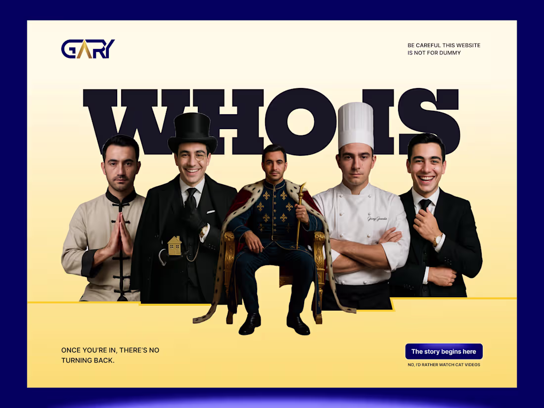
Unlock Revenue With Storytelling UI
Gary needed to stand out in a crowded market. His previous site was functional but forgettable, and it wasn’t generating the leads he deserved.
We decided to flip the script. Instead of a boring "About Me," I designed this "Who Is?" concept to trigger immediate curiosity.
From a UX perspective, we utilized the "Curiosity Gap"—giving users just enough visual info (the different personas) to compel them to click the CTA to get the full answer.
The result?
A memorable experience that turns passive visitors into eager leads.
Need a high-converting landing page for your next big launch?
Send me a DM!
0
42
A Revenue-Ready Landing Page
We kicked off by reviewing analytics goals + competitor pages.
The issue was trust and clarity: visitors couldn’t quickly see why this platform matters.
I redesigned the layout with stronger trust signals (logos + reviews), clearer sections, and a CTA that stays consistent across the page (better UX consistency = less friction).
If you’re launching or scaling, let’s build a page that sells, message me.
0
38
High-Converting Landing Page for Business Growth
This project began when a client realized their outdated website wasn’t reflecting the premium quality of their service.
I approached the redesign by improving the information architecture and simplifying how complex details were presented.
Clear structure, better visual hierarchy, and refined layout choices made the experience easier to navigate and understand.
The result is a website that communicates professionalism instantly, builds credibility, and supports higher-value conversions.
Strong design doesn’t just look better it increases perceived value and helps businesses charge what they’re truly worth.
Want to elevate your brand and convert better clients? Let’s talk about your next project.
2
49
Premium Landing Page Designed to Convert
Trust is currency. My client wanted their business tool to look like a premium investment, not a cheap add-on.
The challenge was organizing a lot of information without overwhelming the user. I started by decluttering the interface and giving the content room to breathe.
I solved the trust issue by integrating social proof (stats and testimonials) immediately after the hero section.
This reassures potential buyers right away that this tool delivers results. The design is now profession al, trustworthy, and ready to scale.
Ready to upgrade your brand’s look? Let’s chat about your project!
1
1
48
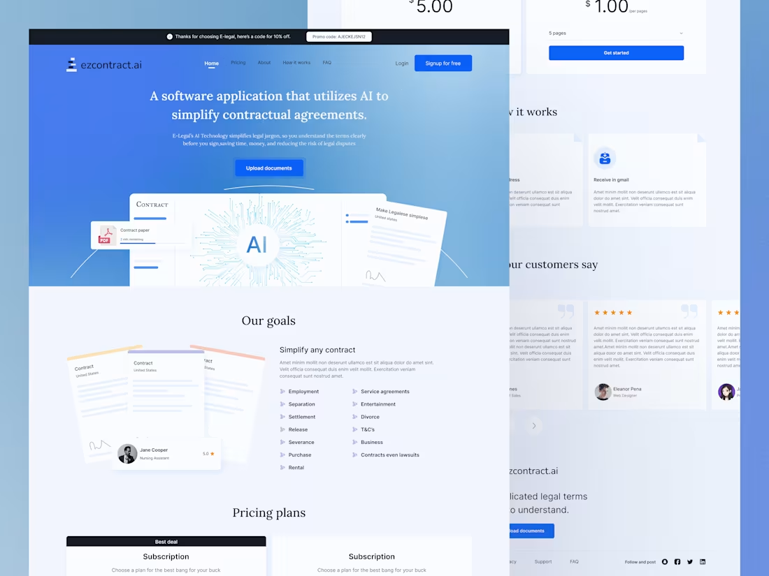
Save $2k on Legal Costs with This Landing Page
My client had a game-changing AI tool for contracts, but no landing page to sell it. I built one from scratch, focusing on:
✅ Instant clarity (hero section explains the product in 3 seconds)
✅ Trust-building visuals (AI-powered contract simplification demo)
✅ Frictionless pricing (transparent plans with a bold CTA)
Result?
$5K+ in monthly revenue within the first 30 days.
Need a high-converting landing page for your SaaS?
Let’s build yours!
1
65
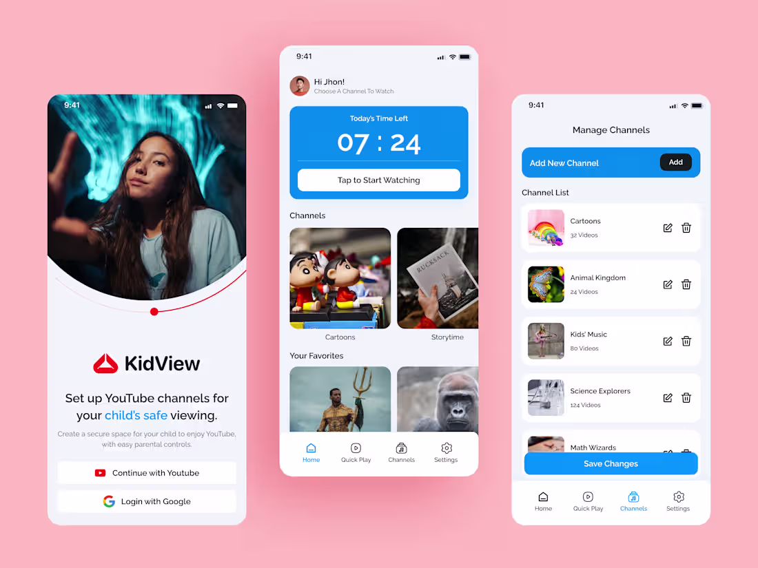
KidView A Safer YouTube Experience for Kids
his project began when a client noticed parents needed a simpler way to manage screen time.
The problem was that most apps are too complex. My solution was KidView a clean, safe, and easy-to-use interface.
I focused on a simplified "Manage Channels" flow, making it effortless for parents to curate content.
When an app is this easy to use, people are much more likely to pay for it.
I specialize in turning complex problems into beautiful, profitable designs.
DM me to discuss your UI/UX needs!
2
2
80
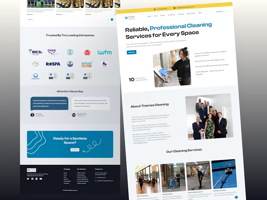
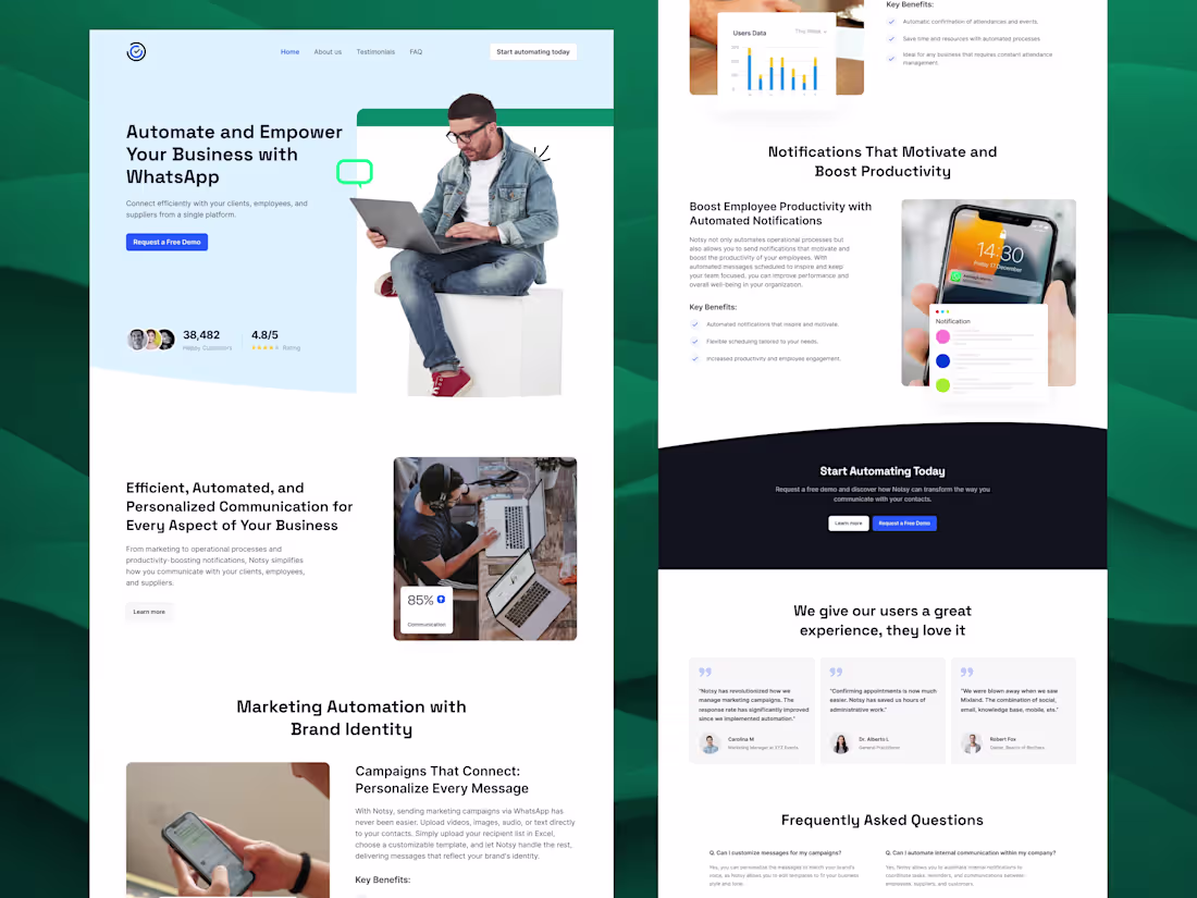
Smart Design For Better Cash Flow
A confused visitor never buys. Thames Cleaning offers many services, and potential clients were getting lost in the details.
They needed a streamlined path to purchase to boost their bottom line ($).
The Solution: I moved from a text-heavy site to a visual-first approach.
UX Point: I utilized distinct service cards with clear imagery.
This improves scanability, allowing users to find exactly what they need in seconds without feeling overwhelmed.
Simple designs make the most money.
Ready to turn visitors into buyers? Let’s chat.
1
2
91
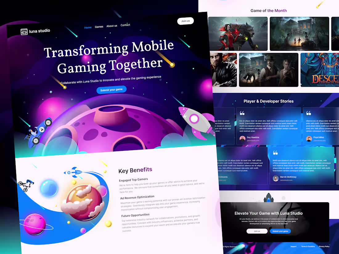
Luna Studio Landing Page Problem to Solution UI/UX
Luna Studio came to me with a clear problem: the page looked fun, but new visitors did not quickly understand the offer or what to do next. The solution was a simple, guided story. First, we made the main message clear: mobile gaming, together. Next, we focused on two actions only: “Join us” and “Submit your game.” Then we added quick value blocks (engaged gamers, ad revenue help, future opportunities) and trust sections (about, featured games, stories). This way, people can understand, trust, and take action fast. If you need a landing page like this for your studio or business,
If you want a landing page that does the same, DM me for UI/UX.
0
66
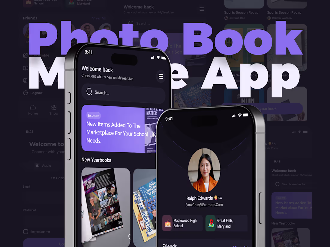
Mobile Design Strategy For Sales
My client wanted to monetize school spirit. They needed an app for students to access yearbooks and buy gear, but the user journey had to be seamless to ensure people actually bought things.
I created the UI/UX for "MyYearLive" from scratch. The main problem was organizing a lot of media without clutter.
How I helped: I implemented a card-based layout for the "Trending" and "New Items" sections. This allows users to scan through products quickly—similar to Netflix or Instagram—which creates a familiar, addictive browsing experience that drives revenue.
It’s not just about looking good; it’s about business results.
Got a project in mind? DM me to start! 👋
2
2
87
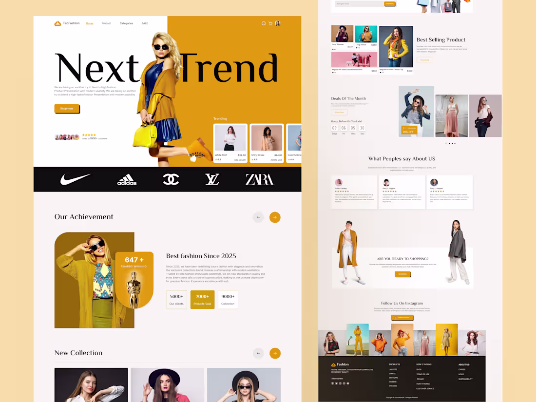
Fashion Landing That Grows Revenue
Client came with high traffic, low sales.
I mapped the buyer journey, then redesigned the hero, product cards, and trust section.
UX focus: clear hierarchy so outfits, prices, and CTAs pop. Want a sales-first redesign? DM me
2
3
100
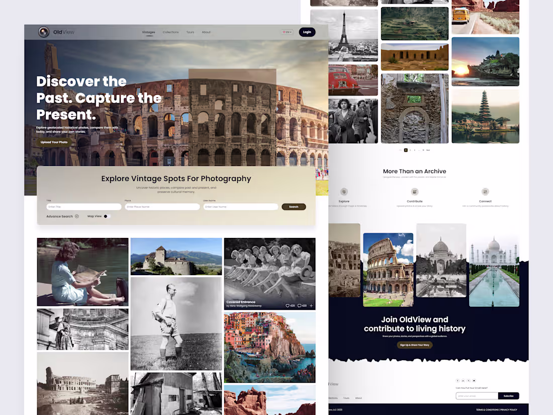
OldView – Vintage Photography UI/UX for History Lovers
As a UI/UX designer, I was asked a simple question:
“How can we turn people who love old photos into real revenue?”
OldView was my answer.
This concept starts as a visual gallery for history fans, then quietly turns engagement into income through premium search tools, map view, upload limits, tours, sponsored spots, and photo licensing.
Curious how UI/UX like this can turn your product into a real revenue stream?
let’s talk
0
76
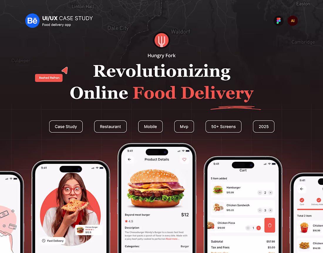
Hungry fork - Food Delivery Mobile App
0
1
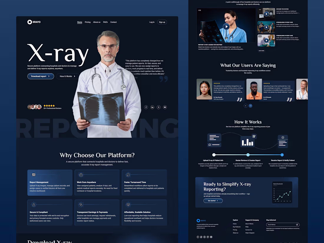
Revolutionizing Radiology: A Real-Time Online X-ray Reporting System
A hospital approached me with a critical problem: delayed X-ray reports, overloaded doctors, and frustrated patients.
Manual processes were causing bottlenecks—especially when patient volume increased.
The Solution
I designed a real-time, web-based reporting system that:
• Enables radiologists to upload & assign reports digitally
• Allows doctors to review cases remotely
• Delivers patient reports in hours, not days
• Streamlines the full workflow from upload to diagnosis
The Impact
✅ Faster report turnaround
✅ Reduced operational strain
✅ Improved patient experience
This wasn’t just a UI challenge—it was a healthcare workflow transformation powered by smart UX.
Clear systems save lives
1
97
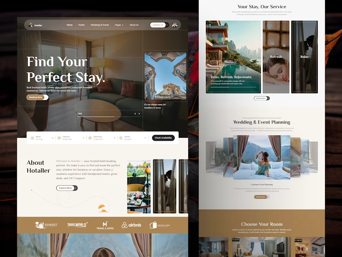
Designing Hoteller: Stress Free Hotel Booking Made Simple
A friend called me last-minute:
“Hey, I need to book a hotel for a business trip, but all the platforms are either confusing, expensive, or loaded with irrelevant options.”
He spent over an hour switching between tabs, cross-checking prices, and messaging hotels—just to find a decent stay.
That’s when it hit me: hotel booking doesn’t have to be this stressful.
So I started designing Hoteller — a clean, intuitive platform that puts the user experience first.
Whether it’s a quick business trip or a long-awaited vacation, Hoteller helps you:
✅ Find curated hotels based on real needs
✅ Get great deals without the hunting
✅ Book fast, with 24/7 support always on standby
Simple filters. Smart recommendations. A seamless booking journey.
2
3
104
A Clear, Conversion-Driven Landing Page
Redesigned Accounting Wise’s main landing page to attract more qualified leads across the UK.
Approach:
• Simplified multiple services into one clear story
• Focused on who they help, pricing clarity, and trust signals
• Used color-coded service blocks so users find their path fast
Result:
A cleaner experience that guides users and supports conversions.
Clear stories convert better.
1
3
105
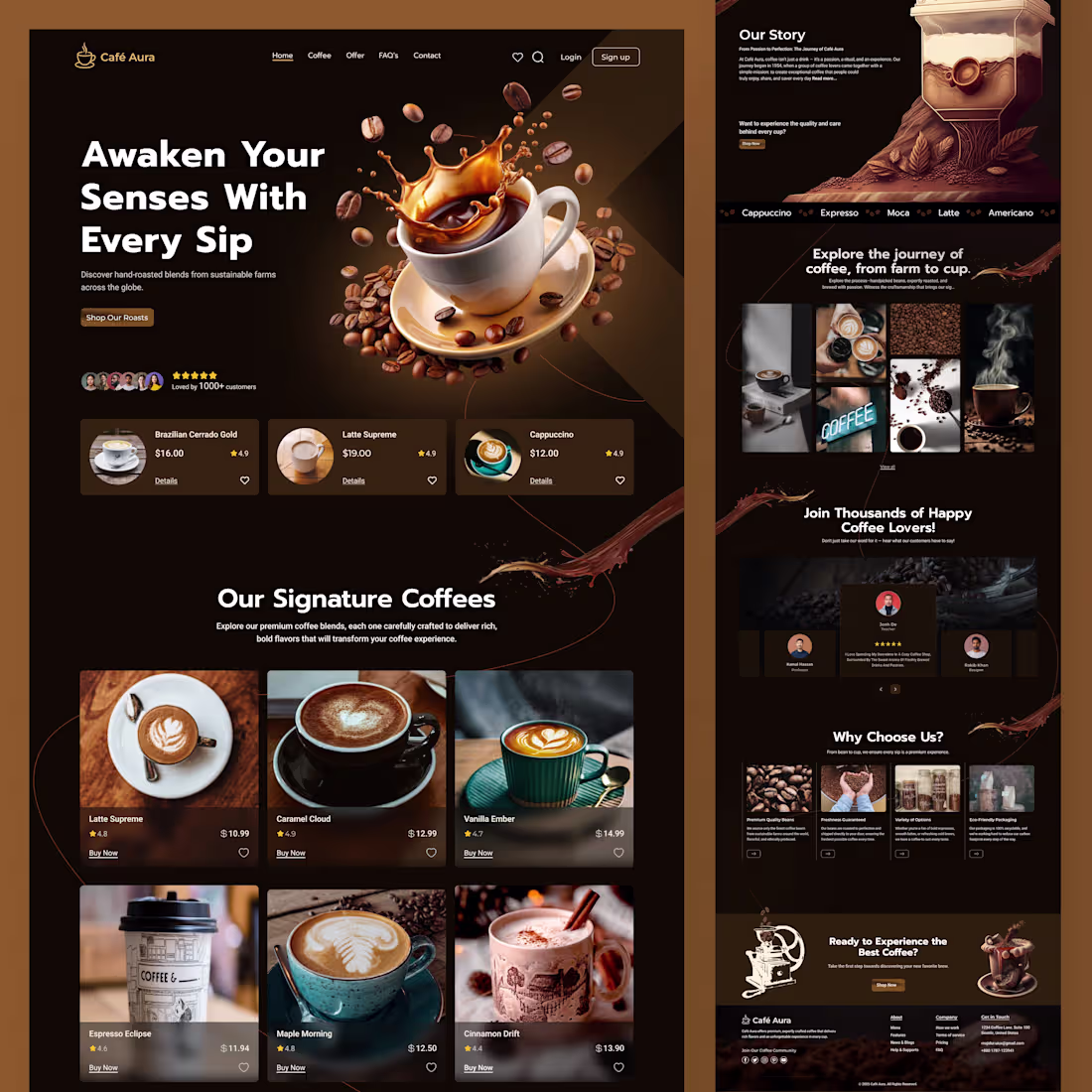
Wake Up & Smell the UI – Coffee Website Design
Most coffee websites look good.
Very few feel good.
Pretty UI doesn’t sell coffee.
Emotion does.
That’s why this redesign focused on warmth, story, and calm—not flashy visuals.
If your website can’t make people feel the product,
it’s just decoration.
Agree or disagree? 👇
3
3
133
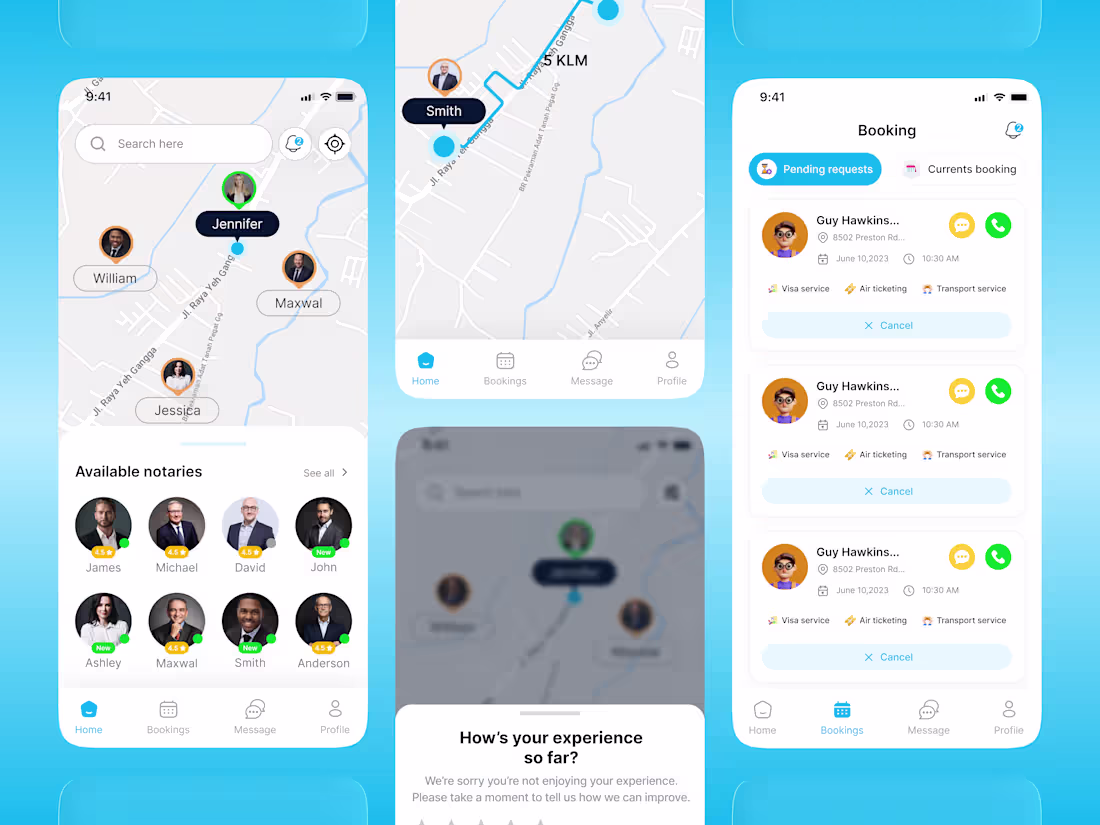
UI/UX Design for Notarix Mobile App
For a mobile notary, one tiny delay costs a deal. But the old Notarix app buried schedules and showed vague document statuses, causing anxiety and lost time.
The Fix: I redesigned the UX to prioritize real-world urgency.
Instead of just "organizing" features, I focused on empathy:
✅ Clear schedules front-and-center
✅ Live, specific document statuses
✅ Frictionless access to client info
The Takeaway: When designing high-stakes tools for professionals, the best interface gets out of the way. It lets them do their job faster, better, and with zero doubt.
👉 Need a UX designer who builds confidence, not just screens? Let's collaborate on Contra!
2
4
110
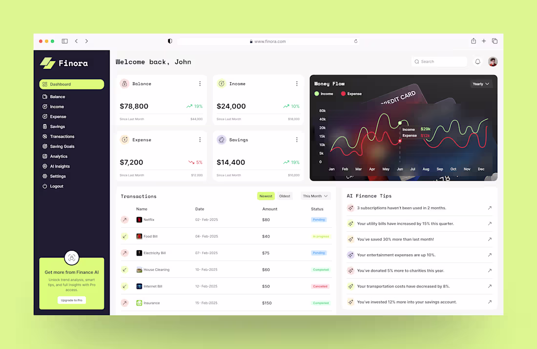
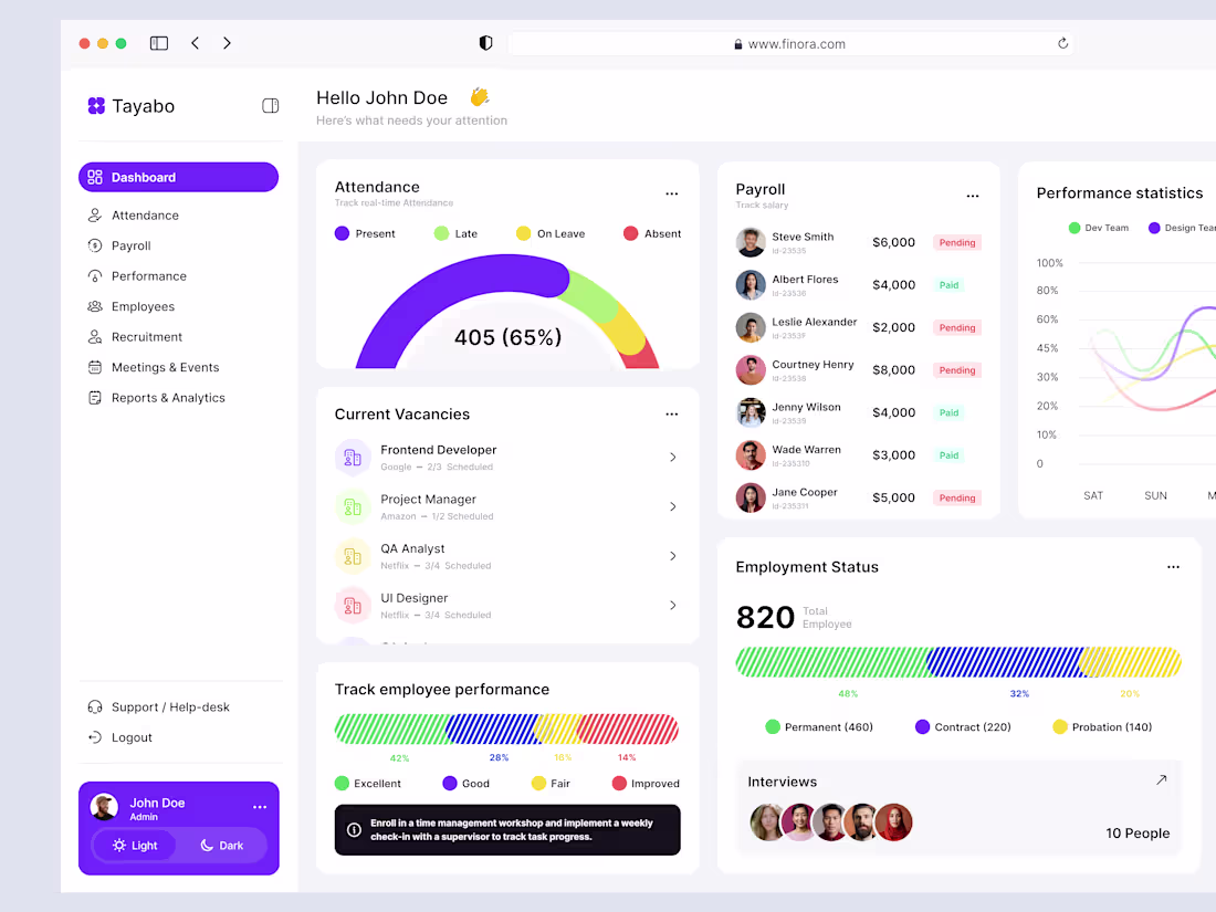
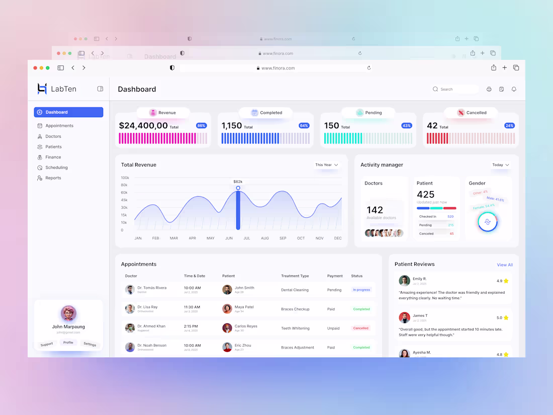
Finora Smarter Finance Management Dashboard.
Designed a modern finance dashboard that simplifies budgeting, income, expenses, and savings into one clear, calm experience.
Built with user research, real-time analytics, goal tracking, and a clean UI focused on quick insights not overwhelm.
FinMate helps professionals feel in control of their money.
What feature do you value most in a finance dashboard?
#UIUX #DashboardDesign #Fintech #ProductDesign #UXDesign
1
98
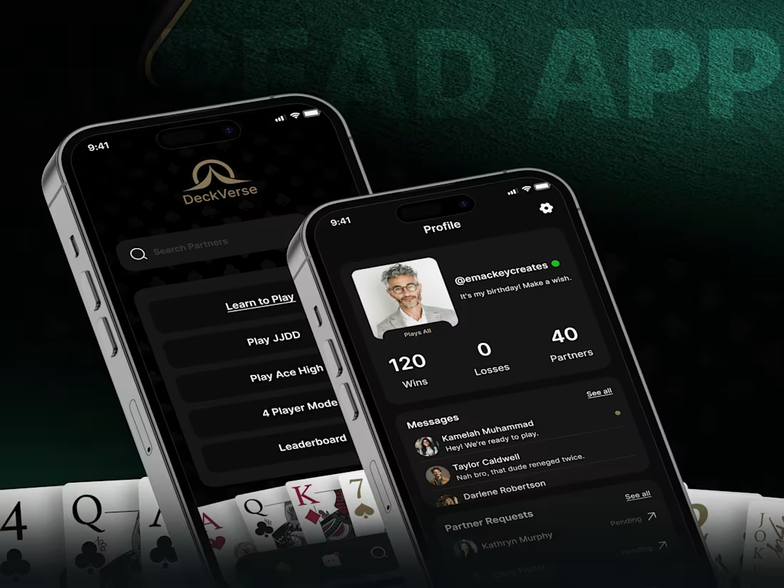
🇺🇽 🇩🇪🇸🇮🇬🇳 🇫🇴🇷 🇦 🇨🇦🇷🇩 🇬🇦🇲🇪 🇦🇵🇵
Designed a sleek, immersive card game app focused on engagement, clarity, and replay value.
Highlights:
• Dark, premium UI for a focused gaming experience
• Intuitive navigation and smooth game flows
• Player profiles, stats, and social interactions
• Mobile-first UX built for long play sessions
Result:
An addictive, easy-to-use game experience that keeps players coming back.
Great game UX is where fun meets frictionless design.
2
3
115
🇩🇴🇨🇹🇴🇷 🇦🇵🇵🇴🇮🇳🇹🇲🇪🇳🇹 🇹🇷🇦🇨🇰🇮🇳🇬 – 🇸🇲🇦🇷🇹 🇦🇩🇲🇮🇳 🇩🇦🇸🇭🇧🇴🇦🇷🇩 🇺🇮
Designed an intuitive admin dashboard to help healthcare teams monitor appointments, patient activity, and operational performance in one place.
Key highlights:
• Real-time appointment tracking
• Clear data visualization & status insights
• Easy-to-scan layout for faster decisions
• Clean, professional UI built for daily use
Result:
A smart dashboard that reduces admin effort and improves workflow visibility.
Great healthcare UX starts with clarity.
2
3
126

Clean & Conversion-Focused eCommerce UI/UX
Designed a modern eCommerce experience focused on calm, clarity, and effortless shopping—without aggressive sales pressure.
Key focus:
• Minimal, distraction-free UI
• Smooth product discovery & checkout flow
• Mobile-first UX
• Trust-driven cart & checkout design
Result:
A clean, intuitive store that helps users shop comfortably while supporting conversion goals.
Calm design can still convert ZenMart proves it.
1
2
119
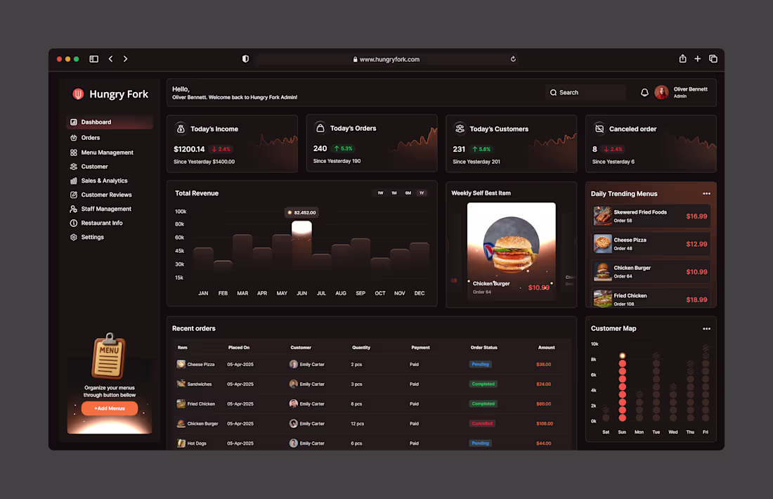
Hungry Fork Dashboard – Restaurant Management UX
A food-industry client needed one simple dashboard to manage orders, staff, menus, and real-time data without the complexity.
💡 Hungry Fork Dashboard was designed to make daily restaurant operations fast, clear, and intuitive.
Key highlights:
📈 Orders & sales at a glance
📋 Quick menu and inventory edits
👨🍳 Staff scheduling made simple
💬 Built-in customer feedback
Designed for cafes, cloud kitchens, and full-service restaurants—clean, modern, and easy for non-tech users.
👀 Thoughts? Let’s collaborate on something similar.
2
112
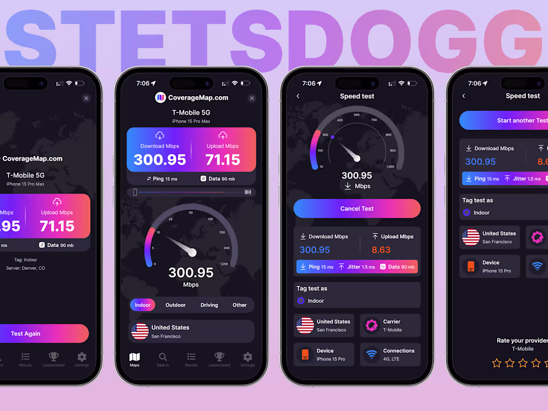
𝐔𝐗 𝐓𝐡𝐚𝐭 𝐓𝐮𝐫𝐧𝐬 𝐔𝐬𝐚𝐠𝐞 𝐈𝐧𝐭𝐨 𝐑𝐞𝐯𝐞𝐧𝐮𝐞
The product already worked the UI was the problem. Users were dropping off because key speed-test results weren’t immediately clear.
I simplified the interface and removed visual noise so core data appears instantly once the test finishes. The result is a faster, clearer experience that keeps users engaged instead of losing them.
Want to turn an underperforming product into a revenue-driving experience? Let’s connect.
2
138
𝗙𝗲𝗮𝘀𝘁 𝗬𝗼𝘂𝗿 𝗘𝘆𝗲𝘀 | 𝗙𝘂𝗹𝗹 𝗥𝗲𝘀𝘁𝗮𝘂𝗿𝗮𝗻𝘁 𝗪𝗲𝗯𝘀𝗶𝘁𝗲 𝗨𝗜𝗨𝗫 𝗗𝗲𝘀𝗶𝗴𝗻
Feast Your Eyes Restaurant Website UI/UX Design
Designed a full website experience for a local restaurant that wanted their online presence to feel as warm and inviting as their physical space.
Focus areas:
• Visual-first menu design
• Clear user flow for reservations & takeout
• Mobile-optimized experience
• Brand-aligned typography, colors, and layout
Result: A website that reflects the restaurant’s vibe, improves engagement, and makes booking effortless.
Good restaurant UX doesn’t just show food it sets the mood.
1
117
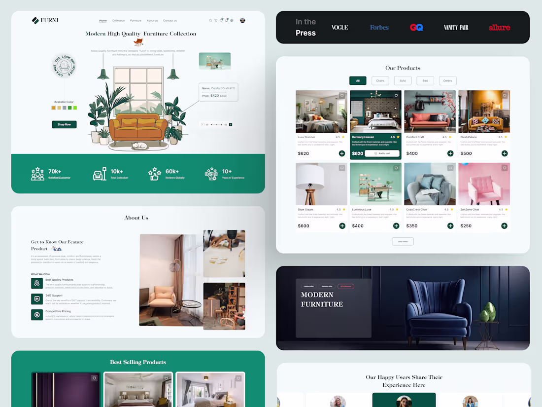
𝗠𝗶𝗻𝗶𝗺𝗮𝗹, 𝗠𝗼𝗱𝗲𝗿𝗻 & 𝗠𝗮𝗱𝗲 𝘁𝗼 𝗟𝗮𝘀𝘁 – 𝗙𝘂𝗿𝗻𝗶𝘁𝘂𝗿𝗲 𝗨𝗜 𝗗𝗲𝘀𝗶𝗴𝗻
A furniture brand thought their website problem was simple: Make it more minimal.
But the real issue wasn’t aesthetics. It was clarity.
The site looked great—but users didn’t understand:
❌ Why it cost more
❌ What made it better
❌ How to choose
So instead of removing more, we added what mattered: → Clear value → Product details → Decision support
The result? Less admiration. More conversions.
Takeaway: Minimalism is a tool—not the strategy. If it hides value, it hurts sales.
1
104
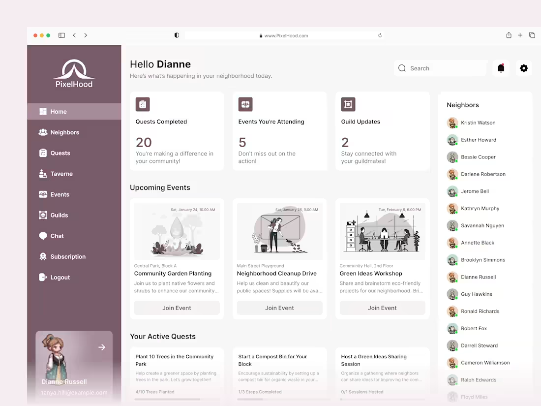
𝐐𝐮𝐞𝐬𝐭 𝐃𝐚𝐬𝐡𝐛𝐨𝐚𝐫𝐝 𝐓𝐡𝐚𝐭 𝐌𝐚𝐤𝐞𝐬 $
This client runs a gamified neighborhood app. When I joined the project, people loved the idea but skipped most events, so sponsor and ticket revenue stayed flat. I began with a simple UX review of the sign‑in flow and first screen. The key issue: actions were hidden under icons. I redesigned the layout with large event cards and direct “Join Event” buttons. UX point: clear visual hierarchy so eyes go from stats to events to chat. Early numbers show more event joins. Need a dashboard like this? DM me.
3
128
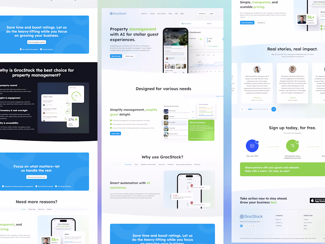
𝐌𝐨𝐫𝐞 𝐁𝐨𝐨𝐤𝐢𝐧𝐠𝐬, 𝐋𝐞𝐬𝐬 𝐖𝐨𝐫𝐤, 𝐌𝐨𝐫𝐞 $
I kicked off this project by digging into analytics for GrocStock, an AI property‑management SaaS: lots of traffic from property managers, not many trial sign‑ups. The problem was clarity—too many messages, no clear path to “start for free.” I created a focused landing page that speaks separately to managers, owners, and hosts, using tabs so each group sees only what matters to them (strong UX for busy users). Social proof, pricing, and mobile apps are now only a scroll away. Want a landing page that turns visitors into paying customers? Reach out and let’s chat about your product.
1
1
129
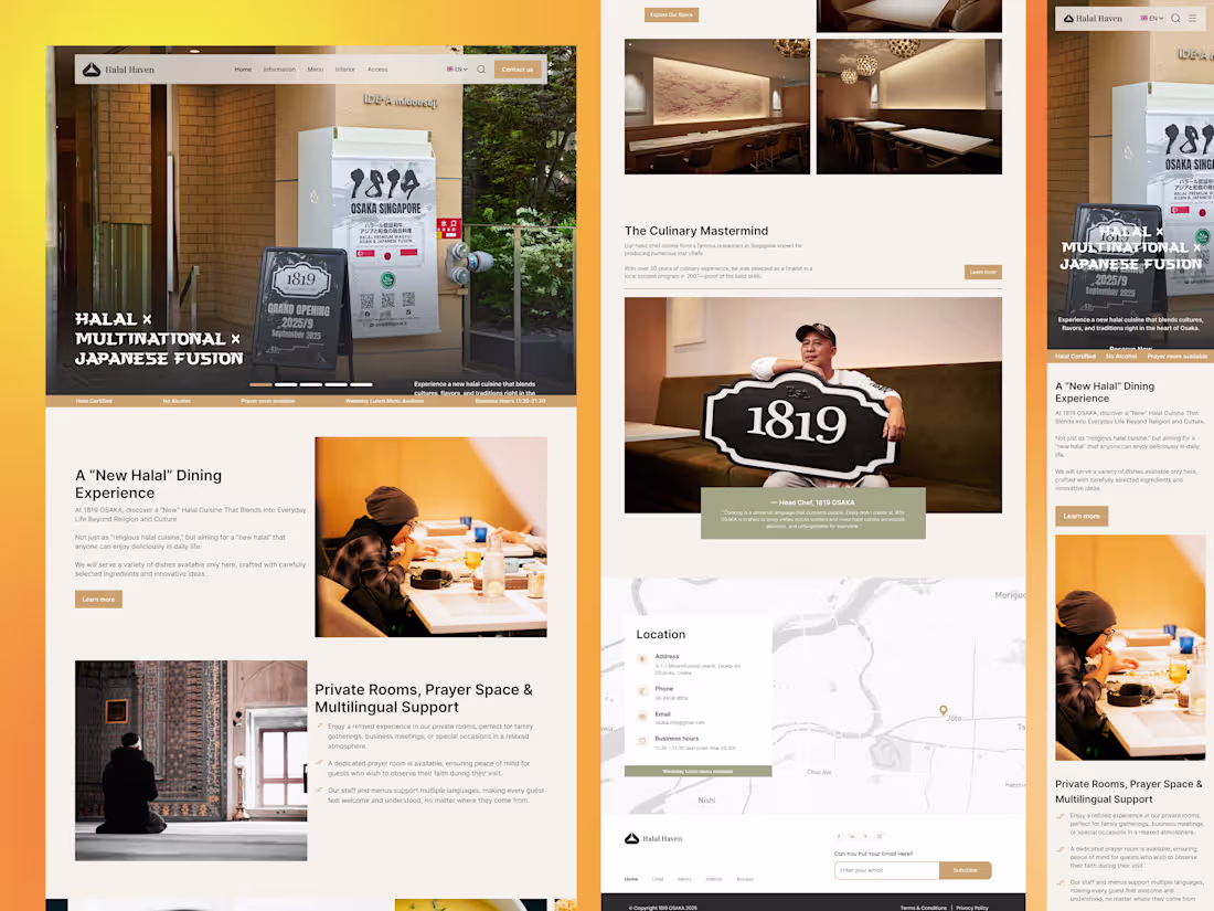
Halal Haven Multinational Japanese Fusion Restaurant Website UI/UX
Halal Haven is a clean, conversion‑focused website I designed for a halal Japanese fusion restaurant in Osaka. The UI balances warm, restaurant photography with simple navigation so visitors can quickly explore the concept, browse the menu, and reserve a table. I focused on clear hierarchy, mobile‑first layouts, and trust elements like halal certification, prayer space info, and multilingual support.
I’m open to new projects in restaurant, food & beverage, and hospitality web UI/UX.
1
150
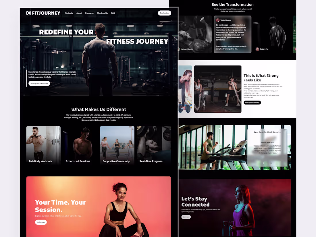
𝐅𝐢𝐭𝐉𝐨𝐮𝐫𝐧𝐞𝐲 𝐋𝐚𝐧𝐝𝐢𝐧𝐠 𝐏𝐚𝐠𝐞 𝐑𝐞𝐝𝐞𝐬𝐢𝐠𝐧 | 𝐔𝐈/𝐔𝐗 𝐟𝐨𝐫 𝐅𝐢𝐭𝐧𝐞𝐬𝐬 𝐁𝐫𝐚𝐧𝐝𝐬
I found this client on social media after they posted: “Our website looks good, but sign‑ups are low.” I jumped in with a quick audit, reviewed competitors, and mapped a clearer user flow. Then I designed a bold, high‑energy landing page with stronger messaging, trust sections, and clean CTAs to guide visitors to join. Want a landing page that turns visits into leads? DM me—happy to help.
2
137
𝗔 𝗥𝗲𝘃𝗲𝗻𝘂𝗲-𝗙𝗼𝗰𝘂𝘀𝗲𝗱 𝗠𝗼𝗯𝗶𝗹𝗲 𝗔𝗽𝗽 𝗨𝗜 𝗳𝗼𝗿 𝘁𝗵𝗲 𝗠𝗼𝘃𝗶𝗻𝗴 𝗜𝗻𝗱𝘂𝘀𝘁𝗿𝘆
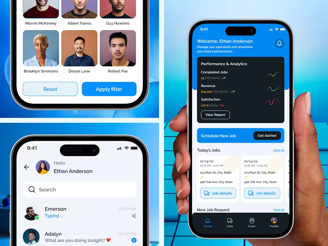
This mobile app project started with one challenge: moving is stressful and confusing for users.
For Move.me, I designed a clean mobile customer dashboard that lets users track their move, view job details, and chat with movers—all in one place.
The focus was on simple navigation, clear actions, and a smooth mobile experience that builds trust and keeps users engaged.
Good mobile UX helps users stay, convert, and pay.
If you need a mobile app design that supports real business growth,
let’s talk 👋
2
139