Durable website redesign project
André Saad
Company
Durable
Role
Senior Product Designer
Project type
Website redesign
Timeline
3 Months
Live version
https://durable.co
The challenge
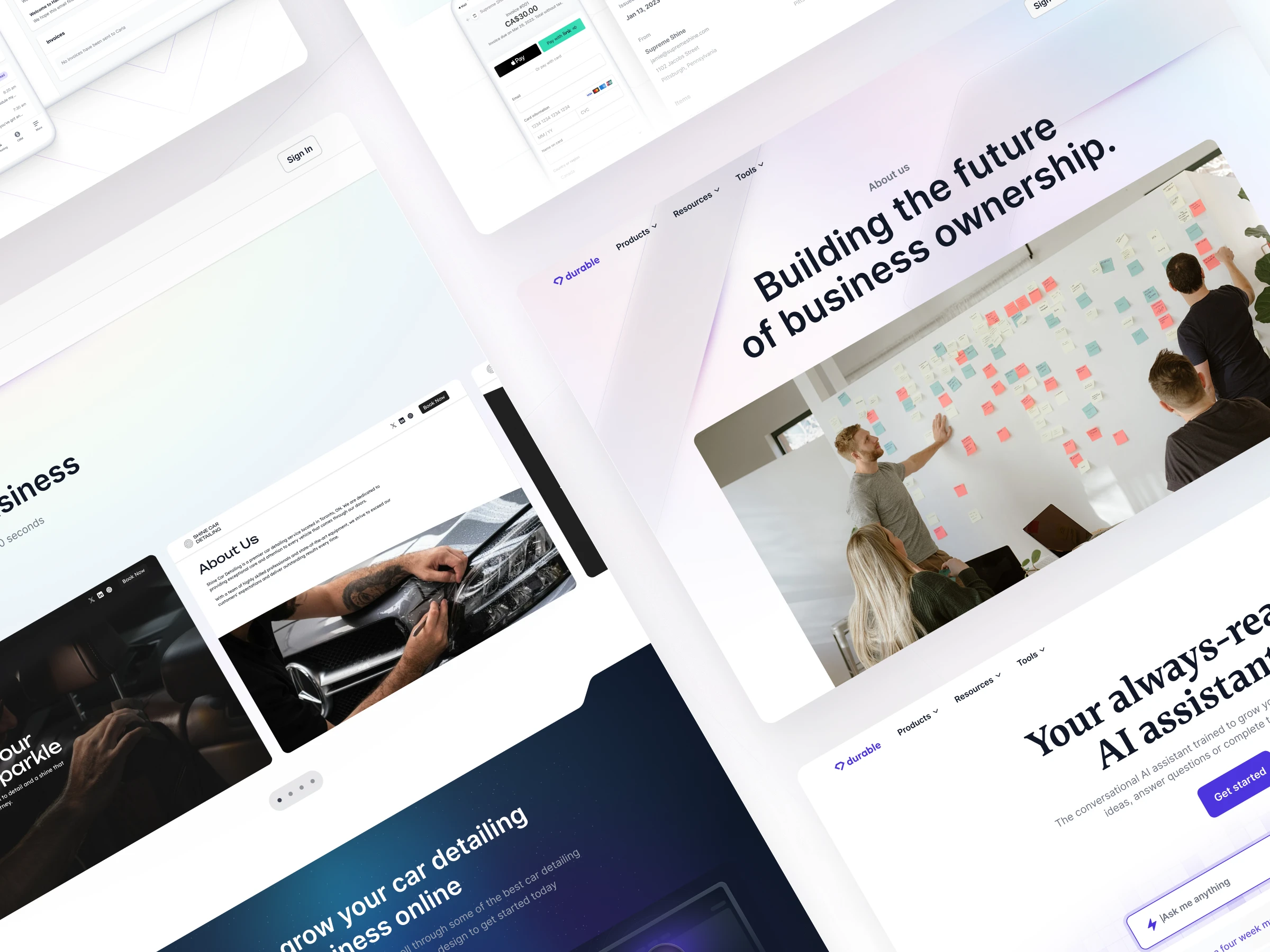
The original website felt like a placeholder—functional, but far from memorable. Built using a Webflow template, it lacked the distinct identity needed to stand out in a competitive SaaS landscape. The biggest issues were unclear brand messaging, weak visual storytelling, and CTAs that failed to capture attention. Our product was strong, but the website didn’t reflect that. My challenge was to create a design that felt authentic to Durable, visually engaging, and conversion-focused.
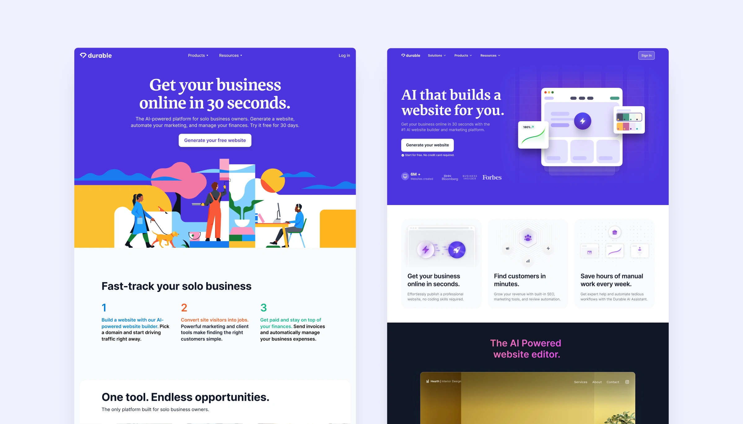
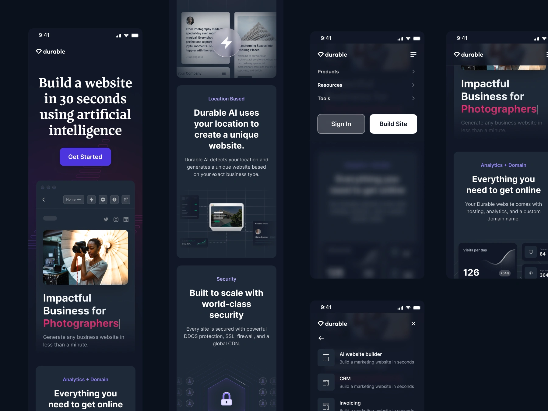
Before and after
The previous design looks nice because of the vibrant illustration, but the main problem was not translating the product and the brand. The user could not understand what the product was about. Also, the messaging was very generic and less focused on the website builder.
Discovery & Insights
Since the company was still in its early stages, we didn’t have a wealth of user data to analyze. Instead, I leaned heavily on qualitative research, internal feedback, and competitor analysis. I reviewed similar SaaS websites to understand how they communicated their value propositions, identified gaps in our existing design, and gathered insights from team members who were closely connected to our early user base. This approach helped me uncover key pain points: users weren’t immediately understanding what Durable offered, the visual design lacked personality, and the CTAs weren’t effective in guiding user actions. These insights shaped the foundation for the redesign.
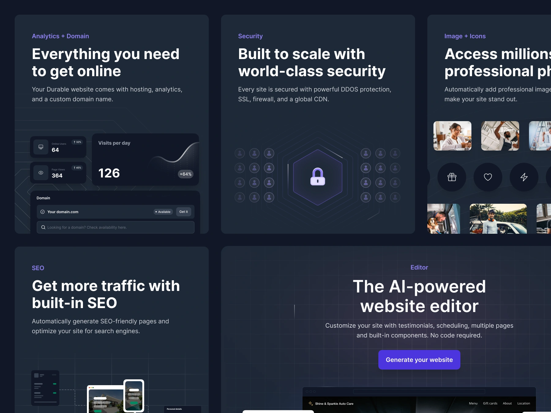
Feature illustrations
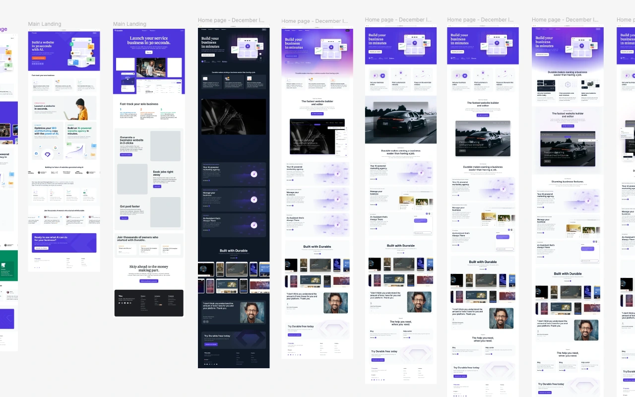
Home page design explorarions
Home page explorations
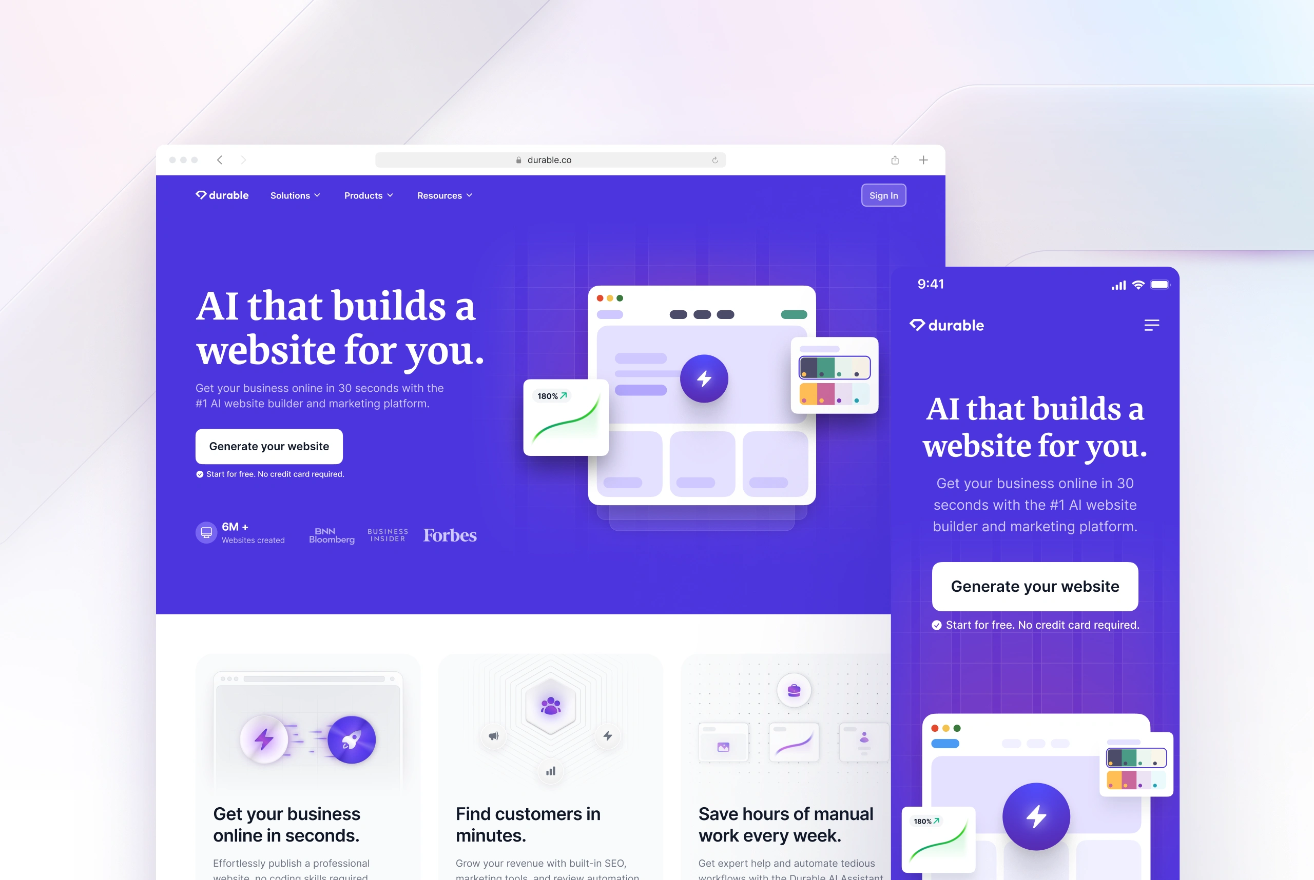
Designing the homepage was an iterative process—we explored multiple variations, testing different approaches to find the one that truly resonated with users. We experimented with light and dark modes, incorporated various illustration styles, and refined the overall look and feel to strike the perfect balance between aesthetics and usability. Through testing and user feedback, we identified the version that performed best: a flat purple background that made the main lockup stand out. This choice not only enhanced visual clarity but also created a bold, memorable first impression that aligned seamlessly with Durable’s brand identity.
Design goals
With a clear understanding of the challenges, I set specific goals for the redesign. First and foremost, I wanted to establish a strong, distinctive brand identity that felt uniquely Durable—moving beyond the generic template to create something memorable. I also aimed to showcase the product features through realistic illustrations, making abstract concepts more tangible and relatable. Enhancing the effectiveness of our CTAs was another key goal, ensuring they stood out visually and encouraged users to take action. Finally, I wanted to improve the overall user experience by creating a clean, intuitive interface that kept users engaged, even without the support of extensive data.
Design Process
User Flows
Based on the entry points of the users, we mapped out the user flows for various scenarios, such as coming from the home page, paid traffic, and organic traffic.
Wireframes
We developed wireframes to sketch out the new interface, focusing on simplifying navigation, improving content creation tools, and enhancing the overall user experience.
Prototyping
Using tools like Figma, we created interactive prototypes to simulate the user journey and gather feedback from stakeholders and potential users.
Usability Testing
We conducted A/B tests trying to see which page converts better. We started driving 10% of the traffic first and gradually increased it to 50%.
Like this project
Posted Apr 2, 2025
This was a project in which I redesigned the Durable website. The goal was to give a first look and fill the brand after the seed investment.
Likes
0
Views
10
Timeline
Jul 6, 2022 - Oct 6, 2023
Clients
Durable