Kajabi Website Design for Northstar Academy

Samuel Olasunkanmi


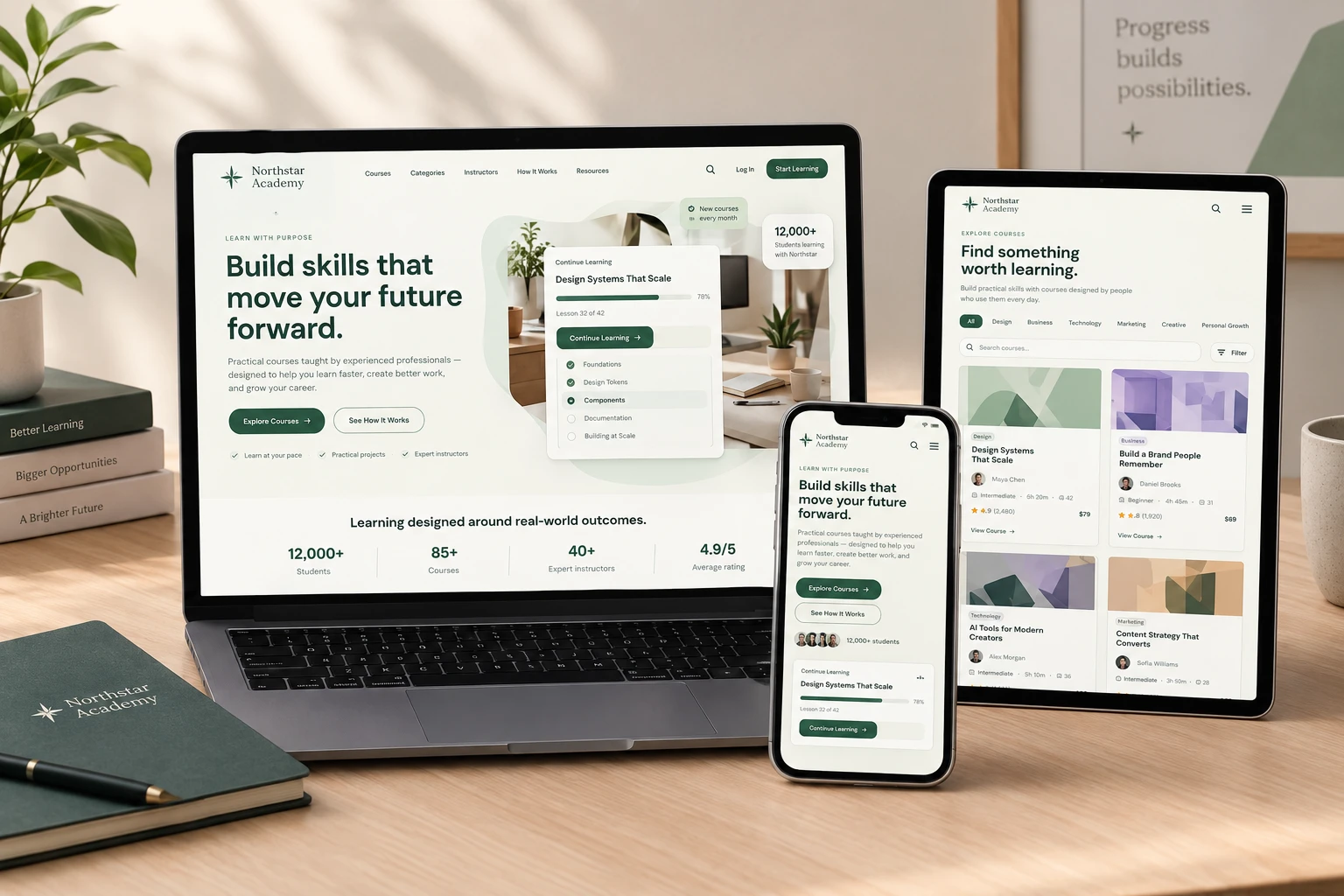
Northstar Academy — Kajabi Website Design for an Online Learning Platform
A modern education website concept designed to turn expertise into an engaging online learning experience.
Kajabi Website Design · Online Course Website · Education Website · UI/UX Design · Responsive Web Design · Membership Website · Landing Page Design
Project Overview
Northstar Academy is a conceptual online education platform designed for educators, course creators, coaches, and knowledge-based businesses looking to build a professional digital learning experience.
The goal was to design a website that goes beyond simply selling courses.
The experience needed to help visitors:
Discover → Explore → Trust → Choose → Start Learning
I designed the platform around the core needs of a modern online education business, including course discovery, learning paths, instructor profiles, curriculum previews, membership options, student testimonials, resources, FAQs, and conversion-focused calls to action.
The design was created with Kajabi implementation in mind, using a modular structure that can translate naturally into Kajabi pages, course offers, membership experiences, landing pages, and content sections.
The Challenge
Online course businesses often have a lot of information to communicate:
What do you teach?
Who are the instructors?
Which course is right for me?
What will I learn?
How long will it take?
How much does it cost?
What happens after I enroll?
Is the content worth paying for?
The challenge was to organize all of this information without making the website feel overwhelming.
I wanted the experience to feel simple, premium, and focused, while still giving prospective students enough information to make confident decisions.
The Approach
I approached Northstar as more than a traditional education website.
Instead, I treated it as a digital learning ecosystem.
The design combines:
Course discovery
Helping visitors quickly find courses based on their interests and goals.
Learning paths
Giving students a structured way to progress toward a larger outcome rather than purchasing disconnected courses.
Instructor credibility
Showing who teaches the courses and why their experience matters.
Curriculum transparency
Allowing visitors to understand what they will actually learn before enrolling.
Membership conversion
Presenting individual courses alongside an all-access membership option.
Student proof
Using testimonials, ratings, student numbers, and completed projects to reinforce trust.
Lead generation
Using newsletter and resource sections to create opportunities for visitors who aren't ready to purchase immediately.
Information Architecture
The website follows a deliberate content hierarchy:
Hero → Course Discovery → Featured Course → Course Experience → Benefits → How It Works → Instructors → Student Outcomes → Testimonials → Learning Paths → Pricing → Certificate → Resources → Newsletter → FAQ → CTA
Each section answers a different question in the student's journey.
Rather than forcing visitors to navigate through complicated menus, the homepage progressively introduces:
What Northstar is → What I can learn → Who teaches it → What I'll gain → How it works → What it costs → How I can get started
The Hero Experience
The opening section immediately establishes Northstar's value proposition:
Build skills that move your future forward.
The supporting copy explains the offering without unnecessary jargon:
Practical courses taught by experienced professionals — designed to help you learn faster, create better work, and grow your career.
The primary CTA:
Explore Courses
is supported by:
See How It Works
This gives visitors two natural paths:
Ready to learn → Explore Courses
Still evaluating → See How It Works
Course Discovery UX
One of the most important parts of the design is the course discovery experience.
Instead of displaying a long list of courses without context, courses are organized into clear categories:
Design
Business
Technology
Marketing
Creative
Personal Growth
Each course card communicates important information at a glance:
Category
Course title
Instructor
Level
Duration
Lesson count
Rating
Student count
Price
This allows users to quickly compare courses before entering the detailed course experience.
The design also incorporates search and filtering, creating a more scalable structure for a growing course library.
Featured Course Experience
The featured course section creates a stronger promotional moment for high-priority content.
Instead of simply saying:
"Featured Course"
the section communicates the actual transformation:
Master the skills behind exceptional digital products.
It then reinforces the offer with:
8 weeks
56 lessons
Intermediate
Certificate included
This approach allows the course to be marketed around both content and outcome.
Course Detail & Curriculum UX
A major part of the concept was showing visitors what the learning experience actually looks like.
The course preview introduces:
Course overview
What the course teaches and who it is for.
Learning outcomes
Clear outcomes such as:
Build scalable design systems
Create reusable components
Establish typography and color systems
Document design decisions
Collaborate more effectively with developers
Curriculum
The curriculum is divided into expandable modules.
For example:
01 — Foundations
05 lessons · 42 min
02 — Design Tokens
07 lessons · 1h 10m
03 — Components
09 lessons · 1h 35m
04 — Documentation
06 lessons · 58m
05 — Building at Scale
08 lessons · 1h 25m
This gives prospective students a clear understanding of the course structure before committing.
Learning Paths
Not every student knows which individual course they need.
That's why I introduced Learning Paths.
Instead of presenting education as isolated products, the website can guide users toward a broader goal.
For example:
Become a Product Designer
Research
↓
UX Design
↓
UI Design
↓
Design Systems
↓
Portfolio
This makes the platform feel more like a complete education ecosystem rather than simply an online course catalog.
Membership Experience
The pricing section presents two different ways to access the platform:
Individual Course
For students who want to focus on one specific skill.
Northstar Membership
For students who want access to the broader learning library.
The membership option includes:
85+ courses
Learning paths
Certificates
New courses
Community access
Downloadable resources
This creates a clear distinction between one-time course purchases and a recurring learning membership.
Instructor Experience
Trust is especially important when purchasing online education.
The instructor section introduces the people behind the content and provides context around their expertise.
Each instructor profile communicates:
Name
Professional role
Area of expertise
Number of courses
The intention is to make the platform feel human rather than like an anonymous content library.
Student Outcomes
Rather than focusing entirely on what students consume, the design focuses on what students can create.
The "What You Can Build" section showcases potential outcomes such as:
Brand Identity Project
Product Design Case Study
Marketing Campaign
This reinforces the concept of learning through application.
Testimonials & Social Proof
The testimonial section provides another layer of confidence.
Rather than using long blocks of text, testimonials are concise and focused on specific experiences:
Practical learning
Career development
Applying skills at work
Flexible learning
Project-based education
The visual treatment keeps testimonials easy to scan while maintaining the overall premium aesthetic.
Resources & Lead Generation
Not every visitor will be ready to purchase a course on their first visit.
To accommodate those visitors, I incorporated a resource ecosystem containing:
Educational articles
Guides
Learning tips
Student stories
Free resources
The newsletter section then provides a low-friction conversion opportunity:
Keep learning.
This creates a secondary path for visitors who aren't ready to enroll yet.
Responsive Web Design
The experience was designed to work across:
Desktop → Tablet → Mobile
The desktop experience uses:
Multi-column course grids
Large typography
Editorial layouts
Course cards
Learning path structures
Detailed curriculum sections
On mobile, the experience transitions into:
Stacked content
Simplified navigation
Mobile-friendly course cards
Expandable curriculum
Accessible FAQ accordions
Full-width CTAs
Simplified pricing
Optimized typography
The objective was not simply to make the desktop layout smaller.
The mobile experience was treated as a separate UX consideration.
Kajabi-Oriented Design Approach
The website architecture was intentionally designed around components that translate well to a Kajabi-based education business.
The structure can be adapted into
Kajabi landing pages
Course sales pages
Product pages
Membership pages
Offer pages
Lead-generation pages
Resource pages
Email capture sections
Course curriculum structures
Instructor content
FAQ sections
Testimonials
Pricing sections
Conversion-focused CTAs
The visual system is also modular, allowing individual sections to be reused across multiple Kajabi pages while maintaining brand consistency.
Visual Design System
The visual identity uses a calm, sophisticated education palette:
Warm Off-White
#F7F7F3
Deep Green
#315C45
Dark Charcoal
#171B18
Soft Sage
#DDE9DF
Warm Accent
#E5B968
Typography is built around DM Sans, creating a clean and contemporary reading experience across headlines, course information, navigation, pricing, and supporting content.
The design relies heavily on:
Typography
Spacing
Grid systems
Borders
UI cards
Progress indicators
Information hierarchy
Subtle motion
rather than depending entirely on photography.
Interaction Design
The interface incorporates subtle interactions designed to make the learning experience feel more dynamic without becoming distracting.
Interactions include:
Sticky navigation
Scroll-based navigation transitions
Course card hover states
Category filtering
Course search
FAQ accordions
Curriculum accordions
Learning path interactions
Button hover states
Mobile navigation
Scroll reveal animations
Pricing interactions
The goal was to use motion to clarify interaction and hierarchy, not simply add animation for visual effect.
Design Goals
The project was designed around five principles:
01 — Clarity
Make it immediately obvious what Northstar offers.
02 — Discoverability
Help users find courses based on their interests and goals.
03 — Trust
Make instructors, outcomes, testimonials, ratings, and curriculum visible.
04 — Simplicity
Reduce friction throughout the learning journey.
05 — Conversion
Create clear pathways from discovery to enrollment.

Final Outcome
Northstar Academy brings together the key experiences required by a modern online education business into one cohesive digital ecosystem.
The result is a website concept that combines:
Education + Content + Community + Courses + Membership + Conversion
into a single consistent experience.
The design demonstrates how an online educator or course creator could use a platform such as Kajabi to create a polished digital presence that doesn't feel like a generic course template.
Like this project
Posted Sep 18, 2026
Designed a Kajabi-based website for Northstar Academy, an online learning platform.