BrightNest Cleaning Co. Website Design

Samuel Olasunkanmi


A modern cleaning service website designed to turn everyday cleaning into a premium digital experience.
Website Design · UI/UX Design · Responsive Web Design · Framer-ready Design · Conversion-focused UX
Project Overview
BrightNest Cleaning Co. is a conceptual cleaning service brand created to explore how a traditional local service business can build a modern, trustworthy, and conversion-focused digital presence.
The goal was to design a website that feels clean, warm, professional, and approachable while making it incredibly easy for visitors to understand the services, build trust, and request a quote.
Rather than treating the website as simply an online brochure, I approached it as a digital sales experience — combining strong visual hierarchy, authentic photography, concise messaging, responsive layouts, and strategically placed calls to action.
The result is a modern cleaning service website designed with the same principles I would apply to a production-ready Framer website.

Cleaning Service Website Using Framer Website Builder
The Challenge
Cleaning services often compete in a crowded local market where many websites rely on generic layouts, stock imagery, and overly promotional messaging.
For BrightNest, the challenge was to create a website that immediately communicates:
"We're professional, trustworthy, reliable, and easy to book."
The website needed to:
Create a strong first impression
Clearly communicate the company's services
Build trust quickly
Make the cleaning process easy to understand
Showcase authentic-looking photography
Provide multiple conversion opportunities
Work beautifully across desktop and mobile
Feel premium without becoming overly corporate
Keep the interface simple enough for everyday users
The Design Direction
I wanted the visual identity to feel fresh without becoming predictable.
Instead of relying on the typical blue-and-white cleaning service aesthetic, I introduced a softer natural palette built around:
Warm off-white · Deep green · Soft sage · Charcoal
The combination creates a feeling of:
Cleanliness
Calm
Trust
Nature
Professionalism
For typography, I used DM Sans throughout the experience to maintain a clean, contemporary interface with excellent readability.
The photography direction was equally important.
Rather than using overly staged cleaning imagery, the design uses natural, editorial-style photography showing cleaners working in realistic homes and office environments.
UX & Information Architecture
The website follows a simple conversion-focused journey:
Discover → Understand → Trust → Explore → Convert
01 — Discover
The hero immediately answers three questions:
What does BrightNest do?
Professional cleaning services.
Why should I care?
A cleaner space means a lighter day.
What should I do next?
Get a free quote.
02 — Understand
The services section introduces the four primary offerings:
Residential Cleaning
Deep Cleaning
Move In / Move Out
Office Cleaning
Each service has its own visual treatment and concise description so visitors can quickly identify the service relevant to them.
03 — Trust
Trust is introduced early through:
500+ homes & offices cleaned
4.9/5 average rating
100% satisfaction focused
7-day flexible scheduling
The website then reinforces credibility through testimonials, team imagery, service explanations, and the "Why BrightNest" section.
04 — Explore
Visitors can continue through:
About
Services
How It Works
Results
Testimonials
Gallery
FAQ
This creates a natural progression without overwhelming the user.
05 — Convert
The primary CTA appears throughout the experience:
Get a Free Quote
The final CTA reinforces the message:
Come home to a cleaner space.
This gives users a clear next step after they've had enough time to understand the service and build confidence.
Visual Design System
The interface was built around a lightweight design system to maintain consistency throughout the page.
Typography
DM Sans
Used across:
H1
H2
H3
Body copy
Navigation
Buttons
Labels
UI elements
The typography relies on scale, weight, spacing, and hierarchy rather than decorative type.
Color
The core palette combines:
#F7F8F3 — Warm background
#315C45 — Primary green
#17201B — Dark text
#DDE9DF — Soft sage
#FFFFFF — White
#DCE2DC — Borders
This creates a visual language that feels natural and premium without losing the recognizable freshness associated with a cleaning brand.
Designing for Conversion
A major focus of the project was conversion-focused web design.
Instead of placing a single CTA at the end of the page, the interface provides multiple opportunities for users to take action.
Primary conversion points
Hero
Get a Free Quote
Services
Learn More
About
Meet Our Team
Final CTA
Get Your Free Quote
The CTAs are supported by trust signals and supporting content rather than appearing as isolated buttons.
The idea is simple:
Give visitors enough information to feel confident, then make the next step obvious.
Responsive Web Design
The layout was designed with responsiveness in mind from the beginning rather than treating mobile as an afterthought.
The desktop experience uses:
Large editorial layouts
Split-screen sections
Asymmetrical image compositions
Multi-column service cards
Horizontal process steps
Masonry-style gallery layouts
On mobile, these structures transition into:
Stacked content
Simplified navigation
Full-width CTAs
Single-column service cards
Vertical process flow
Carefully cropped photography
Comfortable spacing and readable typography
The goal was to preserve the design hierarchy and experience, not simply shrink the desktop layout.
Key Sections
Hero Experience
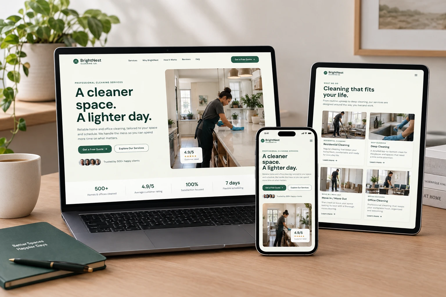
The hero combines a strong headline, supporting copy, CTA hierarchy, social proof, and large natural photography.
The headline:
A cleaner space. A lighter day.
was intentionally kept short and memorable.
Services
A structured 2×2 service grid makes the company's core offerings immediately scannable.
The visual cards combine:
Photography + category + service title + description + action
This creates a strong balance between visual storytelling and practical information.
Why BrightNest
This section focuses on the reasons someone should trust the company.
Rather than using generic marketing statements, the section breaks the value proposition into four simple ideas:
People you can trust
Consistent quality
Flexible scheduling
Satisfaction focused
How It Works
The three-step process simplifies the booking journey:
01 — Tell us what you need
02 — Pick a time
03 — We take care of the rest
This reduces perceived complexity and helps visitors understand what happens after they decide to book.
Results & Gallery
The before/after section gives the service a visual proof point, while the gallery creates an opportunity to showcase the quality and variety of spaces BrightNest works with.
Testimonials
Testimonials were designed as a trust-building component rather than simply filling space near the bottom of the page.
They reinforce three important qualities:
Reliability
Quality
Professionalism
Interaction Design
The interaction direction is intentionally subtle.
The experience uses:
Smooth scrolling
Section reveal animations
Image reveal transitions
Button hover states
Card hover interactions
FAQ accordion animations
Sticky navigation
Responsive navigation transitions
The principle was:
Motion should support the experience, not compete with it.
This makes the design particularly suitable for a modern Framer website, where subtle motion and interactive components can enhance an otherwise clean interface.
Responsive Mockup
The final responsive concept was presented across desktop, tablet, and mobile layouts to demonstrate how the visual system translates across different screen sizes.
The responsive approach prioritizes:
Hierarchy → Readability → Navigation → Conversion
rather than simply scaling every element proportionally.
Final Outcome
The final result is a complete modern website concept for a cleaning service brand that balances visual design with business goals.
The experience gives BrightNest a digital presence that feels:
Modern.
Trustworthy.
Human.
Professional.
Conversion-focused.
More importantly, the project demonstrates my approach to designing service-business websites that aren't just visually attractive, but structured around user experience, trust, clarity, and conversion.
What I Focused On
✓ Responsive web design
✓ UI/UX design
✓ Conversion-focused landing page design
✓ Information architecture
✓ Visual hierarchy
✓ Design systems
✓ Typography
✓ Natural photography direction
✓ Mobile-first thinking
✓ CTA strategy
✓ Interaction design
✓ Service-business UX
✓ Framer-ready website structure
Tools & Workflow
Lovable — Rapid website prototyping and implementation
Framer-ready design thinking — Layout, responsive structure, interactions and component-based thinking
AI-assisted workflow — Accelerated exploration and iteration
DM Sans — Primary typeface
Project Type
Self-initiated concept project
Industry
Cleaning Services / Home Services
Deliverables
Website UI/UX Design
Responsive Web Design
Landing Page Design
Visual Design System
Conversion-focused UX
Responsive mockups
Like this project
Posted Sep 14, 2026
Designed a modern website for a cleaning service, focusing on UX, trust, and conversion.