Quebrando a banca
Pedro Soares
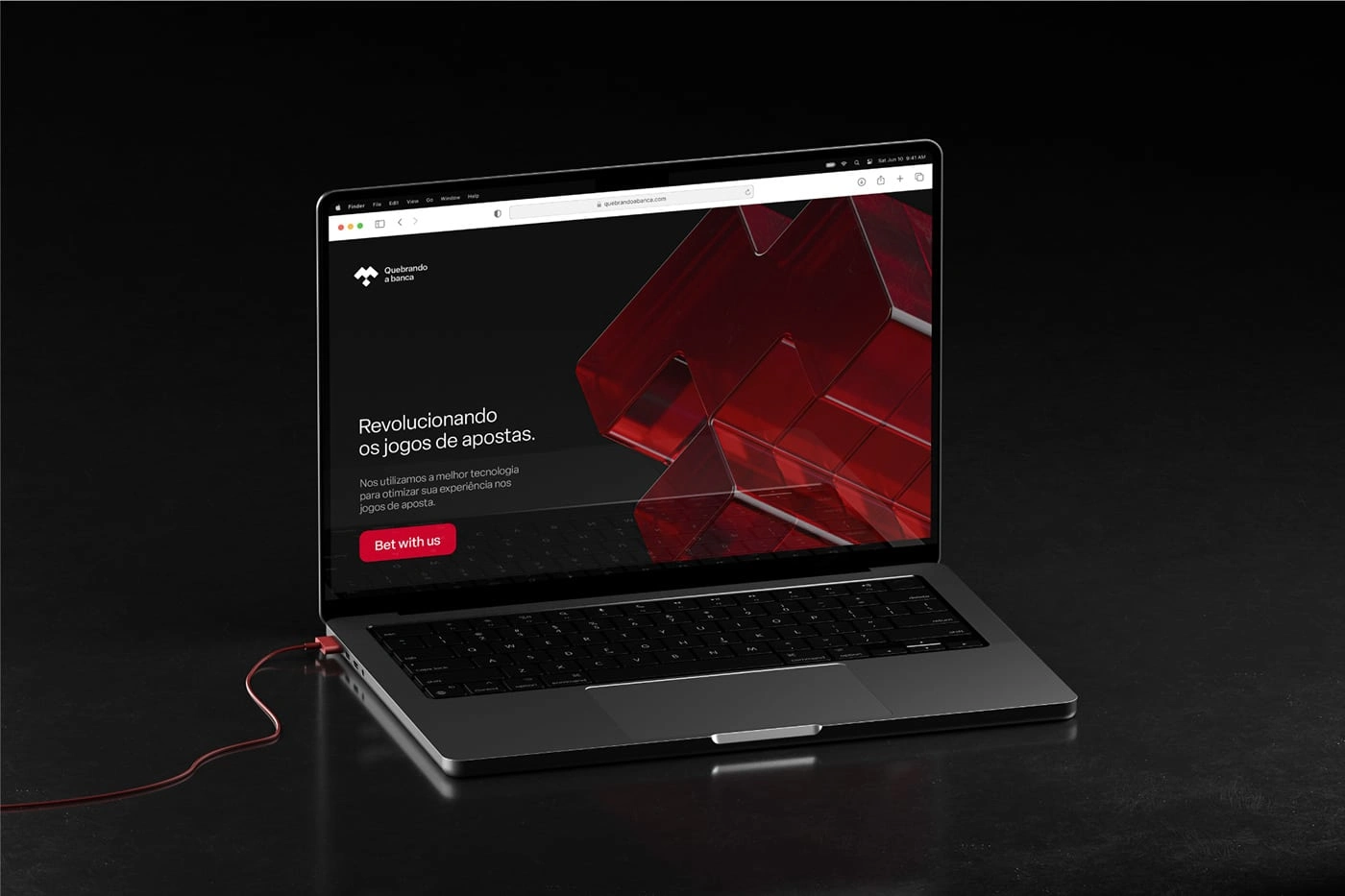
In the dynamic and engaging world of online casinos, Quebrando a Banca emerges as an innovative brand that blends digital entertainment with responsibility and sophistication. Our main challenge was to create a visual identity that reflects the brand's core values: transparency, fair play, and a commitment to a more conscious betting experience.
To bring this vision to life, we developed a modern, technological, and sophisticated concept designed to stand out in the competitive digital market.
The color palette was carefully chosen to convey sophistication and innovation, using tones that evoke trust, modernity, and energy. The artistic and abstract symbol reinforces the essence of the brand, merging dynamism, elegance, and technology into a unique design.
Complementing this identity, the clean and contemporary typography offers versatility, ensuring harmonious applications across various formats and digital media.
Another highlight was the inclusion of 3D elements, which add depth, dynamism, and impact to the brand’s visual communication. These features help create memorable designs that align with Quebrando a Banca’s technological and sophisticated positioning.
The new visual identity is a reflection of how strategic design can transform a brand’s perception. By combining innovation, creativity, and a deep understanding of the target audience, we created a visual language that connects the brand to its consumers in a powerful way, strengthening its presence in the online casino market.

Like this project
Posted May 9, 2025
Fair-Play for betting