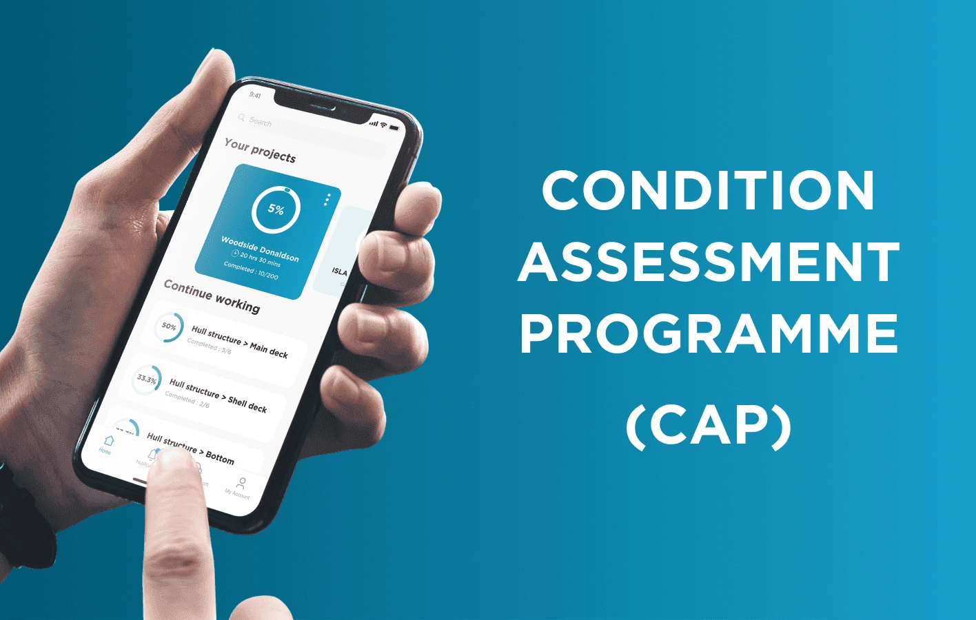
Condition Assessment Programme
Harsh Jain
OPPORTUNITY STATEMENT
Condition Assessment Programme (CAP) - One of the major players in shipping & marine certification, Bureau Veritas. They have been issuing CAP reports for the past few decades which certify a ship's condition and allow it to sail. This process until now was mostly manual & the complete survey could take anywhere from 1-2 months to complete the survey & generate the report. This highlights an opportunity to streamline this process via a mobile app which will help reduce the time it takes to survey the ship, record data & enter the data into the system. The aim of creating this app was to reduce the time & cost efforts it takes to complete a CAP survey.
Time Frame: 12 Months
My Role: Lead UI/UX Designer
DISCOVERY & INSPIRATION
Over the last few years, Bureau Veritas's Marine & Offshore business has become a leader in providing certification to ships. Usually, when a CAP survey is to be created, it was tedious as a surveyor would manually have to go onto the ship & take down their notes on a physical paper and then go back to the office & upload everything to the system to generate a CAP report. The time & cost effort of these activities were a lot and could be improved significantly by introducing an app that would
Systematically maintain & store data
Be able to work without any network
Allow an easier way to navigate through different parts of the ship
Allow the data to be easily uploaded to the system eliminating the manual work.

UX RESEARCH & IDEATION
Curious about the industry and the system, we dived into finding a solution that would fit the requirements of all the stakeholders. We started exploring the problem through stakeholder & user interviews.
Stakeholder Interviews
We connected with the key people associated with the CAP surveys for bureau veritas to figure out the current system & what are the drawbacks that they are facing and what are their key goals with the new system. The following key drawbacks were found with the current system.
The current system is very time-consuming.
Manual recordkeeping makes it difficult to organize and safely keep the data.
Inputting data into the system and adding the right images to the right part of the ship can lead to repetition and wrong information being put in sometimes.
In case the surveyor is to be changed it can become difficult to make the understand previous surveyors notes.
Some of the key features that they required with the new app were :
Able to work without the need of being connected to the internet.
Organized data so that all the data points and images are associated with the right field when uploading to the system.
Easier navigation as a ship can have hundreds of different sections & parts
Ability to use the app with wearing gloves, as at times surveyors might be wearing gloves.
Ability to upload photos from the camera as well as the gallery.
User Interviews
We created a set of questions to ask the potential users, the key focus was to understand their workflow and what are their goals with the digitization of the current process.
From the interview responses we drafted the app idea & the MVA. which was used to create the user personas
App Idea
A way for CAP surveyors to organize the items and sections they need to survey will allow them to store the data around the survey on their phones without the need for the internet, It will also allow users to upload the collected data to the system to generate CAP reports.
Minimum Viable Audience (MVA)
Well Settled, middle-aged (30-60) surveyors who are not very tech-savvy but are interested in finding a way to simplify their workflow and be able to organize and push collected data.
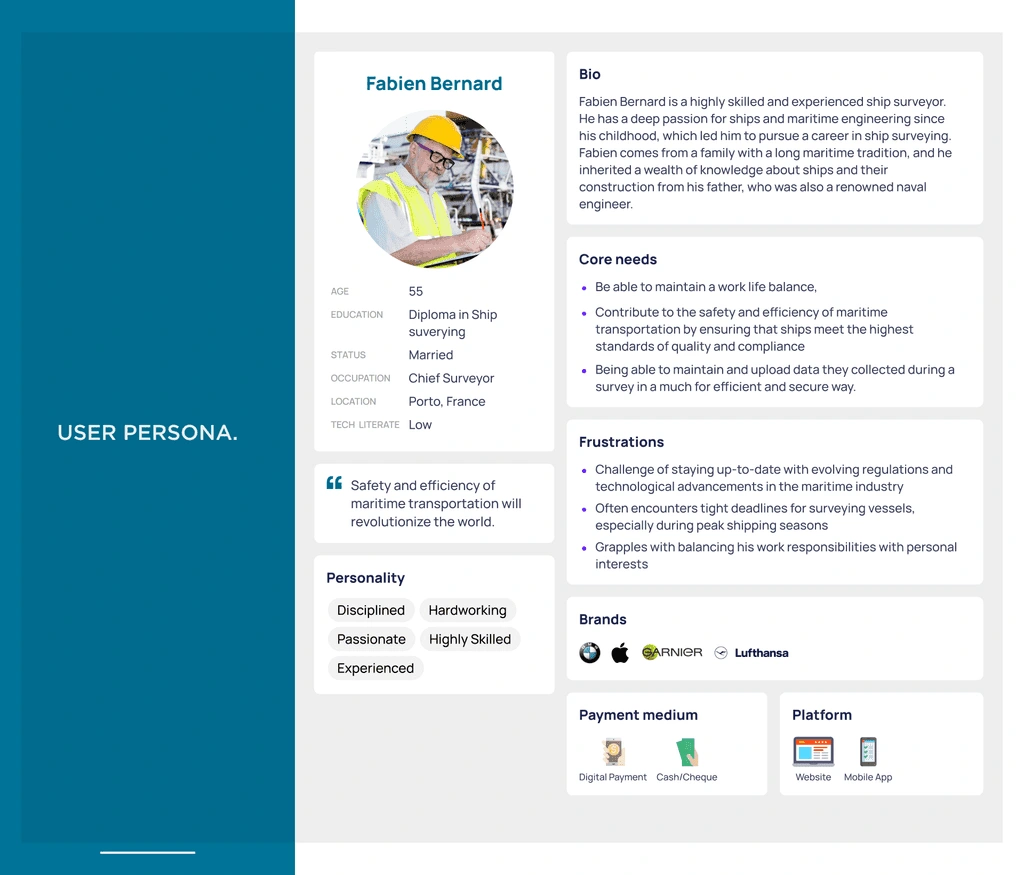
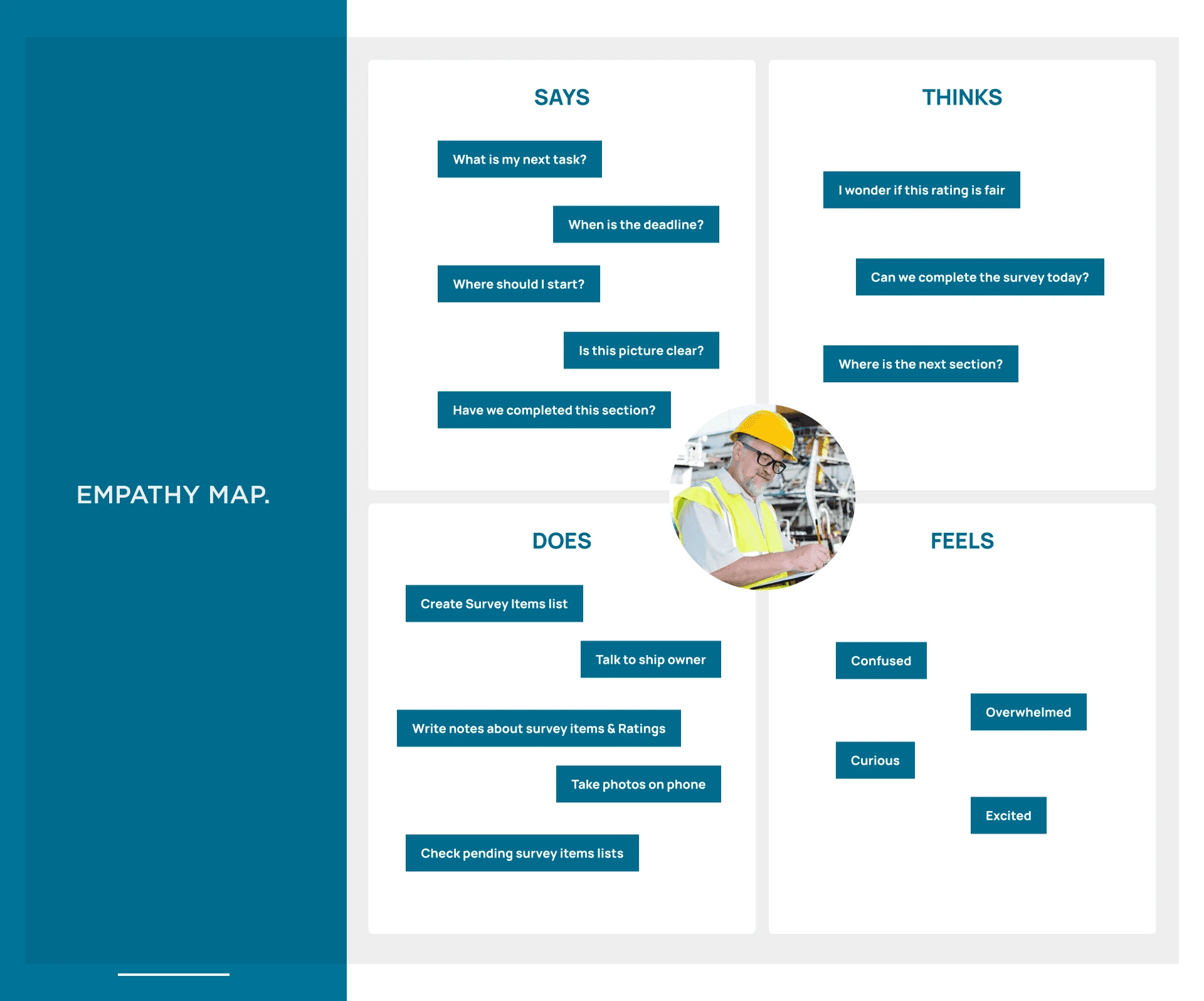
Persona & Empathy Map
Our Persona Fabien Bernard is a 55 years old chief surveyor, who has 25 years of experience working as a CAP surveyor. He is looking for ways to make his work more efficient so he can find a work-life balance
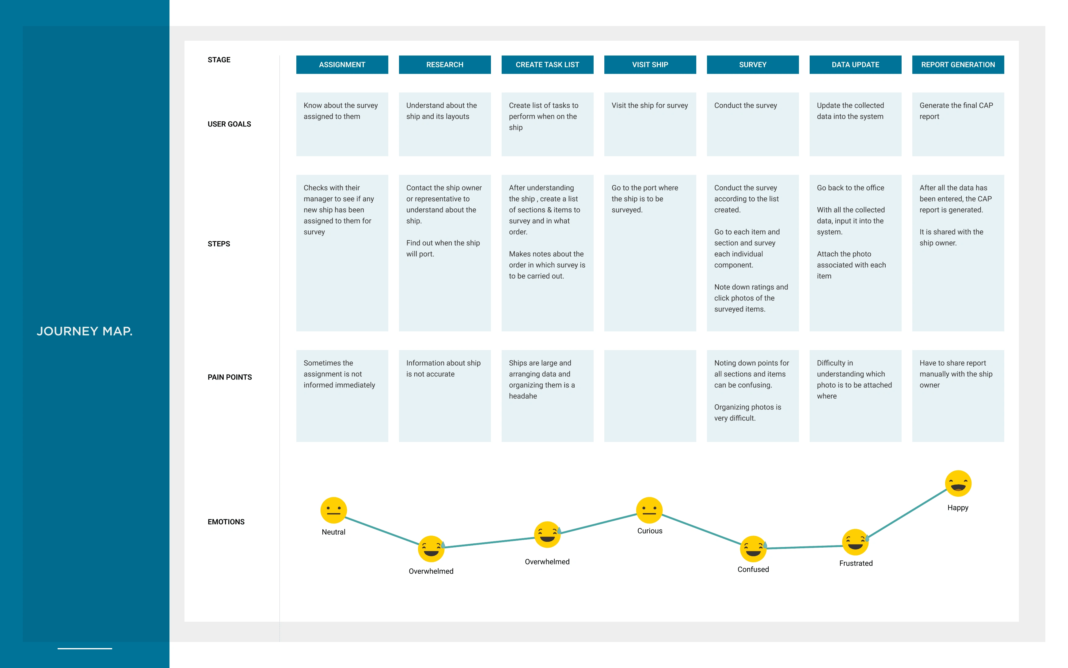
Journey Map
We mapped out the process of our user persona, Fabien, Starting with a new CAP survey. He got assigned the project, Lists downs all the areas and sections he needs to survey, goes onto the ship, writes down the rating and click photos while surveying & finally comes back to the office & update his findings to the system and generates the CAP report.
Using what we know about him, we can hypothesize what his feelings and thoughts might be at each decision point, and consequently identify an opportunity for improvement.
The persona, empathy map and journey informed my problem statement.
Problem Statement
An experienced ship surveyor who is not very tech savvy but needs a way to organize his survey, collect data, take images & upload the data to generate the report.
INFORMATION ARCHITECTURE
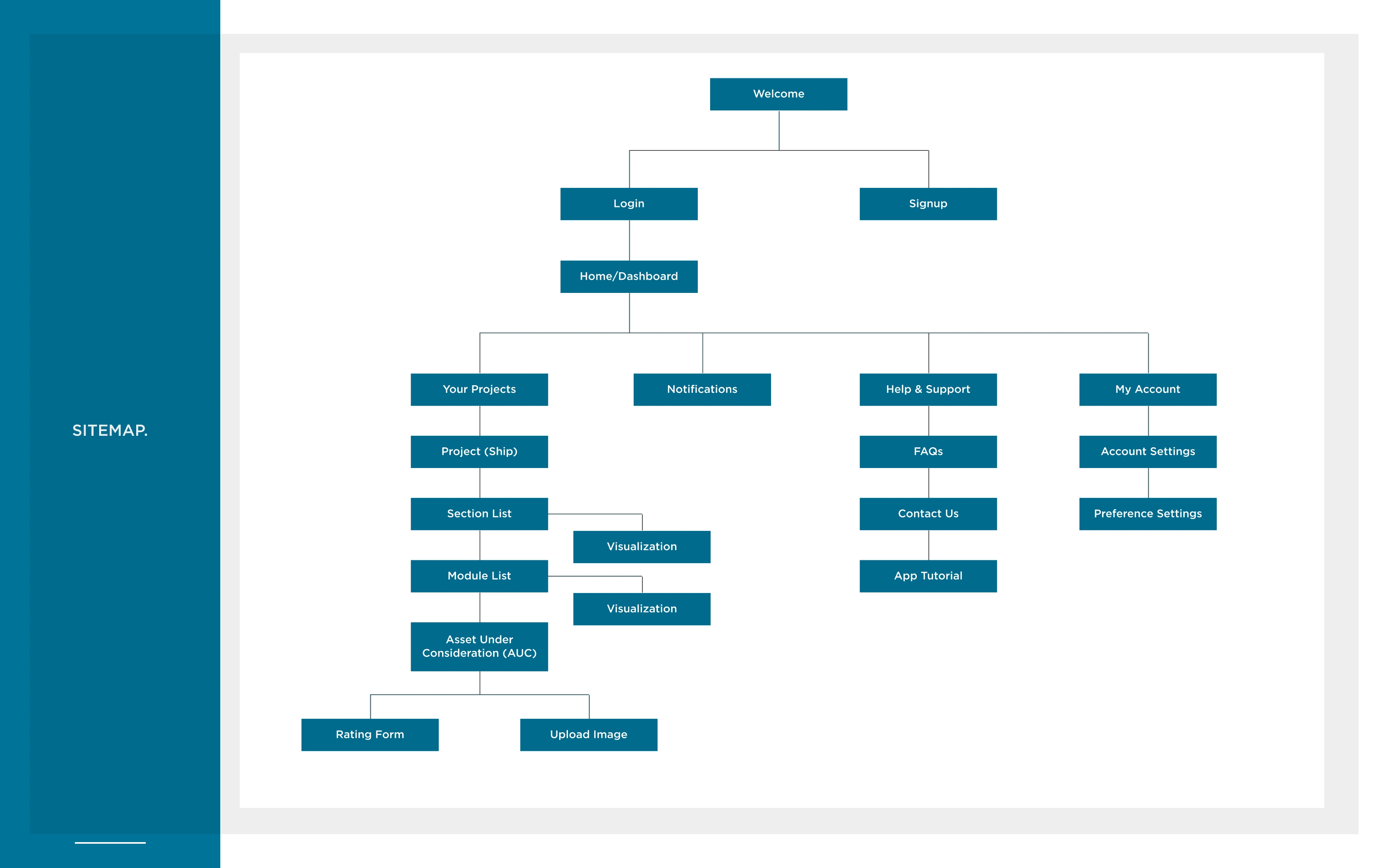
With our initial UX research and planning complete, We created a site map to outline the key screens for the MVP.
The Home Screen is a dashboard where the surveyor can see the following :
Projects Assigned to them
Last Items they were working on
Items that are marked for repair
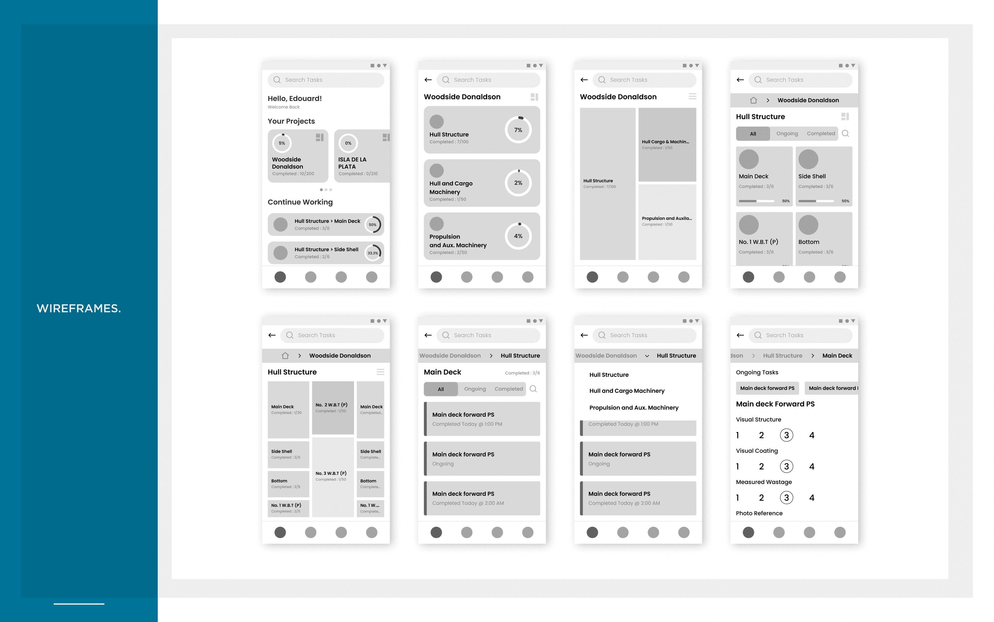
WIREFRAMES
After having an understanding of the problem statement and noting down the key pain points of the surveyors, we came up with multiple variations of Low Fidelity wireframes, after continuous iterations and meetings with the stakeholders we had the following wireframes.
UI DESIGN & BRANDING
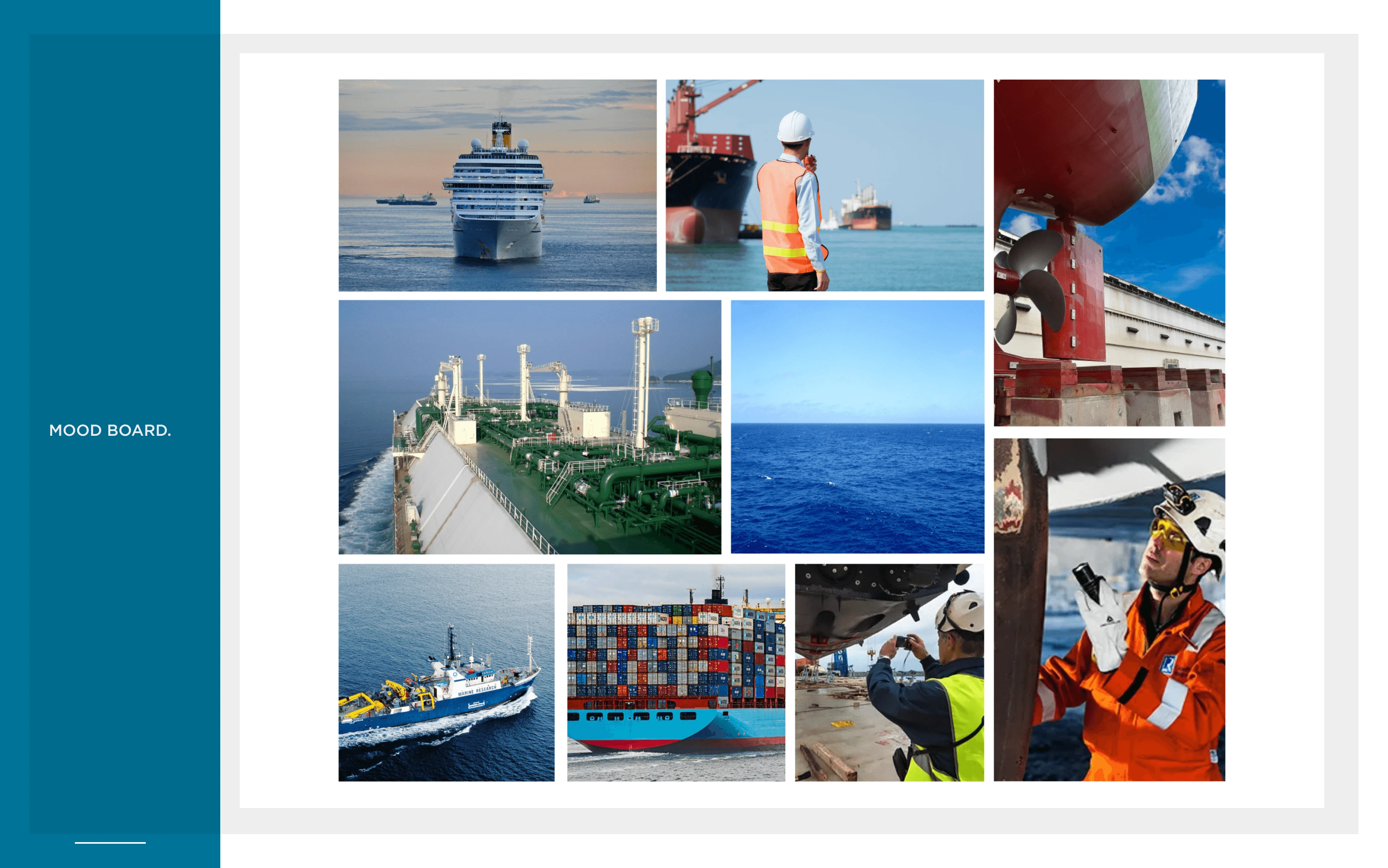
Moodboard
For Branding and visuals, We wanted to focus on the key aspects of Bureau Veritas which are Trust, Authority & Sustainability. Also as this project was focused on the Marine & Offshore branch of Bureau Veritas, the sea was our key focus.
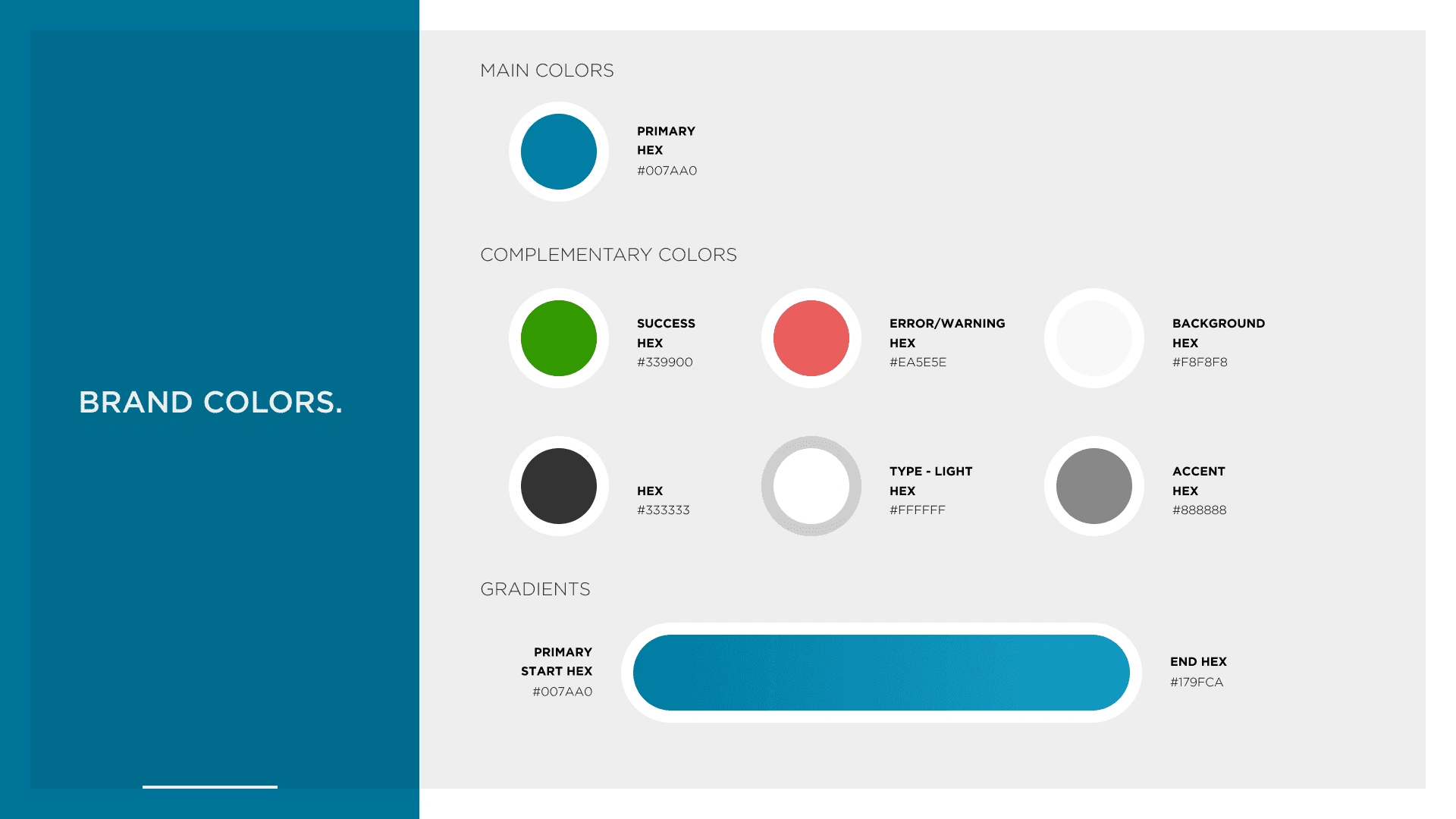
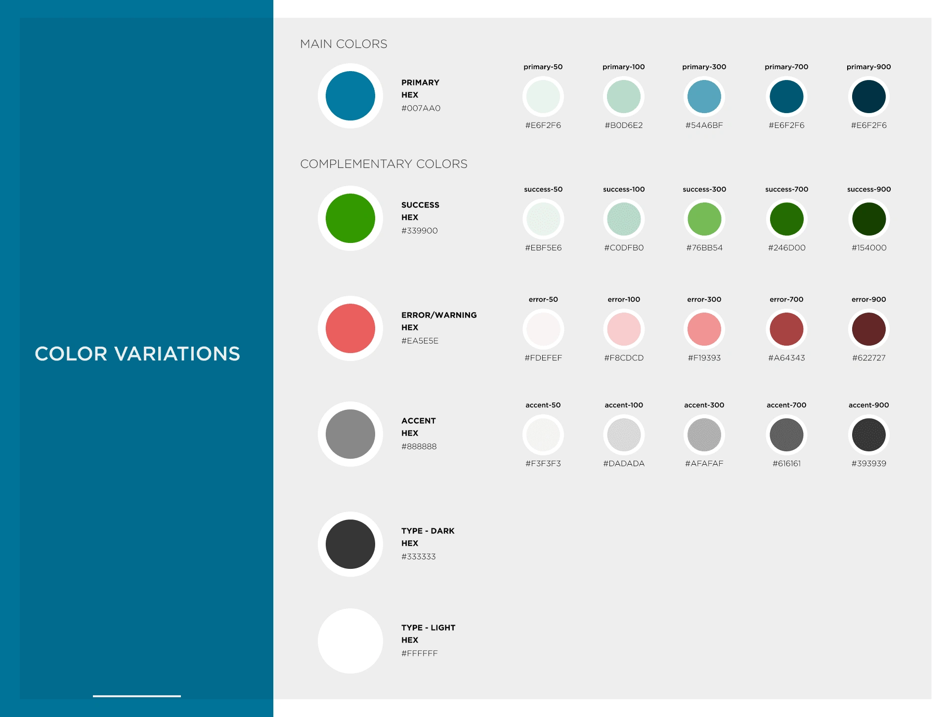
Colours
For colours we ended up choosing a dark blue shade as our primary colour as blue is associated with trust & authority, It is also a depiction of the sea. Along with we also created other colour styles and variations.
Typography
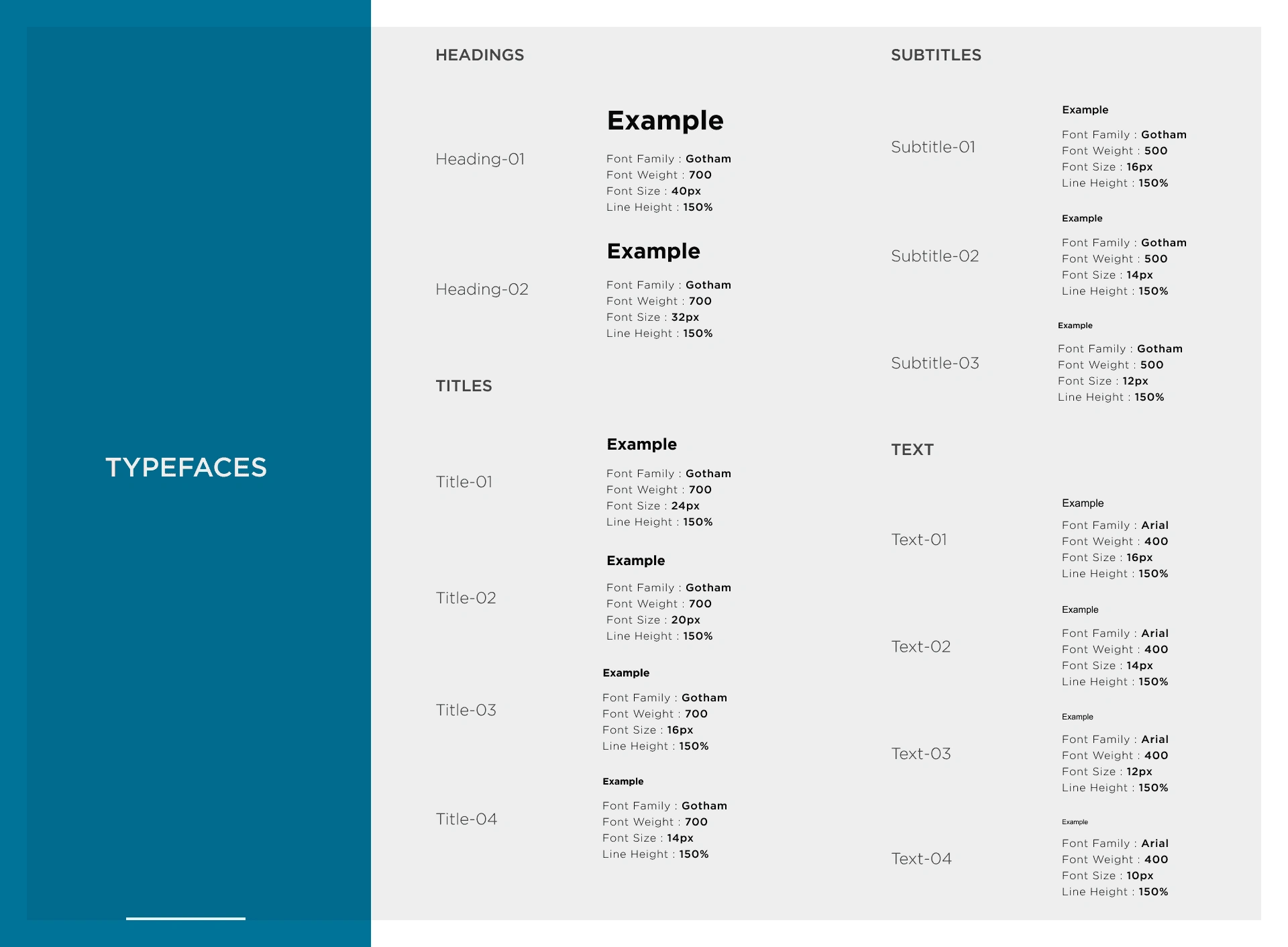
For Typeface we went with Sans Serif fonts for better readability, as this is a mobile app which is going to be used by people in their 40s & 50s having a clear font that is readable was one of the crucial requirements.
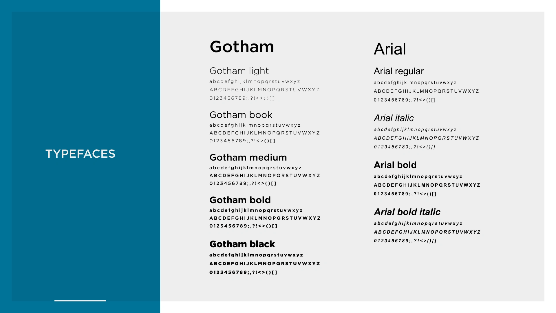
We also created Typography styles so that it becomes easier for developers and standardize the typography.
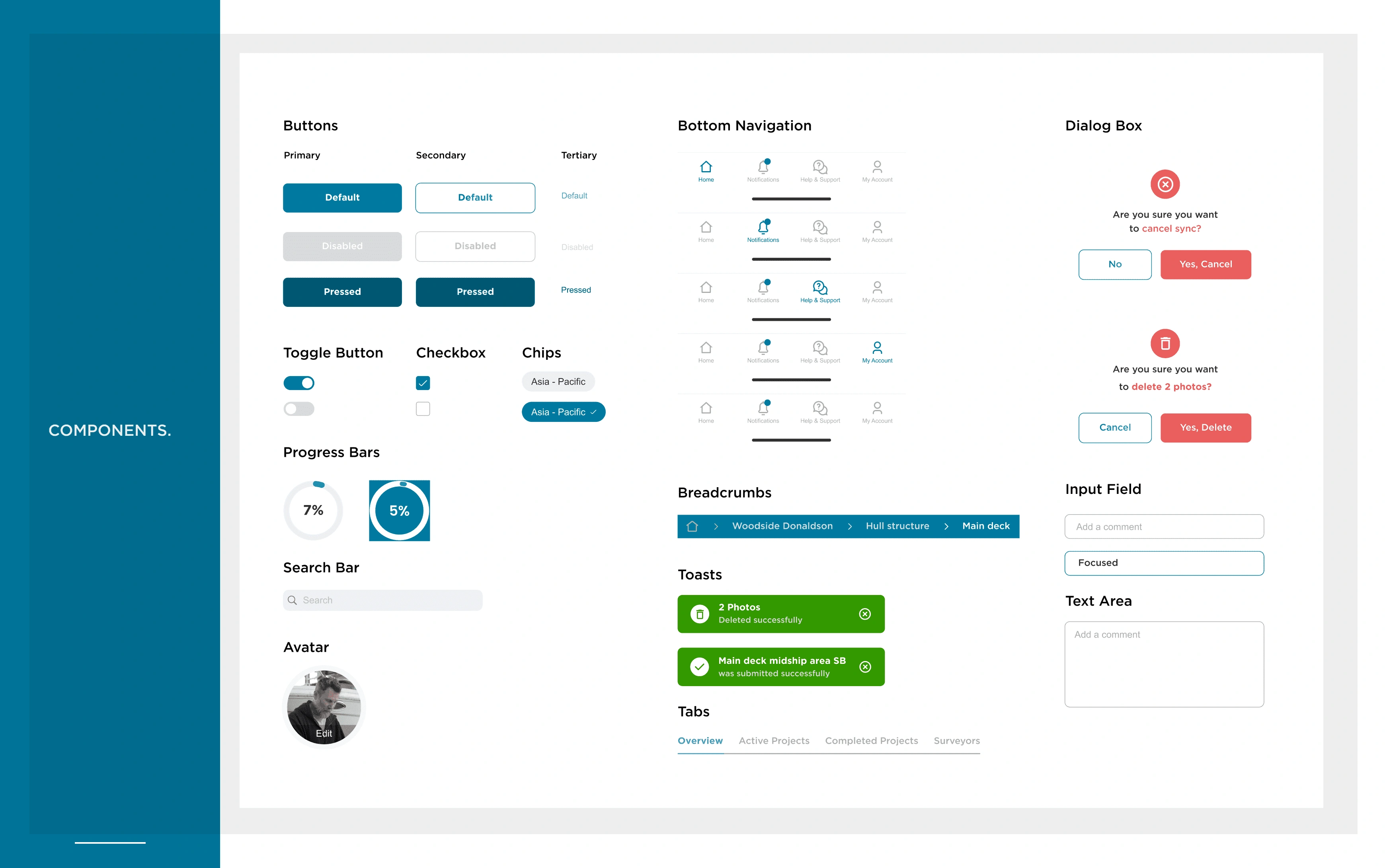
Components
Based on the style guide we created a few UI components, which will be used throughout the app.
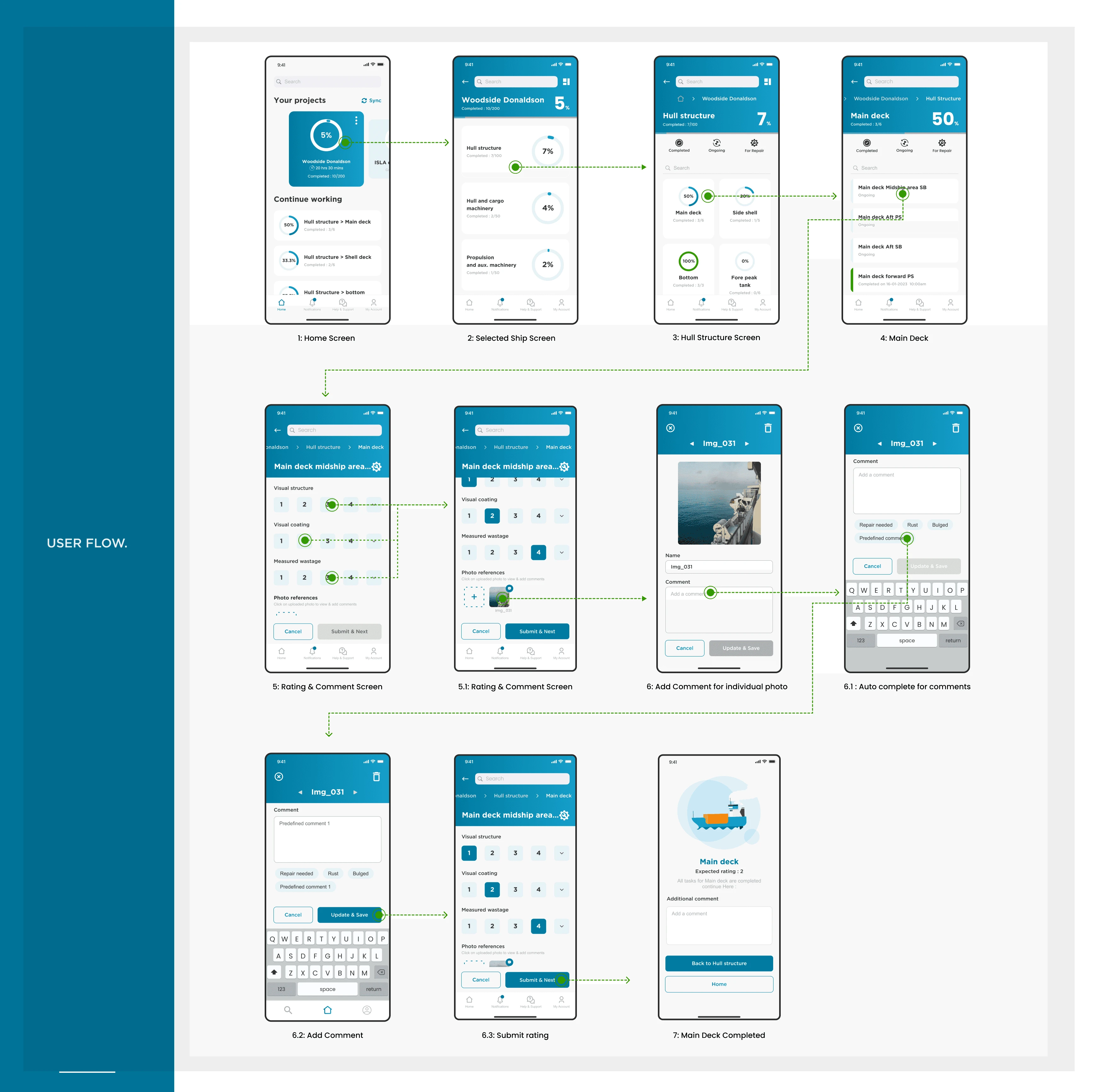
User Interface
The final user interface focuses on Bigger cards to allow for better clickability. It also allows users to jump directly from one section to another using the breadcrumbs. All the data is well organized into sections and modules so the surveyor can easily navigate through the application.
The Primary(MVP) user flow of this app looks like this :
Some of the other key screens that we made were :
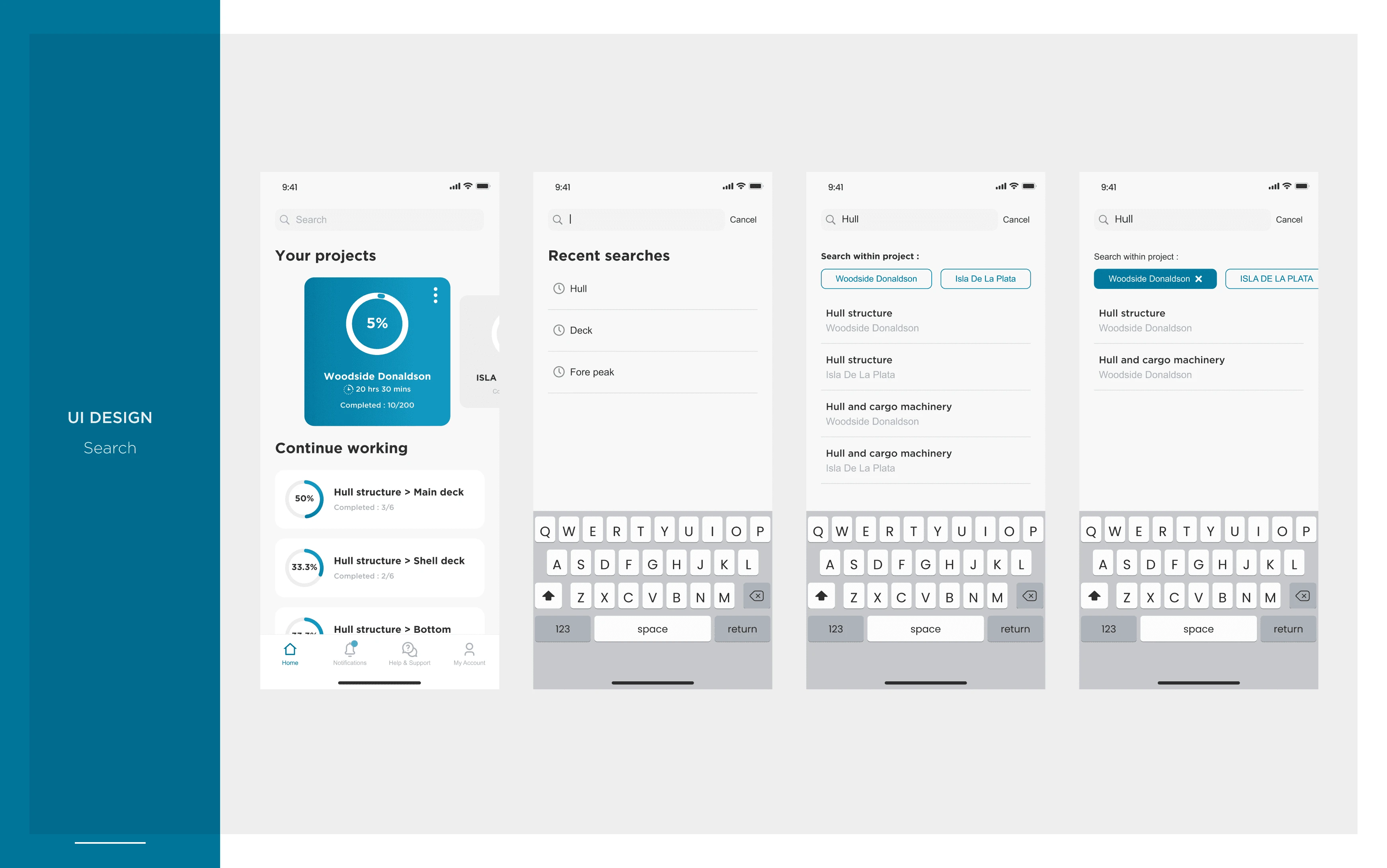
Search
Search allows the surveyors to search any area of the projects assigned to them. It also included filters so search within a specific project.
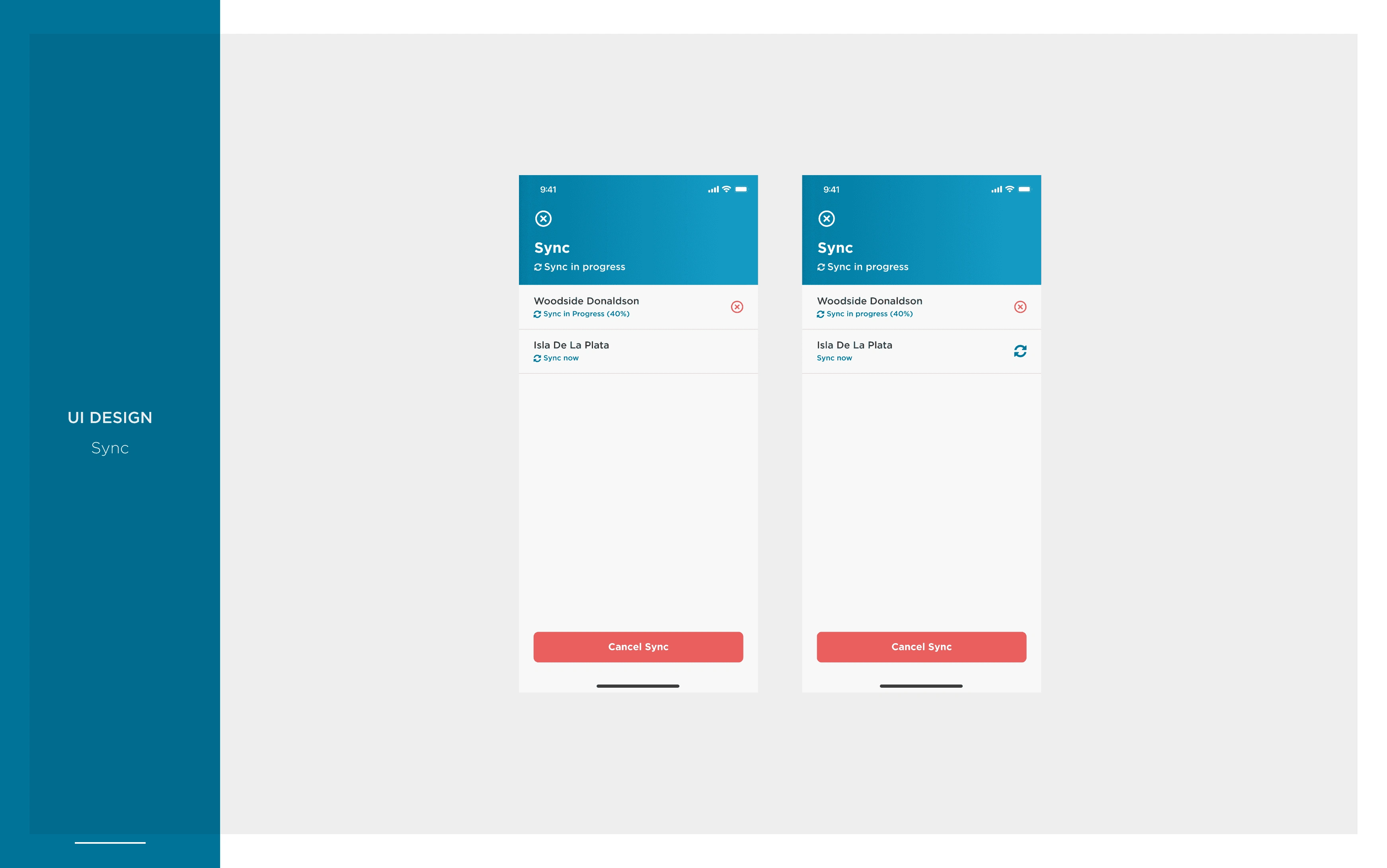
Sync
This allows surveyors to manually sync the data collected on the app with the system. Sync is also automatically started when the app is connected to the network, however, surveyors can manually start and stop sync from here.
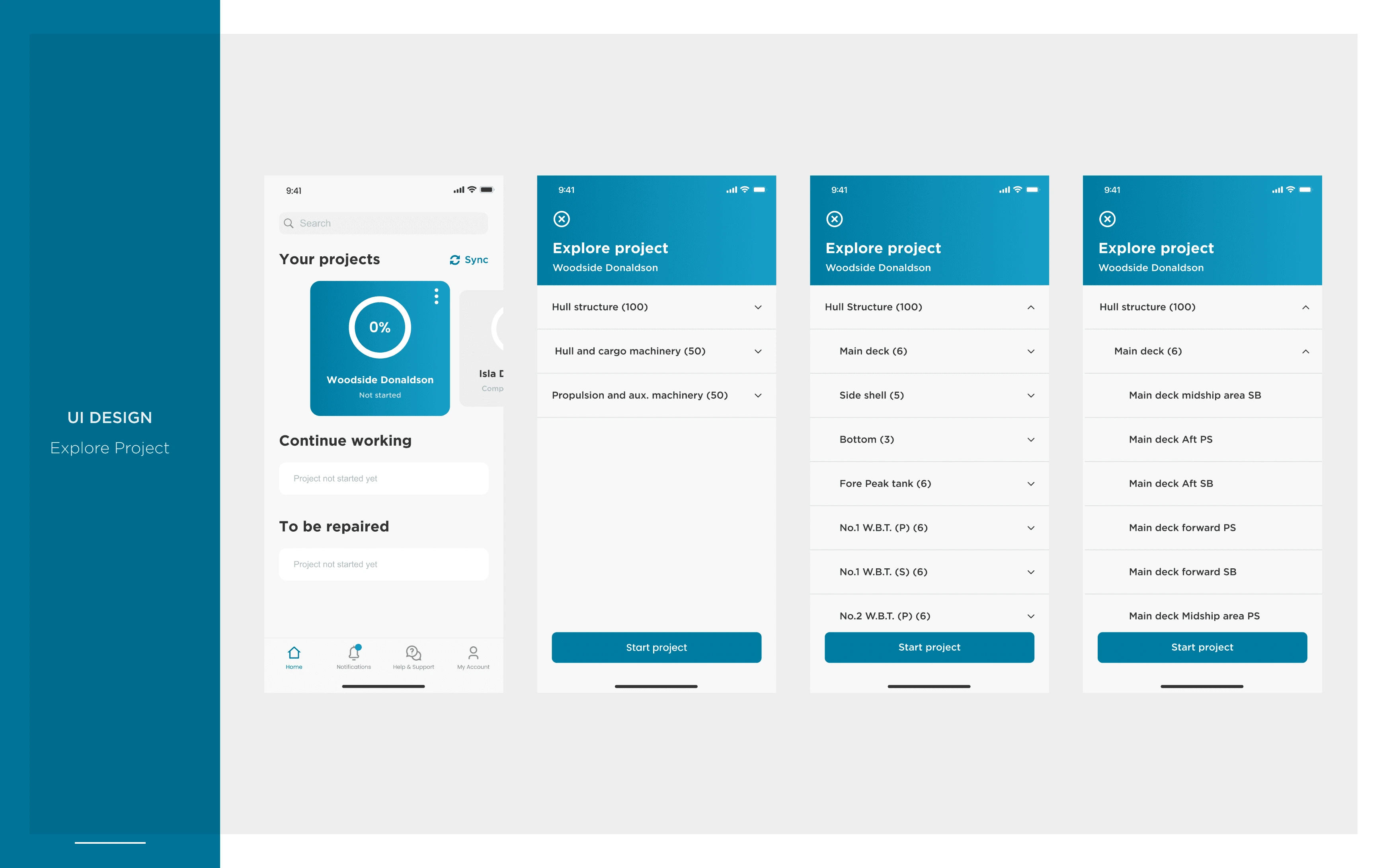
Explore Project
As projects are time-bound, before starting a project a surveyor can explore the projects assigned to them without having to start the time.
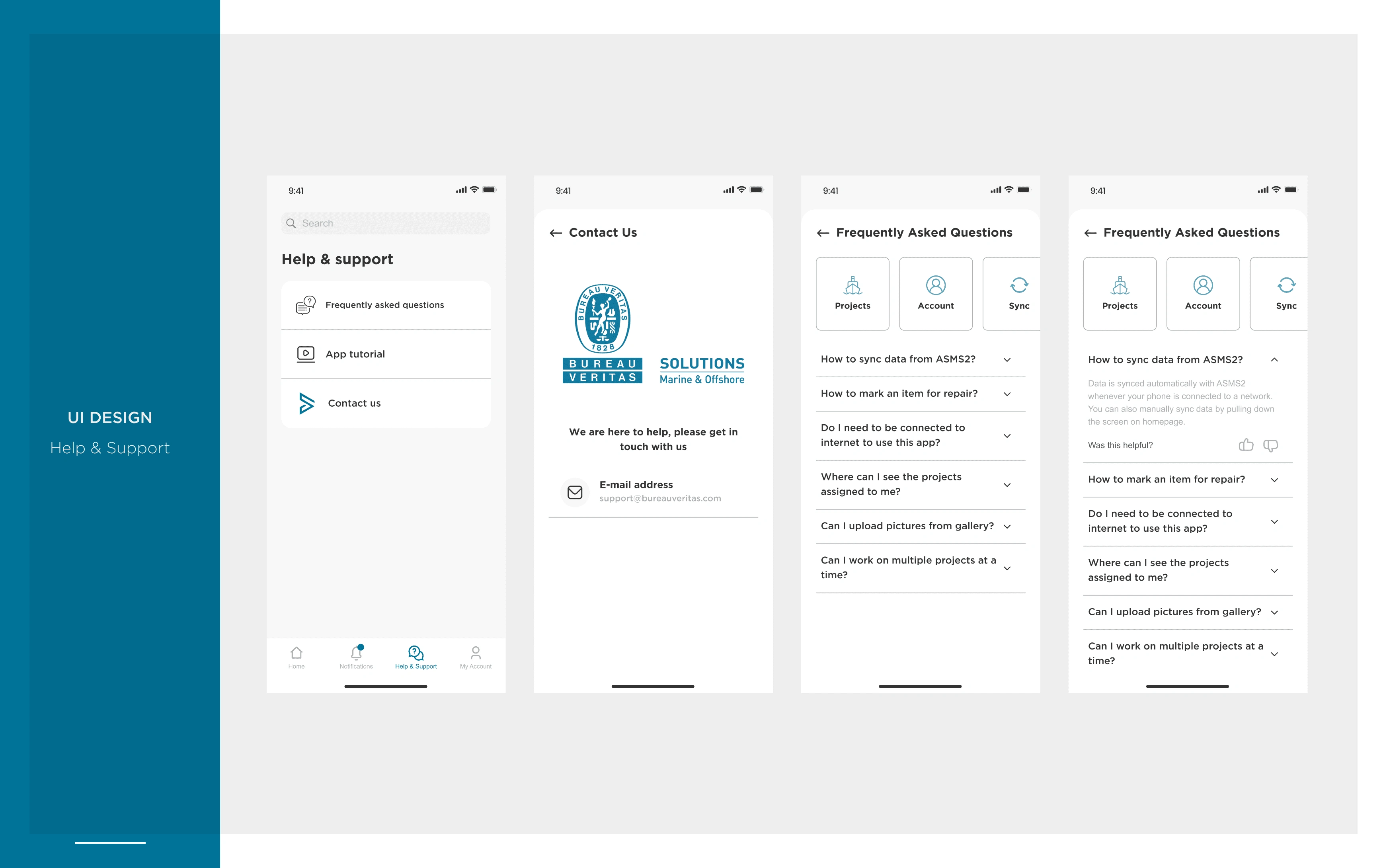
Help & Support
These sections are to help surveyors in case they are stuck within the app. It includes FAQs, App tutorials and contact information.
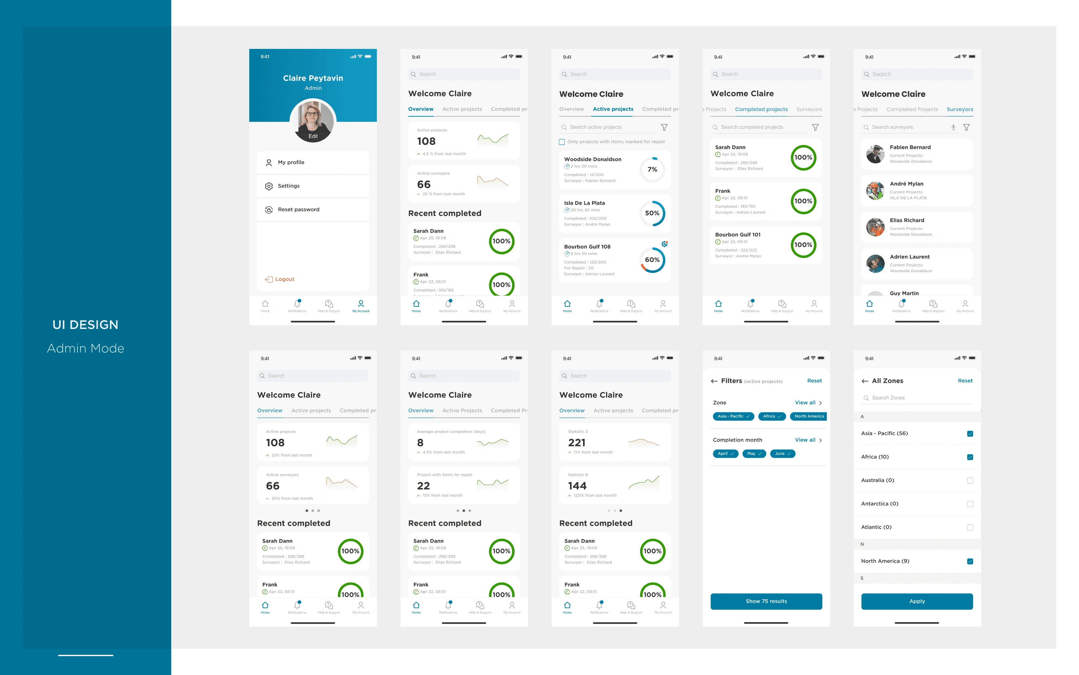
Admin Mode
This is for the admin role users who can have an overview of all the surveyors assigned under them, This includes key stats for CAP reports, Recent projects, Completed projects, Available surveyors etc.
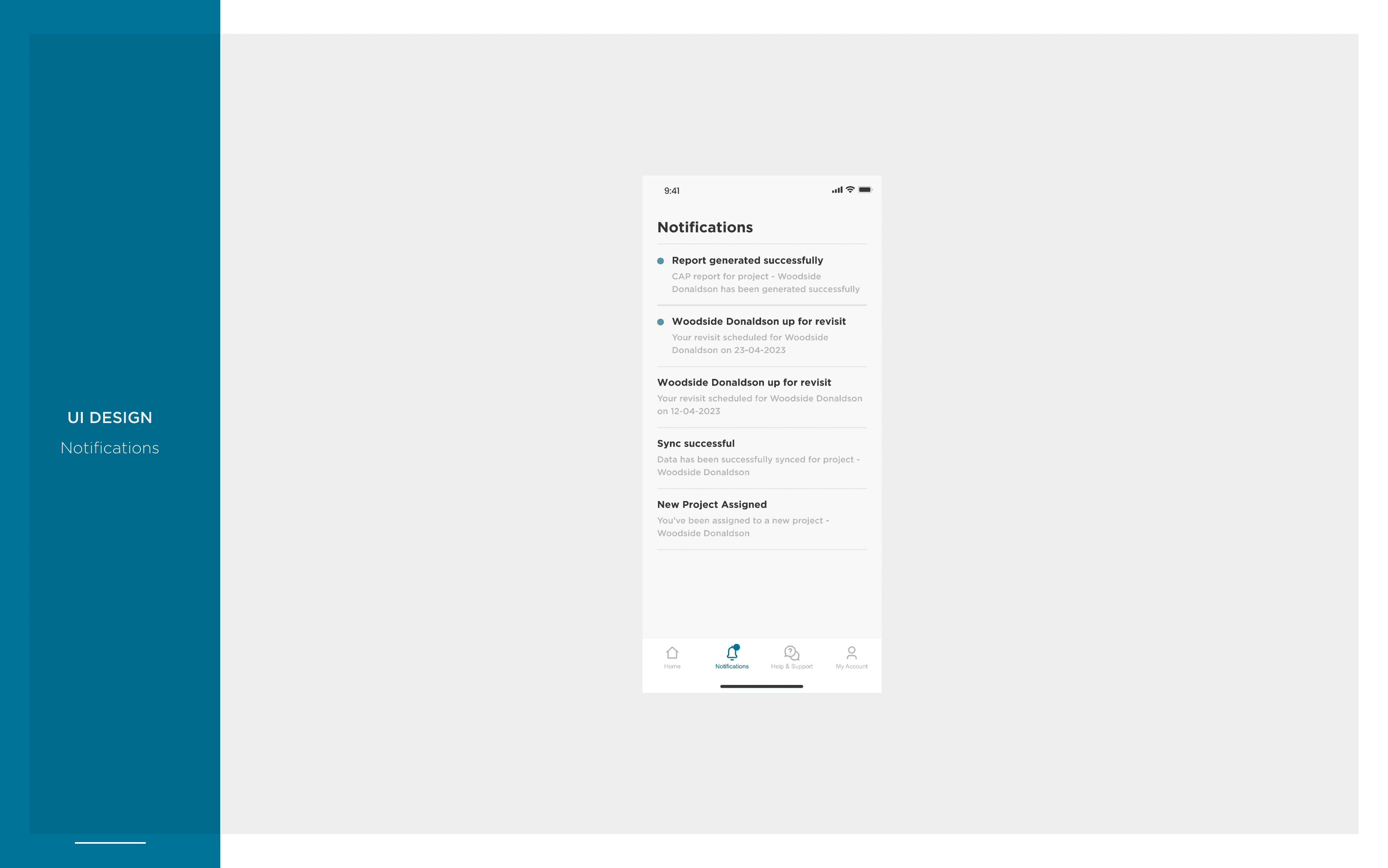
Notifications
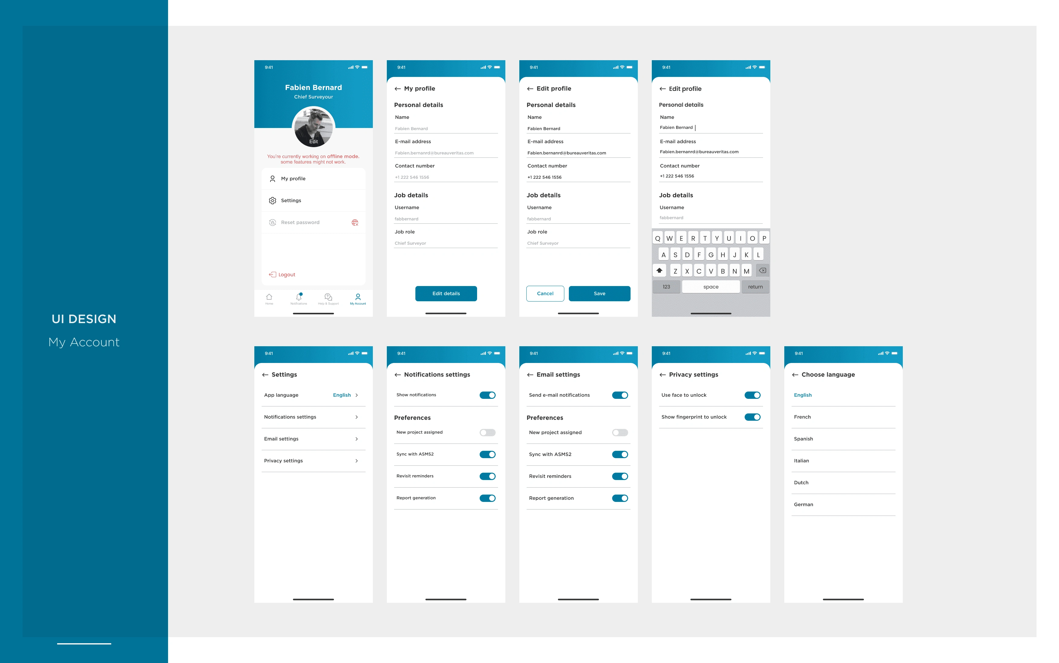
My Profile
FINAL PROTOTYPE
High Fidelity prototype of our MVP. This highlights the flow for completing a section in a ship by giving ratings and adding images for the same.
CONCLUSION & REFLECTIONS
With introduction to the first phase of the app where our key focus was to rollout the MVP to allow surveyors to digitize their workflow, we were able to achieve the following :
Reduced average survey time from 2 months to 1 week, As this app is still new there is a learning curve however as time goes by we are aiming to reduce this to 2-3 days.
Significant improvement in data accuracy & reduction in rework caused by human mistakes.
All surveyors that used the app had positive feedback and strongly agreed that this app helped them organise their work a lot better.
We were able to get the MVP in place however there is a lot to still do with the app. A few things that we had in the pipeline for the future were :
Voice-based navigation to help surveyors to navigate the app hands-free.
Real-time collaboration allows multiple surveyors to work on the same survey simultaneously.
Report generation on the fly so that the app itself can generate reports without having to rely on a secondary system for the reports.
Like this project
Posted Jan 27, 2024
Created a app that helped ship surveyors to digitize their manual process of surveying which helped in reducing their survey time from 2-3 months to 1-2 weeks.
Likes
0
Views
9
Clients
Office Veritas France