Syberion Studio
Syberion Studio is a dynamic Gen Z software studio based in Germany, dedicated to shaping the future of digital experiences. When tasked with creating their brand identity, the goal was to create something that reflected the innovative and bold spirit of Generation Z while maintaining a strong professional presence.
Logo and Symbolism
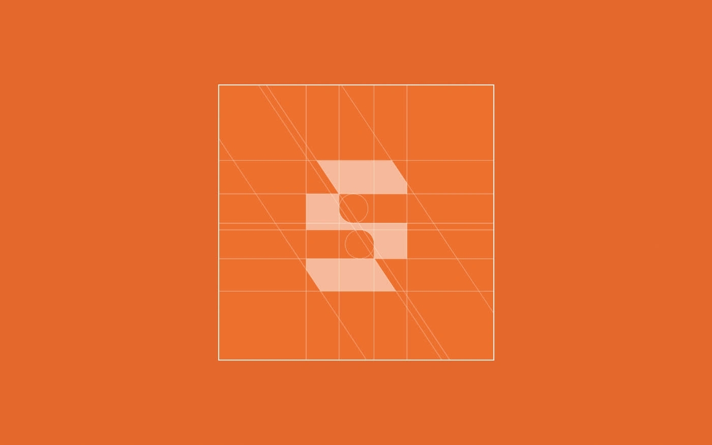
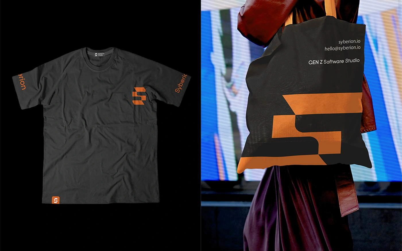
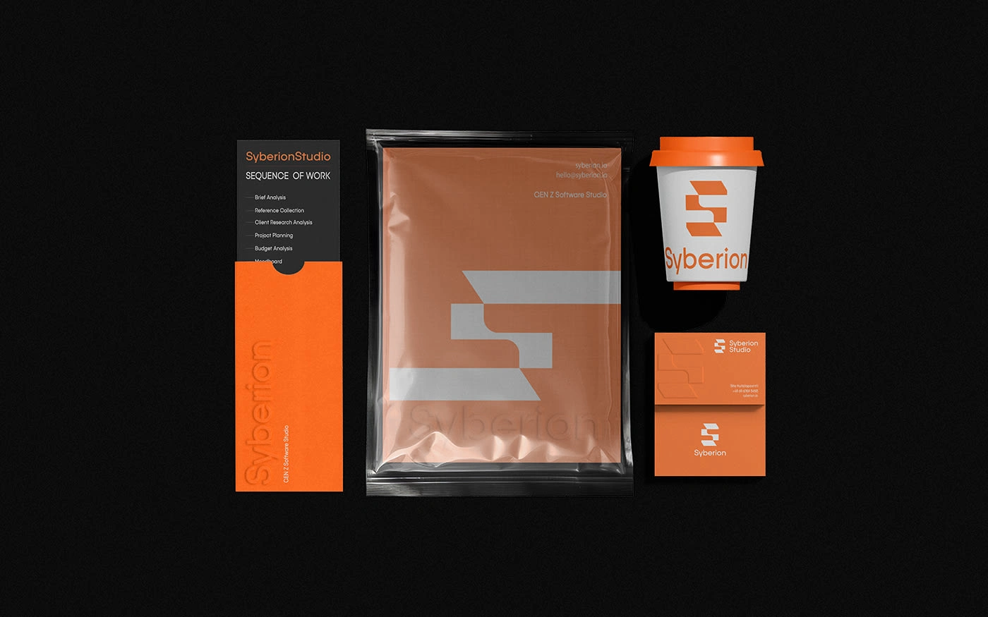
The logo design is centred around a minimalist approach, using sharp, clean lines to represent the cutting edge technology and precision that Syberion Studio stands for. Using the letter ‘S’ in a grid system, the symbol strikes a balance between modern aesthetics and functional design, just like the software solutions they develop.
Colour Palette
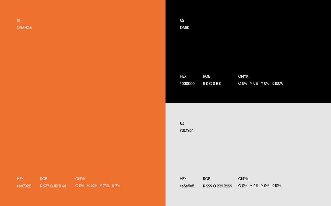
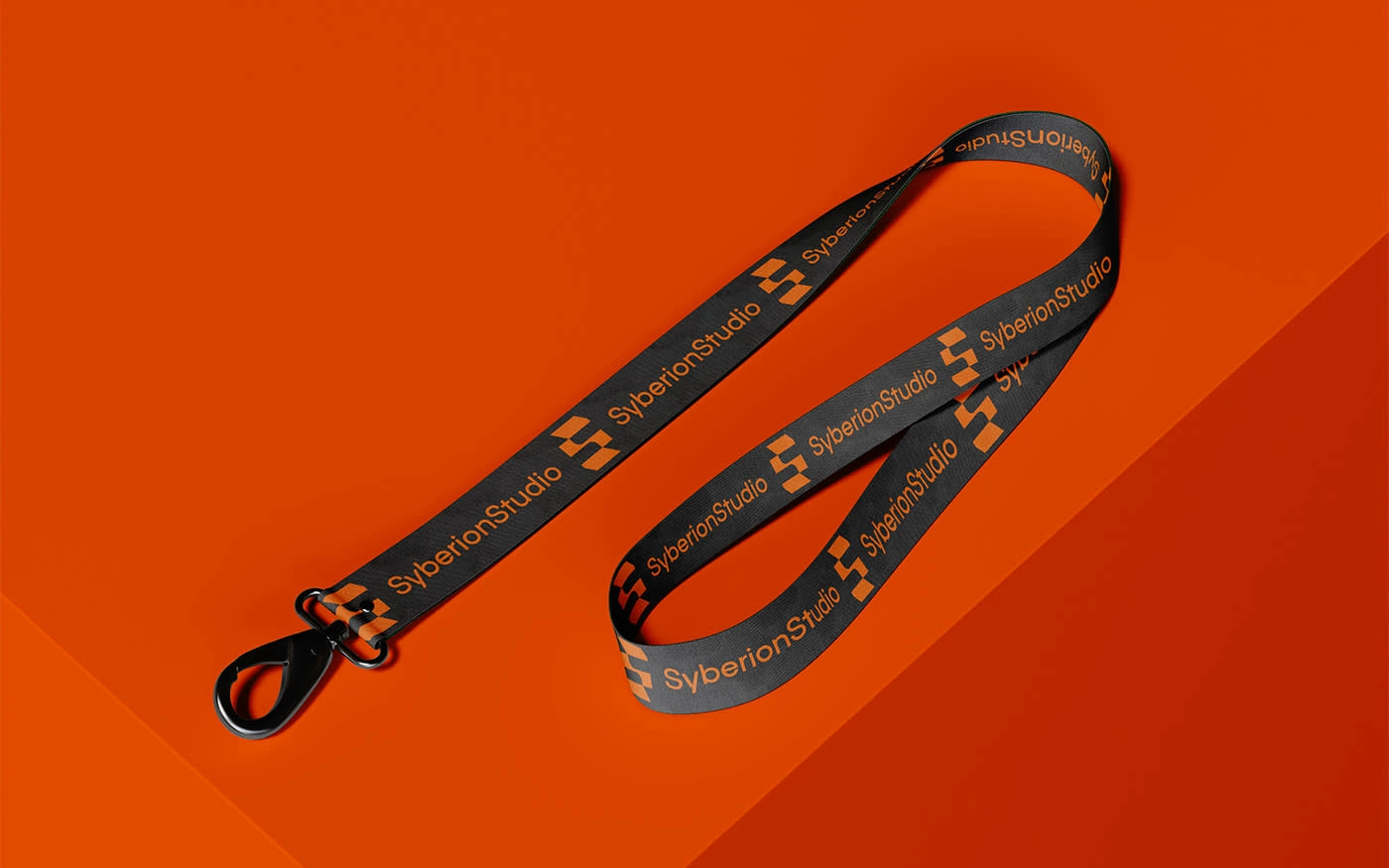
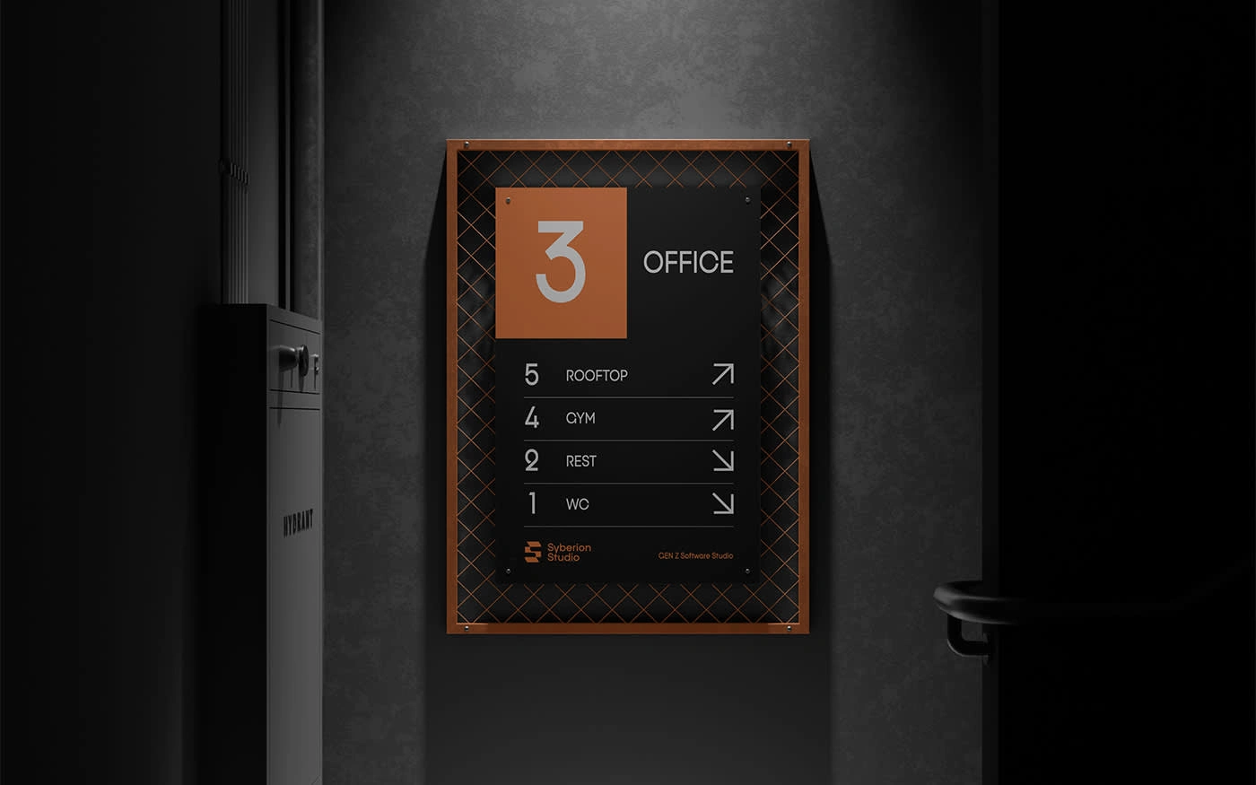
Vibrant Orange (#ed702e) reflects the energetic and forward-thinking nature of the studio, infusing the brand with a sense of creativity and enthusiasm. Paired with deep, authoritative Dark (#000000), which emphasises the studio's expertise and credibility, the palette is complemented by subtle Grey90 (#e5e5e5), which offers a neutral backdrop that enhances the overall visual harmony.
Typography
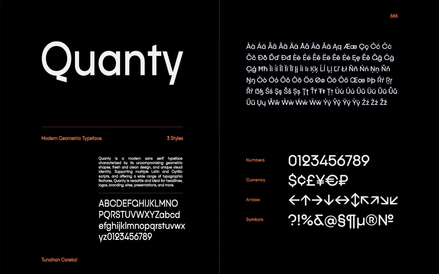
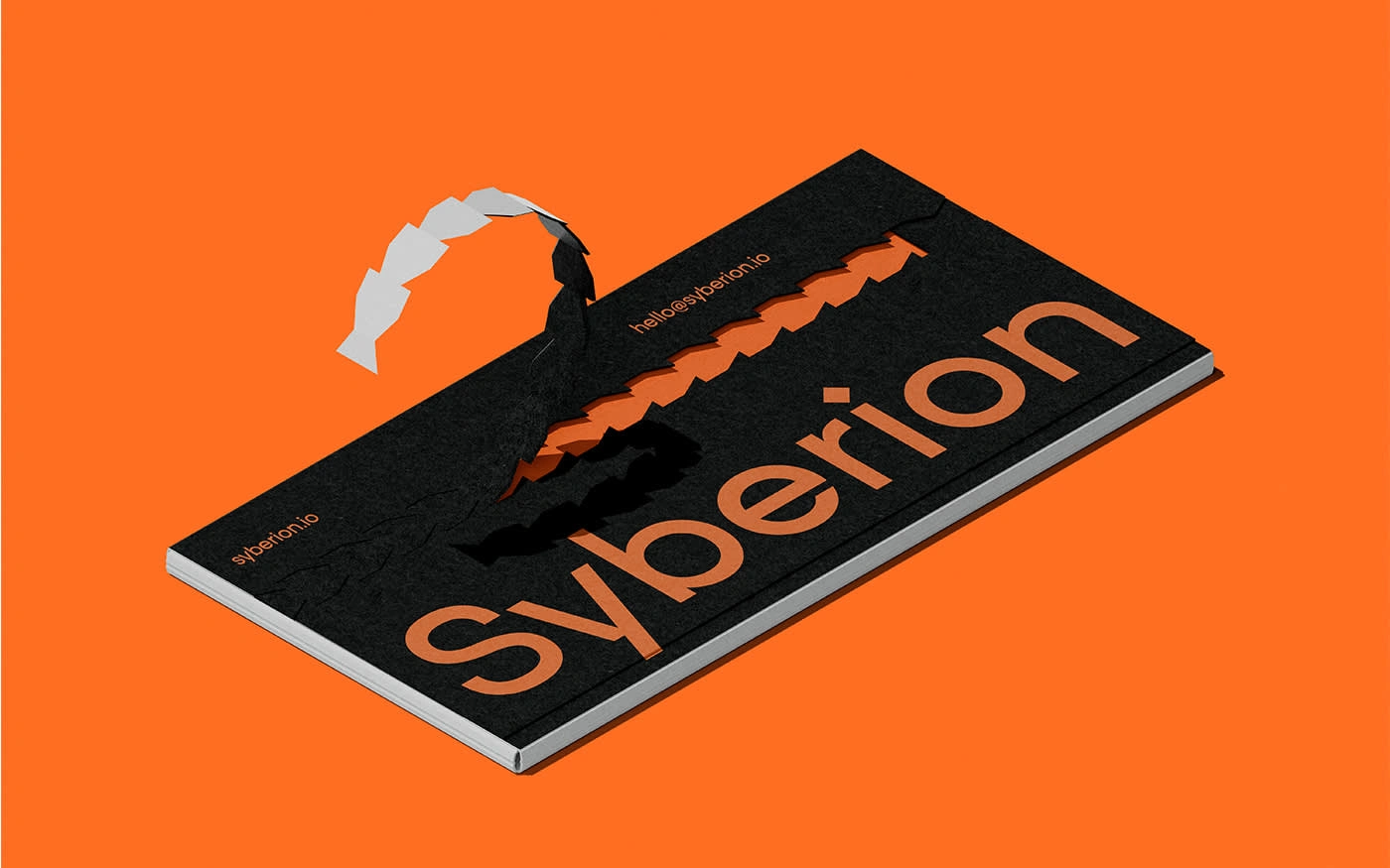
The Quanty typeface was chosen for its modern and approachable characteristics, which align perfectly with the studio's focus on innovative solutions and youthful energy. The clean, sans-serif lines of the font contribute to a brand identity that is both contemporary and timeless.
The resulting brand identity is a strong, cohesive representation of Syberion Studio’s commitment to pushing the boundaries of software development. It’s a bold statement that aligns with the studio's vision of driving innovation and delivering exceptional digital experiences.
Deliverables
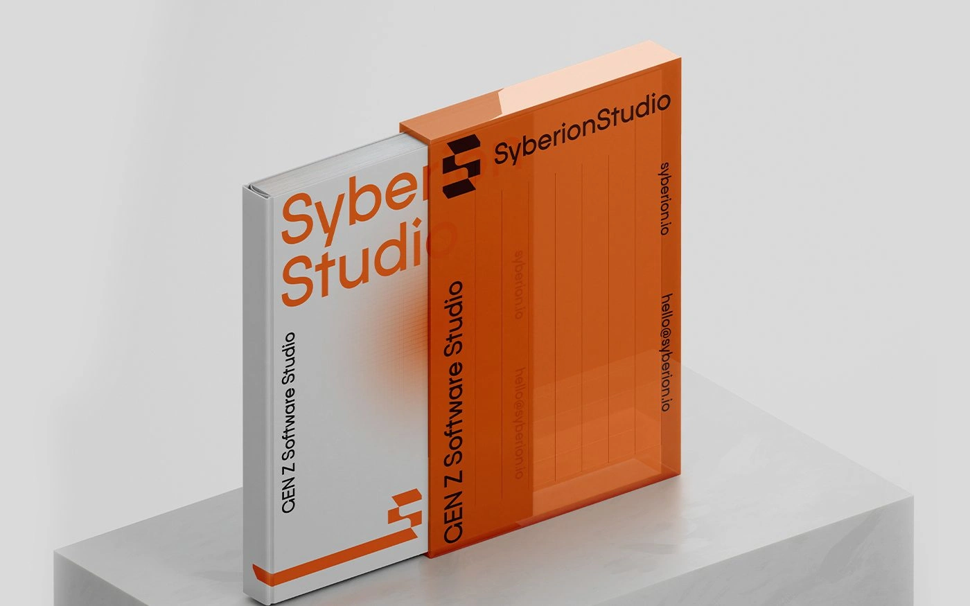
Branding, Art direction, Stationery.
Client: Syberion Studio
Year: 2024
Thank you!
Syberion Studio Branding, Art direction, Stationery
Like this project
Posted Aug 15, 2024
Syberion Studio is a dynamic Gen Z software studio based in Germany, dedicated to shaping the future of digital experiences.


