Website Design for a denim brand

Martina Manca


Disclaimer: This is a passion project. I invented a brief for a denim brand to create the official website.
The brief
Company Name:
Center Yolk
Company Description:
We are a fashion company that sells modern jeans. Our items are made with high-quality materials and are shipped directly to your home. Our target audience is young adults. We want to convey a sense of power while at the same time being old-fashioned.
Job Description
You must create a website that will mainly provide information. The goal is to increase search rankings. Besides the landing page, the website will need an information page, a shop page, and a blog. The landing page should have a Contact Us section. There should be a call to action to get users to order a free sample. They would prefer an old-fashioned design and would like you to use the brand color, white. Take into account the client's preferences and values.
The BTS
Brainstorming phase
Looking at the brief, I have to create a 4 pages website. So, I started with the company's strong points and the target audience. I knew that the main focus of the communication had to be on high-quality materials, the empowerment of the design, and the old-fashioned vibe of the brand. These elements perfectly align with the target audience because young adults care greatly about high-quality fashion and reaching the old-money aesthetic.
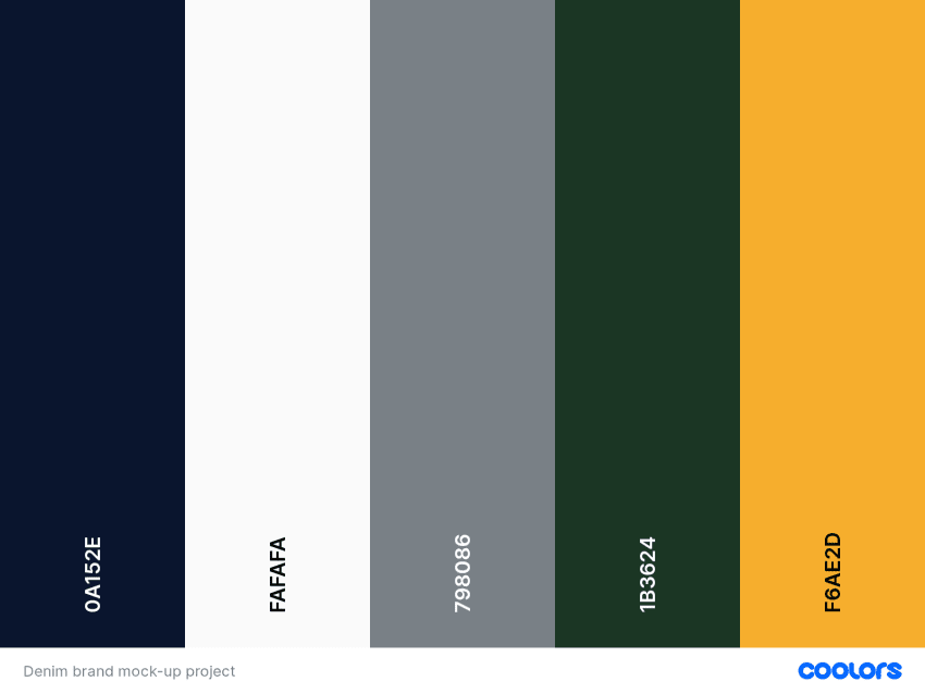
Moodboard and the creation of the color palette
The second step is one of my favorites because I love creating mood boards and color palettes. I used Pinterest for the mood board and Coolors for the color palette.
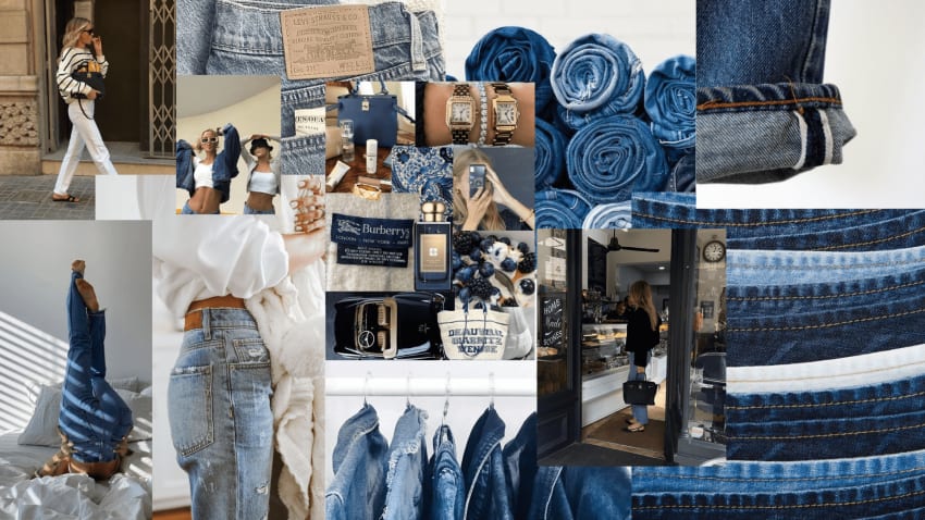
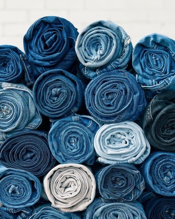
This moodboard highlights that a great pair of denim can make you feel confident and beautiful no matter how you style them. If you find the perfect pair of jeans, this is a timeless staple in your closet.
From this moodboard, I went to Coolors to create the perfect color palette that could enhance the brand color, white. The following colors are perfect for expressing the old-fashioned vibe of the brand, highlighting white, and communicating the product effectively.
The website draft
I love creating my drafts on paper with a pen. My brain works better if I can go with the flow of my mind on a piece of paper. So, I drafted the website pages in my notebook accordingly to the brief. Then, I went on Squarespace to check if it worked.
The final product
You can find the final product at the link in the caption below. In addition, the final website is responsive to different devices (i.e., the About us page screenshot is taken as if it was on a smartphone).
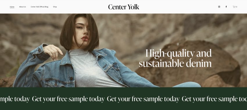
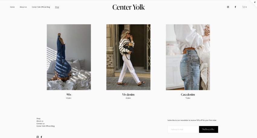
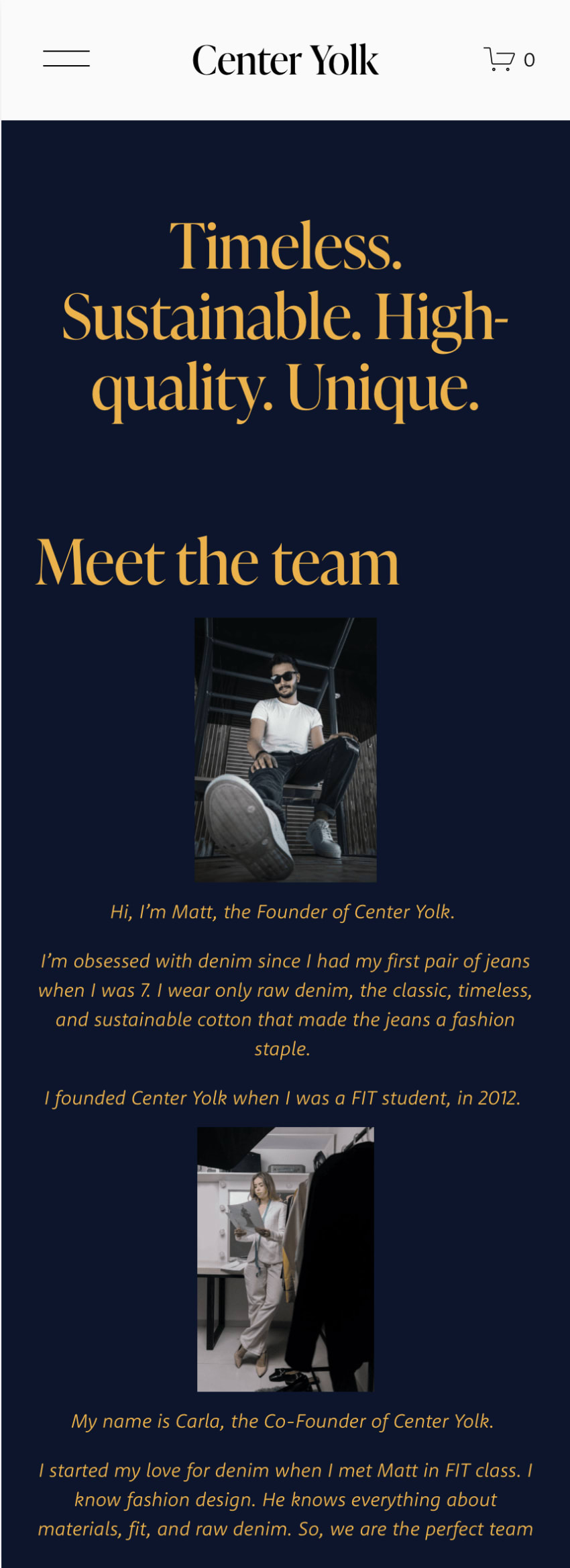
Since I didn't have the texts and the images for the website, I used Pinterest pictures from the moodboard and some royalty-free photos from Unsplash. For the texts, I wrote everything by myself, starting from the initial brief. I even invented three name products, the team names to make the website feel as official as possible.
I worked for three days and am in love with this website. What do you think?
Reach out to me if you want to create your website with Squarespace!