IW Capital UX+UI Designs
Chelsea Morgan
Digital product design + Icon design + Branding + UX
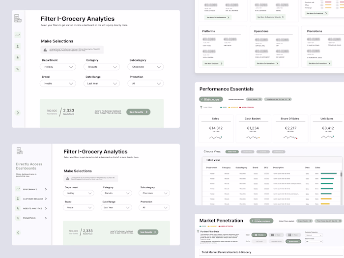
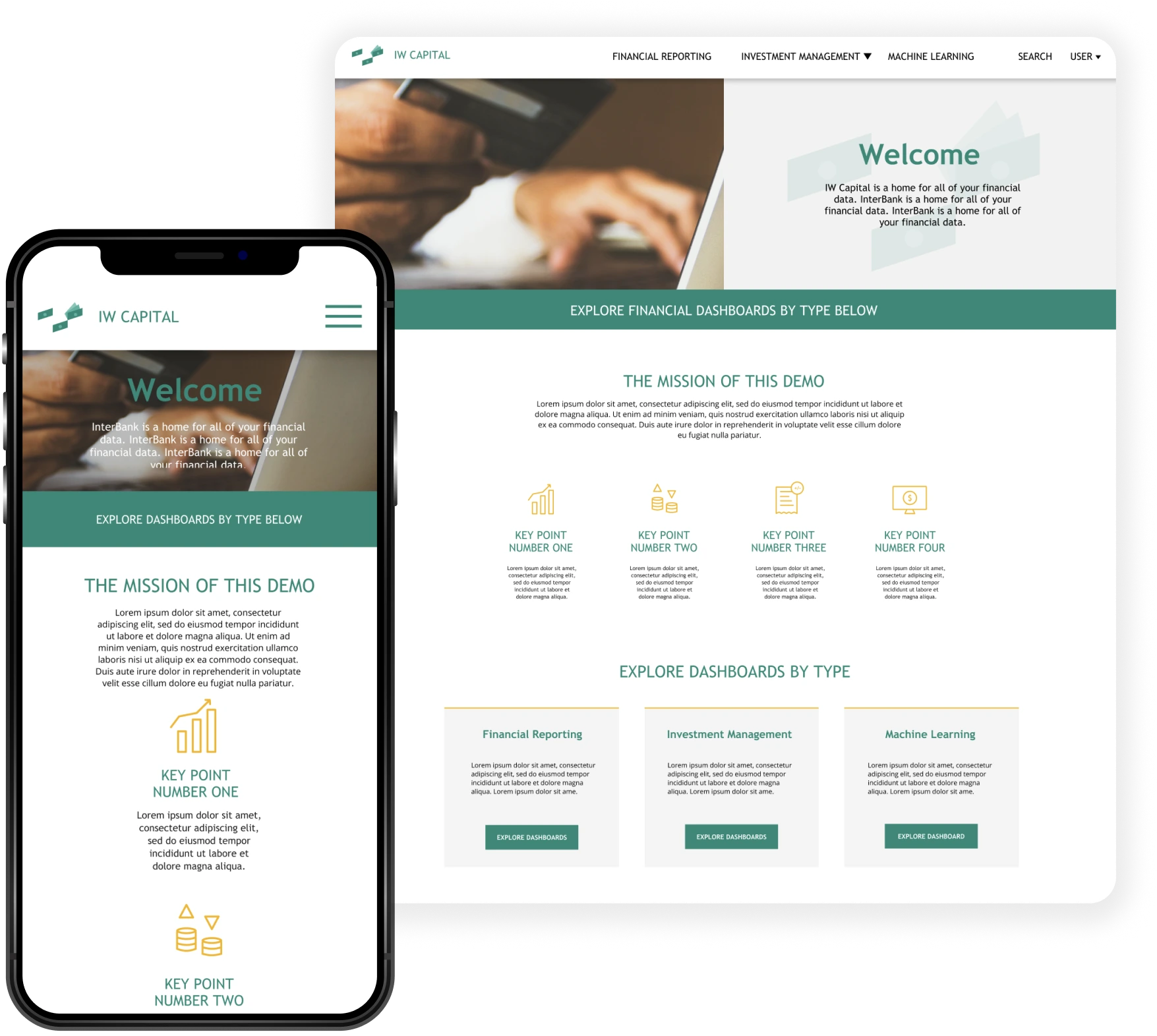
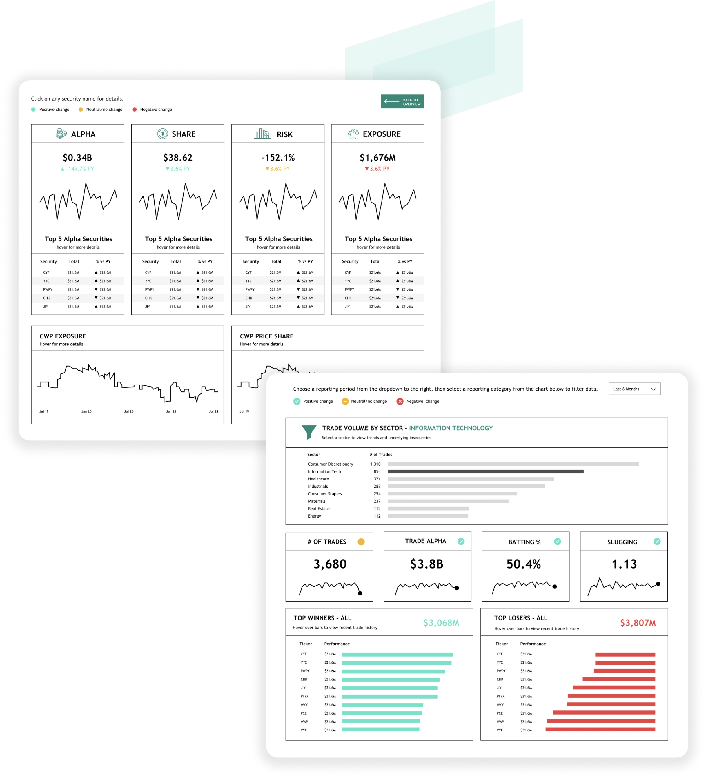
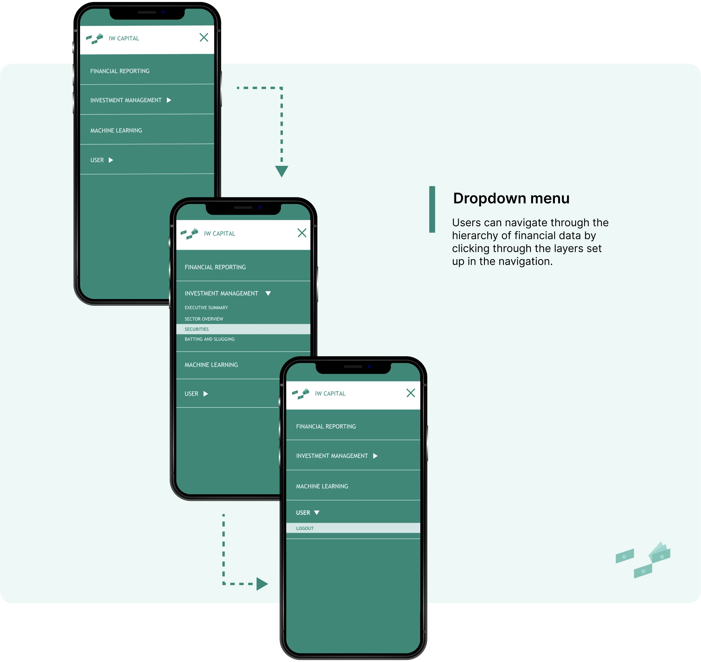
A selection of screens from the data visualizations and website I designed for IW Capital. These digital products display financial data in a modern and user-friendly way, and you can see the visual hierarchy, typography, and color choices I made to create consistency, clarity and a better user experiences overall with this dataset.


The Re-design Process
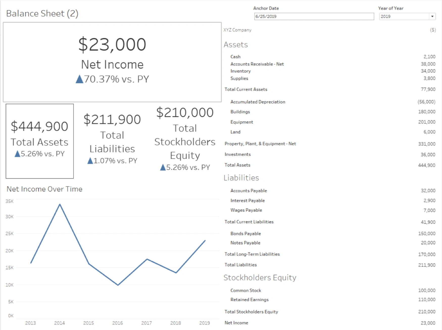
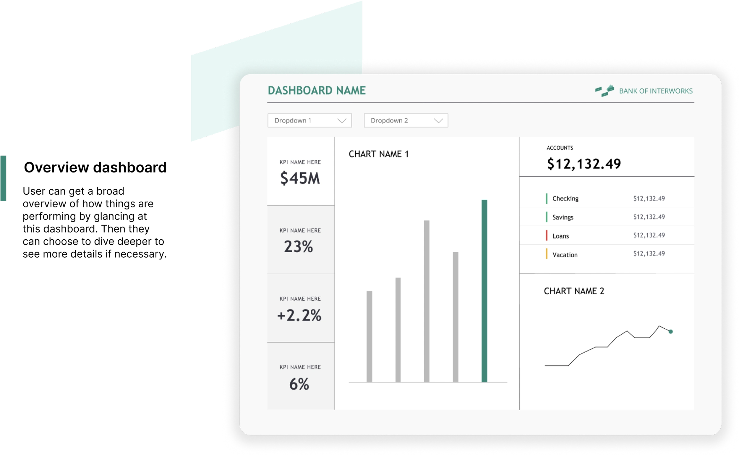
Before: Balance Sheet Dashboard
This was a dashboard someone sent seeking feedback before it was added to the IW Capital microsite and I sent them the below re-designed version to update it. This is one of 2 forms dashboard design work usually takes (the re-design) - the other is designing from the ground up with only data and UX consultations to go off of. Both can be equally rewarding.
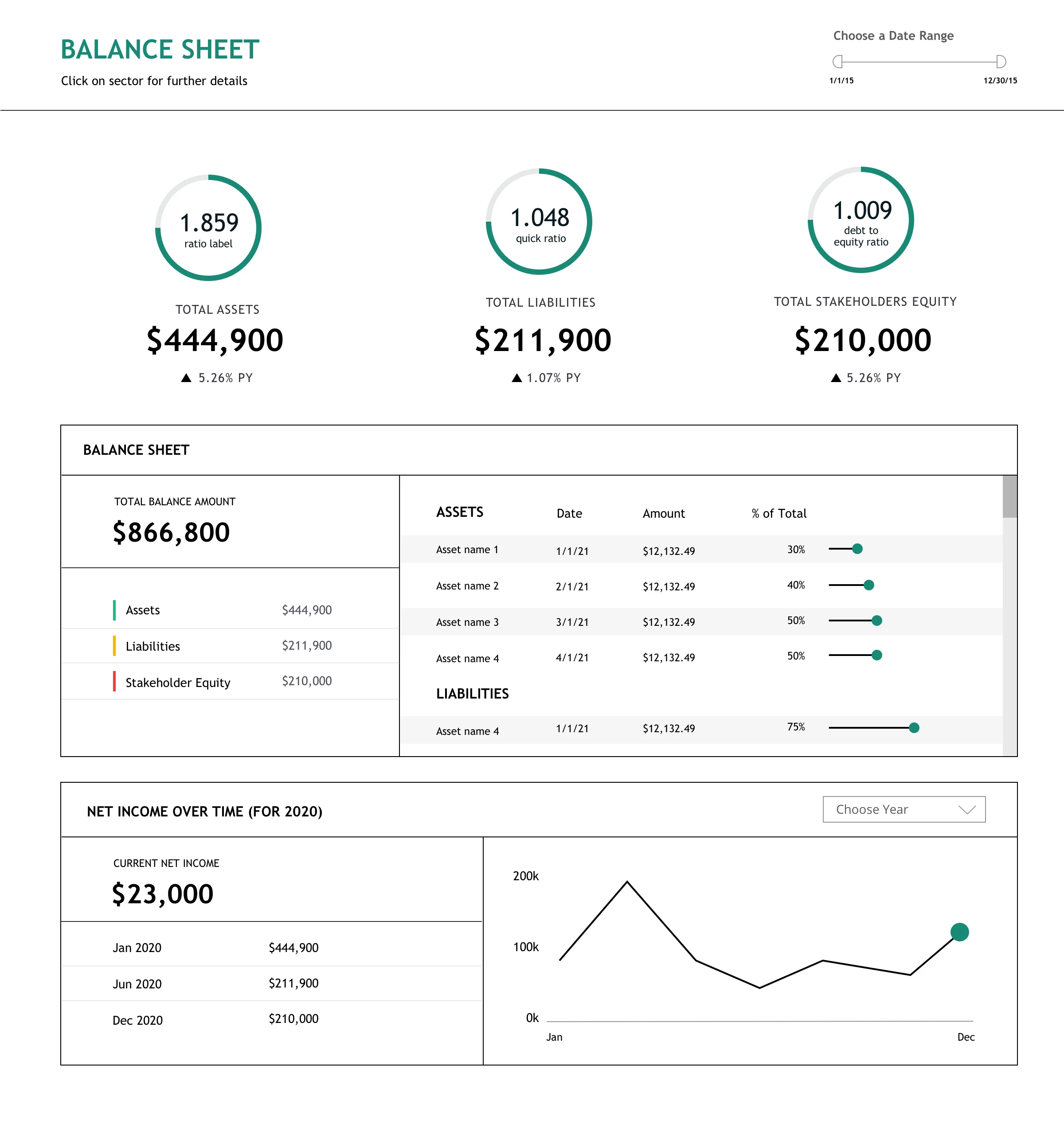
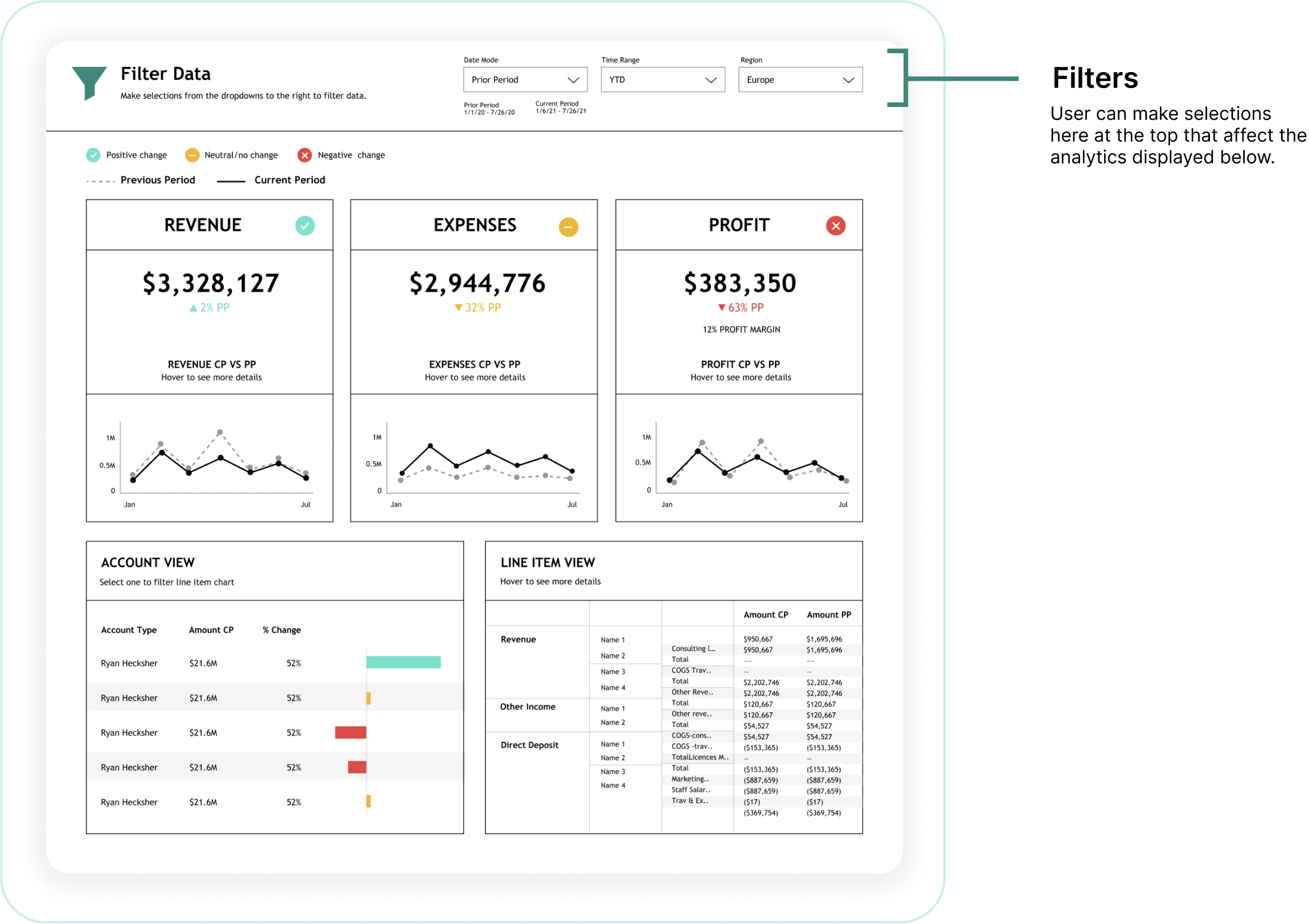
After: Balance Sheet Dashboard
This is the re-designed version I created, focusing on making the hierarchy of information clear, making more white space so it feels less cluttered, and aligning it with the rest of the microsite’s styling. A crucial piece of the puzzle when working with data visualization is making sure that color is used with intention to indicate something to the user, and sparingly so it guides and directs the eye around the page. I think when we make improvements like this we are making a more intuitive and less stressful experience for our users.
Like this project
Posted Jul 22, 2024
Digital dashboards housing financial & banking data; UX/UI design