Logo Redesign

Nabneet Rana

1. Project Overview
The brand wanted a better design that should portray the meaning and also should be more aesthetic and appealing to the user of the website.
2. Problem & Solution
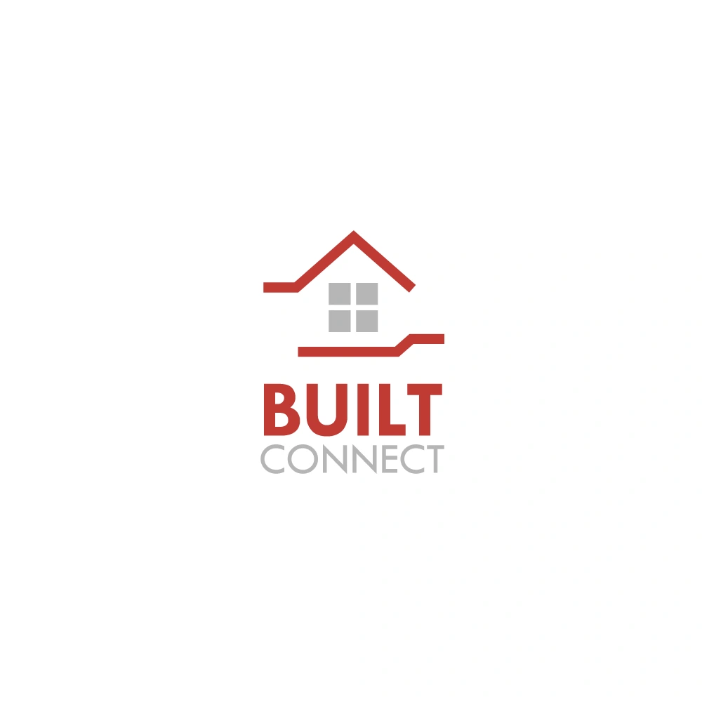
The problem with the last design was that it was really broad. It looked like it was stretched and didn't really portray the meaning to the user. So I simply redesigned the basic look of the logo. I used simple lines to showcase hands forming a house and made the logo more square instead. I kept the same colors as the old logo had which were the actual colors of the brand.
3. Results
The client was speechless after he saw the drastic change between the two logos and asked me to do some more design work for him.
Like this project
Posted Apr 2, 2021