2022 Work Sample #2
Brief Project Overview
I redesigned a training website for a prior client in the proptech industry. The training site is tailored for agents with busy schedules and serves as a self-paced training resource, divided into different modules that teach agents how to use the software and explore its numerous features.
User Persona
Realtor Client
This realtor is busy and needs to be able to navigate the system easily.
The realtor may or may not be tech-savvy so the writing must be direct and avoid the use of tech jargon.
The realtor has never used the software before so detailed instructions should be included with screenshots and other visuals.
UX Research
Scheduled 1-hour stand-up with a group of realtors who are currently using the platform to learn the software.
Asked the following targeted questions to discover the user's pain points:
How would you describe your current experience using the eLearning platform?
What would you change about the platform?
What would you keep the same?
User Pain Points
The platform is too text-heavy for realtors who hate to read long pages of information.
There are little to no graphics for visual learners (i.e., screenshots, tables, videos).
The pages focus on bulleted definitions instead of step-by-step instructions for new users.
Although there are section headers the content isn't arranged to follow any particular work flow.
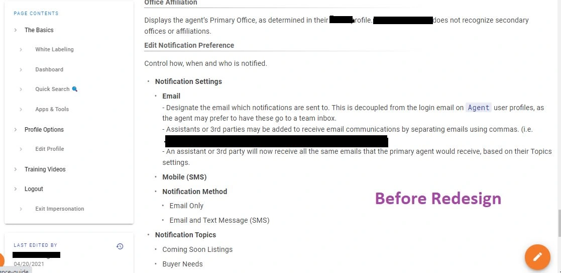
This screenshot serves as an example of the platform's original design.
My Workflow
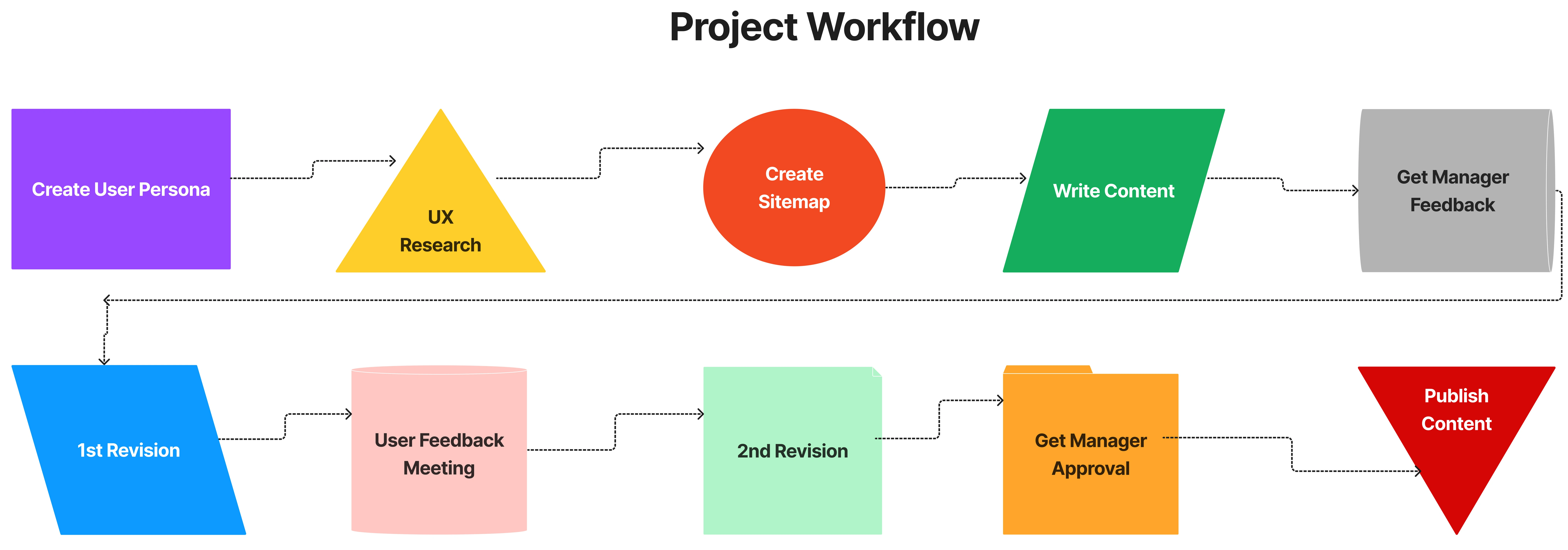
Created using Figma
My Goal
When I redesigned the site my goal was to educate the user in a robust way without overloading them. I created tables, utilized screenshots, and reorganized the modules so that the information could be displayed in a clearer format. Each module flowed into the next and mimicked a new user's experience using the software for the first time.
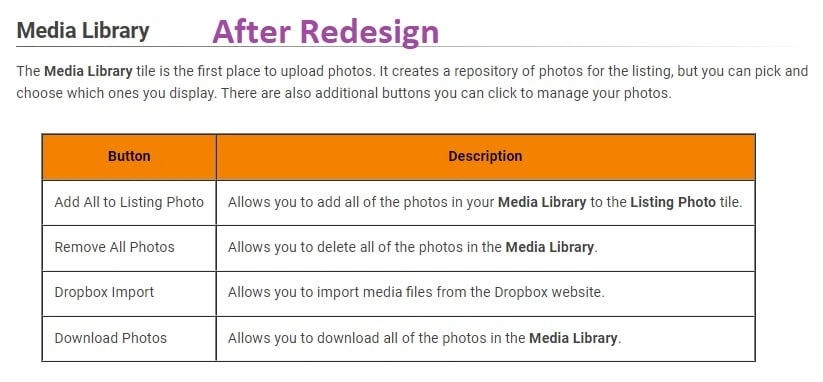
I utilized tables to define input fields and button functions.
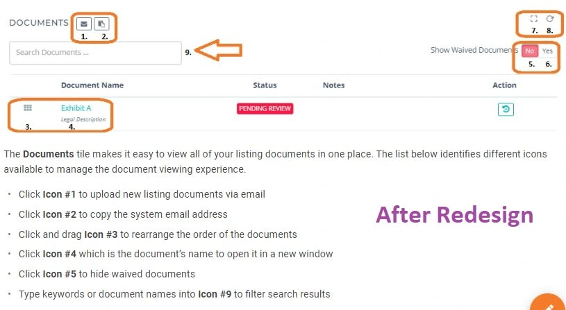
I labeled icons and buttons in order to simplify the software's layout.
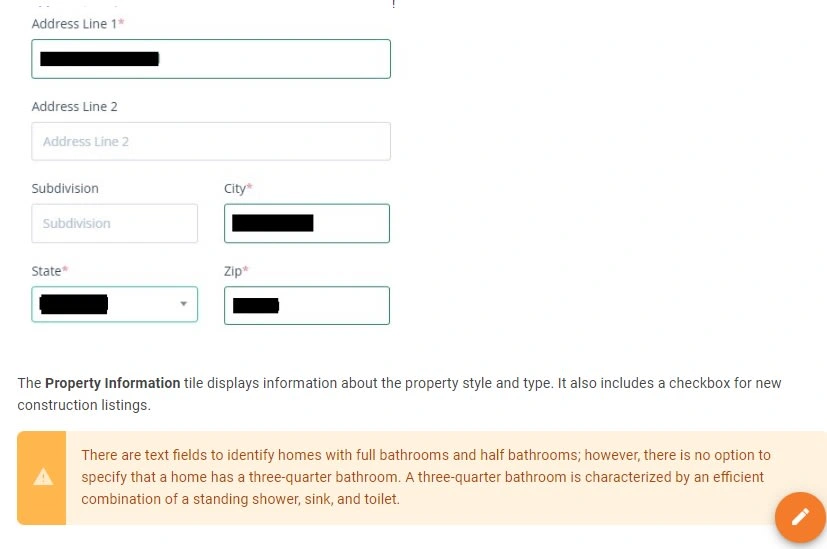
I blocked out personal data and included alert fields to point out critical information.
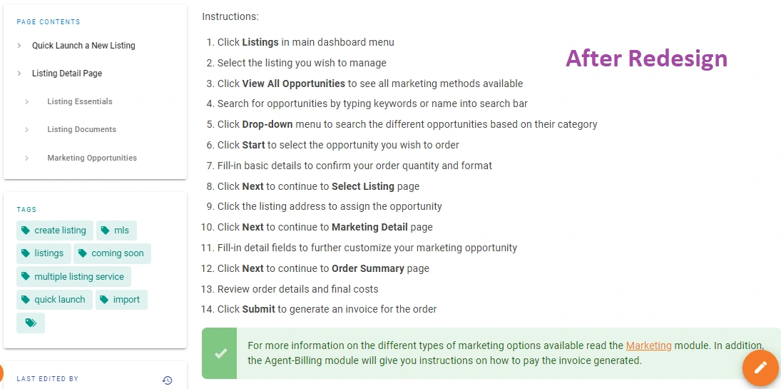
I added relevant tags to each module to enhance the site's search results.
Like this project
Posted Apr 29, 2022
This project highlights a snippet of my work for a prior client. This sample showcases my UX writing abilities.
Likes
0
Views
20
Featured on


