KORA: Brand Identity and Packaging Design
Roseline Bassey
Posted Jun 6, 2026
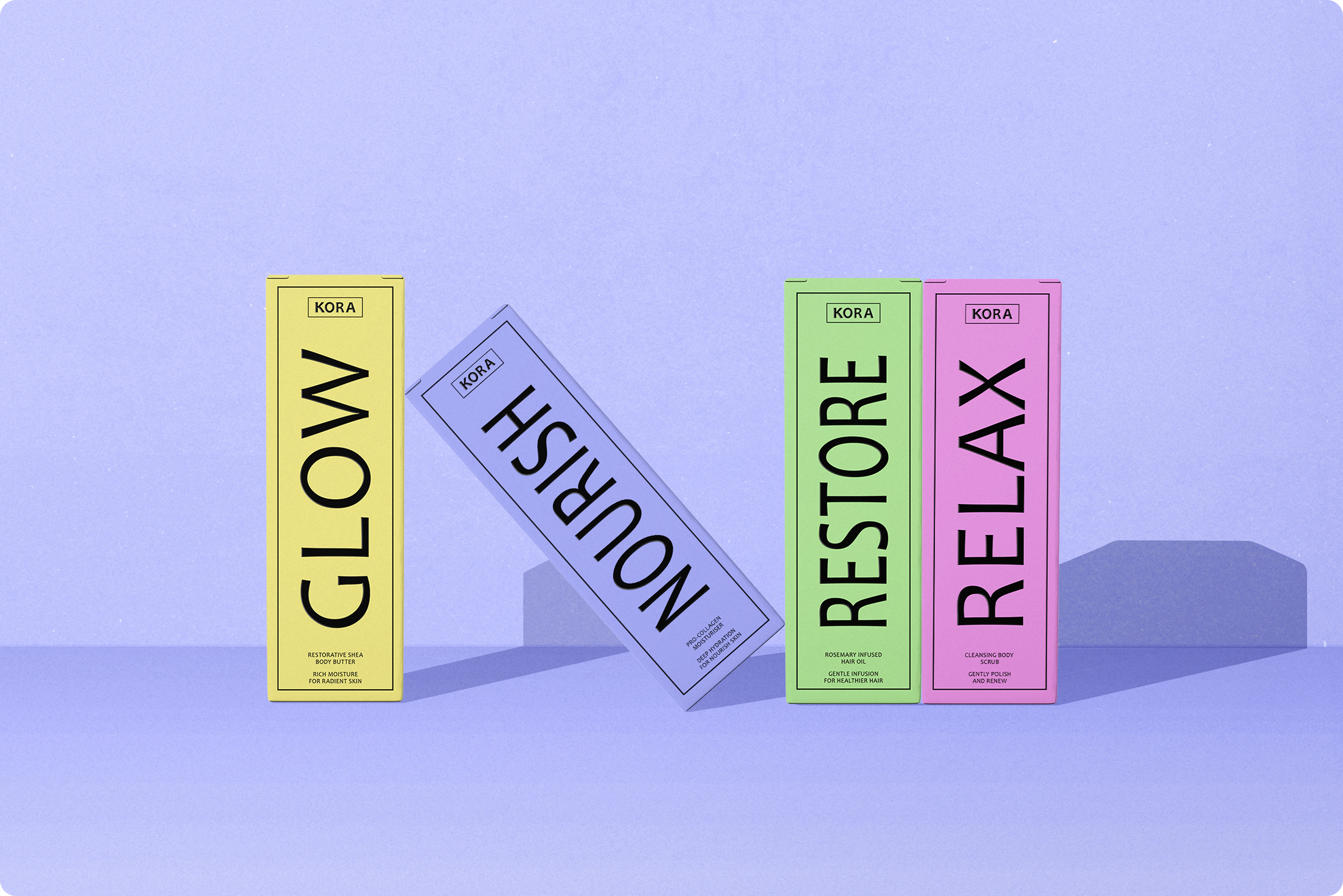
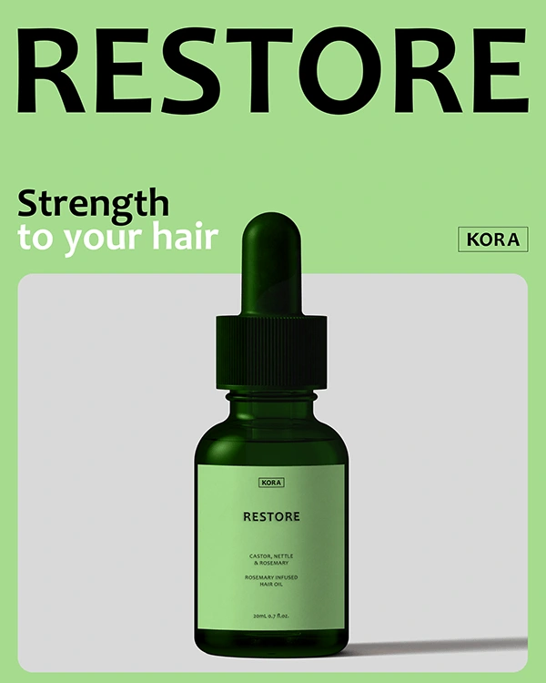
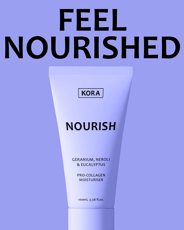
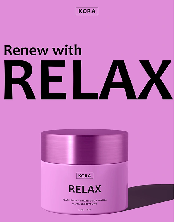
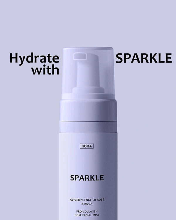
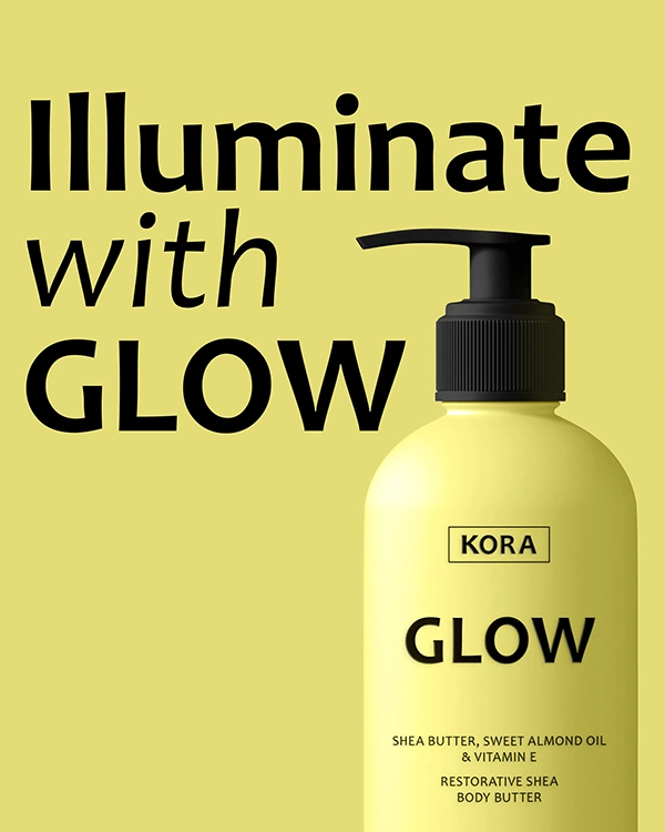
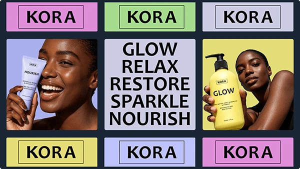
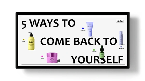
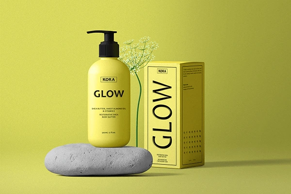
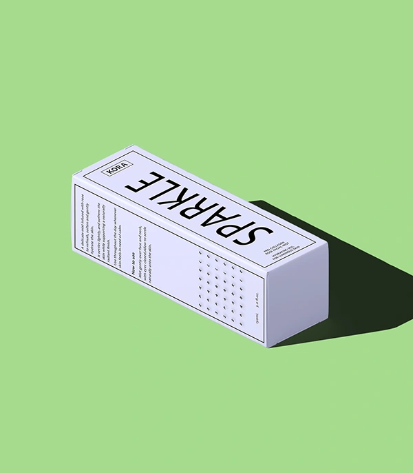
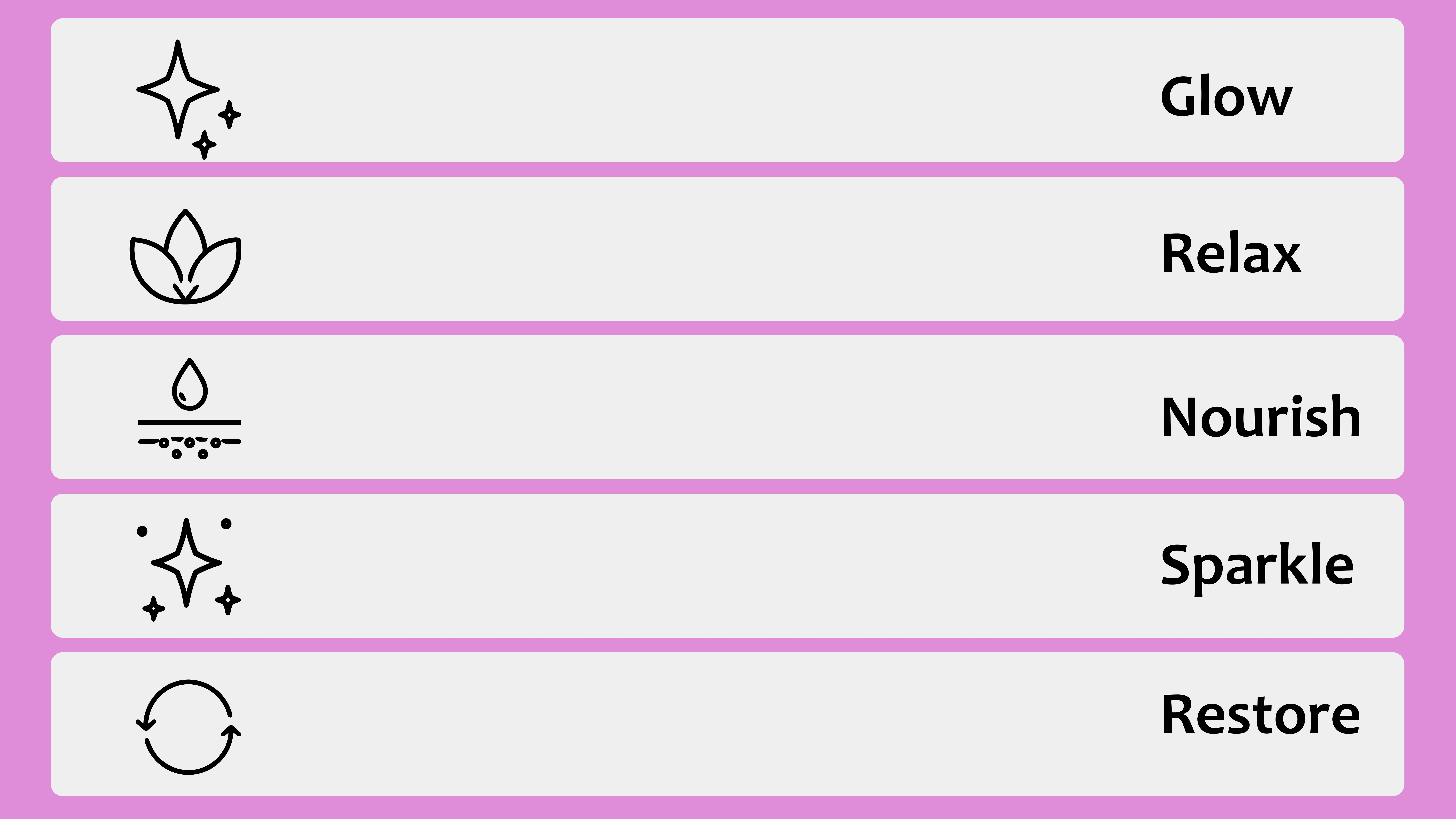
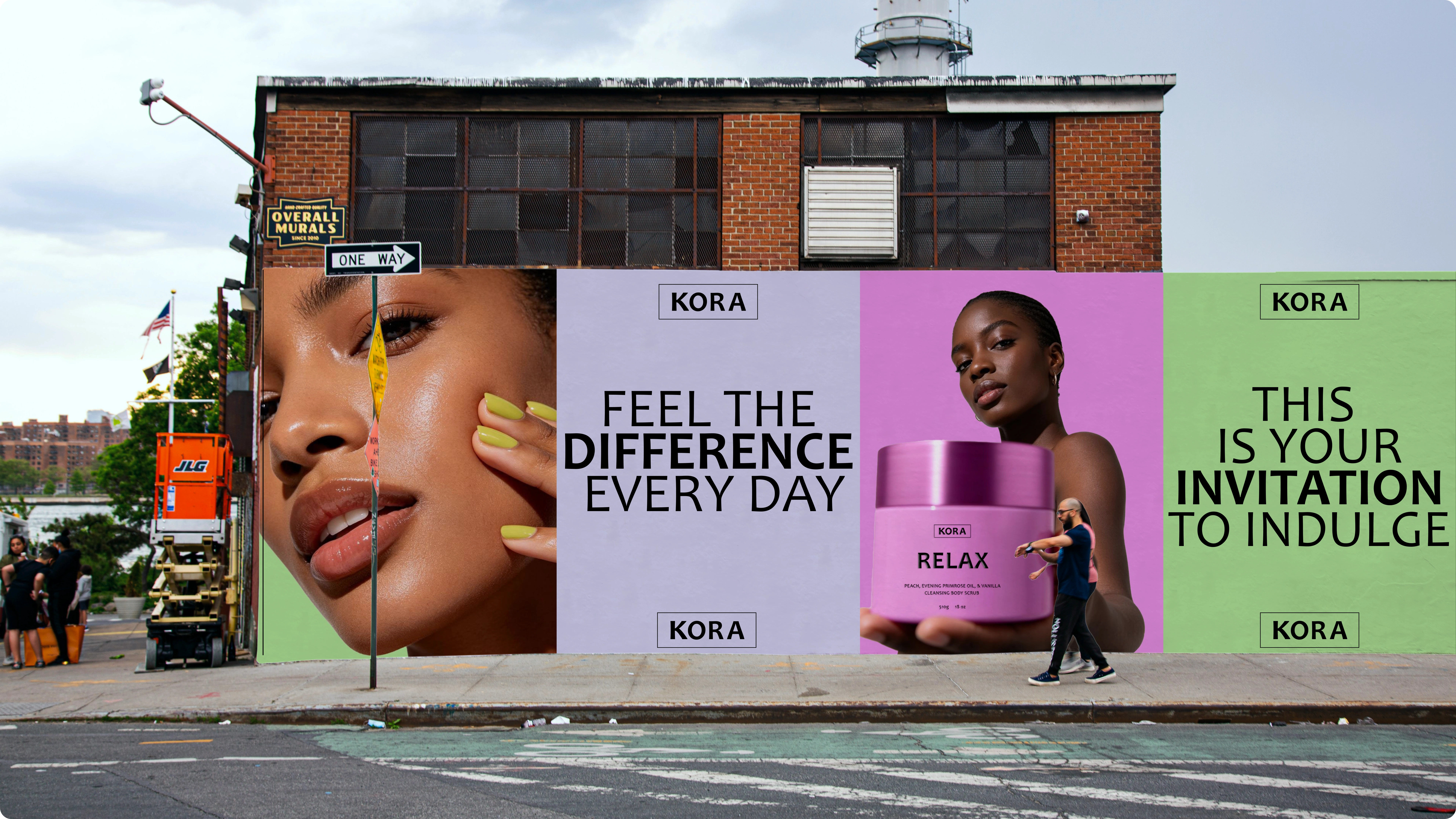
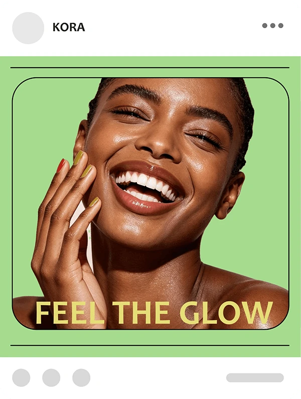
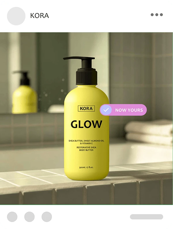
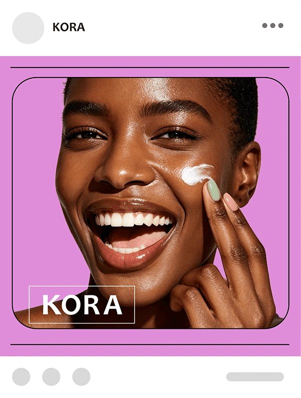
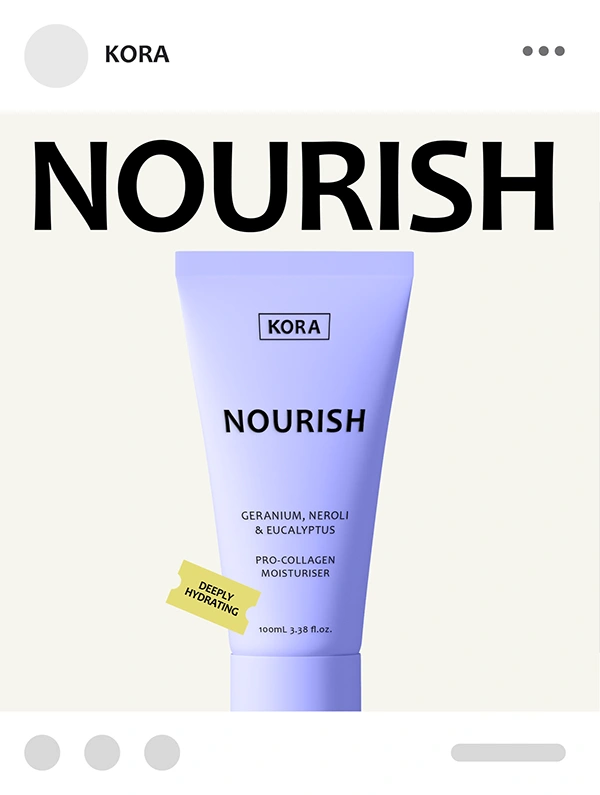
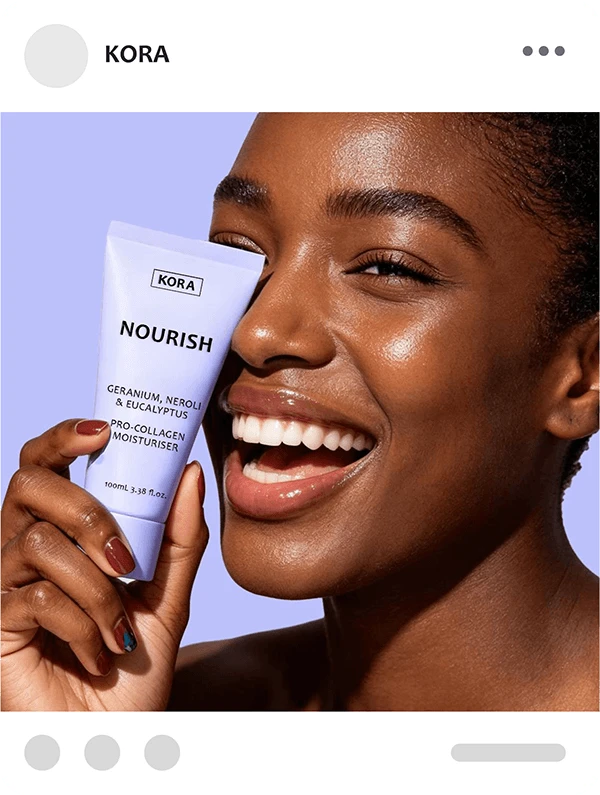
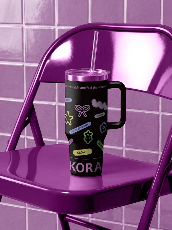
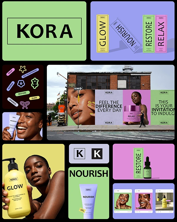
The African skincare category has a problem. Every brand operating in it looks identical, with the muted earth tones. The challenge for KORA was not simply to enter this market. It was to make the existing landscape look outdated. STRATEGY A competitive audit of established African skincare brands revealed that every competitor clustered in the same visual position: Traditional-Soft. KORA was designed to occupy the only uncontested position in the market: Contemporary-Bold. IDENTITY The KORA wordmark is set in Candara typeface with wide tracking. The product collection: SPARKLE, RESTORE, NOURISH, RELAX, and GLOW was named to foreground the emotional and sensory benefit of each product over its functional description. Each name operates as both a product identifier and a brand statement. The product names are the primary typographic element across all packaging faces. The colour palette reads as joyful, expressive, and confident. KORA proves that African skincare can look bold.