UX/UI Gimme App: Empowering Wellness for All Shapes
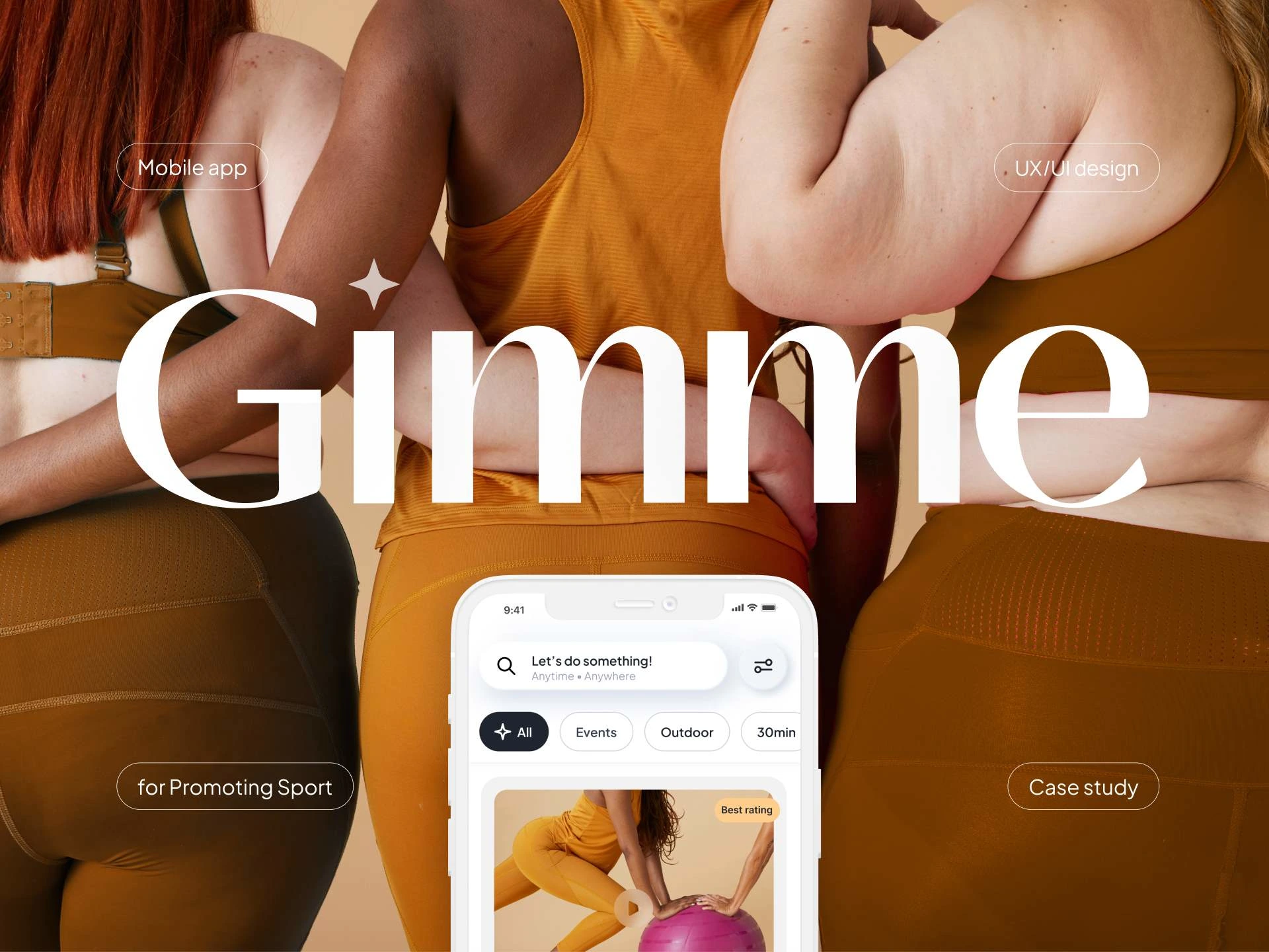
Case Study Mobile App
1. Introduction to UX/UI Case Study
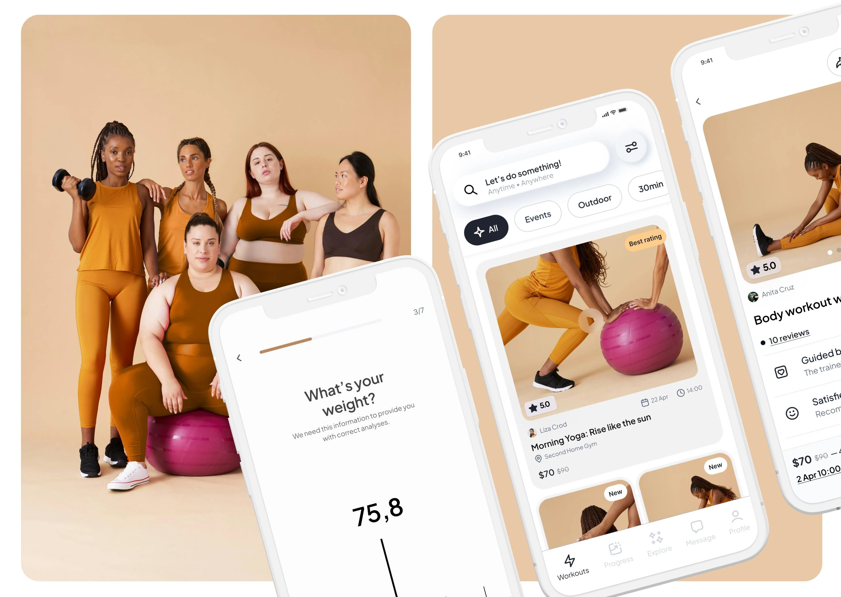
Mobile application for promoting sport. Amidst rising obesity rates and sedentary lifestyles globally, there's a critical need for solutions to promote physical activity across diverse demographics. This case study focuses on the UX/UI design of a mobile app aimed at encouraging physical activity among individuals struggling with obesity, while also welcoming users from various backgrounds and fitness levels. The app aims to make exercise accessible and enjoyable, fostering behavioral change to improve overall health outcomes. This study explores strategic design decisions aimed at enhancing usability and appeal, addressing the challenge of increasing physical activity participation effectively.
2. Design Process
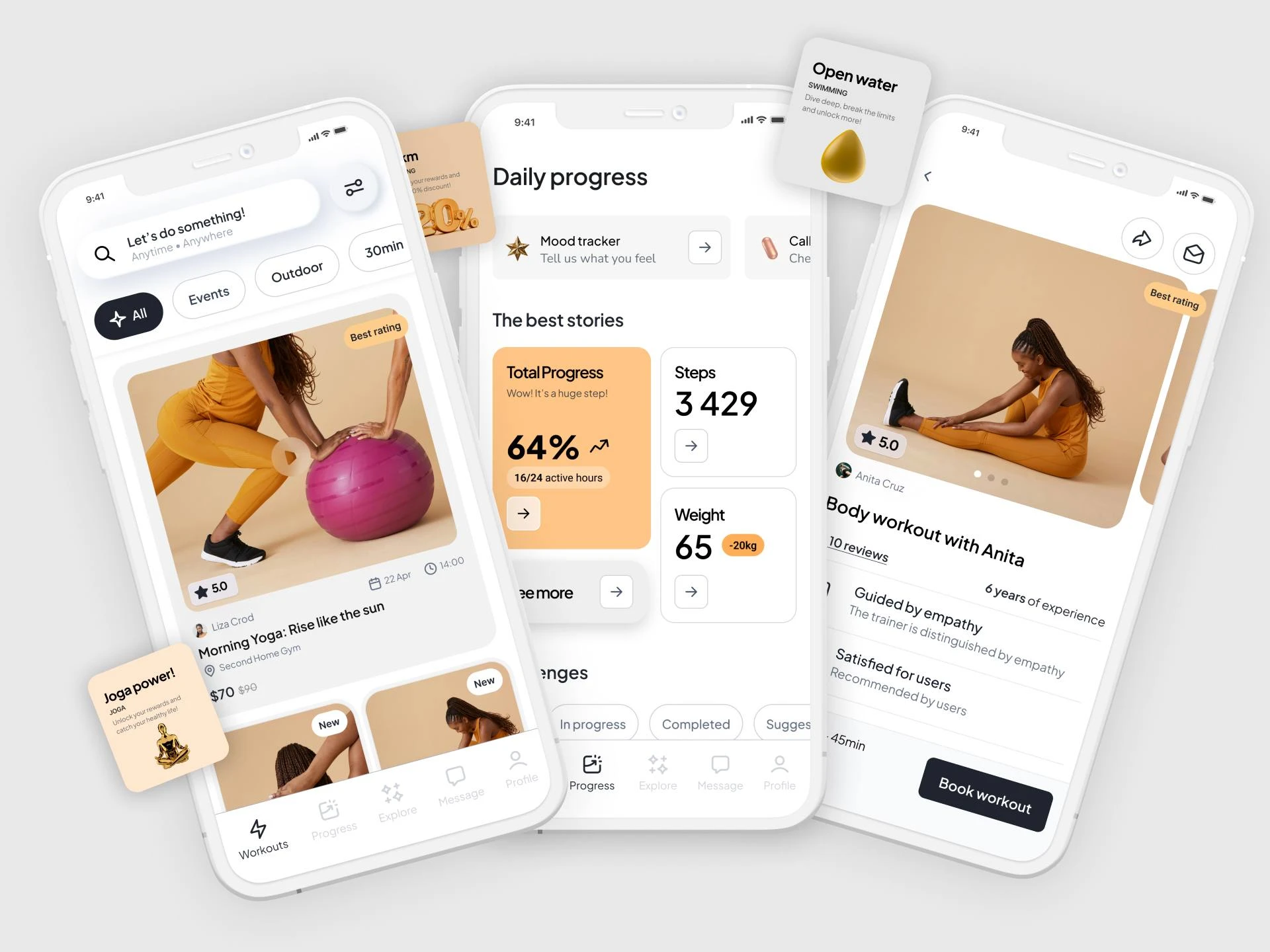
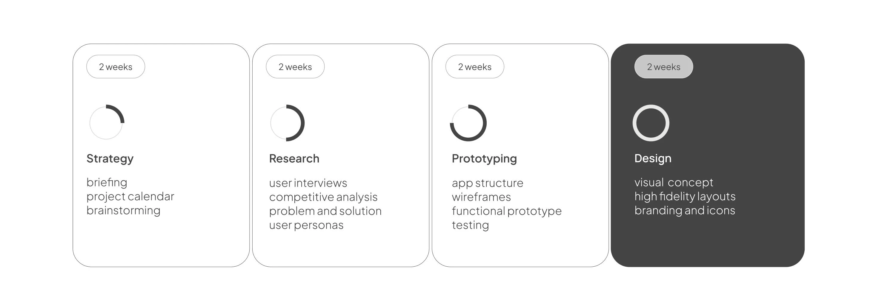
Over a two-month design process, thorough research, iterative prototyping, and user feedback were instrumental in developing the Gimme app. The result is a polished application that prioritizes intuitive user interfaces and functionality to enhance user engagement and satisfaction.
3. What I Want to Solve
Problem
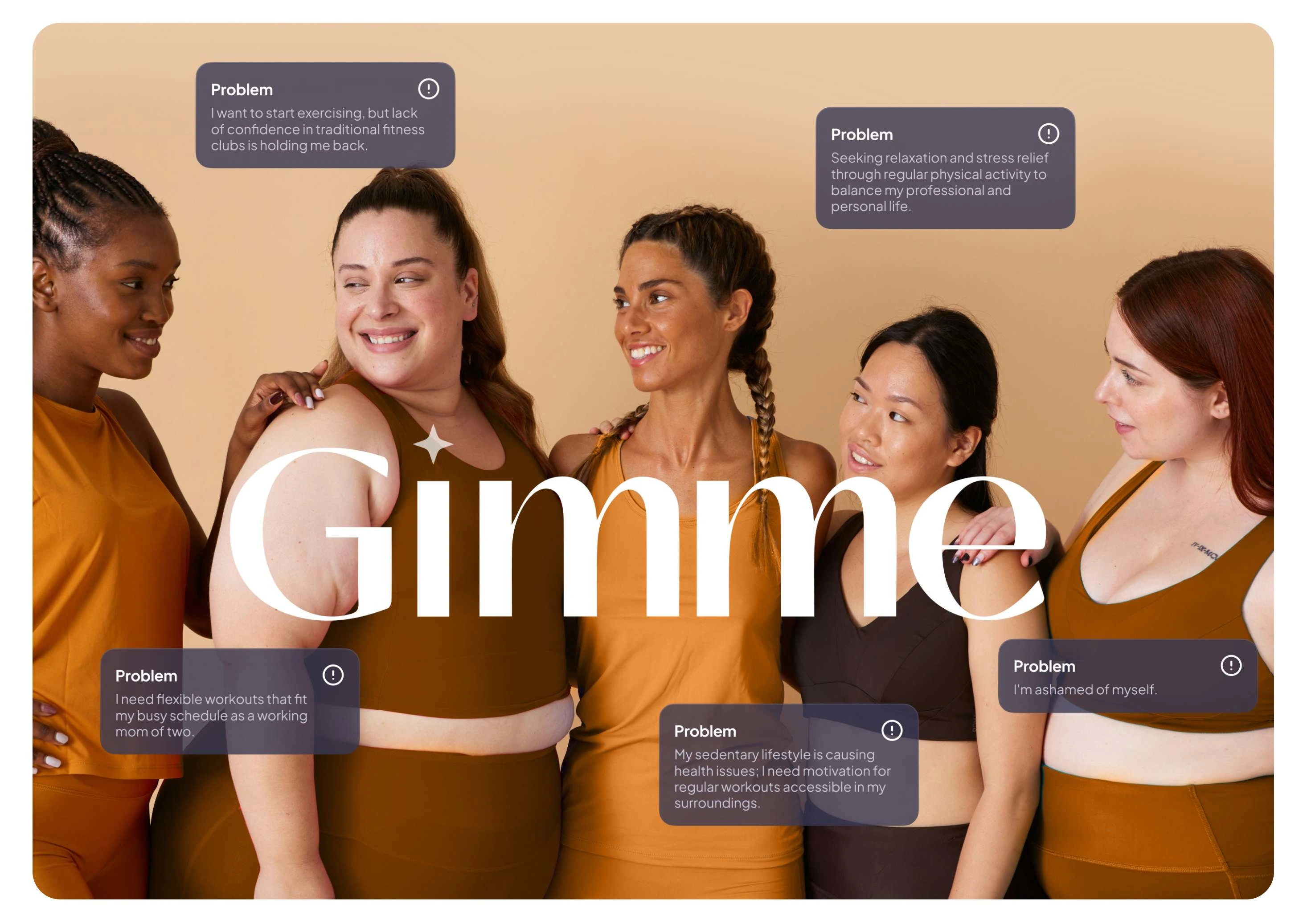
The global rise in obesity rates and sedentary lifestyles presents a significant health challenge, with many individuals lacking motivation and guidance to engage in regular physical activity. Traditional fitness apps often cater to already active individuals or lack inclusivity for diverse demographics, including those with obesity.
Solution
Developing a user-centric mobile application that promotes physical activity in a way that is accessible and engaging for individuals of all backgrounds and fitness levels. The app will feature intuitive UX/UI design elements aimed at inspiring behavioral change and improving health outcomes by making exercise enjoyable and seamlessly integrated into daily routines.
4. Overview of the Market
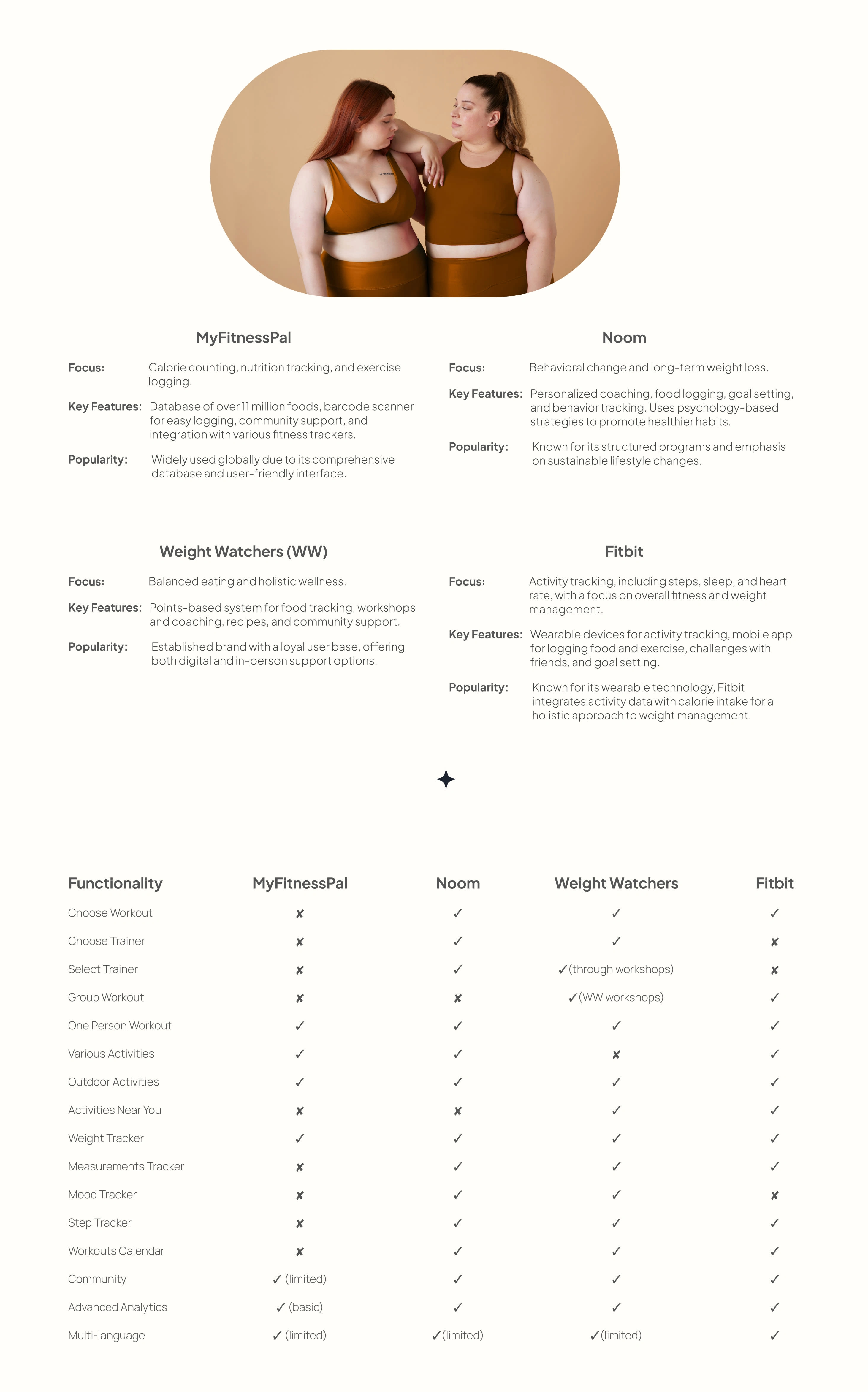
These existing apps vary in their approaches, from calorie tracking and community support to behavior change and holistic wellness, catering to different user preferences and goals in the weight loss journey. Each competitor has carved out its niche in the market, appealing to various segments of users seeking to manage and improve their health.
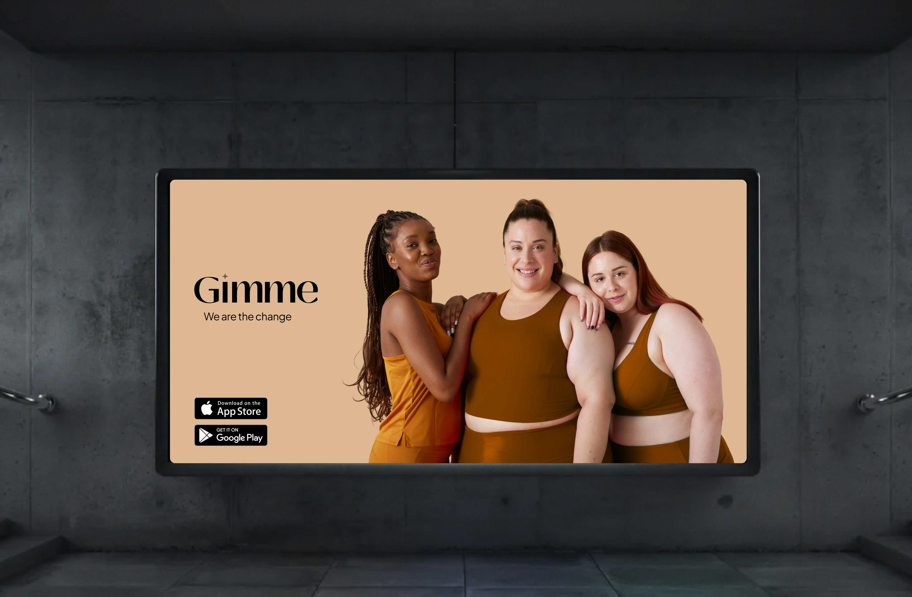
Identity of brand
5. Hear the Voice of Users
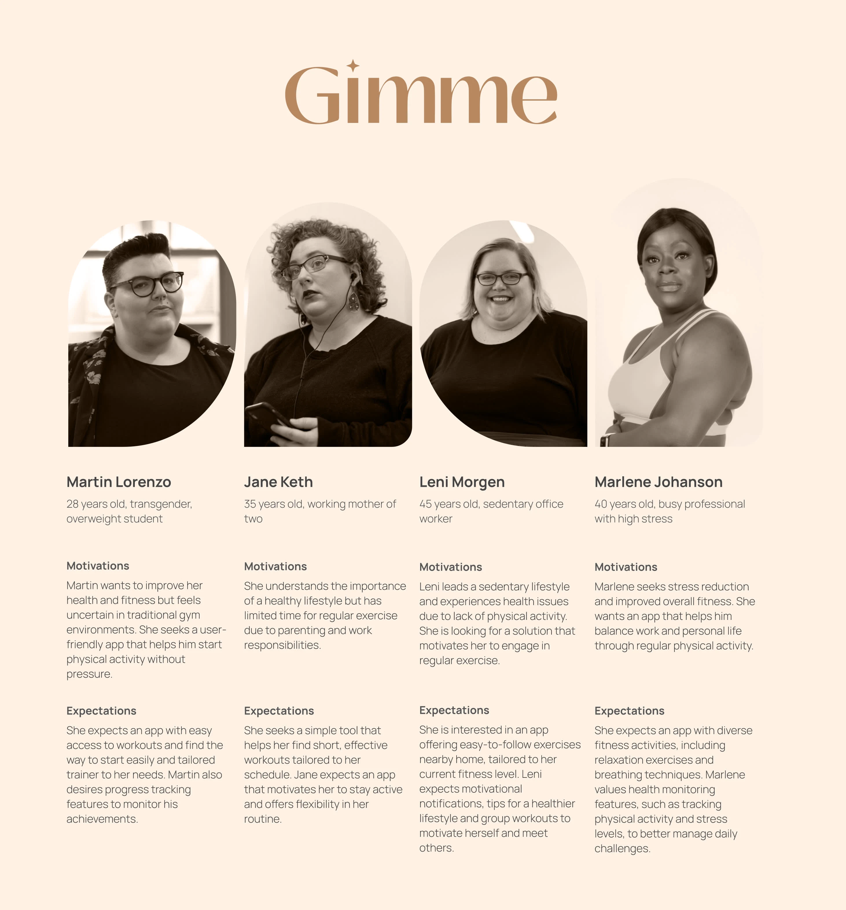
User personas
This table highlights the strengths and capabilities of each app across various functionalities important for users interested in weight loss and fitness management. Depending on specific needs such as personalized coaching, community interaction, or comprehensive tracking, users can choose the app that best aligns with their goals and preferences.
However, no application on the market offers very advanced assistance in matching the trainer and a wide selection of activities. A range of activities may be important in maintaining interest in the product. Building a community that helps keep users systematic and motivated can have also a big impact on users.

6. Mission Behind New Product
The app name "Gimme" relates to its core idea of providing users with easy and immediate access to motivation and tools necessary to start physical activity, leveraging the term "gimme," which is a shortened form of "give me," reflecting an immediate need and readiness to take action. This concept is inspired by the song titled "Gimme" emphasizing urgency and a desire to fulfill a need or desire promptly, aligning with the app's mission to encourage proactive engagement in fitness and healthy lifestyles.
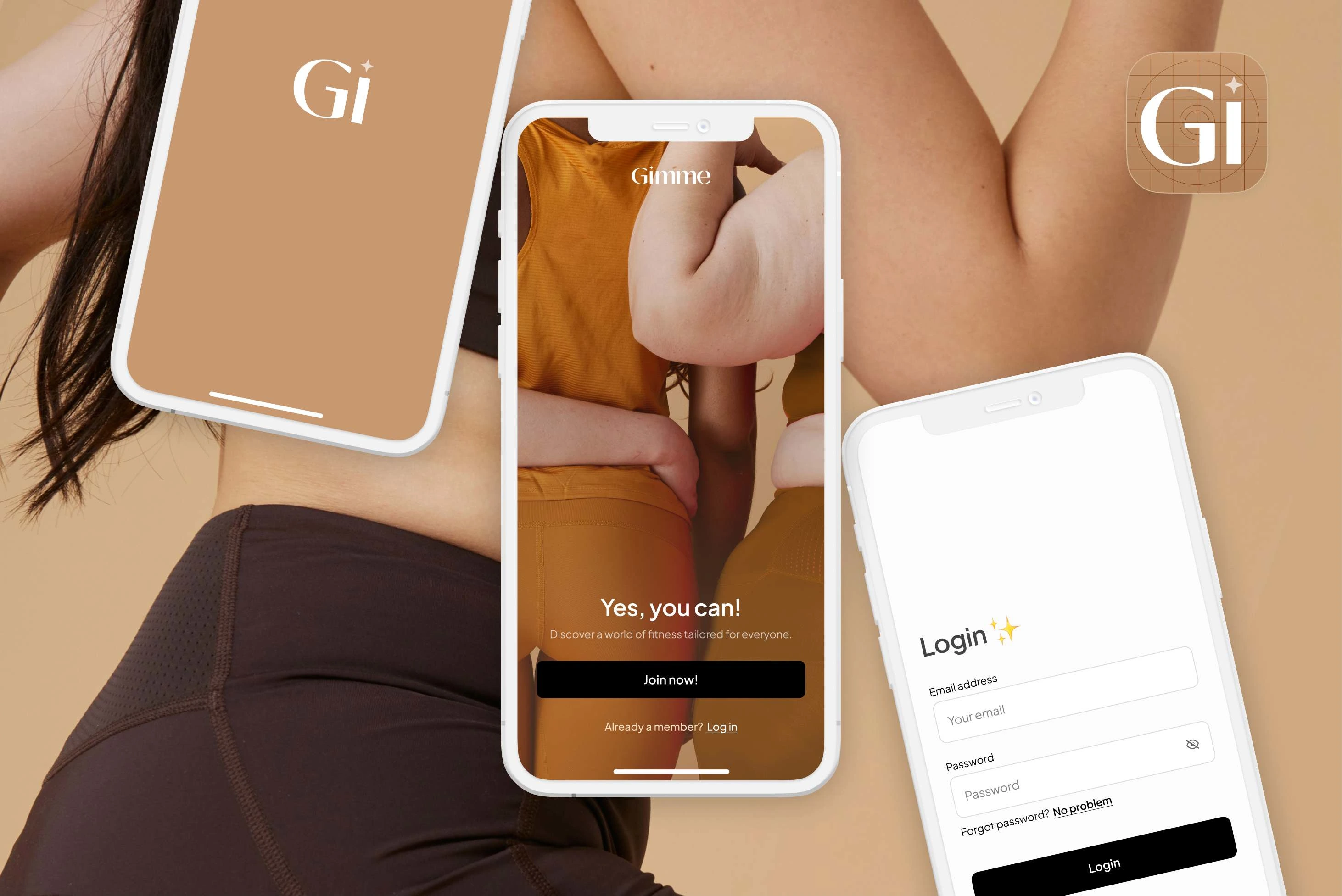
Icon and first screens
7. App structure
Get familiar with Gimme layout, where each section is designed keeping user experience in mind. Simple and intuitive, it connects one feature to the next, ensuring the user’s fitness journey is straightforward and engaging.
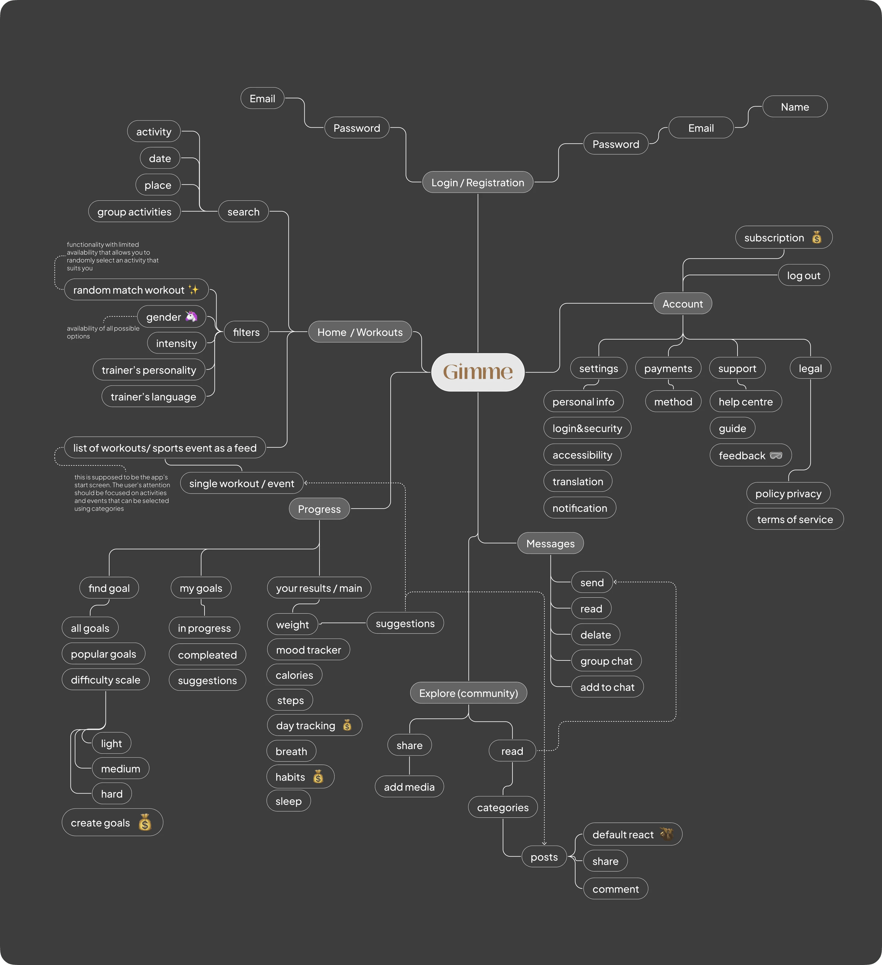
App structure in Figma
8. Blueprinting Success: Wireframing
As a result of applying to wireframe, the project achieved a clear and structured blueprint for the mobile app's design and functionality, fostering stakeholder alignment, streamlining communication, and enabling early identification and resolution of usability issues, ultimately enhancing the app's user experience and effectiveness in promoting physical activity globally.
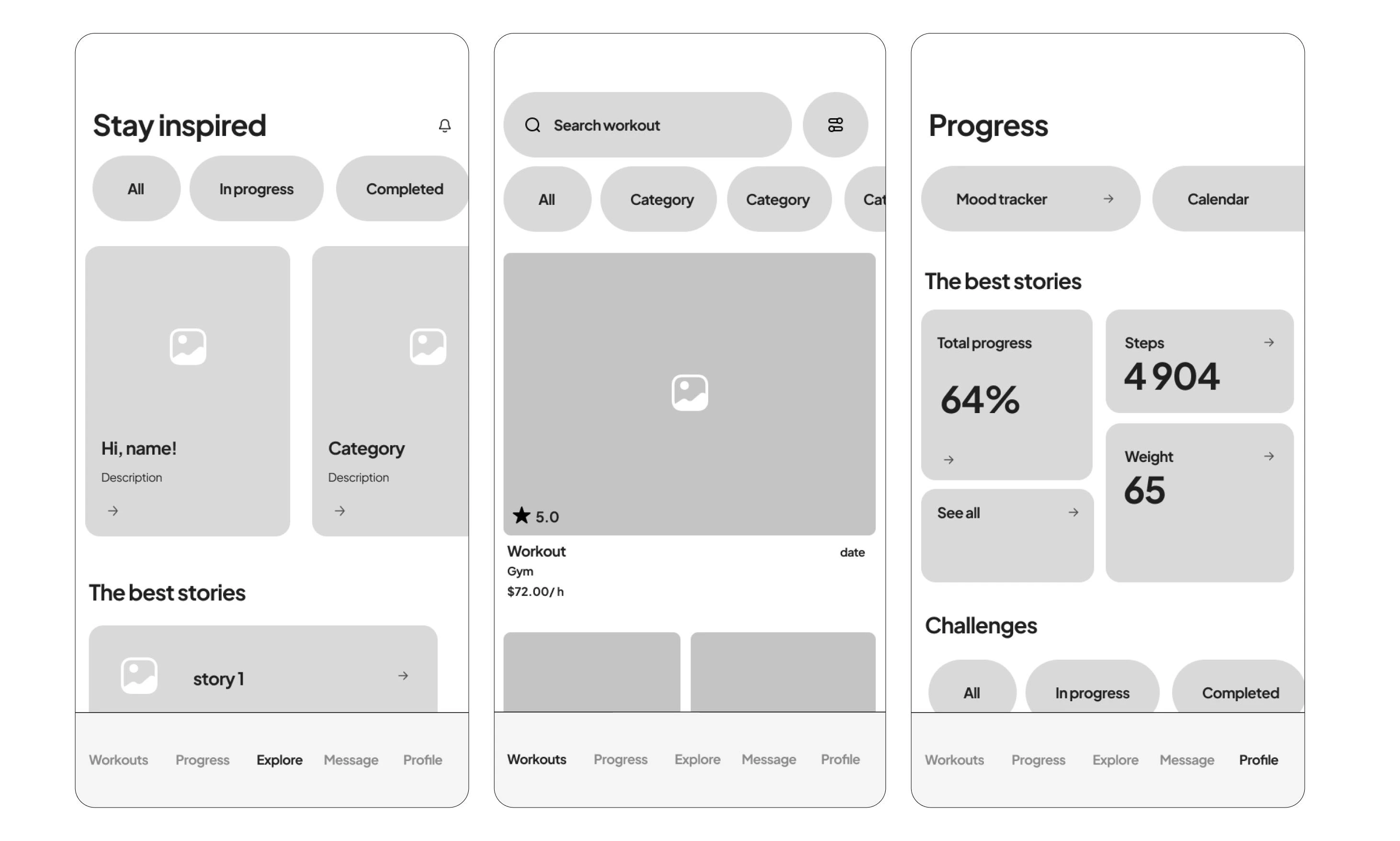
Examples of screens
9. Welcome Aboard: Getting Started
This onboarding process aims to familiarize new users with the Gimme app, customize their experience, and motivate them to integrate physical activity into their daily lives effectively.
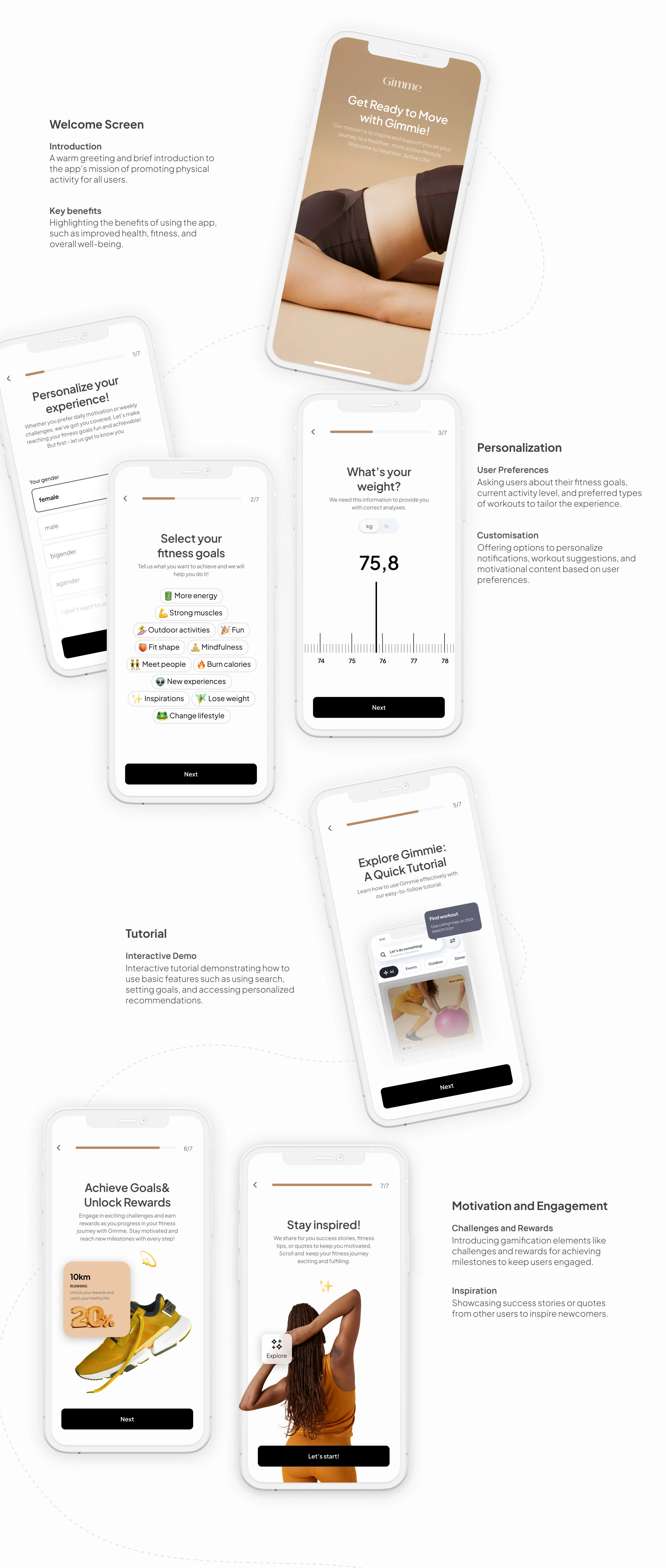
Onboarding
10. Design system
Beige and brown colors in the app's design system are chosen for their association with energy and warmth. Beige symbolizes calmness, earthiness, and naturalness, translating into a sense of stability and balance. Meanwhile, brown is associated with strength, resilience, and warmth, adding vitality and coziness to the app. These colors harmonize with the app's guidance.
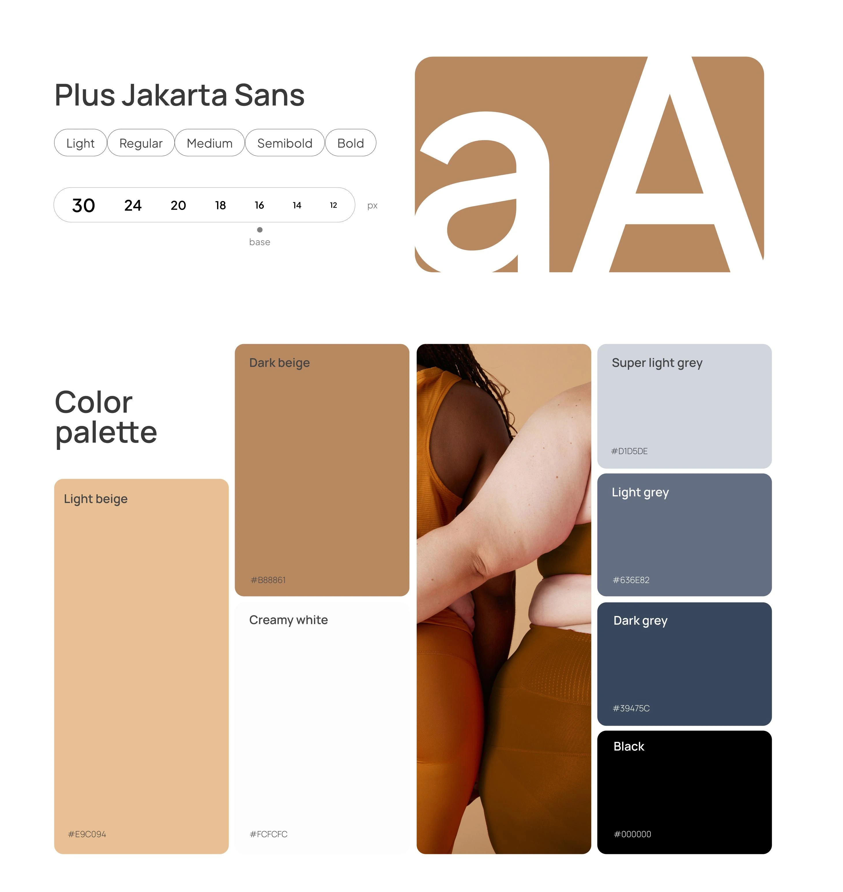
Design system / Gimmie App
11. Find Your Match: Activity Search and Filtering
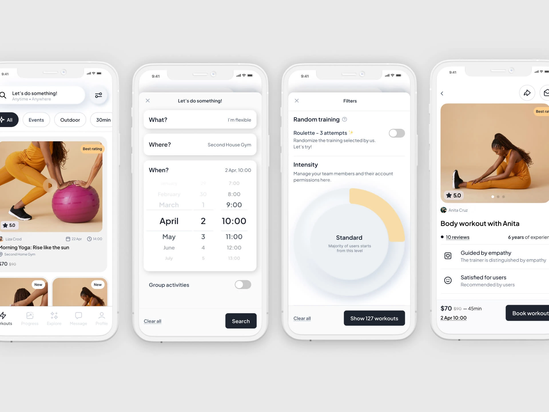
Gimme app allows users to quickly find suitable workouts tailored to their goals and preferences. Users can browse various workouts and match them with trainers who best meet their needs, providing a personalized approach to physical activity.
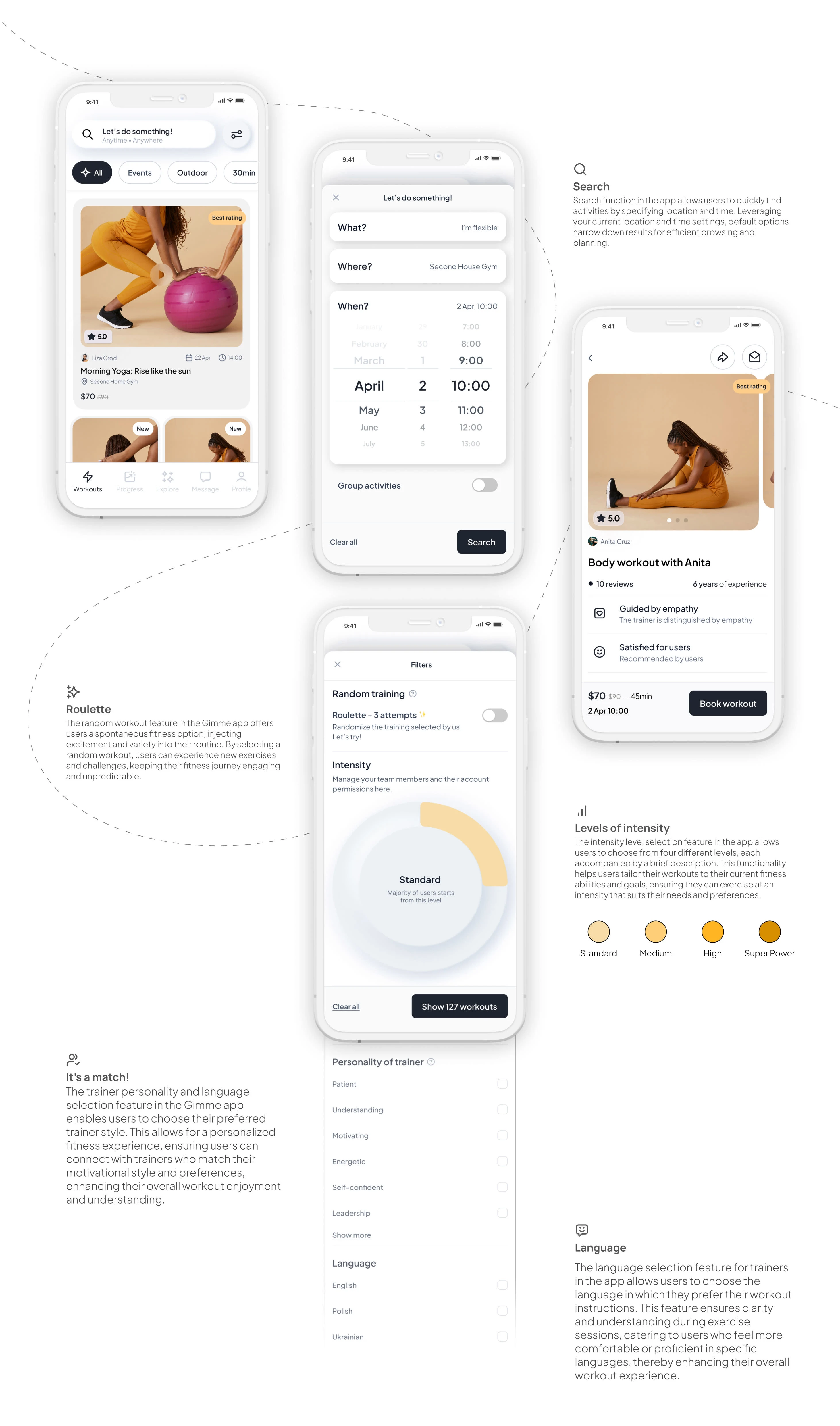
Searching process
12. Connect & Inspire: Social Impact
Social features focus on fostering connections and making a positive difference. Here, users can engage with like-minded individuals, share achievements, and participate in challenges that contribute to a supportive community dedicated to health and fitness goals. This section not only encourages collaboration but also amplifies the collective impact of users' efforts towards healthier lifestyles and broader social well-being.
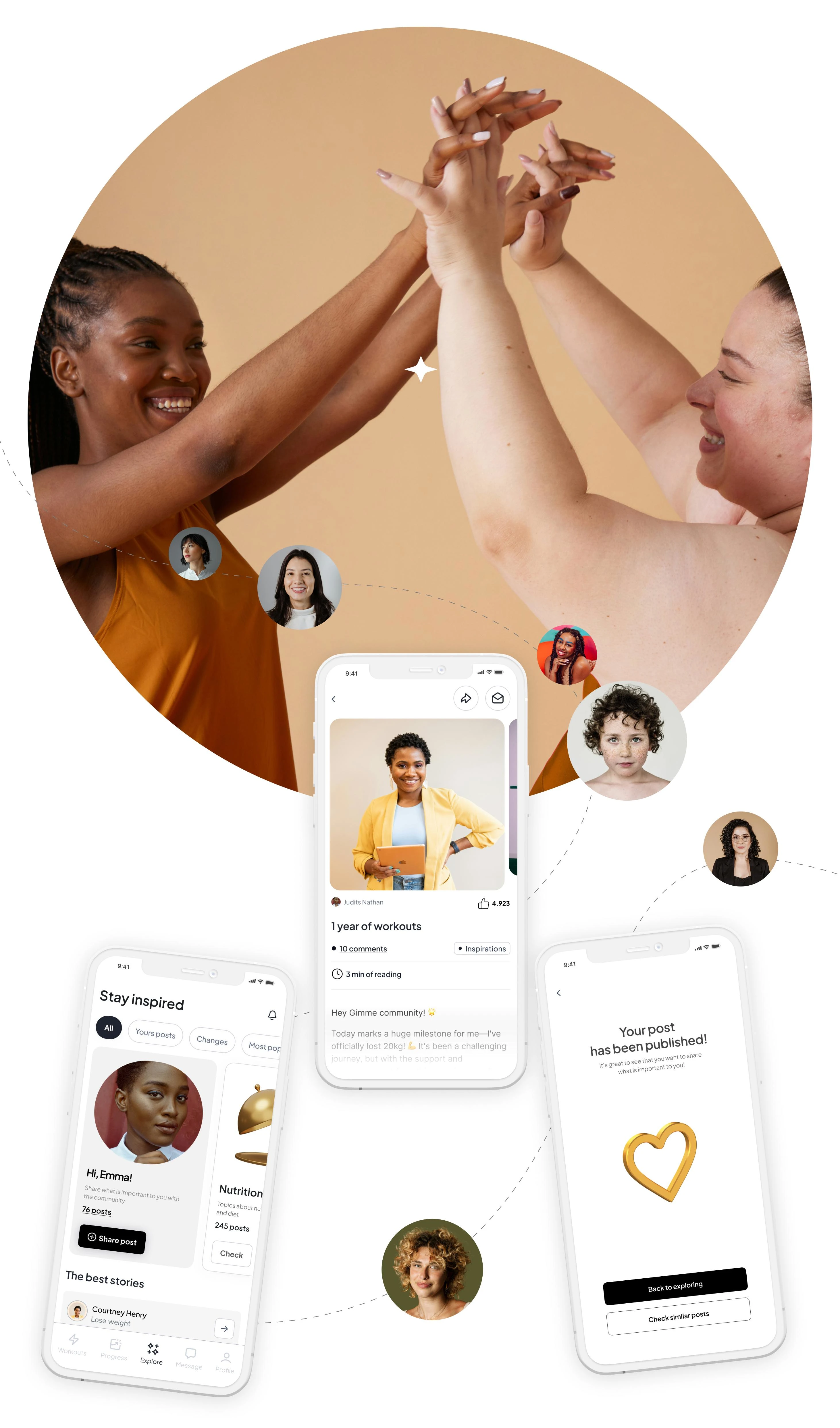
Community
14. Track Your Progress: Measurements
The Measurements section in Gimme allows users to track their fitness progress by recording weight, body measurements, and other metrics. This feature provides valuable insights and helps users stay motivated by visualizing their achievements and adjusting their goals accordingly.
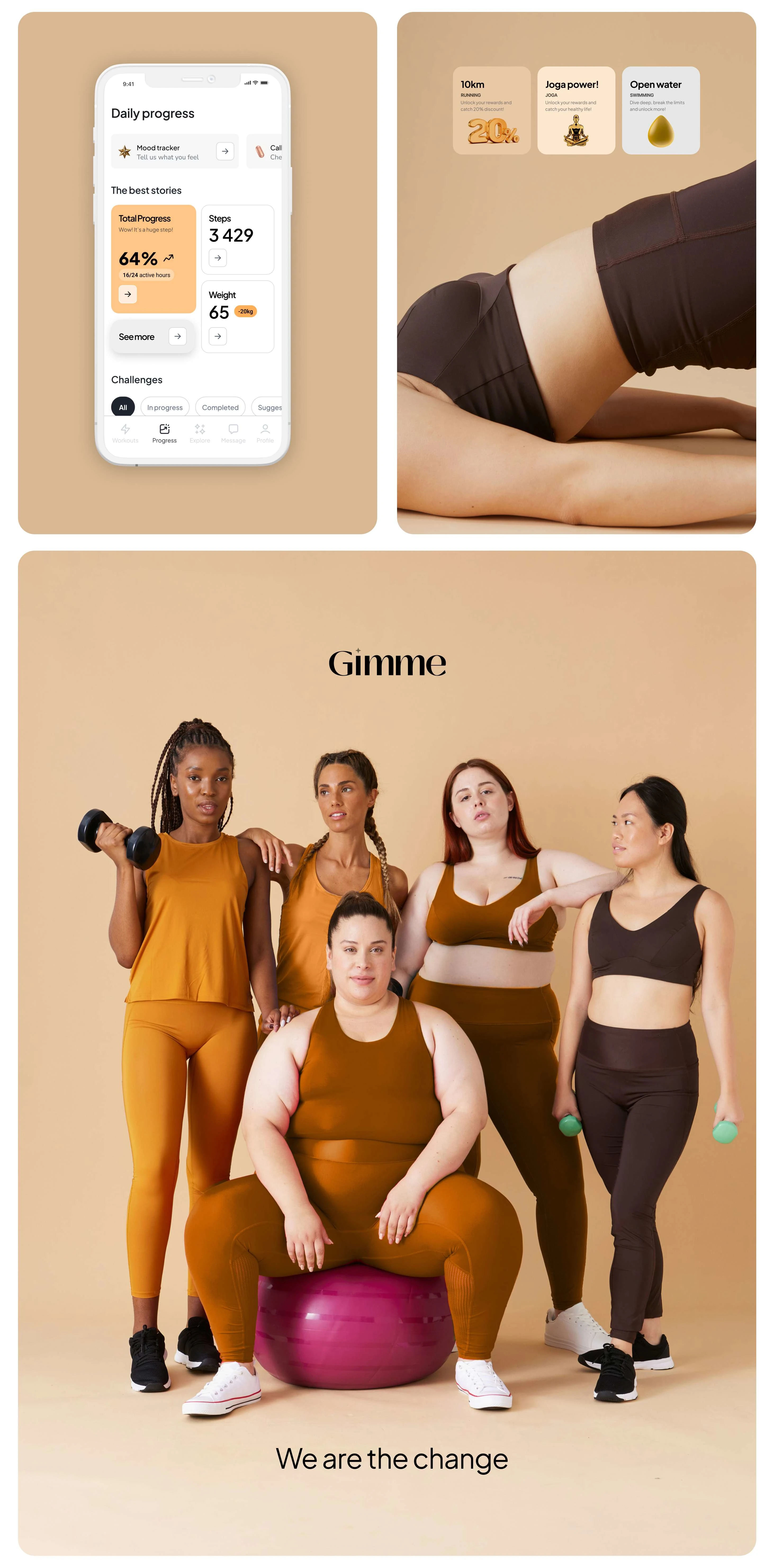
Measurements in app
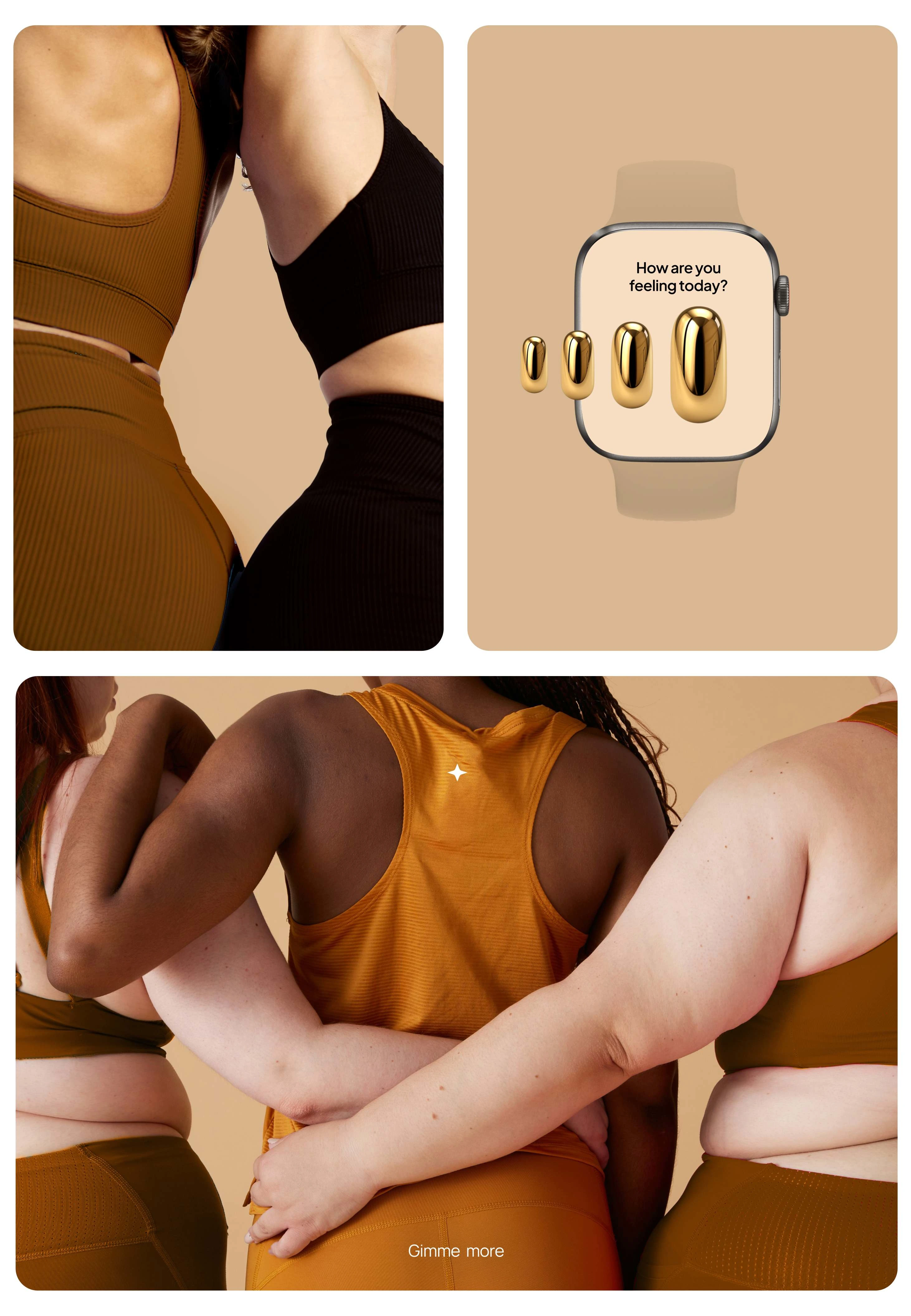
Widget concept
Like this project
Posted Jul 24, 2024
Mobile application to promote sports for everyone.

