Livestream music concert app — a UI/UX case study
Brief : Provide users with Livestream music concerts from an app. It’s like artist Kanye West playing song sitting in his home studio and watching live by a million people.
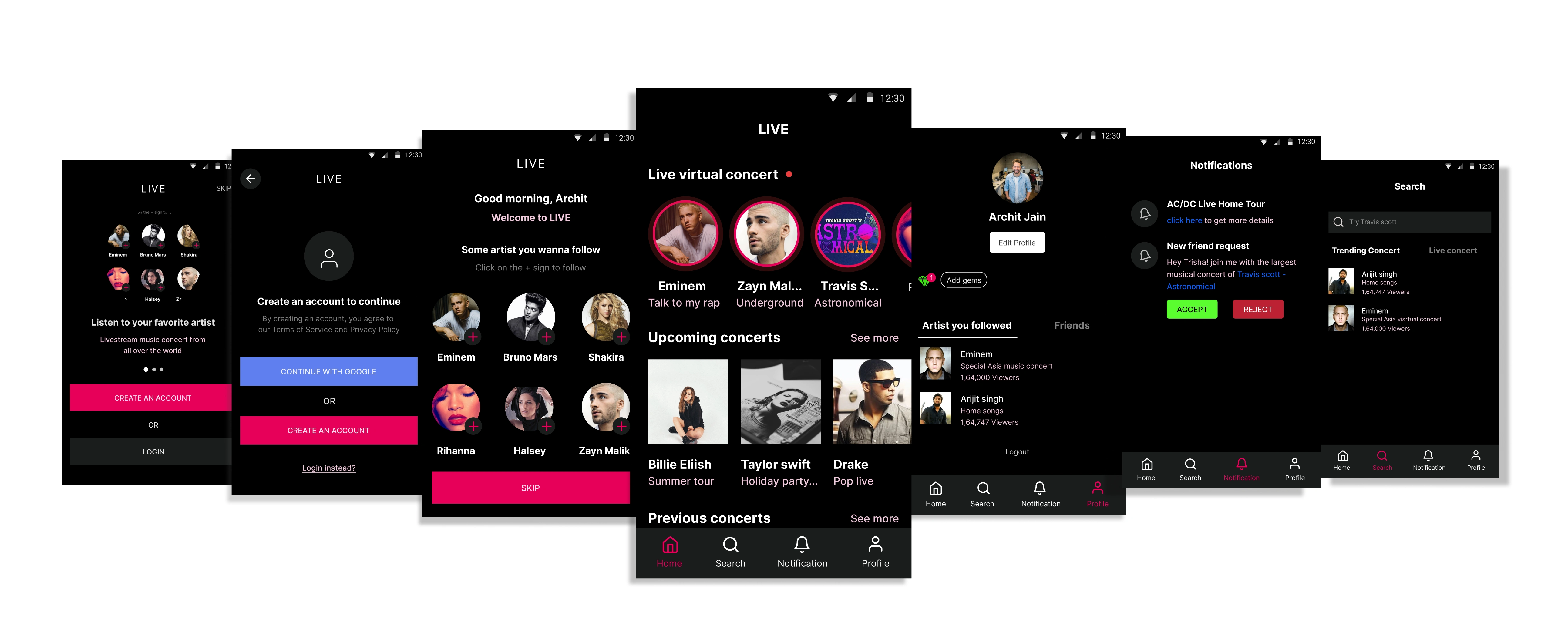
Note: This is part of the design challenge where I have to come up with a mobile app that interestingly uses Livestream.
Challenge: Due to COVID 19, we’ve seen the explosion of a lot of Zoom meet-ups and Live streams. People are looking for new ways to socialise online — whether that’s to meet their friends or to meet new people.
But first, what is LIVE?
Live as the name suggests provides live music concerts from around the world. You can watch previous music concerts, invite friends over to Livestream and enjoy with friends.
Short Story
The story behind why I choose the Livestream music concert app in the design challenge. There are mainly two reasons behind this,
I have seen people downloading hours of concert videos of their favourite artists from the internet.
The second one is due to COVID-19 music concerts are cancelled, and it is necessary for apps that do Livestream music concerts.
Users
Before doing research, I listed down who are the potential users. I realized the users are going to be any person aged 20–40 who is a fan of music, music concerts and attends 1–3 music concerts in a year.
Research
Competitive research: I studied some apps like WAV(ios only) and nugs.net which provides live music concerts. I am an Android user, so I decided to download the nugs.net application.
The whole point of my using the nugs.net app is how’s the experience was, how they are solving the user needs, what features the application has.
Google Play reviews: I decided to look for google play ratings and reviews, what their users say about their app and found that apps do not remember where you left off so users have to remember what they are watching and show content which is not available in countries.
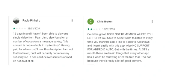
Google play reviews
Viewership: I also went to digging over the internet about how the viewership increases on the internet during the lockdown period and found one of the viewership in the music and performing section.

User flows and Wireframes
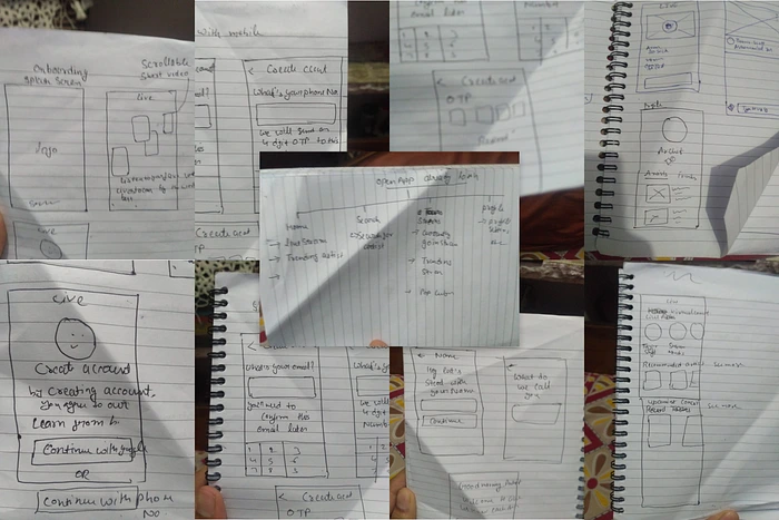
Before directly jumping into the visual design, I made user flows and wireframes so that I could understand how the user is going to complete his task and what other possibilities for improving his steps to complete his task.
Inspiration for visual design
For taking inspiration, I go through a site like mobbin.design and search for how music apps like apple music, Spotify, Vevo, wav are and what colours they are using and take screenshots and make a small mood board on Figma.
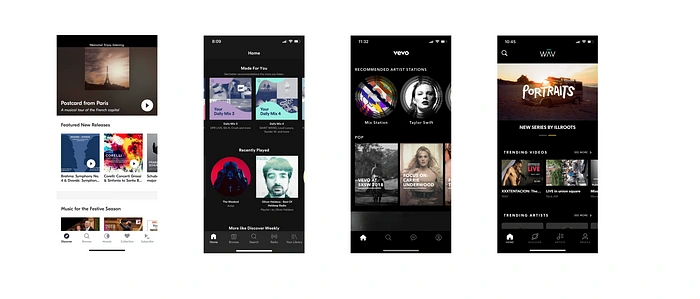
After taking inspiration, it's time to decide what colour I want to go with, so I choose to go with the dark mode, for text colour decides with cool orchid pink colour and for input, cards and black colour shade.

It's time to decide which typography I want to use so decided to go with the most famous typeface Inter, designed by Rasmus Andersson. Inter-typeface is designed so well that you can use it with any digital device and it's free.
For spacing between elements, I go with the 8px spacing method with some exceptional of 4px spacing where things need to be more closely.
Visual design
I started my visual design on Figma, I listed down all the tasks done by a user and made a design according to that.
Walkthrough of an app to the users
Create an account
Watching Livestream
Inviting friends over Livestream
Search
Visiting and editing a Profile
Notification
so let’s get started with the onboarding of users
Walkthrough of app
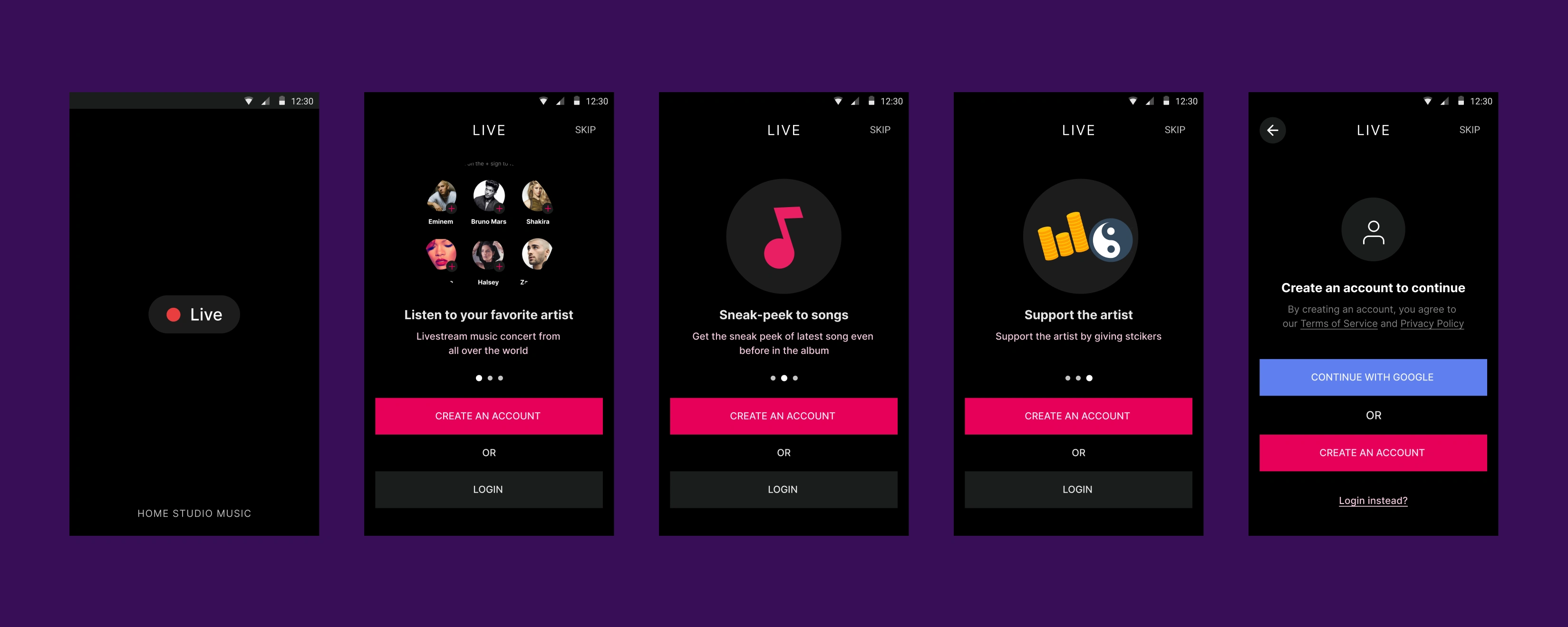
Walkthrough should be easy and communicate the value of an app when the user first time opens the app. I read in an article that a walkthrough should help users how the app can fit into their lives. The purpose of this process is to provide insight into what your app can do.
The walkthrough is skippable and the user jumps into the home screen of an app without login. Login walls don’t belong in the initial experience of the users.
You can see flows is like a funnel, let’s say 100% user download an app and start the app. After opening an app when the user interacts with the login screen another percentage of users will drop. In each step, users drop and only 40% will end up on the home screen. The goal is to reduce the interaction cost of user and tighten the funnel ,some of the ways are removing removing login walls upfront and showing site content upfront.
2. Create an account
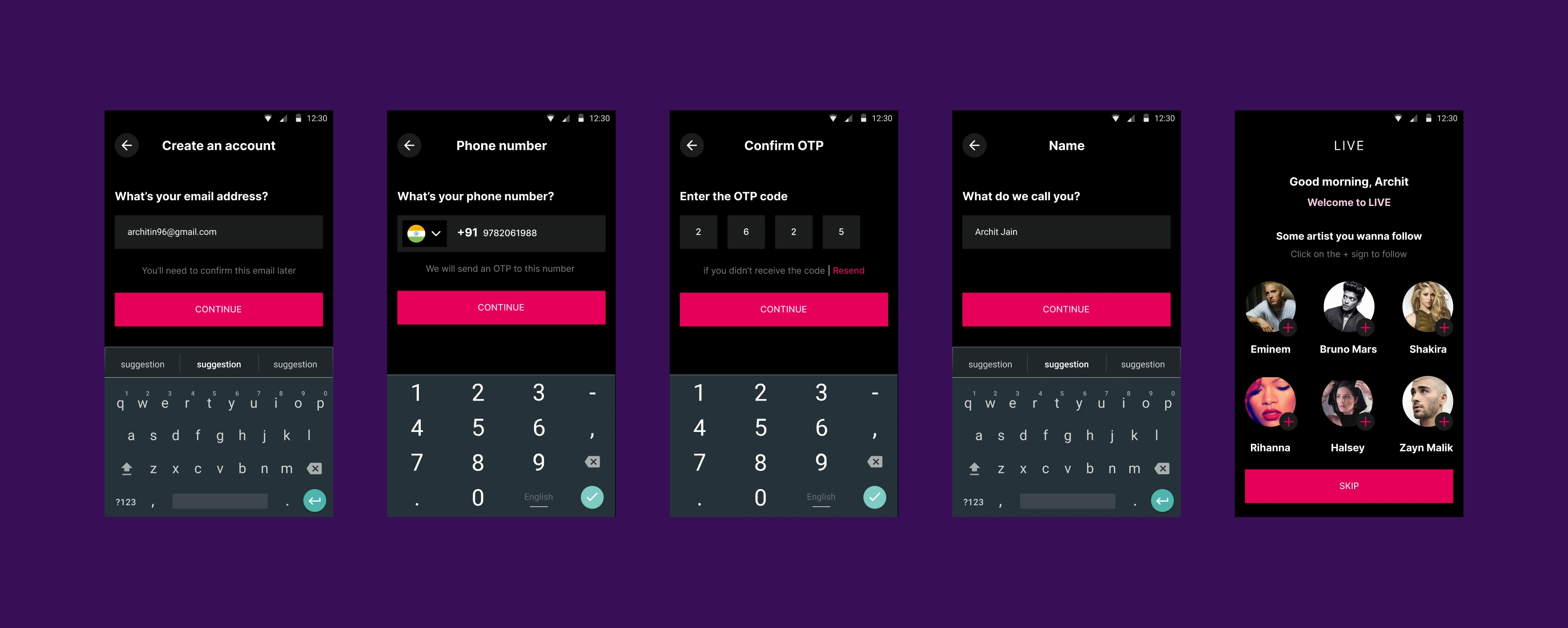
Creating an account is the most important screen as lots of users drop off if the app is asking for too much information or irrelevant information. I keep it simple by asking email address, phone number, OTP for verification and Name. And for returning the user's Phone number and OTP.
After Deciding on how the user creates an account on the app, the User can follow some artists suggested by the app according to country-specific.
3. Watching a Livestream
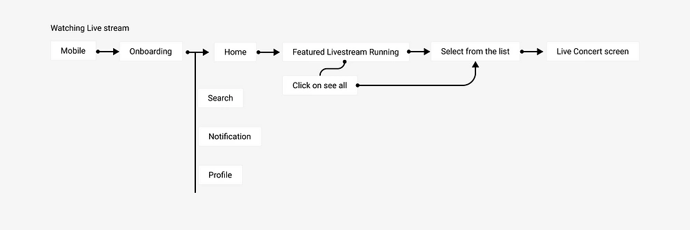
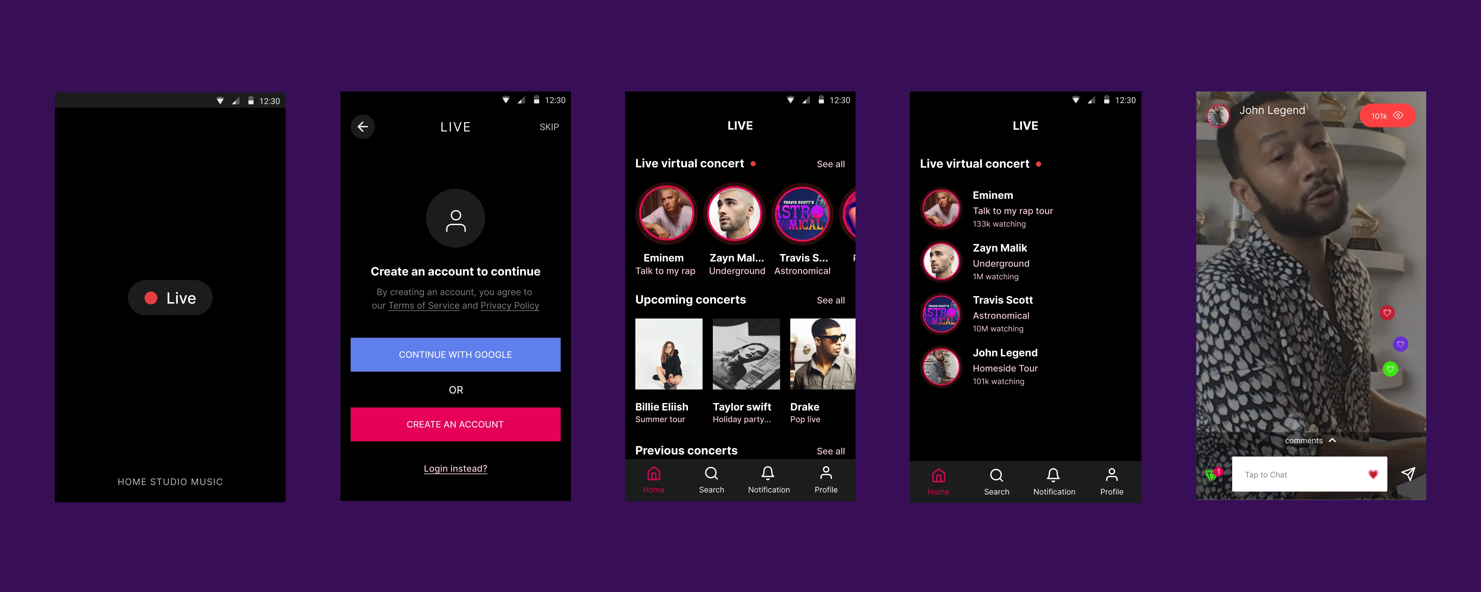
After the user onboard and lands on the home page containing Live virtual concerts, upcoming concerts, and previous concerts.
User can see the live virtual concert on the top section of the app or can see the full list of artist who is currently having a virtual concert, Directly clicking on the artist profile picture, drive the user to the virtual concert screen.
4. Inviting friends over Livestream
When I first thought about it, I designed it for people who are already using the app so that they can invite other friends who are also using the LIVE app.
But its an opportunity to welcome or inviting the new user who has not downloaded the app yet. Enticing a new user by sending an invitation link to a phone like “hey, Archit invited you for a Live music concert with John legend download the app to join.
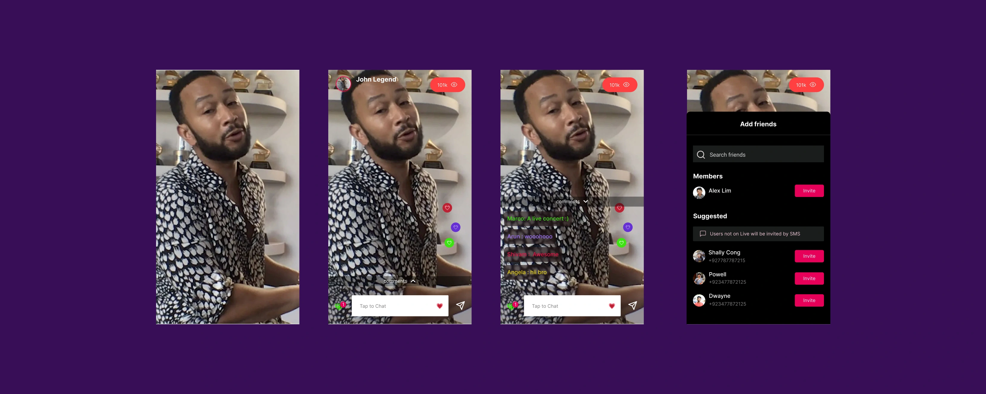
In a live virtual concert, the user taps on the send icon at the bottom of the screen then add friends screen comes up from the bottom then the user sends the invitation to Live app users and non Live app users.
5. Search
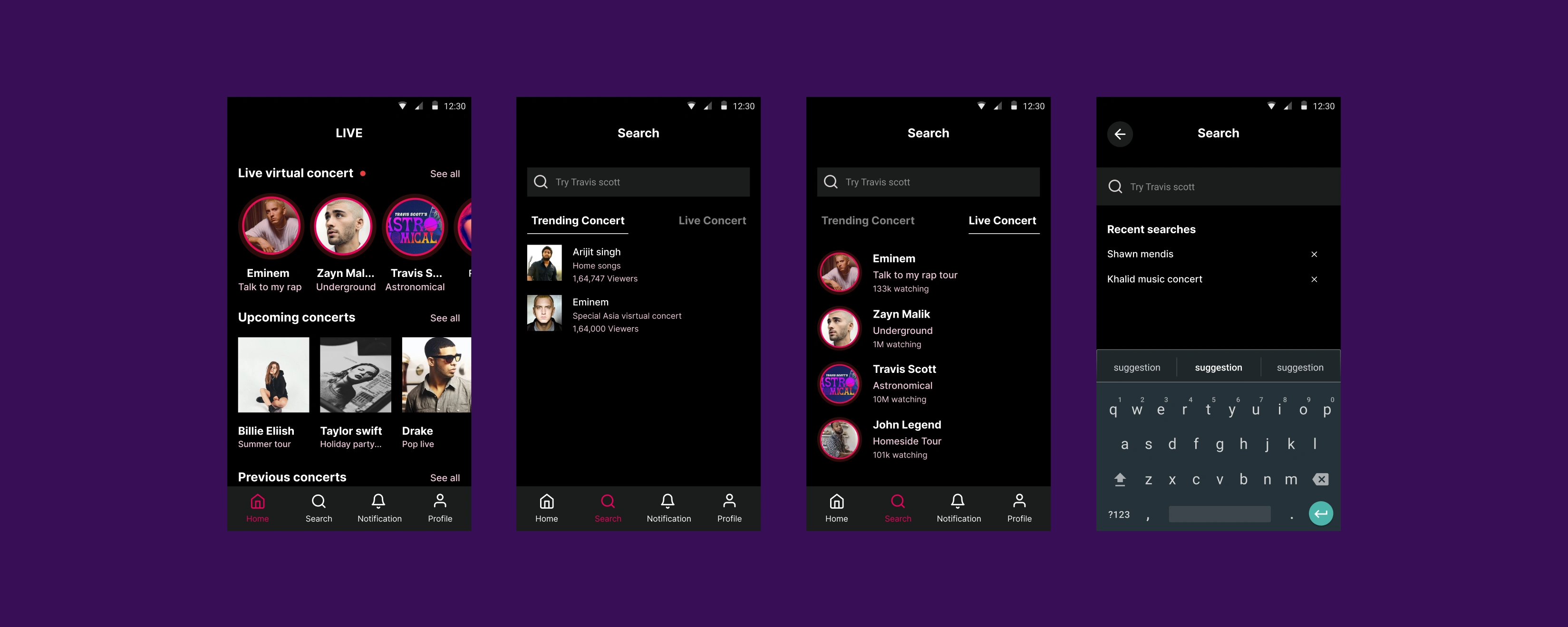
The search is pretty straightforward. After clicking on the search icon in the bottom navbar of the home screen, the search screen comes up. User search for an artist and concerts through concert names.
The search screen suggests user trending concert that has already happened so that they can view them later and Live concert i.e. all the live concert that is happening right now.
After clicking on the search screen expand and let the user search concert and artists.
6. Visiting and editing profile
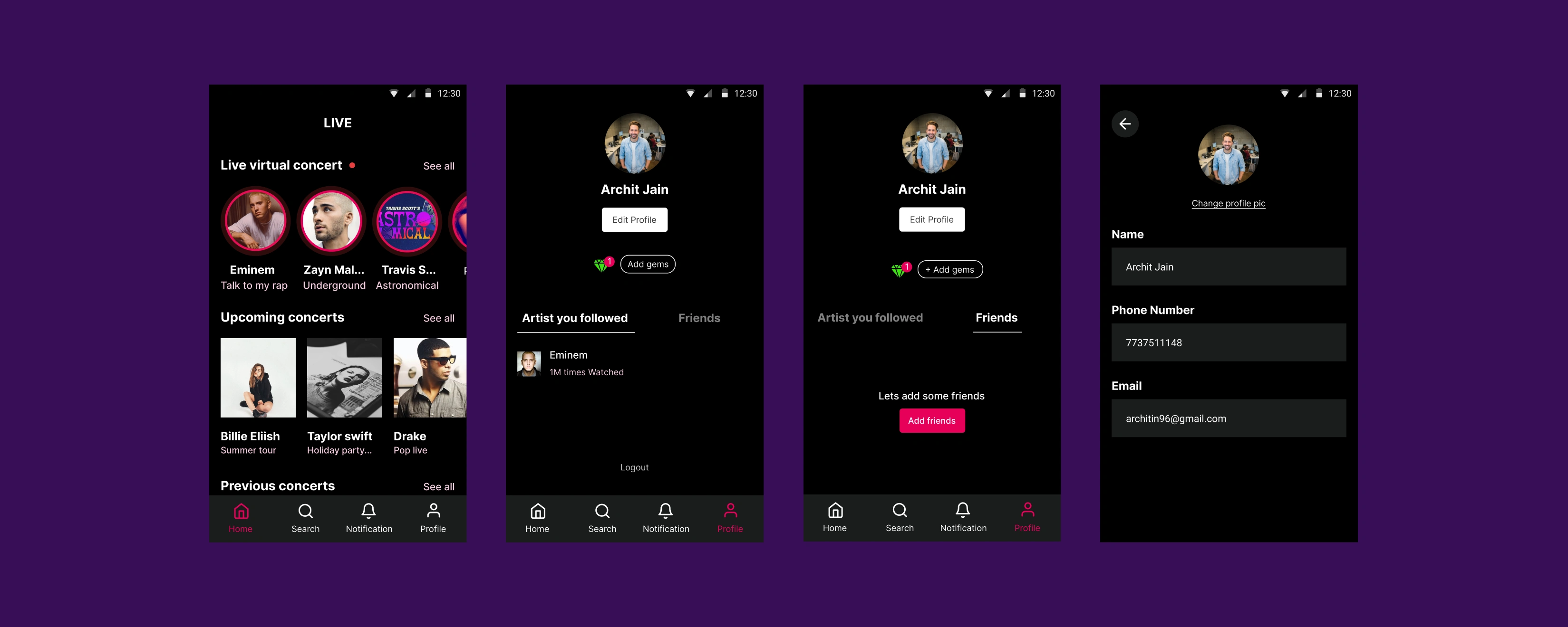
Clicking on the profile icon in the bottom nav bar user moves into their profile where he can edit the profile, Add gems, and see the artist followed and the friends they add.
After clicking on the edit button in the profile will send the user to the edit profile page where the user can edit the name, phone number and email.
7. Notification
The notification also played important in notifying users by notified about upcoming Live concerts, and requests by friends to join a concert. Giving users a perfect notification at the perfect time gives them more engagement in the app.

Learnings
Always iterate and don’t settle upon your first solution. We think that I have to make a design which looks good on the first attempt, but that is not going to occur. Try to explore more solutions to one thing.
Get’s feedback and get early feedback
When you are in a design challenge or in doing product design, don’t make things which are used by everyone try to niche down your product to a fewer audience.
Conclusion
It’s my first article on the medium and loved how it goes. Working on a design challenge always help you to refine your skill and improve your knowledge in different domains. Hope you guys like it, feel free to hit me on social media.
I am available to freelance and help you with your design, please dm below on any of the platforms
Social Connect
If you like this case study, Try holding the clap button for a few seconds.
Like this project
Posted Jul 24, 2023
This is part of the design challenge where I have to come up with a mobile app that interestingly uses Livestream.
Likes
0
Views
25


