Cyrela Website

Rafael Chiqueti


About Grupo Cyrela, Its Brands, and Their Challenges.
Grupo Cyrela is a vast network of real estate developers and construction companies. Within this network, Cyrela and Living stand out as two brands with distinct goals, audiences, and communication styles.
Both brands currently share a similar visual style on their websites, differing only in the colors of their components. This approach has created challenges for both brands.
Challenges
The visuals and components of the websites did not align with the brands' identities.
Different brands using the same visual style on their websites.
Visual inconsistency across components.
Solutions
Develop a unique identity for each brand.
Provide a delightful experience throughout the property acquisition journey.
Convey the essence of each brand within their respective websites.
Implement distinct design libraries for each brand.
About Grupo Cyrela, Its Brands, and Their Challenges
Grupo Cyrela is a vast network of real estate developers and construction companies. Within this network, Cyrela and Living stand out as two brands with distinct goals, audiences, and communication styles.
Both brands currently share a similar visual style on their websites, differing only in the colors of their components. This approach has created challenges for both brands.
Challenges
The visuals and components of the websites did not align with the brands' identities.
Different brands using the same visual style on their websites.
Visual inconsistency across components.
Solutions
Develop a unique identity for each brand.
Provide a delightful experience throughout the property acquisition journey.
Convey the essence of each brand within their respective websites.
Implement distinct design libraries for each brand.
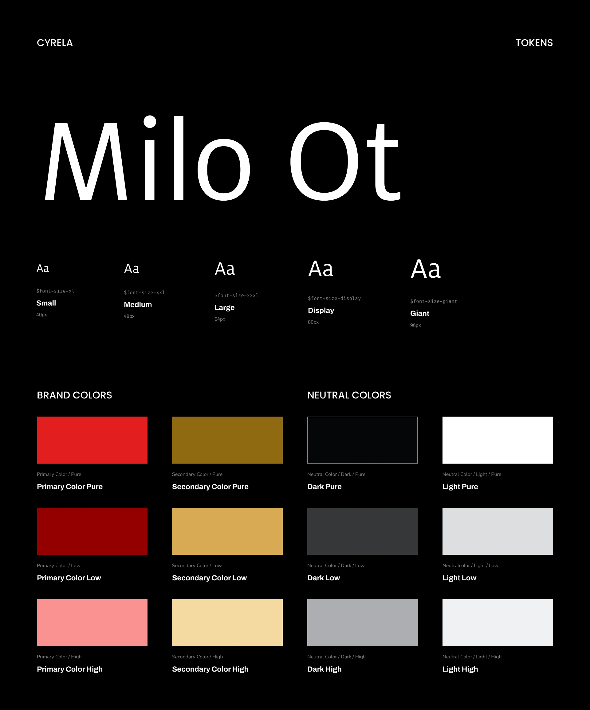
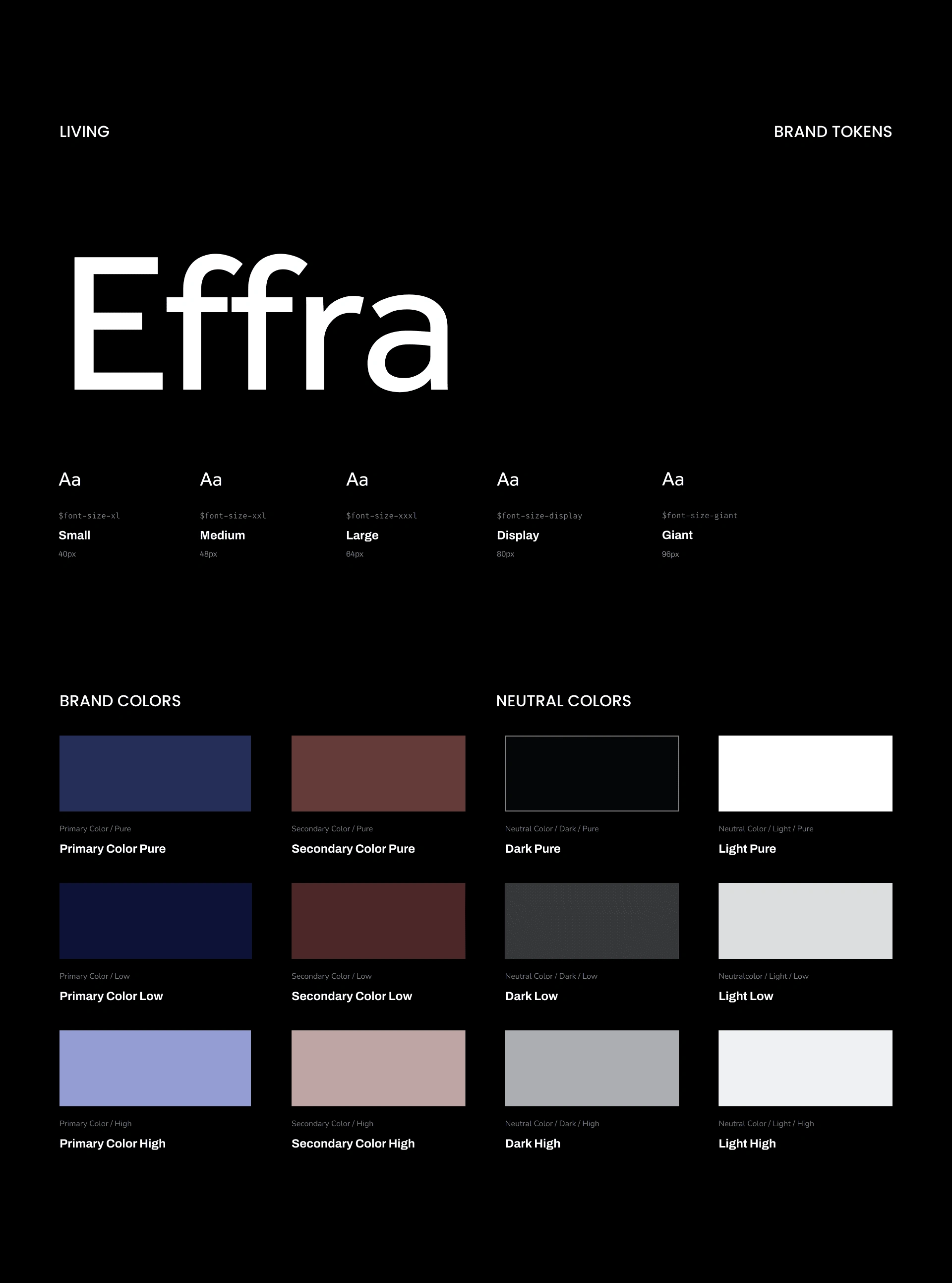
Starting the Token Library
I began by creating the design library, conducting extensive research to better understand how the components could reflect each brand’s aesthetics.
Next, I started defining the tokens, establishing the colors, typography, icons, and grids that would be used for each brand.
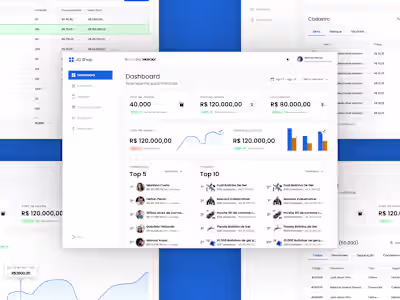
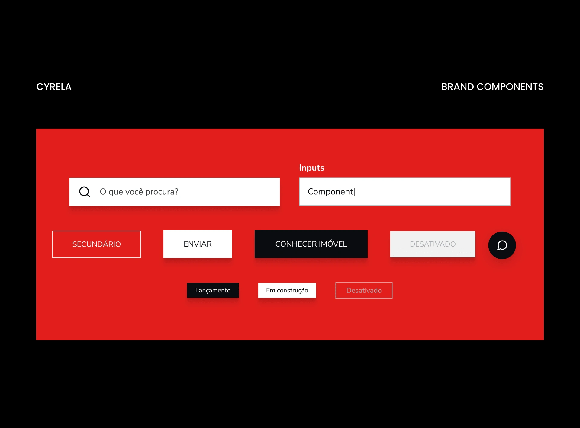
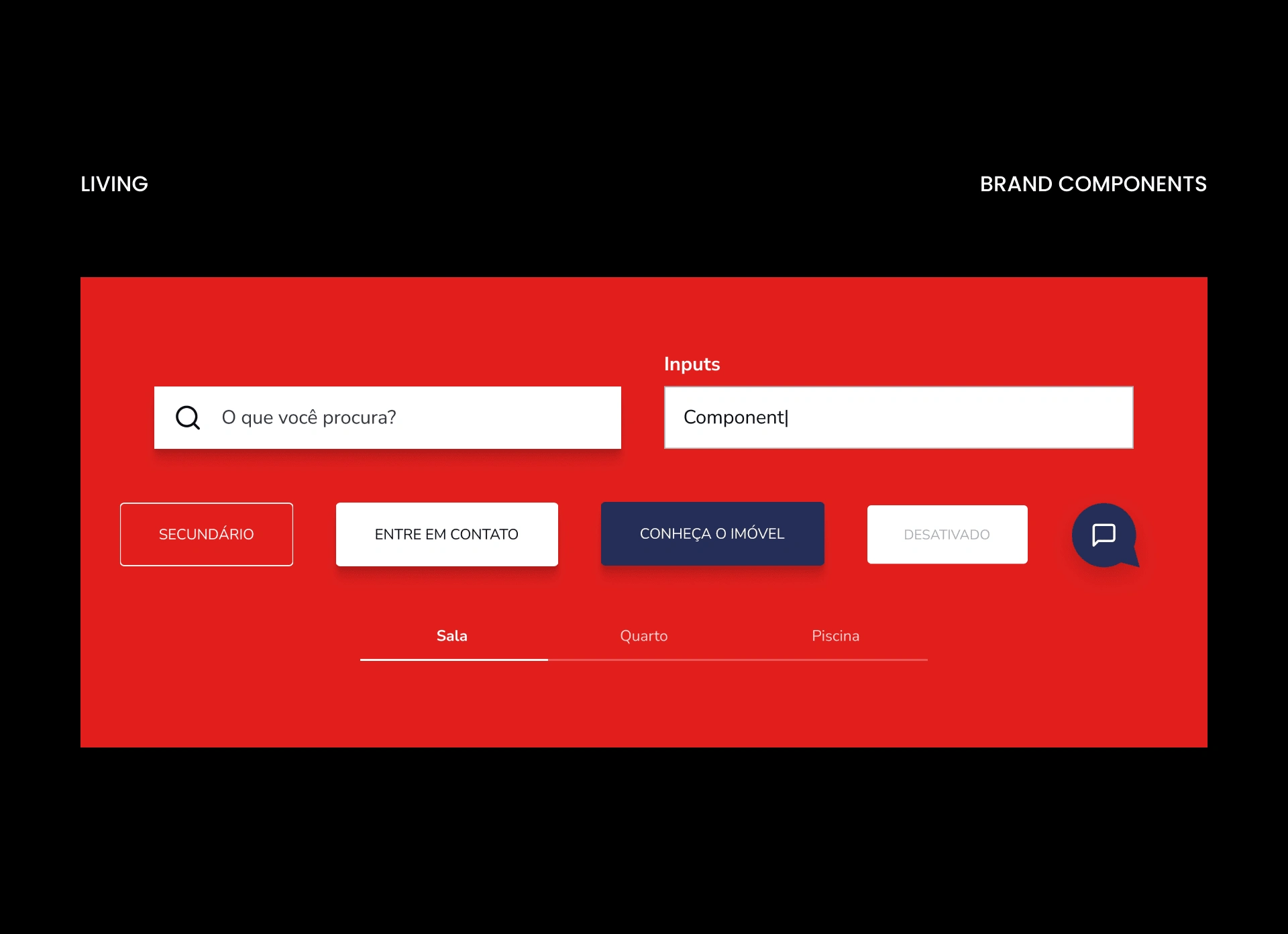
Defining the Components
With the foundation of the library in place, the next step was to define the components. However, it wasn’t just about defining them; we needed to ensure these components aligned aesthetically with the brands.
Each component was carefully designed to reflect the unique aesthetics of the brands.
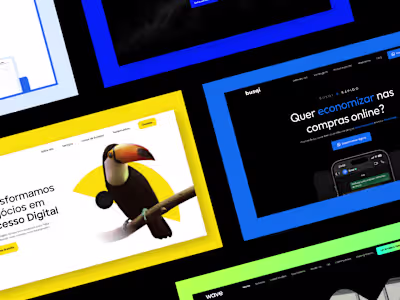
Conveying the Essence of the Brands
Now, with the project’s foundation established—tokens and components—it was time to recreate the brands’ identities.
I began this process with a competitive analysis of various players in each brand’s niche. The goal was to understand how we could more effectively reflect what each brand represents on their respective websites.
See the rest of the project on my website: https://www.rafaelchiqueti.com
Like this project
Posted Dec 27, 2024
Conveying the essence of brands within their websites
Likes
0
Views
7