Silly Kittens

DELIVERABLES
Brand Strategy
Brand Identity Design
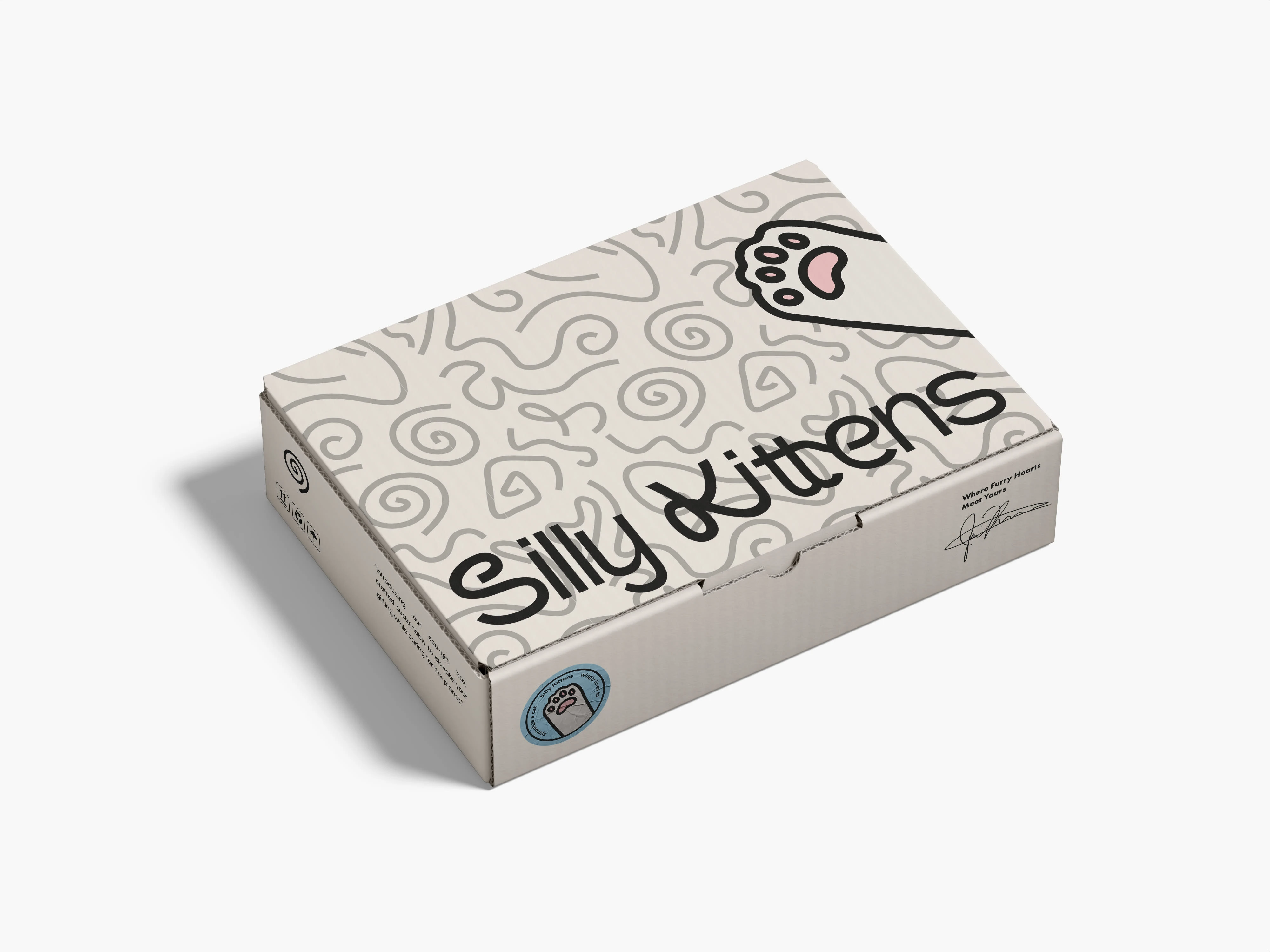
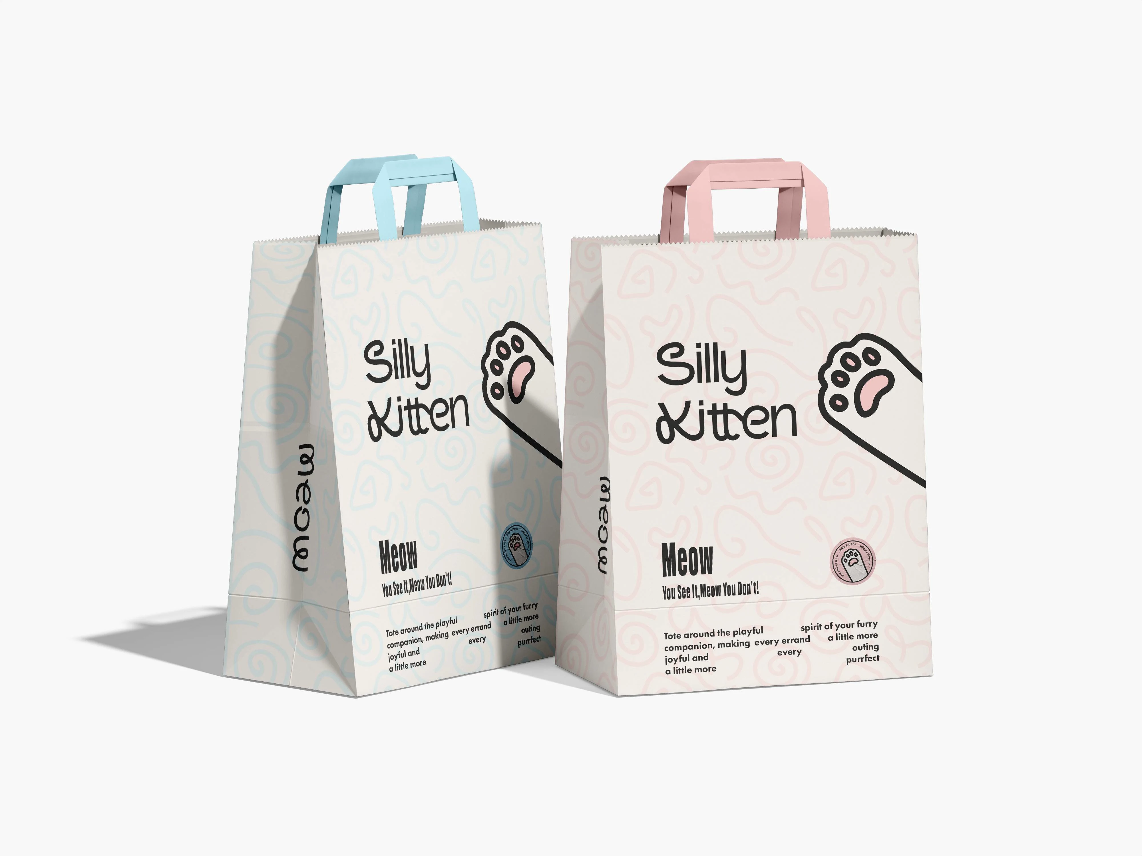
Packaging Design
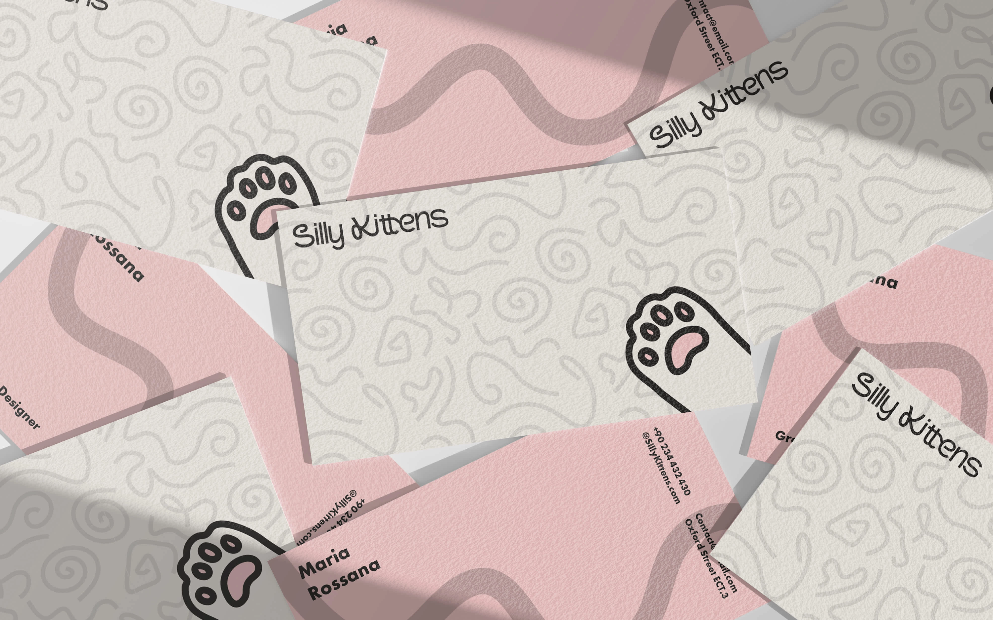
Print Design
Concept Development
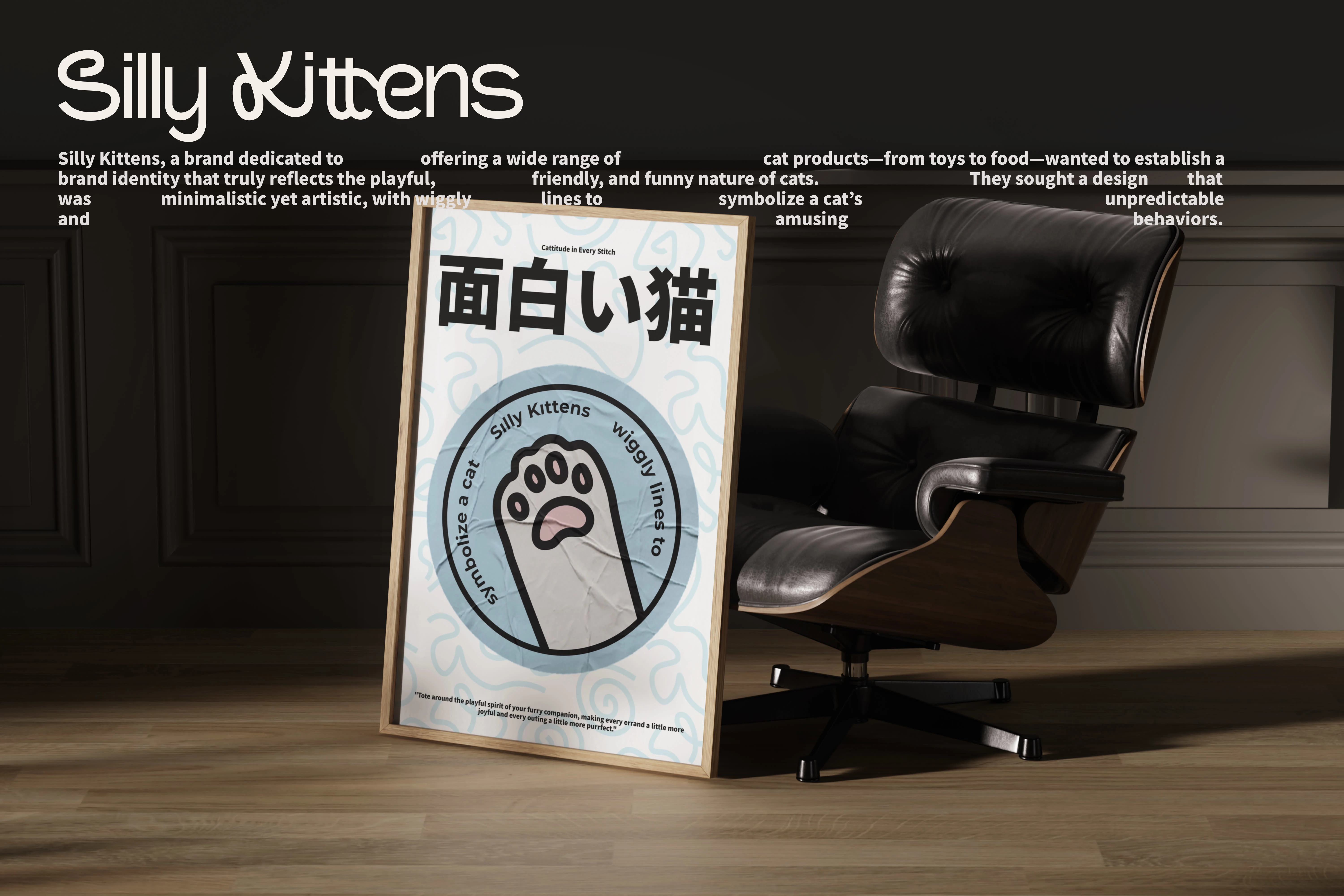
Based on my research and insights, I brainstormed several concepts that captured the playful spirit of Silly Kittens. My focus was on:
Creating a word mark that incorporates wiggly lines to represent the playful movements of cats.
Designing a visual identity that balances minimalism with artistic flair, using a soft color palette.
Design Execution
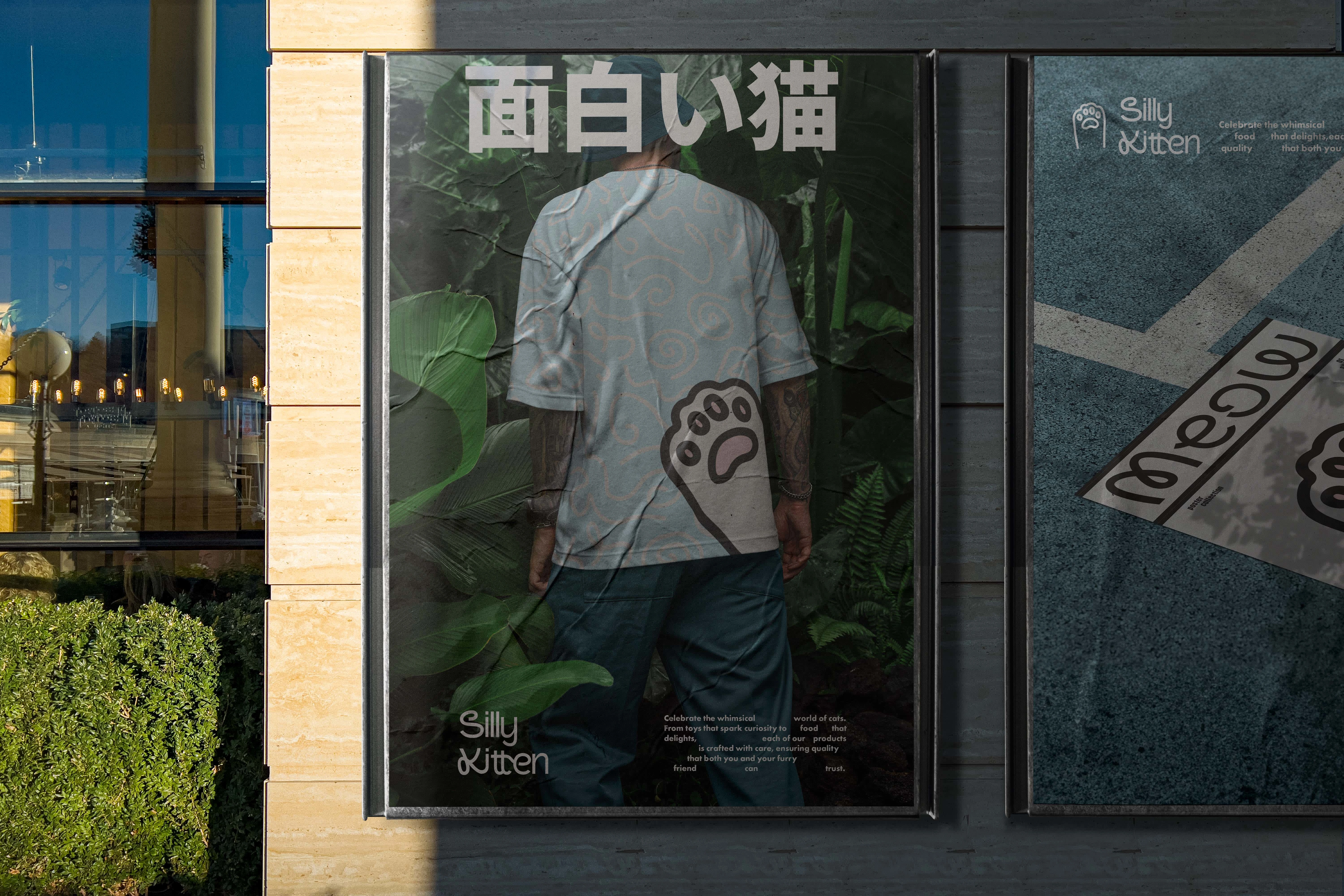
Symbolism: I used wiggly lines to mimic a cat’s playful and curious behavior, creating a sense of movement within the logo.
Color Palette: The logo features a predominantly white and grey theme, with subtle accents of baby colors like soft pinks, blues, and yellows to convey warmth and friendliness.
Minimalism: The overall design is kept simple and clean, with a focus on artistic elements that don’t overwhelm the viewer.
Conclusion
This case study demonstrates my ability to understand and creatively address branding challenges. By blending minimalism with artistic flair, we delivered a brand identity for Silly Kittens that is both fun and memorable, resonating with their target audience.
Like this project
Posted Sep 20, 2024
Brand strategy and playful visual identity for Silly Kittens, a minimalistic cat product brand.

