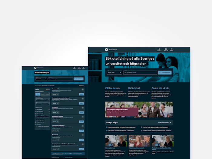
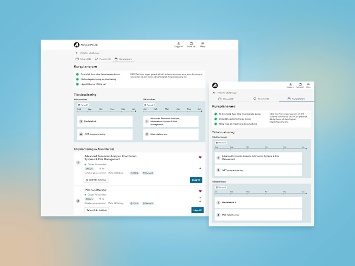
Redesign of FAQ page
Project overview
The goal with this project was to redesign the frequently asked questions (FAQ) page for the Swedish university admissions website. This was a conceptual design and a solo summer job project I did when working for ITS during the summer 2023.
Design process
This project gave me an opportunity to discuss, co-create and iterate the design with users as well as discuss and modify the design based on insights from the stakeholders of the system.
The design process consisted of these activities:
Conducted exploration and ideation to gather design concepts.
Researched best practices and guidelines for FAQ pages, focusing on chunking, jump links, and accessibility.
Created a mid-fidelity prototype for user feedback.
Conducted user interviews to gather insights and preferences.
Iteratively refined the design based on user feedback.
User Research
For my user research I chose to do interviews with 4 users. To make it easier to discuss the needs and pain points of the users I created a mid-fi prototype of a different FAQ page:
First draft
During the interview I showed both the existing version of the FAQ and my new version and asked questions aimed to understand the users preferences. The result from these interviews was that the users preferred the existing version of the FAQ page because they liked the scannability of it. Which was an interesting insight since my hypothesis was that the users would find it easier to navigate the page if they could more quickly switch between categories. Since that was not the case I created a new prototype and more similar to the existing design and then landed at the final design below.
Results
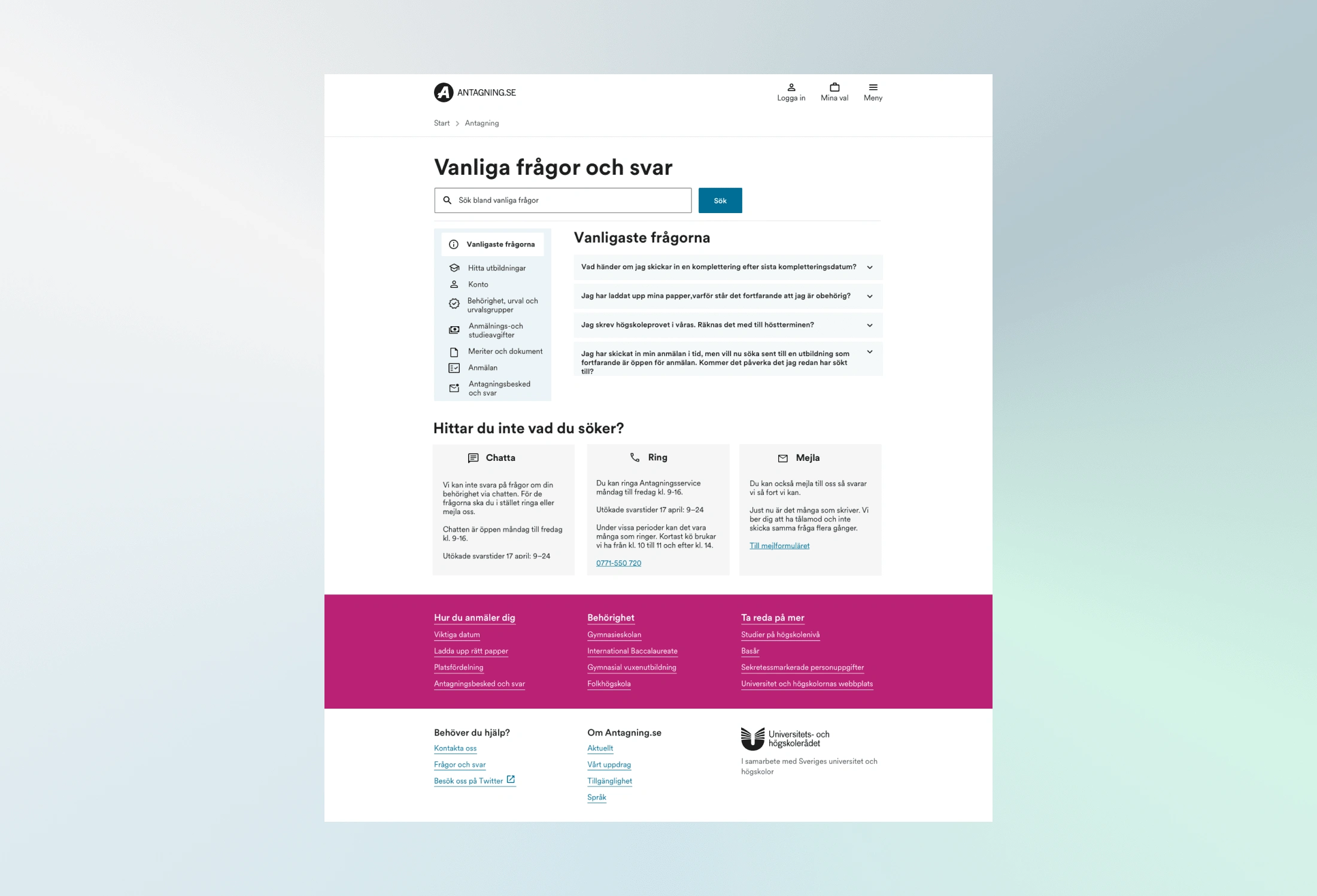
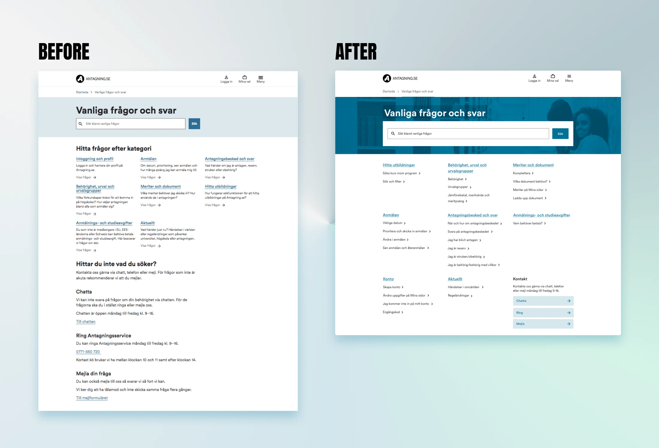
The new design has:
A more compact, clean design
Better visual balance and connection to the style guide
The headings within the categories are broken out into quick links
On other pages (not shown in the pictures) there are jump links to navigate to the questions within the page
Lessons Learned
Scanability is important
User needs are hard to predict
Finding the middle ground among preferences
Through this project, I discovered the importance of prioritizing scannability. Initially, I assumed that breaking down information into smaller chunks with a toggle menu would enhance the ease of digestion and scanning. However, interviews with users revealed a different behavior—the target audience tended to scan specifically for keywords related to their queries. Consequently, my initial FAQ draft, featuring a toggle menu, proved to be more challenging for users to navigate.
Despite encountering similar designs in other solutions where designers had used a toggle menu, I realized the difficulty in predicting user behavior accurately. It think that such a design might be more effective for a FAQ page with less questions or maybe in an different environment.
The last thing I take with med from this project is that the more users you ask the easier ot becomes to find a middle ground. Even if there may be some variations in preferences it becomes easier to see where the pain points actually is when more people is included in the study.
Like this project
Posted Oct 20, 2023
Interviewed students to see the flaws and strengths of the current FAQ page and and co-created the new version of the page during summer job at ITS
Likes
0
Views
21

