Course Planner
Project overview
This project originated from the idea that it could be helpful for students to have a tool which helps them prioritize and easier overview the courses they are interested in. This was a conceptual design and a solo summer job project I did when working for ITS during the summer 2023.
Design process
During this project I learned about visualizing courses in a timeline, how clear distinction between visualization and actionable sections can make a big difference on understanding as well as the importance of clear labeling.
The design process consisted of these activities:
Conducted research
Studied various planner designs
Generated and evaluated multiple concepts for course planner placement
Discussed and iterated on concept with users and other designers
Results
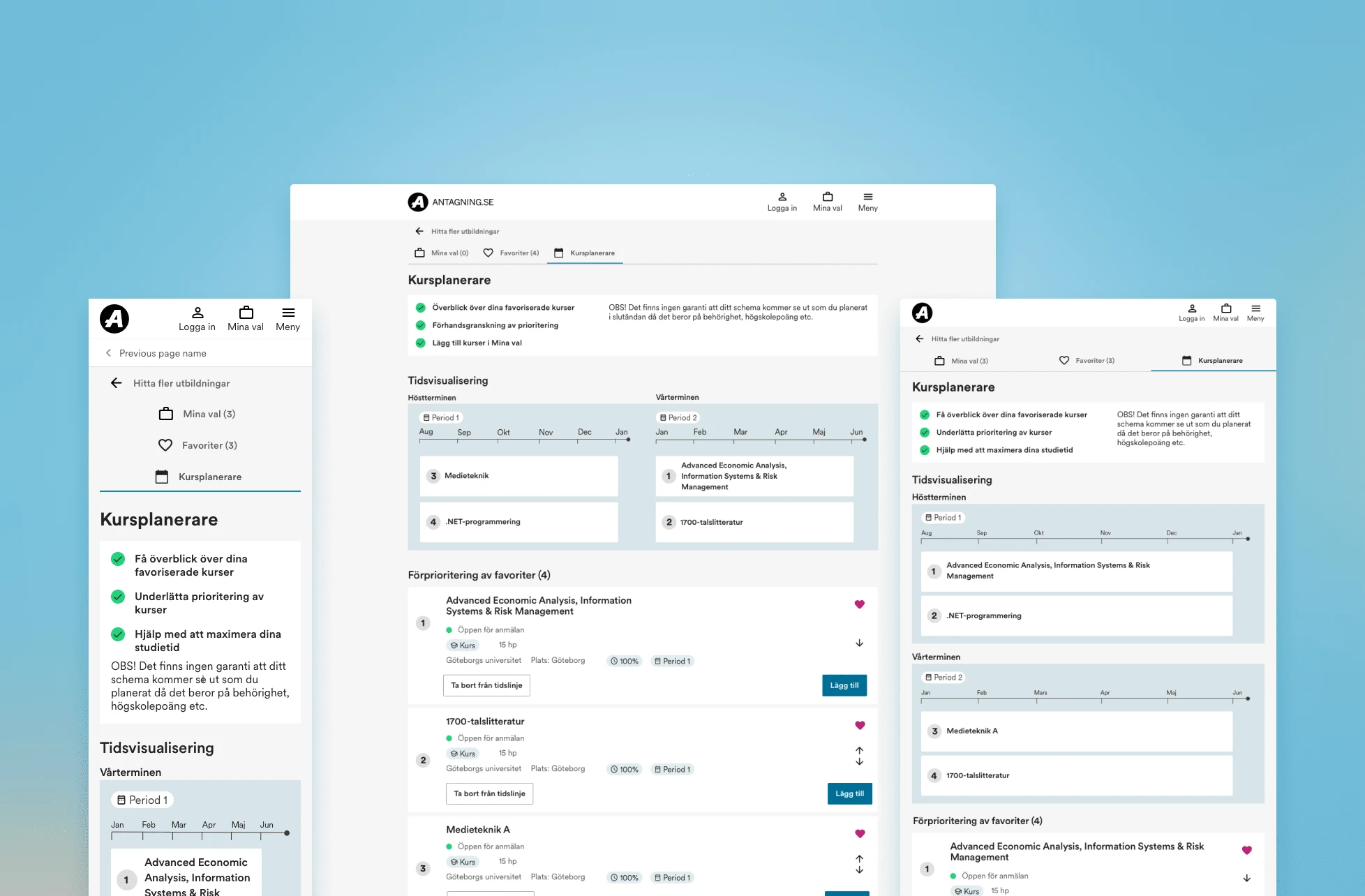
This concept is currently awaiting usability testing and additional user research before proceeding with implementation. The proposed design allows users to mark courses of interest with a heart icon, automatically adding them to the course planner. Within the course planner, users have the flexibility to remove selected courses, eliminate entries from the favorites list, and add them to "My Selection," where the final choices are made. Additionally, users can establish a pre-prioritization, influencing the order of courses in the "My Selection" tab.

Mobile, tablet and desktop version
Lessons Learned
Making clear titles are essential
Separating actionable vs unactionable sections can be a solution for simplicity
What I came to learn through this project was how essential and challenging naming titles are. If the titles are clear enough it is likely they will understand the tool, if the title is too vague it can make a simple tool overly complicated because it can effect the users cognitive schema of how the functionality works.
Moreover, after making several prototypes and discussing with other designers I received feedback that it could be confusing if the time visualization also had functionality like "add" because the users may have difficulty understanding where they are adding their course. To make it simpler I removed all functionality from the timeline and made the behavior and placement of the function similar to what currently exists on the website. This may not be the best solution in all cases but in this particular project and in projects where there are several buttons and choices the user can make it may be the most suitable solution.
Like this project
Posted Nov 6, 2023
Designed a concept for a course planner that students can use when applying for courses during my summer job at the company ITS
Likes
0
Views
14


