Tatizo Brand & Visual Identity Development
Olayinka David
Tatizo - Software as a Service (SaaS) Brand & Visual Identity
Project Overview
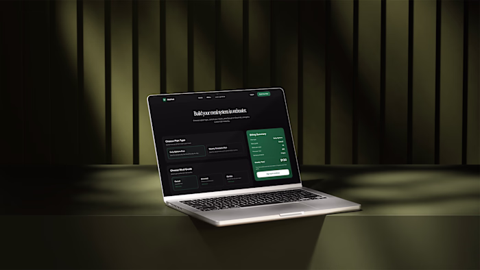
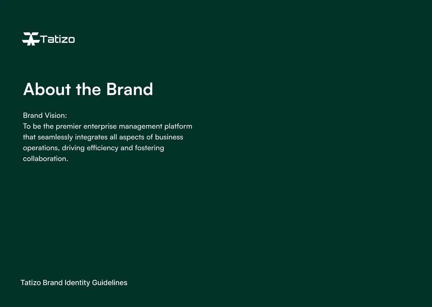
Tatizo is a modern ERP and business operations platform designed to help growing companies streamline processes, improve visibility, and make smarter, data-driven decisions. The brand needed a strong visual identity that could communicate trust, intelligence, and scalability while standing out in a crowded enterprise software landscape.
Key strategic pillars included:
Trust & Credibility – Essential for ERP adoption and long-term usage
Simplicity – Making complex operations feel manageable
Scalability – A brand that grows with the business
Innovation – Subtle futurism without sacrificing usability
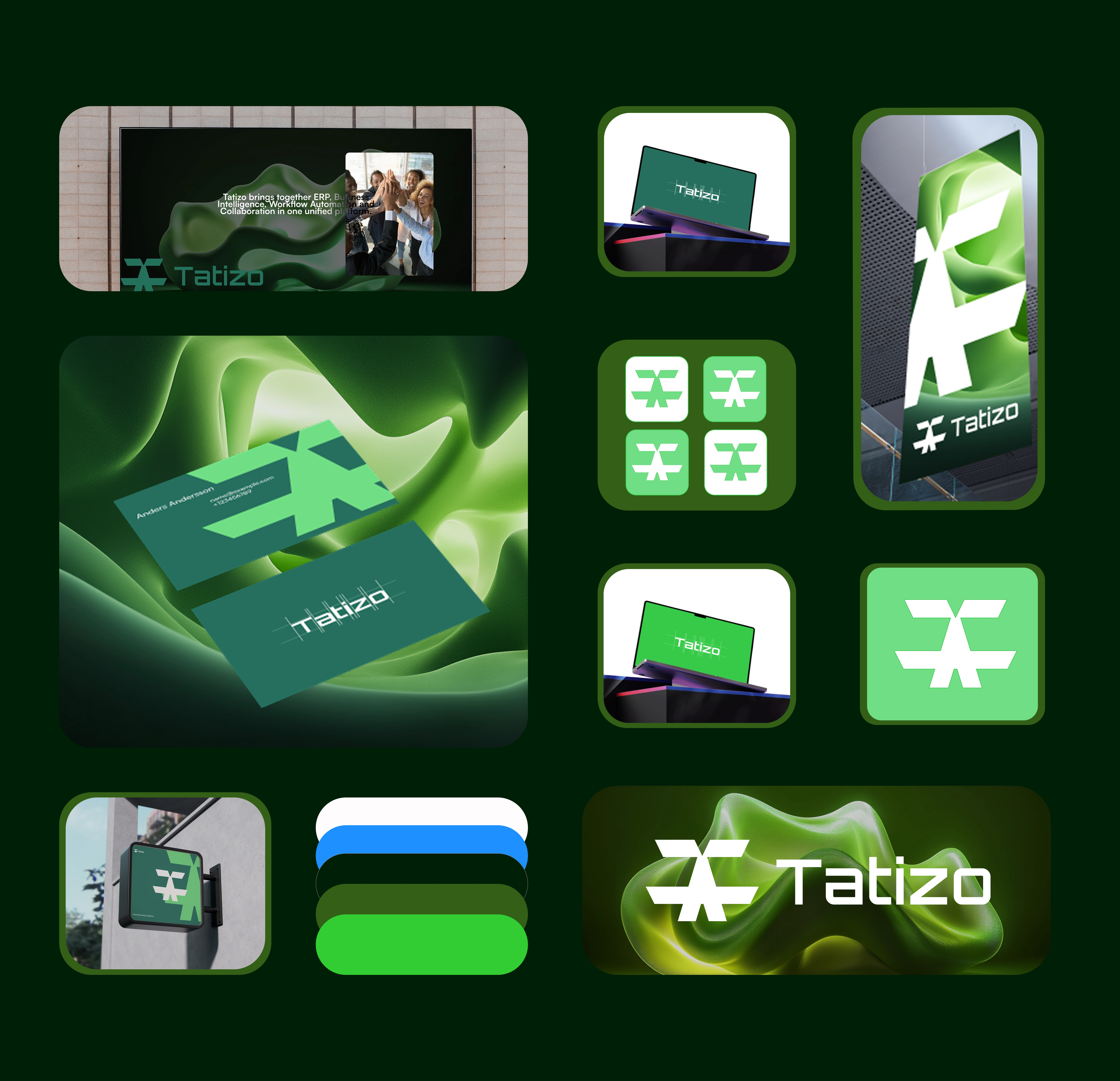
Visual Identity System
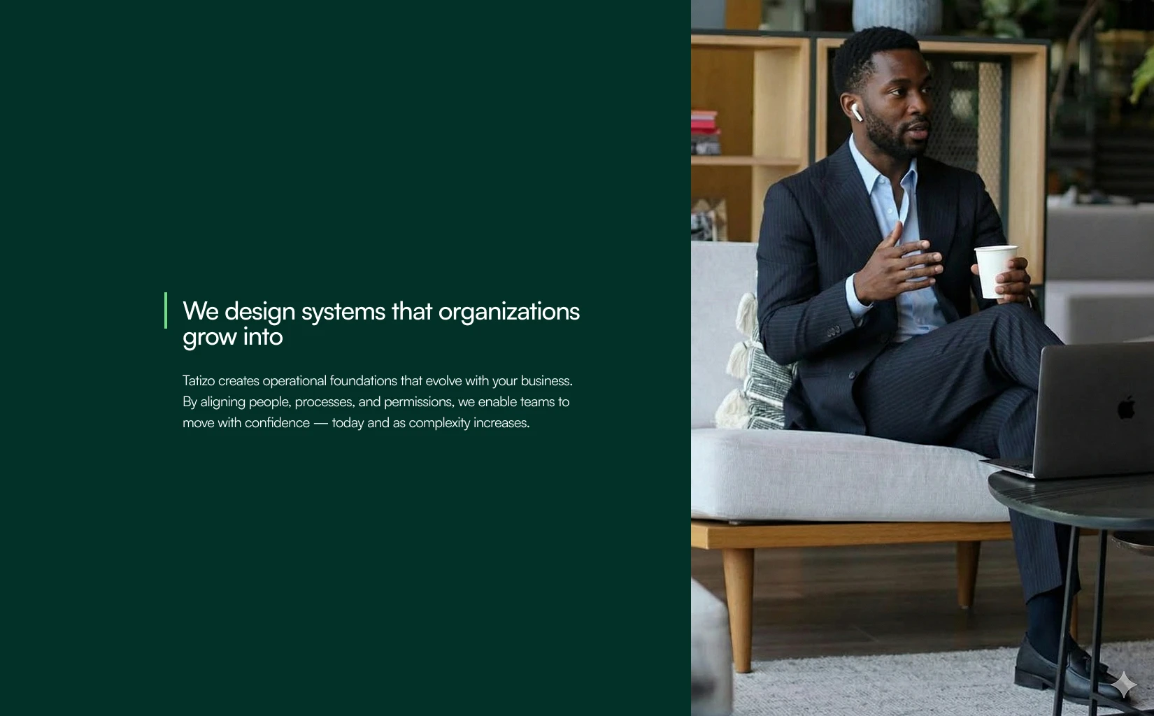
The visual identity was built as a modular system that mirrors Tatizo’s product philosophy.
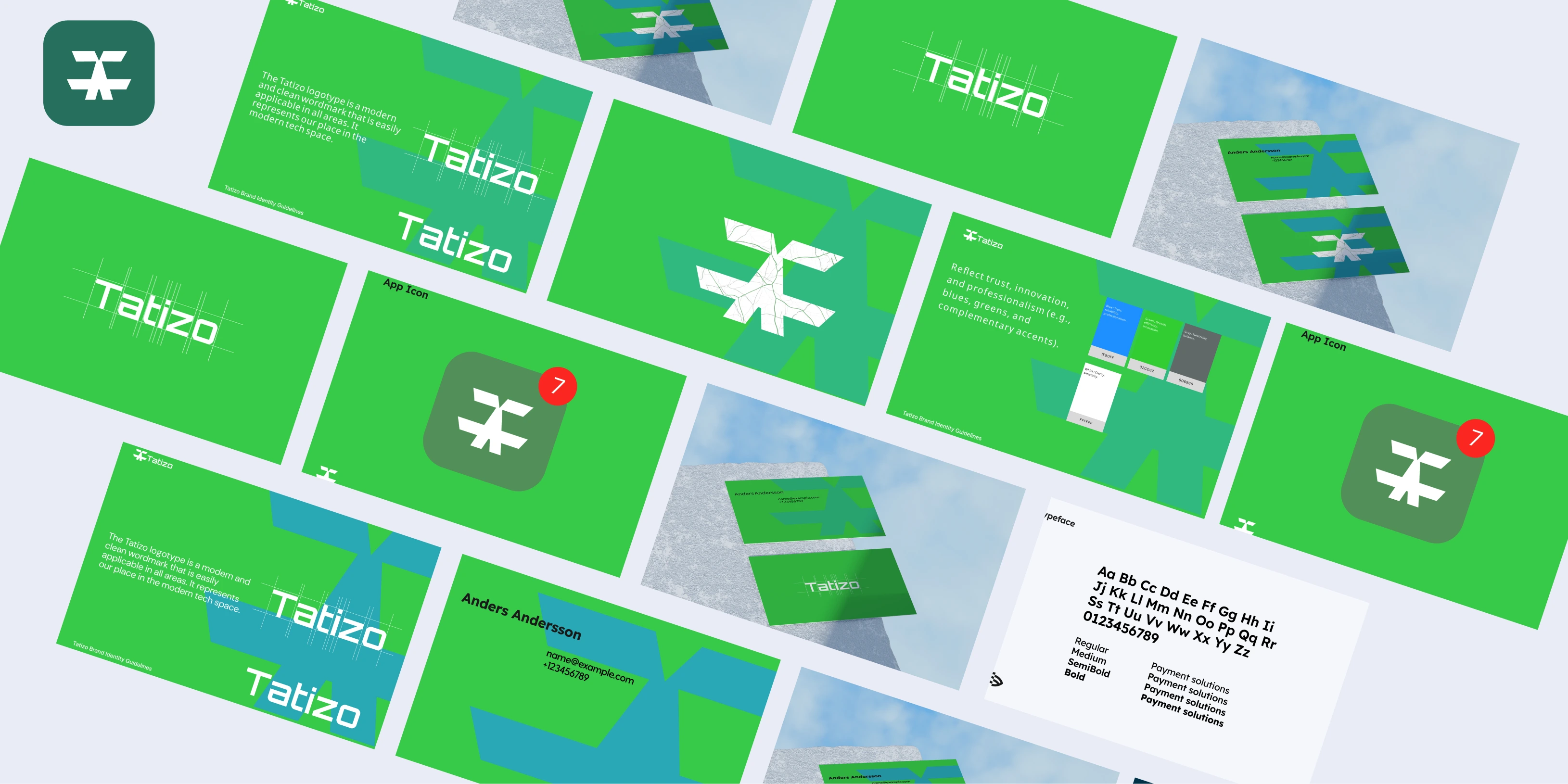
Logo Design
A clean, structured wordmark with balanced proportions, designed to feel stable and enterprise-grade while remaining contemporary.
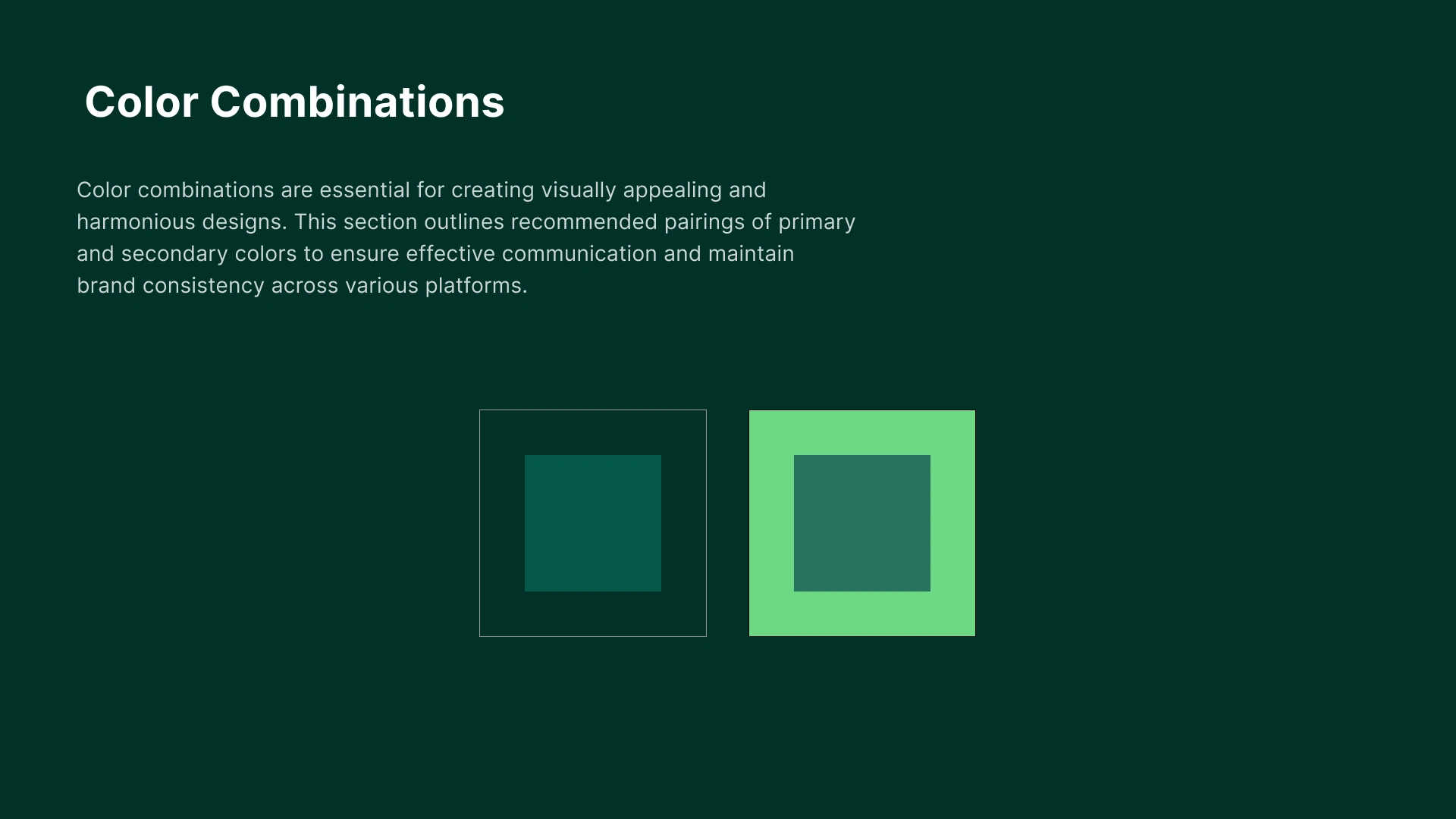
Color Palette
A refined, modern palette centered around deep, confident tones complemented by lighter accents. The colors reinforce trust, clarity, and technological sophistication.
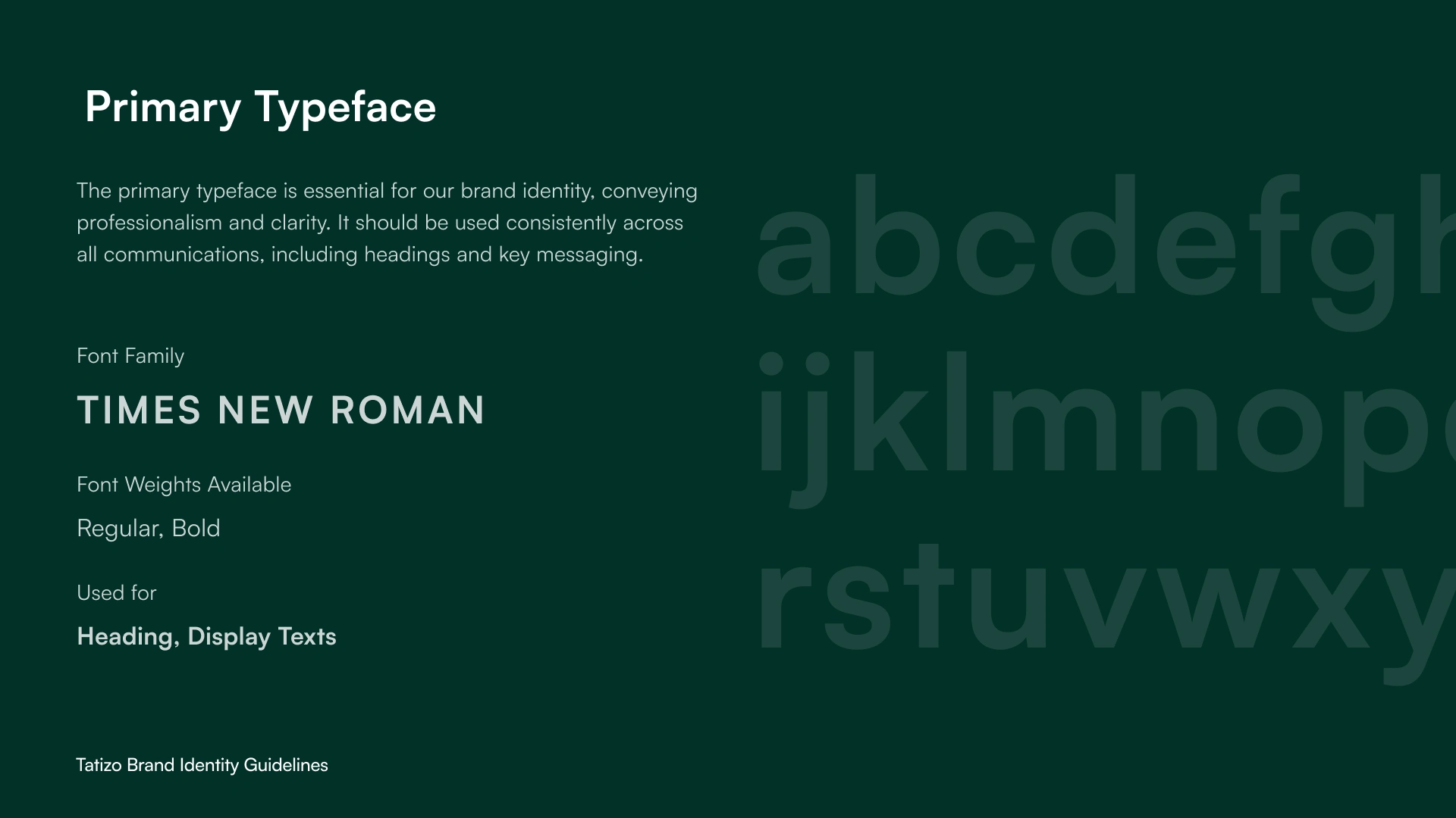
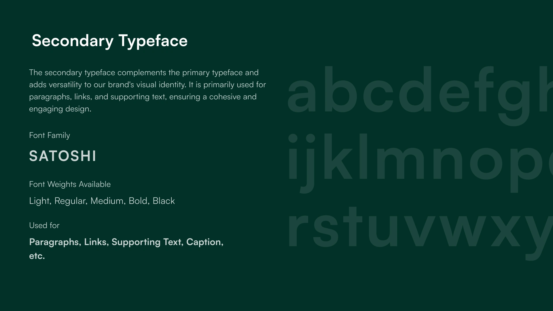
Typography
Clean, modern sans-serif typefaces chosen for legibility across dashboards, marketing materials, and digital interfaces. Typography supports hierarchy, clarity, and ease of navigation.
Visual Language
Subtle grid systems, spacing, and geometric patterns reflect organization and flow. Design elements were intentionally restrained to let content and data remain the hero.
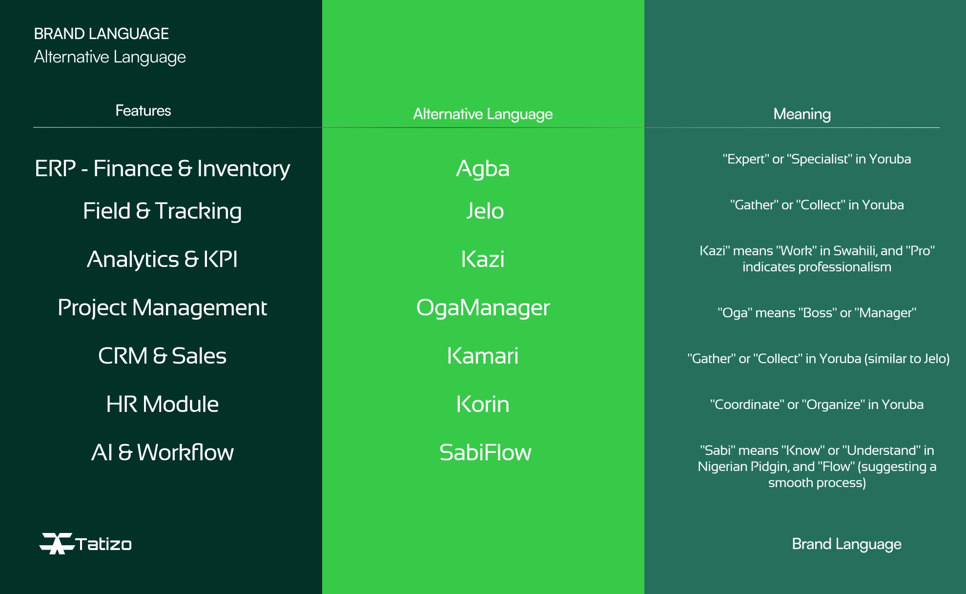
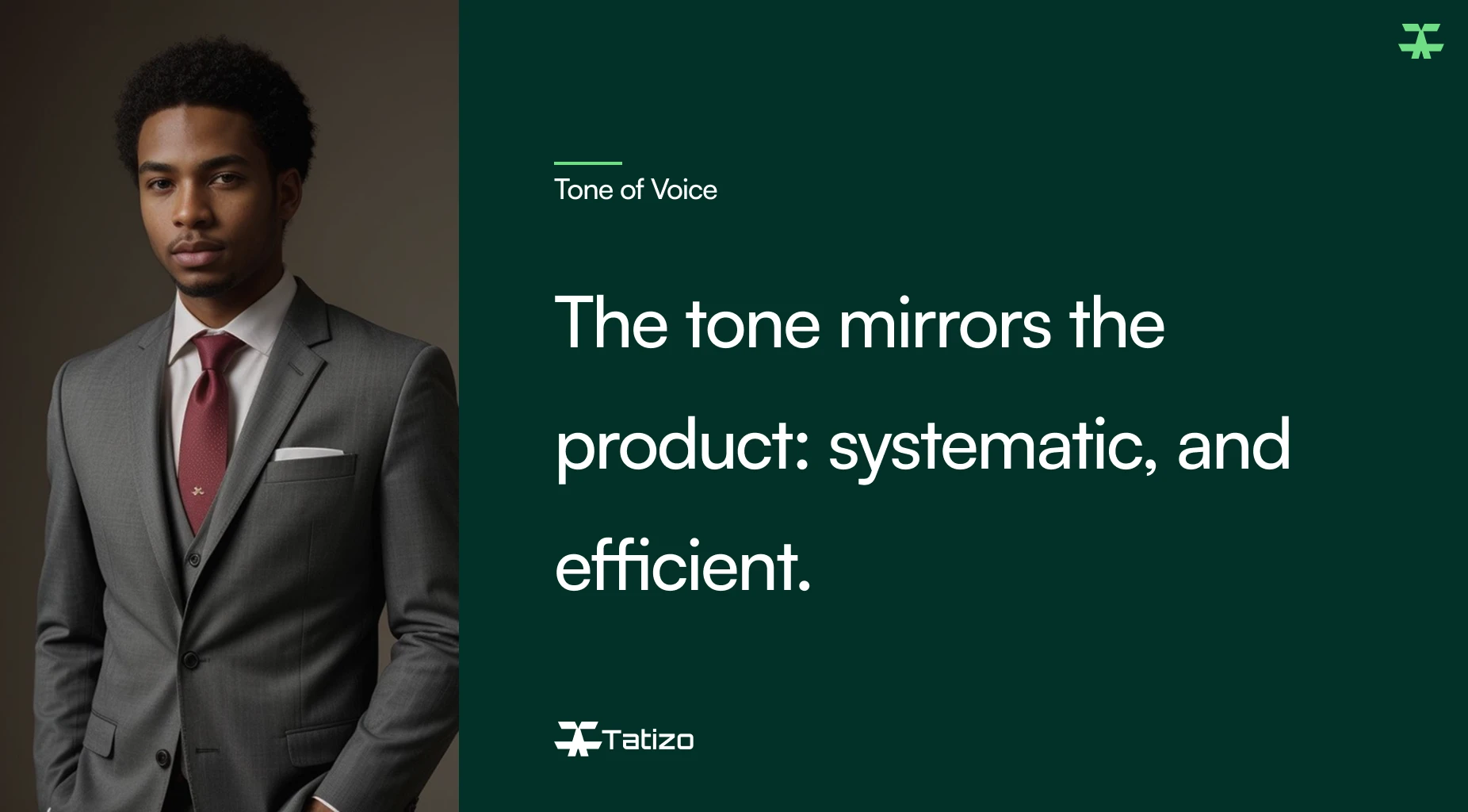
Brand Voice and Language
Goal
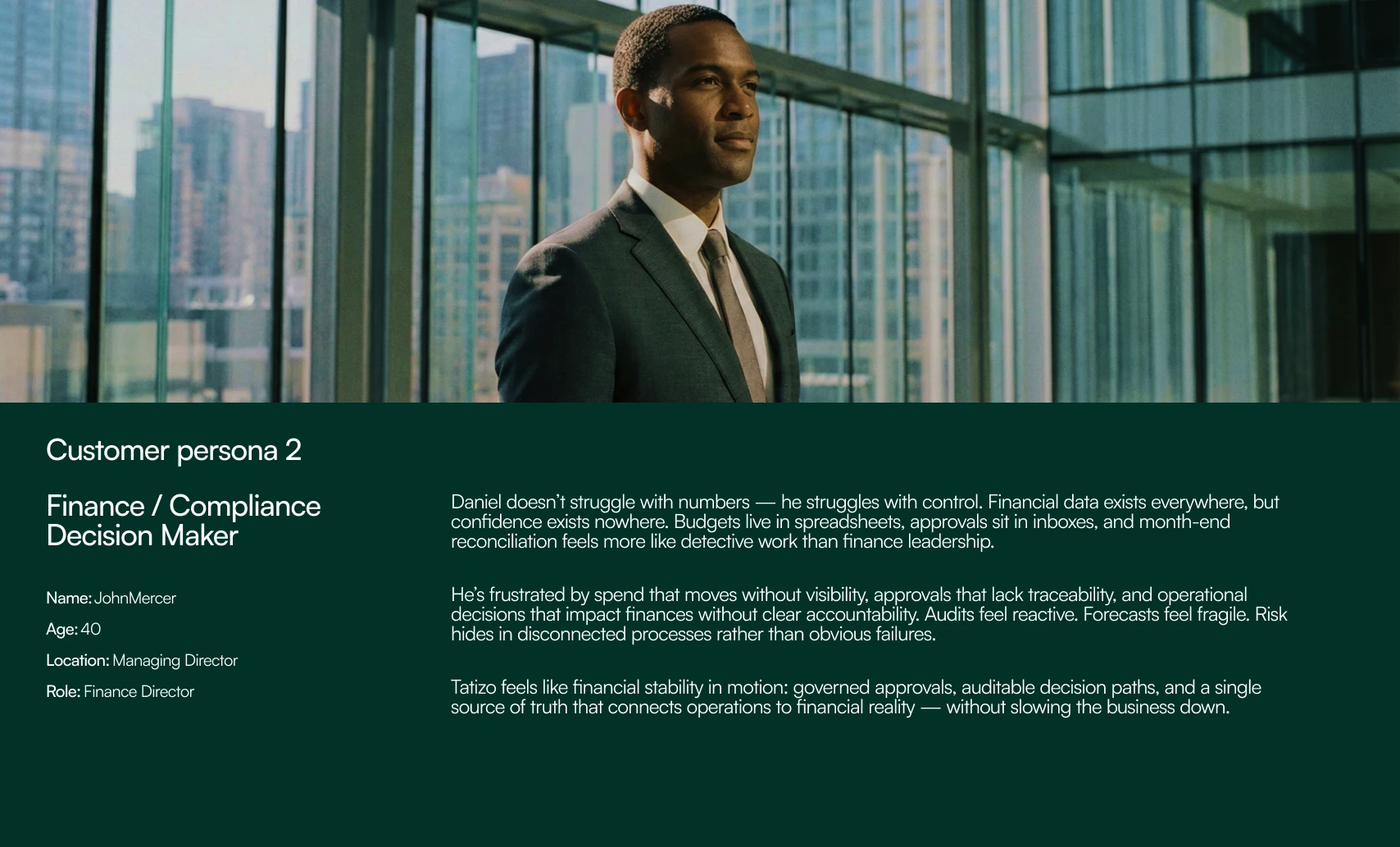
Develop a cohesive brand and visual identity that positions Tatizo as a forward-thinking, enterprise-ready platform while remaining approachable for startups and mid-sized businesses. The identity needed to feel modern, modular, and flexible enough to scale across product interfaces, marketing assets, and investor communications.
Applications & Use Cases
The identity was designed to seamlessly extend across:
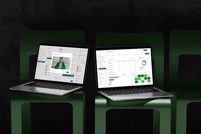
Product UI and dashboards
Marketing website and landing pages
Pitch decks and investor materials
Social media and brand communications
Sales collateral and documentation
This ensured brand consistency while allowing flexibility for future feature expansion and integrations.
Result
The final brand and visual identity positioned Tatizo as a credible, modern ERP solution built for growth. The system communicates confidence, clarity, and structure, helping Tatizo stand out as a platform that simplifies complexity and empowers businesses to operate smarter.
The identity now serves as a strong foundation for product design, go-to-market efforts, and long-term brand scalability.
Like this project
Posted Jan 24, 2026
Developed a cohesive Brand and Visual identity that positions Tatizo as a forward-thinking, enterprise-ready platform for startups and mid-sized businesses.
Likes
0
Views
5
Timeline
Jan 1, 2026 - Jan 15, 2026