Naro: Brand Identity and Application System

Ali Shayan


Petrol and amber, a serif that does the talking, and a mark built to survive being shrunk to sixteen pixels.
Most identities are designed at poster size and then discovered, painfully, at favicon size. Naro was worked the other way round. The mark had to hold at the smallest place it would ever appear before it was allowed anywhere else.
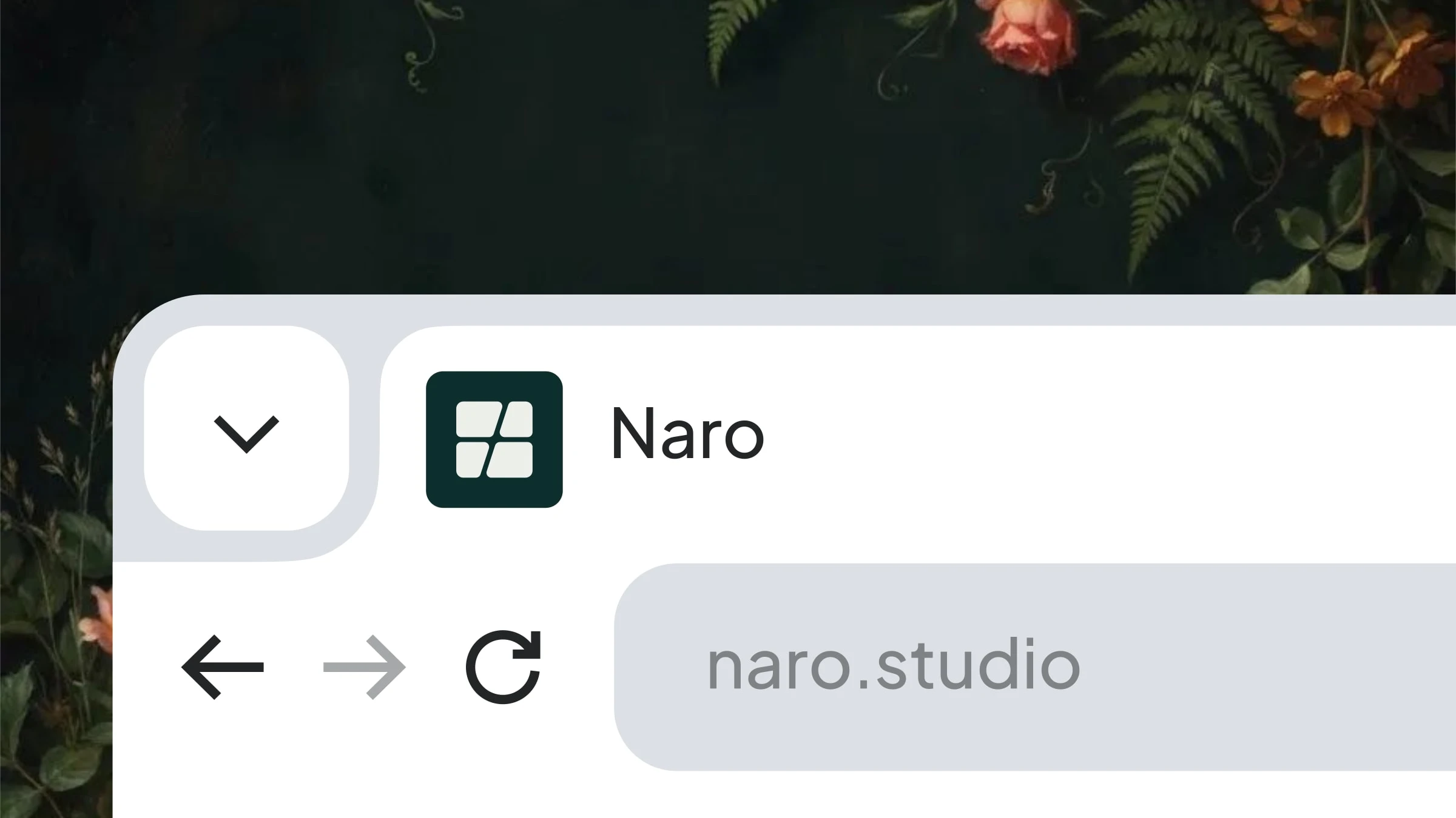
The mark at real favicon size
That is the actual test. Not a brand board, a browser tab with eleven other tabs open next to it.
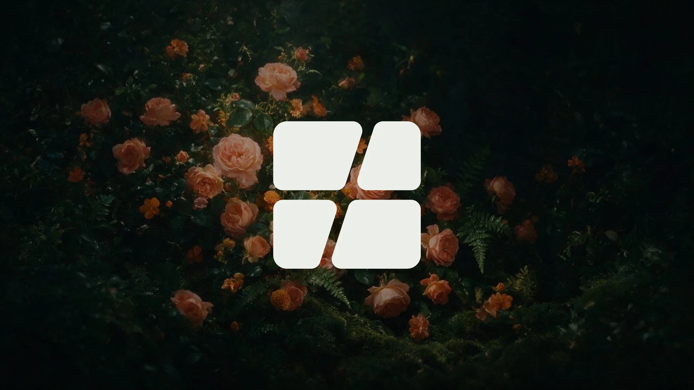
The mark on the brand field
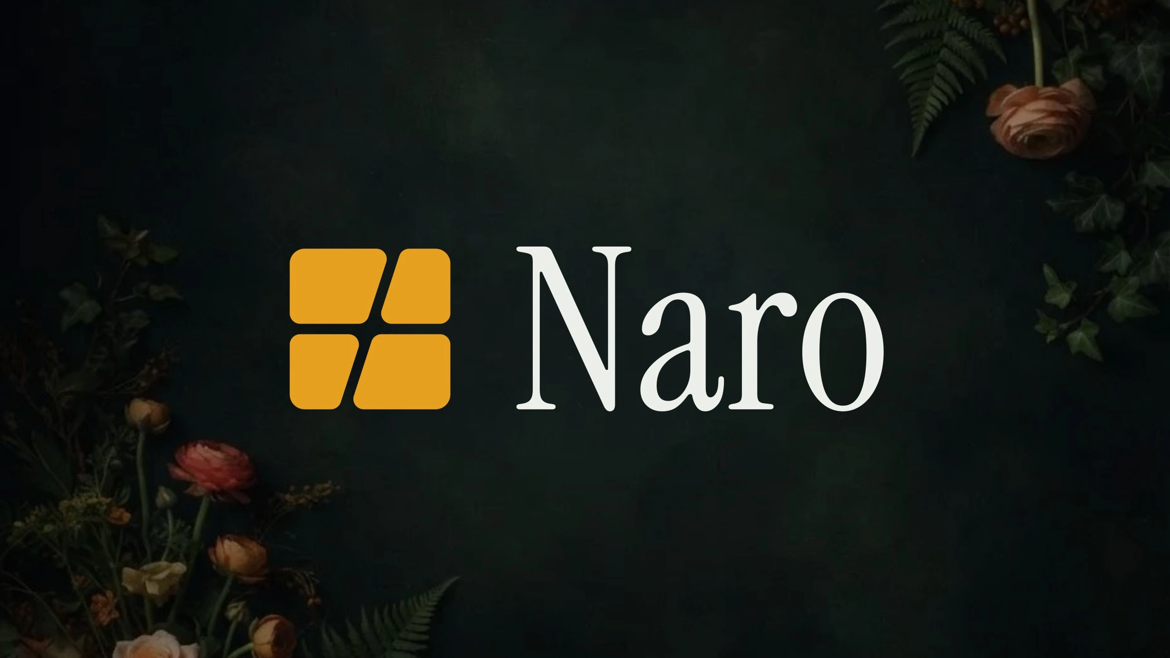
The full lockup
The palette is deliberately narrow. A deep petrol that carries almost everything, and a single amber reserved for one job: the thing you are meant to press. Restraint is what makes an accent colour mean something.
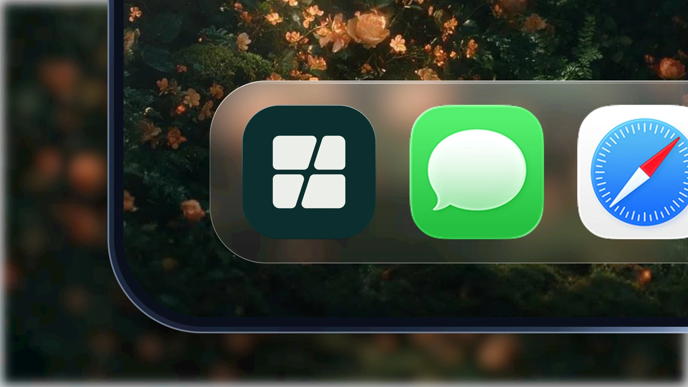
Amber on petrol, among its neighbours
An app icon is never seen alone. It is seen in a grid of thirty other icons competing for the same glance, which is a much harder brief than it looks.
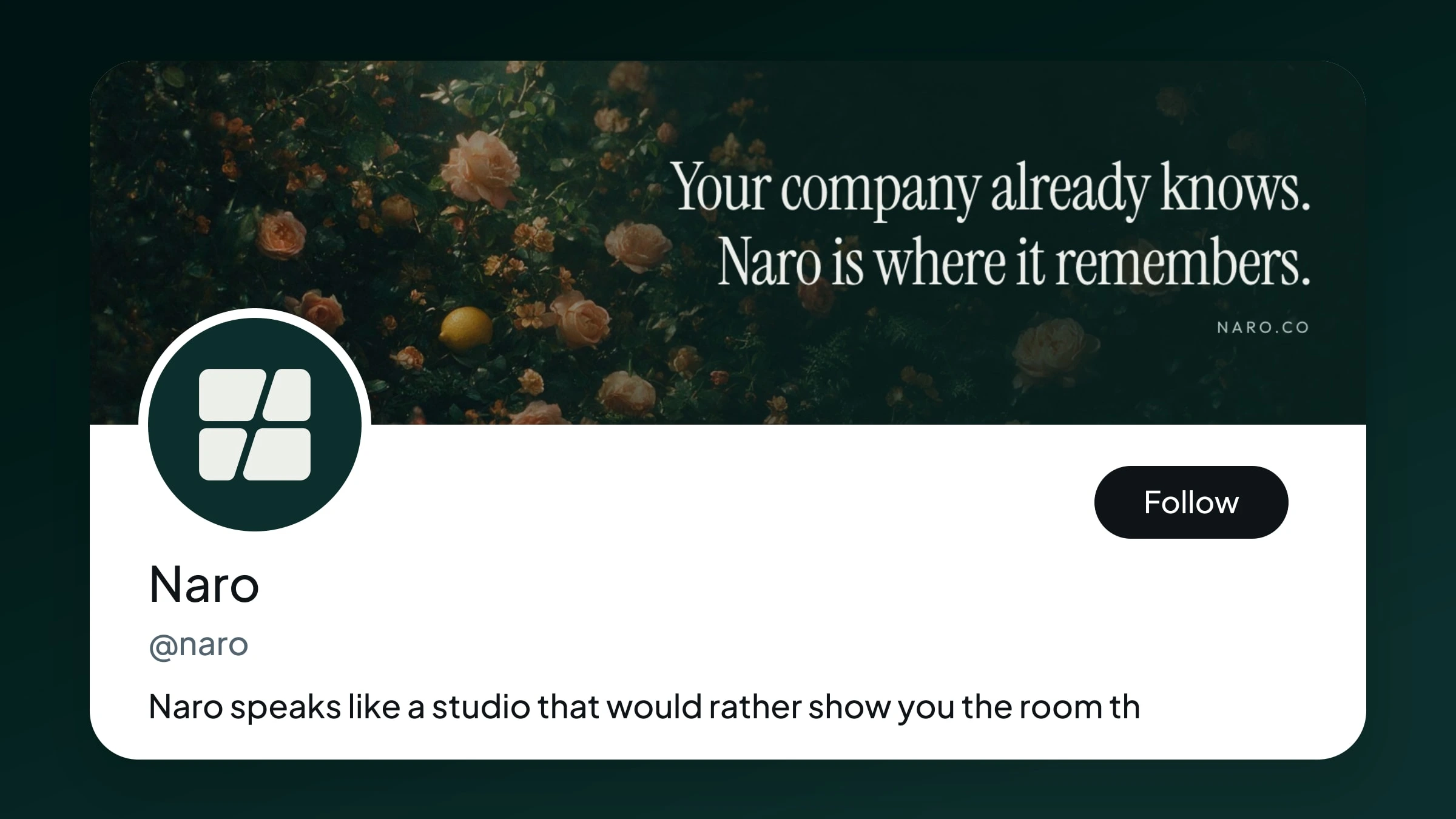
Cover, avatar and handle
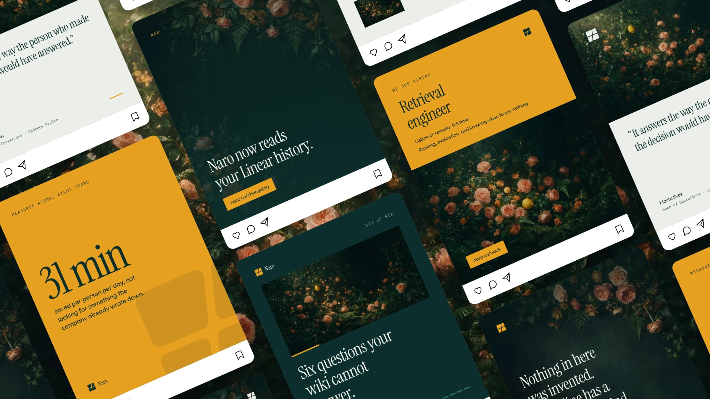
The feed, six posts deep
Social was designed as a feed rather than as individual posts, because that is how anyone actually encounters it. Six posts deep is where a system either holds together or falls apart.
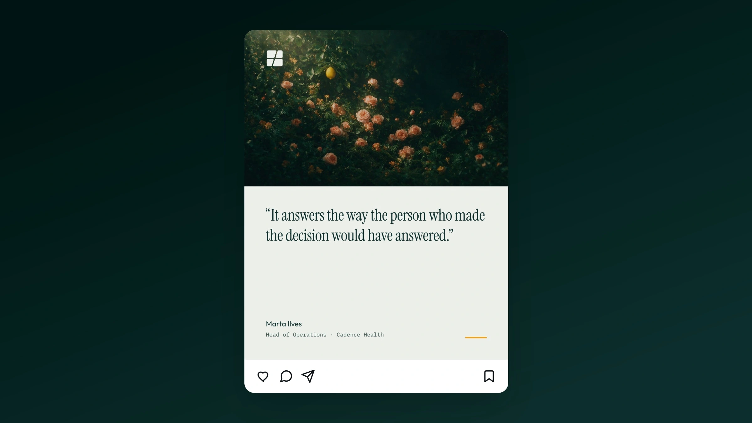
One post: serif line, one amber action
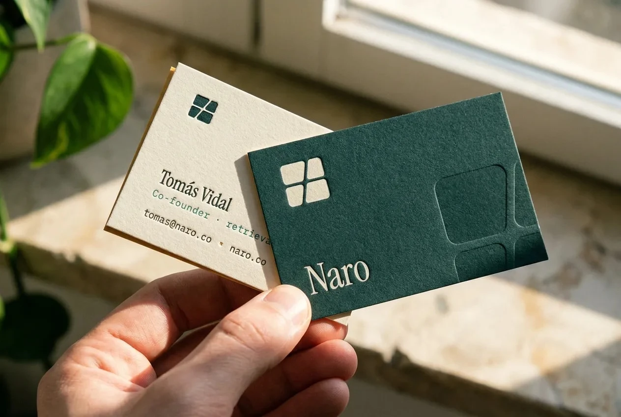
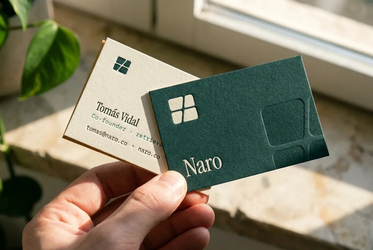
Cards in hand
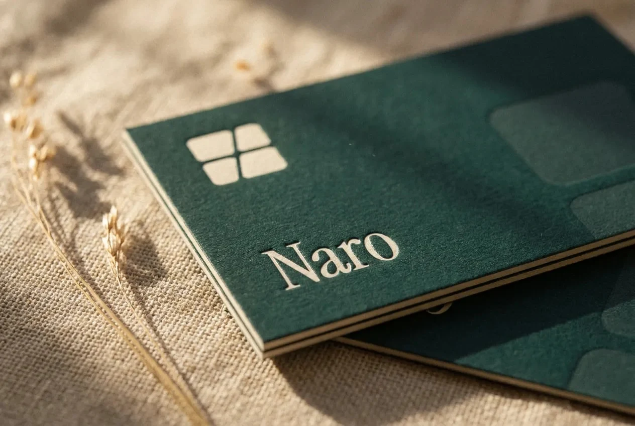
Application
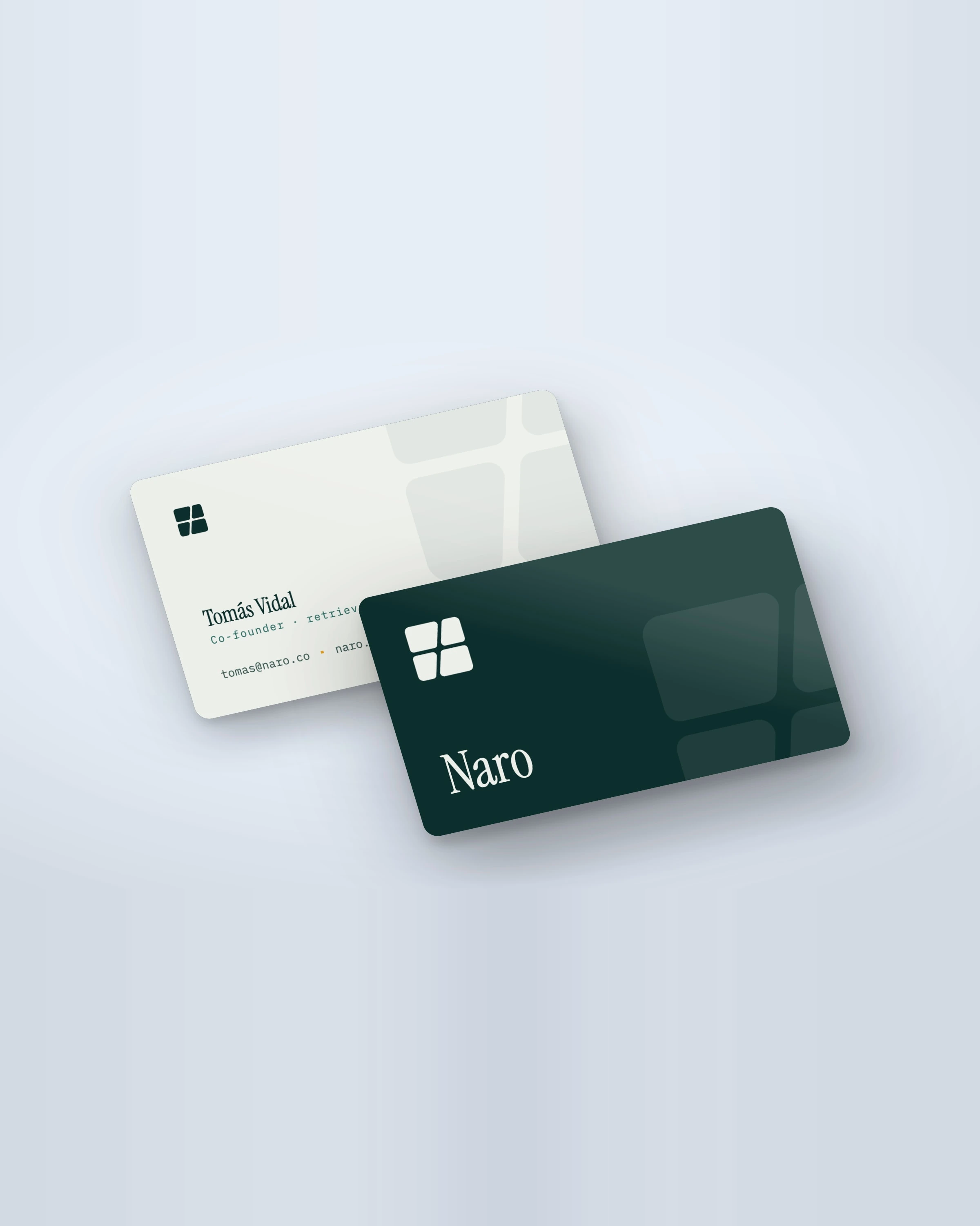
Business card, petrol
Print keeps the same discipline. One colour doing the work, one accent earning its place, and type left enough room to be read rather than decorated.
Like this project
Posted Aug 18, 2026
Brand identity for Naro. Petrol and amber, a serif voice, and a mark designed from favicon size upward rather than poster size down.
Likes
0
Views
12