Portal UI Design
Summary
The problem with OneTap's customer portal is that the system is not user-friendly and visually unattractive. Thus, it does not meet the customer's need and therefore, there is a possibility of losing customers.
OneTap's goal is to increase customer satisfaction with the customer portal, improve its visual appeal and attract new customers.
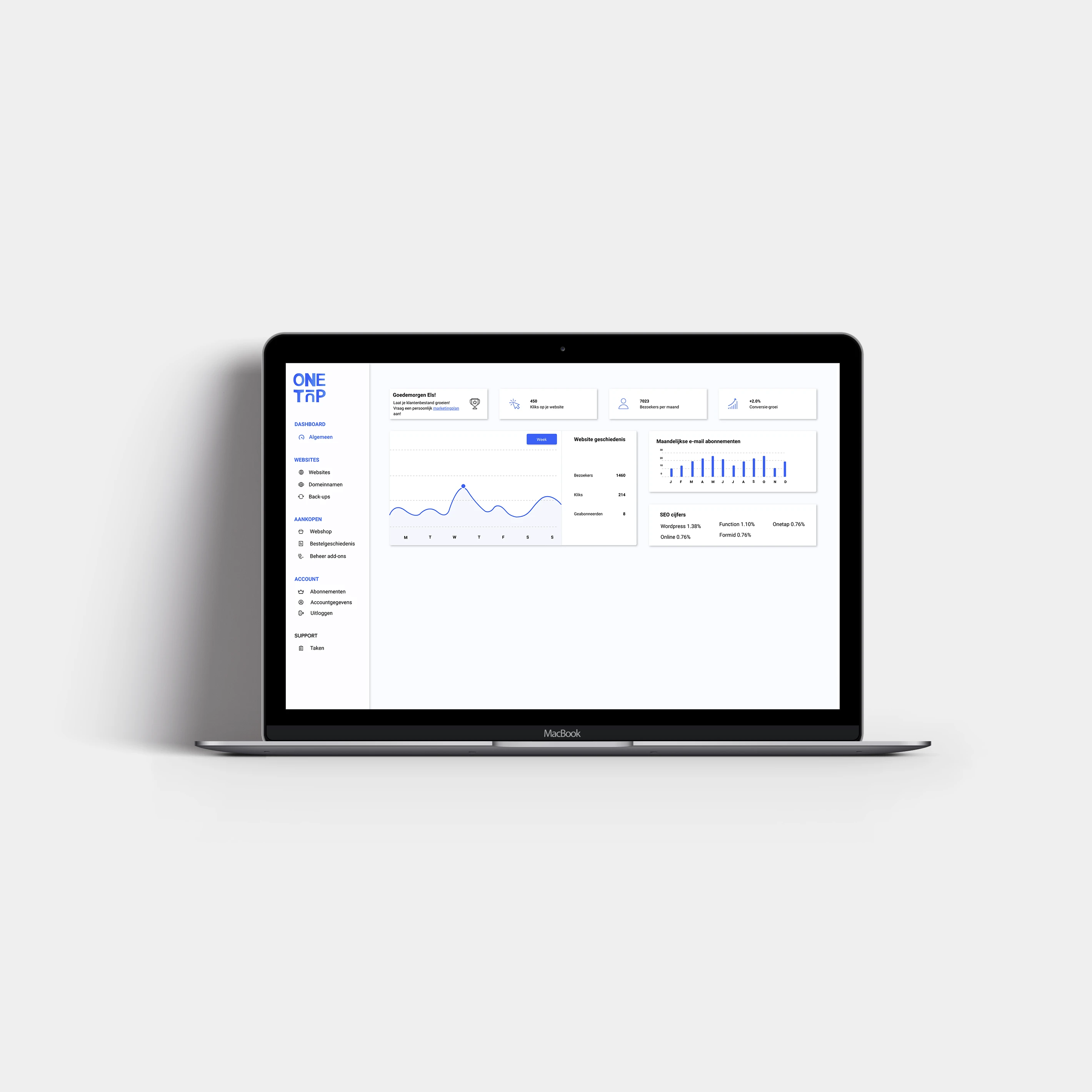
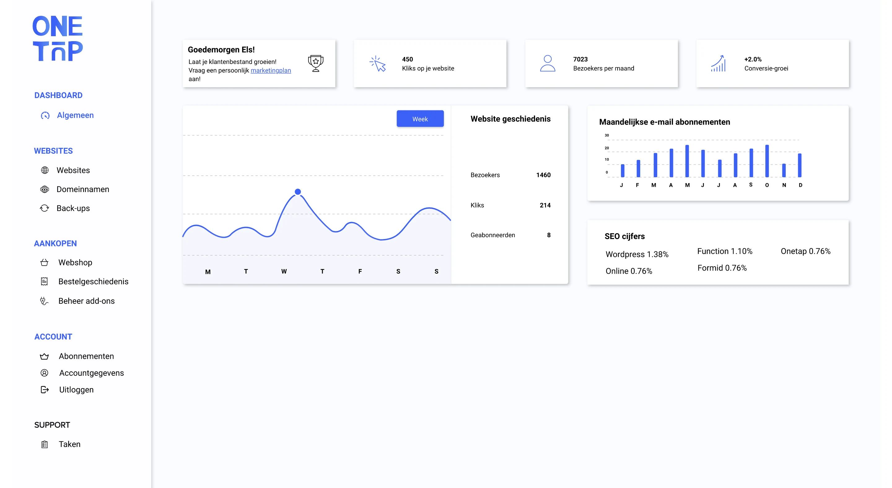
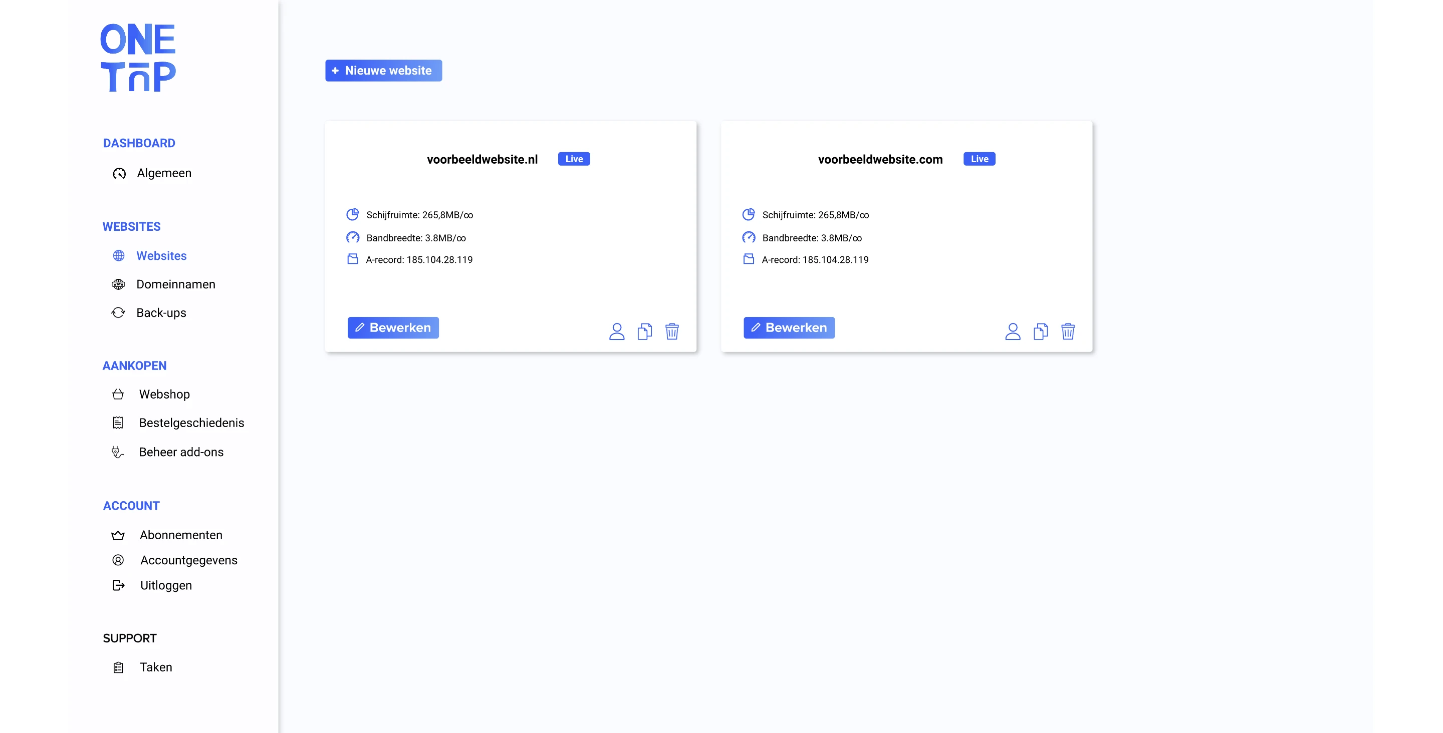
The goal is to find out the user's needs, improve the onboarding and the customer portal, increase the usability and deliver a hi-fi prototype of the onboarding and the customer portal.
What did I do?
1. Desk research
2. Target group research
3. Establishing system requirements
4. Defining interaction design
5. Defining navigation design
6. Sketches
7. Lo-fi prototype
8. Usability tests
9. Corporate identity
10. Hi-fi prototype
Target group research
The audience consists of SMEs, MGBs and self-employed people: companies and self-employed people who need a website but do not have sufficient programming knowledge themselves.
This target group makes the most use of the portal and therefore these opinions are indispensable during the development of a user-friendly system.
The target group knows better than anyone else what they miss in the system, what they encounter and what works well. This input is important for us to be able to set up good functionalities.
Personas, ideas and the menu
In order to give the client a better idea of who exactly the target group is, we draw up personas.
Based on the results of the target group research and the needs of the personas, we brainstormed about concepts and a menu layout.
The best ideas emerge during these kinds of creative sessions, and it helps us to come up with a concept that better suits our client.
Sketches
After doing sufficient research into the client's target group, sketches were made based on the findings.
As usual, we involve the client in the process and after the client's approval, we proceeded to deliver a final, user-friendly design for their customer portal.
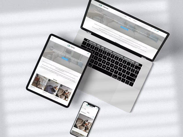
Result
Live link
Like this project
Posted Jun 13, 2021

