Logo design for a mobile app for readers “Xbook”
Houssam Kebbas
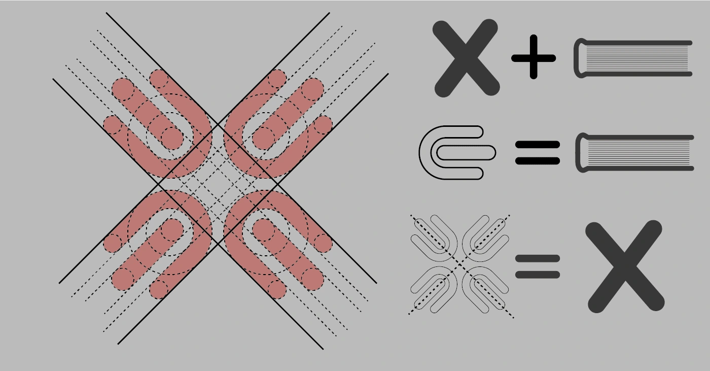
The logo design aims to attract readers and convey to them the idea of the distinguished application. It is elegant and innovative, making it eye-catching and easily recognizable. A logo was designed that reflects the readers' application in a unique and attractive way. The logo consists of an X symbol, but it consists of 4 books that overlap and integrate forming the The font used with the logo is clean and simple to express simplicity and elegance.
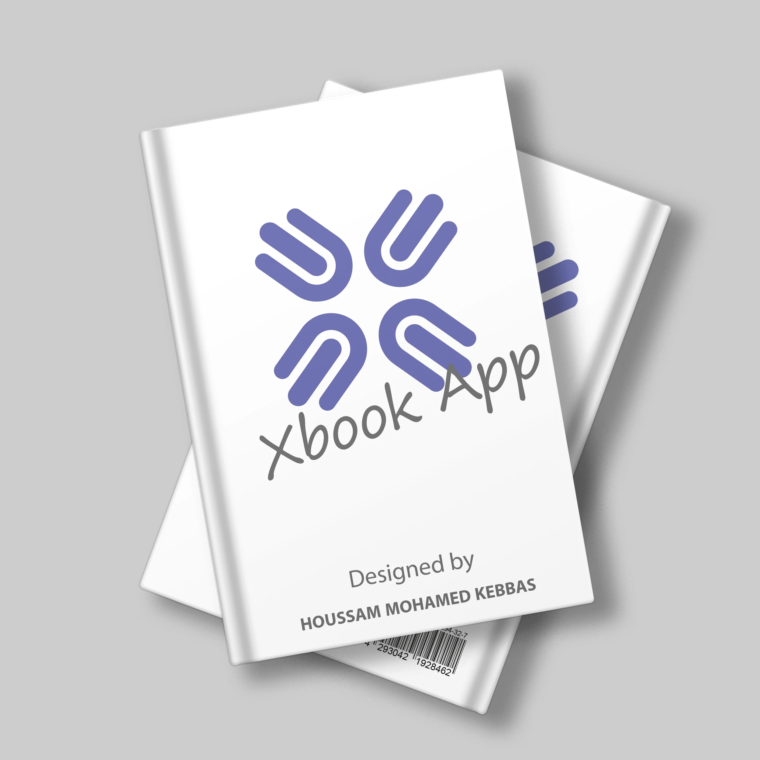
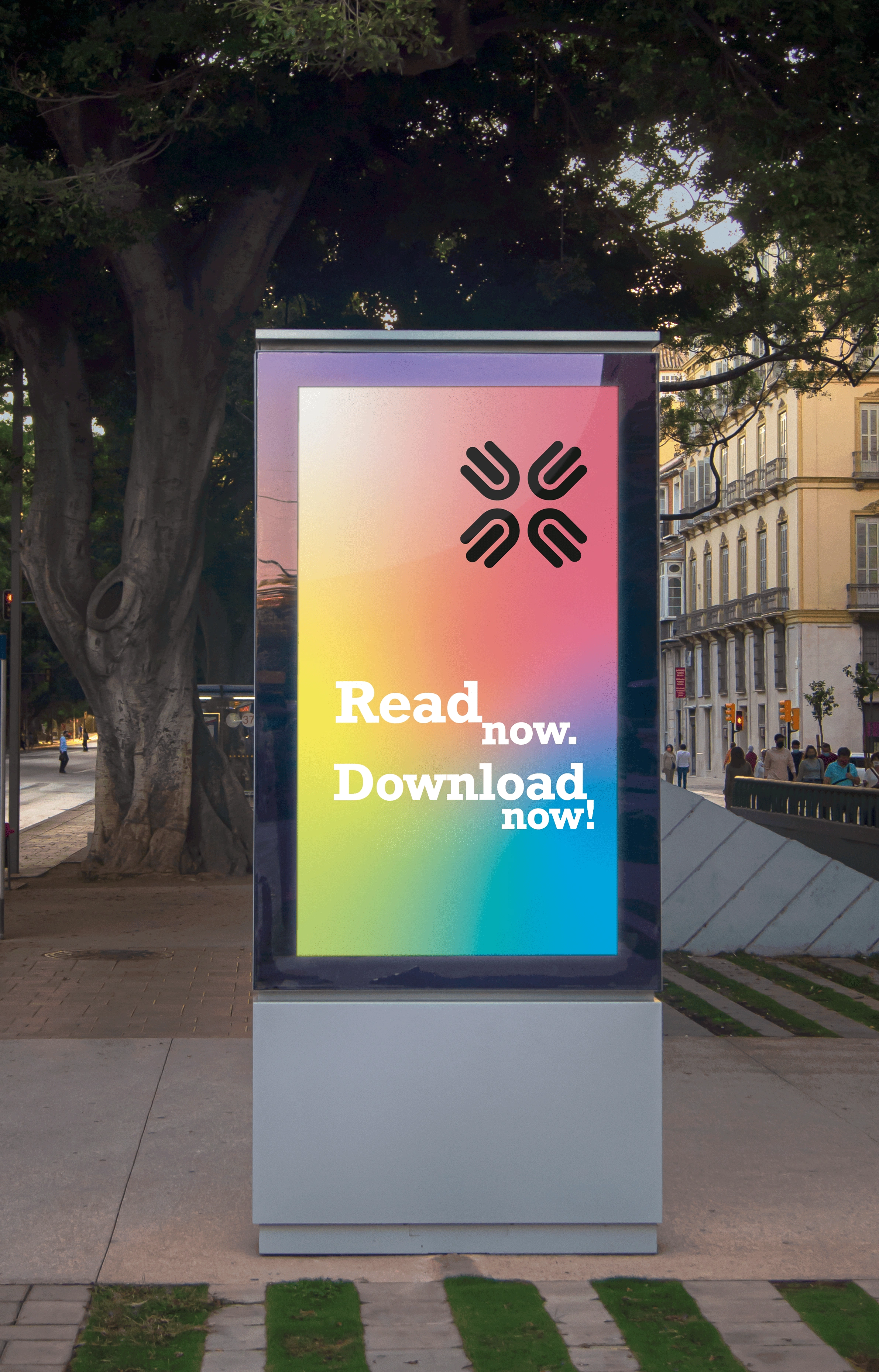
The project lasted 3 days of construction, the first two days of which the logo was designed and modified, and the third day was to add the logo to 3D products.
The project was delivered to the client on the fourth day with all the formats he needed (png, jpg, pdf), print copies, and the original open file of the project (Ai.)
The client was very satisfied with the work, and of course I did not hand him the final work unless he was 100% satisfied.


Like this project
Posted Sep 6, 2023
logo for mobile application