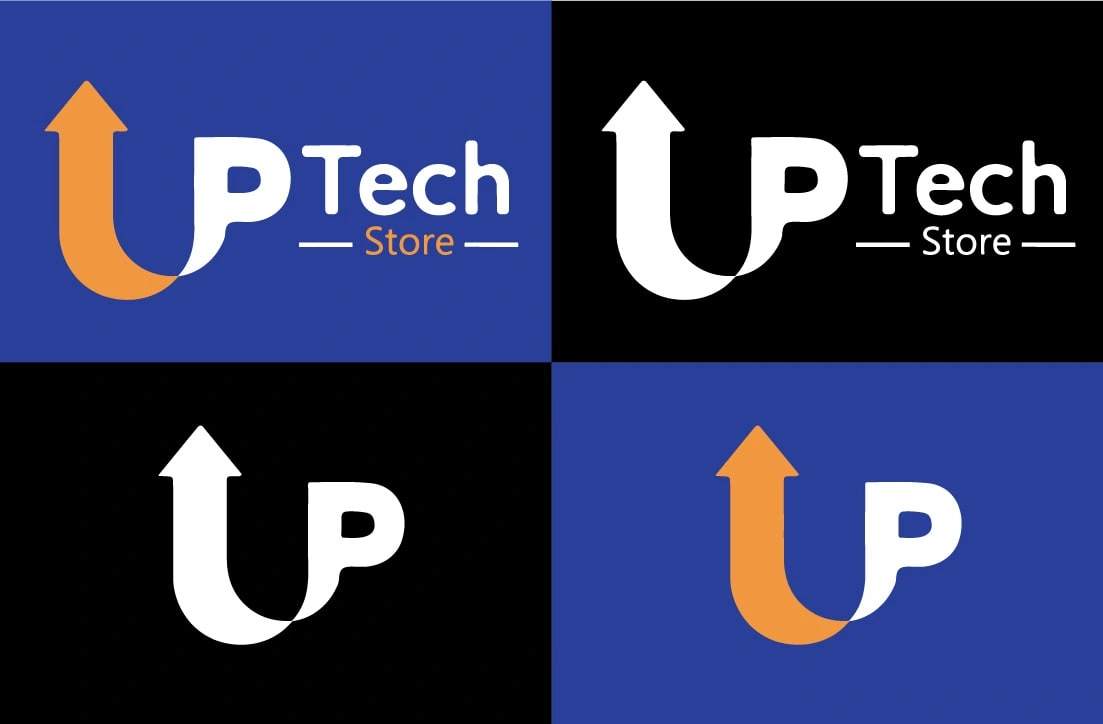
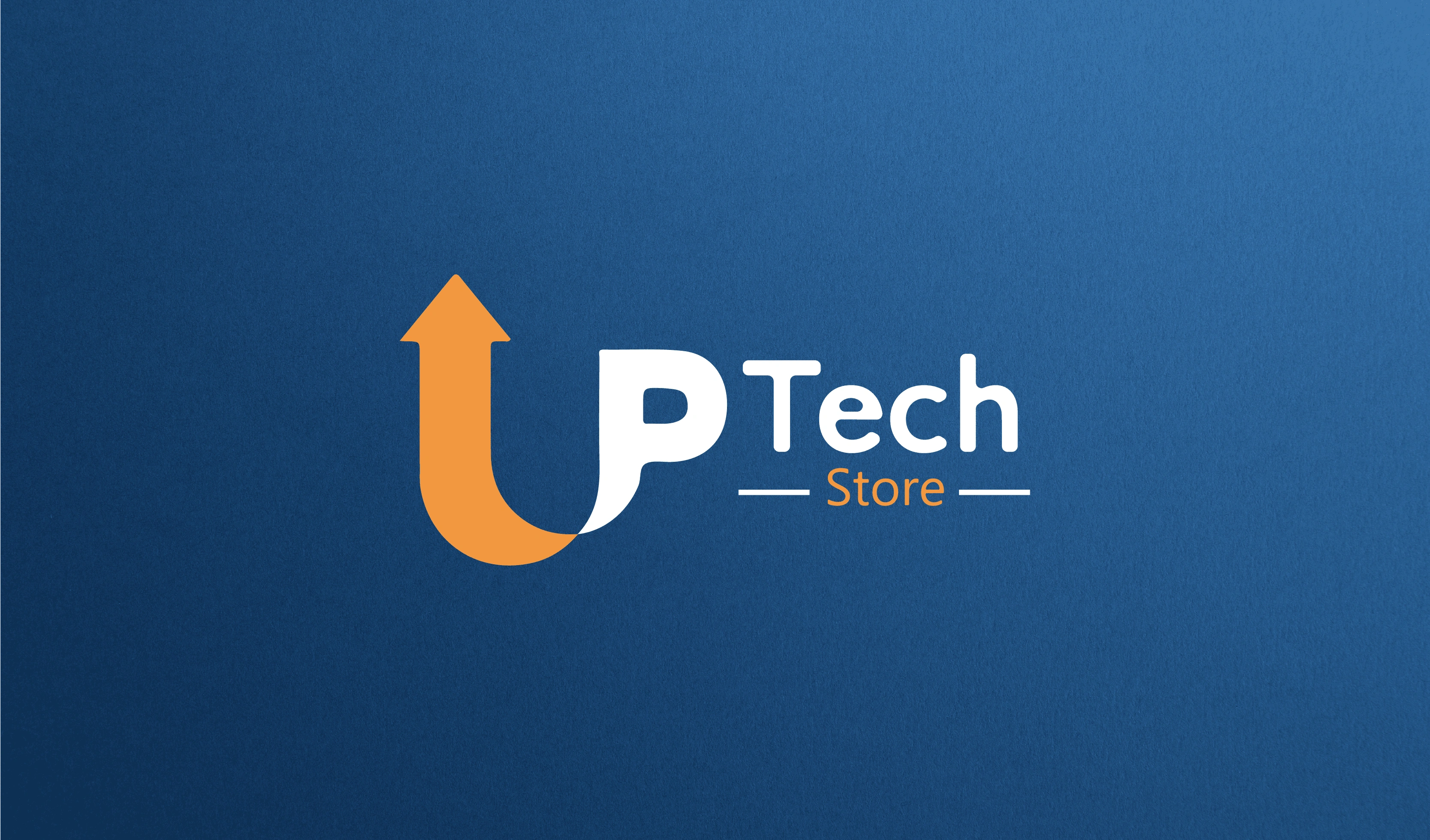
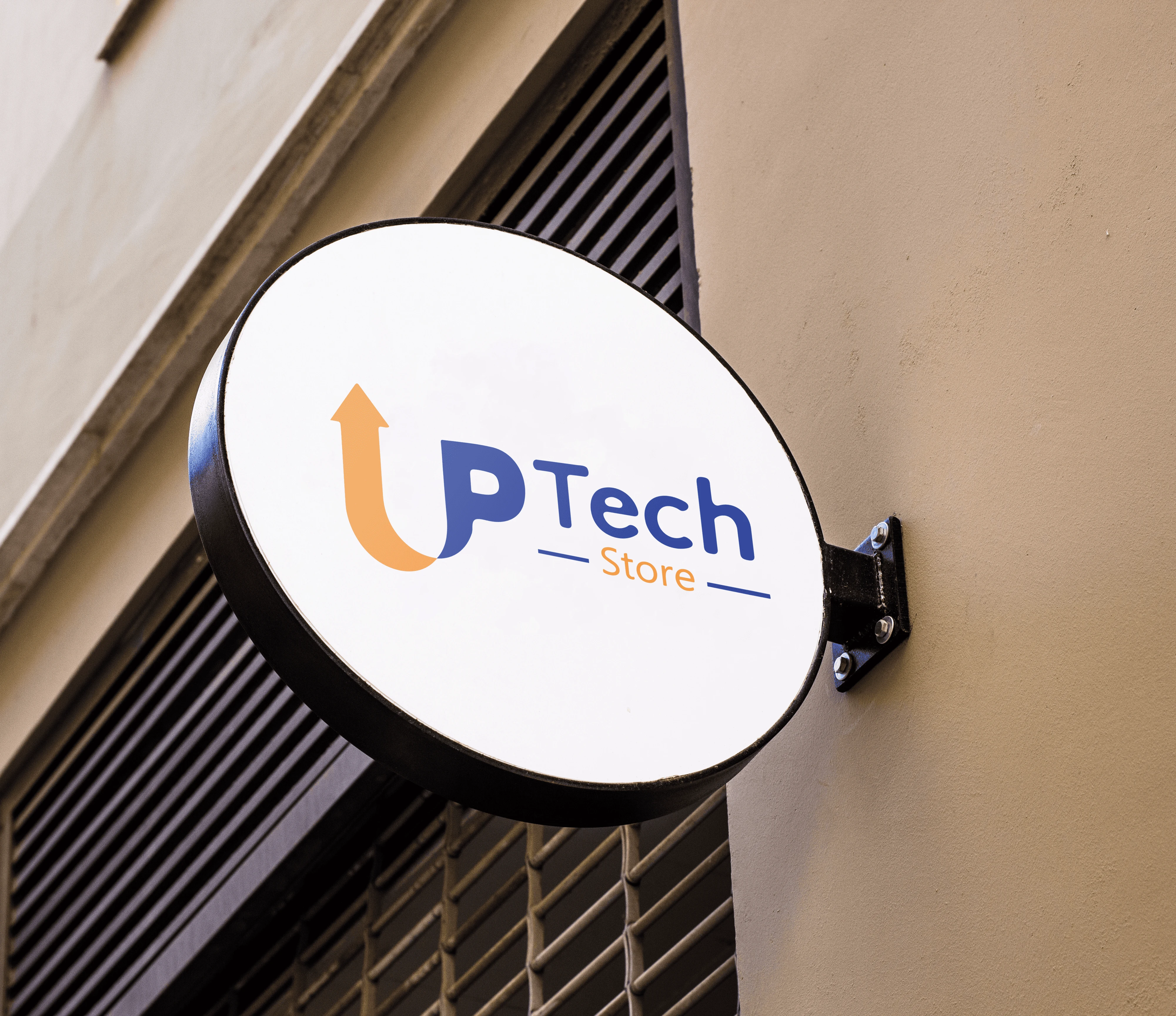
Logo for Up Tech Store, which sells phones and accessories
Houssam Kebbas
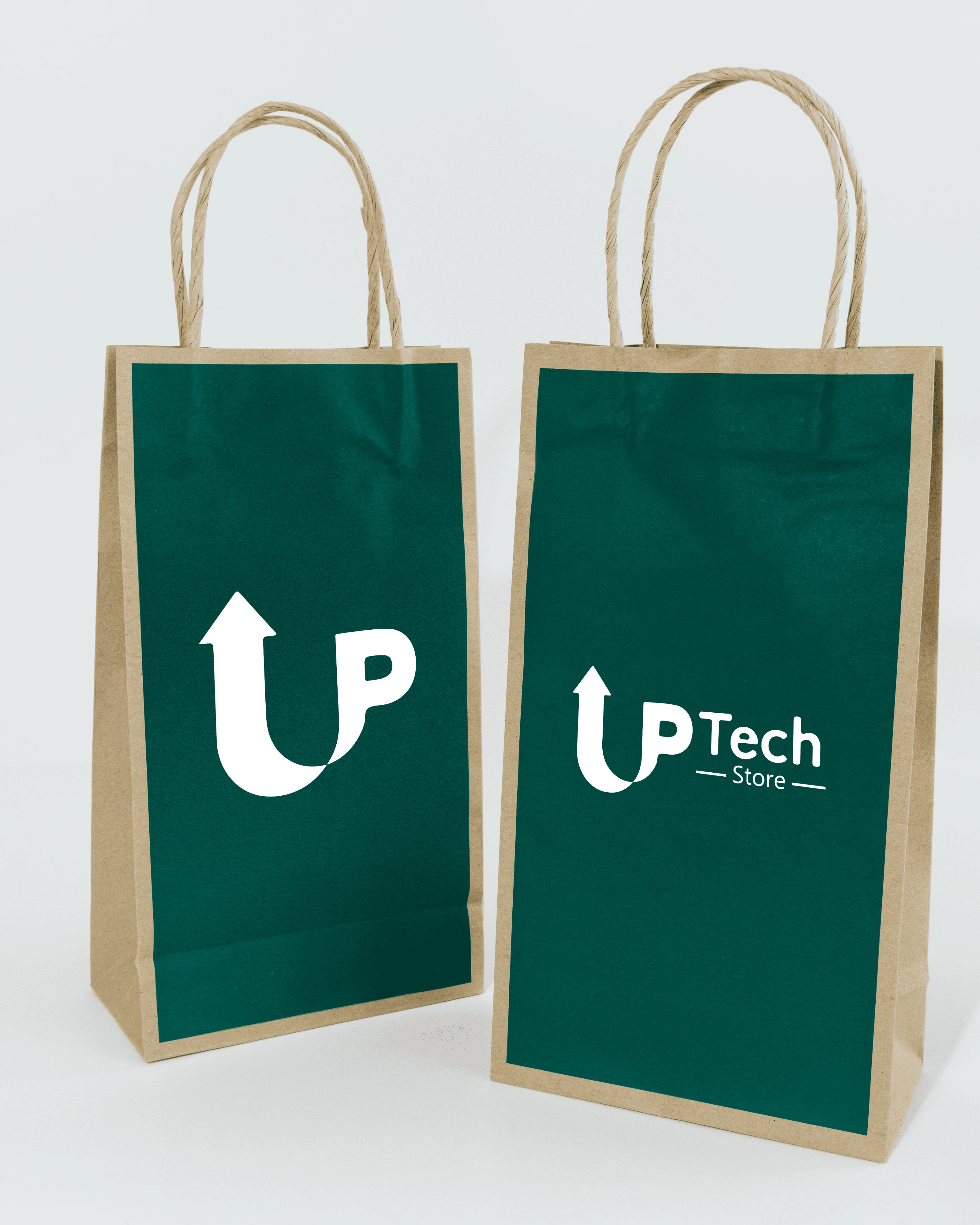
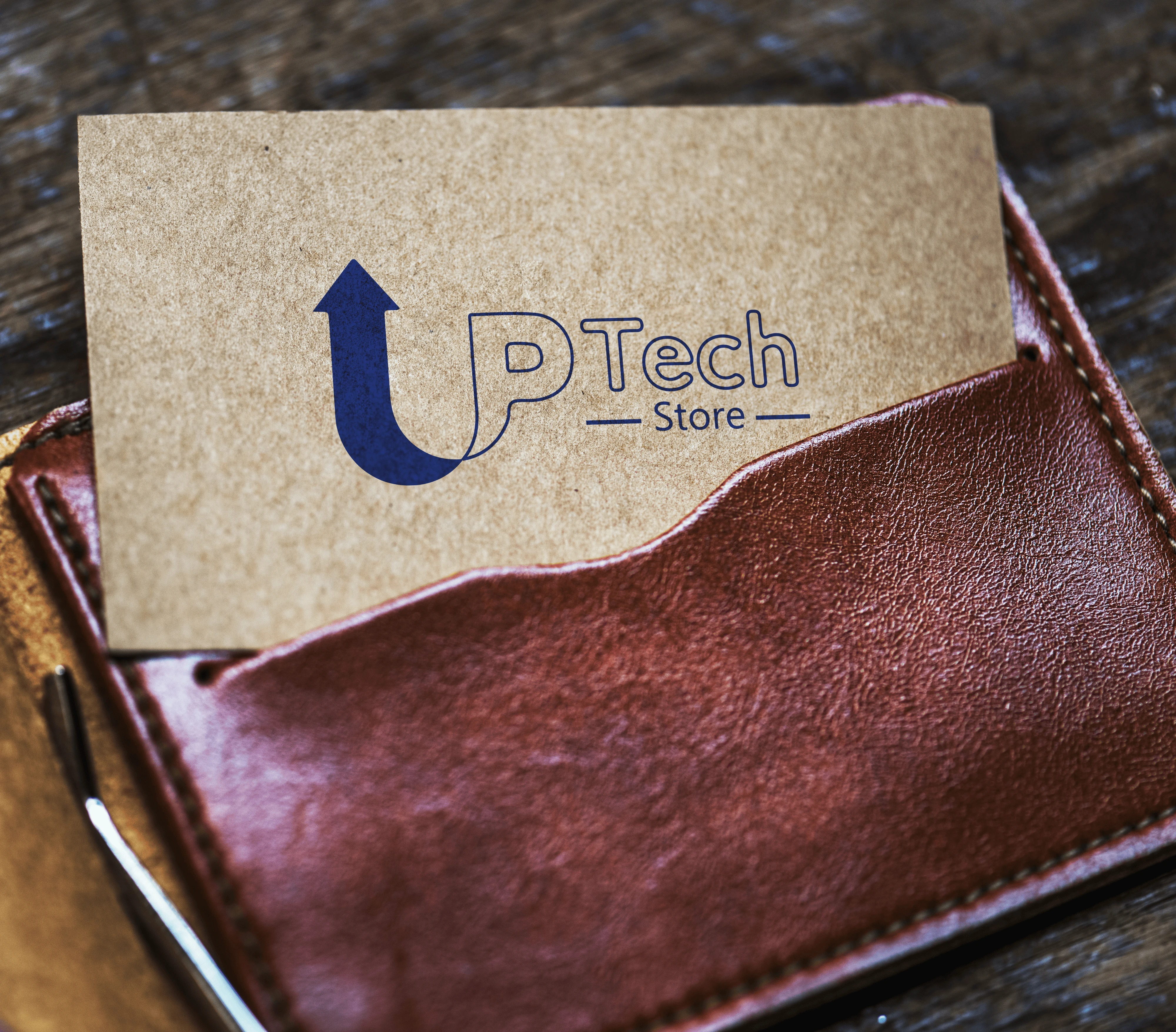
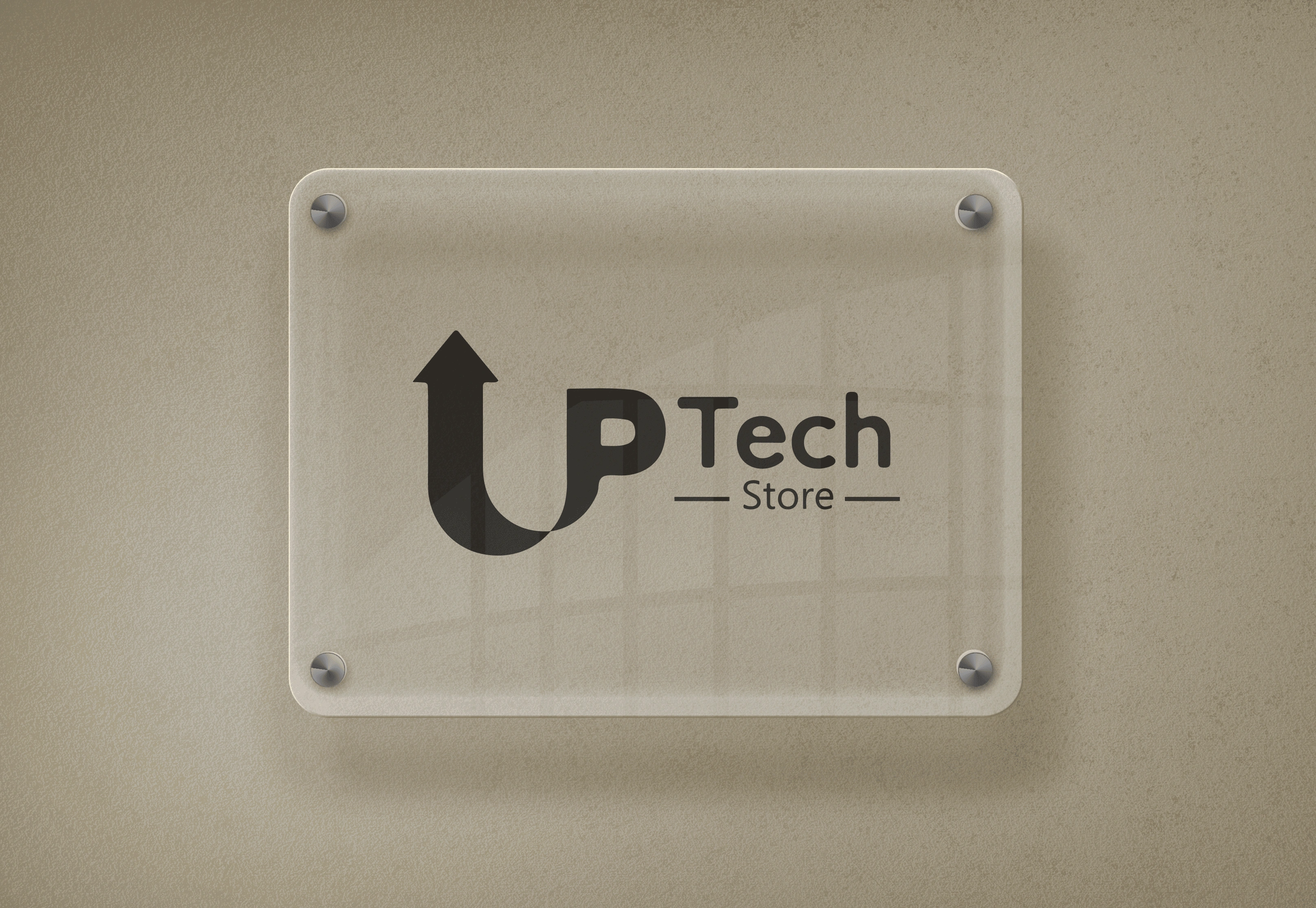
The logo is a combination of the word Up and an arrow that expresses the name of the store and its ambitions. Clean lines and vibrant colors were used to attract customers' attention and communicate the idea clearly and simply.
The project lasted 3 days of construction, the first two days of which the logo was designed and modified, and the third day was to add the logo to 3D products and design a business card for the client.
The project was delivered to the client on the fourth day with all the formats he needed (png, jpg, pdf), print copies, and the original open file of the project (Ai.)
The client was very satisfied with the work, and of course I did not hand him the final work unless he was 100% satisfied.
Like this project
Posted Sep 6, 2023
logo for store