Customer Support in your Inbox
Background
UnionBank Online is the official mobile and web banking application by UnionBank of the Philippines. I was tasked to create a proof of concept, and eventually High-Fidelity Wireframes for a Customer support ticket system. The goal of the feature was to reduce the number calls the Customer Experience team receives daily.
Research
First, I had a meeting with the product owner in order to clarify the expectations and requirements for the project. We went over the reasoning for developing a customer support ticketing system in the UnionBank Online App.
The Stakeholders in customer experience noticed that the process of receiving a report from a customer through call is taking too much time. This limits the amount of tickets that can be attended to in a given time as well as it takes away from addressing more complex and serious Issues.
After the discussion with the product owner conducted a baseline research on what a user-facing customer support ticketing system include in contemporary applications and arrived with the following insights:
Support Threads - Most support ticketing systems are monitored on the user end via emails or support threads.
Support Chat - Support tickets can also have a chat feature where users can connect with agents.
Automated Forms - They also feature automated forms that can help reduce inaccuracies in the reports
Challenges
One of the main challenges that I encountered while designing this feature was timeline for the project. With the team working in an agile environment, we created solutions as the requirements evolve from sprint to sprint.
Another challenge for this feature is retrofitting it into the existing inbox system where notifications where located. This was done to take advantage of the existing user base’s learned behavior of checking their Inbox for updates; where the support ticket threads can be accessed.
Inbox Redesign
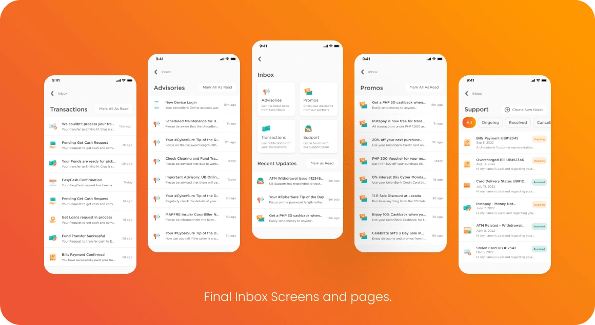
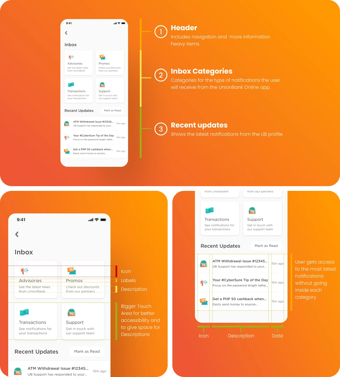
As part of the retrofitting process of the customer support feature, we created initial drafts based on the requirements and iterated on it until we ended up with the final design.
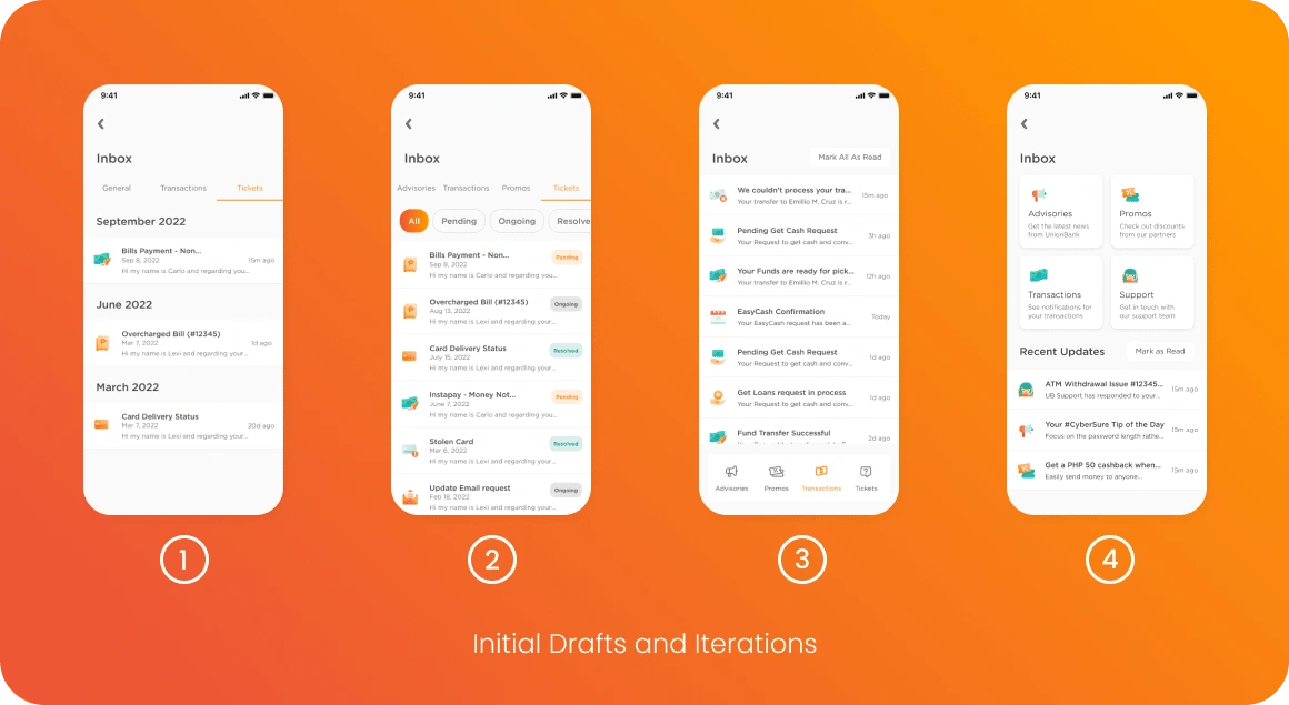
The initial designs were based closer to the old inbox design, but during the design critique sessions, it was identified that the distinction between tabs and each of their purposes were vague. As a solution we created a dashboard for the Inbox that shows 4 large buttons that leads the users into each category along with the “Recent Updates” section.
Ticket Creation
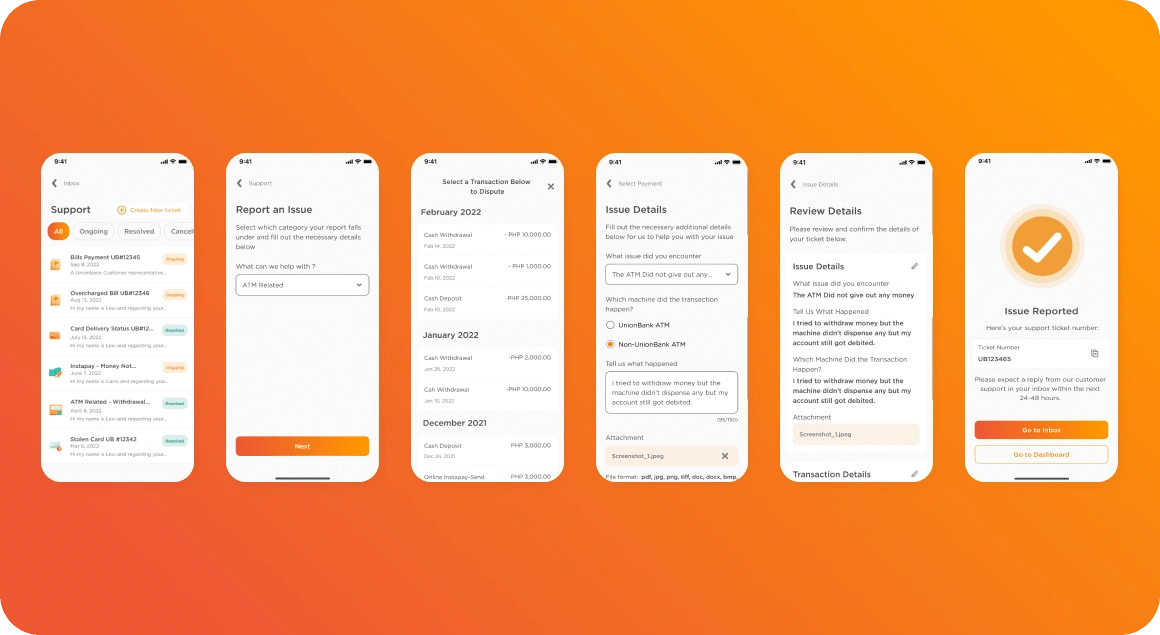
For the ticket creation flows, the form was based on the company’s existing questionnaire used for filing a support ticket. The biggest advantage with already having the user’s information is that we can speed up the process by pre-filling the information that’s already available to the app. This helps in making sure information is accurate and alleviates the responsibility of remembering all the details from the user.
Support Threads
Once the support ticket is opened, the user will be kept up to date through notifications from the app. An agent will be assigned to communicate with the user via the support thread located in the support page of the app.
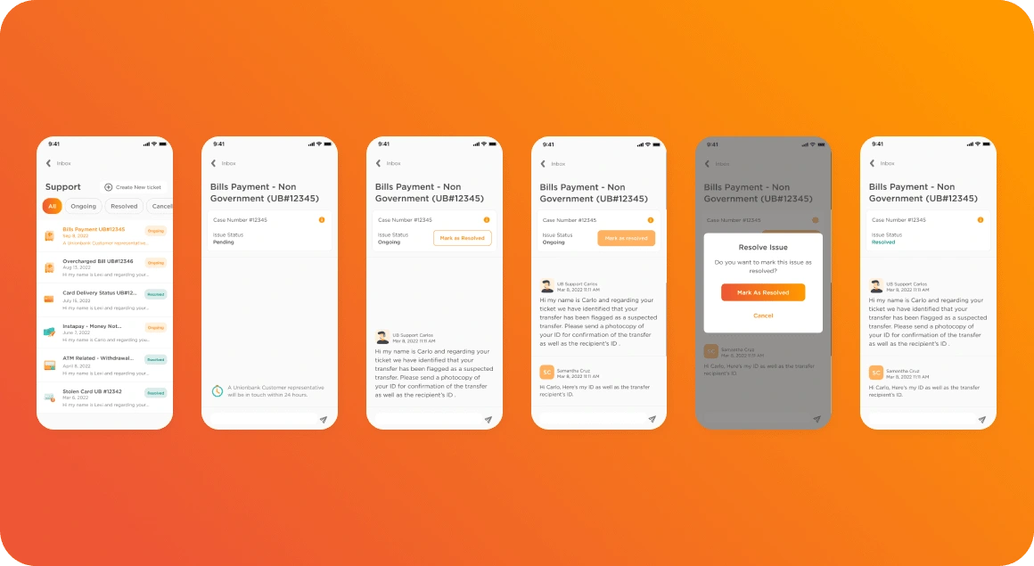
Once the user’s ticket is resolved, they can tap on the resolve ticket button to close the thread.
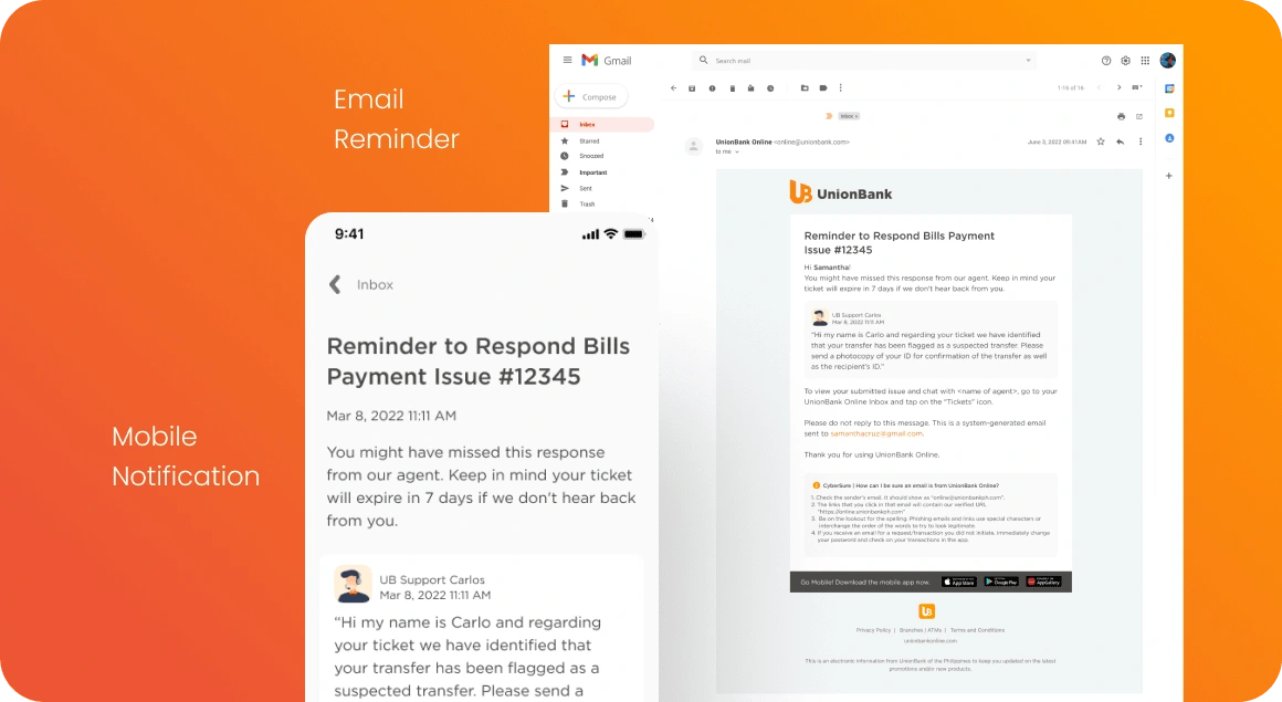
A notification is also included for threads so that users that haven’t gotten around to respond to the agent are informed before their support thread are closed due to inactivity. This helps with ensuring resources are properly utilized and are not wasted on unresponsive users.
Lesson Learned
With the Agile nature of the project, and tight timeline that was provided, understanding the problem and involving the stake holders early in the process is even more important. This is because having a clearly defined direction help ground the initial drafts to solving the problem.
Being aligned and having initiative to check up and ask important questions from the various stake holders all throughout the process have helped ensure prompt and appropriate design decisions.
Further Exploration
If given the opportunity to revisit the feature, I would explore the following:
the impact of putting the ticket creation directly in the inbox dashboard so that it’s more visible and accessible to the user.
Consider adding an FAQ section to decrease low-value tickets, enabling customer support to prioritize more complex user issues.
include more user testing during low and high fidelity wire framing to accurately measure the impact of the feature.
Like this project
Posted Nov 27, 2023
Providing solutions for Customer support integration and UI redesign for the UnionBank Online's Inbox.

