Built with Framer
AI Insurance Automation SaaS Website Design
Yuvi S.
Nixa is an AI product that automates insurance claims and underwriting - a technically complex, high-stakes space where trust is everything and confusion kills conversions.
The challenge wasn't just making it look good. It was making AI feel approachable to people who've spent their careers being skeptical of it.
Website Teaser
The challenge
B2B SaaS in regulated industries has a credibility problem. Too slick and it feels untrustworthy. Too dense and no one reads it. Target users need to understand what they're buying before they book a demo.
The site needed to walk a precise line: technically credible enough for procurement, clear enough for a first-time visitor to get it in 10 seconds.
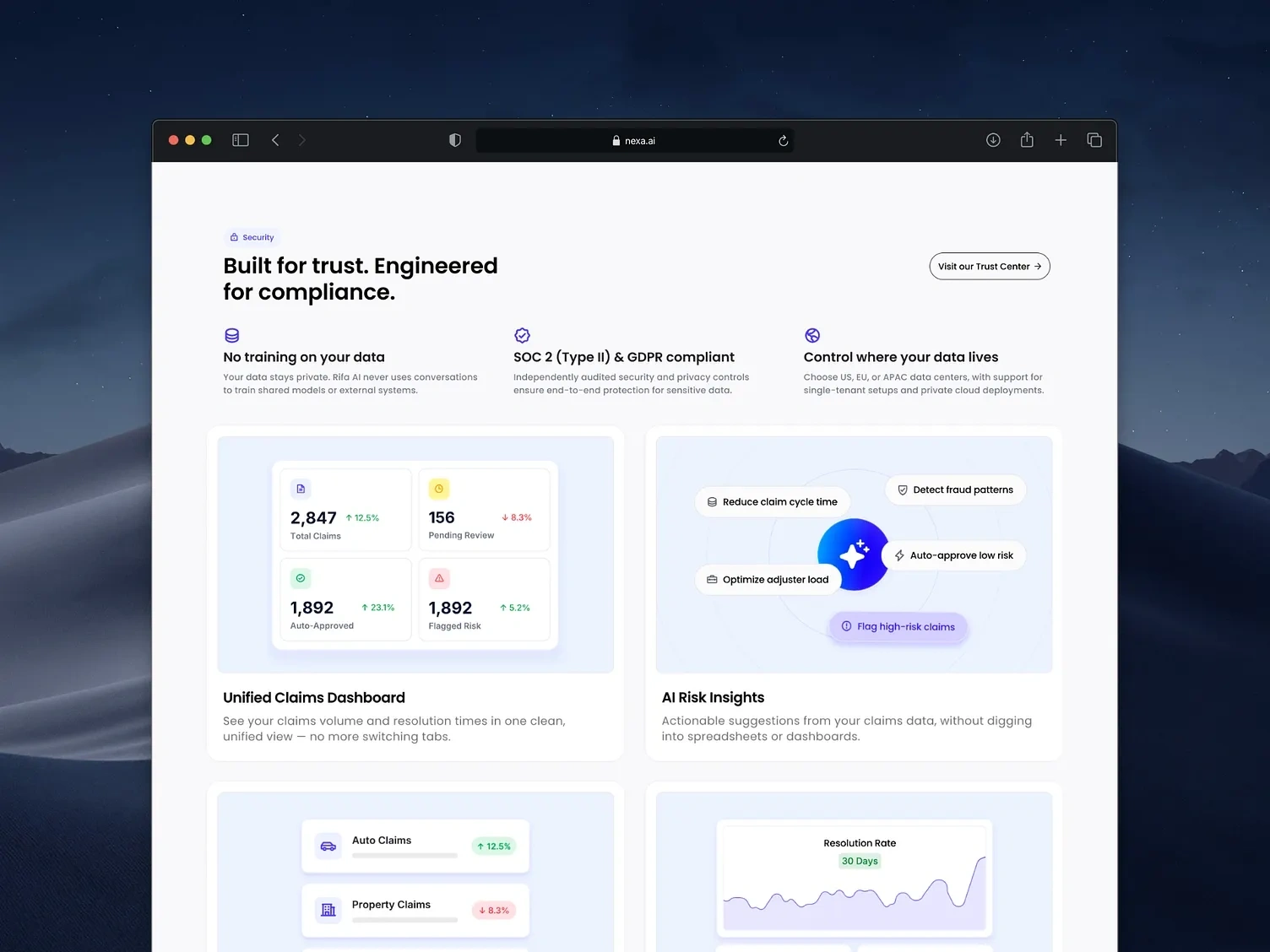
Metrics Bento Cards
The Approach
Product storytelling was structured around outcomes, not features, leading with what the product does for the business, then unpacking how. Compliance signals and security elements were placed at natural hesitation points, not hidden in the footer. The demo CTA is persistent but never pushy.
Motion was used deliberately, the preloader sets a premium tone, and interactions reinforce precision without feeling like a demo reel.
Preloader Animations
Security section
The Result
A site that earns trust before it asks for anything. Built entirely in Framer, optimized for performance, and designed to scale as the product grows.
Visit the framer website by clicking here
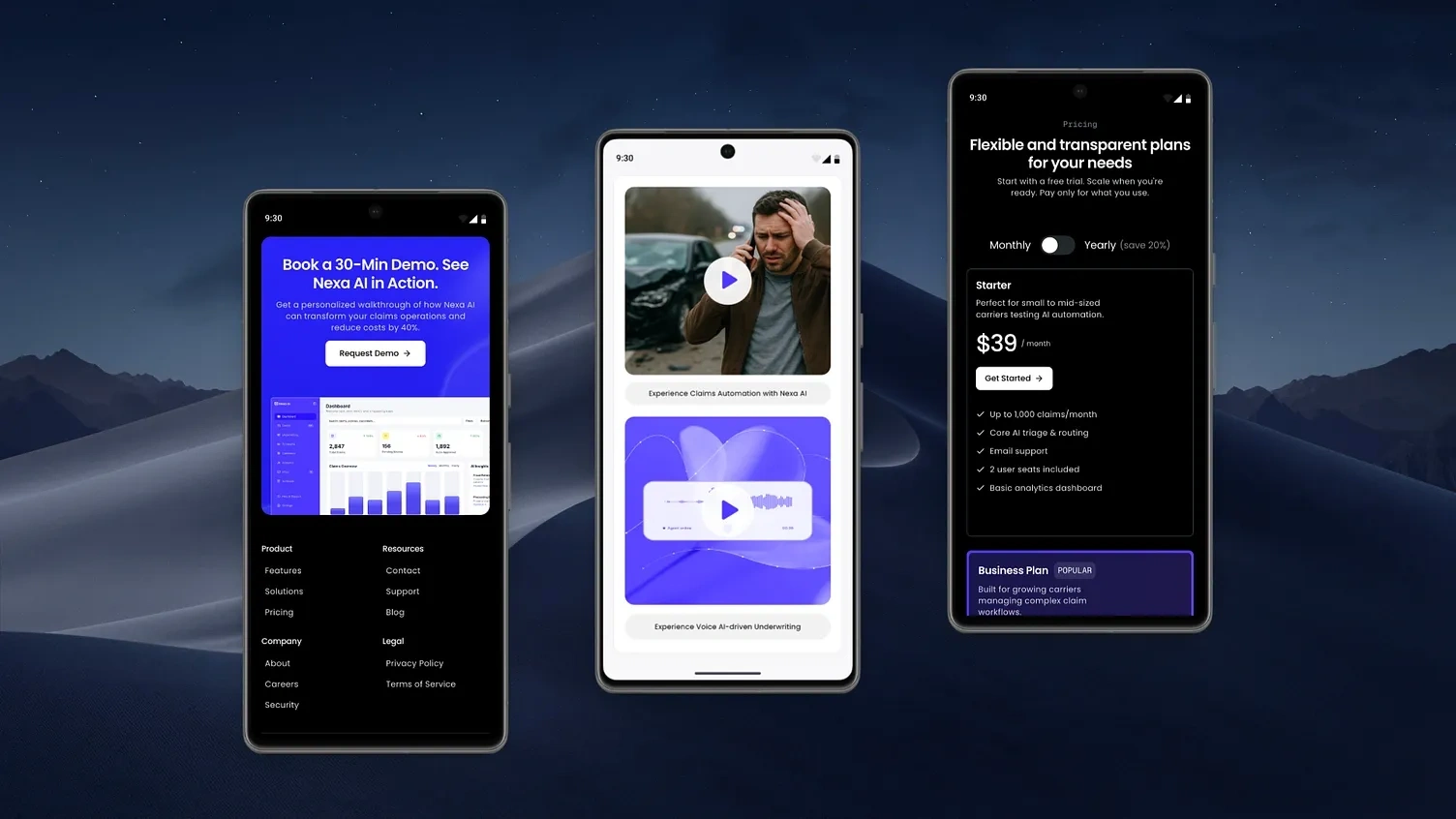
Responsive Design
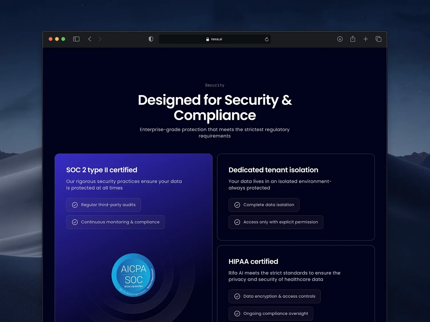
Compliance certifications
Working on a SaaS product?
If you're building a SaaS product and need a conversion-focused Framer site, let's connect.
Like this project
Posted Apr 5, 2026
Designed a high-conversion SaaS site for AI insurance automation, simplifying complex workflows into clear messaging and trust-driven UI to drive signups.
Likes
1
Views
5