Packaging Design for Kapila Soaps By Flipside Co
Packaging Design for Kapila Soaps by Flipside Co.
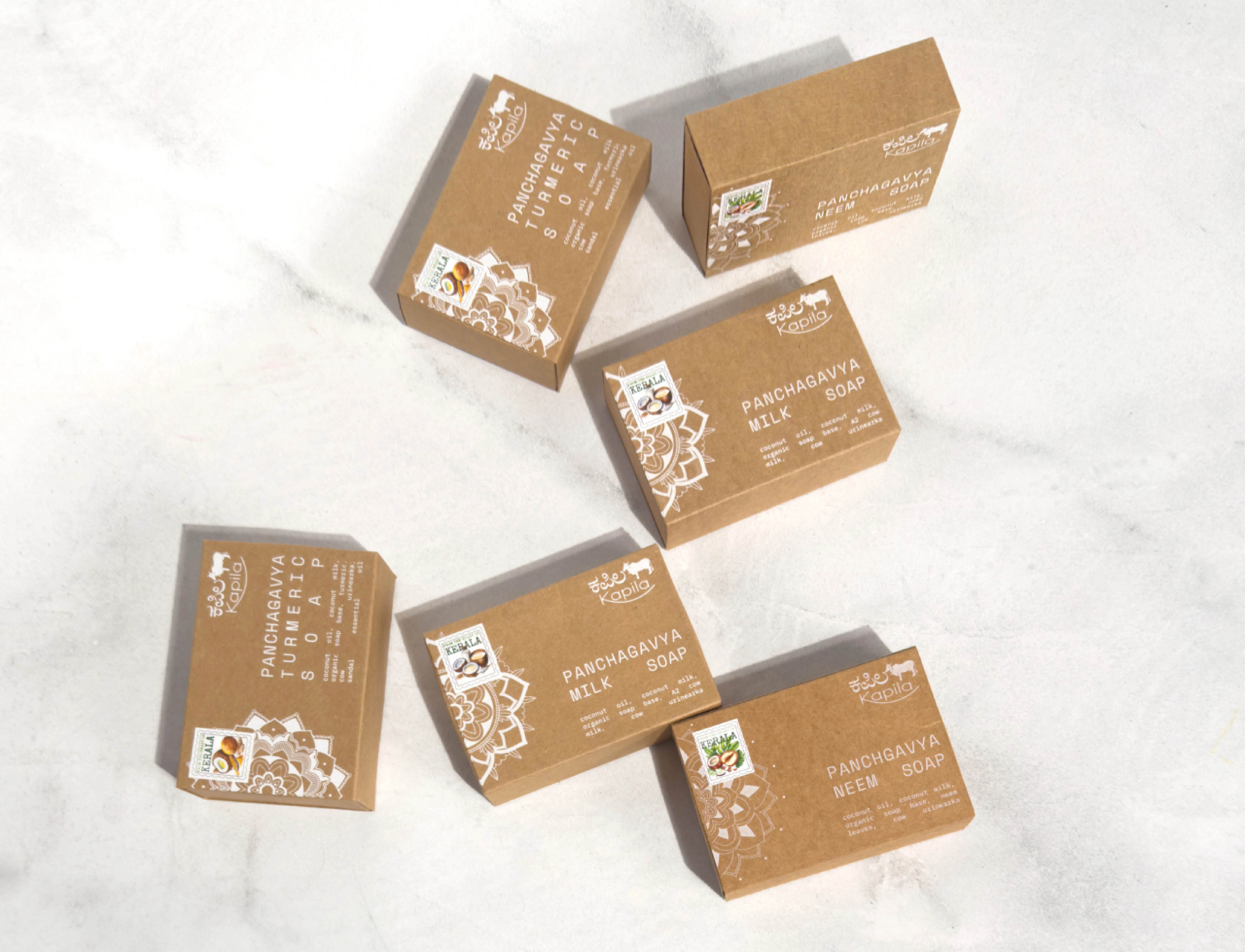
The Kapila Soaps packaging design project brings a rich cultural essence to life through intricate alpana-inspired illustrations and a refined, natural aesthetic.
Role: Senior Design Associate - I led the conceptualization, illustration, and complete design execution, ensuring that the packaging design looks visually appealing and meaningful.
The outcome is a packaging system that highlights the soap’s natural ingredients while staying true to its South Indian roots. Custom AI-generated stamps, monotype typography, and earthy tones create a distinctive, handcrafted feel that sets the brand apart.
The cohesive design enhances brand recognition, reinforces an authentic artisanal appeal, and strengthens consumer trust, positioning Kapila Soaps as a premium, heritage-inspired skincare brand.
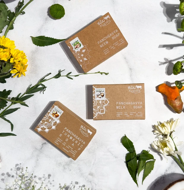
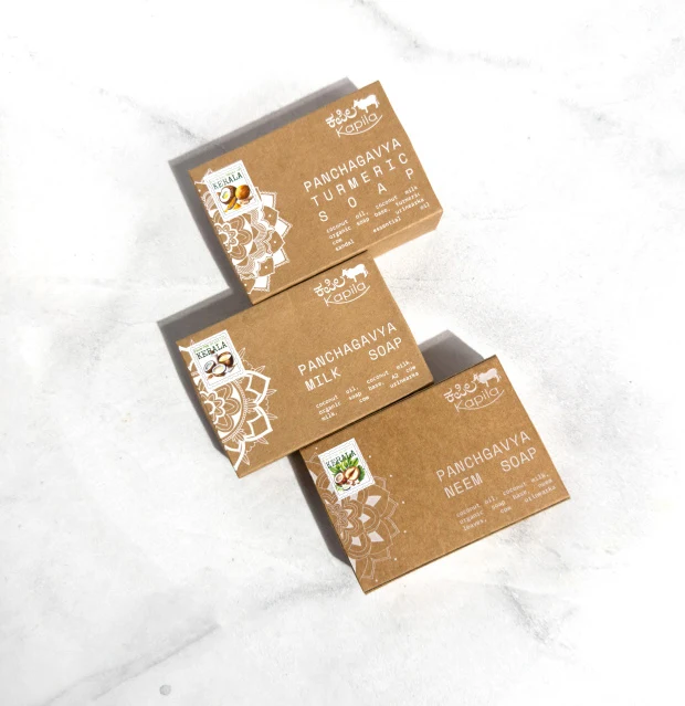
Kapila is a home grown situated in scenic village of Bekal in Kerala. We re-designed the packaging for their line of soaps to reflect the cultural essence of Kerala, emphasizing the traditional art.
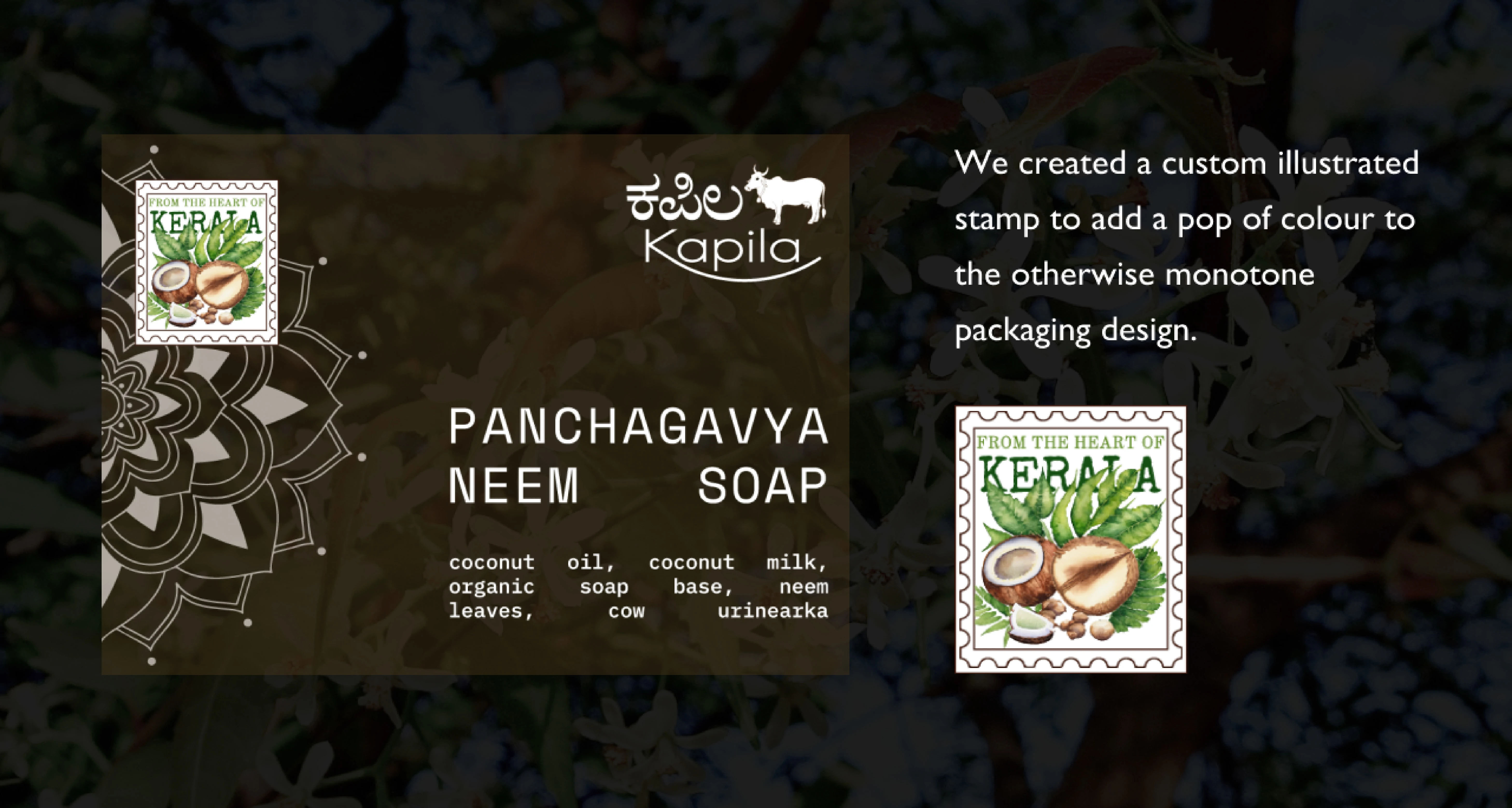
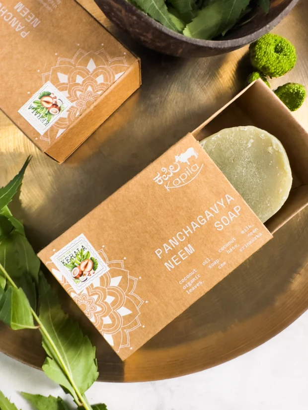
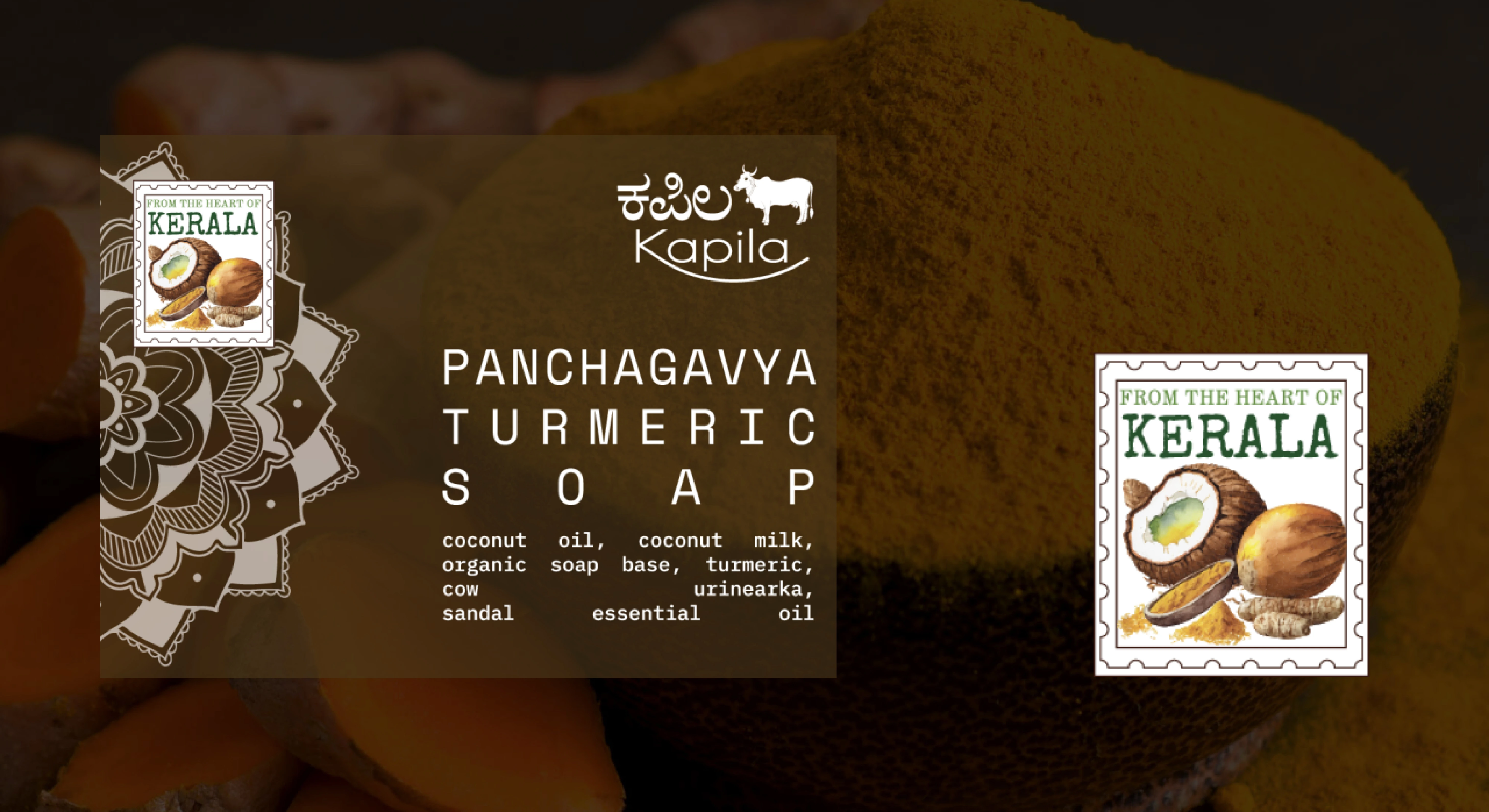
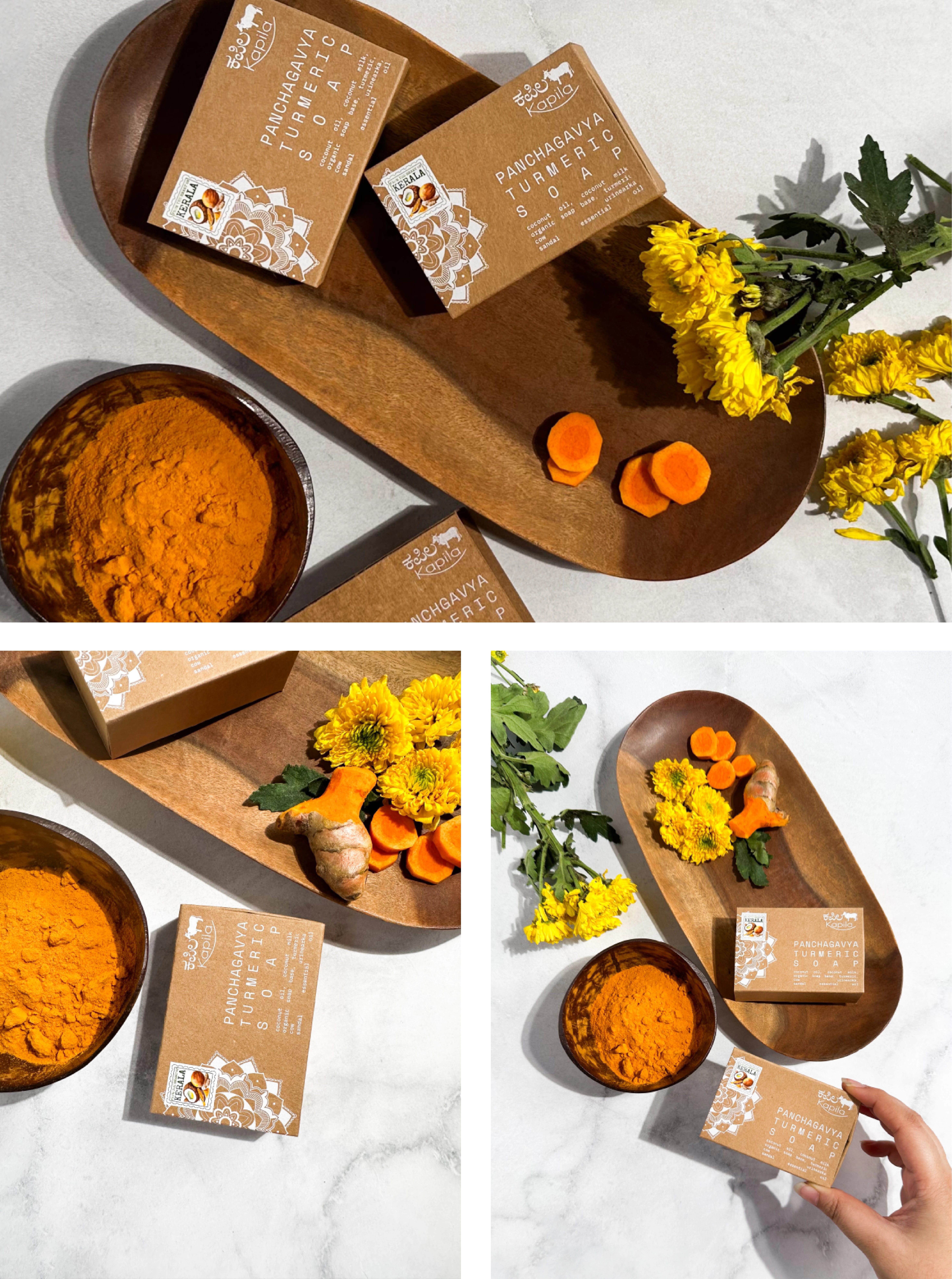
Alpanas are big part of Southern India. We used that as a main element on the box. For later versions of the box, colour was added based on the variation.
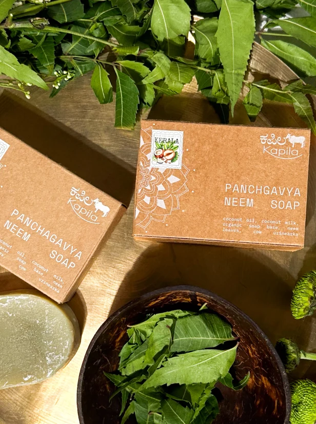
Forget fancy frills, we went for good ol' brown paper. The monotype typeface coupled with screen printing on the Kraft Paper, to bring out the slated look.
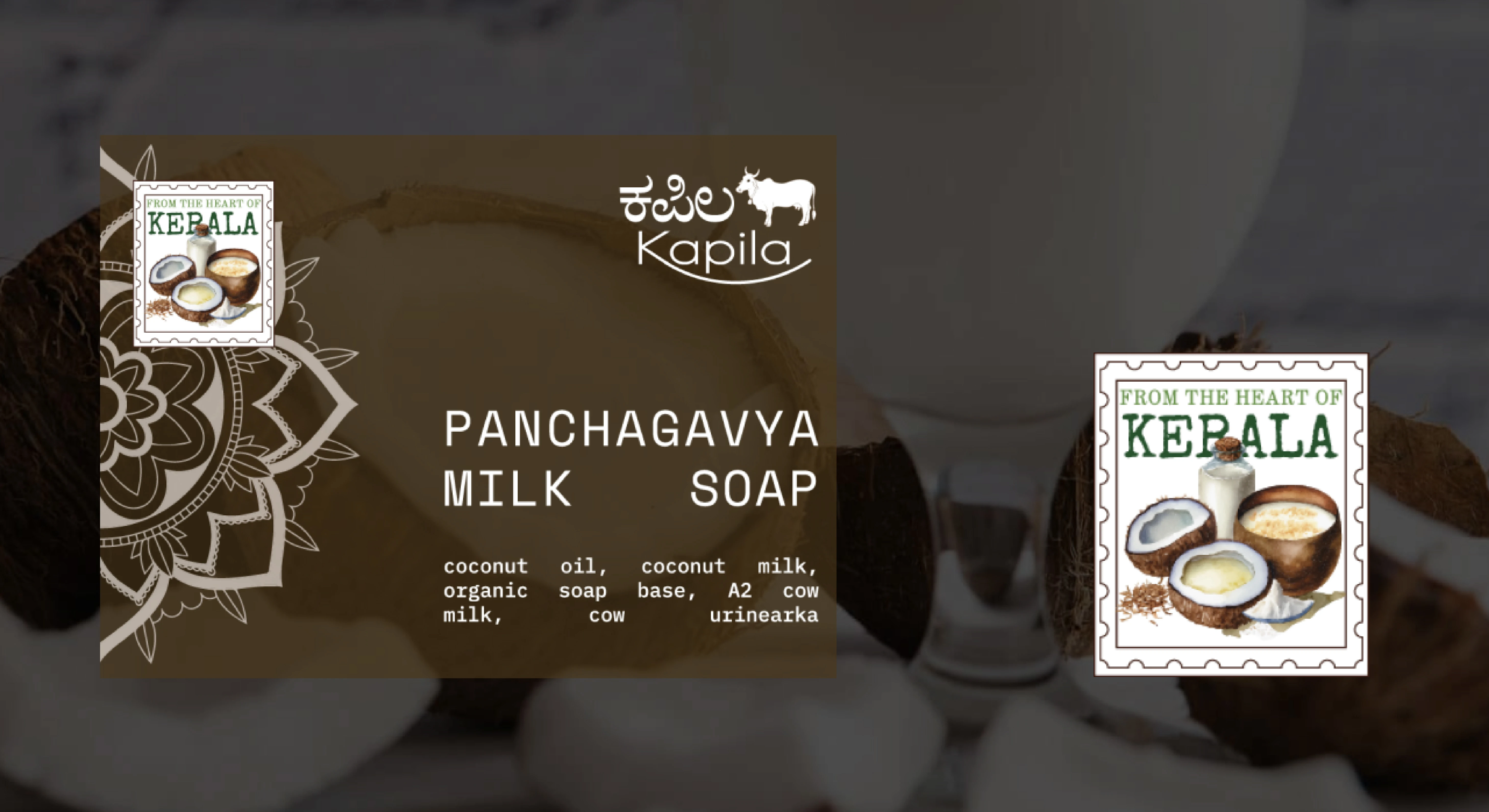
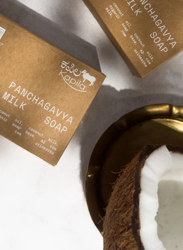
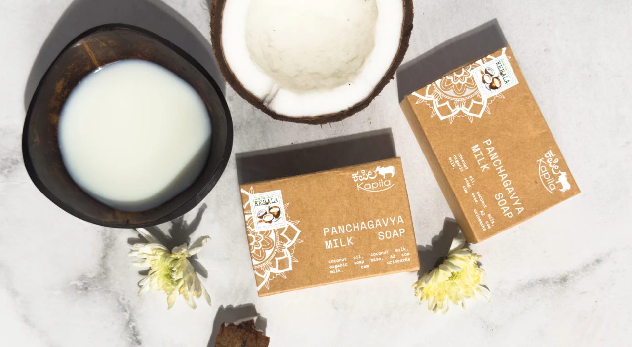
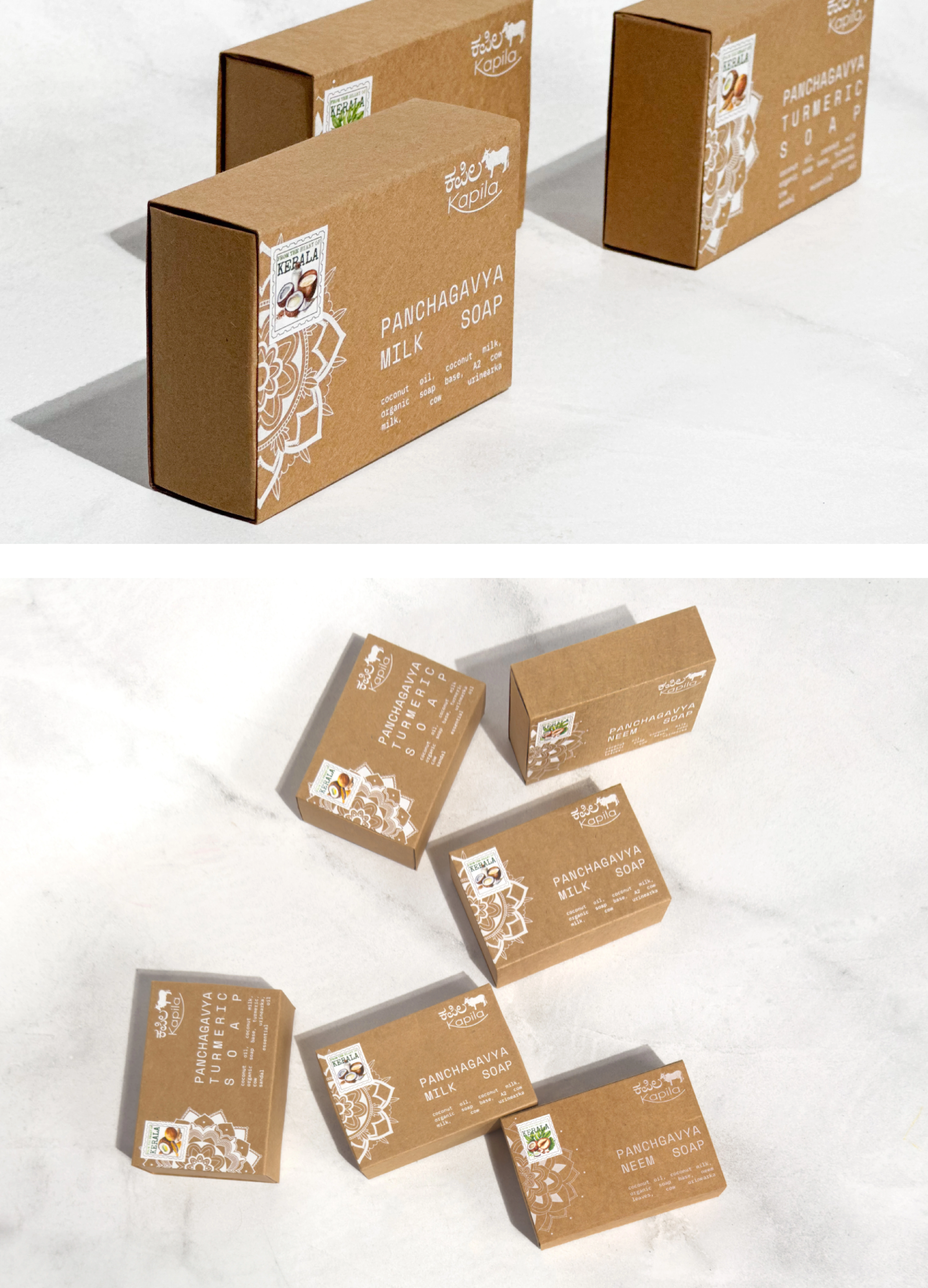
All variations were created using elements that are synonymous with the Southern Regions of India. The variations we created were – Neem, Turmeric and Coconut Milk.
Like this project
Posted Mar 20, 2025
As Senior Design Associate, I led concept, illustration & design for Kapila Soaps, creating a bold, cultural identity with artisanal, nature-inspired packaging.
