Flexible Pill
Hussein Saeed
Increase visibility of delivery actions and clarity of delivery stages to the user
Context
The main goal was to remove the swap option from the kebab menu previously when it was on the app since it required users to do more clicks to achieve there goal of swapping a meal.
The CX team was approached in attempts to understand whether any complaints were being received in regards to the amount of clicks needed to swap a meal. Despite mentioning that they weren’t getting complaints concerning that issue, they did point out they were getting numerous calls regarding how to perform specific actions. The latter included changing the address, altering the delivery time for a specific delivery day and how to skip a delivery day, especially from new users.
My Role
UX Researcher
UI Designer
Hand-offs to Developers
Product Review
Methods
Heuristic Analysis
Brainstorming Session
Sketching
Usability Testing
Tools
Figma
Slack
Jira
Time Period
4 weeks
Status
Released
The Problem
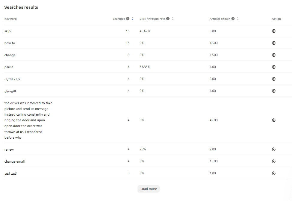
The CX team receives a lot of questions from new users about how to change their address, delivery time, or how to skip a delivery.
Users tend to pause their subscription instead of skipping for a day.
Not enough visibility for those features, since it is hidden in the screw icon that is on the top right.
Solution
Increase visibility of those features by taking them out of the screw option on the top right of the screen.
Make it flexible and adaptable to the user's current stage of delivery or subscription that the user is in.
Opportunity
Reduction in phone calls directed to the CX team regarding how to perform these actions, thus, saving the team more time for other tasks.
Increasing visibility to users and making them feel more in control of the app.
Research
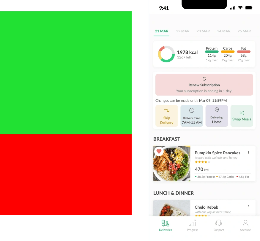
Analyzing the current state of the deliveries page:
1- Hierarchy on the Delivery Page
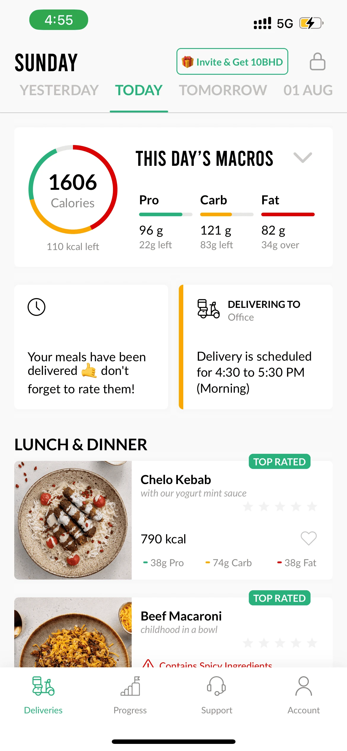
Previously, the sections regarding macros and delivery action used to take up plenty of space on the app's layout. This not only reduces space, but also overshadows important aspects for users such as meal information, renewal due time and renewal failure.
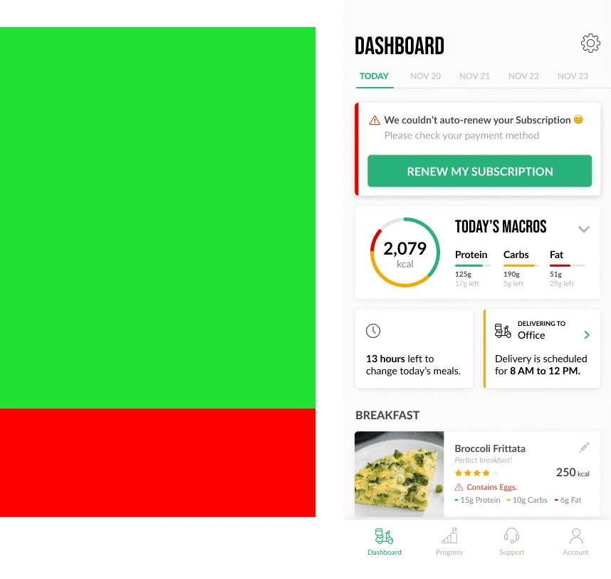
2- Visibility of Delivery level actions
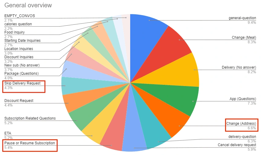
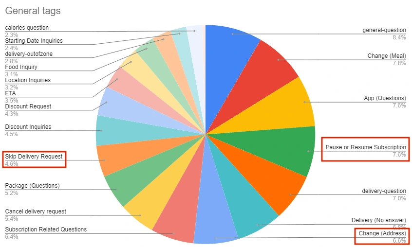
Delivery level actions such as change address, change delivery time, and skip delivery are not visible to the user properly. Thus, users tend to pause their subscription instead of skipping a delivery day because they are unaware of the "skip delivery" feature and its location. Ultimately, this results in a lot of phone calls to the CX team.
3- No distinct difference between the different delivery stages
There is no clear difference between whether the user is on lock-up, their meal is being delivered, or whether their meal has already been delivered since the UI doesn't differ that much.
Concept
Sketches
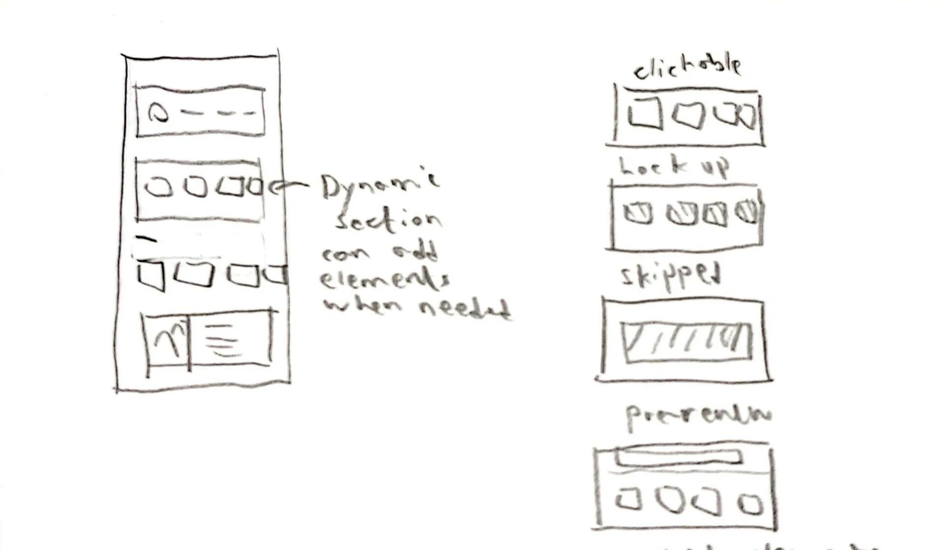
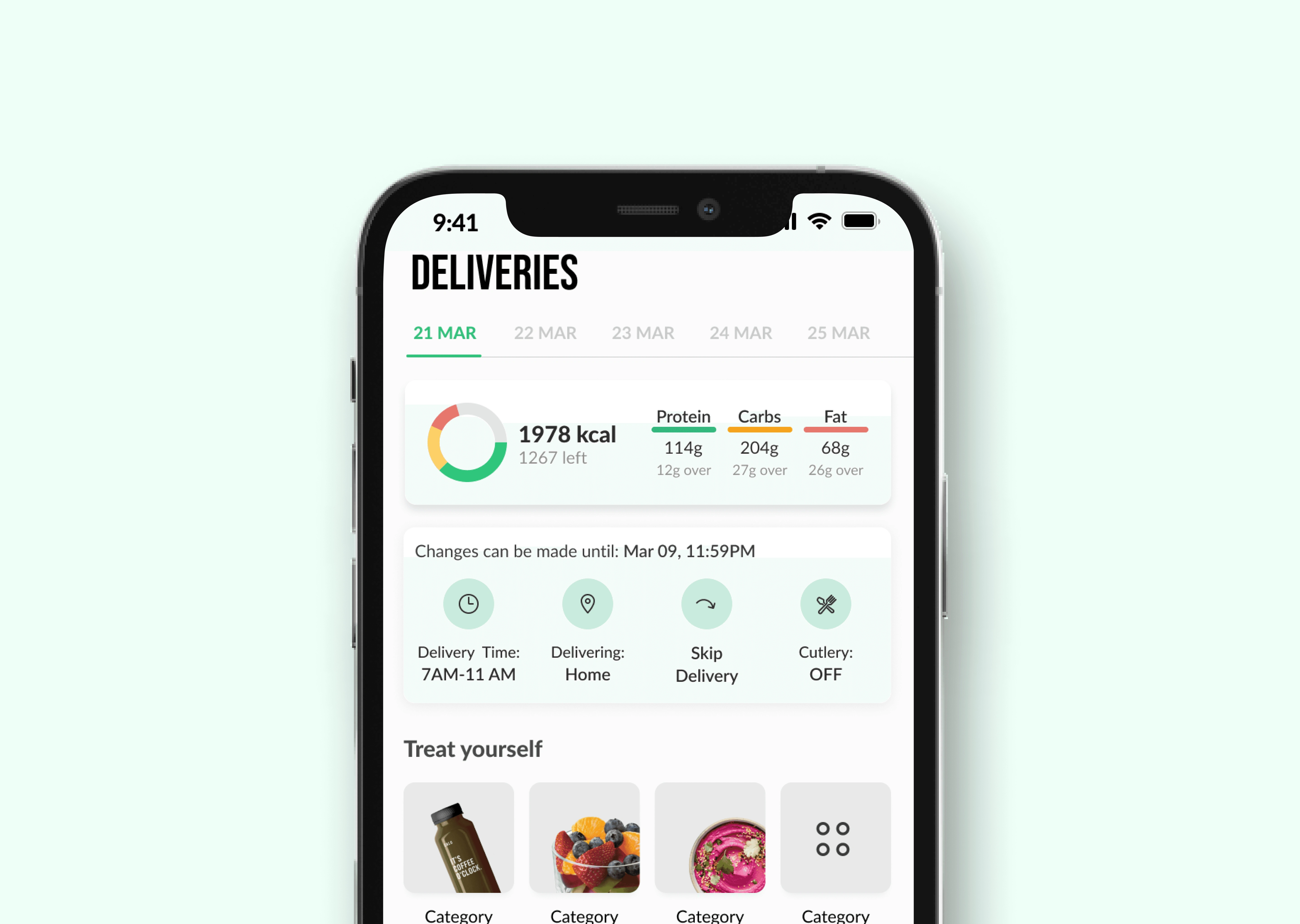
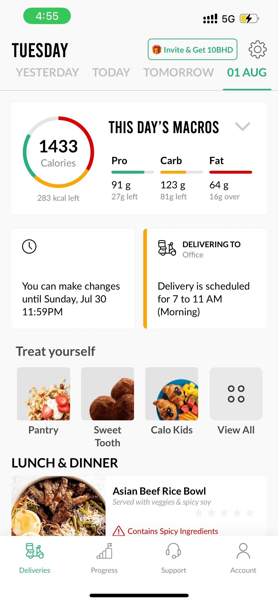
1- Creating a dynamic section:
Implementing change in a way that all the delivery options are presented, as well as making it interactive so that it reflects what stage the user is at whether it being subscription or delivery stage.
Also this helped in increasing the visibility of all the delivery level actions that the user can do so new users wont have difficulty looking for them.
This allows for future actions related to the delivery level to be added there where it can be scrolled to view them and there order can be controlled incase of events to view actions related to the events.

2- Increased hierarchy for meals
This helped also in reducing the amount of space needed and allowing for more space for the meal cards to be visible.
Validating Concept
Conducting usability testing
A usability test took place involving 4 returning and 4 new users, who were tasked with accomplishing a series of tasks to verify the capabilities of the feature, with success metrics being speed and successfulness of completing the tasks.
Results
Users were able to complete all tasks successfully and in less time using the new solution rather than the former one on the app.
Feedback from stakeholders
Idea was enjoyed, just a question arise around the buttons and actions that will be provided.
A color change for the actions was advised to reduce cognitive load and to go along with brand guidelines.
Operations Team pointed out that they made a change and now users can change there address and delivery time up to 24 hours before there delivery day, so we needed to show the difference between features that can be edited 48 hours and 24 hours before the users delivery day.
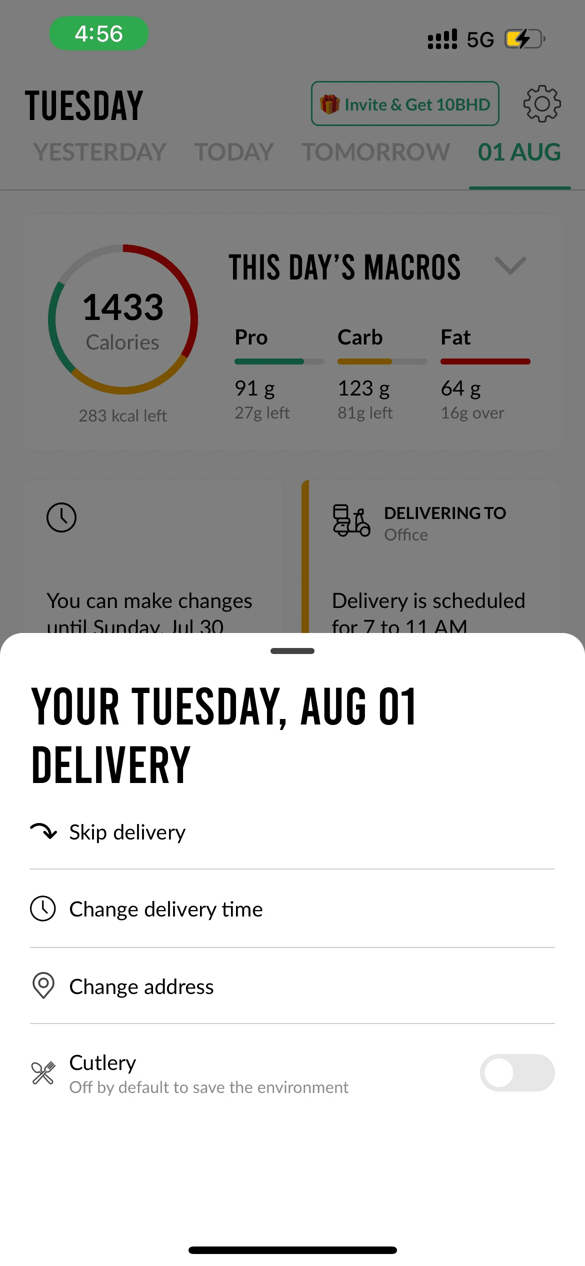
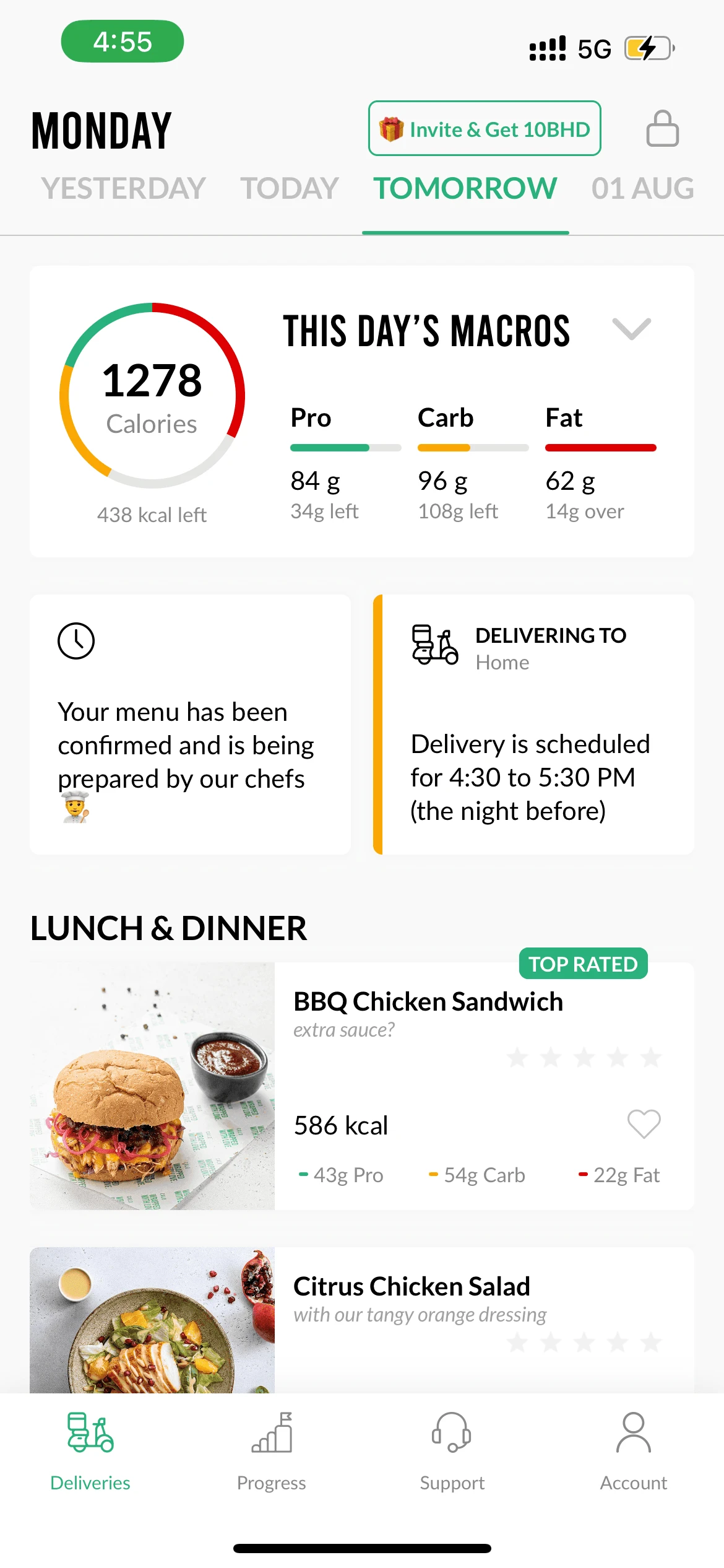
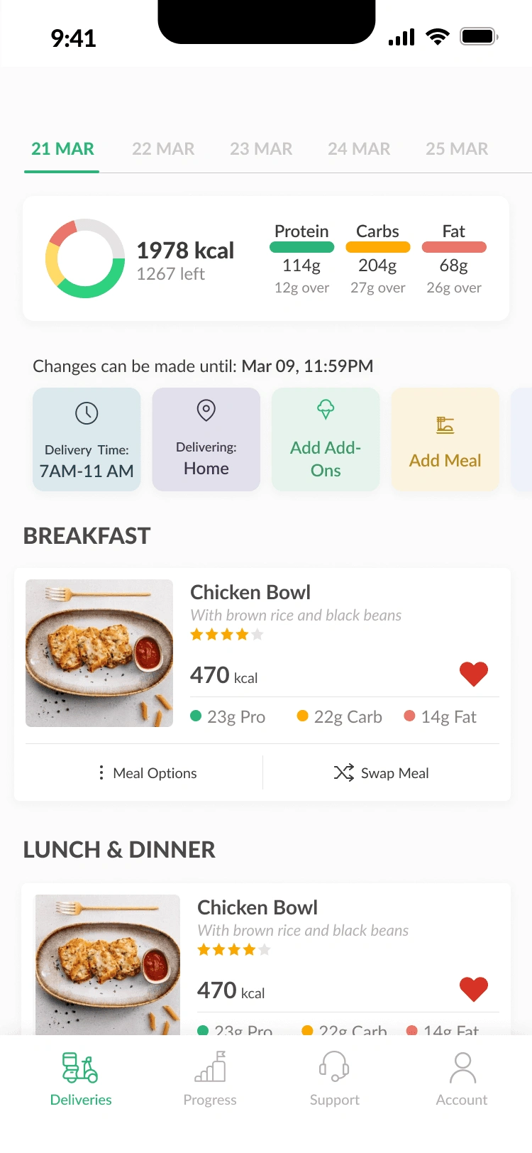
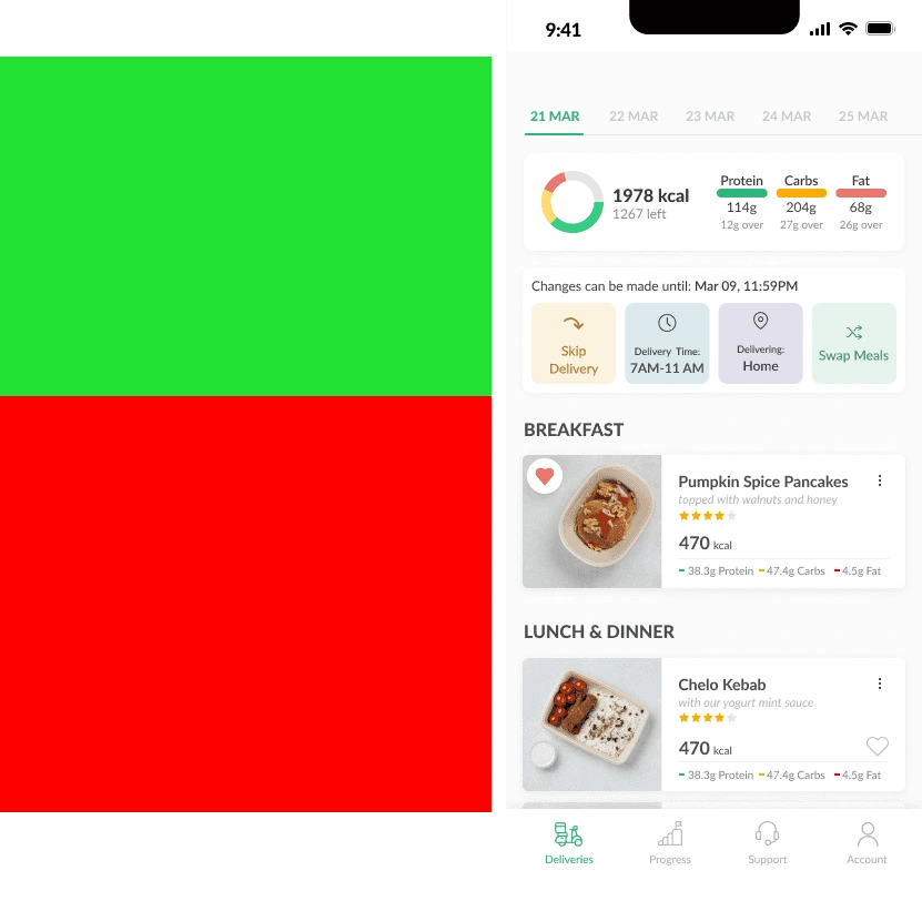
Final design
High-Fidelity Wireframe
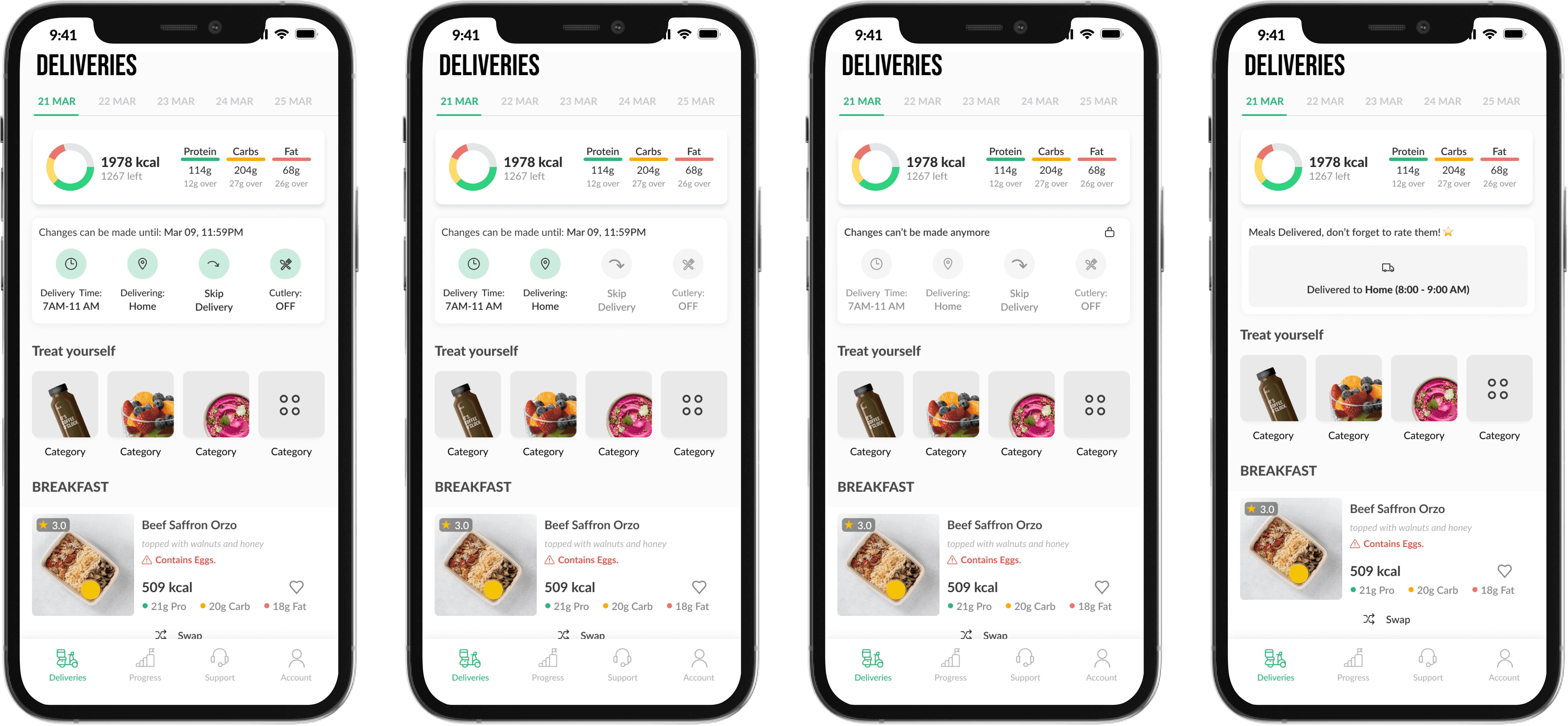
Pre-lockup
Mid-Lockup
Full Lockup
After Being Delivered
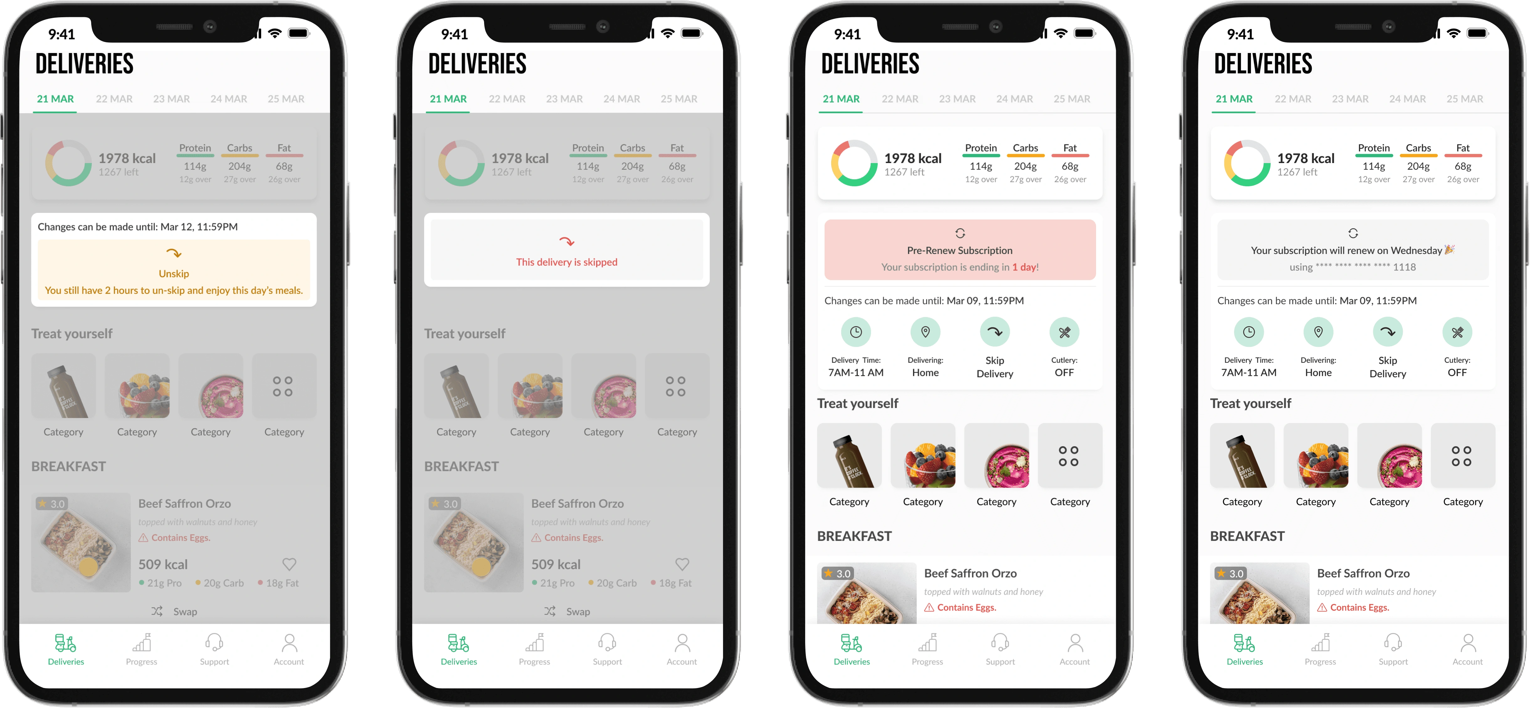
Skipping a day
Post Lockup
PRe-renewal
When auto renew is applied
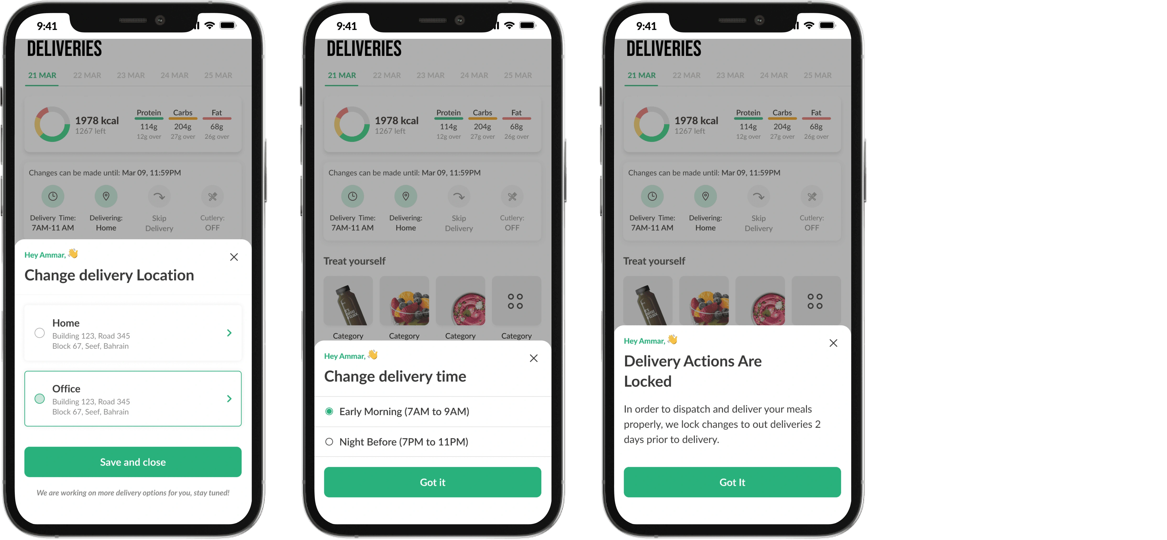
Changing a delivery address Changing a delivery time explanation of lockup period
need for alignment
Aligning with operations team so they are ready
Having the users do too many changes from the beginning to delivery time or address might break operations since they are working on reducing the lock-up period for these two elements
Releasing in percentages
After aligning with the operations team, they recommended releasing the feature to 30% of our users in each MP and monitor the usage and will be increased on a weekly basis till we reach 100% in all MPs.
Results after releasing to 50% of users
After releasing to 50% of users, we checked the data to see how the feature was doing before going 100% visibility for all users.
Changing delivery time: Slightly higher adoption on the new UI
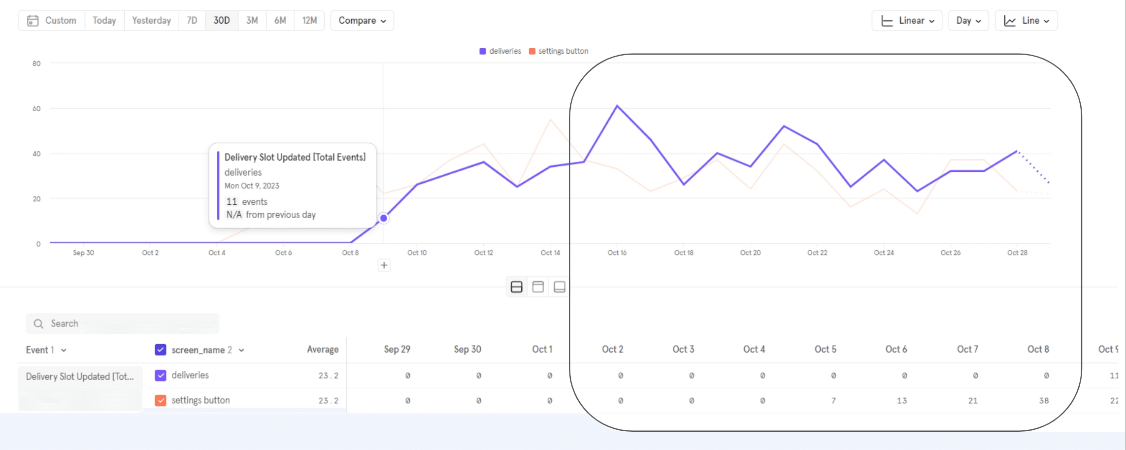
Cutlery ON/OFF adoption: High Adoption on new UI
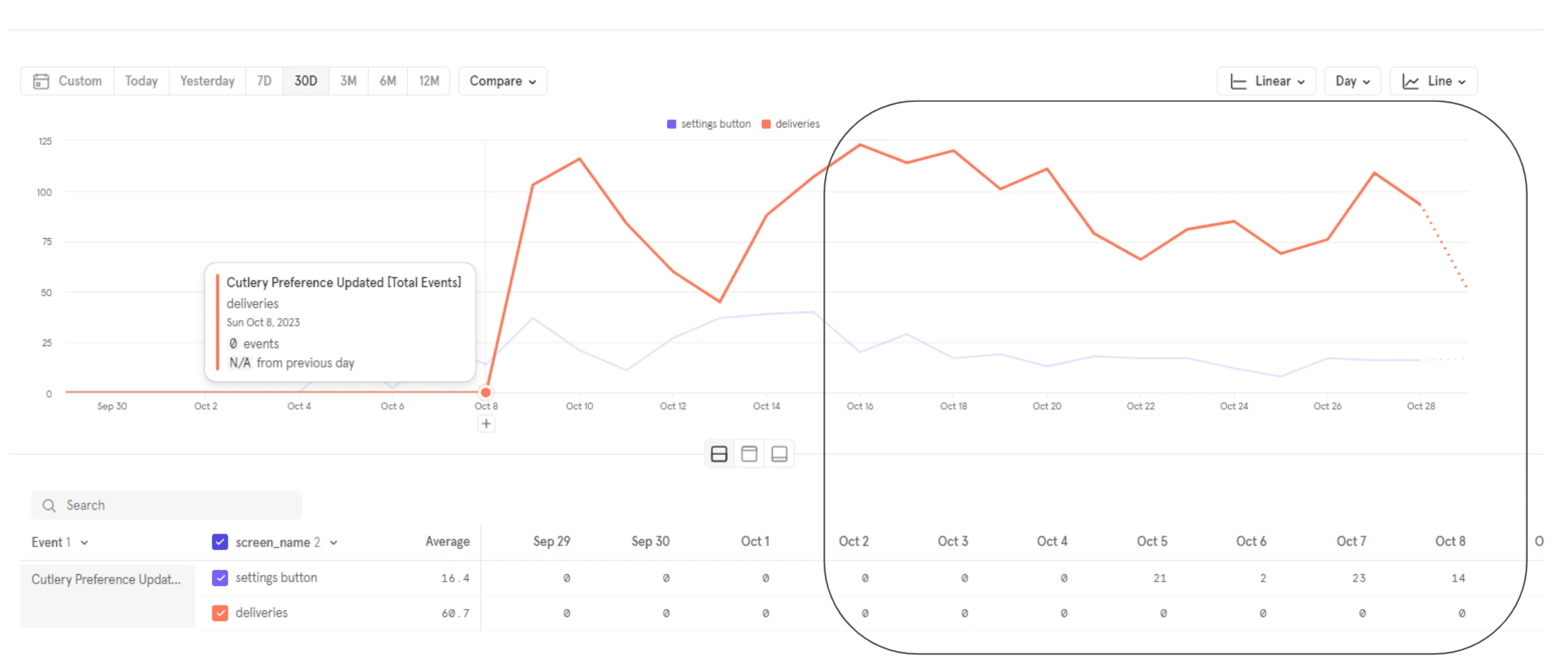
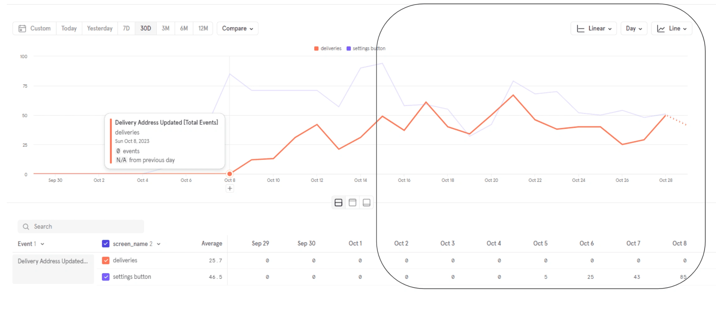
Changing delivery address: Low adoption on the new UI
Releasing to 100% visibility
After noticing that most features were having a better adoption rate it was decided to increase visibility to 100% in all MPs after communicating that to the operations team as well.
Next Steps
Monitoring users feedback.
Update designs to showcase Icons depending on delivery time, address, and cutlery status.
Add confirmation before skipping a delivery.
Like this project
Posted Feb 26, 2024
Increase visibility of delivery actions and clarity of delivery stages to the user
Likes
0
Views
8