Lemonade Fashion Mobile App
Designing The App With 32% Conversion Rate
Story telling
Lemonade Fashion is a startup that began 3 years ago when the CEO noticed that the fashion industry had two problems:
When it came to shopping online, people had an issue with their cloth arriving not entirely to their fit.
There was a lot of talented designers that were still not discovered.
So Lemonade Fashion decided to become the platform that will connect these unknown talented designers to the people as well as providing the users with custom made-to-measure cloth. Lemonade Fashion already has a running website, but is missing a mobile app which i was tasked to work on alone since they didn’t have any other UX/UI Designers at the time.
My Role
UX Researcher
UI Designer
User Testing
Hand-offs to Developers
Product Review
Methods
Competitor Analysis
Card Sorting
Impact Mapping
Information Architecture
Tools
Figma
Slack
Jira
Time Period
6 months
Status
Released
The Problem (Business Wise)
The need for a better product considering that web is flaky, riddled with support issues and browser bugs, and since most users were on mobile and the mobile version of the app contained many issues.
The Goals (Business Wise)
To increase retention rates and provide the users with a faster access to the products by creating the Lemonade Fashion App.
Research
Research done before I joined the company
The Company had already done some research by the time I was hired, and it was done by the product manager, so I went through all the data they had collected and the key findings they reached which included:
Surveys were already sent out using google forms.
The need to create an MVP which contains the most needed pages for the users to be able to search for items, browse through the collection, choose what they want, see its information, buy it, and track its location.
Users wanted a seamless experience and for them to be able to easily find what they want.
User Persona were already performed.
Research done by me
The rest are research performed by me post entering the company to gain more understanding of the requirements.
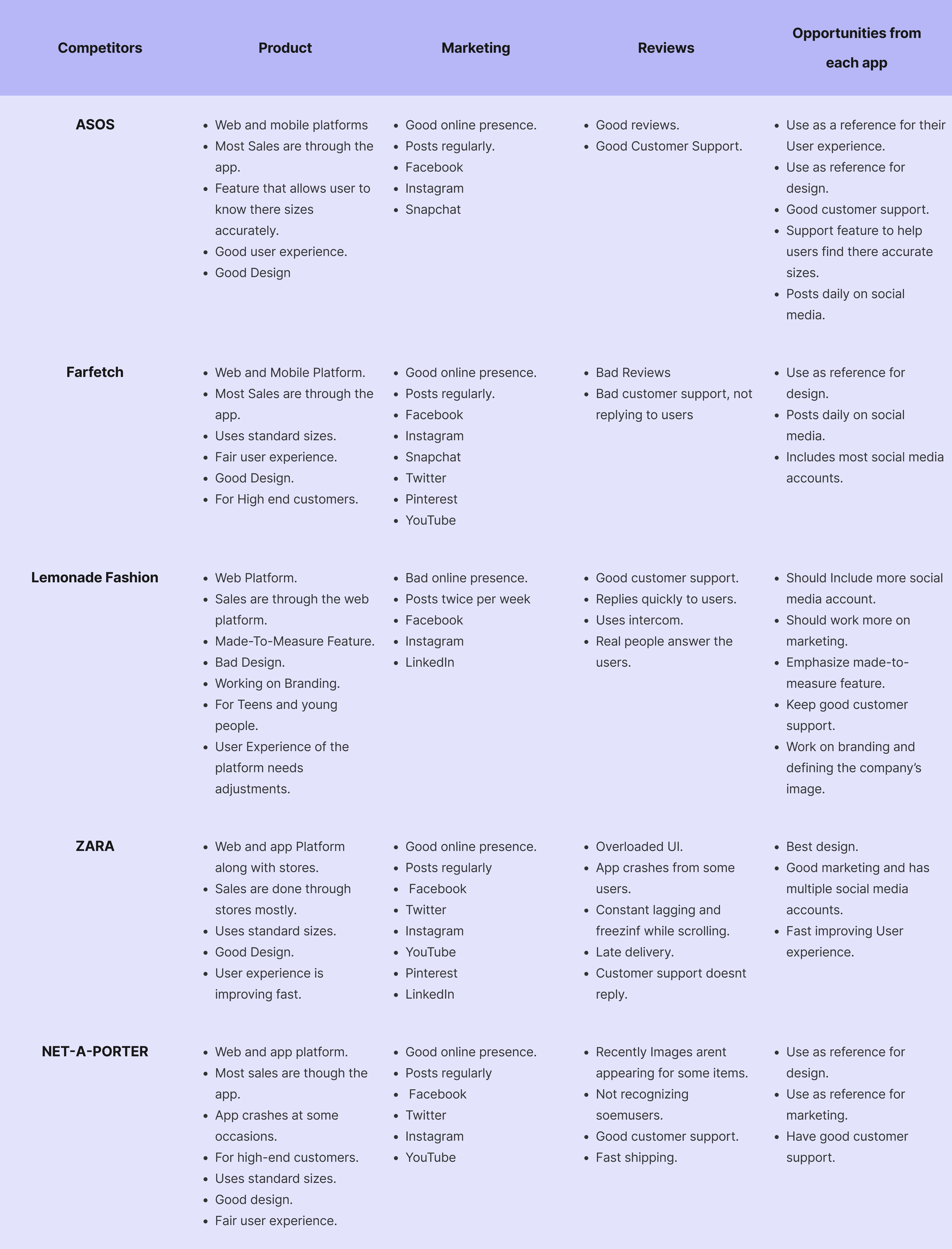
Competitor Analysis
The next step was to analyze the main competitors that the company wants to reach and go beyond, and those are:
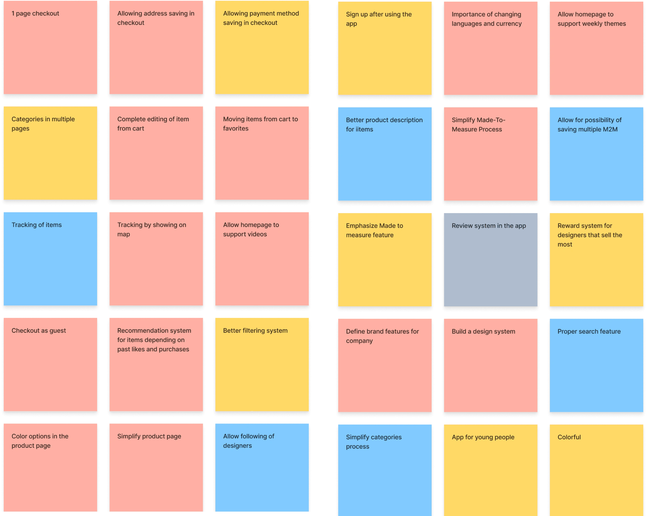
Defining what are the main components needed for the MVP
These components will allow us to apply our consideration for the features that the app will mostly constitute to allow us to develop the app quickly and launch taking into consideration all the needed aspects to give the users a seamless experience.
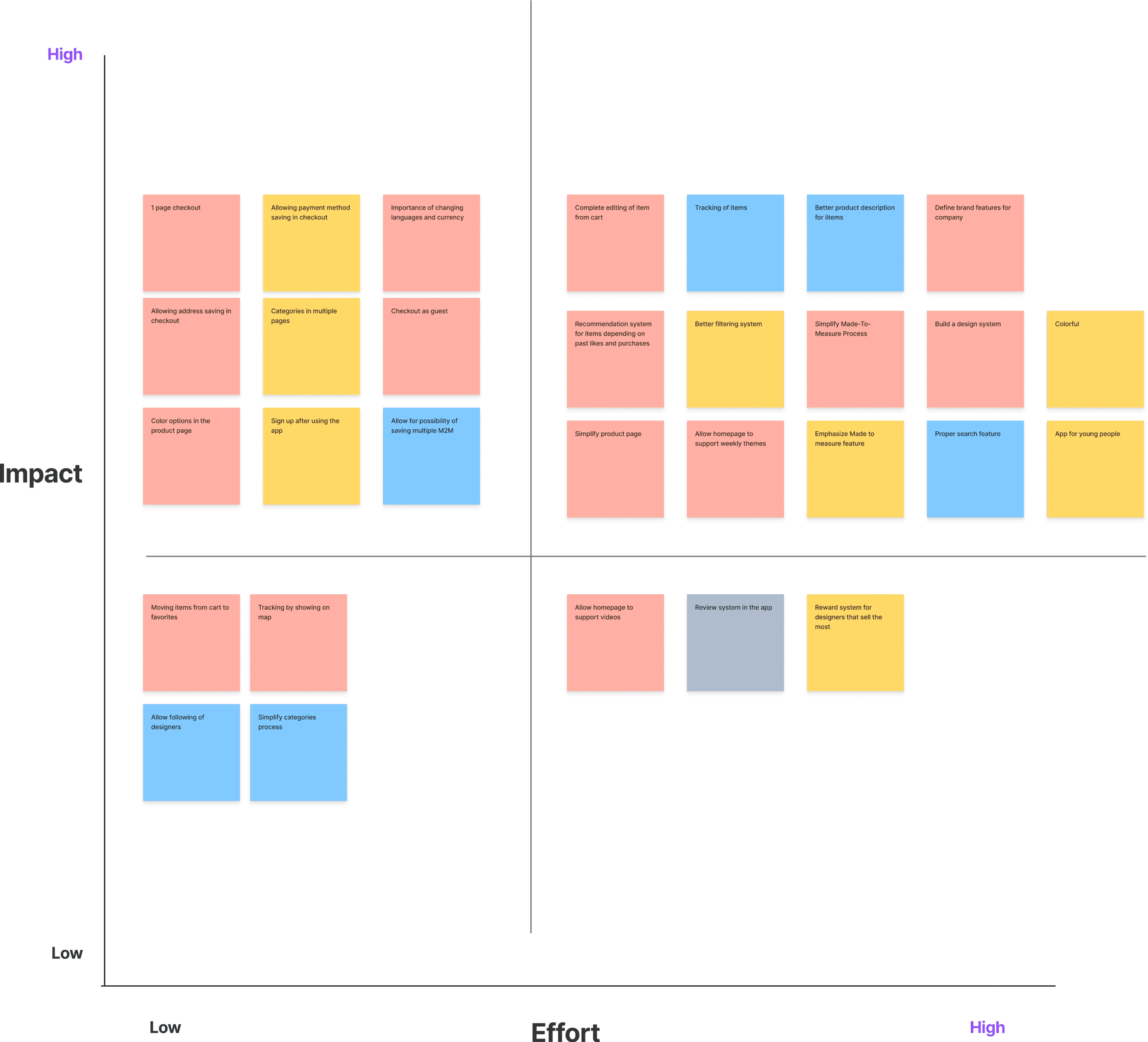
Impact mapping
This exercise was performed to define the features that will be in the MVP and which will be left for later updates.
Design Principles
Give Flexibility
Allow users to easily be able to fix mistakes if they ever choose an option they didn’t mean to choose.
Be Transparent
Communicate clearly and truthfully to users about all payments that may arise such as transportation.
Keep It Simple
Optimize for easy understanding of complex ideas such as the Made-To-Measure option
Build Confidence
Build confidence by showing value and allowing the user to completely try out our services before committing to us.
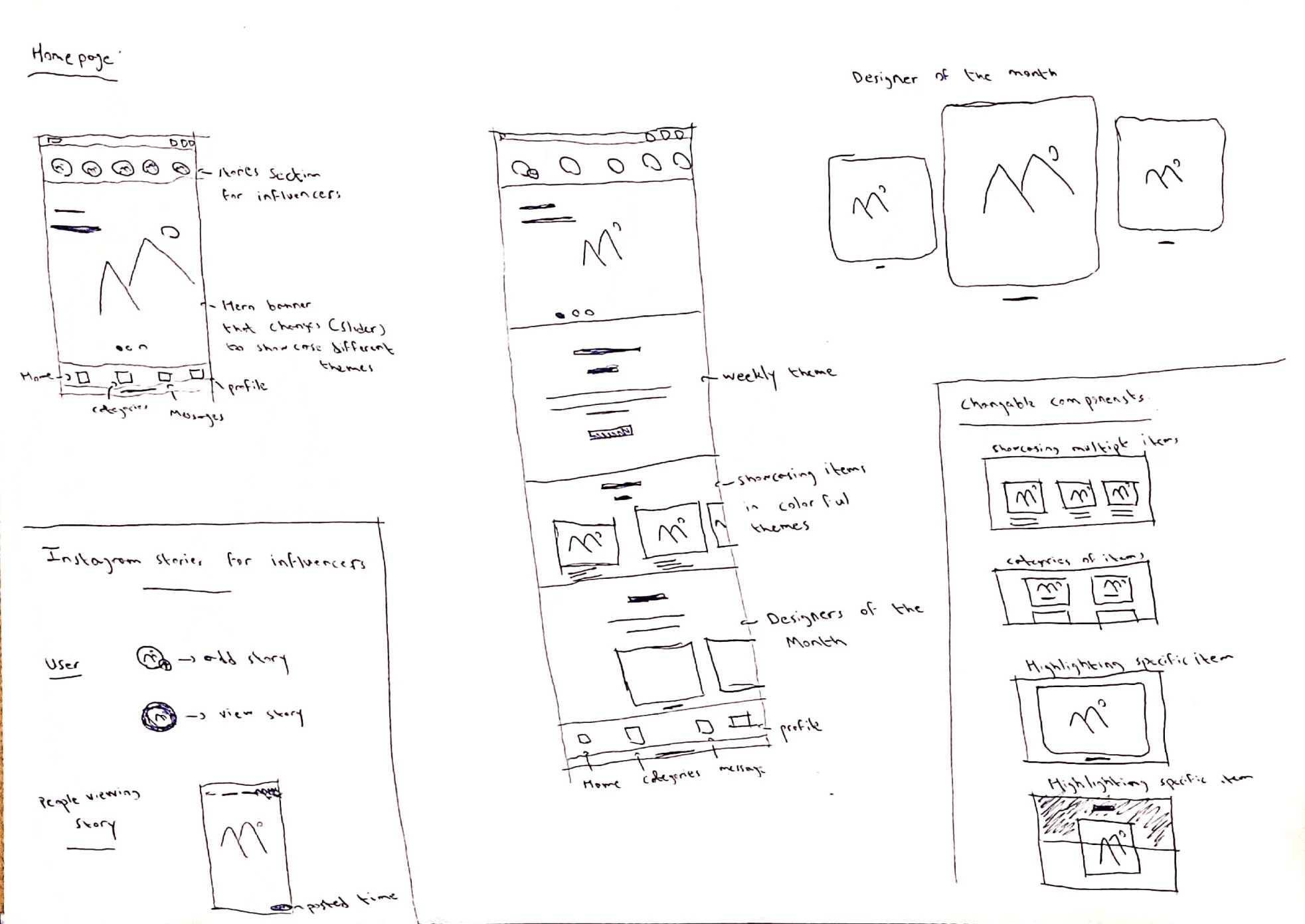
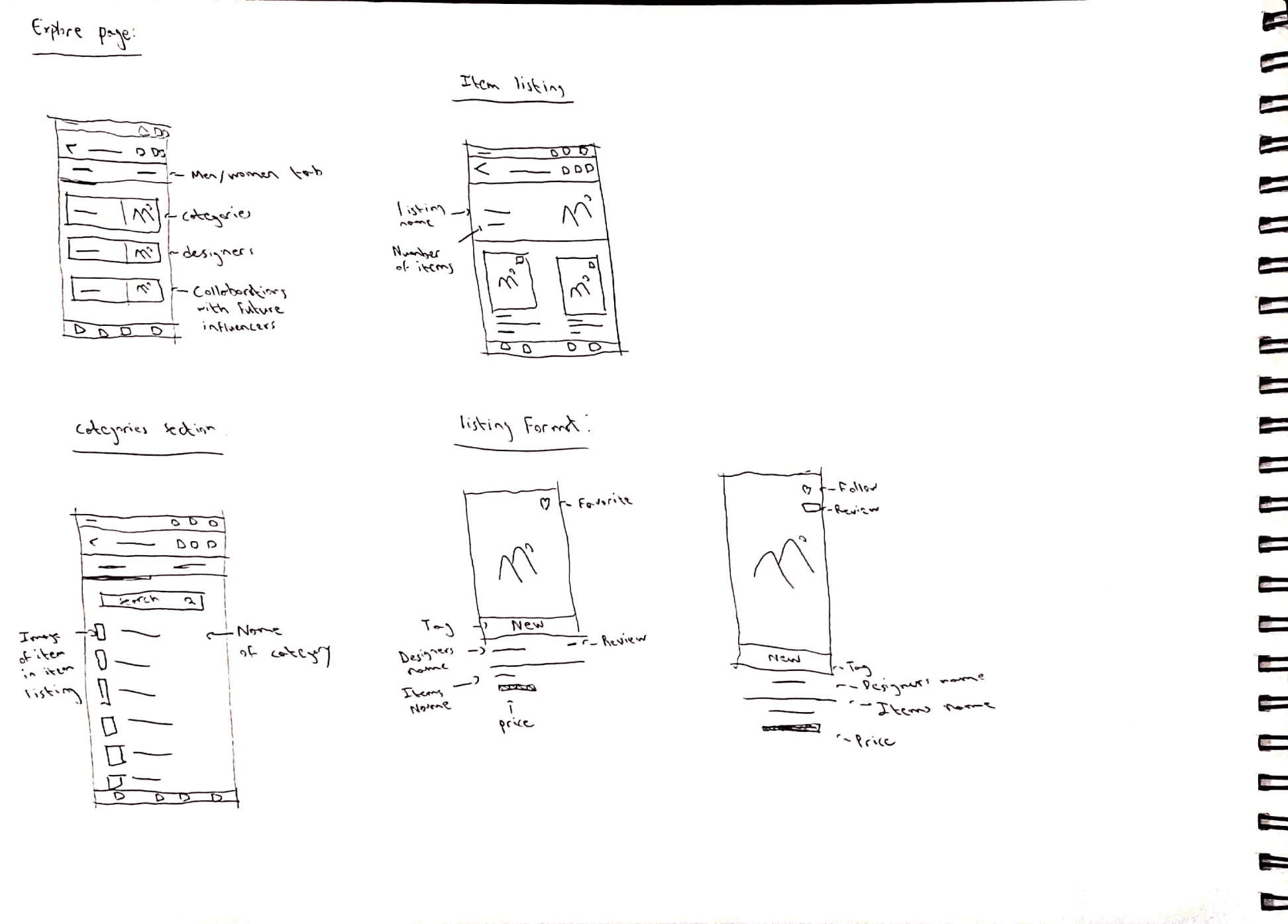
Concept
Sketches
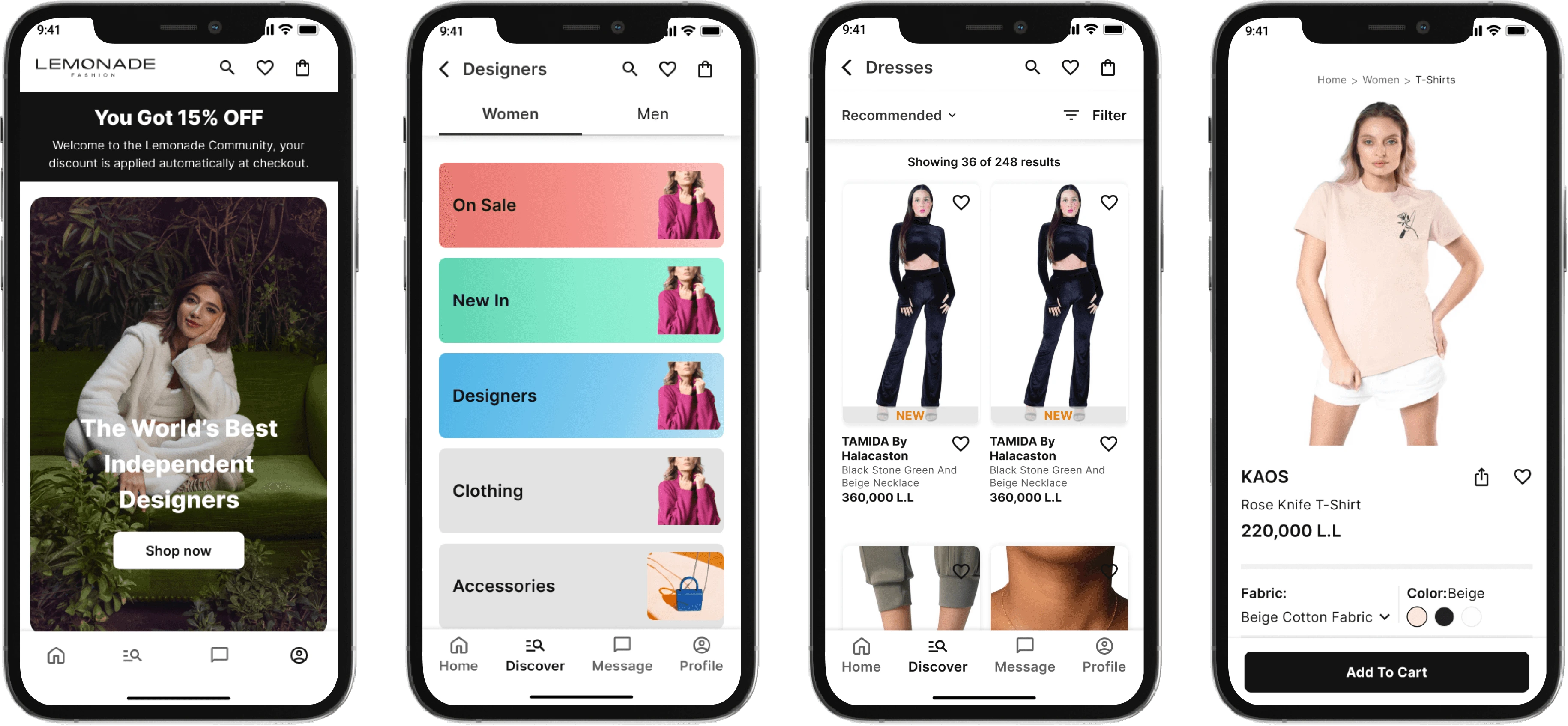
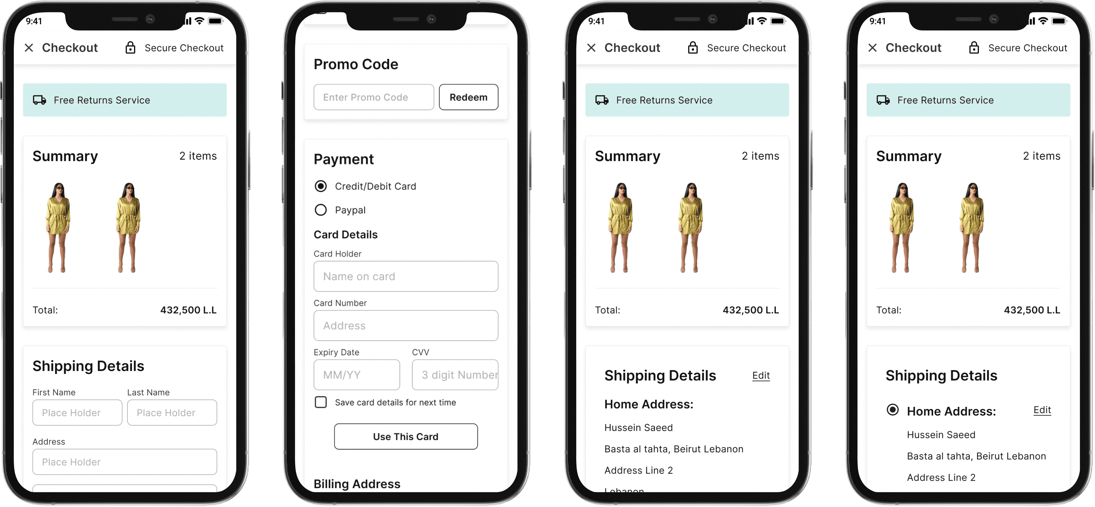
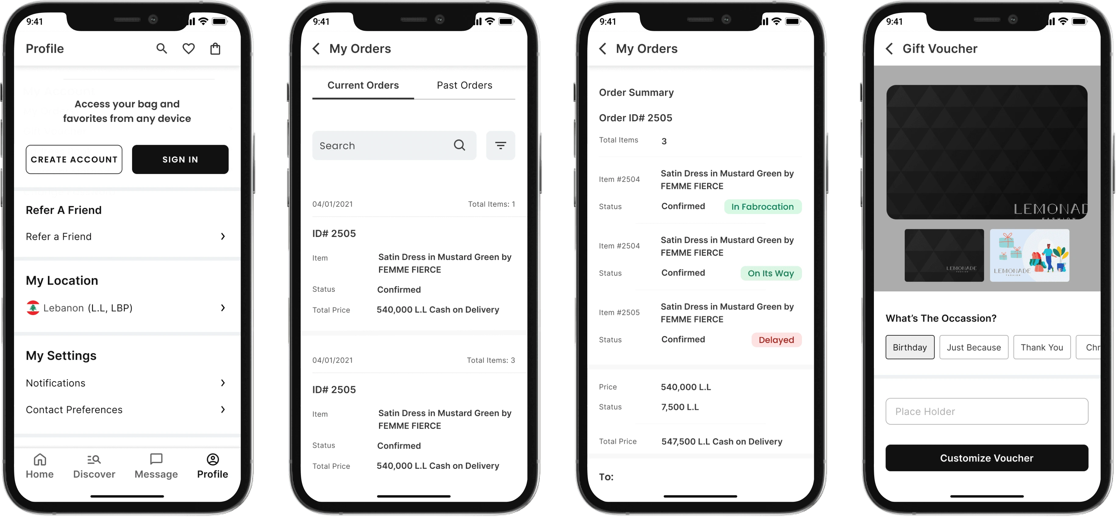
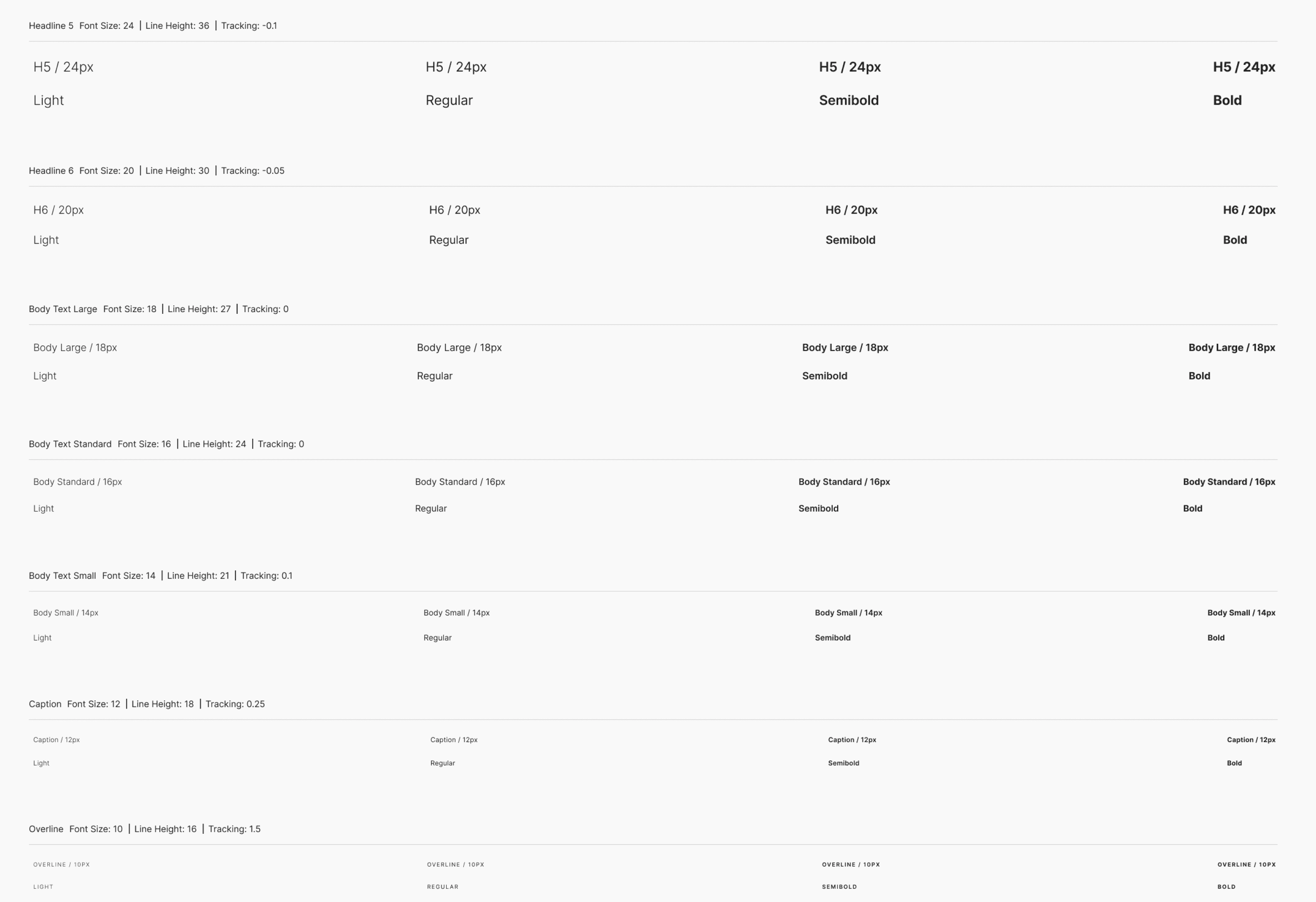
Final design
Home Page + Item Listing + Item Description
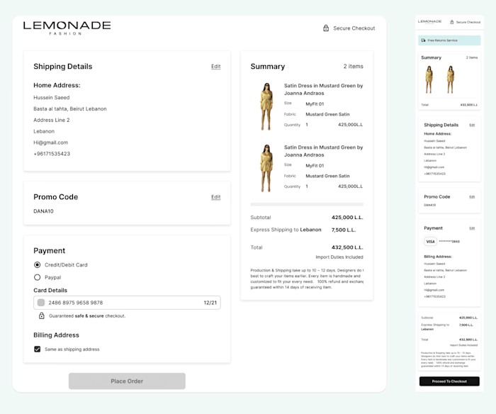
Checkout Page
Profile Page
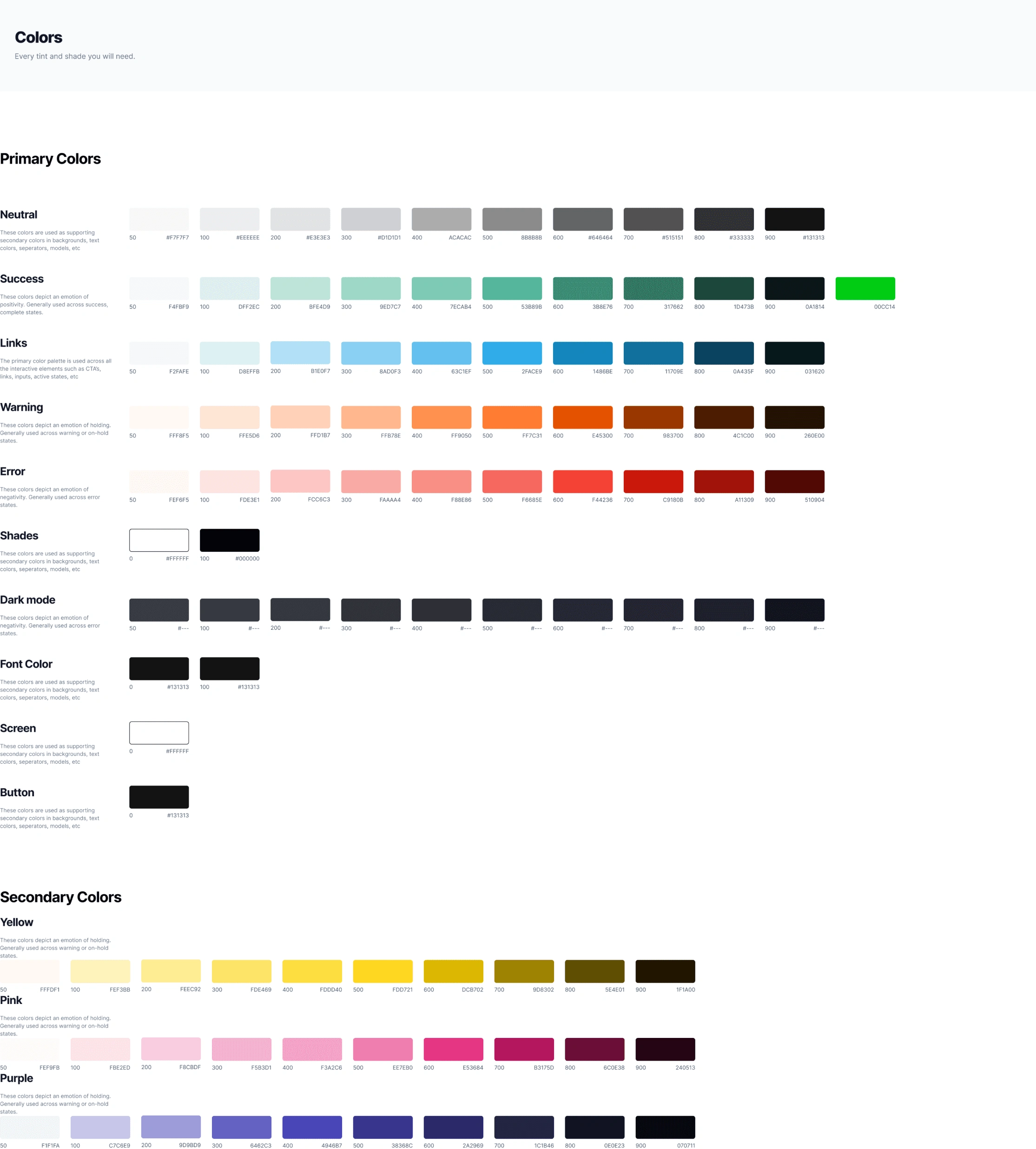
Design System
TESTING RESULTS
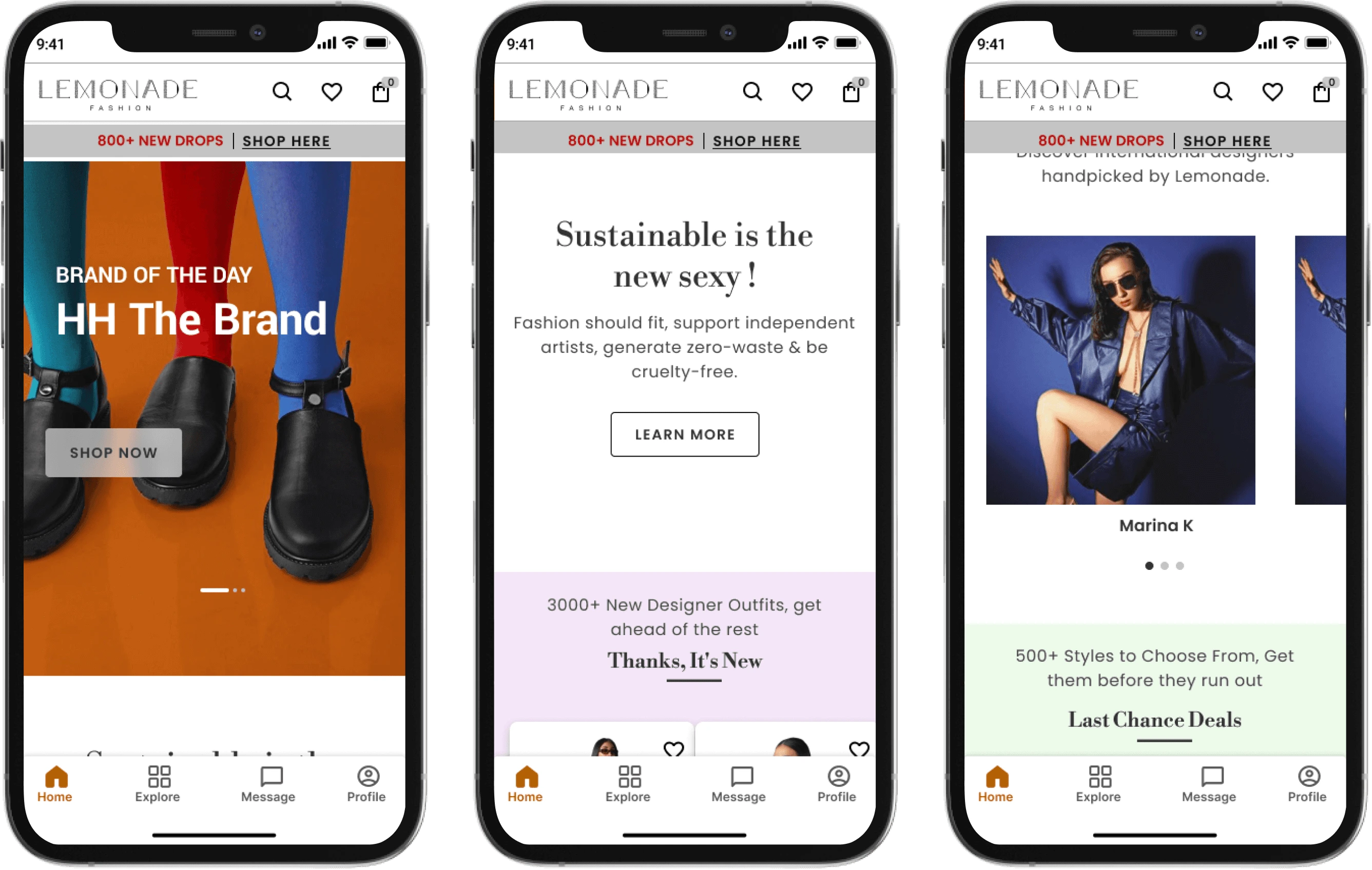
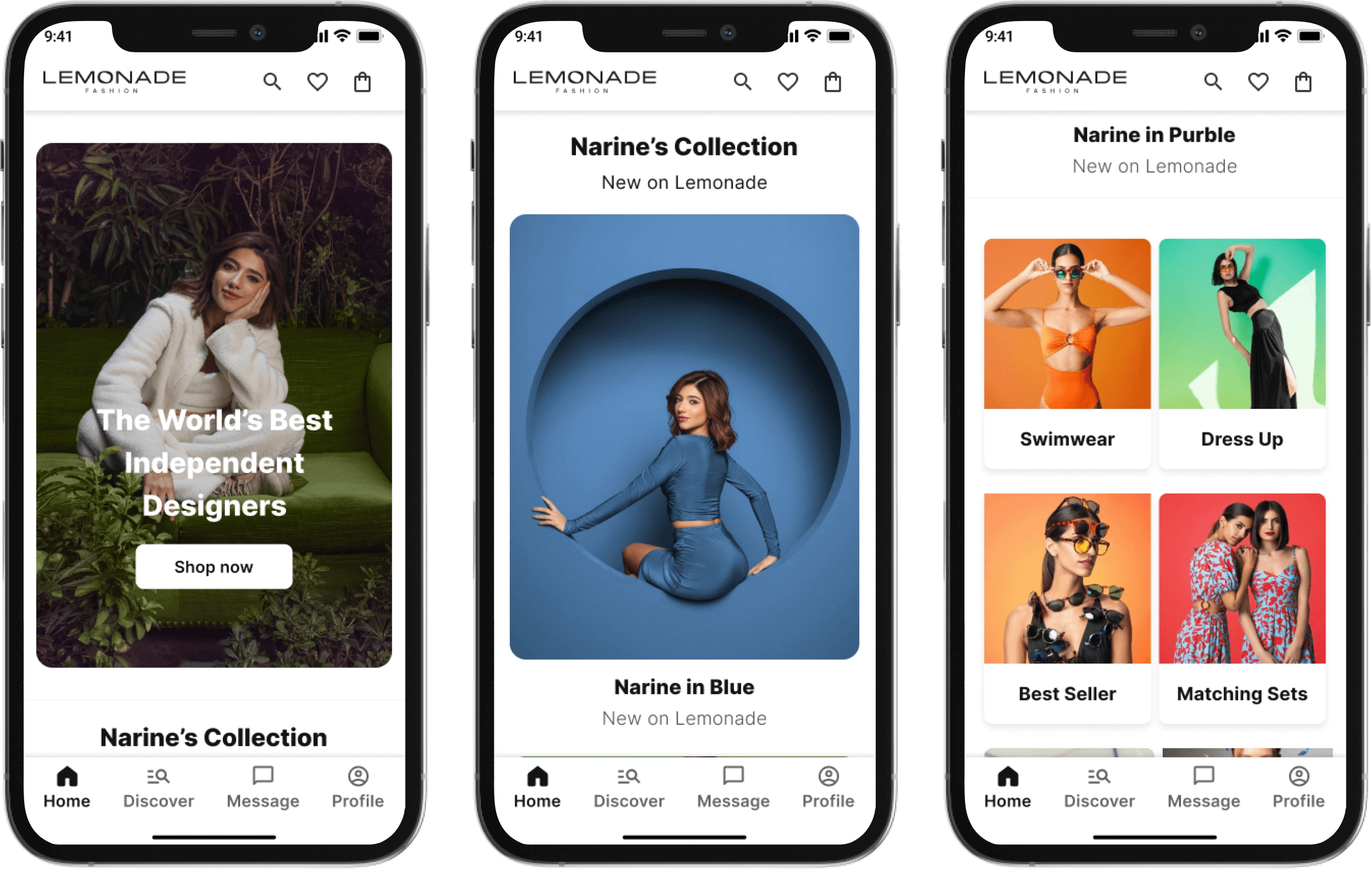
HomePage Redesign:
Problem:
Users found the original homepage to be extremely long and weren’t going through all the sliders.
Solution:
We discussed with the marketing team what content they would prefer to show and created banners and a small categories zone for what items we would want to highlight each week.
Old Flow
New Flow
Result:
Users were more likely to go through the whole homepage and were pressing on the banners and categories as was intended.
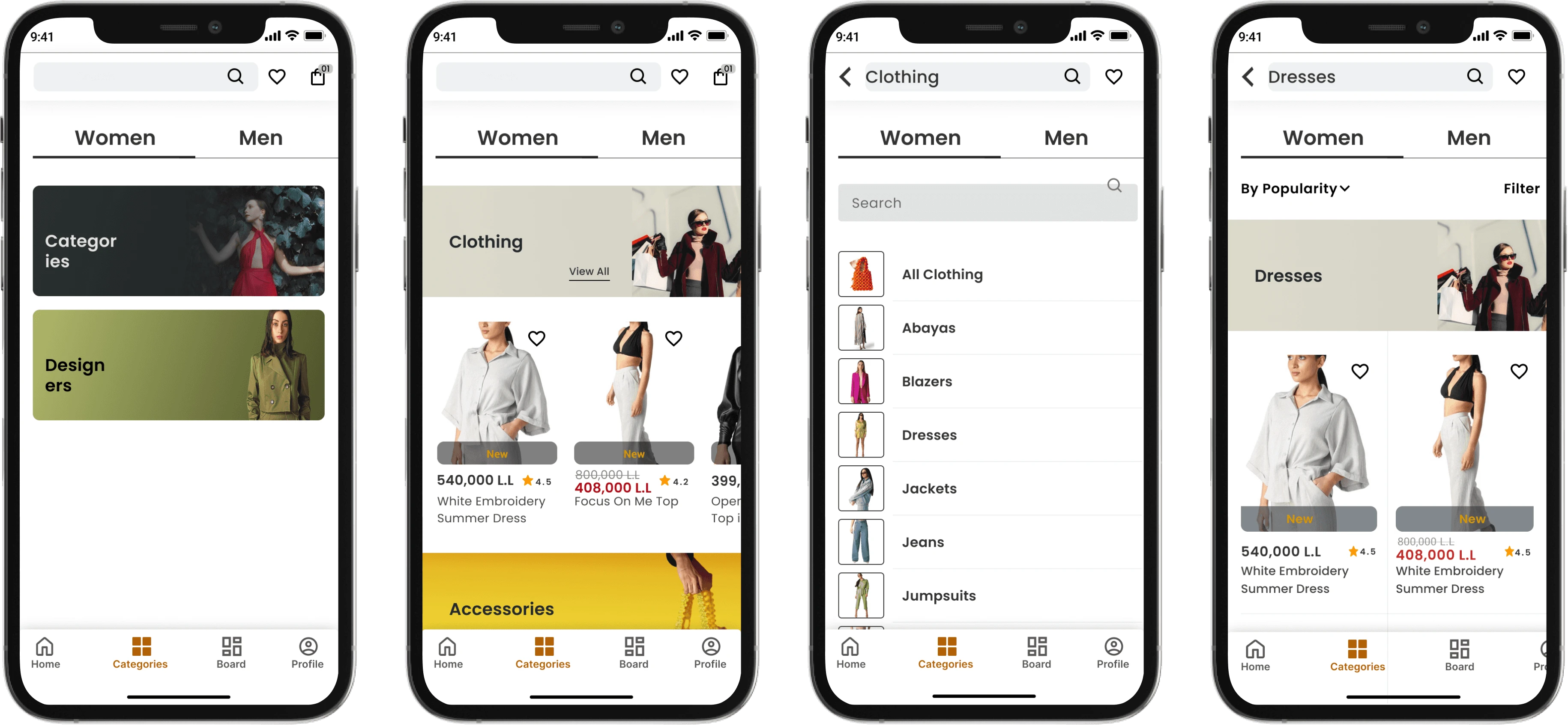
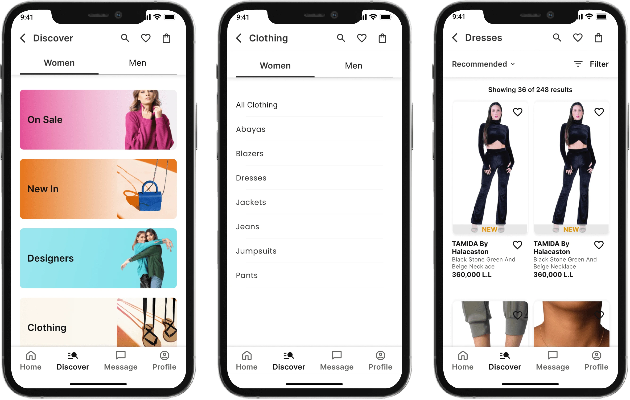
Categories Flow Redesign
Problem:
Users found that it took them too long to reach the screen of the options for the categories.
Users were not sure about what exactly to expect after pressing on the categories option since most of them thought it would directly take them to the clothing options and didn’t know we had options for accessories, shoes, and so on.
Moving the Designers and Categories option into the Discover page and adding a “New In” and other options since would allow the users to know the full scope of what we offer.
Solution:
Moving the Designers and Categories option into the Discover page and adding a “New In” and other options since would allow the users to know the full scope of what we offer.
Old Flow
New Flow
Result:
It was easier for the users to go through the options and make a more educated option.
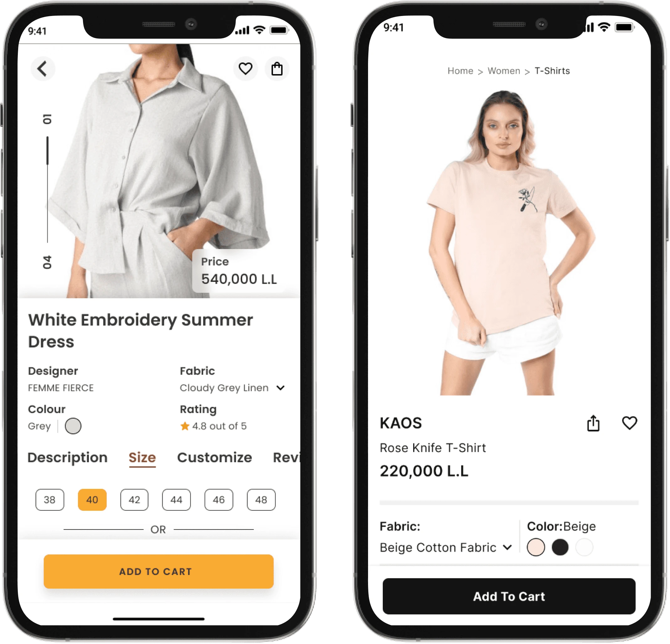
Product Description Page
Problem:
Users found it confusing in the previous having to go through different tabs to see different information as well as overwhelmed with info.
The new design showed information depending on information with less cognitive load.
Solution:
Decluttering the page and providing only the needed informtation at a time.
Old and New Design
Results
2,000
Monthly active users
App is Launched
on both IOS and Android devices.
32%
Conversion rate
Next Steps
testing inside the company and with family members to check for bugs before the official release.
Upon official release, gaining data on sales and retention rates as well as addressing any issues regarding user experience from user testing.
Working on adding features that were not implemented due to the tight schedule in order to have a more complete app such as adding more options for bad item editing.
Like this project
Posted Feb 26, 2024
Designing The App With 32% Conversion Rate
Likes
0
Views
13

