Built with Framer
Manuella’s Portfolio Redesign: Elevating Visual Storytelling
Cameron St Clair
Manuella’s Portfolio Redesign: Elevating Visual Storytelling
Manuella needed a portfolio that seamlessly showcased her photography, creative direction, and research in a way that felt structured yet immersive. The redesign focuses on a minimalist editorial layout, refined navigation, and a frictionless user experience, ensuring her work stands out while maintaining clarity and cohesion.
The Challenge: Balancing Simplicity with Depth
Manuella’s previous portfolio lacked a clear structure, intuitive navigation, and visual consistency, making it difficult for potential clients to explore her work effectively. The absence of defined content hierarchy led to a disjointed experience, where projects felt scattered rather than cohesive.
Key Problems
Unstructured Layout – Lack of clear categorization made navigating her diverse work difficult.
Low Engagement – Visitors left the site before fully exploring her portfolio.
Inefficient Navigation – Users struggled to switch between Photography, Creative Direction, and Research.
User Insight
I want my portfolio to feel like an extension of my work—minimal but immersive, structured yet creative. – Manuella
See the Before and After images below.
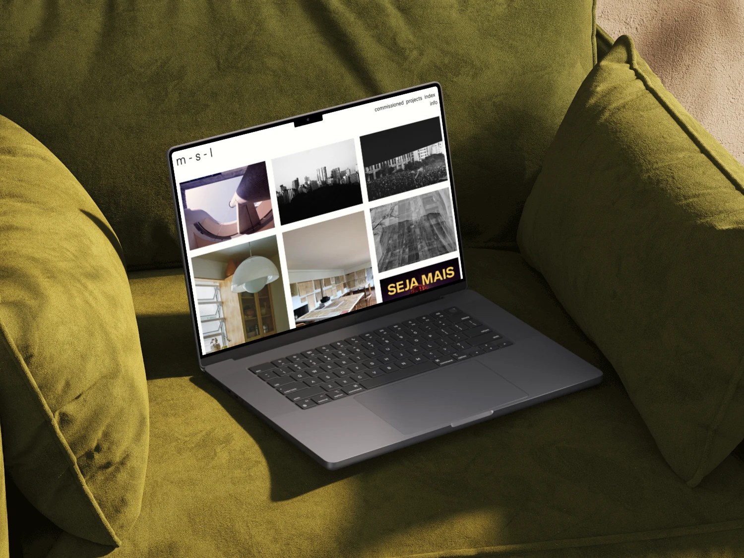
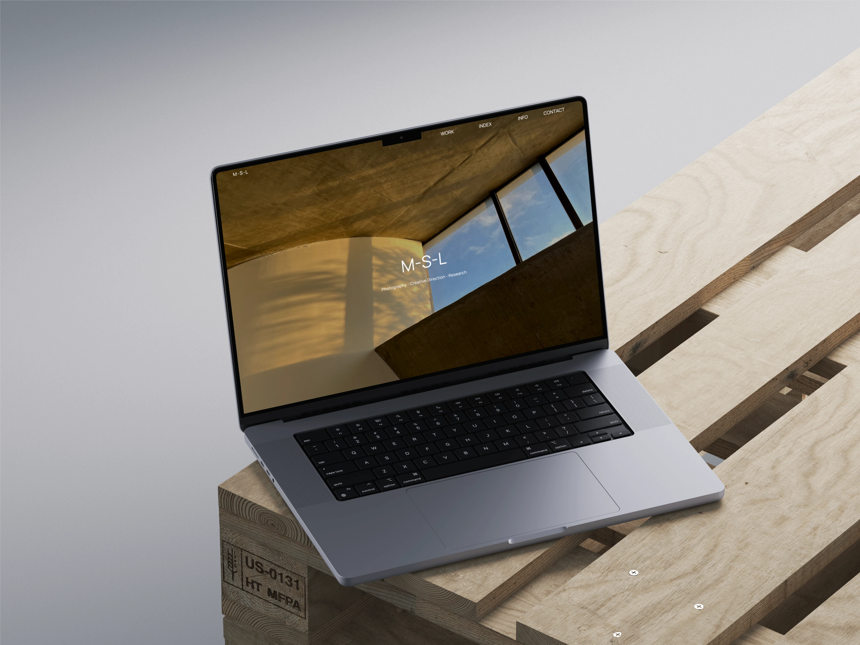
Before
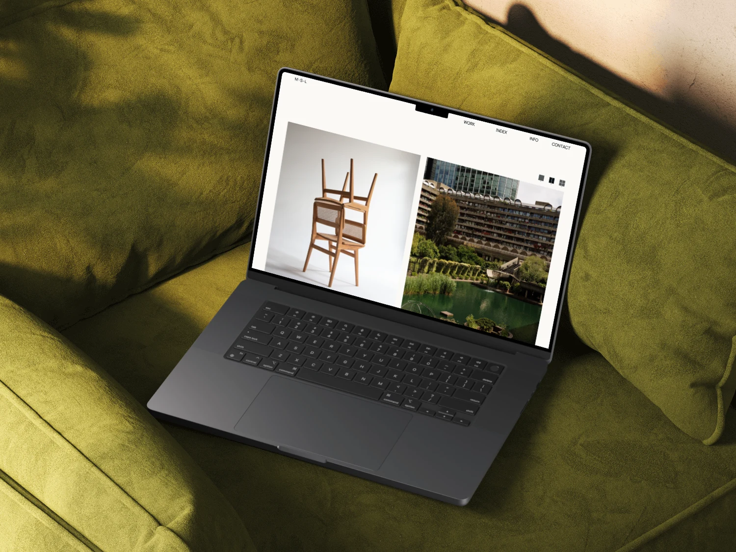
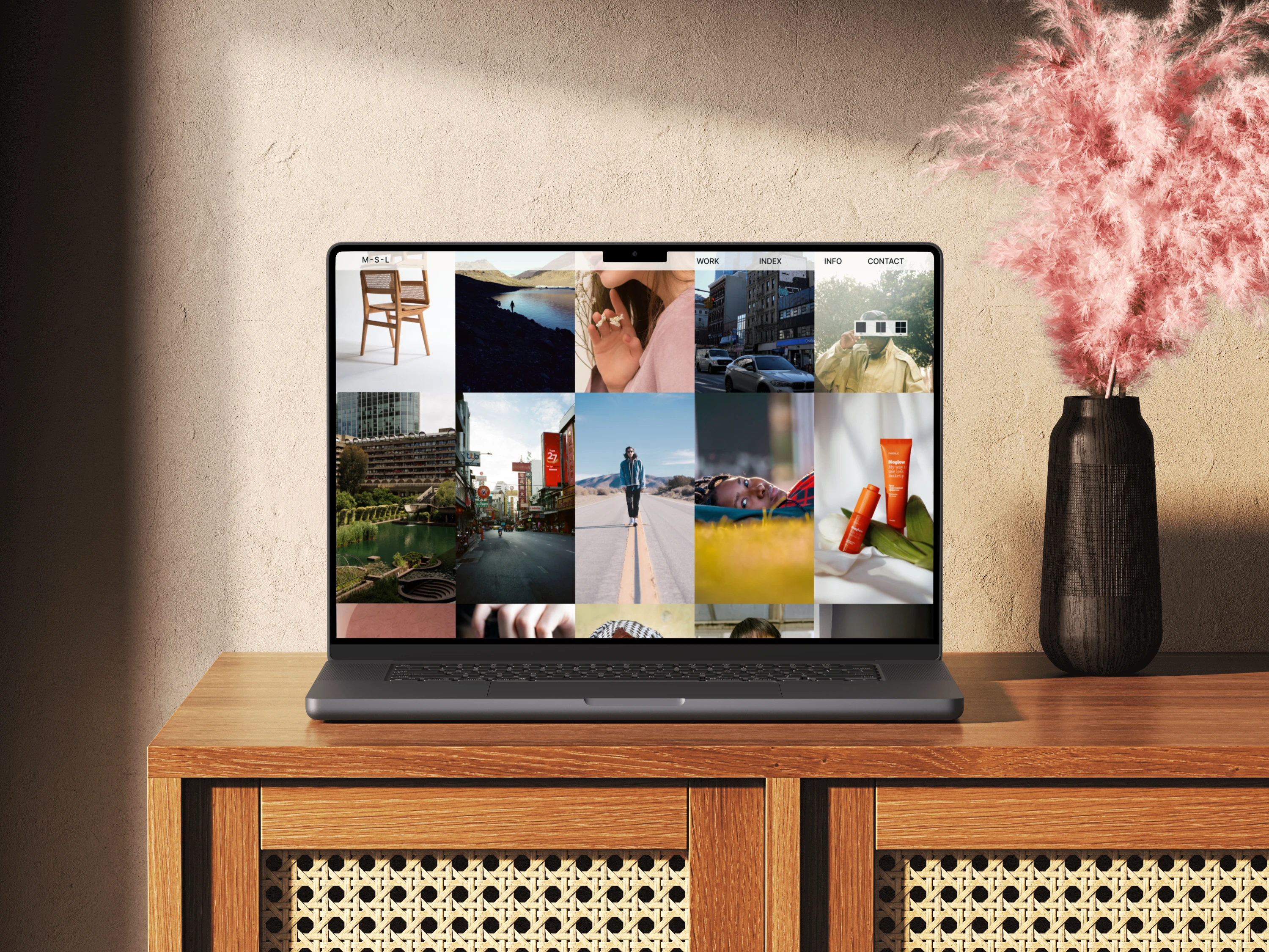
After
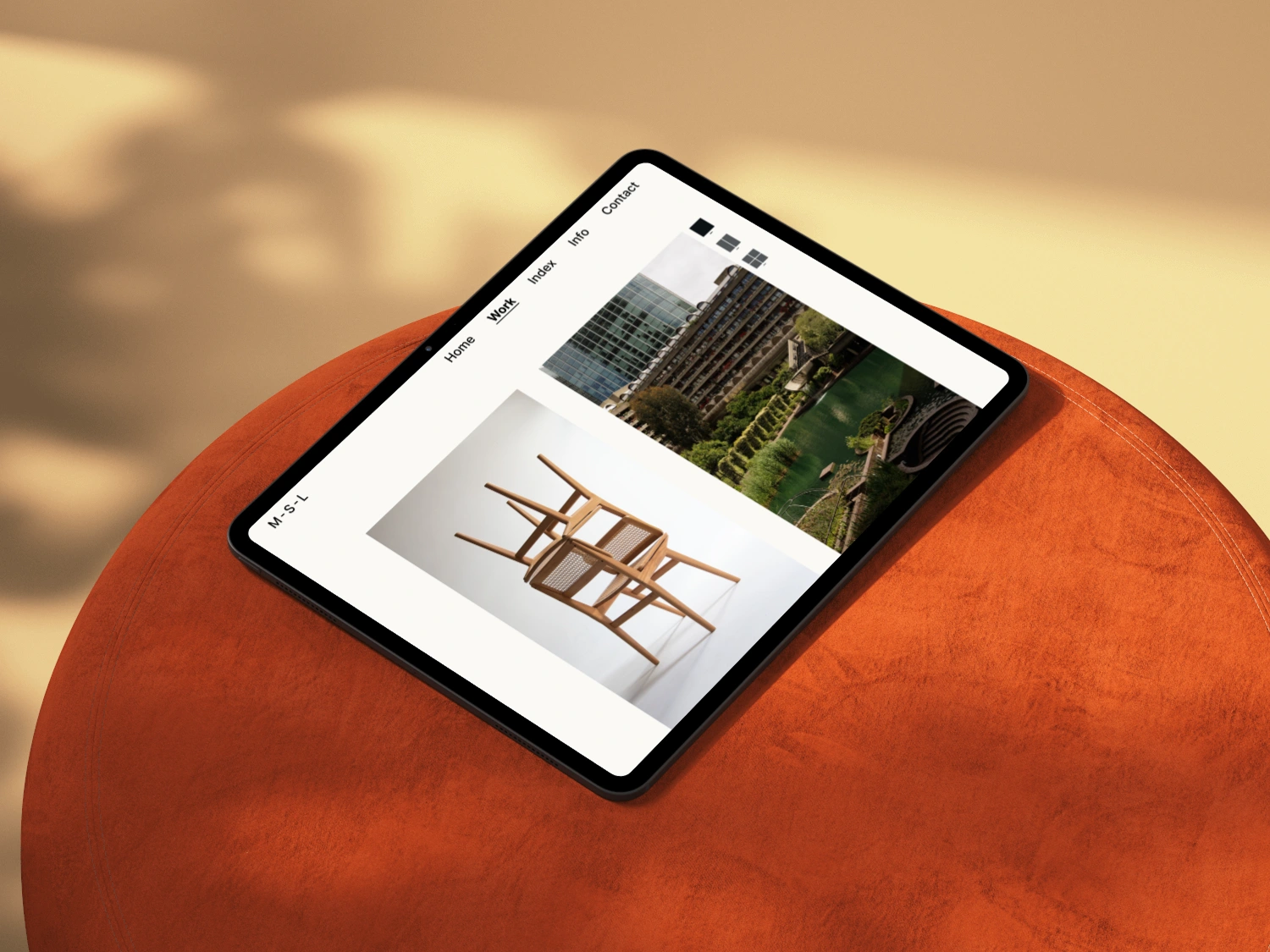
The Solution: A Clean, Editorial-Inspired Portfolio
The redesign embraces a refined, high-end editorial aesthetic, ensuring Manuella’s work takes center stage.
Key Features
Full-Screen Visuals – Projects are displayed in an immersive, distraction-free layout.
Magazine-Style Grid – A structured, editorial format balances text and imagery.
Category Navigation Tabs – Seamless switching between Photography, Creative Direction, and Research.
Cross-Linking Projects – Related projects are intelligently linked for deeper exploration.
Mobile Optimization – A fully responsive design ensures accessibility across all devices.
Design Process: Research, Wireframing & Iteration
To ensure the portfolio reflected Manuella’s creative identity, I followed a structured design thinking approach:
Research & Competitive Analysis
Analyzed 10+ portfolios of photographers, creative directors, and researchers to identify best practices.
Interviewed 5 potential clients & art directors to understand how they navigate portfolios.
Wireframing & Prototyping
Developed low-fidelity wireframes to experiment with content structure.
Created high-fidelity prototypes in Figma for interactive testing.
Usability Testing & Refinement
Tested with 5 creative professionals to assess navigation and user experience.
Refined visual balance, spacing, and typography based on feedback.
The Outcome: A Portfolio That Elevates Manuella’s Brand
The redesigned portfolio transforms Manuella’s work into a structured, immersive experience, making it easier for clients and collaborators to explore her projects.
Key Results:
Seamless integration with existing design systems is key to scalable solutions.
40% Increase in Engagement – Visitors explored more projects per session.
Refined Brand Identity – The minimalist layout reinforced her artistic aesthetic.
Improved Content Discovery – Category tabs made navigating between disciplines seamless.
What I Learned
This project emphasized the importance of structured storytelling in portfolio design. By removing distractions and focusing on elegant layouts, I created a functional, aesthetically refined space that enhances creative work rather than competing with it.
Key Takeaways:
Editorial layouts create a curated, high-end experience.
Minimalism enhances clarity while maintaining artistic depth.
Navigation should be intuitive, especially for multidisciplinary creatives.
Like this project
Posted Jul 9, 2025
Designed a minimalist, portfolio for an artist, enhancing visual storytelling and project discoverability through structured layouts and intuitive navigation.
Likes
2
Views
8
Timeline
Jan 1, 2025 - Feb 9, 2025