Brand Identity Design for a Vietnamese Restaurant
Like this project
Posted Aug 11, 2023
Designed logos, brand identity, and packaging for a Vietnamese restaurant, making sure to portray the bold and retro feel of the restaurant.
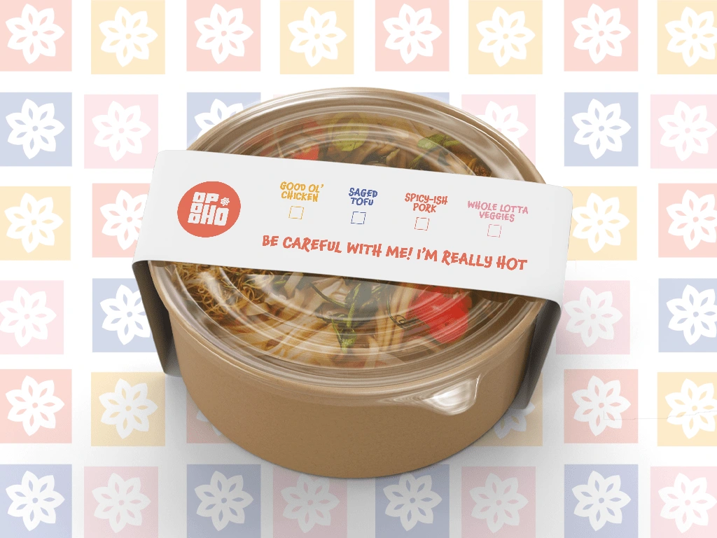
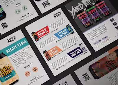
Creating sustainable, informative packaging was important for me in this project. I made sure that my client could effectively organize what food was being packaged while remaining consistent and on brand.
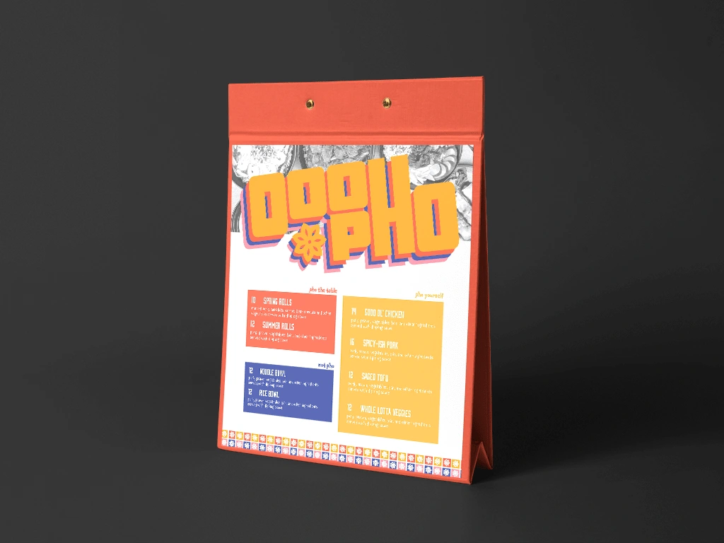
Using colors from the created brand guidelines, I created a simple and clean menu layout that keeps readers engaged. Playing with black and white images against saturated visual elements brings a slightly retro feel to the branding.
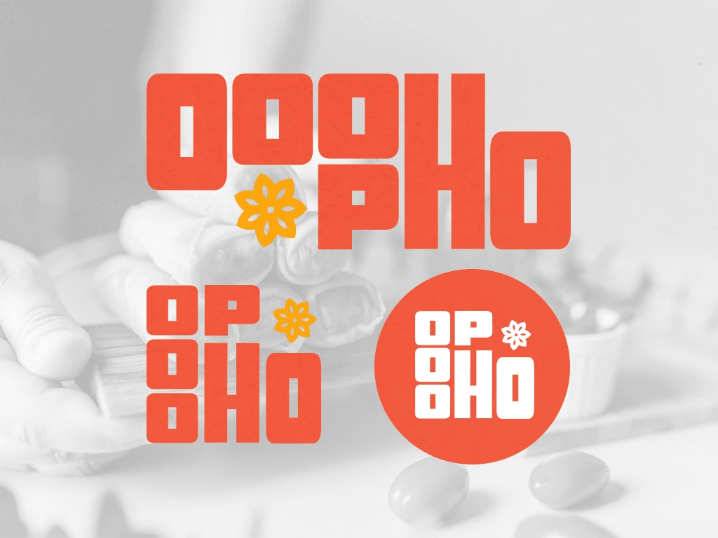
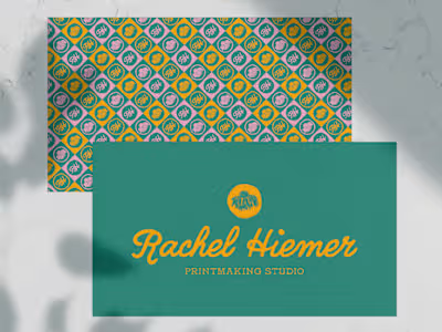
I created a primary logo, a secondary logo, and a logo mark. These are all able to be printed in one color while still being attractive and readable.
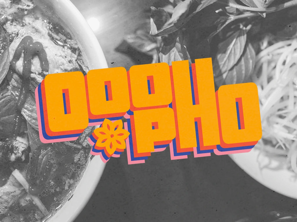
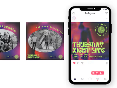
Using a black and white image against the very colorful logo gives this brand a bit of a retro twist, and attracts viewers with bold design.


