Access Management Automation Dashboard
Michael Pons
Risky Business, Meets Clear Signals
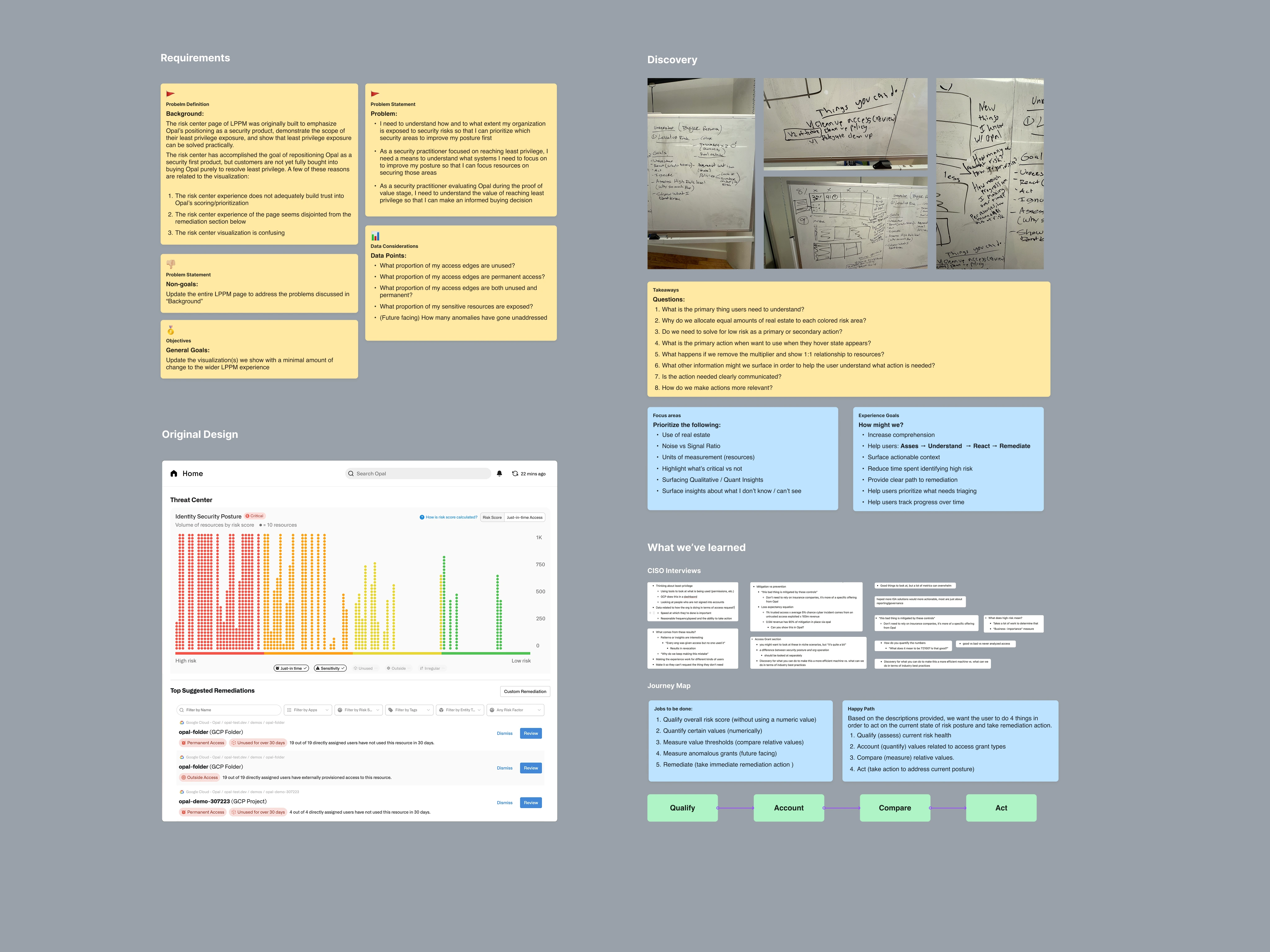
Earlier this year I got to work with the folks at Opal the Risk Center, from scratch to make important signals clear, actionable, and more trustworthy. The project began with a deep dive into the existing product's flaws and the users' needs. We analyzed the original design, conducted CISO interviews, held whiteboard sessions, and created a user journey map to define the core problems and requirements.
The Challenge
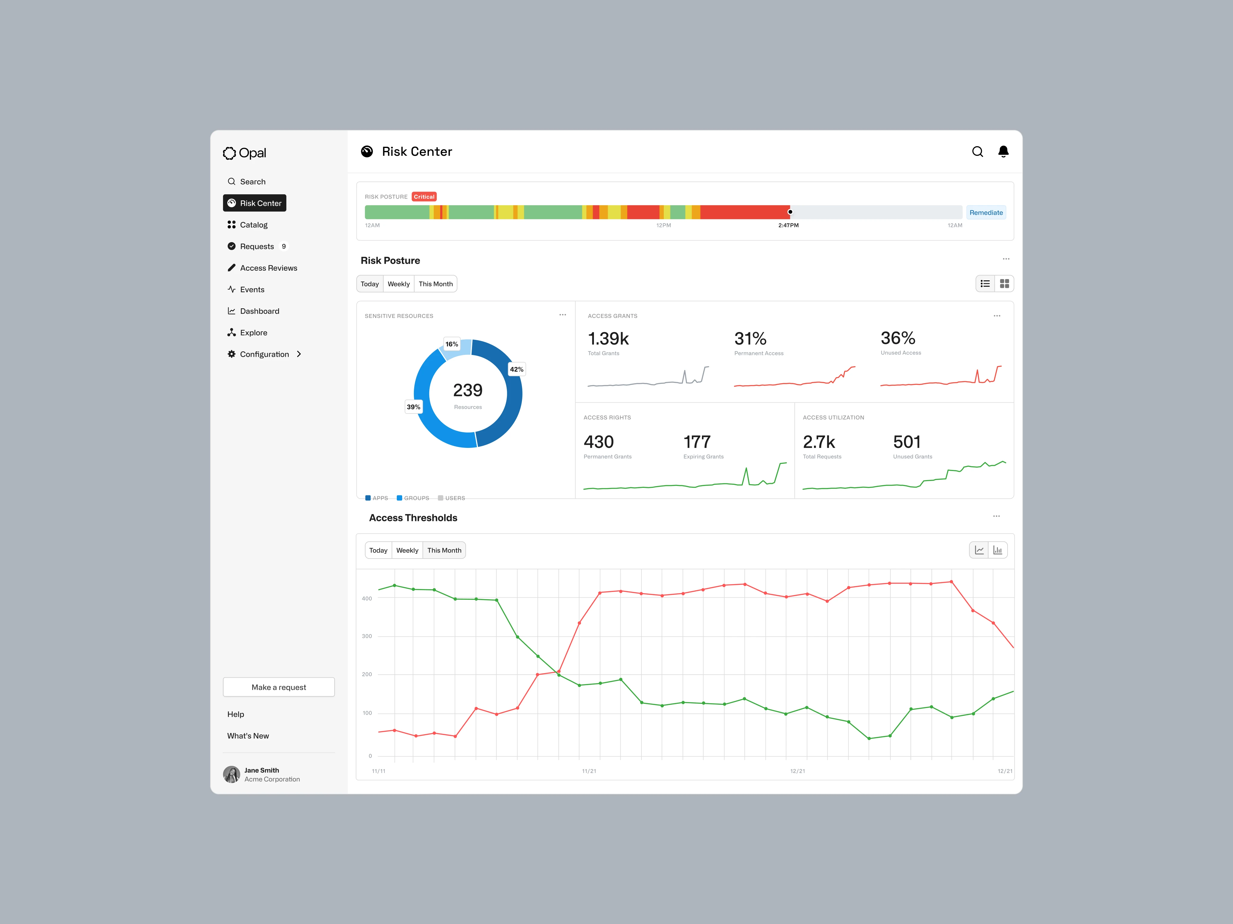
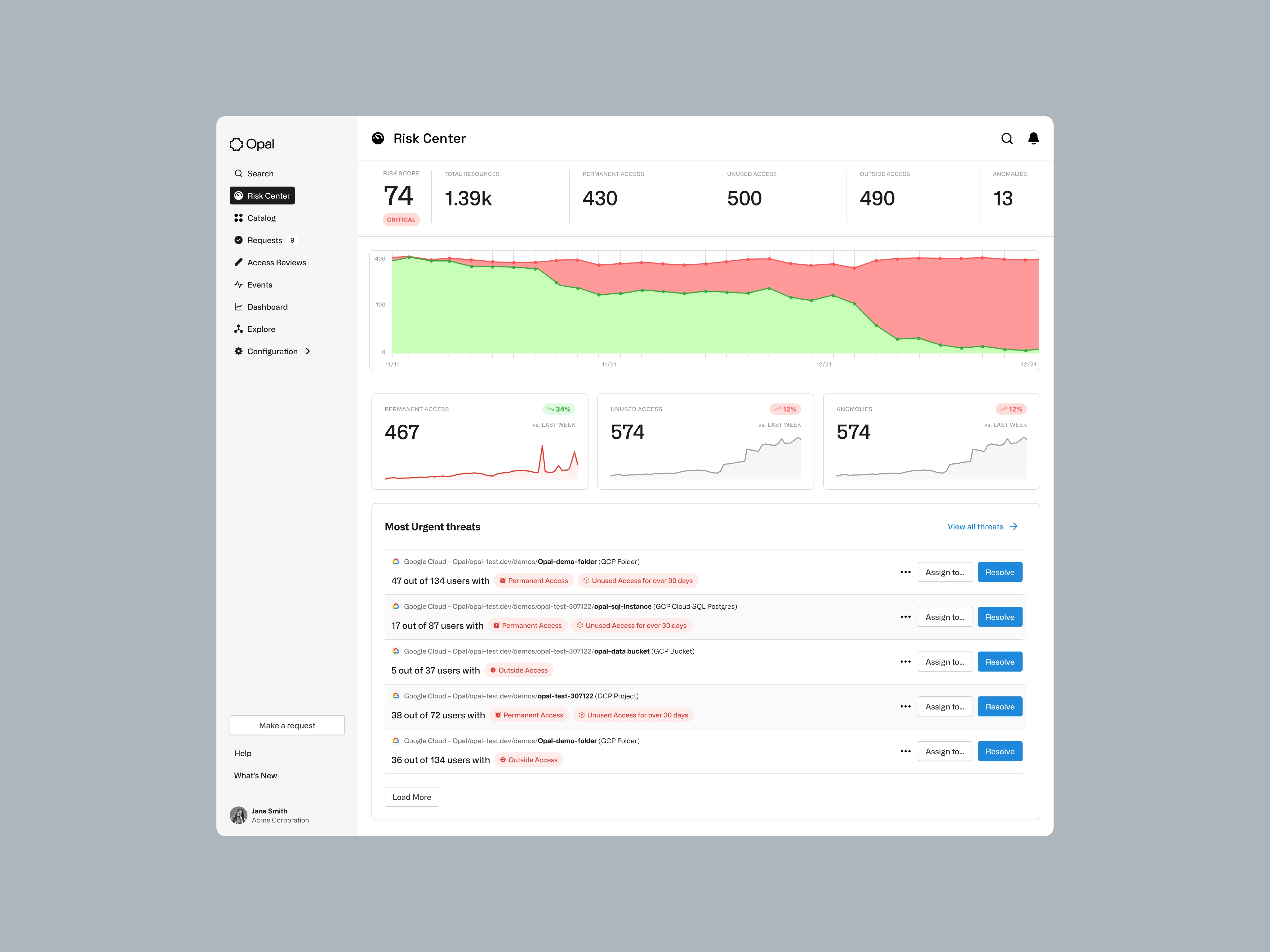
The existing Risk Center dashboard presented several significant challenges for its users, primarily CISOs and security professionals. The core of the problem was a lack of clarity and actionable intelligence, which stemmed from a combination of confusing data visualization, a poorly structured layout, and an unreliable risk scoring system.
The Solution
Our approach to solving these challenges was rooted in a commitment to a content-first, iterative design process. We began by moving away from the single, ambiguous risk score and instead focused on surfacing clear, quantifiable metrics that would provide genuine insight into the organization’s security posture.
What We Learned
Through a series of CISO interviews and a heuristic analysis of the existing dashboard, we identified several key friction points:
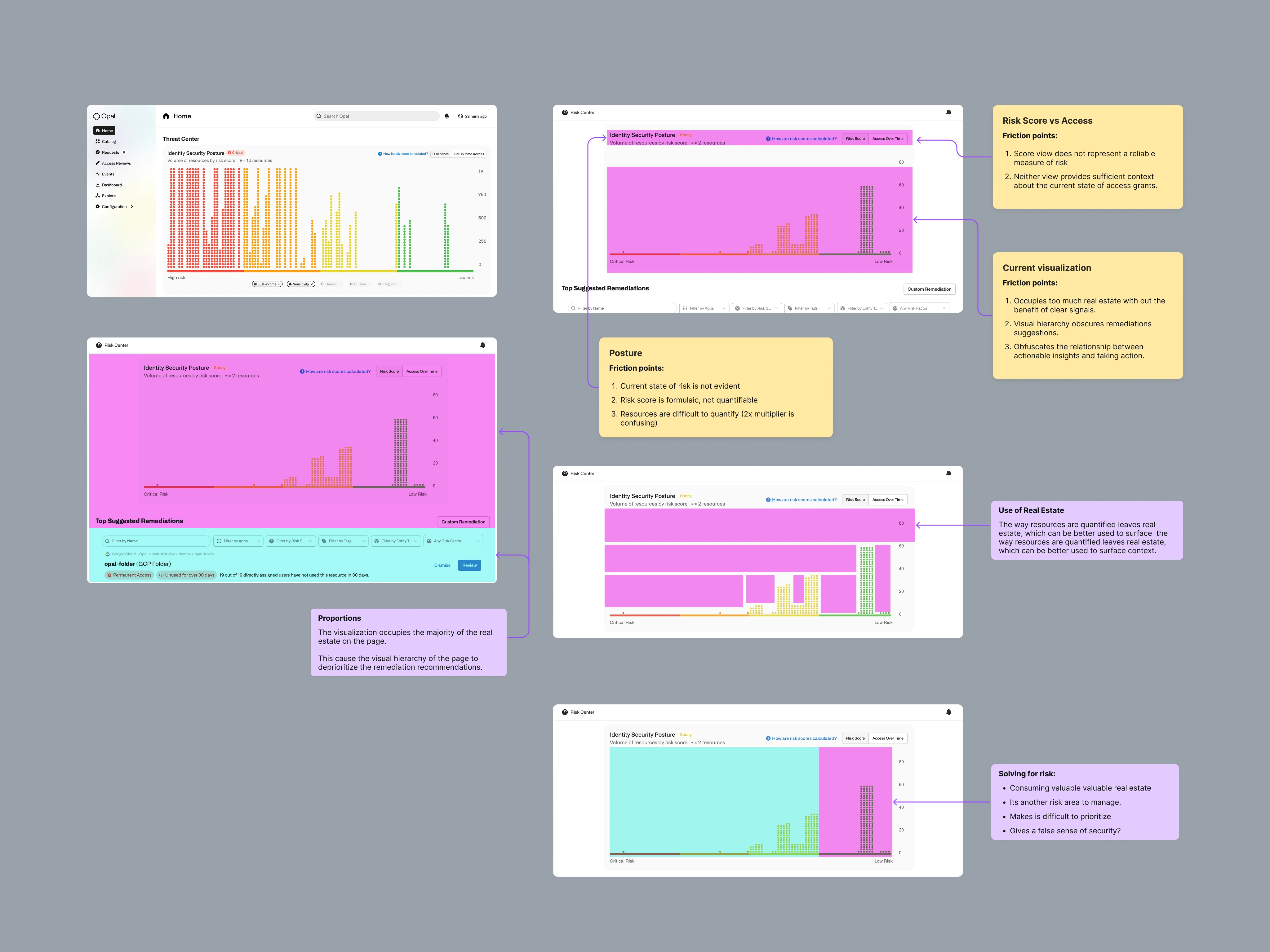
→ Unreliable Risk Score: The central risk score was based on a formulaic and non-quantifiable calculation, making it difficult for users to trust.
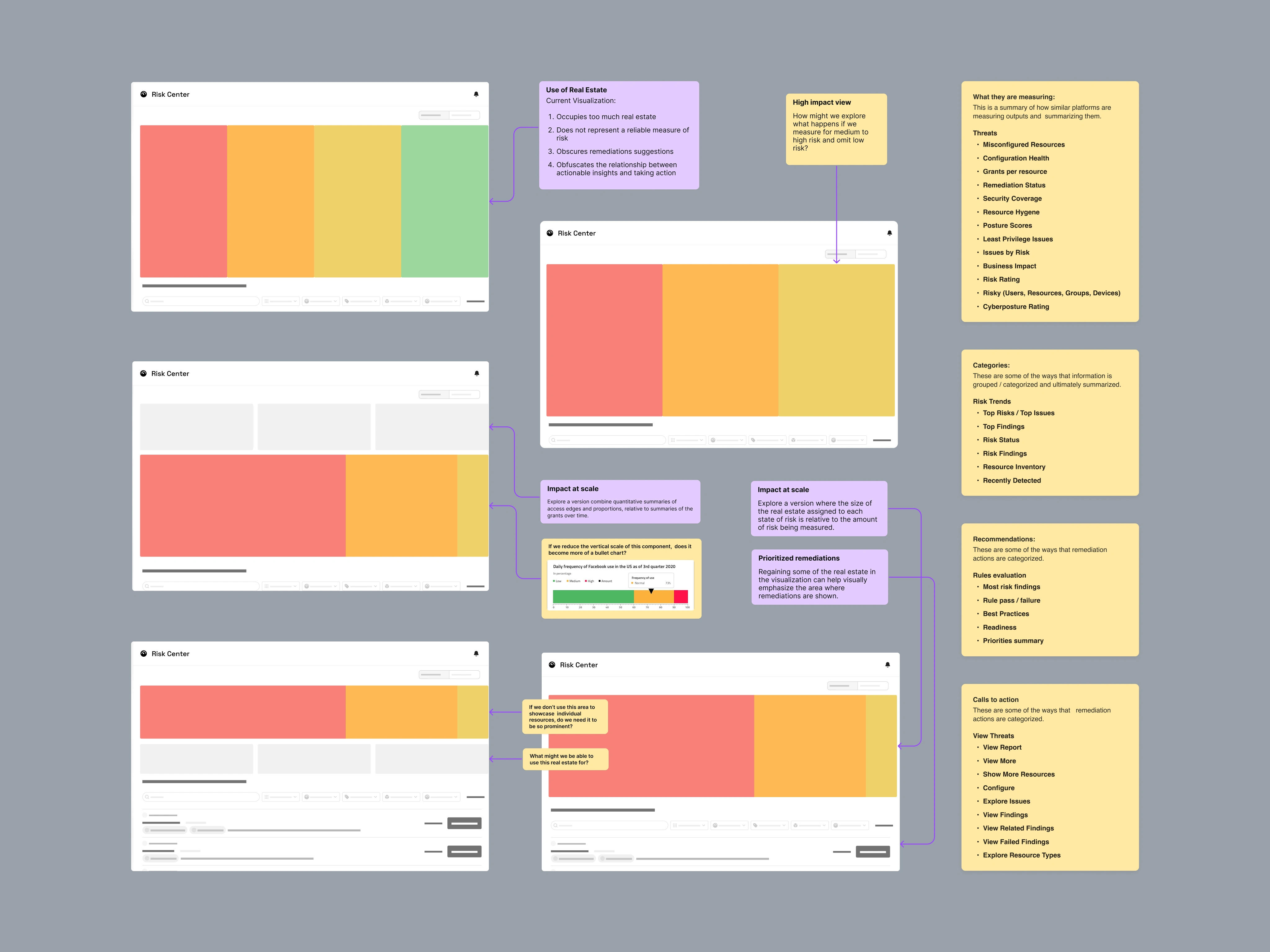
→ Poor Use of Real Estate: The visualization of the risk score dominated the interface, occupying significant screen real estate without providing clear, actionable signals.
→ Obscured Actionable Insights: The visual hierarchy of the page de-prioritized and obscured remediation suggestions, making it difficult for users to take action.
→ Lack of Clarity and Context: The relationship between the data presented and the actions that could be taken was not clear, leading to confusion and a sense of being overwhelmed.
→ Confusing Resource Quantification: The way resources were quantified was confusing, with an arbitrary multiplier that made it difficult to understand the true scope of potential risks.
How we got there
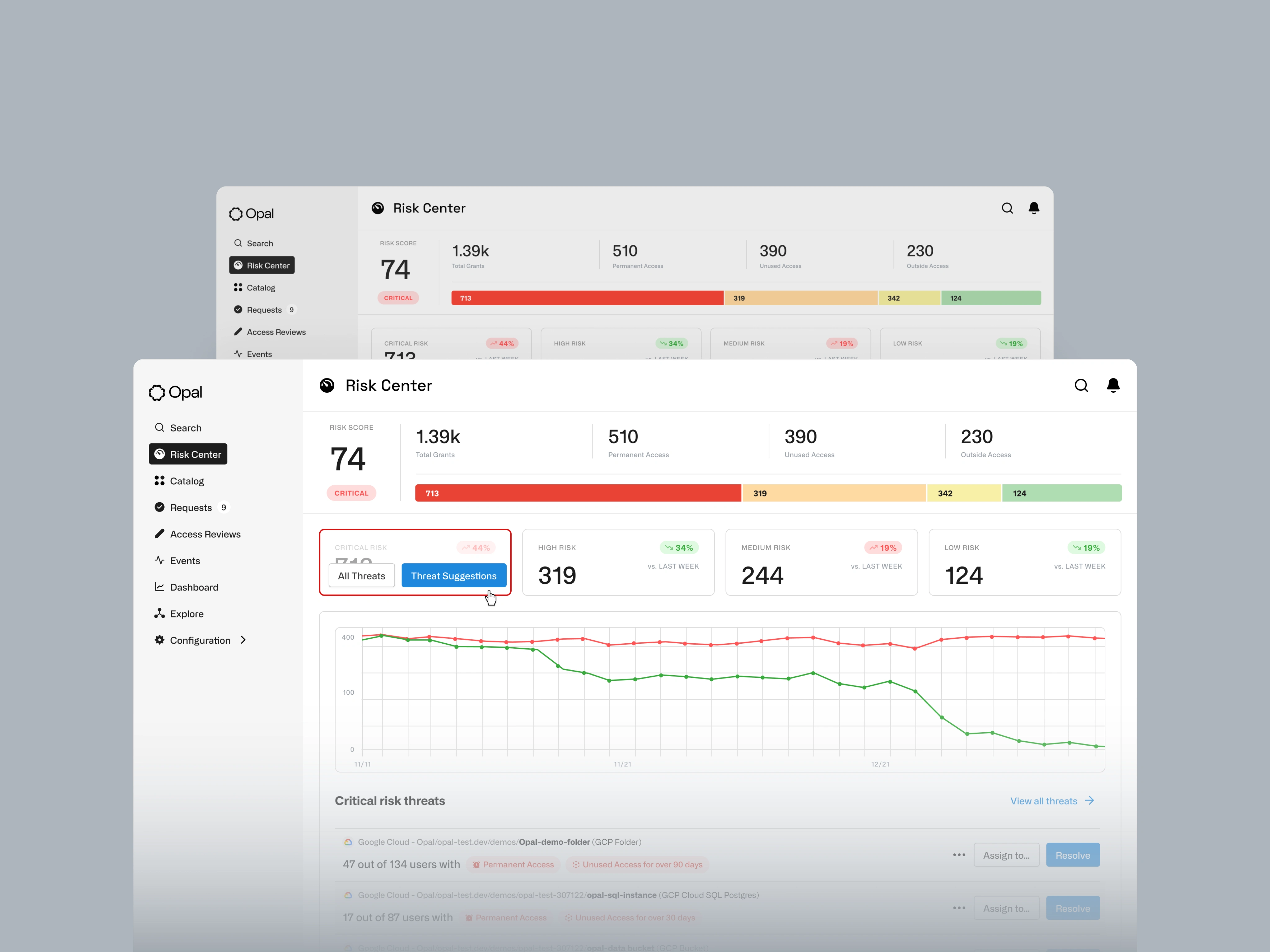
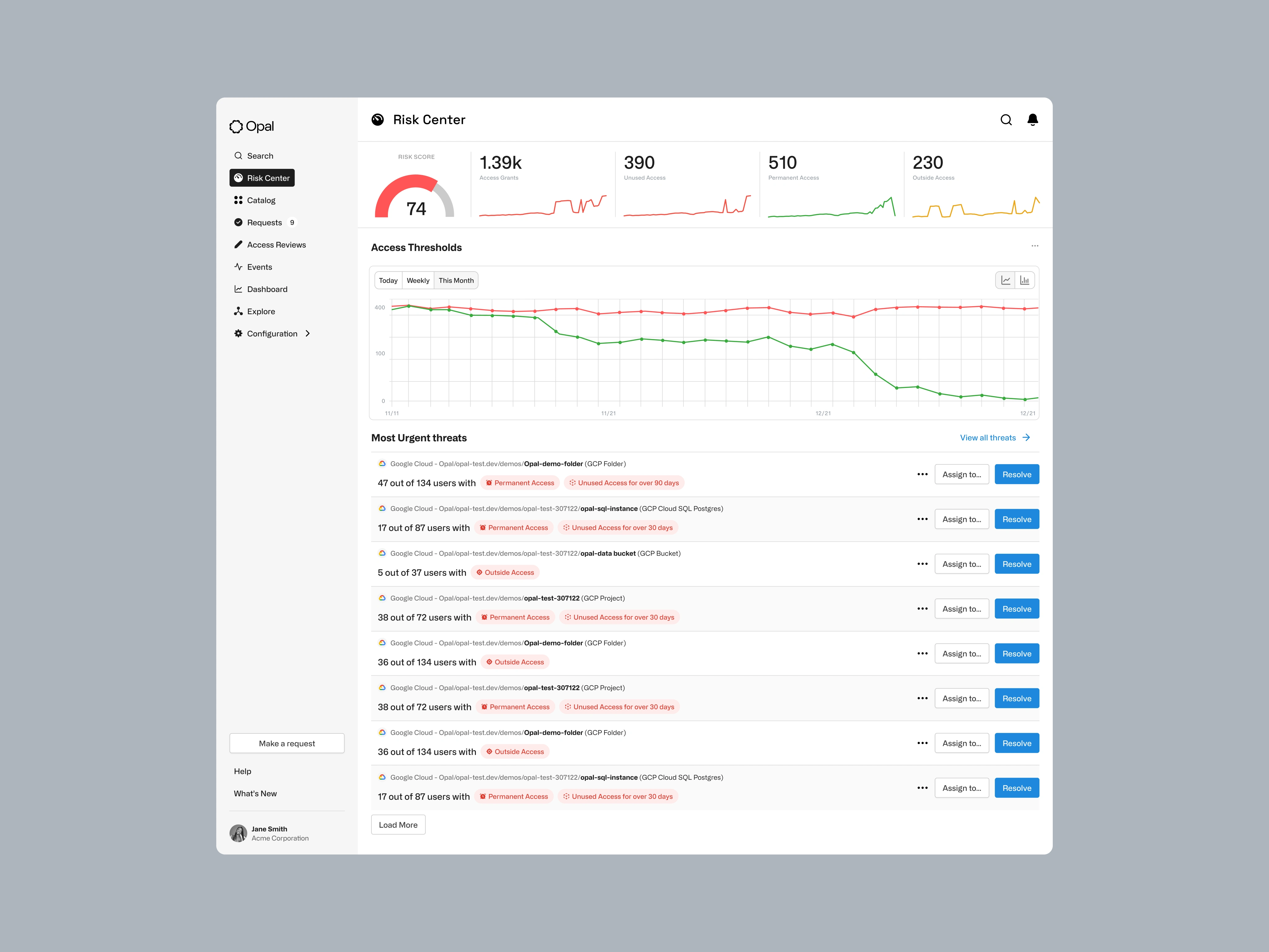
The initial design suffered from a confusing and unreliable risk score, poor use of screen real estate, and a visual hierarchy that obscured actionable insights. Through a process of deep discovery, multi-fidelity prototyping, and iterative design, we were able to create a more intuitive and actionable dashboard that empowers users to quickly identify and remediate critical security threats.
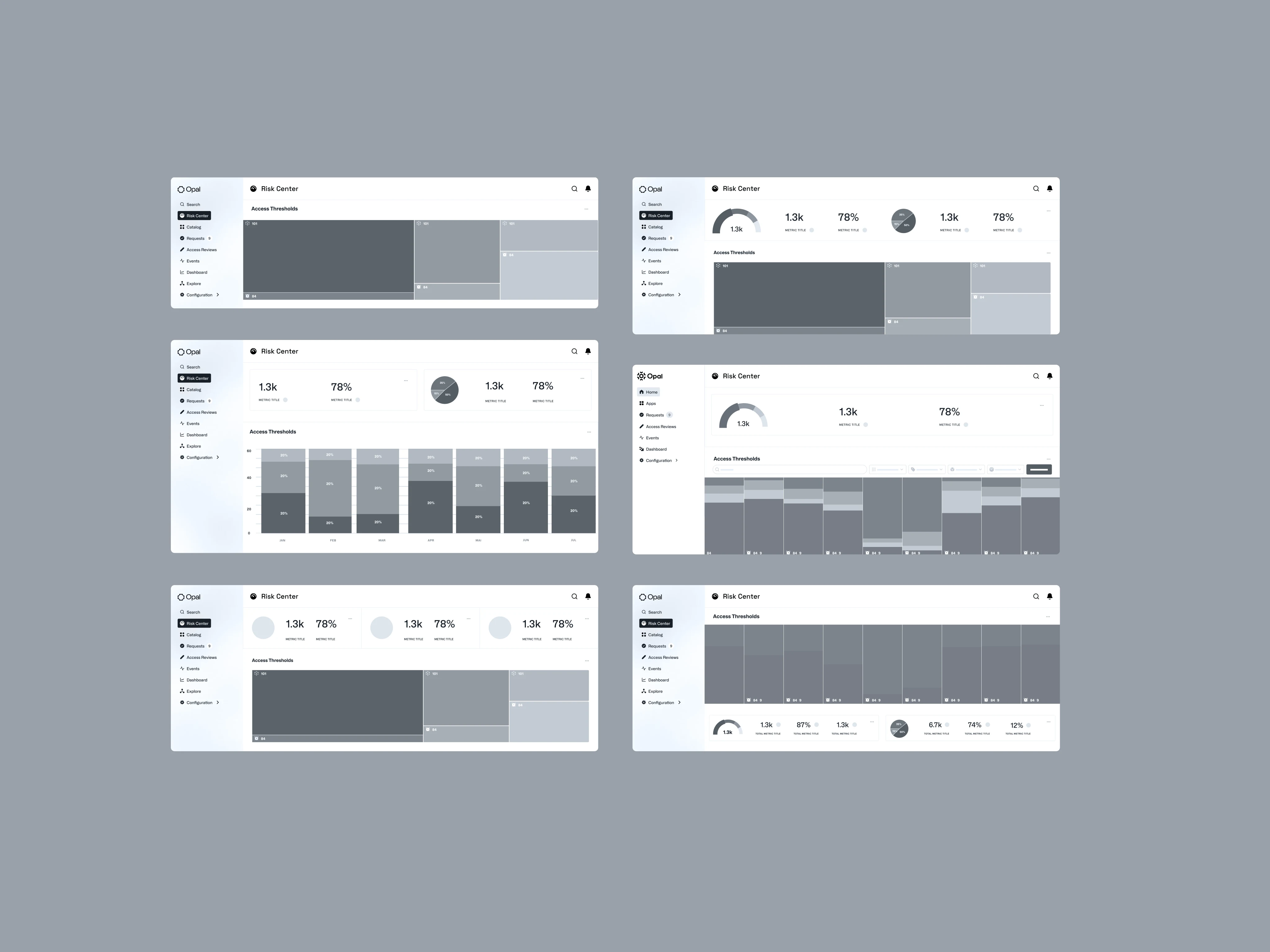
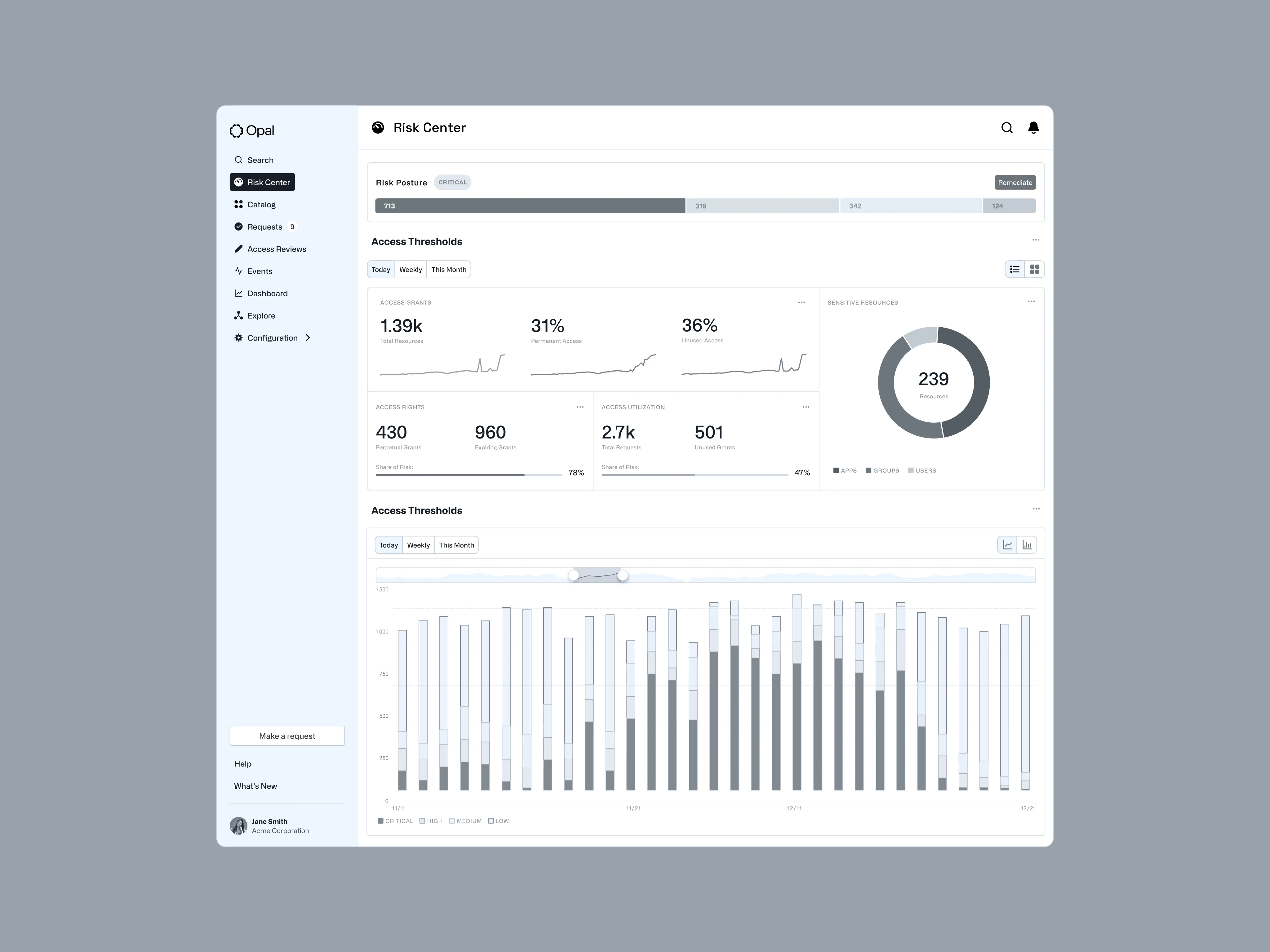
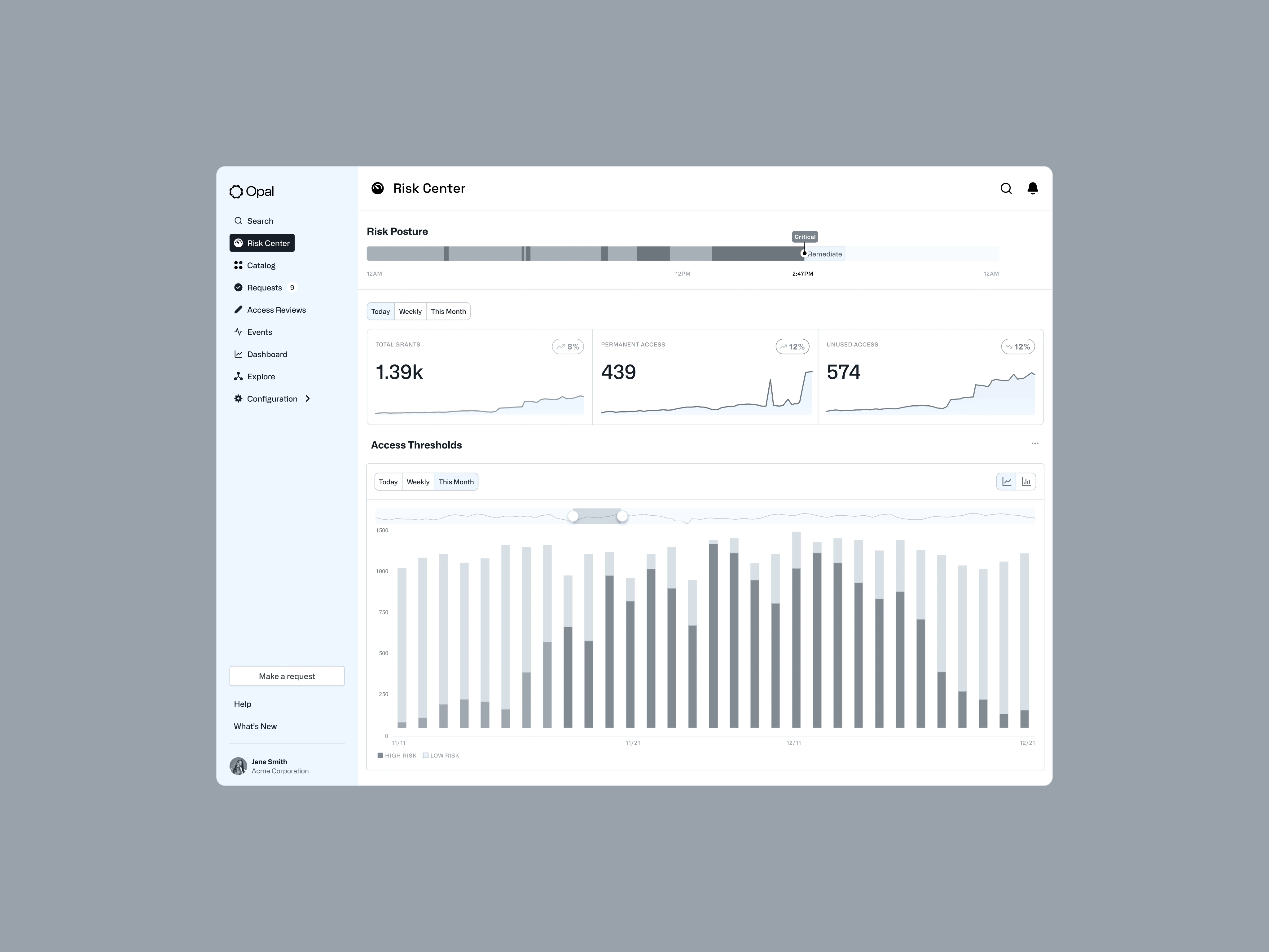
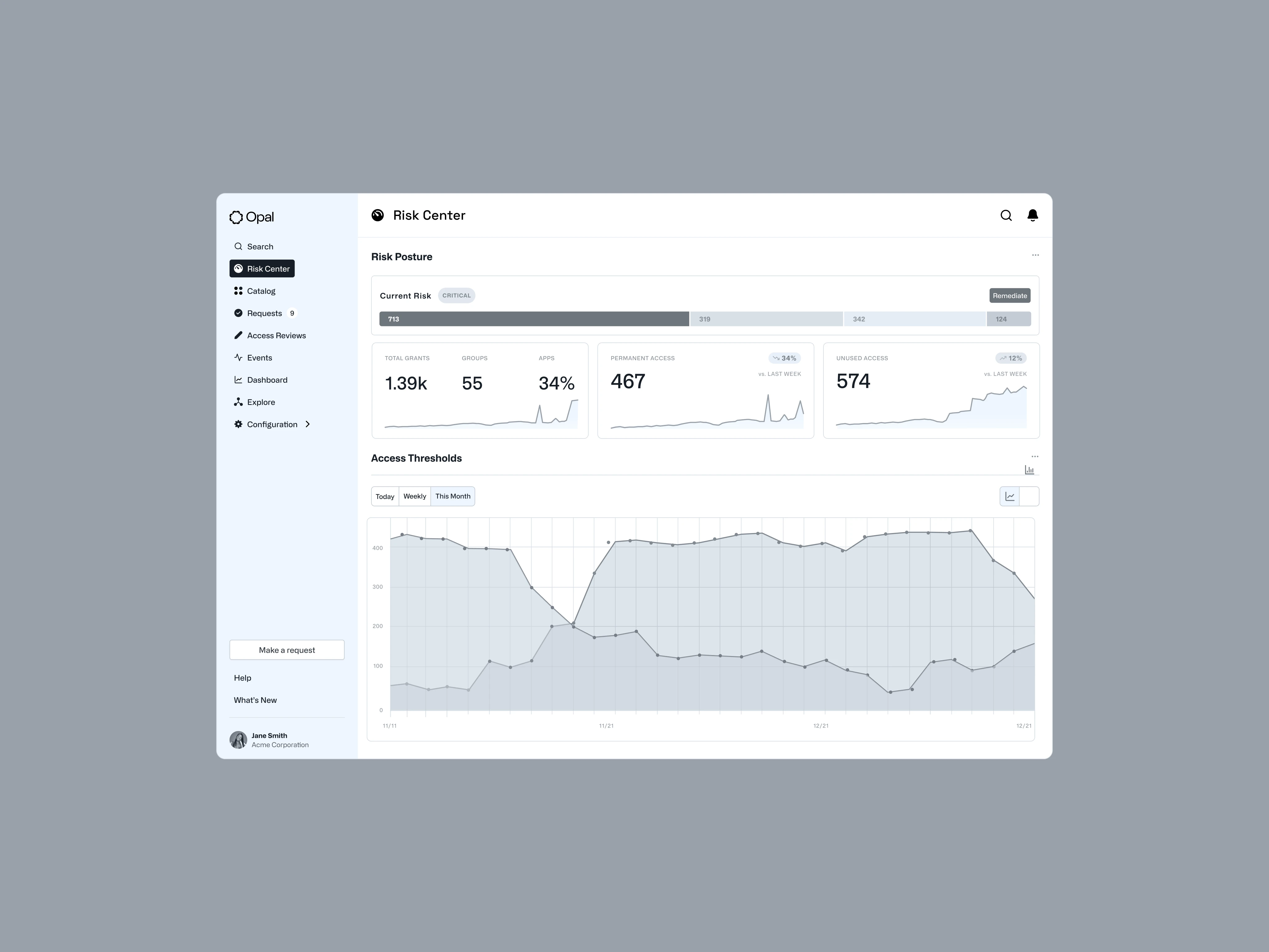
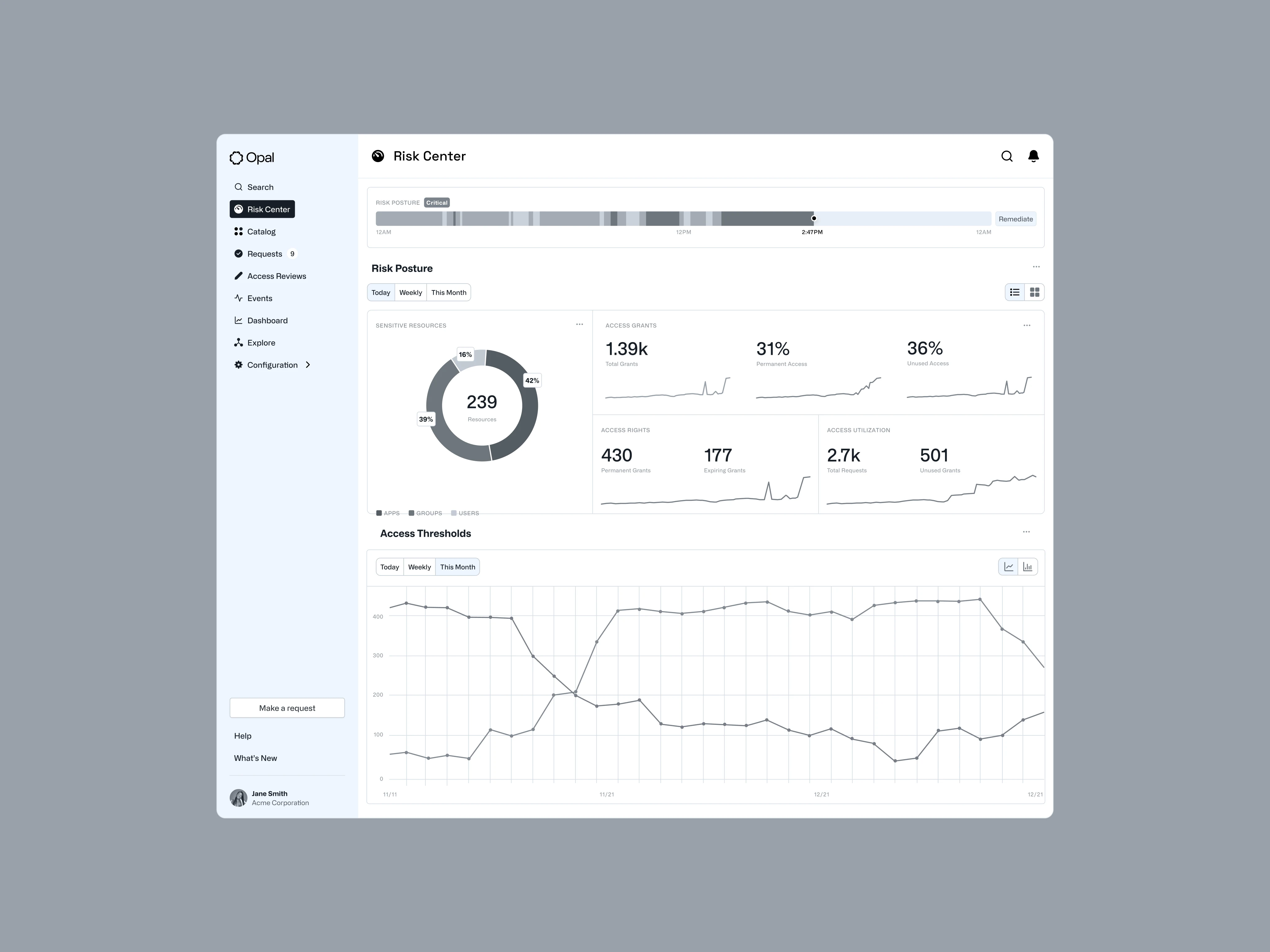
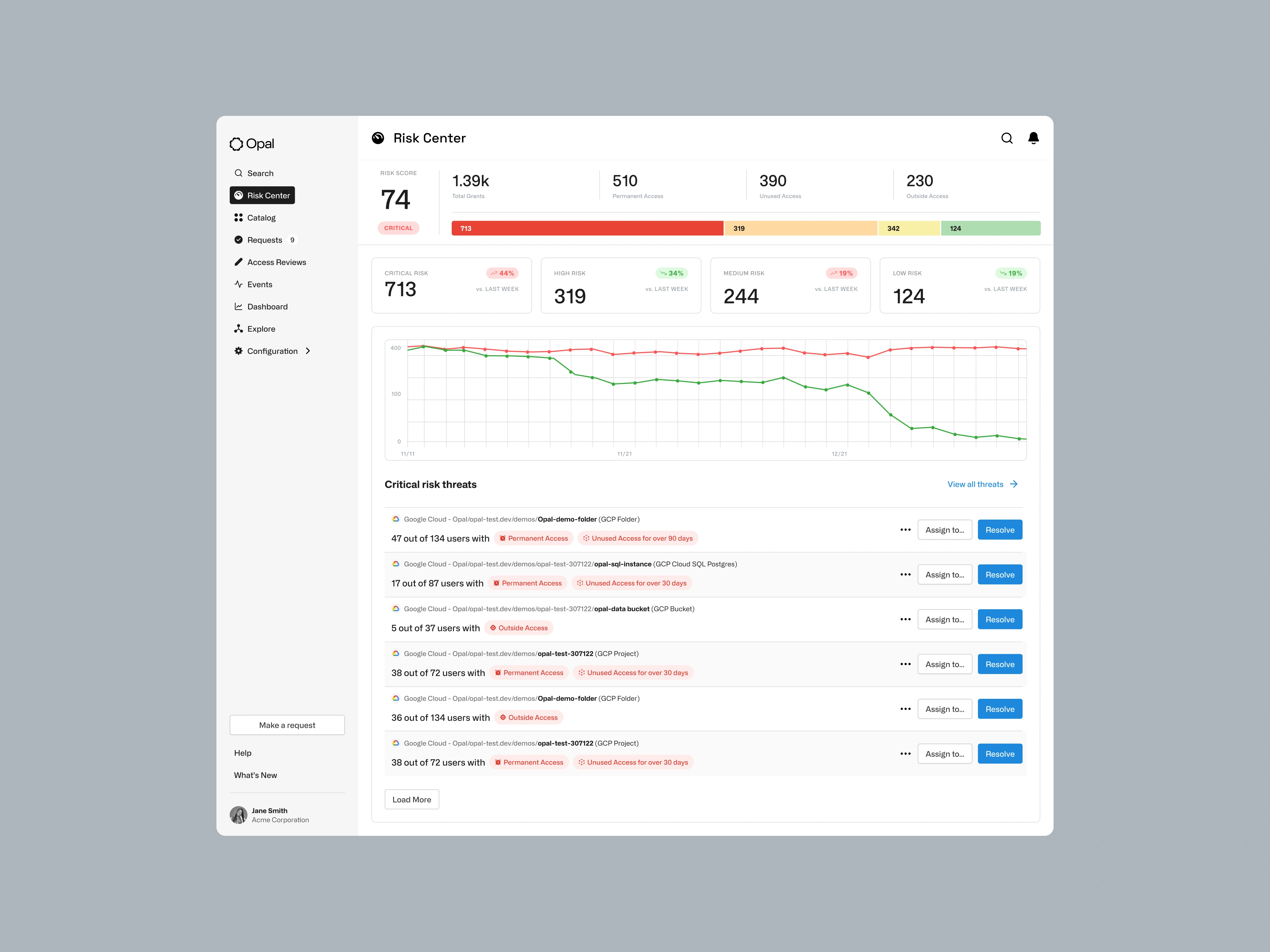
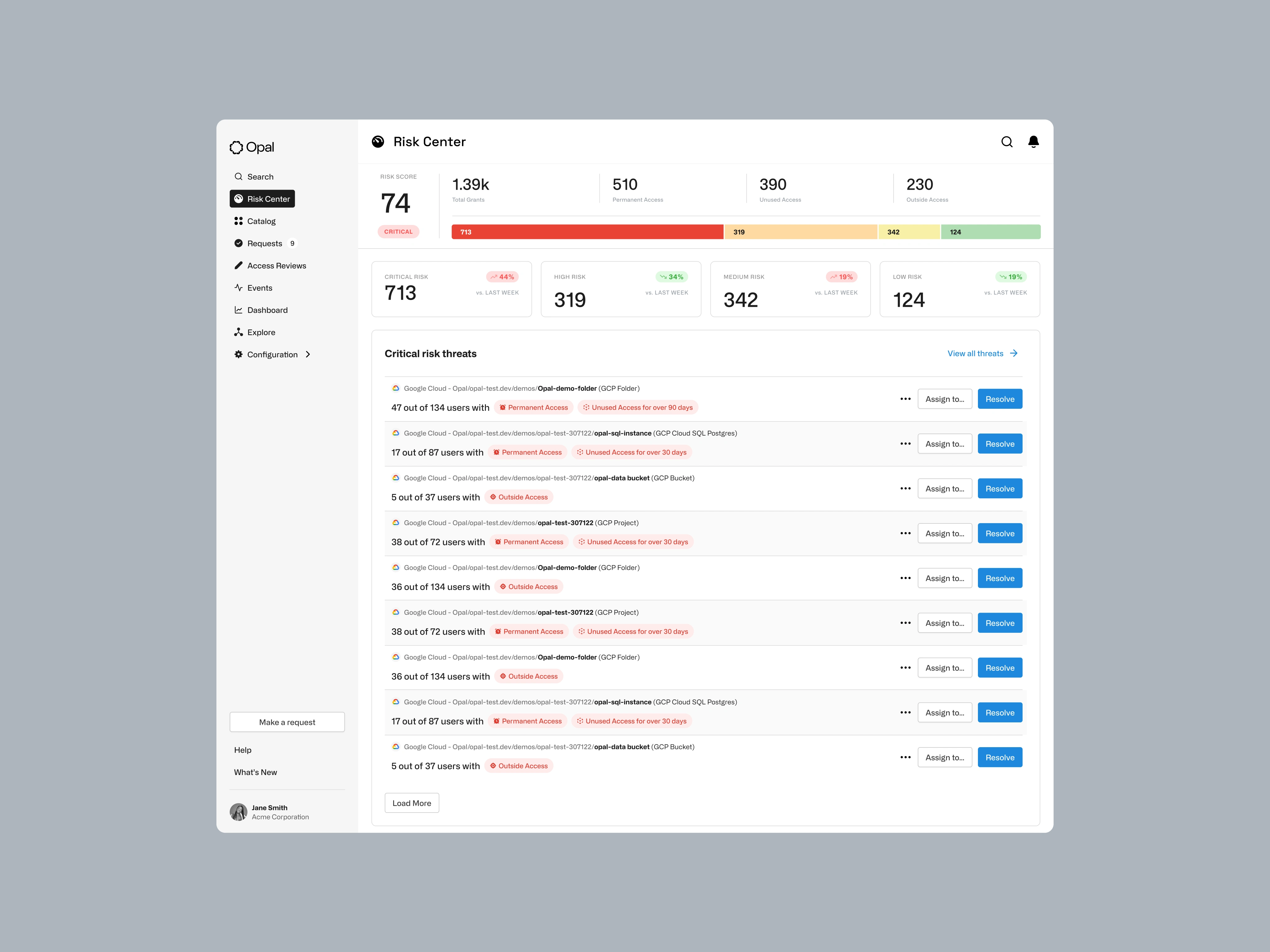
The new design separates risks into quantifiable metrics, establishes a clear visual hierarchy to guide attention, and provides clear remediation suggestions. The result is a dashboard that empowers security leaders to make informed decisions quickly.
→ Low-Fidelity Wireframes: Explored different data postures (Qualitative, Quantitative, Proportional, Distributed)
→ Data Visualizations Audited: Explored different chart types (Marimekko, stacked charts, area charts).
→ Real Signals, Less Noise: Refined the visual hierarchy, simplified metrics to surface actionable data
→ Validated, Shipped, Iterated: Tested high-fidelity variations with users to arrive at the optimal design.
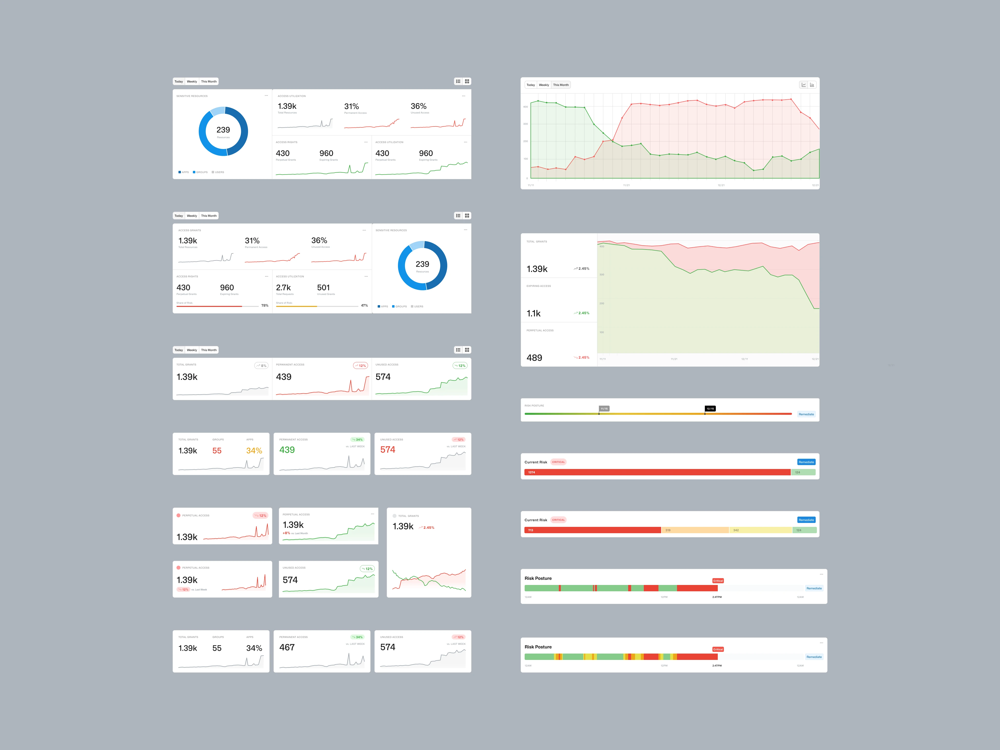
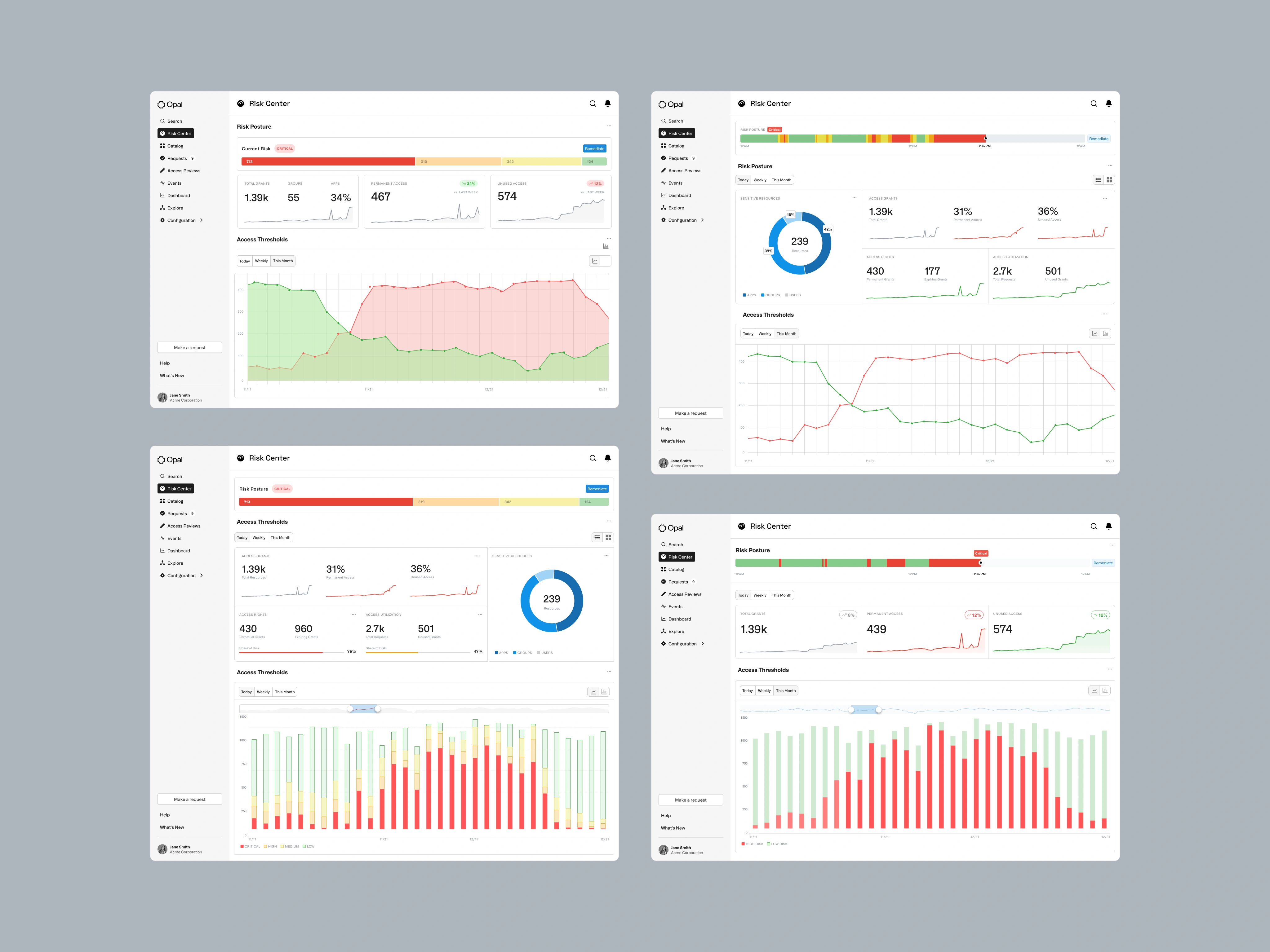
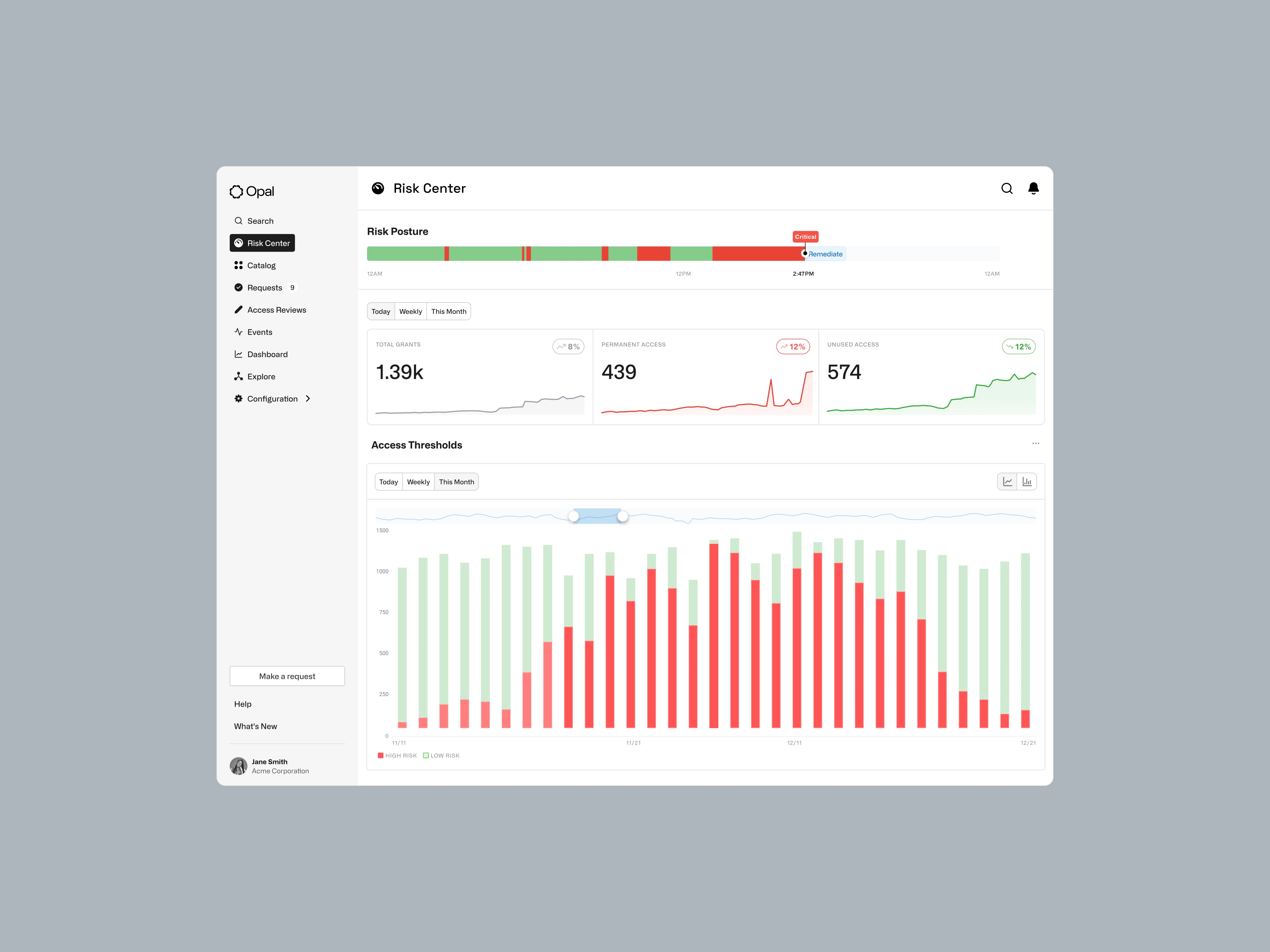
Designs Iterations
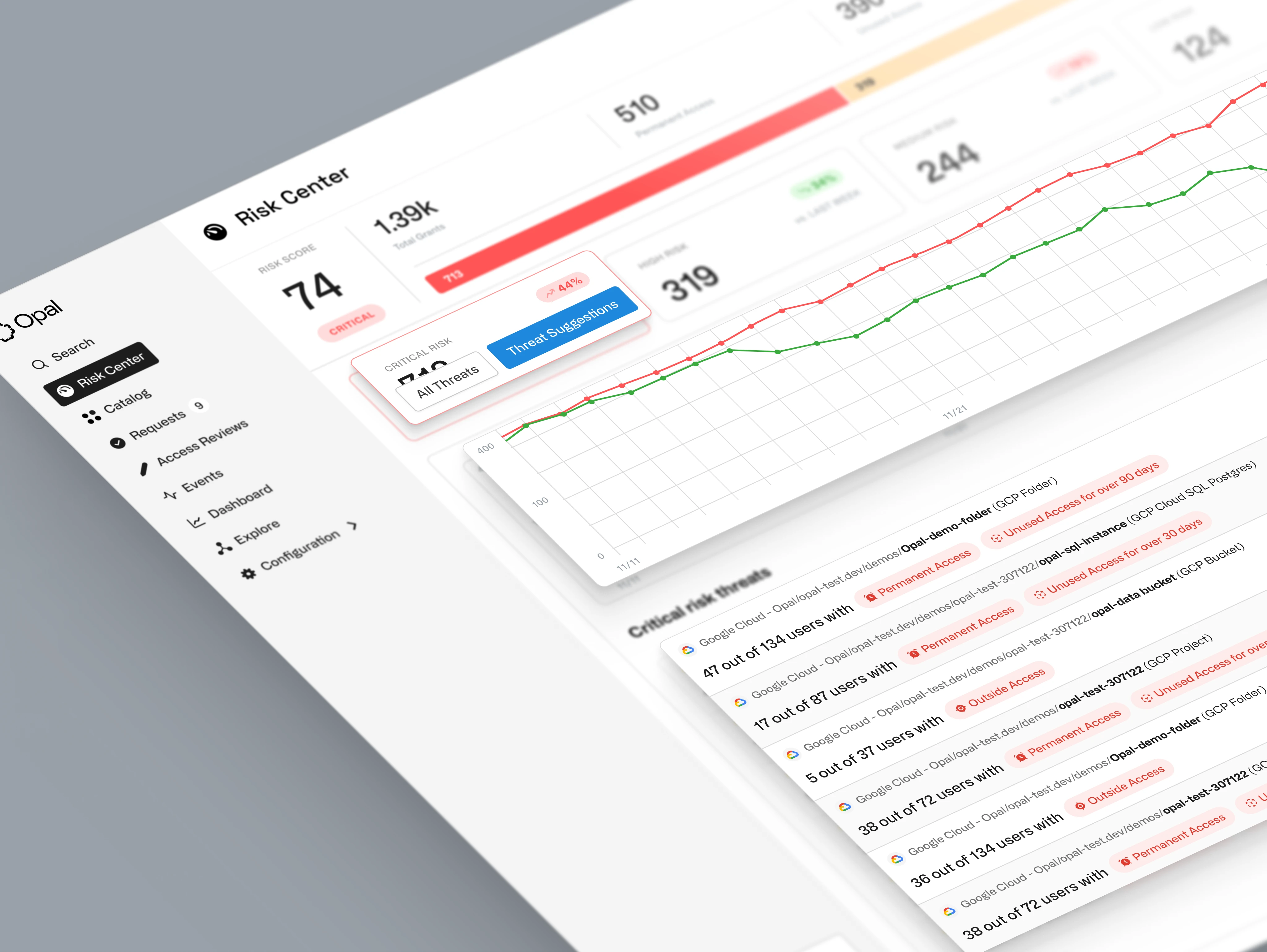
The final rounds of design focused on refining the visual hierarchy, simplifying metrics, and introducing a key new forecasting feature. We introduced the concept of "Critical Risk Threats" and organized them into clear, understandable categories.
The forecasting feature allows users to see the projected impact of their current security posture and the positive effect of using Opal to remediate risks. We tested several high-fidelity variations with users to arrive at a new baseline.
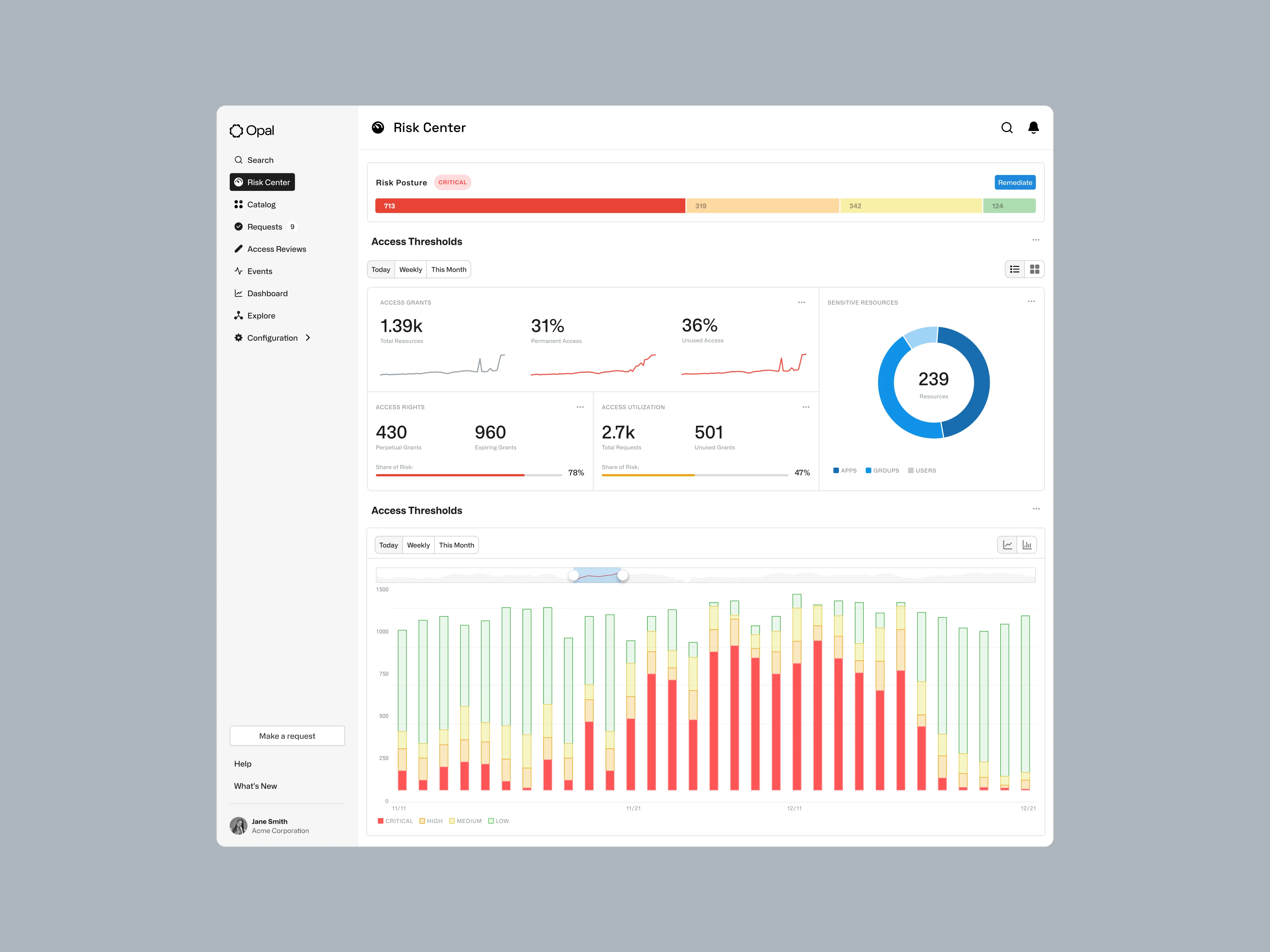
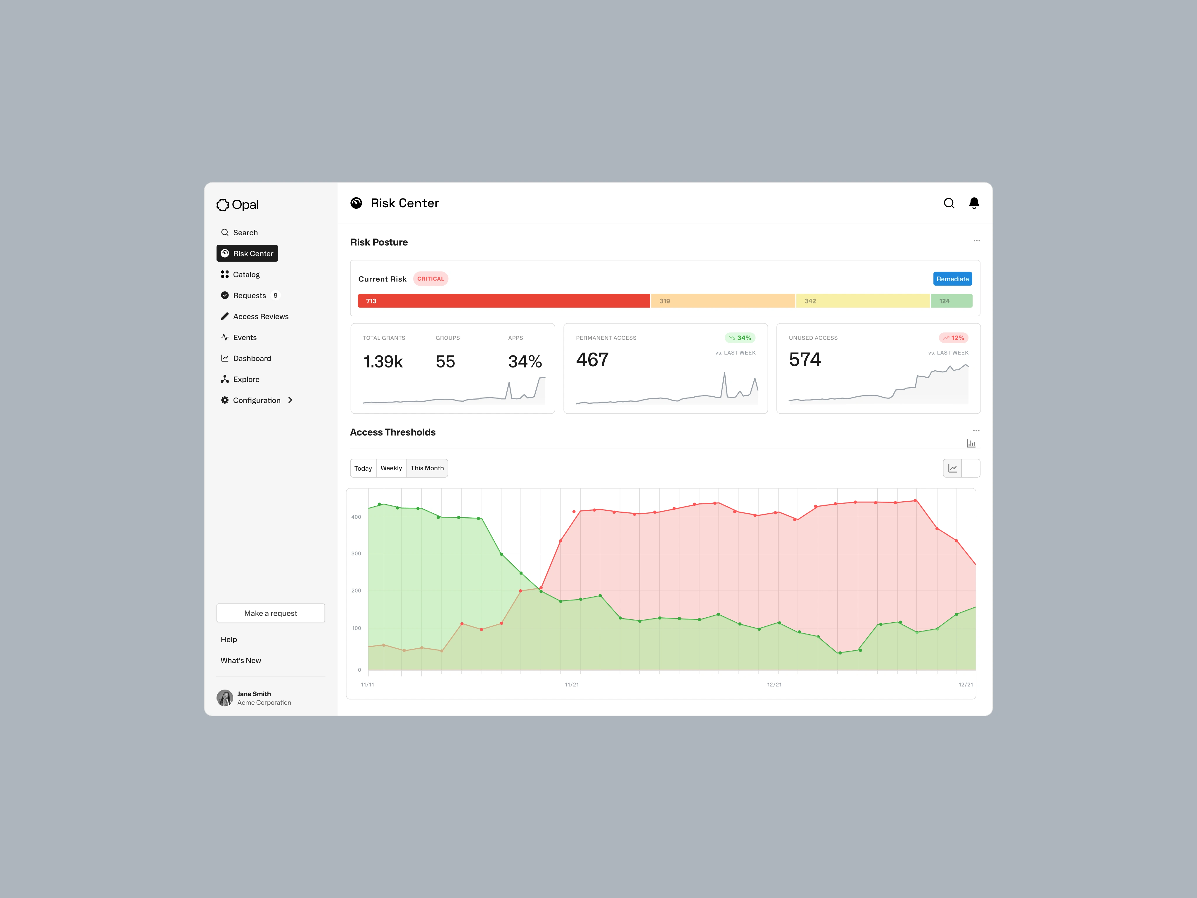
Impact
The redesigned Risk Center delivered a dramatic improvement in efficiency and security for Opal's customers. The redesigned Opal Risk Center provides a clear, actionable, and forward-looking view of an organization’s security posture. It transforms a confusing dashboard into a powerful tool that quantifies risk, guides remediation, and demonstrates the value of proactive security.
→ 97% Reduction in Approval Time: Median time to approve or deny access requests was reduced by 97%, from hours or days to just minutes.
→ From Days to Minutes for Access Reviews: Quarterly User Access Reviews (UARs), which previously took up to three days of manual effort, can now be completed in just three minutes.
→ 710% Increase in Access Requests: The streamlined, self-service process led to a 710% increase in access requests, indicating a major improvement in usability and a reduction in friction for users.
→ Drastic Reduction in Manual Labor: Automation of access reviews and compliance reporting has drastically reduced the manual labor involved in these processes, freeing up security teams to focus on more strategic initiatives.
→ Elimination of Standing Access: The new dashboard enabled the elimination of standing access to critical production environments, significantly reducing the attack surface and improving the overall security posture.
The Final Shipped Design
The redesigned Risk Center provides a clear, actionable, and forward-looking view of an organization’s security posture. It transforms a confusing dashboard into a powerful tool that quantifies risk, guides remediation, and demonstrates the value of proactive security.
🤙🏼 Made by 🦁 with ❤️ in NYC 🤙🏼
Like this project
Posted Dec 11, 2025
I transformed confusing dashboard into a powerful tool that quantifies risk, guides remediation, and shows the value of actionable insights.
Likes
0
Views
10
Timeline
Feb 11, 2025 - Ongoing
Clients
Opal Security