Café Oliven | Logo Redesign
Vilde Sofie Mathisen
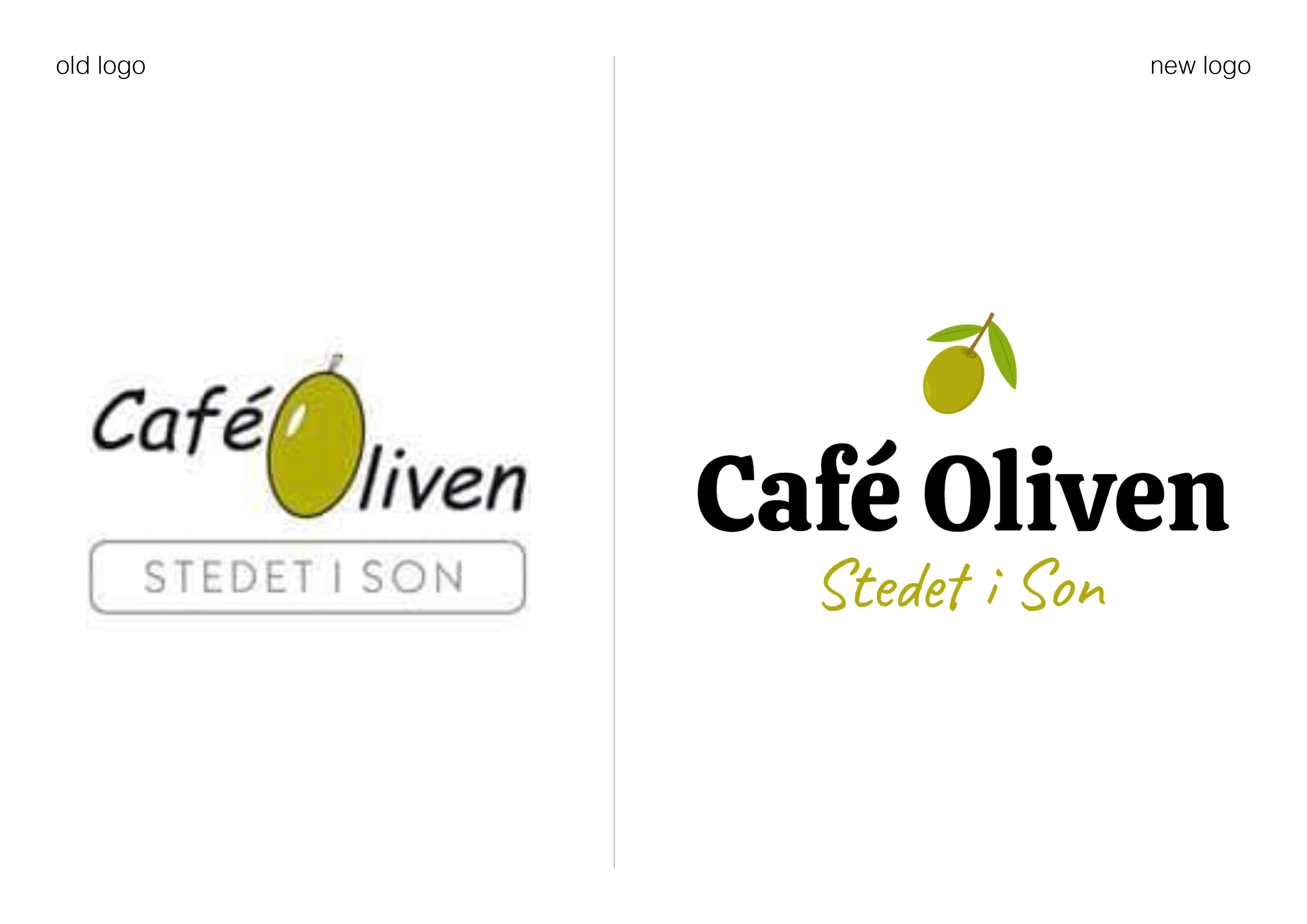
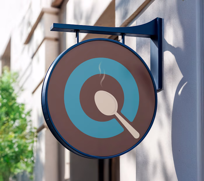
Café Oliven is a long-standing restaurant in my hometown of Son, known for its cozy atmosphere and central location. After many years with the same visual identity, the restaurant needed a fresh look that could reflect both its heritage and its modern, inviting vibe.
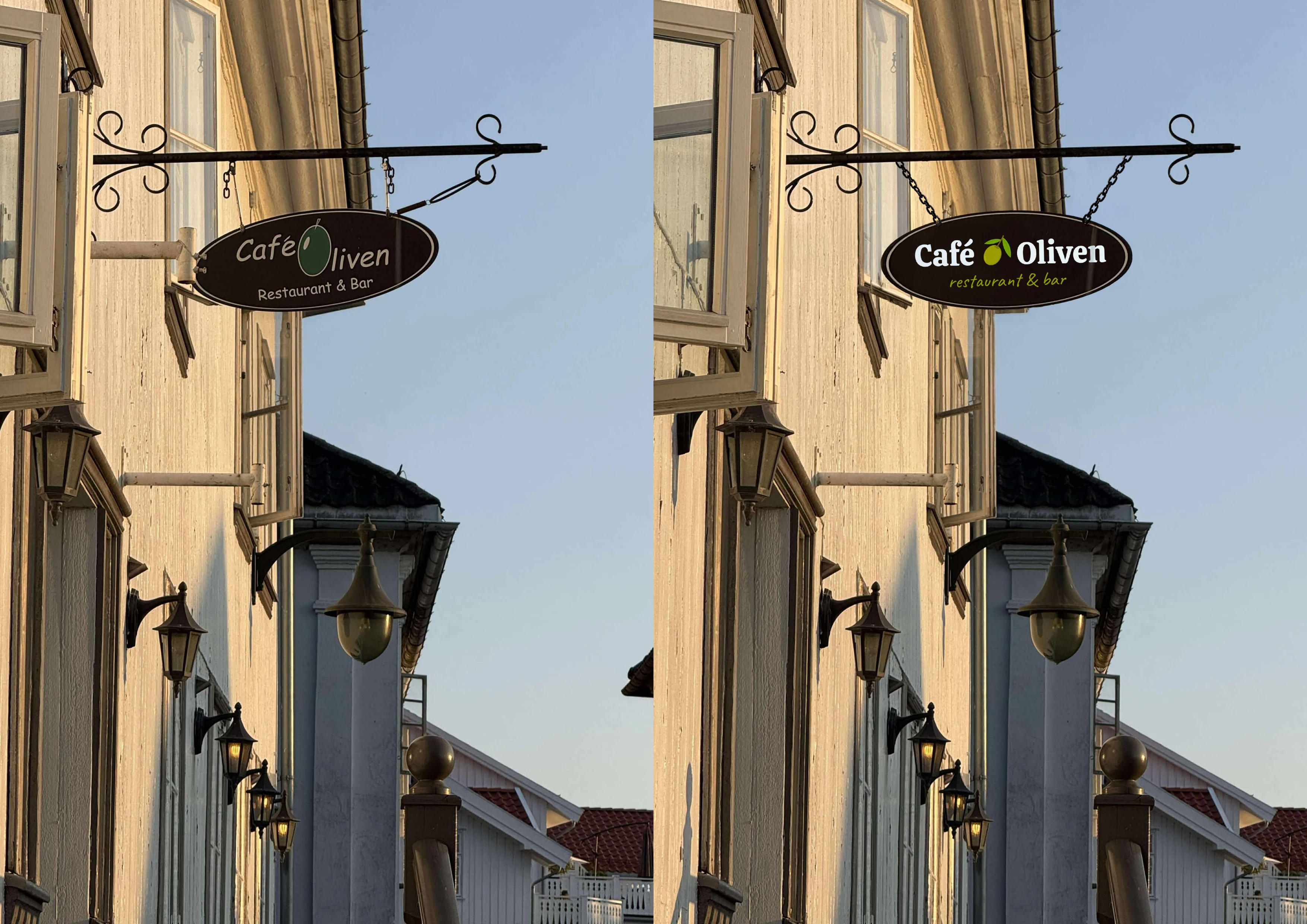
I took on the redesign as a personal project, aiming to explore how a refreshed visual identity could reflect the restaurant’s charm while modernizing its look. My goal was to create a logo that felt warm, trustworthy, and timeless, something that could work across signage, menus, and digital platforms.
Design choices
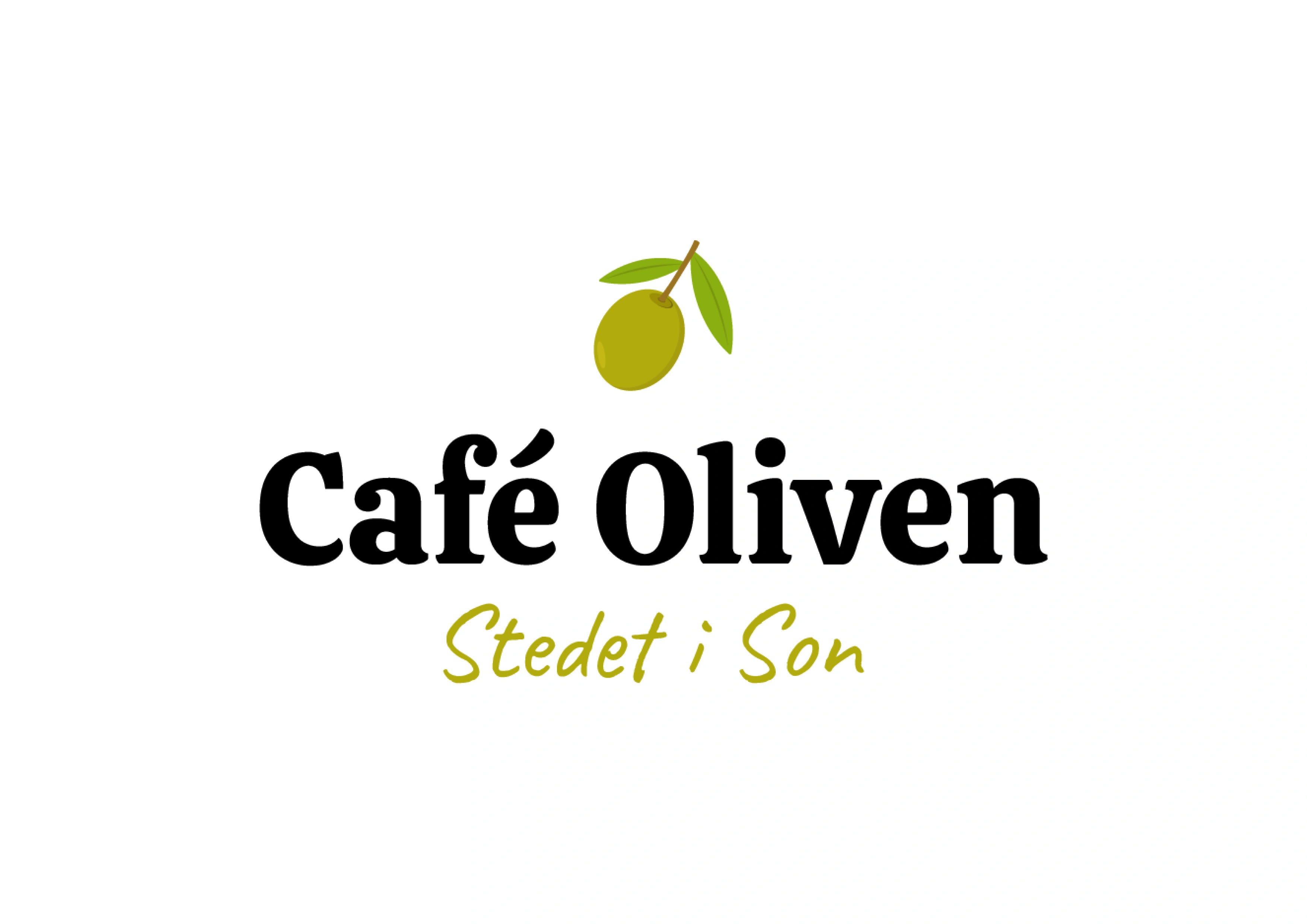
Typography: I replaced the original typeface with one that has more weight and personality, while still being easy to read.
Illustration: The olive icon was updated with more shape, color, and a couple of leaves to give it more life and visual presence.
Layout Options: I experimented with different placements, both above the text and between the words, to ensure the logo works across various formats and surfaces.
Tagline Variants: In the versions that include the local tagline “Stedet i Son,” I used a more handwritten-style font to convey a friendly and down-to-earth tone that reflects the restaurant’s atmosphere.
Like this project
Posted Aug 2, 2025
A self-initiated redesign of the logo for Café Oliven, a well-known café and restaurant in my hometown.