IP/Agency

Román Bianco


Read more
Directing the world's attention in creative culture.
Based in London, IP/AGENCY works across PR, talent management, and production, supporting emerging and established innovators in the creative industries. The agency represents talent, influencers, and lifestyle brands with one clear understanding: every person, project, and brand has its own light. Its own frequency. Its own way of moving through culture.
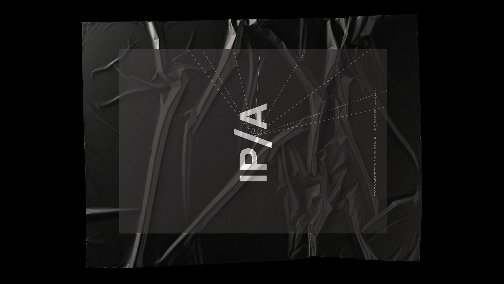
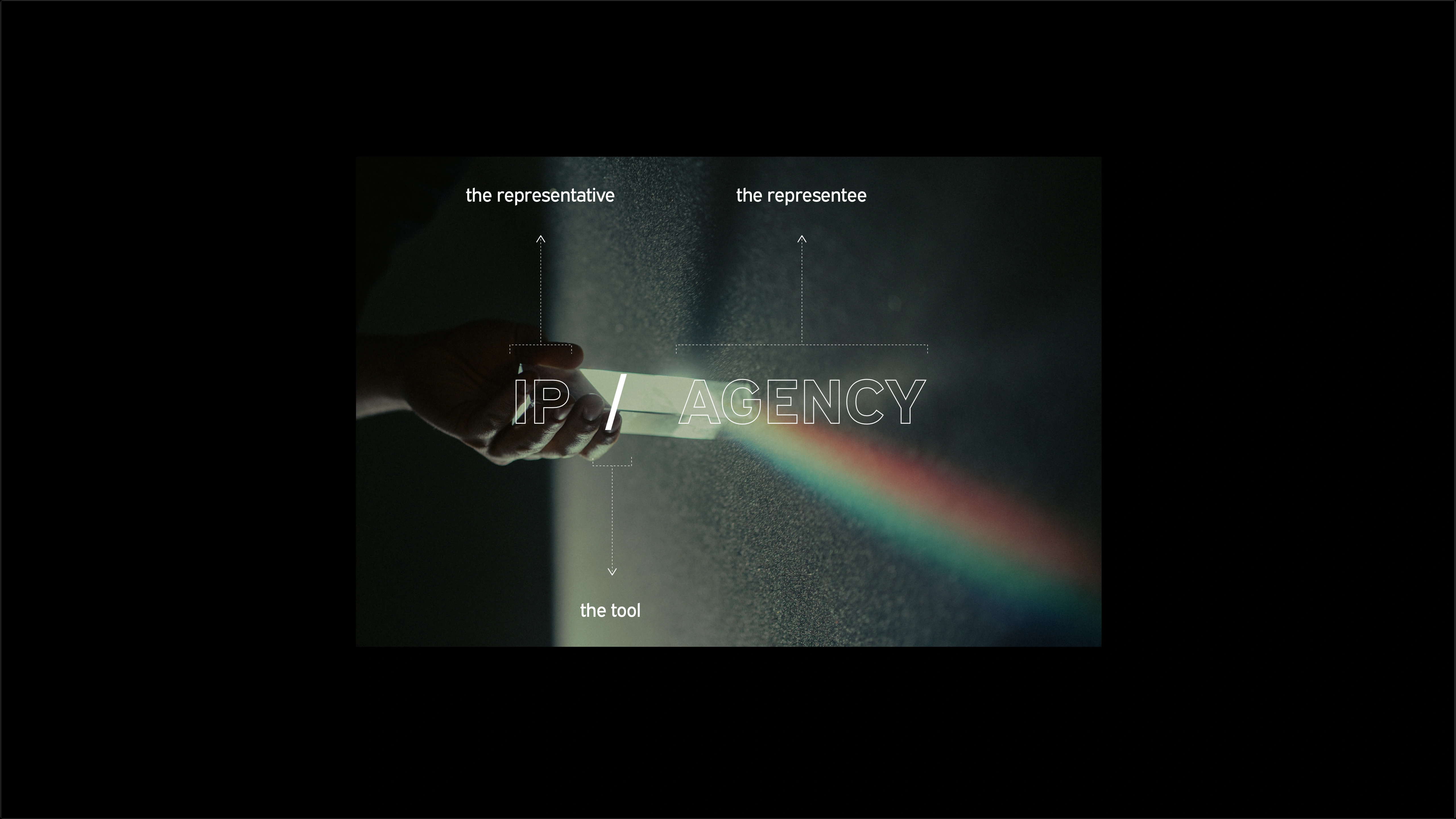
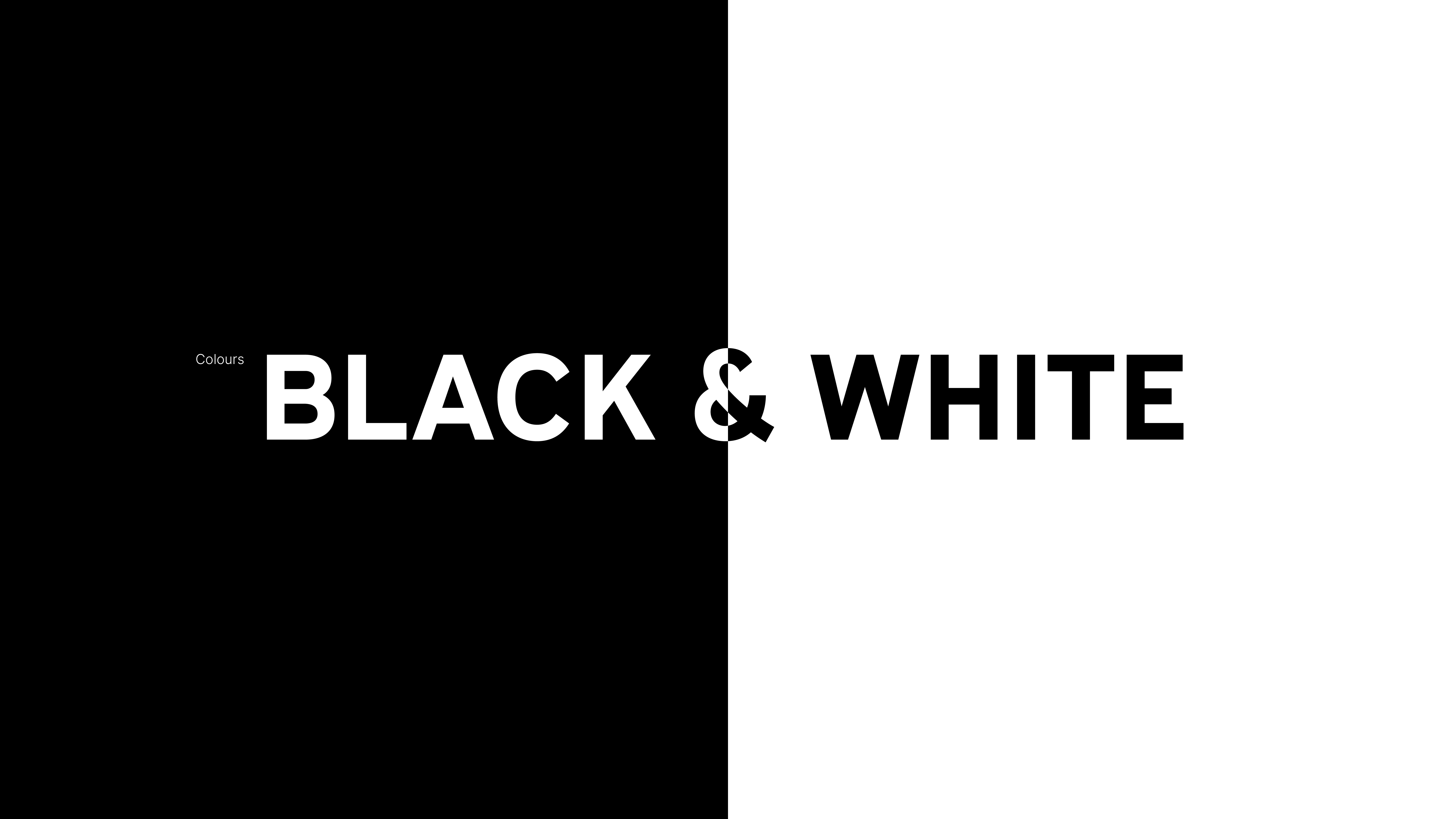
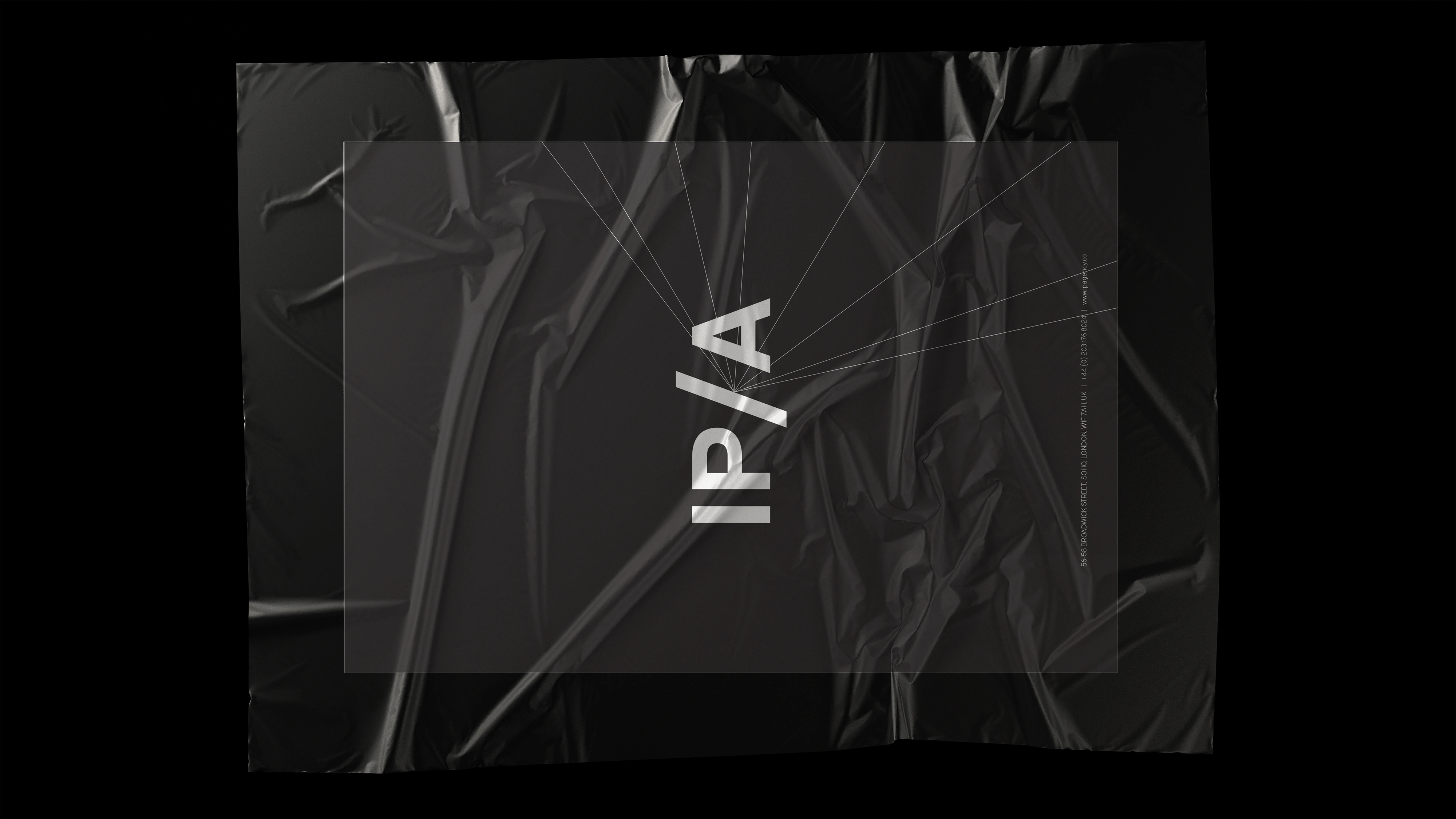
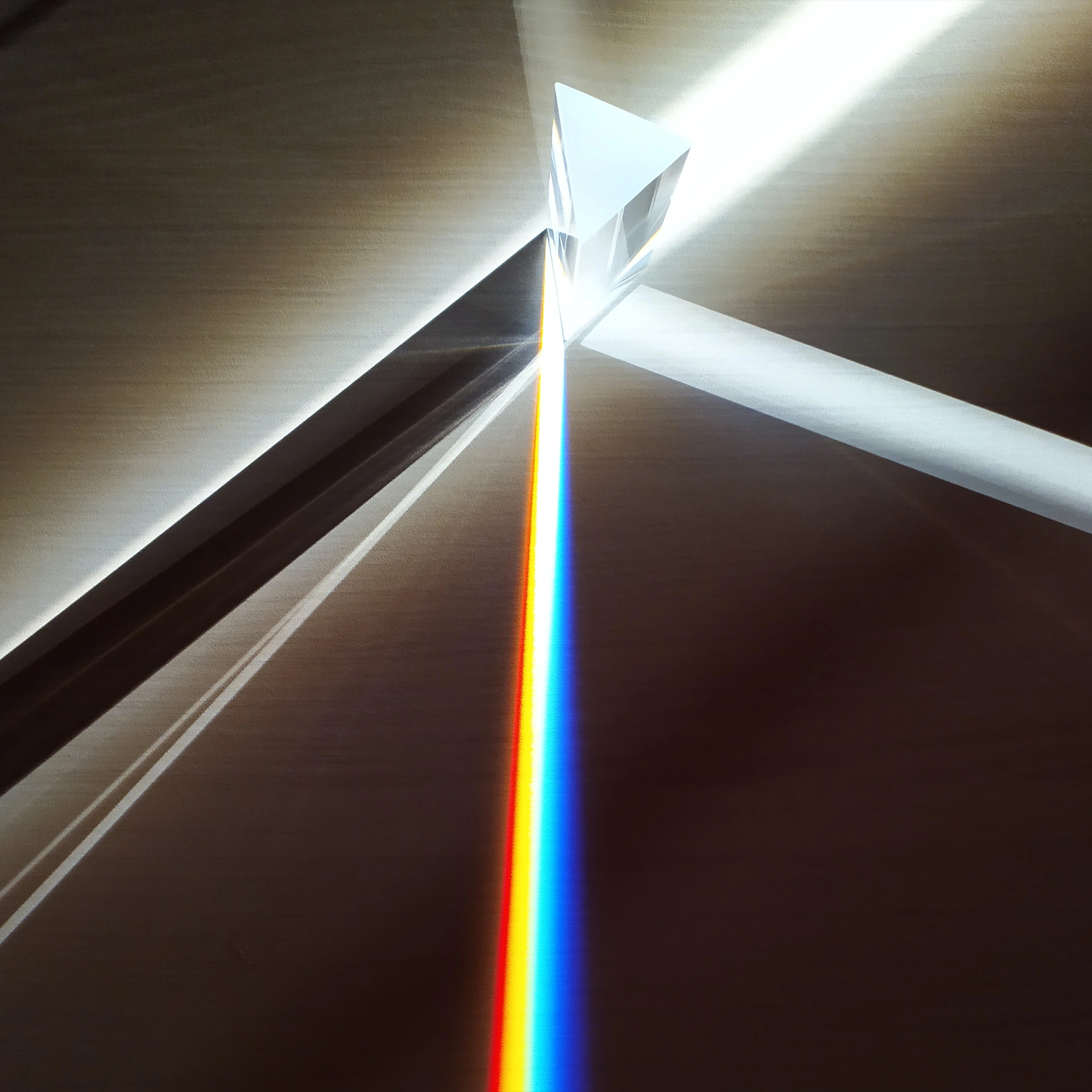
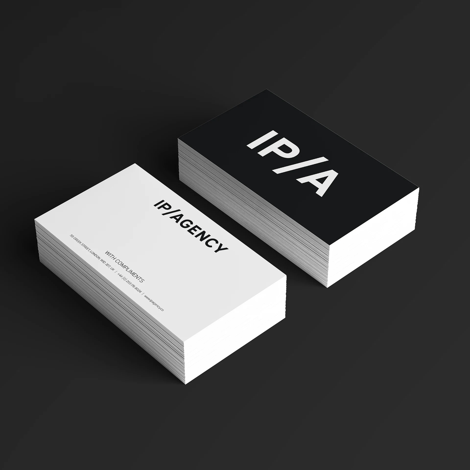
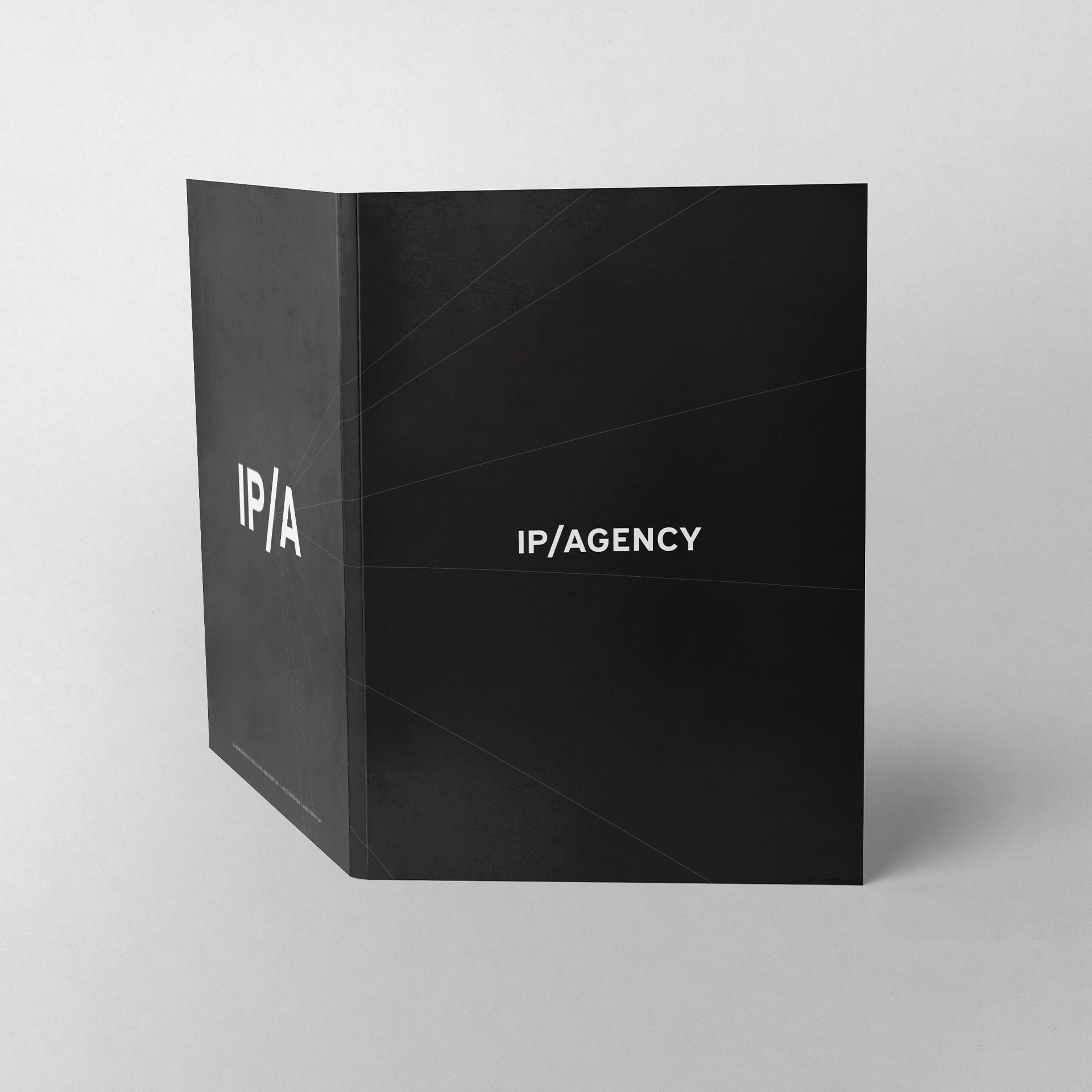
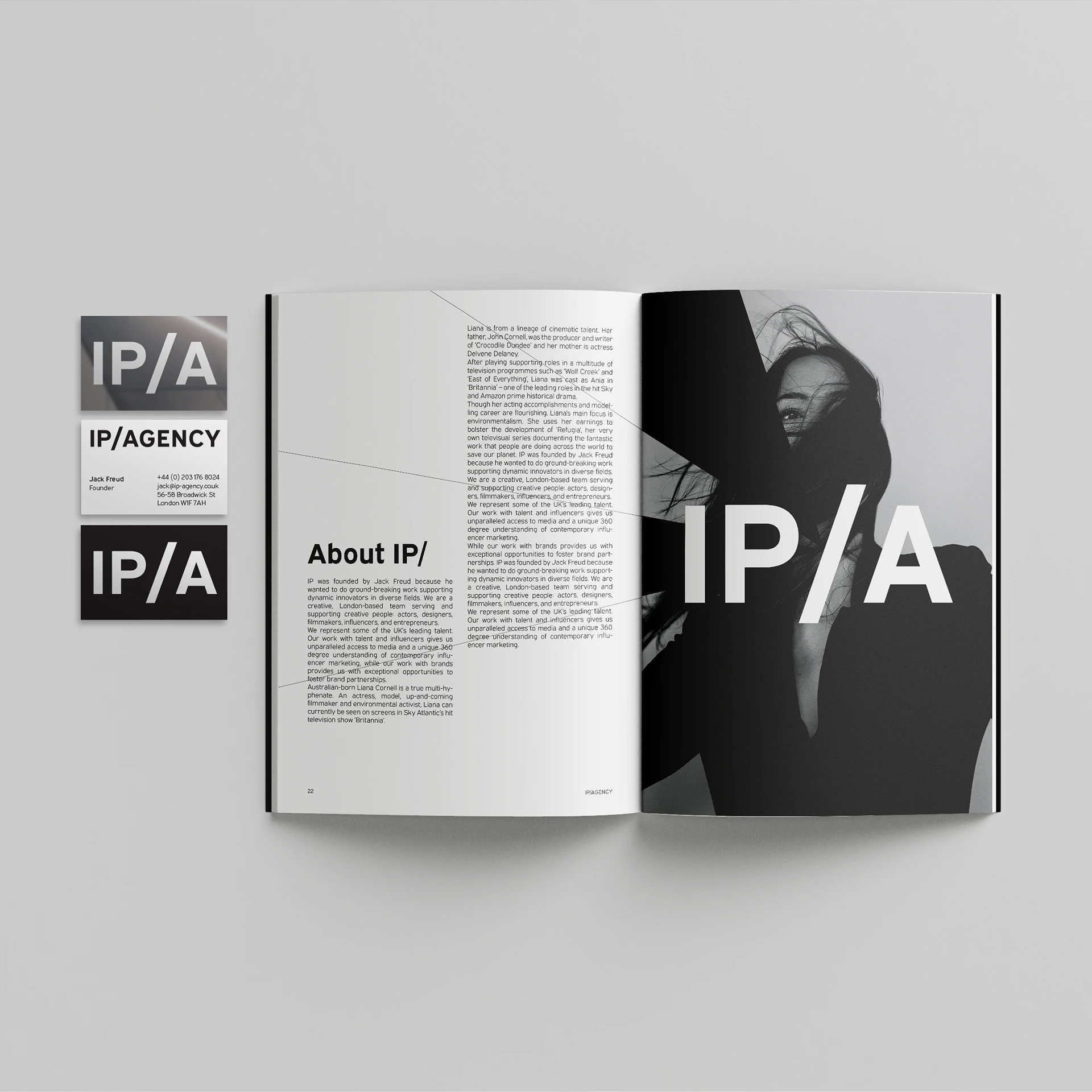
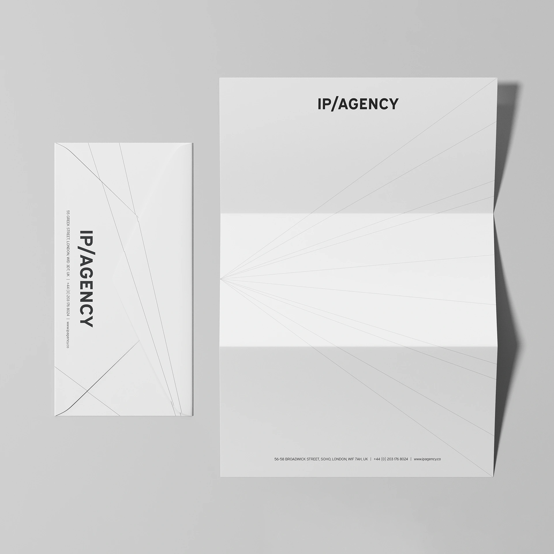
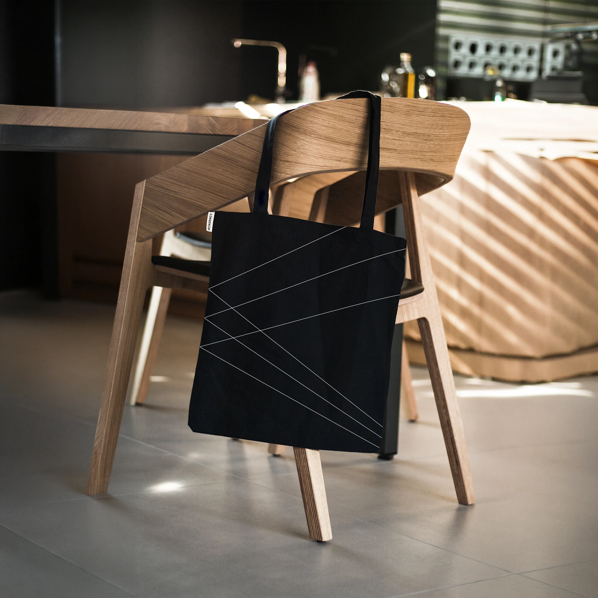
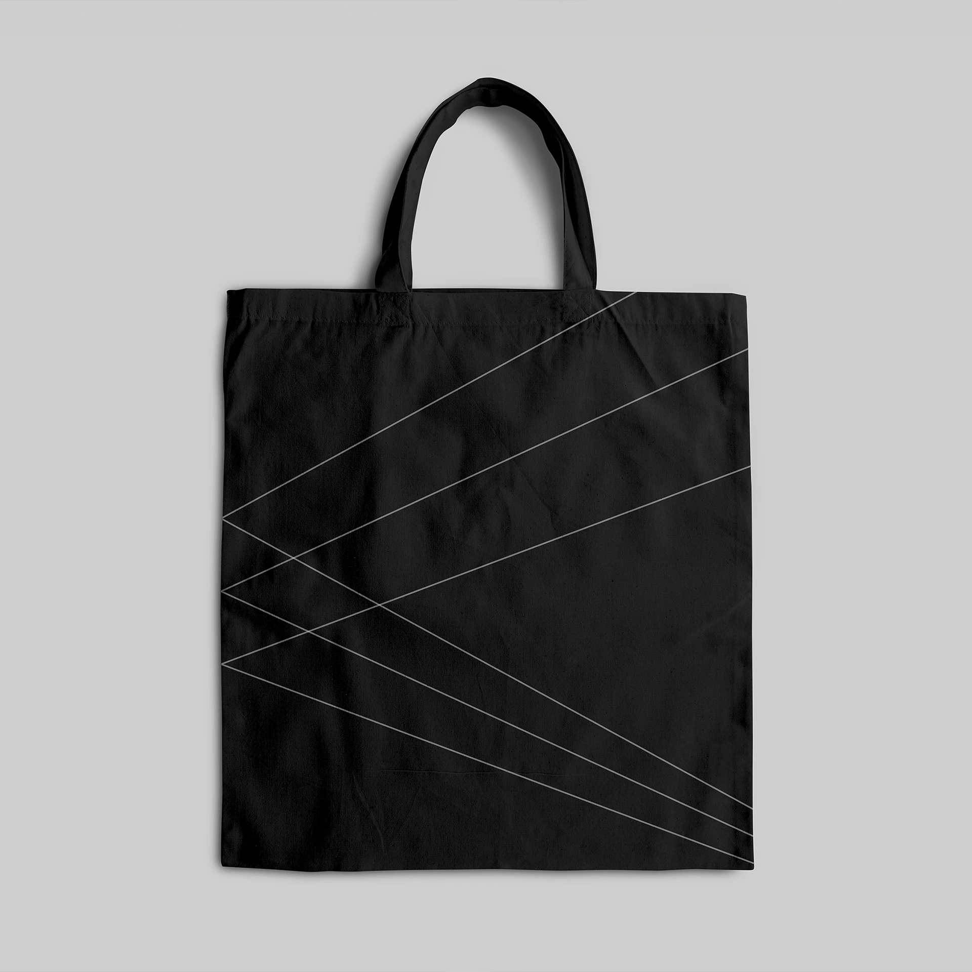
The rebrand transformed IP Publicity into IP/AGENCY, a broader and more dynamic platform for the business. At the centre of the identity is the idea of the prism; a symbol of direction, refraction, and visibility. A way to express how the agency identifies potential, sharpens it, and projects it into the world. The visual system is intentionally stripped back: black and white, elegant typography, and simple beams of light. From logo structure to digital applications, the identity gives each IP/A subbrand a distinct voice while holding everything together under one precise, confident brand world..
Client
IP/Agency
Expertise
Art Direction
Strategy
Branding
Graphic Design
Digital
Industry
Lifestyle & Fashion




Like this project
Posted Aug 4, 2026
Rebrand transforming IP Publicity into IP/AGENCY, using the prism concept to express direction, refraction and visibility.
Likes
0
Views
1