Built with Framer
MTJ Web redesign
Raji Adeoye
Project Overview
I redesigned the landing page for My Trading Journey (MTJ), a SaaS platform for backtesting and journaling trades. The focus was on improving visual appeal, clarifying the value proposition, and increasing conversions. The new design uses clearer messaging, stronger visual hierarchy, and a modern layout to better connect with potential users and drive sign-ups.

Project Live link
Problem
MTJ’s original landing page felt dark, outdated, and lacked clear messaging. Users couldn’t easily understand what the product offered or how it worked. Key features weren’t showcased, and there were no visuals or screenshots to demonstrate the app’s actual interface—leading to a lower conversion rate.
Goal
The client wanted a cleaner, brighter landing page with a predominantly white layout. The main goals were to improve clarity, communicate the product's core features, and showcase live screenshots to help users instantly grasp the platform’s benefits.
Solution
I redesigned the landing page with a clean, minimal aesthetic and a more structured content layout. I added clear messaging around MTJ’s value proposition and strategically placed live screenshots of the dashboard, trade journal, and backtesting features. This gave visitors a better understanding of the product and created a more trustworthy and professional impression.
Pricing section redesign
Outcome
The redesigned landing page led to improved clarity for first-time visitors and a noticeable increase in user engagement and conversions. By showcasing real screenshots and clearly outlining MTJ’s features, users better understood the value of the platform, resulting in more sign-ups and a stronger first impression of the brand.
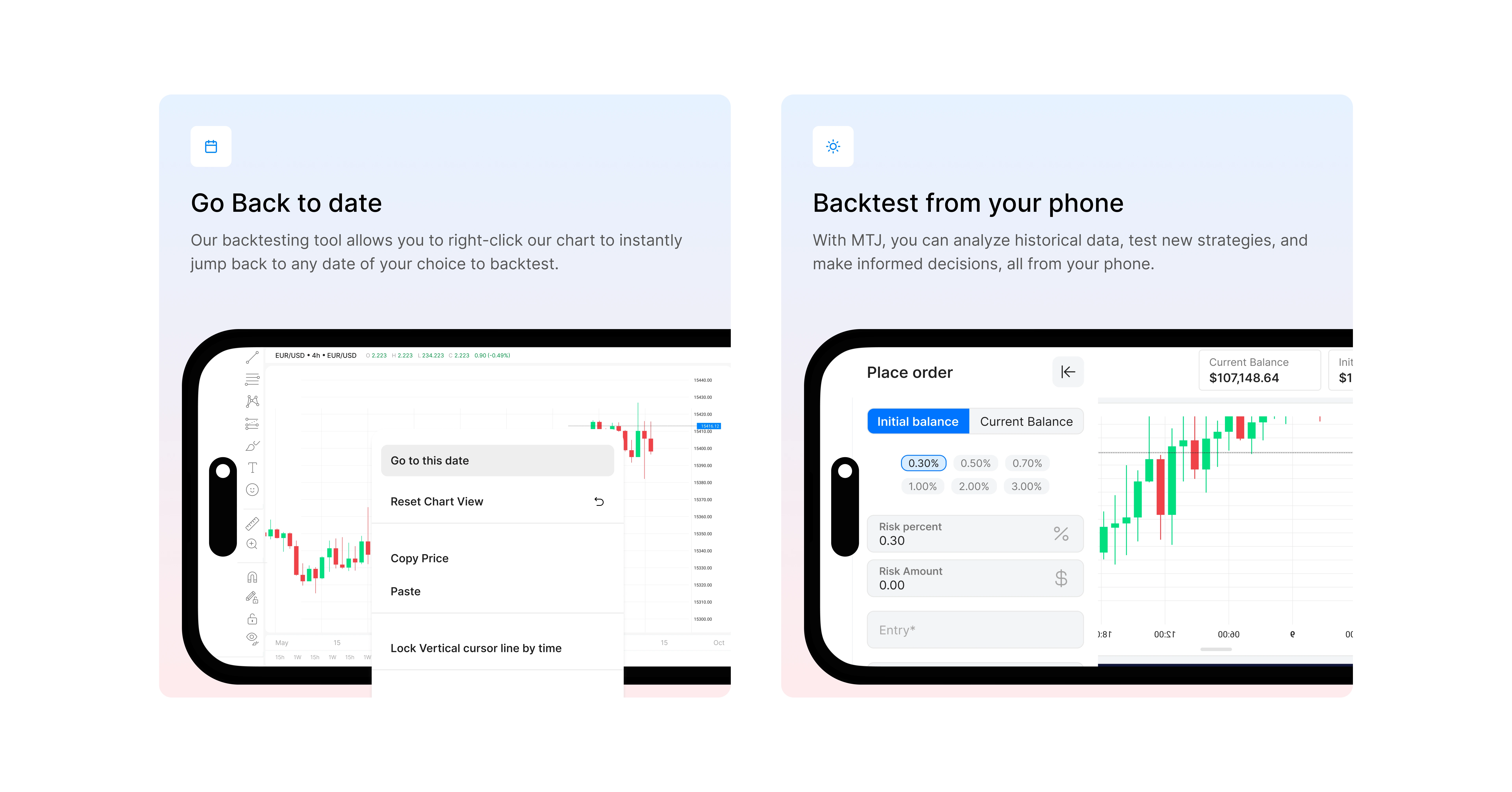
Some Backtesting Features
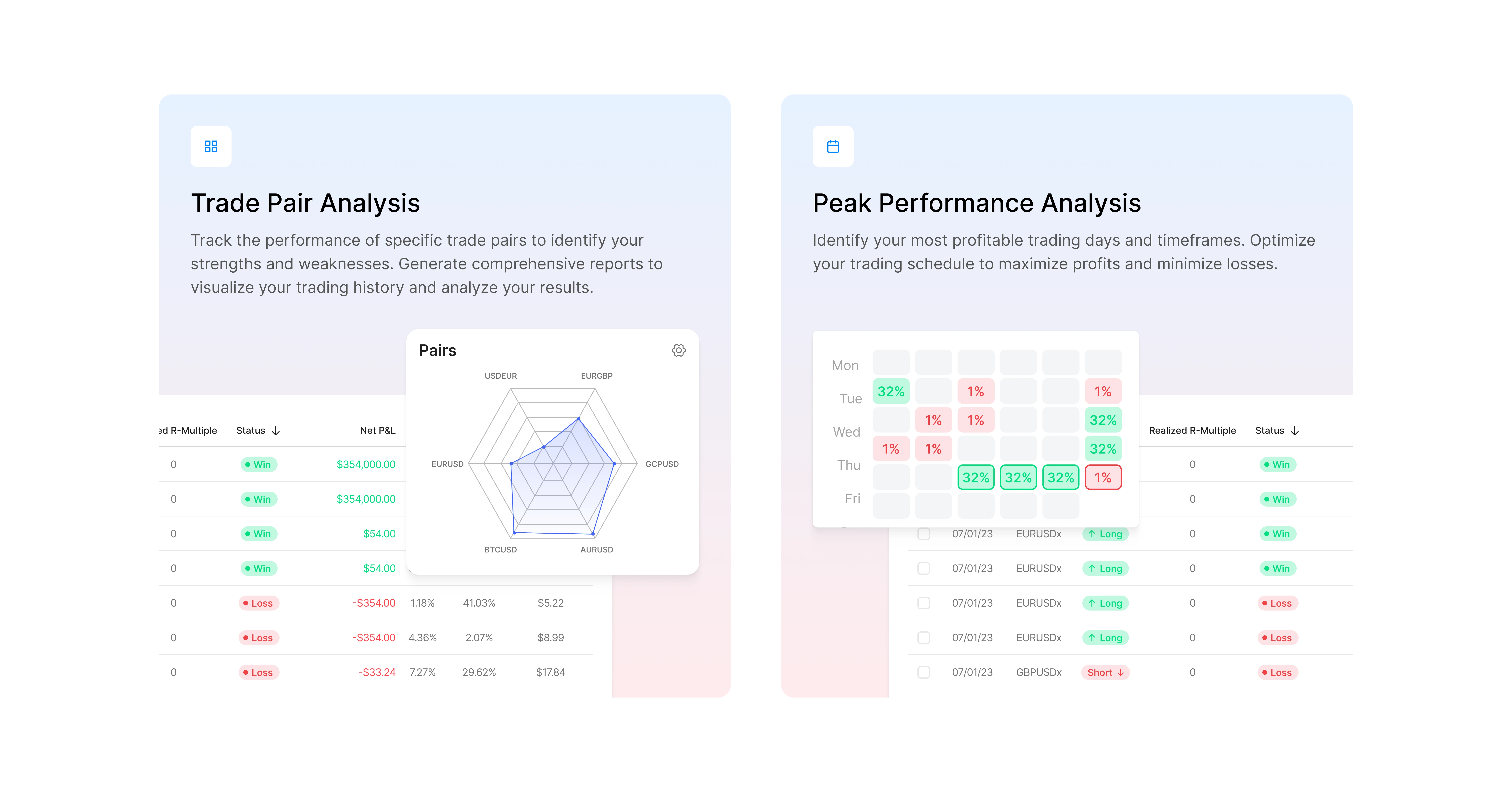
Journaling Features
Like this project
Posted Feb 20, 2025
I redesigned the existing MTJ's website with sharp, modern and clear visuals, resulting in a more intuitive experience aimed at boosting conversions.
Likes
3
Views
47
Timeline
Oct 21, 2024 - Oct 31, 2024