Ives Torres Foundation 💙
mayra | m.dsgn creative studio
The Ives Torres Foundation is a family-run non-profit organization that helps support and integrate children with developmental challenges into their communities.

Logo Design Concept
The organization was started by the Torres family; who named it after their son Ives. The "I" in the logo comes from the son's name and doubles as an icon of a human reaching out for help. The logo symbolizes the reason the foundation exists as a network of support.
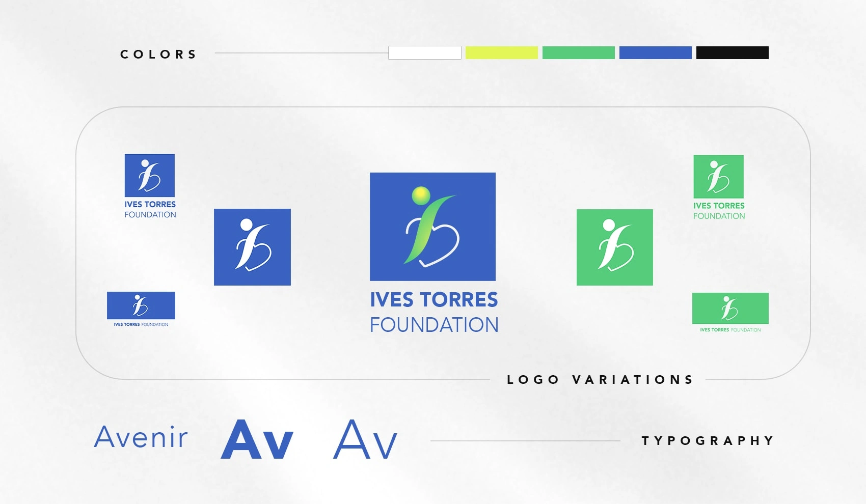
Color Story
The lime, green, and blue colors are deliberately energetic. They embody the foundation's zest for life and inspire hope. As a foundation in its early stages, it needed a classic identity that could go the distance as it achieves its goals.
Brand in Action
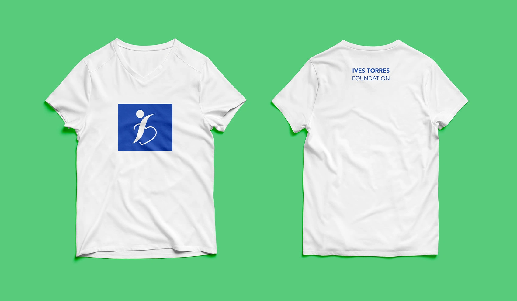
T-shirt Design
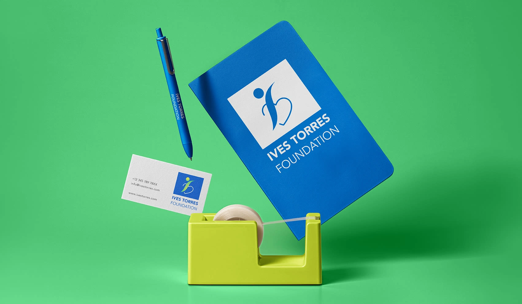
Field Toolkit
Like this project
Posted Oct 19, 2023
Through close collaboration with the Torres family — I designed an energetic brand identity for the non-profit Ives Torres Foundation.