Coachella App Redesign
Necole Cayanan
Driving app-adoption by designing a utility-first Coachella app
It begins in the desert...
Coachella Valley Music and Arts festival hosts about 650,000 people each year in Coachella Valley, California. The music festival has an app-companion to assist attendees throughout the festival weekend.
17% of people do not use the app
Beyond browsing a schedule or buying merchandise, it offered attendees little to rely on.
I set out to make the app indispensable.
I built an end-to-end discovery process for the Coachella app focusing entirely on uncovering what features would drive adoption based on what users need most.
User Research
UX Design
UI Design
Feature Strategy
Journey Maps
User Interviews
High Fidelity Designs
Prototypes
Designlab Capstone Project
First, I needed to understand what attendees value.
Before designing anything, I surveyed 37 past attendees. 3 key values rose to the top of the list for users:
Users Value
⏳ Conserving time and avoiding missing moments
🧭 Assistance navigating through dense crowds
💧 Accessing essential resources and facilities: restrooms, water refill stations, shaded areas, medical tents, etc.
Real stories validated what the data was telling me.
Four in-depth interviews with past festival goers gave weight to the survey findings and surfaced the kind of detail that data alone can't capture.
“I’m someone who never skips a meal and all my basic needs come first. Coachella forces you into impossible choices between eating and the music performances”
Mya, 27 years old
“A neighbor needed medical help during a set - it was scary and we knew what to do, but most people wouldn't know where to find the med tent.”

Eli, 30 years old
My research identified a pattern: people struggled with the logistics of being at the festival.
My focus shifted to how I could create reasons for users to open the app.
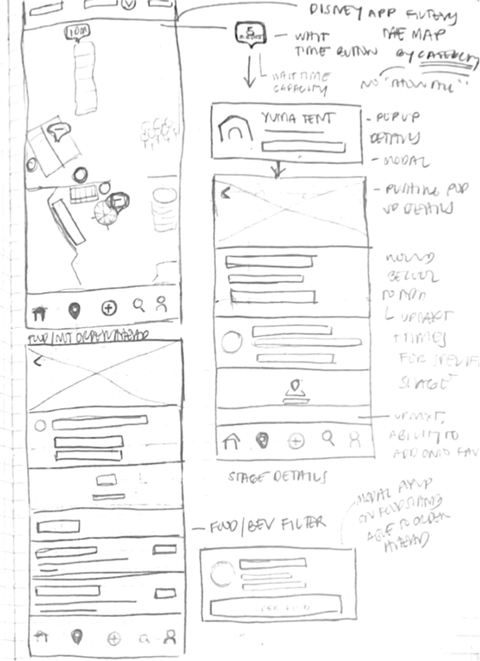
I gathered inspiration, sketched low-fidelity concepts, and created product maps to stress-test ideas against real festival scenarios - addressing key pain points that revealed opportunities for new solutions.
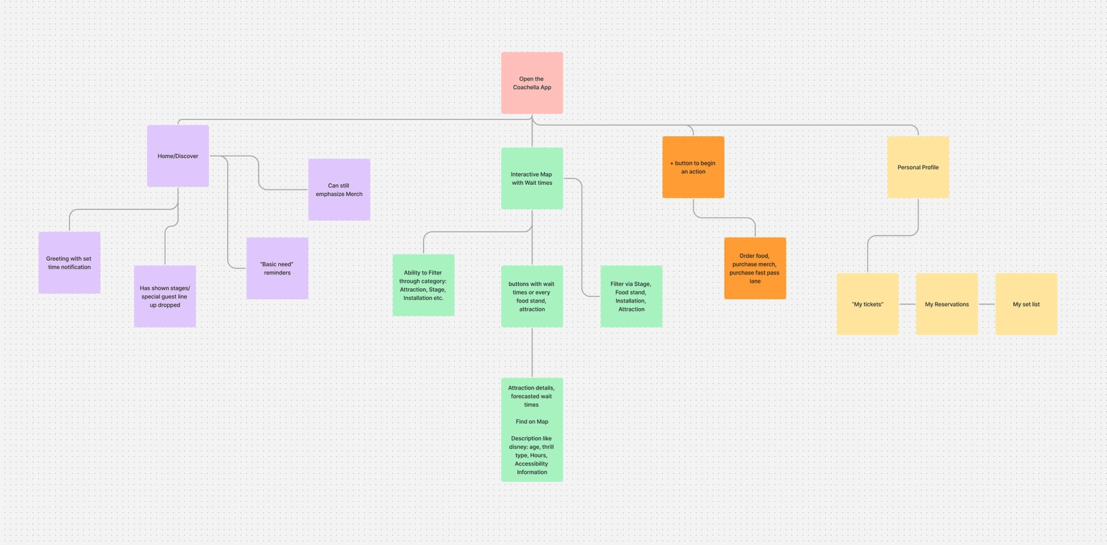
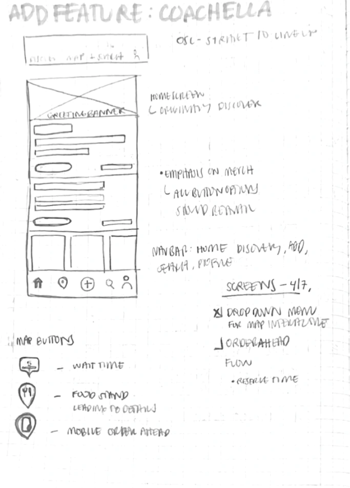
I finalized my ideation phase with a priority feature list.
Priority Feature List

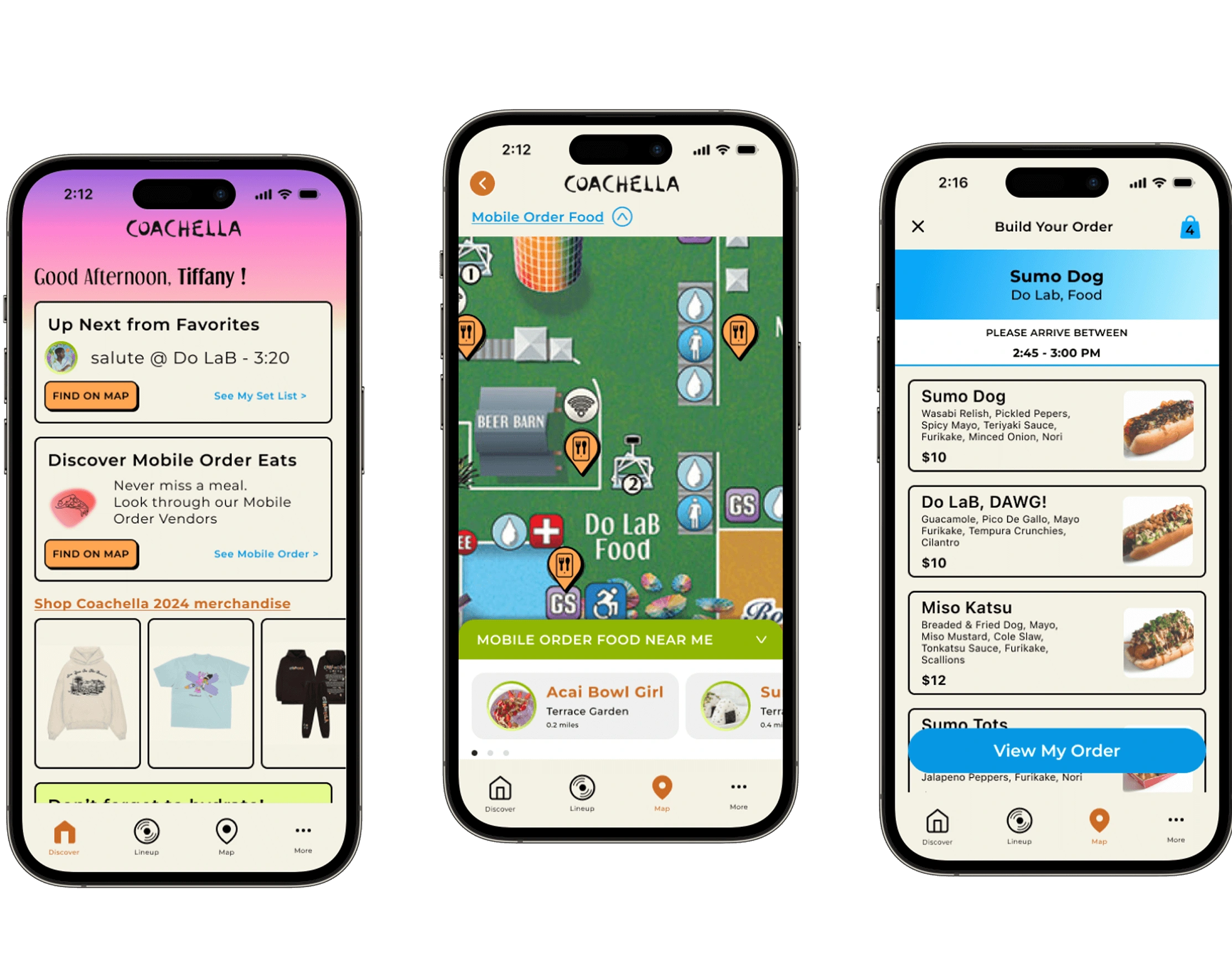
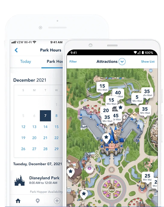
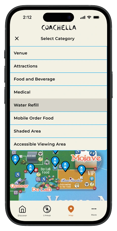
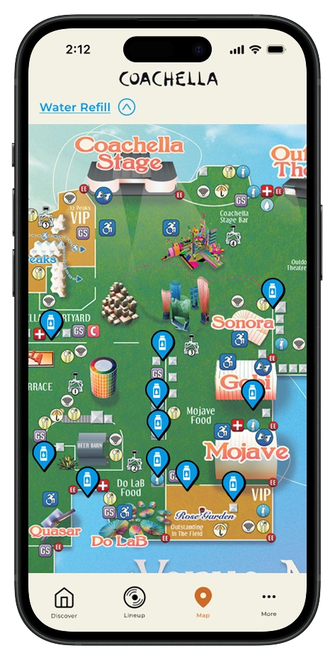
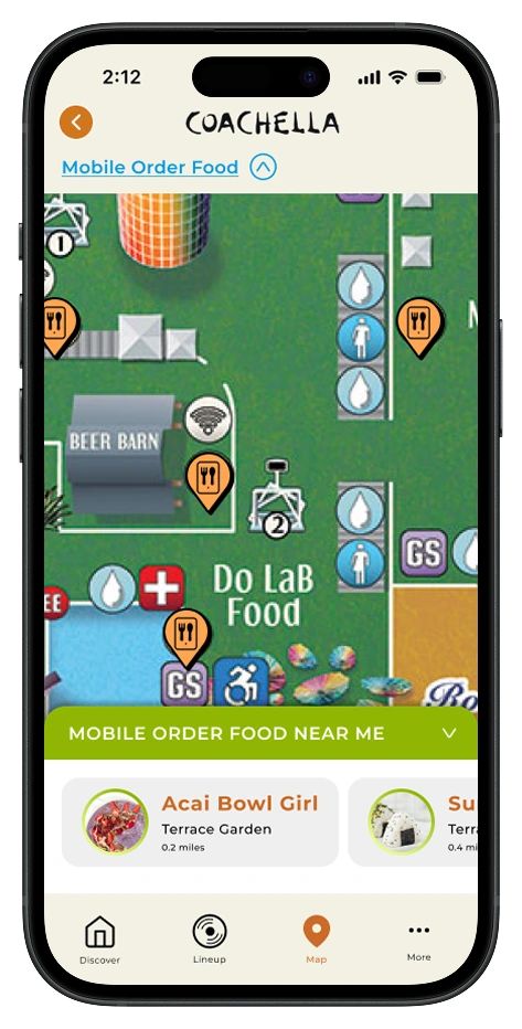
Smart Navigation Map: An interactive map with a filtered search system, allowing users to easily find desired locations.
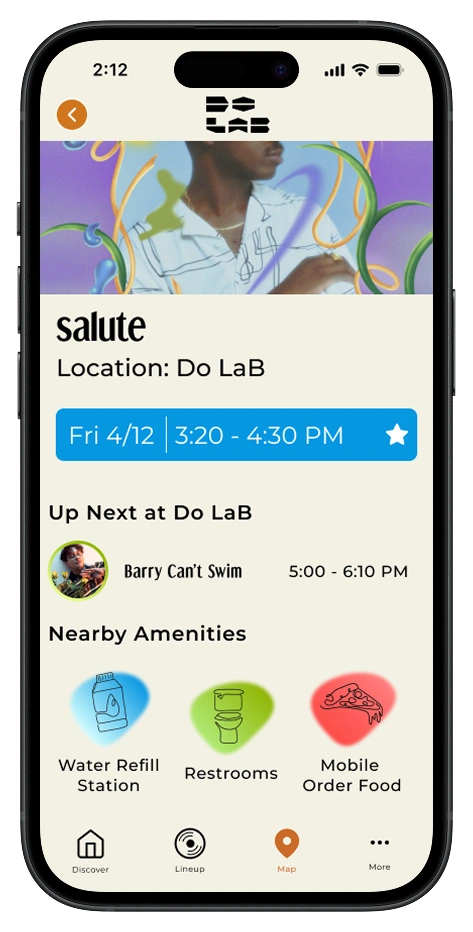
Proximity Highlights: Displays nearby amenities when users select a destination or experience’s detail page, optimizing their time and making navigation more intuitive.
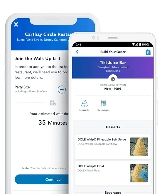
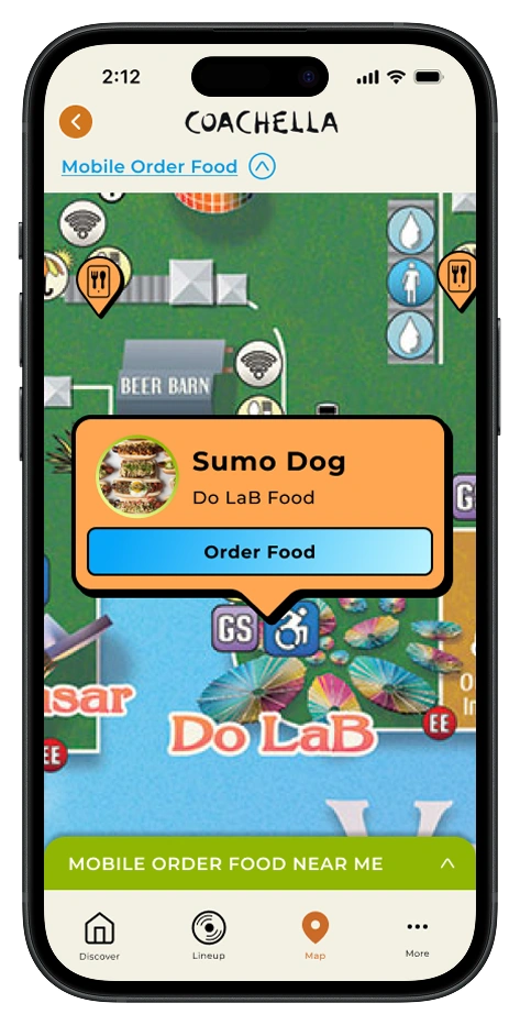
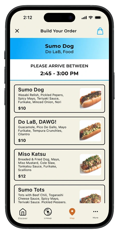
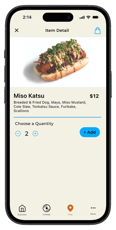
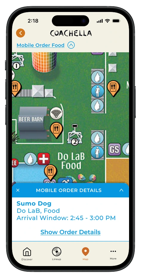
Mobile Order Capabilities: Pre-order food and drinks from participating vendors to skip long lines, with real-time wait estimates and pickup notifications to maximize time at performances.
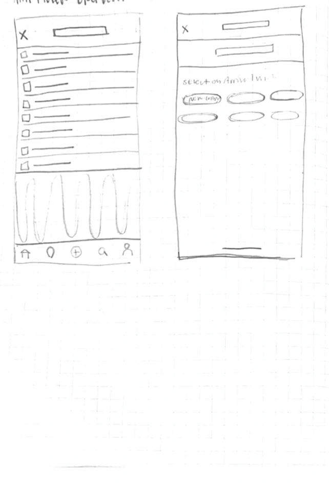
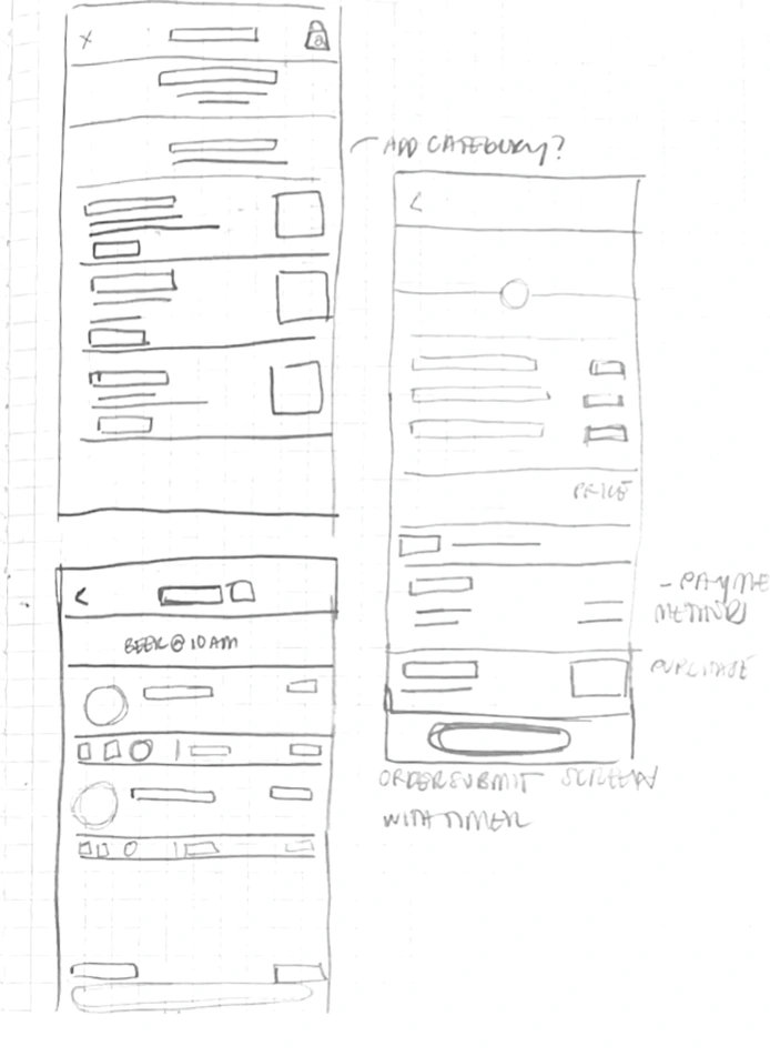
Then, I built high-fidelity frames for each feature.
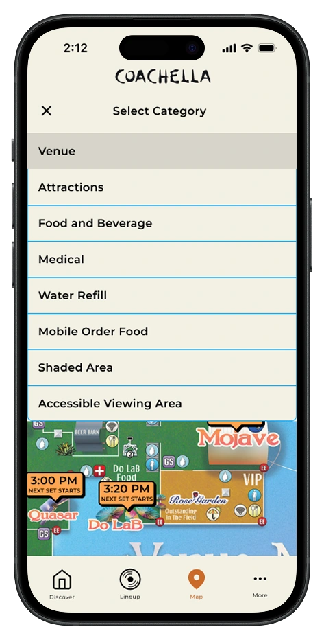
Smart Navigation Map
Smart Navigation highlights stages, medical tents, water stations, and shaded areas —helping users navigate crowds without missing a moment.

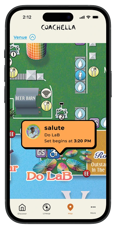
Proximity Highlights
Two integrated map features surface nearby amenities and food options at each stage, keeping users informed without missing performances.

Mobile Order Capabilities
To keep users fed and hydrated without sacrificing stage time, I designed an in-app mobile order flow with real-time wait estimates.
After sketching, I moved into high-fidelity wireframes, refining how each priority feature would look and function within the product cards.
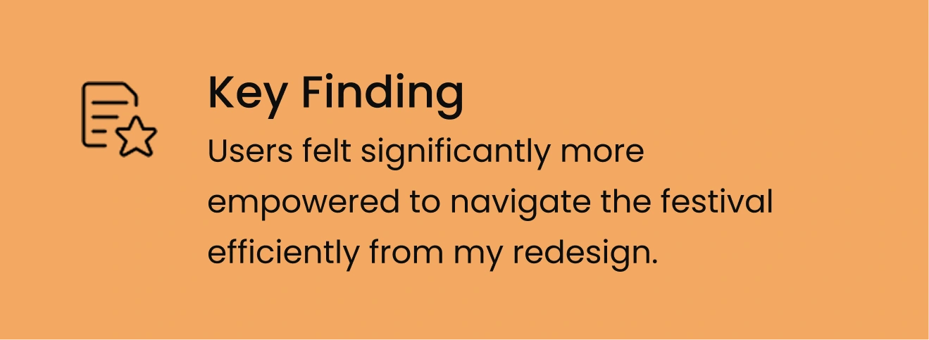
Overall, my testing indicated that users felt more confident moving through the festival with these new features, but their feedback surfaced small friction points in my designs.
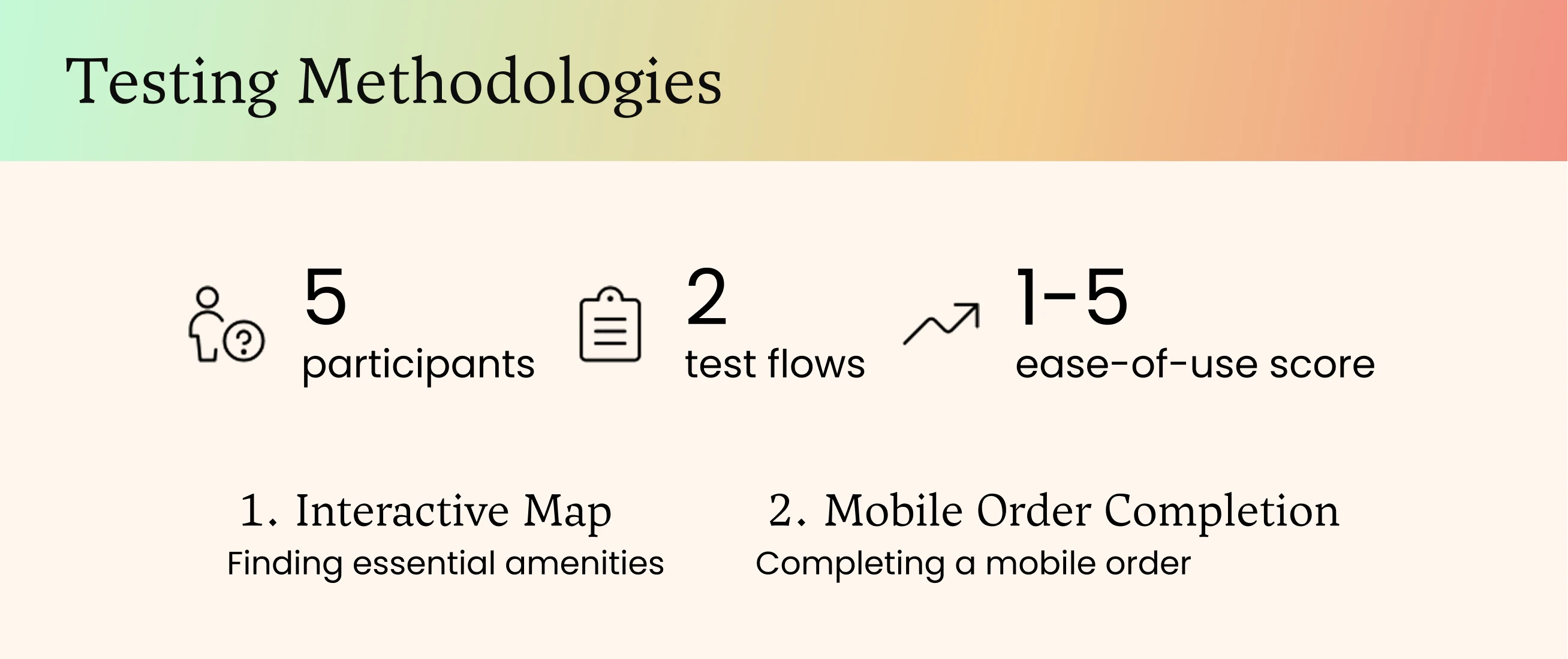
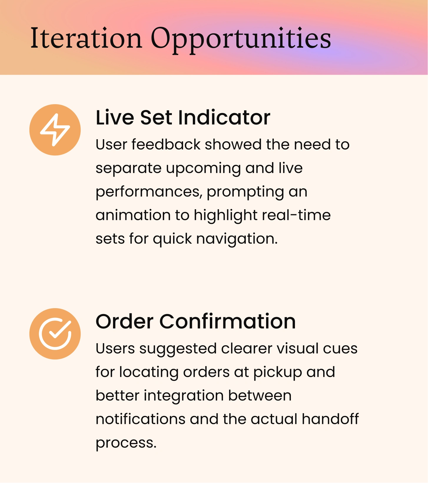
I made two targeted iterations to address user issues.
Users struggled to tell which stages had live performances happening in real time, and felt uncertain whether their mobile order had actually gone through.
Live Set Indicator
A pulsating neon dot on the map marks stages with active performances - giving users a read on anticipated traffic, crowded areas, and a timely reminder of who's on right now.
Before
My original design featured time flags for each stage, informing users of upcoming sets or time left until a set would begin.
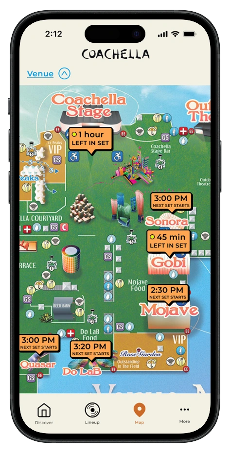
After
Users felt that the time flags were informative but needed differentiation between upcoming and Live Sets. To remedy this, I added a flashing yellow light for sets that were Live Now.
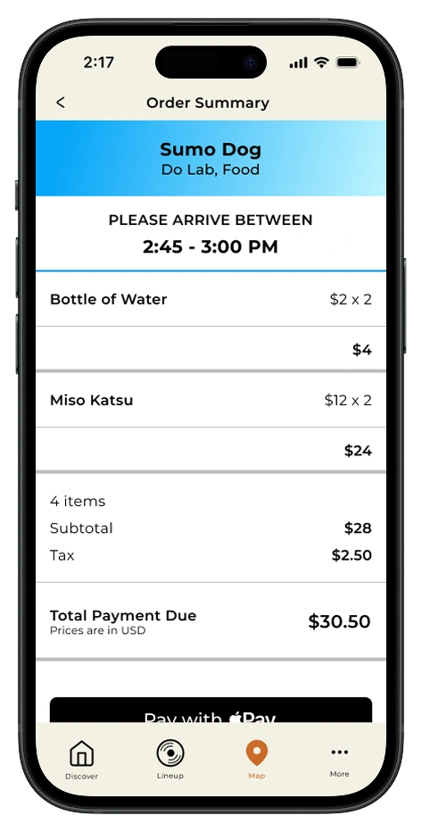
Order Confirmation
Users found the ordering flow smooth but felt it dropped off at during pickup. I added visual cues and clearer vendor directions, closing the loop between notification and physical handoff.
Order Confirmation
Attendees see arrival windows instantly on the map, eliminating the need to track orders through menus and emails in a chaotic festival environment.
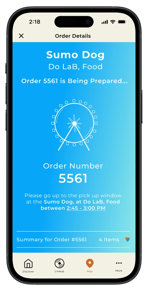
Order Confirmation
A dedicated confirmation screen ensures users know exactly which vendor to visit and where to find them, eliminating the confusion of "wait, where was I supposed to pick this up?" in a crowded festival with dozens of food stations.
My final prototypes show how utility drives adoption.
Through intuitive map filtering and a streamlined mobile order flow, attendees can locate essentials and secure what they need, transforming the app from a passive schedule viewer into an essential festival companion.
This project taught me that reframing a business problem as a utility problem unlocks better solutions. When people have a genuine reason to open an app, adoption takes care of itself. And designing for the hardest use cases, then sweating every detail to get them right, proved that user trust is built in the finishing touches.
The future of the Coachella app has potential to improve safety at scale.
Using technology to improve safety at scale. Future iterations could integrate wristband sensors for real-time crowd intelligence. This could potentially create a replicable model for festivals, sporting events, and large gatherings worldwide.

Like this project
Posted Jun 9, 2026
Utility-first design for Coachella app to enhance user experience and drive adoption.
Likes
0
Views
3