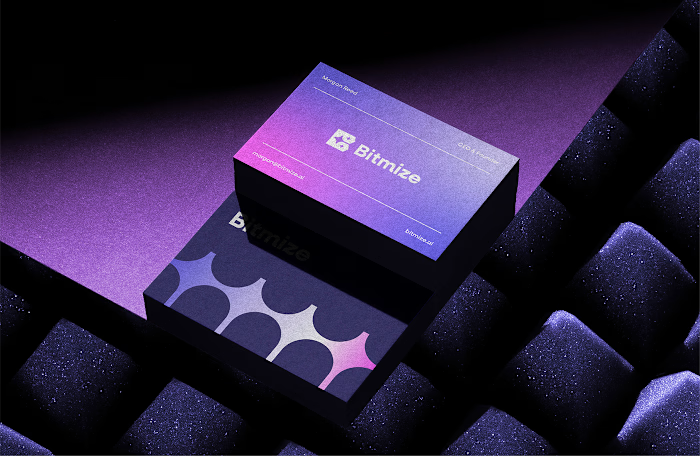
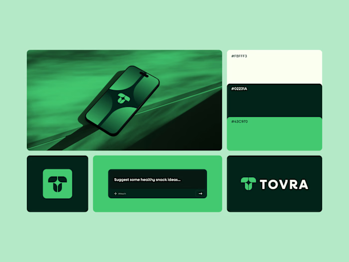
Rejected logo concept for Transparent I
Rejected logo concept for Transparent
I recently worked with Transparent, a backend technology company building powerful, easy to use APIs that connect business systems and enable seamless data exchange.
This concept took a clean, technical approach. I used angle brackets to shape the letter T, referencing backend code, and added a subtle arrow form to represent growth and progress.
The client chose Concept 2, and we wrapped up the project smoothly with no revisions on the final delivery, which is always a win.
Not every concept gets selected, but every concept moves the project forward.
Would love to hear your thoughts.
Like this project
Posted Feb 20, 2026
Rejected logo concept for Transparent I recently worked with Transparent, a backend technology company building powerful, easy to use APIs that connect busin...
Likes
0
Views
1
Timeline
Feb 12, 2026 - Feb 19, 2026


