Toronto Prorailings: Site Redesign
Introduction 📖
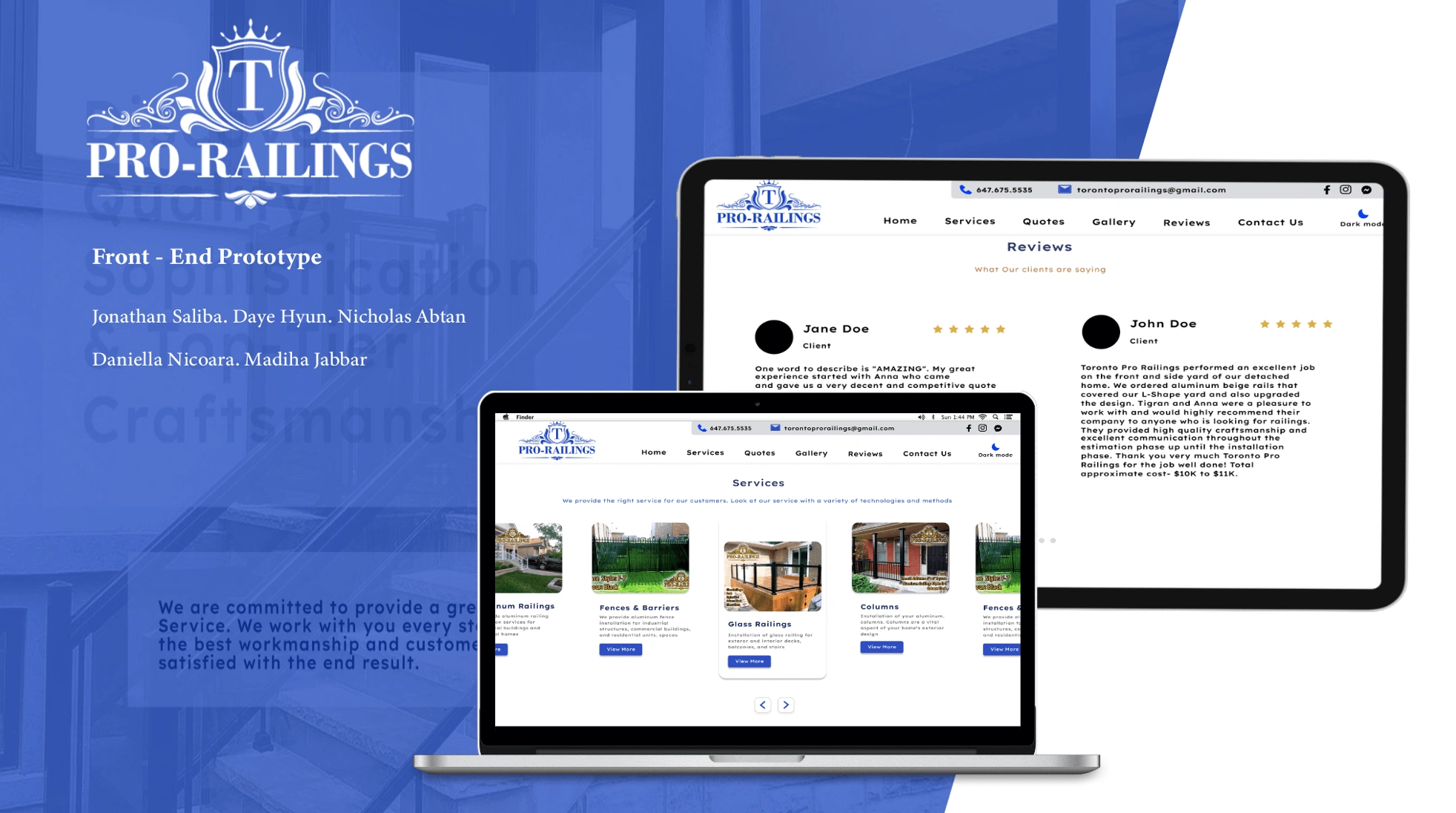
As an exercise, we were tasked with redesigning this website through the application of UI principles and concepts to create an exciting, dynamic and impressionable website.
The Stats 💯
Timeline: 4 Weeks
My Role: UI/UX Designer, Project Manager, Web Designer
Deliverables: Responsive Website Design, Page Design (XD), User Research, Wireframes (lo-fi & hi-fi), Front-End Website
The Problem 🧨
We have observed that the Toronto Pro Railing website does not do itself justice, leaving potential clients with a lacklustre experience. This draws away from the dynamic and positive experience they provide clients. We hope to extend this experience into the website redesign.
Objectives ⭐️
Through our analysis of the website, we determined the following fixes:
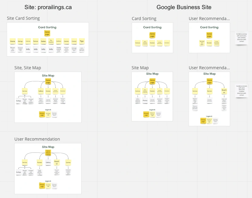
Revising the information architecture
Creating a better way to display of visuals to enhance user experience
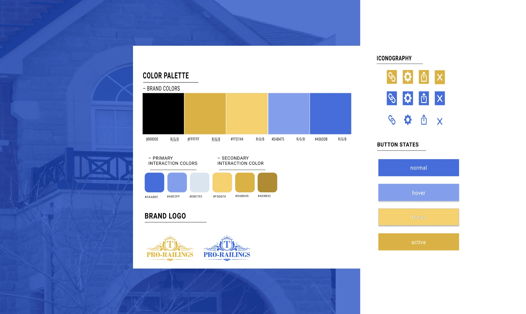
Establishing an a more sophisticated colour palette & layout
The website must include all their work, contact and location information
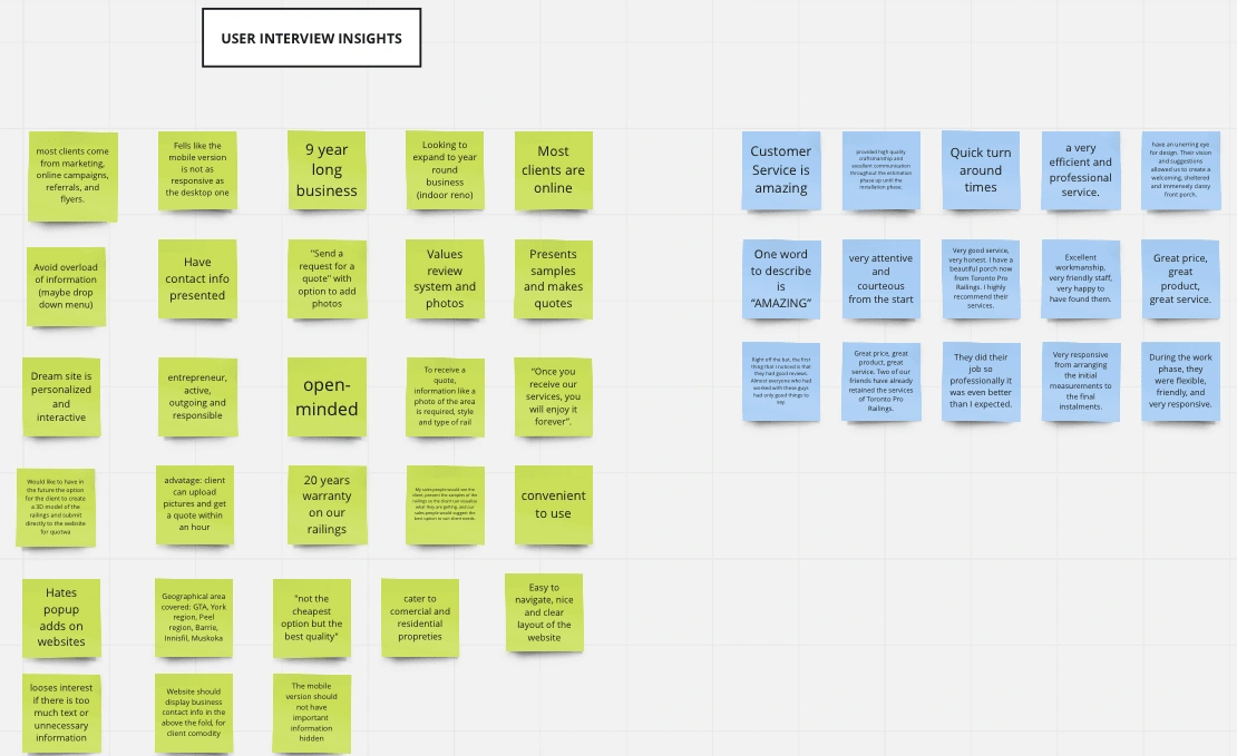
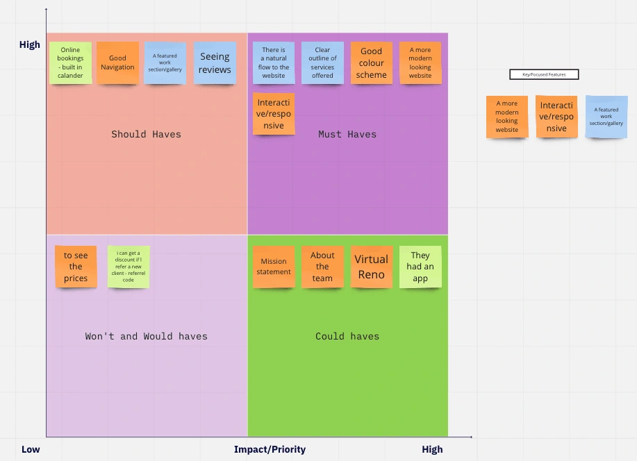
User Research 🧐
Value Proposition 📃
The messaging was based on the reviews and customers experience that is provide by Toronto prorailings, which resulted in the following messaging:
"Great price, great product, great service. We work with you every step of the way to give you the best workmanship and customer service."
Personas 👀
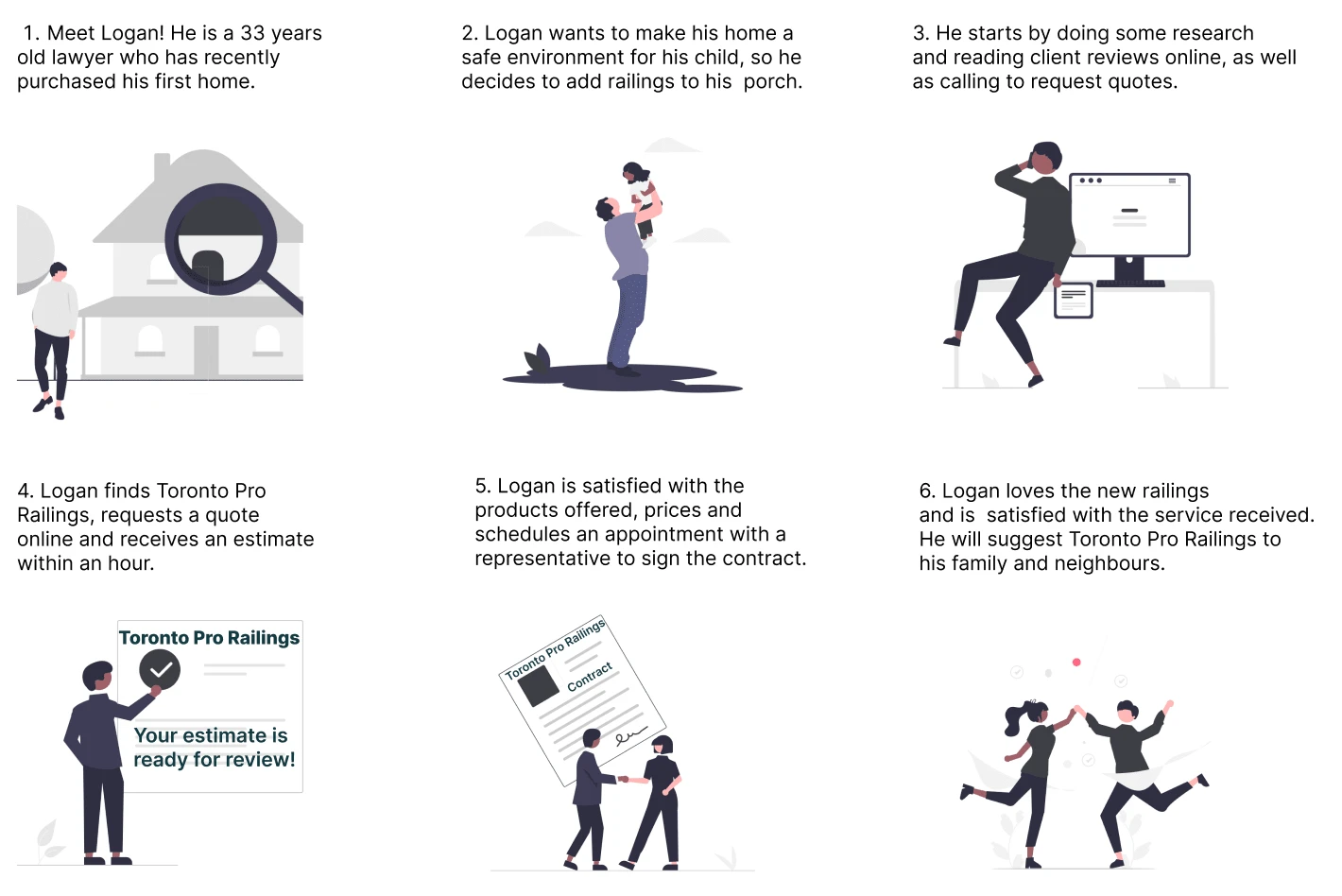
Through our user interviews we were about to create the following persona and understand the main motivations behind people wanting to install railings either indoors or outdoors. People need reliable, stylish and safe railings that they can rely on for their children and elderly.
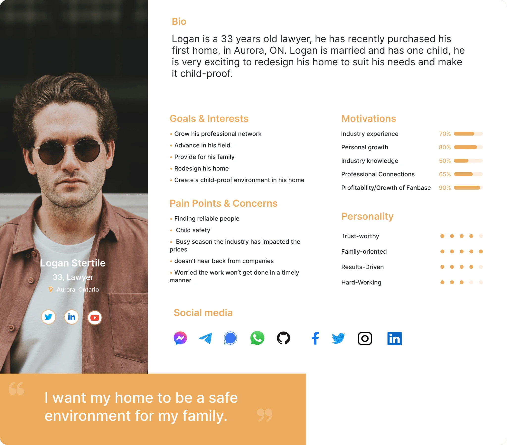
Lets walkthrough Logans Journey:
Style title 🎨
Research & Definition 🔬
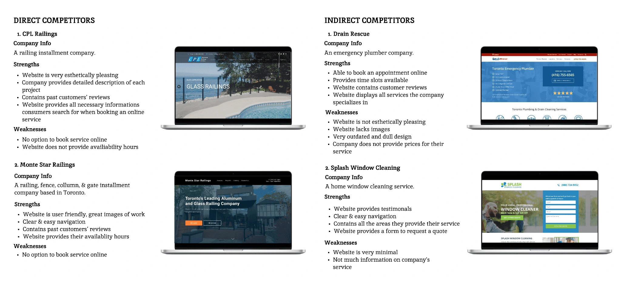
Competitor Analysis 🧐
Prototype & Testing 😍
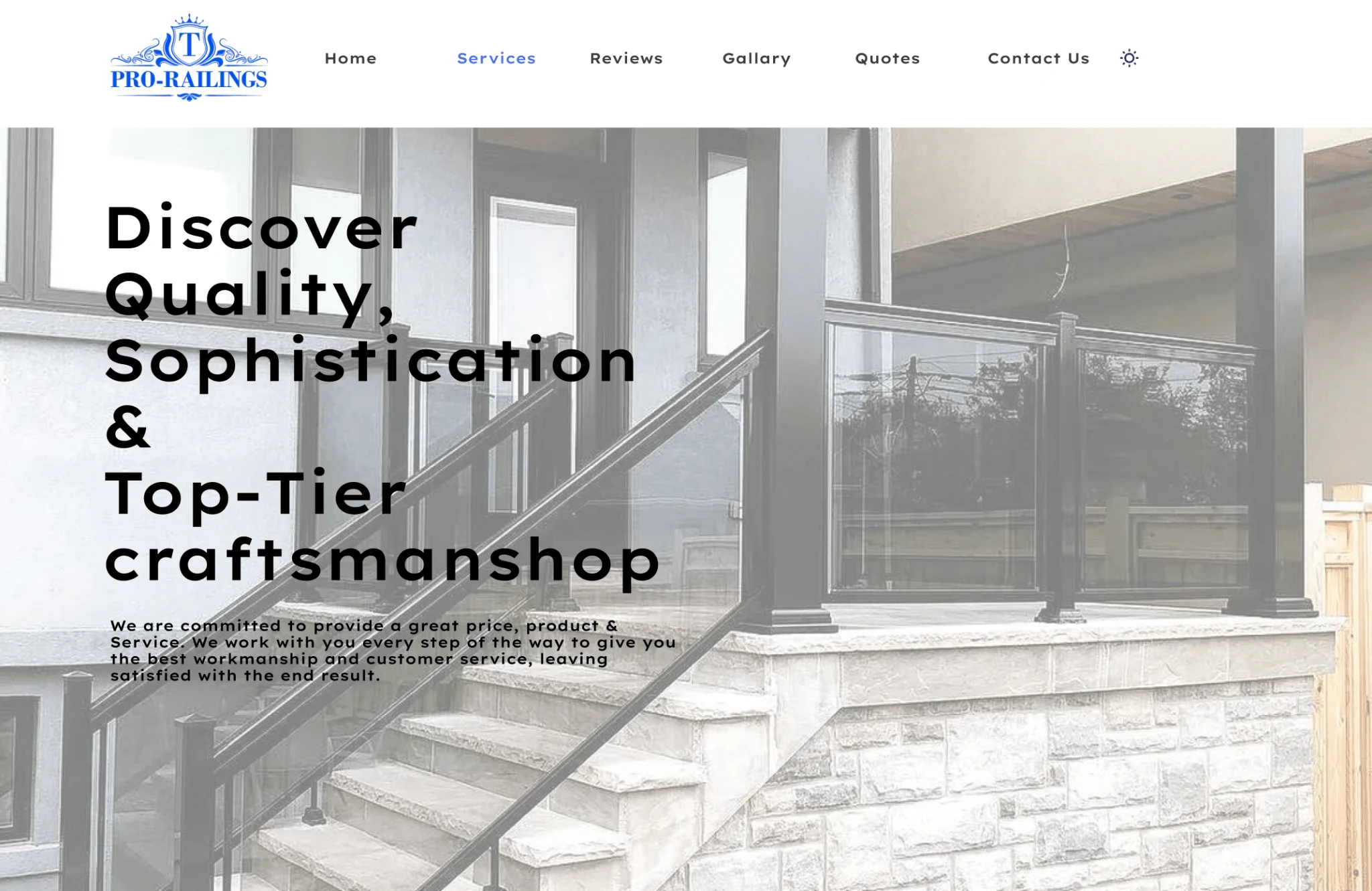
Light Mode ☀️


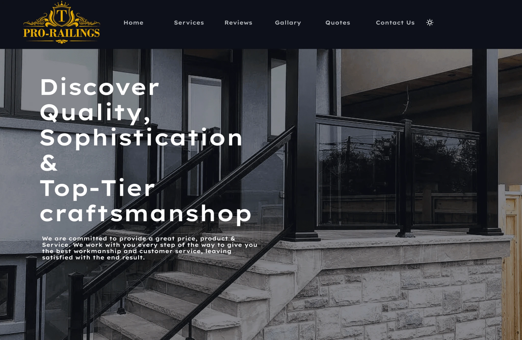
Dark Mode 🌙


User Insights 🗒️
Key Findings:
Dark Mode test has proven to run nicely with instinctive features, users knew exactly where to navigate
Tried clicking buttons that did not function but each page worked well
Liked the logo and different features and overall layout
Nav bar on the first 3 pages was different than the last 3
User preferred DM however enjoyed more consistency in this light mode in terms of layout
Light Mode test ran well, the user knew instinctively where everything was and ran into no navigation problems
A/B Testing 📝
Through our A/B testing we determined that 60% of our users preferred the dark mode look and feel. This led us to decide to have a dark mode added to give users the ability when they first visit the site to be able switch between the two modes.
A.
B.
The Product 🪄
After a few rounds of user testing and iterations we combined the typefaces, colours, logos, branded photos, user-generated content and writing to produce a website that guided Toronto prorailings customers through showcase of their past works a several call actions with the intention to help drive conversations.
We made sure that the website hit on the key deliverables to ensure a pleasant experience when using the site. Our main goal was to modernize the site and its components to emulate the quality service and support they provide to their customers.
Six key components make up the finished website:
The Homepage, Hero banner with a call to action/tag line
The Services they provide
Testimonials
Gallery of past works
Call to action for customer to get a project quote
Contact us
Conclusion 🔥
Future Considerations 🚆
Pitch website to stakeholder
Iterate based on feedback
Making it more Accessible
Debug Website - Known issues Contact us Animation and Gallery Images overlapping
Potential to prototype a mobile app
Hope you enjoyed scrolling through this piece of work. I really appreciate you spending a few minutes of the day to see my thought process behind attempting a redesign for this brand and showcasing its updated look.
Are you ready to kickstart your online website? Let's build a welcoming online space for your business by getting in touch ✅.
Like this project
Posted Jun 9, 2023
A railing contractor website where I managed the project and helped to create UI/UX designs that highlighted the organization's mission, services and goals.
Likes
0
Views
11


