Rebranding a Small Business Through Visual Design
The Brief Details🔍
Category: Beauty & Hair
Business: Hair Fashion
Design Type: Logo
Design Requirements 📄
The following was the requirements outlined by the client:
Incorpates the name of the business with the tag line beauty & beyond
Theme: Elegant, Simple, Soft
Multi-purposed
Easily digestible
Style Guide 🎨
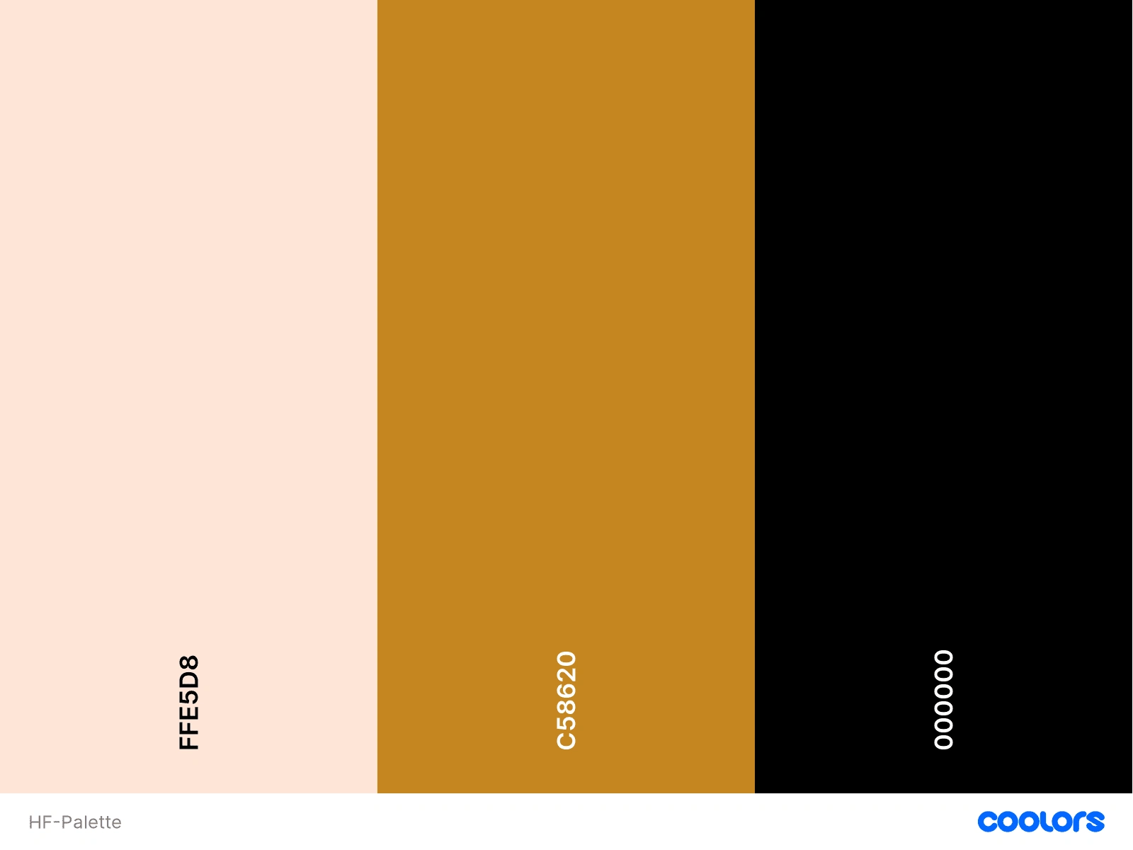
I used a combination of fonts to create distinction and to signify different weights of importance to where we wanted the users attention to be drawn to.
Moontime
Josefin Sans Regular
Glacial Indifference
Iterations ⚙️
The first iteration leaned into being more simple with a neutral palette and direct in its messaging.
The feedback given was to incorporate symbolism to show they are more than a hair salon, as well as to add some soft colours.
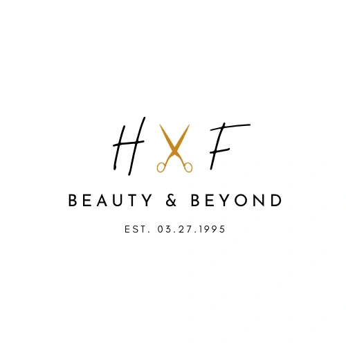
Following the feedback given, I added the requested imagery and leaned more into that elegant feel they were looking for.
The Design 🖌️
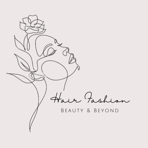
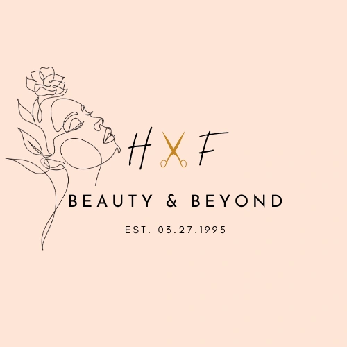
After our feedback rounds we arrived to with this primary logo, were I wanted to combine an artistic flair that made the brand easily identifiable with more modern style, joining the elements that the client liked best from previous iterations.
Like this project
Posted Jun 7, 2023
Redesigned the company's logo, business cards, flyers, and letterheads to give them a fresh look.
Likes
0
Views
15

