Merch for PR specialists – the unique diary 🤖
Vladimir Khablov

Creative agency Tochka has commissioned a customized concept and layout of the diary to give it to their clients and partners in the PR-industry.
The Brief
It should be a tool for work, help in networking, have a clear structure, ease of use, be relevant, "speak the same language" and entertain the user.
The References
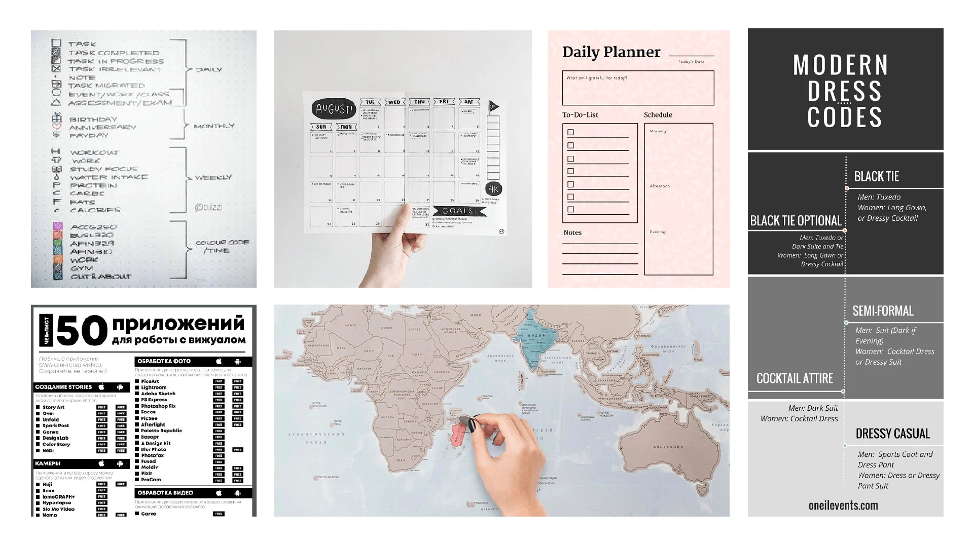
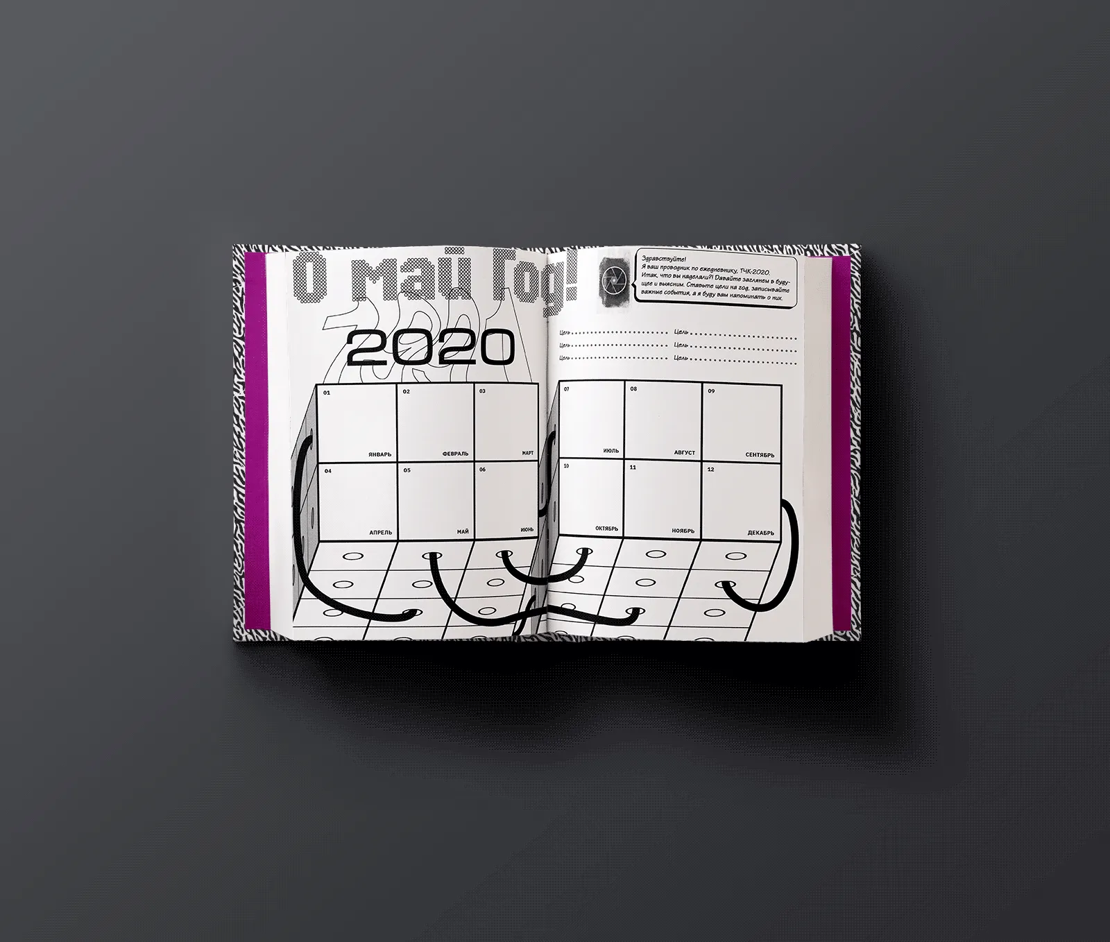
All the necessary things: questionnaires, fill-forms, maps and grids – for productivity.
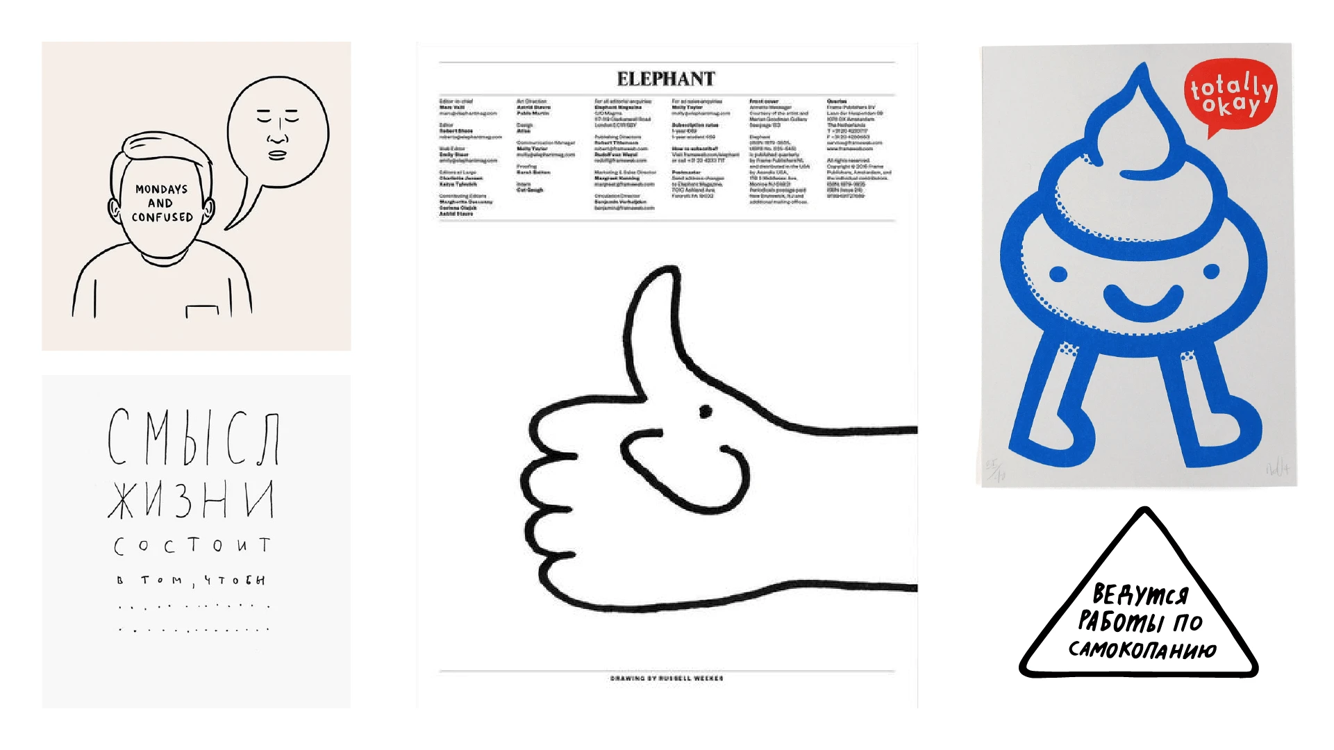
Comic pieces, illustrations and motivators for entartainment purposes.
Tear-off b-cards for practicality
The Concept
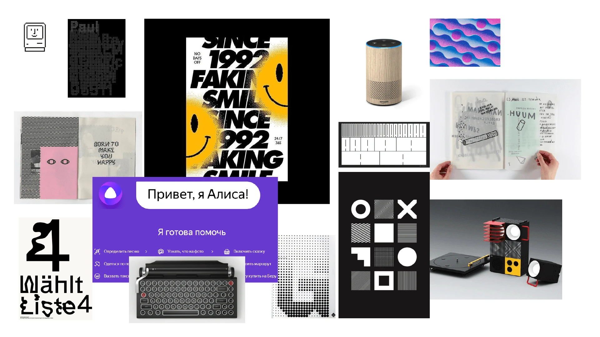
The moodboard
The diary is an analog version of the device. "Analog" shades in it the principle of a technological device, humanizes it. This is evident both in the use of tactile materials [pleasant to the touch paper, textured varnish], a certain naivety and vintage of graphic presentation [office programs, ads, 90s aesthetics] and in the nature of the texts and content.
Behind the seeming complexity and intricacy of the interior of the diary hides the sly "face" of the keeper-conductor, whose caring "hand" guides the owner through its contents. He has scattered "beacons" all along the way, so that the traveler does not stray from his intended course ["Have you forgotten your goal for the month?!"].
Sometimes our hero can pretend to be human [handwritten font], but at its core it is interfaces, dialogues, codes [graphics (patterns) and typography (font compositions)].
He is so helpful, organized, and not without a sense of humor that he could become a good friend. Or at least a colleague 😉

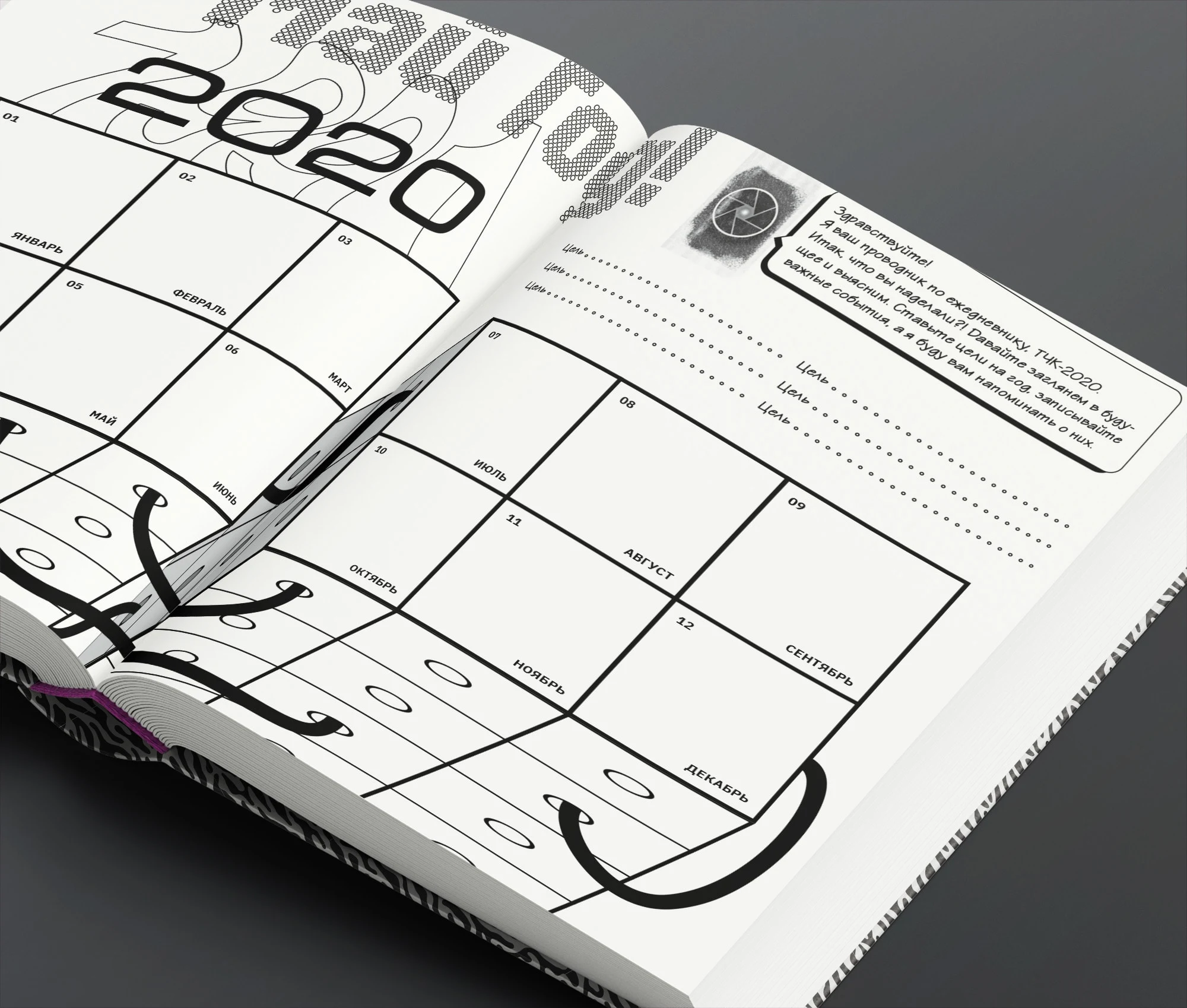
Year grid
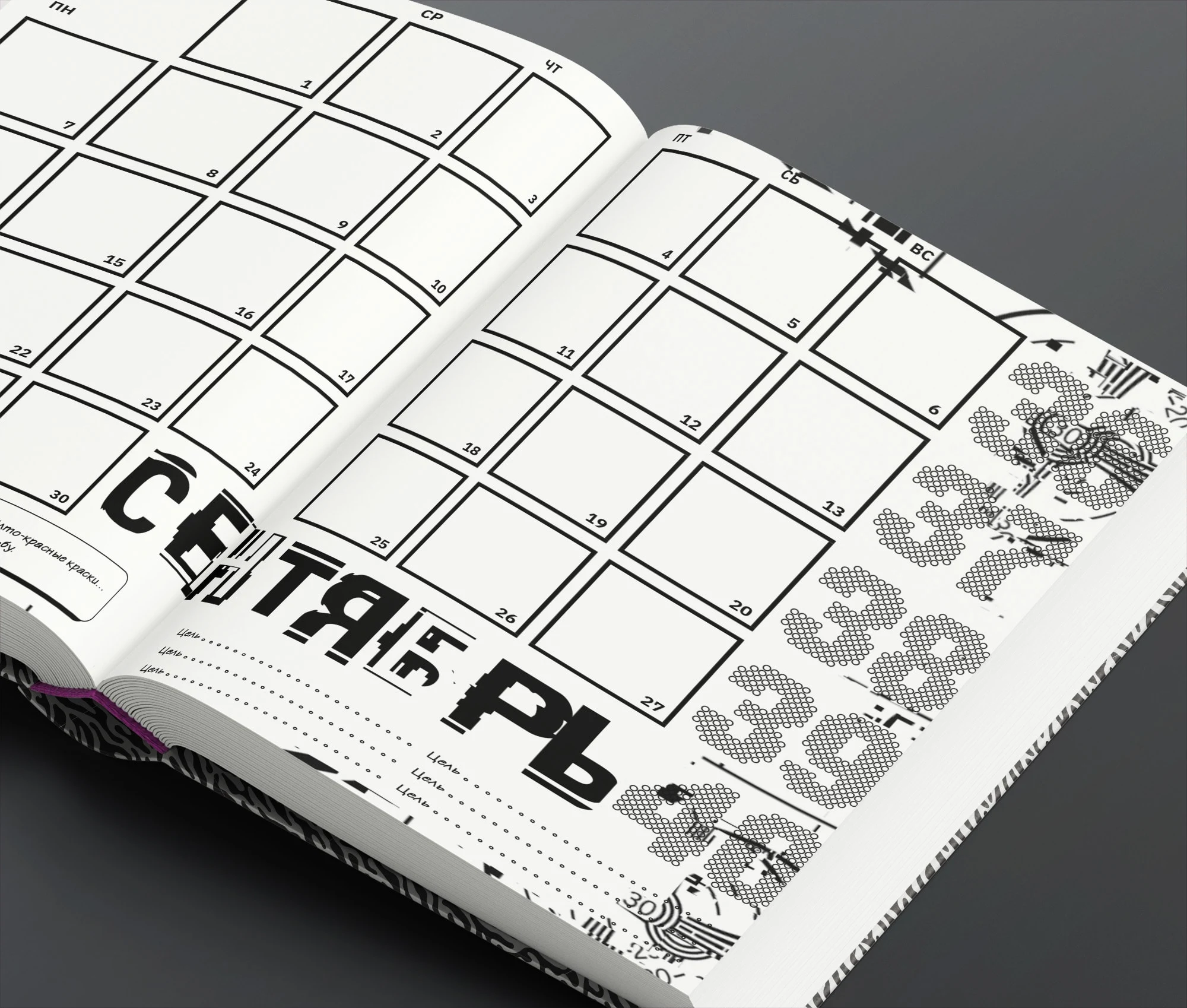
Month grid
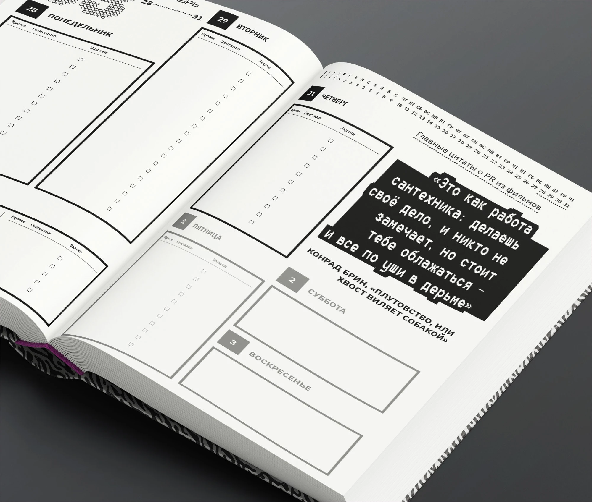
Week grid
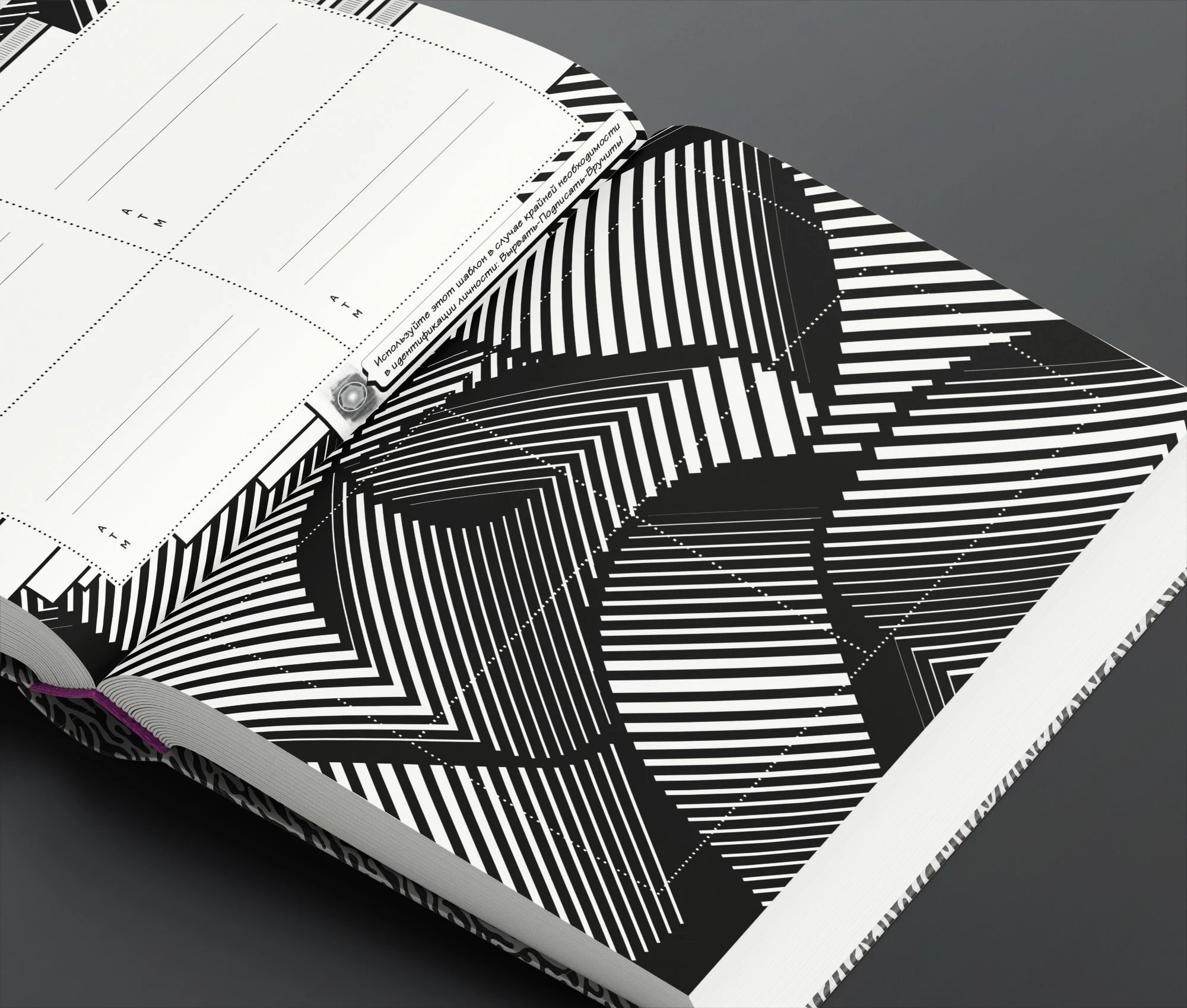
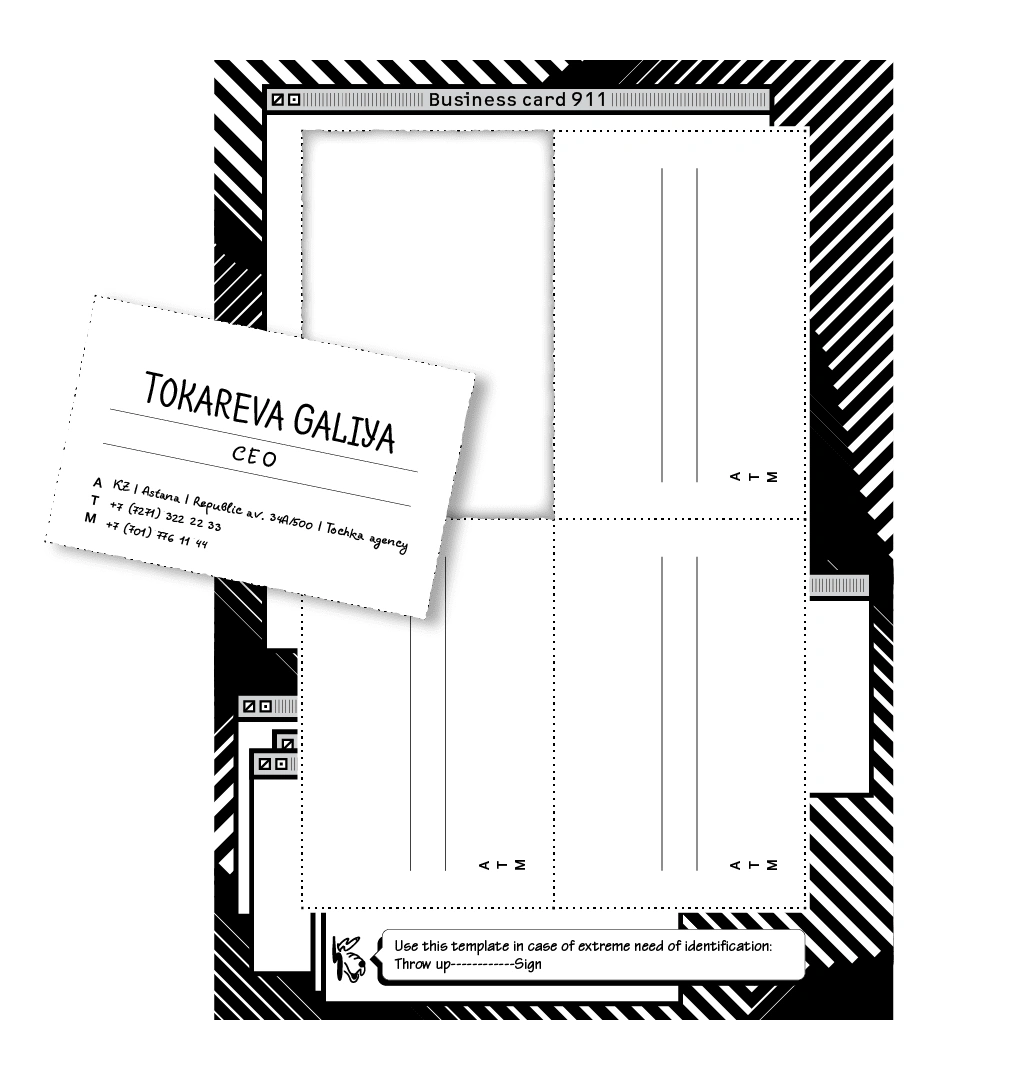
Tear-off b-cards

Like this project
Posted Aug 16, 2023
Custom diary concept, layout and make-up for PR professionals.