Superlist WordPress Site Design
Sachin Kumar
Hero Section
Core Features Showcase
Voice & AI-Powered Notes
About
Final CTA & Footer
https://www.superlist.com/
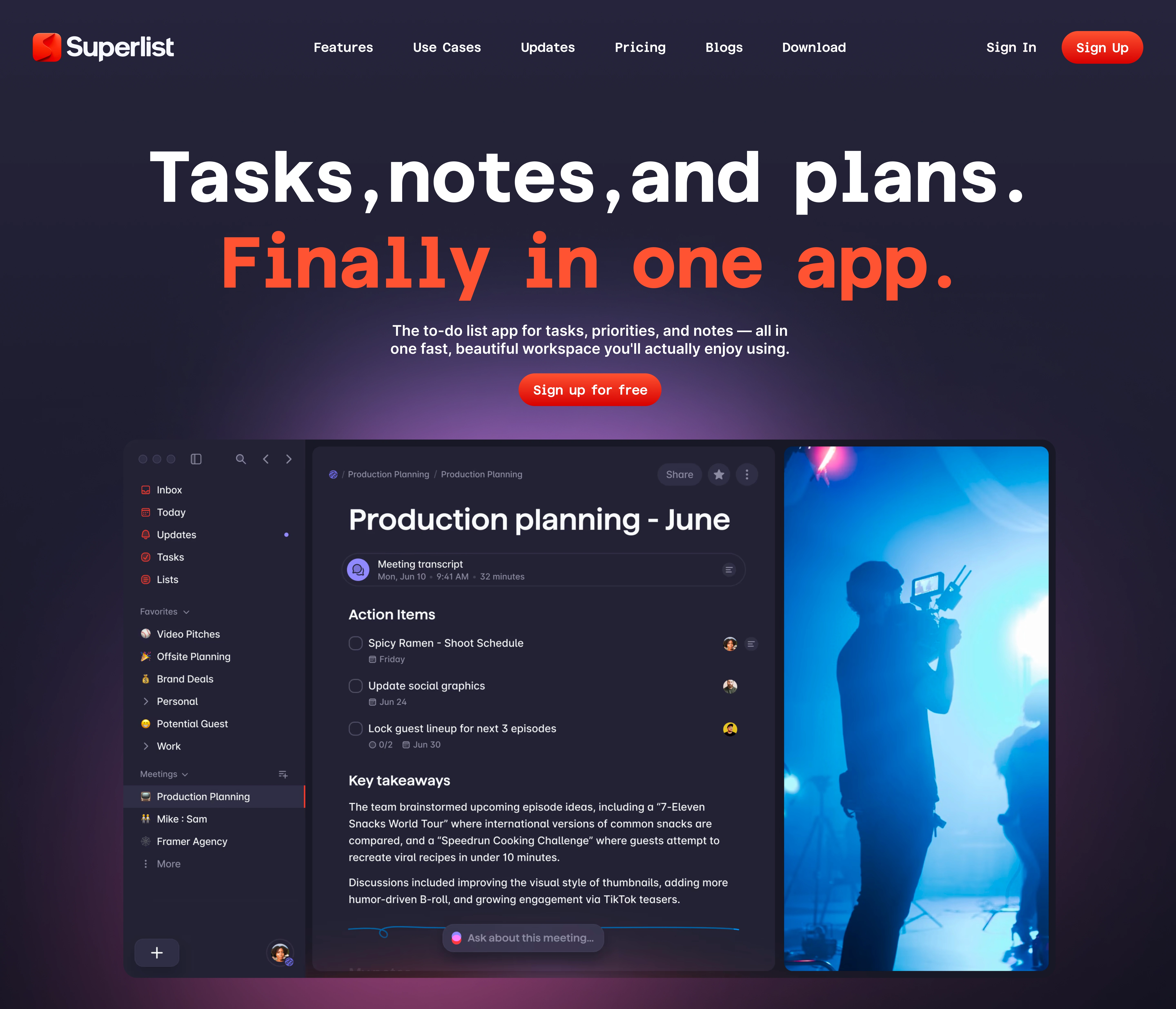
This project was built entirely on WordPress, customized from the ground up to reflect a modern, futuristic productivity brand.
🔹 Hero Section
The homepage opens with a bold, high-contrast hero that sets the tone right away — clean typography, bright CTA, and a glowing gradient backdrop that adds depth. I designed this section to immediately capture attention and communicate the brand’s message: clarity, control, and smart task handling.
🔹 Core Features Showcase
Just below the fold, I introduced the product’s main feature — the planning interface — paired with real-life visuals to keep it relatable. This section uses a dark theme with subtle shadowing and hover effects to keep the UI feeling alive.
🔹 Notes + Tasks Flow
I designed this to demonstrate how users can convert thoughts into actions. The layout uses a split design — task panel on the left, real-world image on the right — to tell the story visually. Every pixel was adjusted for readability and flow.
🔹 Voice & AI-Powered Notes
This section highlights AI features with a clean, focused layout over a cool-toned background. I kept the visual style consistent but gave it enough separation so each feature gets its own spotlight without distraction.
🔹 Team Productivity & Collaboration
The goal here was to showcase team workflow in a peaceful, empowering way. The UI section blends beautifully with a scenic image that brings calm and focus — exactly the kind of energy this product offers.
🔹 Mobile-First Design Preview
Both mobile layouts are placed over vibrant color blocks, designed to break the pattern slightly and give visual freshness while clearly showing mobile responsiveness. Built with complete responsiveness in mind, every element adjusts perfectly across screen sizes.
🔹 Feature Highlights Section
A clean, center-aligned list of features written to feel both technical and easy to understand. I avoided heavy icons and clutter to keep focus on what matters. It ends with a subtle glowing Superlist branding line for recall value.
🔹 Final CTA & Footer
The closing CTA is simple but strong, followed by a neatly structured footer with essential links and clear typography. Every link is styled with hover interactions and minimal color accents.
Like this project
Posted Jun 17, 2025
Created a responsive WordPress website for Superlist with clean design and optimized UX to enhance clarity and engagement.
Likes
0
Views
4
Clients
Superlist