Built with Webflow
Designed a Trusted Partner Directory Webflow Site
Sachin Kumar

Hero Section
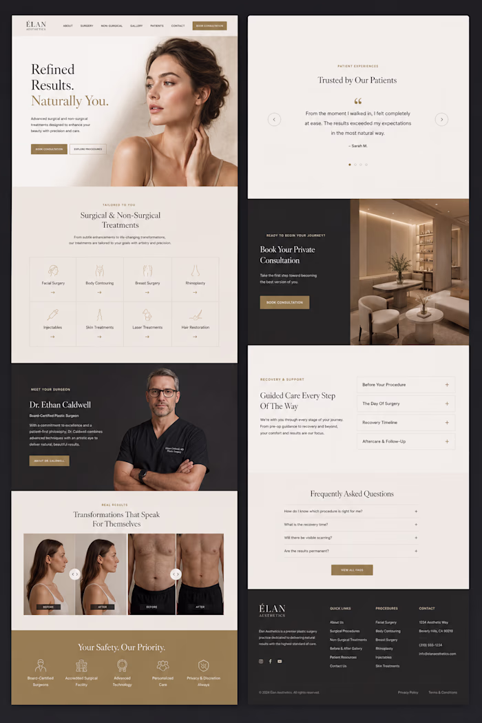
Partner Directory Layout
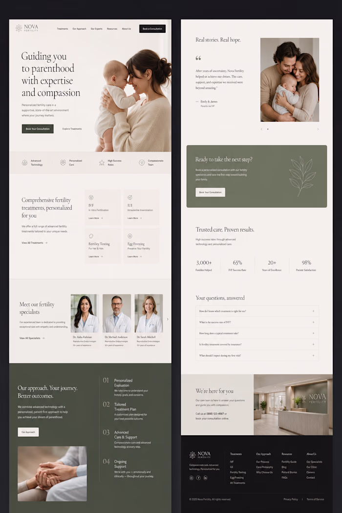
Partner Directory layout 2
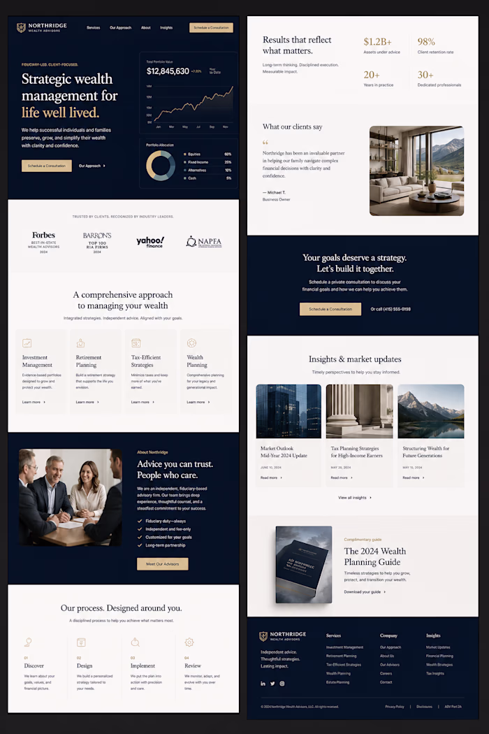
Partner Directory Layout 3
Footer
http://marketplace.shopperapproved.com/
Hero Section
Designed a professional hero section with a bold headline, clean typography, and trust-focused messaging to highlight verified partner solutions. The layout guides users toward exploring trusted service providers through clear navigation and strong CTA buttons.
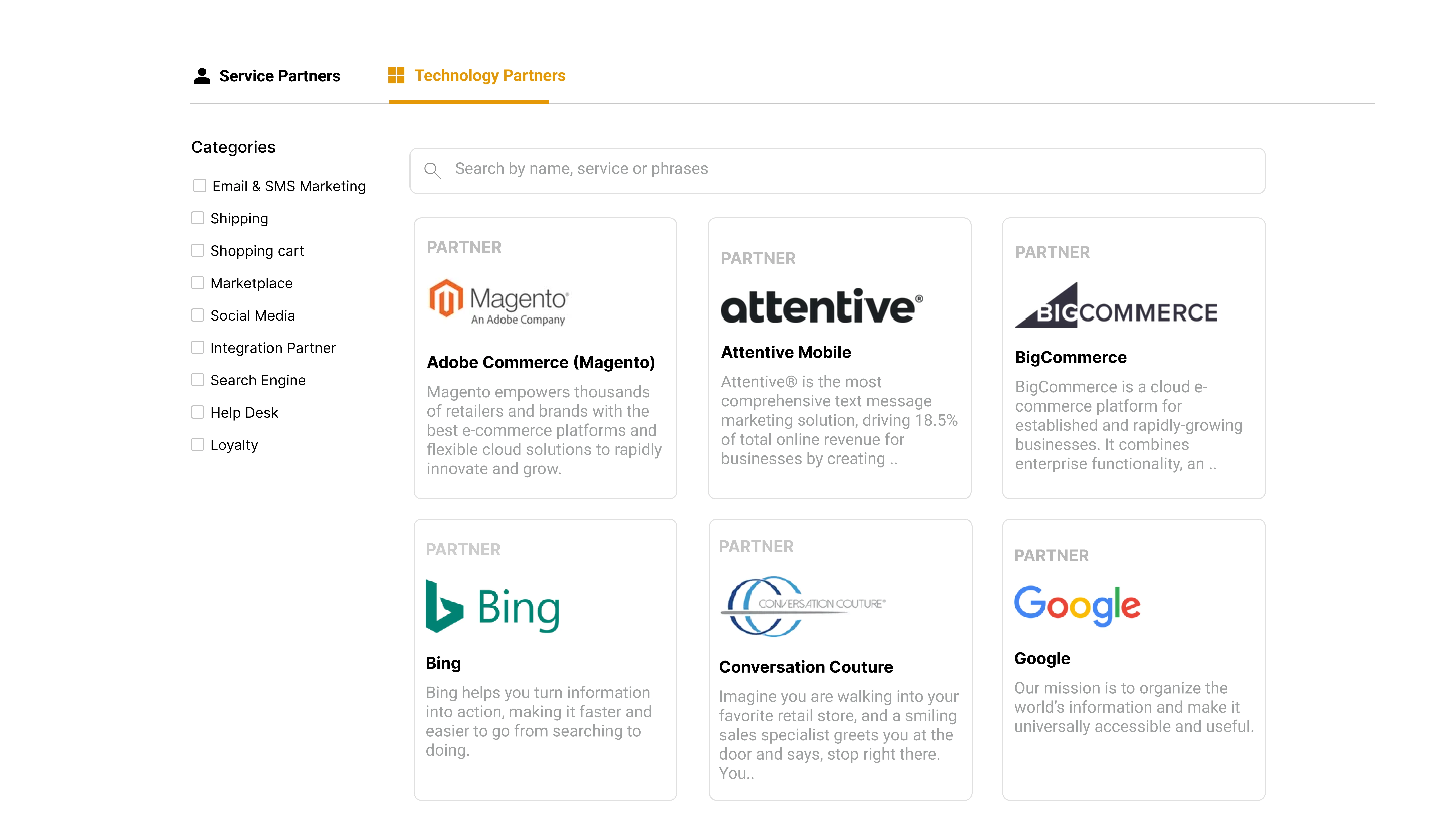
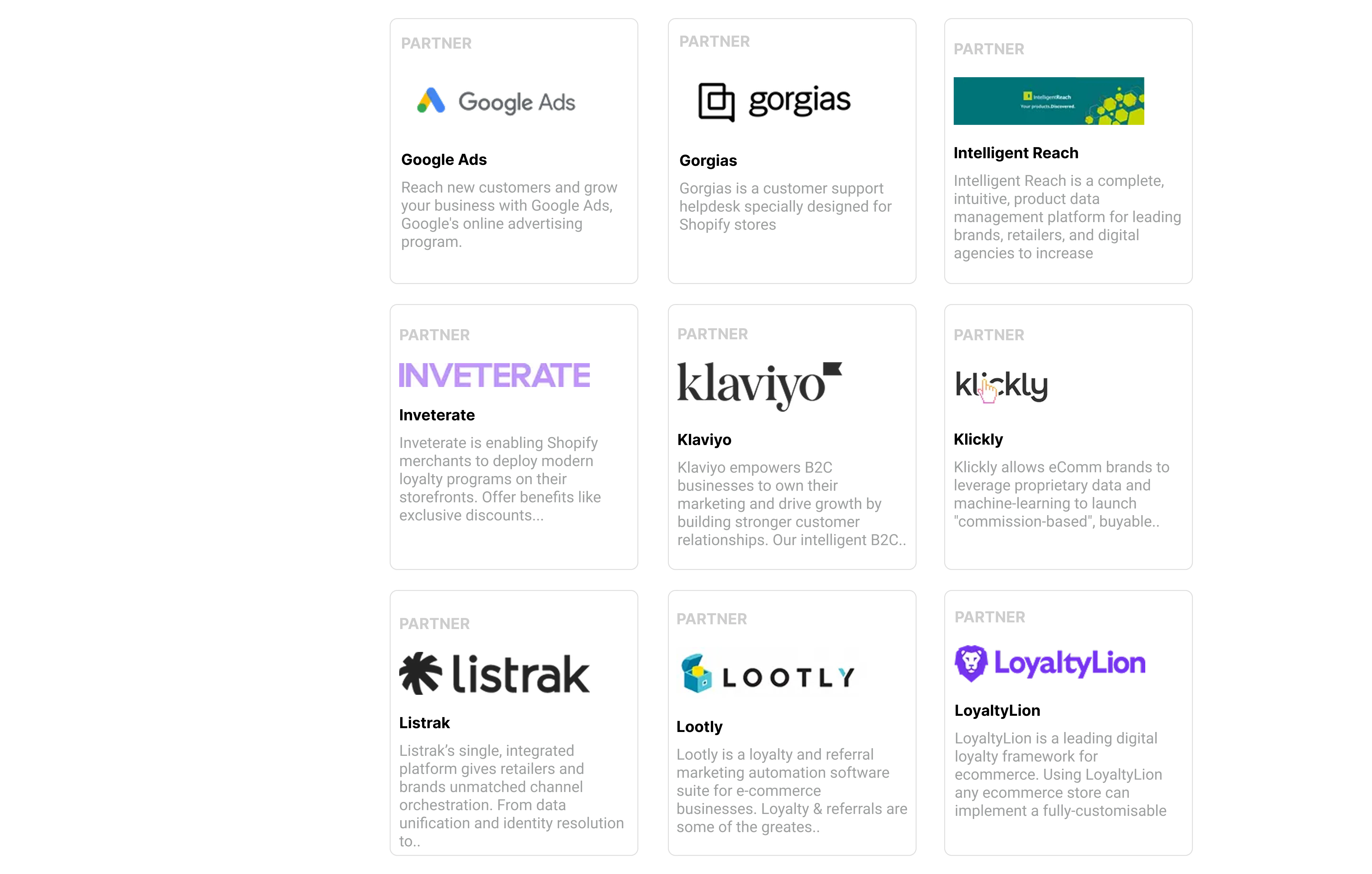
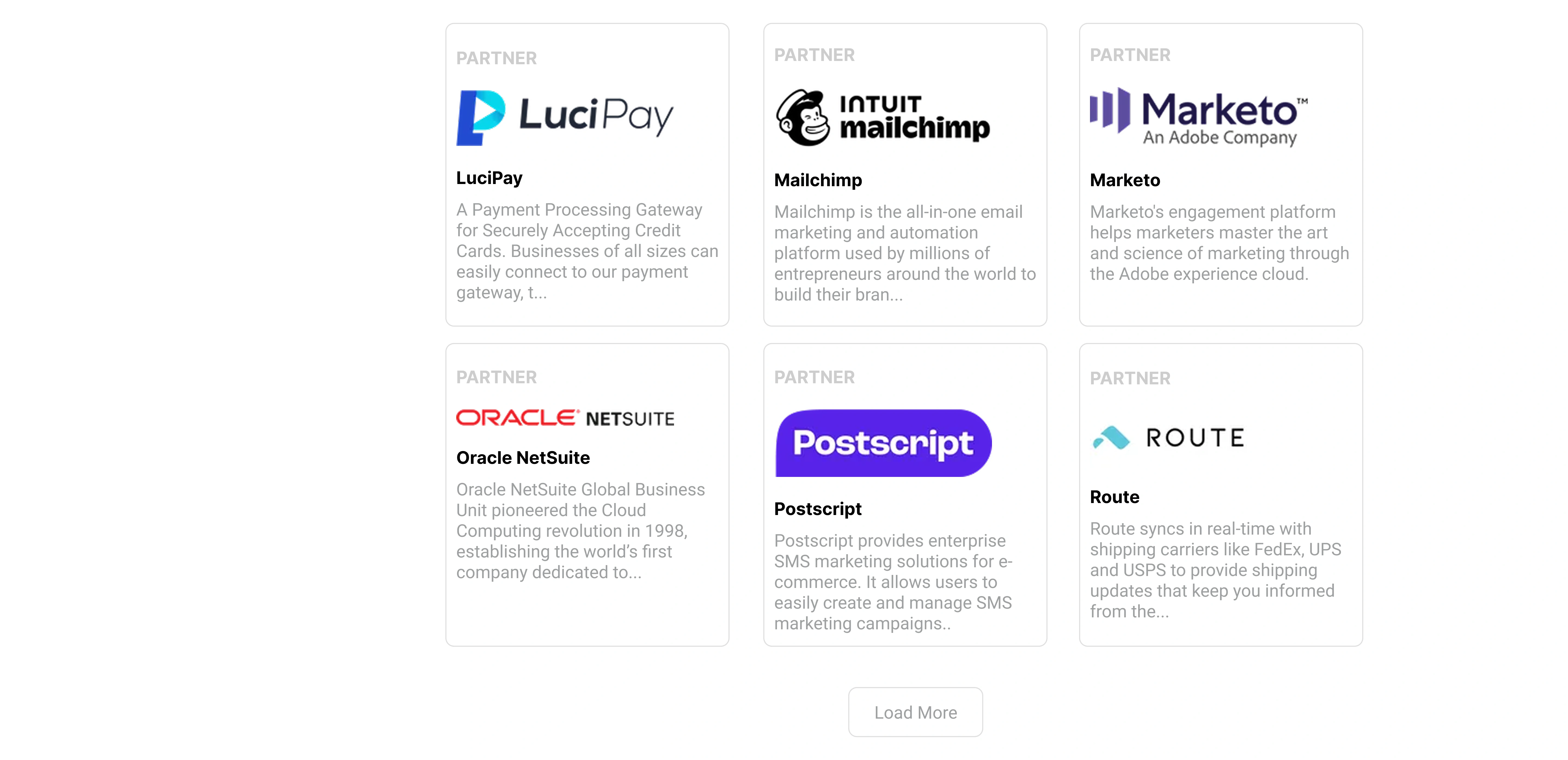
Partner Directory Layout
Created a structured directory system with categorized partner listings displayed in clean card-based layouts. Each partner card includes branding, partnership level, and short descriptions for quick browsing and better user decision-making.
Advanced Filters & Search
Built an easy-to-use filtering system with dropdown categories such as marketing services, location, platform expertise, and budget. Added a search bar to help users quickly find the most relevant partners and improve overall usability.
Featured Partner Cards
Designed responsive partner cards with consistent spacing, clear hierarchy, and visual branding. The layouts help maintain readability while showcasing multiple agencies in an organized and scalable way.
Call-to-Action Section
Added a dedicated “Get Matched” section to encourage users to connect with the right service providers. The CTA uses strong contrast, clean copy, and focused positioning to increase engagement and lead generation.
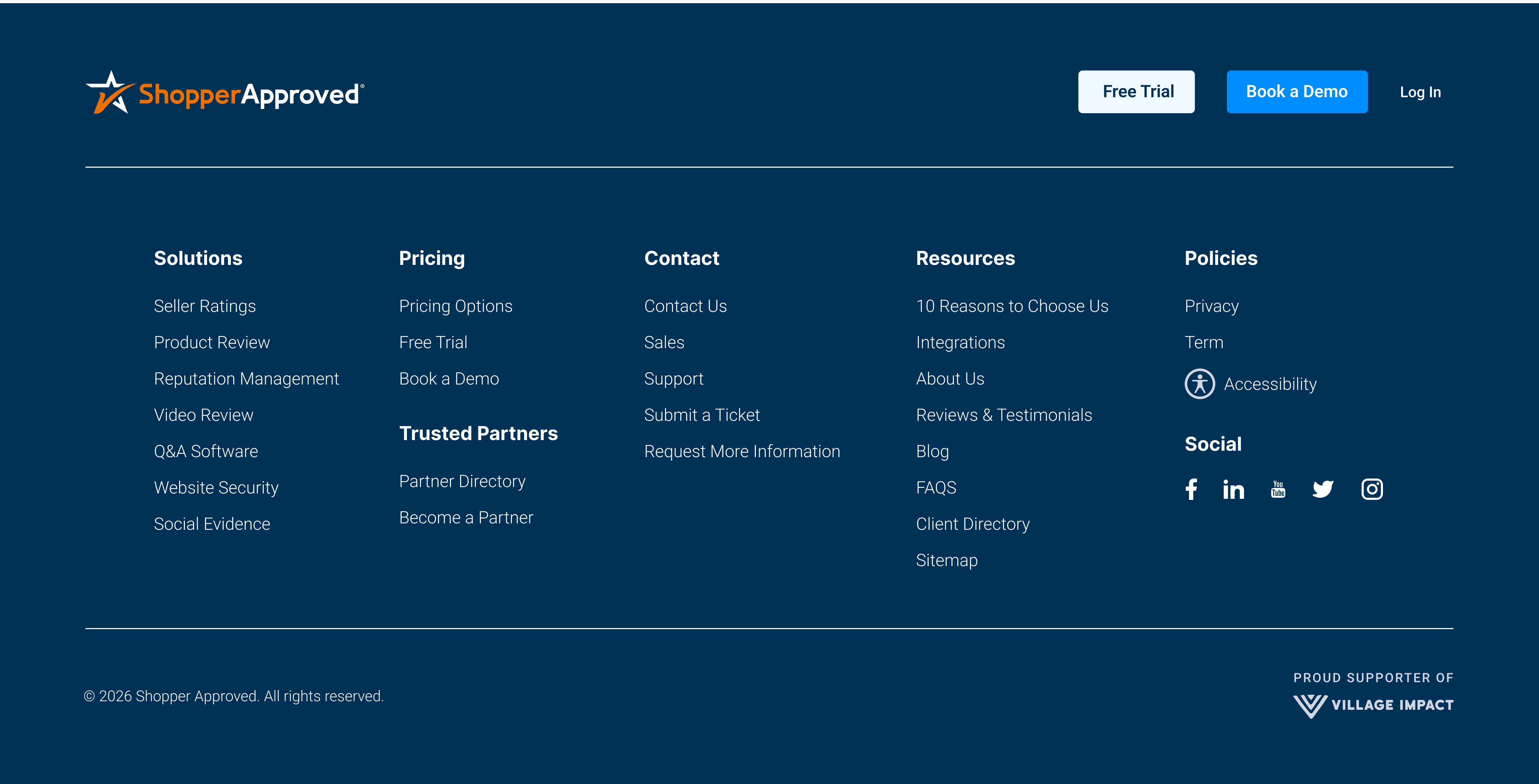
Footer Section
Structured the footer with categorized navigation links, product resources, contact information, and social icons. The clean multi-column layout improves accessibility while maintaining a polished SaaS-style appearance.
Responsive Layout
Designed the entire platform with a responsive approach to ensure smooth performance across desktop, tablet, and mobile devices. Optimized spacing, card alignment, and navigation for a seamless browsing experience on all screen sizes.
Like this project
Posted Jun 13, 2025
Planned in Figma and built in Webflow—fully responsive, CMS-integrated website for Trusted Service Providers with clean UI, smooth UX, and fast performance.
Likes
0
Views
1
Timeline
Apr 13, 2025 - Apr 30, 2025